Website Design
Website Design
Website Design
Insights
Insights
Insights
February 22, 2025
February 22, 2025
February 22, 2025
55 Best Fonts for Websites in 2026 (Designer Picks)
55 Best Fonts for Websites in 2026 (Designer Picks)
55 Best Fonts for Websites in 2026 (Designer Picks)
Unveil the 55 best fonts for websites in 2026! Explore top google fonts, premium fonts, and display fonts for UX & style.
Unveil the 55 best fonts for websites in 2026! Explore top google fonts, premium fonts, and display fonts for UX & style.
Unveil the 55 best fonts for websites in 2026! Explore top google fonts, premium fonts, and display fonts for UX & style.
4 Min Read
4 Min Read
4 Min Read


Picking the right font for your website feels like finding a needle in a digital haystack. Thousands of typefaces exist today, yet selecting the best website fonts in 2026 depends on how well they read, adapt and enhance your brand's message.
Sans-serif fonts work better than their serif counterparts on websites. These fonts are easier to read across devices and screen sizes. Our team reviewed hundreds of options and focused on typefaces that support multiple languages, weights and styles.
The Creative Boom community helped us put together this list of 55 outstanding fonts. We combined their feedback with our design expertise. Our selection includes everything from digital versions of timeless classics to innovative designs that challenge creativity. Each font brings both practical function and visual style to your web projects.
Best Sans-Serif Fonts
Sans-serif fonts are pioneering modern web design. These fonts are exceptionally readable on digital screens. Here are three powerful sans-serif fonts that deliver outstanding results on digital platforms of all types.
Helvetica
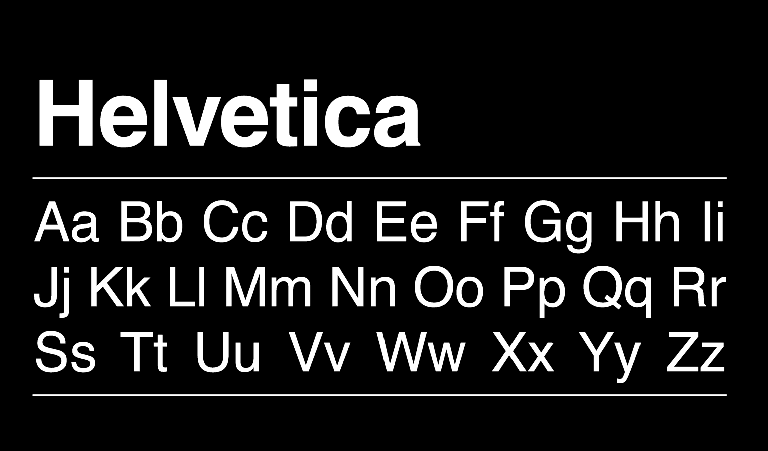
Helvetica's versatility and effect remain unmatched. The 2019 Helvetica Now cemented its legacy as one of the most influential sans-serif fonts. The font's distinctive feature comes from its letterforms with strictly horizontal or vertical terminals that create a crisp, clean look. Notwithstanding that, Helvetica's legibility reduces at smaller sizes, which makes it better suited for headlines and larger text displays.
Roboto
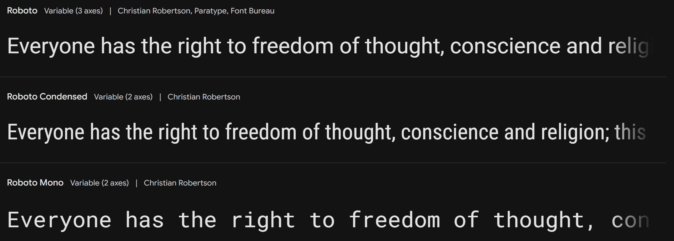
Roboto is the life-blood of digital typography as Android's default font. This versatile typeface has six weights plus italics that provide remarkable flexibility. Roboto stands out with slightly thinner and more compact letterforms. These features make it work exceptionally well for busy user interfaces where space efficiency is vital. It also lets designers activate alternative character styles, such as a more Helvetica-like "R," through specific CSS settings.
Inter
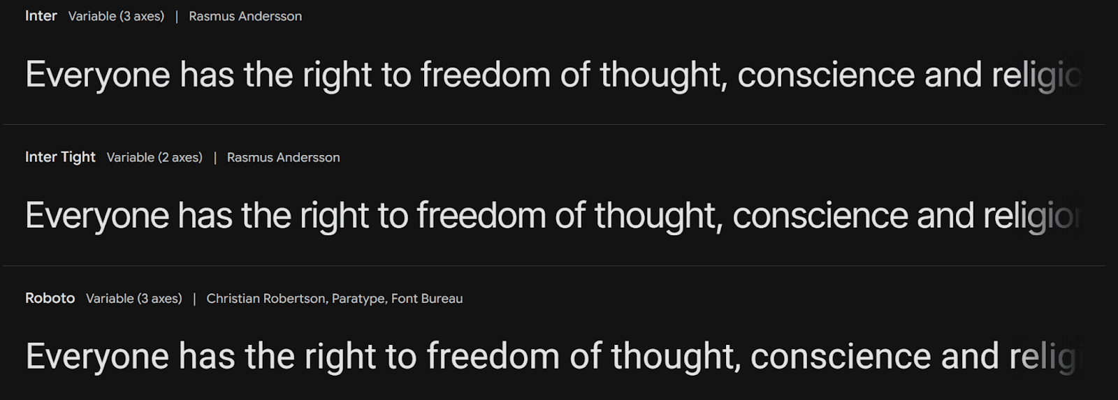
Inter represents the rise of sans-serif fonts engineered specifically for digital interfaces. Rasmus Andersson created this font with more generous spacing than traditional neo-grotesques. This spacing allows designers to adjust letter-spacing at larger sizes for stronger visual impact. The font has over 2000 glyphs and supports 147 languages, which makes it perfect for international websites. Inter's regular version uses a smaller x-height to boost readability at reduced sizes. The display sizes then showcase clean lines that scale beautifully across different dimensions.
Top Serif Fonts
Serif fonts add elegance and professionalism to web design, particularly now with high-resolution displays becoming common. These classic typefaces showcase decorative "feet" that trace their origins to ancient Roman inscriptions and still improve digital experiences today.
Merriweather

Merriweather is a strong and friendly serif font that reads well on platforms of all types. Its balanced design uses moderate contrast between thick and thin strokes, which makes it perfect for web content and print materials. The typeface features clean lines and carefully sculpted serifs that boost its visual appeal. Designers often combine Merriweather with sans-serif fonts to create balanced web layouts.
Playfair Display

Playfair Display is a stylish and decorative serif font that shines in creating striking headings and titles. The high contrast between thick and thin strokes pairs with elegant serifs to bring sophistication to design projects. This font stays readable despite its decorative elements, making it perfect for projects that need luxury and elegance. Digital media increasingly uses Playfair Display to help designers add sophistication and trust to their work.
Lora

Lora takes a modern approach to serif design and naturally connects digital and print media. Its balanced letterforms, moderate contrast, and readable serifs are a great way to get the right look for body text, headings, and branding. The font's thoughtfully crafted details give it remarkable versatility. Lora's design provides clear visibility and pleasant reading on screens of all sizes and resolutions, making it perfect for modern web projects that need both style and function.
Popular Display Fonts
Display fonts grab attention with their unique features that make them perfect for headlines and titles that leave a lasting impression. These typefaces look their best at larger sizes where you can really see their special details.
Bebas Neue
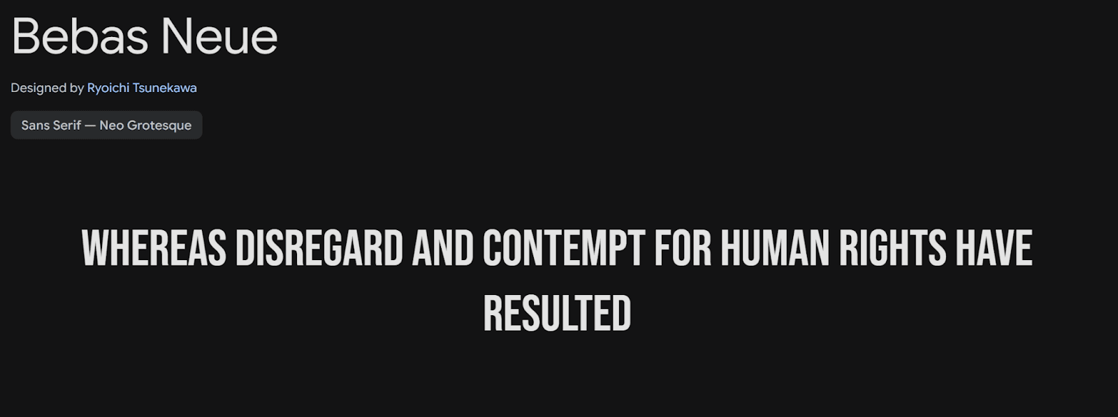
Bebas Neue catches the eye as a clean, condensed typeface that shows confidence through its uppercase-only design. Strong vertical lines and precise letterforms give this font a powerful look that works great for social media visuals and YouTube thumbnails. You'll get the best visual balance by pairing Bebas Neue with Source Sans Pro in your web designs.
Anton

Anton stands tall as a powerhouse in display typography with its bold, all-caps design that radiates strength and confidence. Blocky shapes make this font impossible to ignore, which makes it perfect for short headlines and callouts where you need maximum punch. Designers often add extra letter spacing to boost readability, especially when they use all-caps.
Abril Fatface
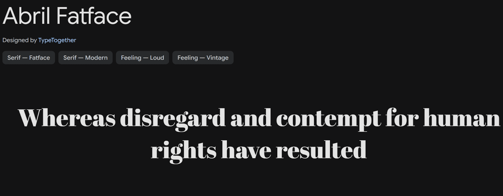
Modern web design gets a touch of class from Abril Fatface's carefully crafted contrast between thick and thin strokes. This elegant display serif font takes its cues from 19th century European advertising posters, especially those from France and Britain. Delicate serifs and subtle details make it a sophisticated choice for headlines that pack both punch and elegance. The font's proportional design looks striking on screens of all sizes, though it works best when used for titles or pull quotes that need to pop in tight spaces.
Modern Geometric Fonts
Geometric fonts have become essential tools in modern web design. They draw inspiration from simple shapes like circles, squares, and triangles. These typefaces, which originated in 1920s Germany, blend naturally with today's design esthetics.
Raleway
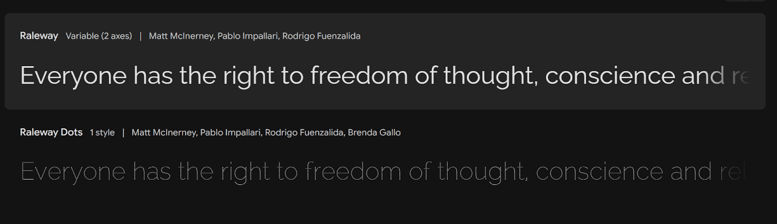
Raleway shows off modern geometric design through clean lines and graceful curves. This versatile typeface gives designers plenty of options with nine weights in standard width and three in its narrow version. The distinctive "W" with crossed center strokes and geometric elements helps create visual hierarchies in web interfaces effectively.
Rubik
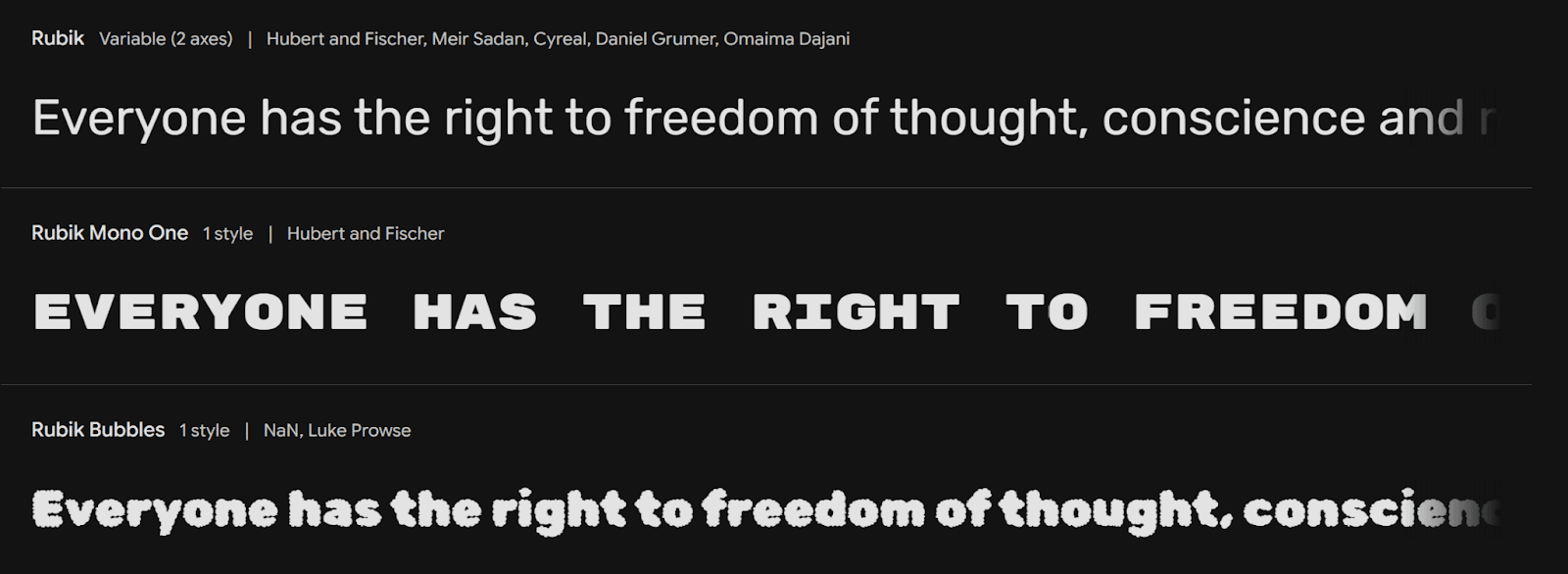
Philipp Hubert and Sebastian Fischer created Rubik, a font that shines with its precise geometric construction and consistent stroke widths. The font's balanced proportions and minimal variations make it easy to read across digital platforms. Rubik and Raleway go together naturally, making them perfect for modern web designs that need both structure and warmth.
Questrial

Questrial brings a fresh point of view to geometric sans-serif design with its clean, structured approach. The font's calculated proportions and geometric foundation work well in today's web interfaces where clarity matters most. Its modern look and excellent readability make it a great choice for headlines and body text in digital environments.
These geometric fonts share mathematical precision but keep their unique characteristics. They adapt well to current design trends because they're built on simple geometric forms. This makes them perfect for technology websites, mobile apps, and modern digital interfaces. As we move through 2026, designers can use these fonts to strike the perfect balance between minimalist aesthetics and functional clarity.
Minimalist Font Options
Minimalist design principles have transformed web typography with fonts that focus on clarity and simplicity. These well-crafted typefaces blend naturally into modern interfaces through clean lines and balanced proportions.
DM Sans

DM Sans works great for small text sizes, which makes it perfect for body content. Originally commissioned by Google, this versatile font family has complete OpenType features like fractions, ordinals, and case-sensitive forms. Its geometric shapes keep clean edges on different screen resolutions and stay readable in digital environments.
Manrope

Manrope stands out with its slightly closed-off counters that create a unique visual rhythm. This modern sans-serif typeface comes in seven distinct weights, giving designers plenty of options to create visual hierarchies. Its balanced letterforms and precise geometric construction work well for both headlines and body text.
Plus Jakarta Sans
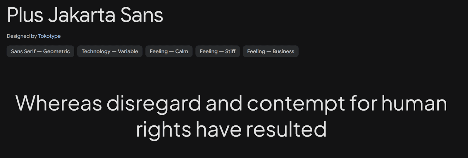
Plus Jakarta Sans marks a big step forward in minimalist typography and draws inspiration from classic designs like Neuzeit Grotesk and Futura. The font's slightly taller x-height makes capital letters and lowercase characters easier to tell apart. Its open counters and well-balanced spacing help readers see text clearly on screens of all sizes.
These minimalist fonts share key features that are great for modern web design:
Generous spacing between characters
Clean, geometric construction
Balanced proportions for better readability
Extensive language support for global accessibility
These fonts work best when paired with other typefaces to create dynamic visual hierarchies. To cite an instance, DM Sans pairs well with serif fonts to create contrast, while Manrope's versatility lets it go together with both modern and traditional typefaces.
Professional Business Fonts
Professional fonts are the life-blood of business communication in the digital world. These typefaces strike a perfect balance between authority and accessibility. Your message reaches audiences of all types with maximum impact.
Work Sans
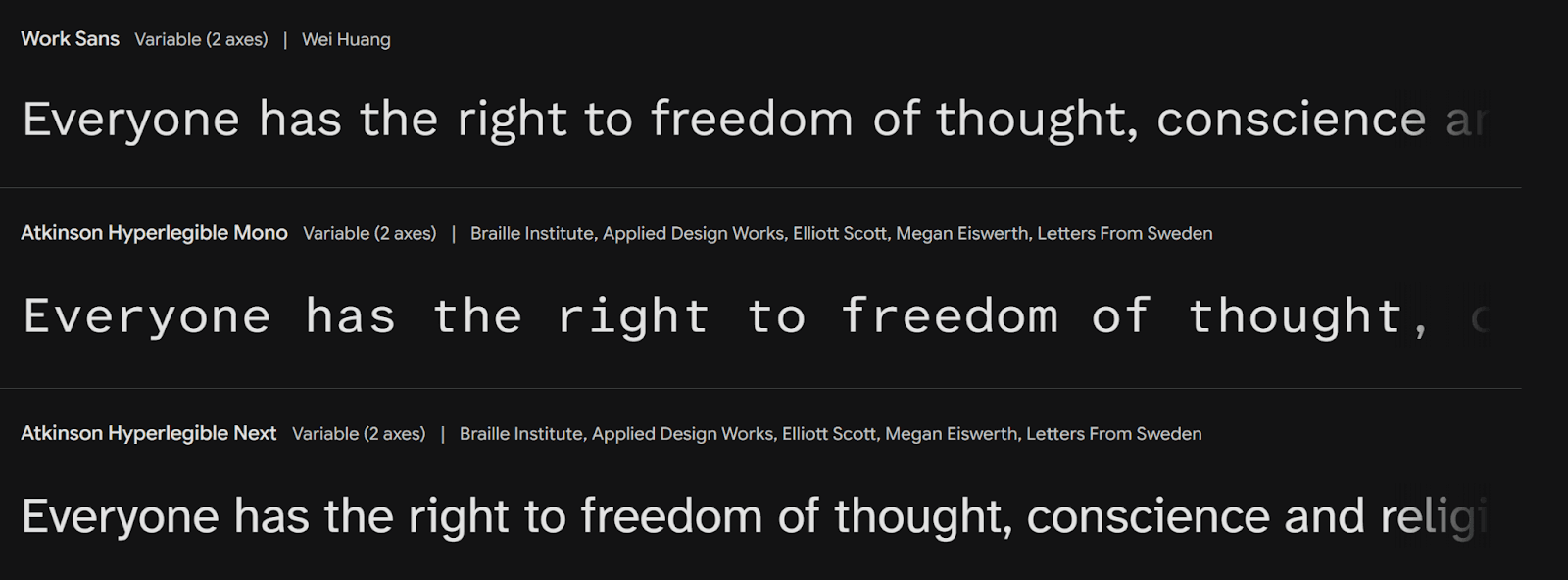
Work Sans is a versatile sans-serif typeface that shines in corporate settings. The font family has nine distinct weights with matching italics to give you plenty of design options. Clean letterforms and balanced proportions make this font work well in headlines and body text. Work Sans also has complete language support, which makes it perfect for international businesses that want to keep their brand consistent.
Nunito
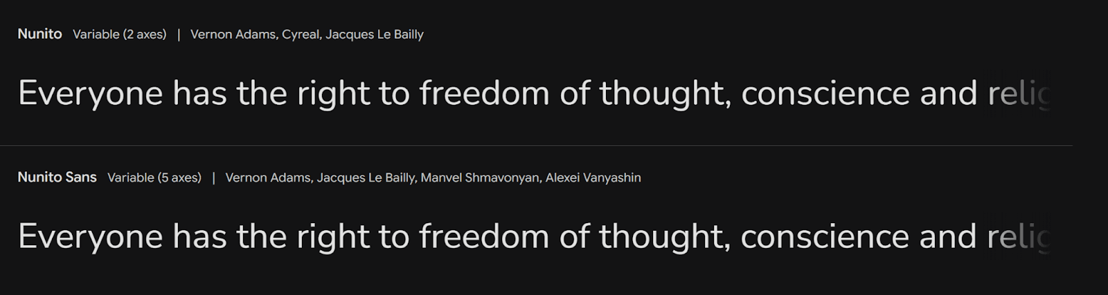
Nunito's rounded terminals and design elements set it apart. Vernon Adams created it first, and Jacques Le Bailly improved it later. This font blends professional looks with a touch of warmth. You get sixteen styles from ExtraLight to Black, plus matching italics. Nunito's optical size adjustments help it look great on screens of all sizes.
Libre Franklin

Libre Franklin shows how modern typography has evolved in professional settings. This refined typeface gives you eighteen different styles - nine weights plus their italic versions. The text stays readable whether big or small, which is perfect for corporate websites and digital presentations. Businesses can keep their brand consistent worldwide thanks to the font's extensive character set that works in multiple languages.
These professional fonts share key features that are a great way to get business applications right:
Weight variations that create clear visual hierarchies
Best performance on digital platforms
Easy to read at any size
Support for multiple languages to reach global markets
Creative Font Choices
Creative font choices bring personality to digital spaces through expressive typography in web design. These unique typefaces help build memorable brand identities and create engaging user experiences.
Bungee

Bungee brings a fresh take on vertical typography to web design with its stacked lettering approach. This font family gives designers multiple styles including Inline, Outline, and Shade variations they can layer for chromatic effects. Bungee stands out because it works well both vertically and horizontally. The font's bold nature needs careful use, making it perfect for energetic brands that want to make a statement.
Pacifico

Pacifico shines as a script font that strikes the right balance between creativity and readability. Its character shows best in social media graphics and digital marketing materials. The flowing letters create a welcoming feel while staying professional. Smart spacing and well-designed characters keep Pacifico clear even in complex layouts.
Lobster

Designers love Lobster for adding a touch of casual elegance to web projects. This script typeface creates headlines that grab attention without losing readability. Well-crafted ligatures and alternative characters help the text flow smoothly across screens of all sizes.
Key points to remember when using creative fonts:
Save them for headlines and short text blocks
Make sure they contrast well with backgrounds
Check how readable they are on different devices
Pair them with simple fonts for body text
Readable Body Text Fonts
The right body text font plays a vital role in making content readable on digital platforms. These adaptable typefaces keep text clear even in long content blocks and are essential for modern web design.
Open Sans
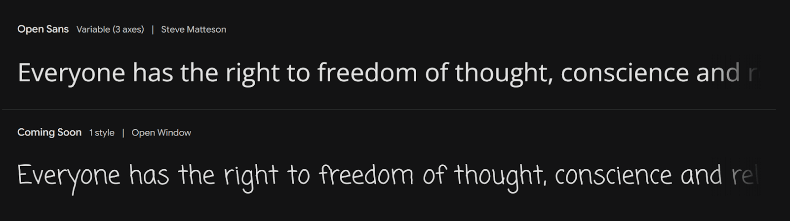
Open Sans has become a trusted choice for body text over the years with its exceptional x-height and balanced letterforms. Recent studies showed readers achieved 35% faster reading speeds with their best font choices. Open Sans provides complete character support for multiple writing systems that covers Latin Extended, Cyrillic, Greek, and Hebrew alphabets. The generous spacing between characters prevents visual crowding and enhances legibility on screens of all sizes.
Source Sans Pro
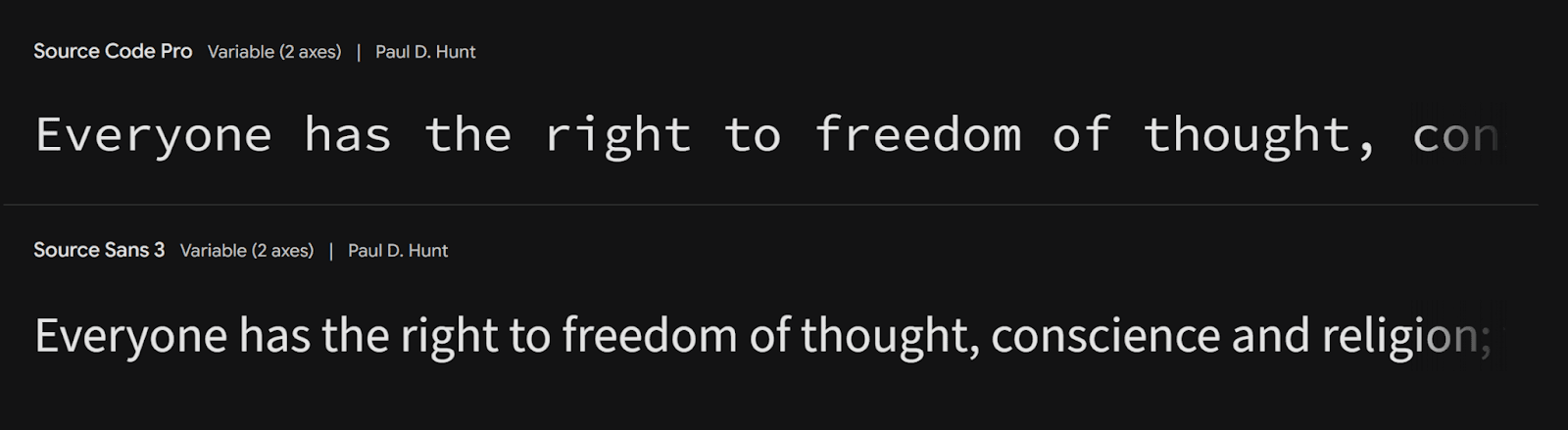
Source Sans Pro stands out because of its careful design that maximizes legibility on digital displays. This versatile typeface supports over 200 languages, which makes it perfect for international websites. Readers can easily distinguish characters against busy backgrounds thanks to the font's generous spacing and clear letterforms. Source Sans Pro also uses anti-aliasing technology that keeps text crisp on low-resolution screens.
Karla
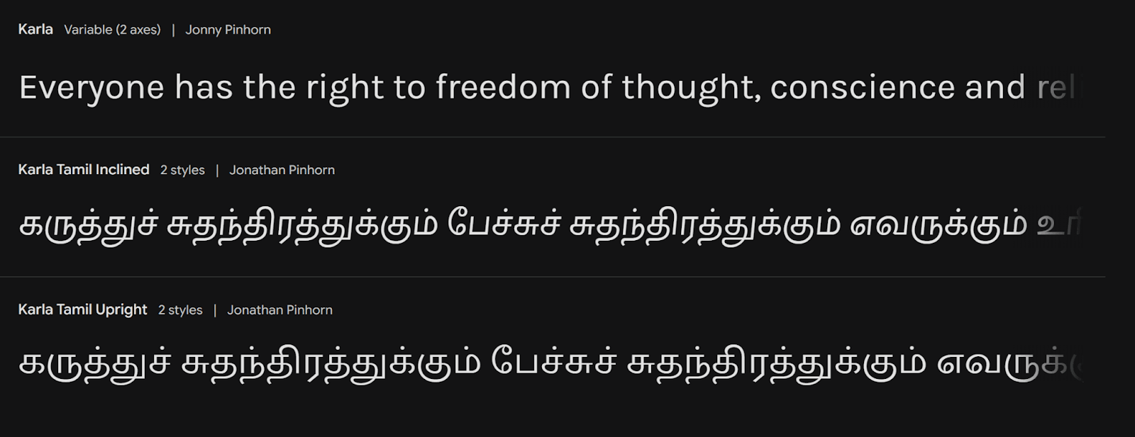
Karla is a modern sans-serif that puts readability first without losing its unique character. This typeface works best at smaller sizes, especially when you have body text in digital environments. The clean, simple design stays clear across different screen resolutions. The font's balanced letterforms and adequate spacing help reduce eye strain during long reading sessions.
Important points to remember when using these body text fonts:
Keep appropriate contrast ratios (minimum 4.5:1) between text and background colors
Use enough line spacing to prevent visual crowding
Think over off-white backgrounds instead of pure white to reduce eye strain
Keep consistent spacing between paragraphs to improve readability
Versatile Font Families
Modern web typography relies heavily on versatile font families that provide flexible solutions for design challenges of all types. These adaptable typefaces support many languages and weights to maintain consistent branding worldwide.
Noto Sans
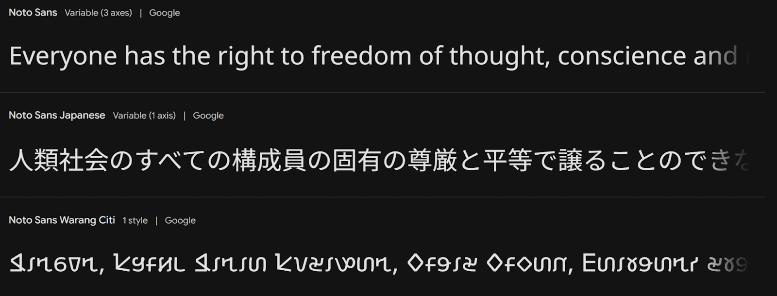
Google created Noto Sans as their answer to universal typography that supports almost all modern and ancient languages. This remarkable font family covers over 800 languages and scripts of all types, including Latin, Greek, Cyrillic, and complex scripts like Arabic and Chinese. The font maintains clarity with its unmodulated design across 3,741 glyphs and comes in 18 different styles from thin to black weights. The font prevents unsupported character boxes known as "tofu" and ensures continuous multilingual communication.
Noto Serif
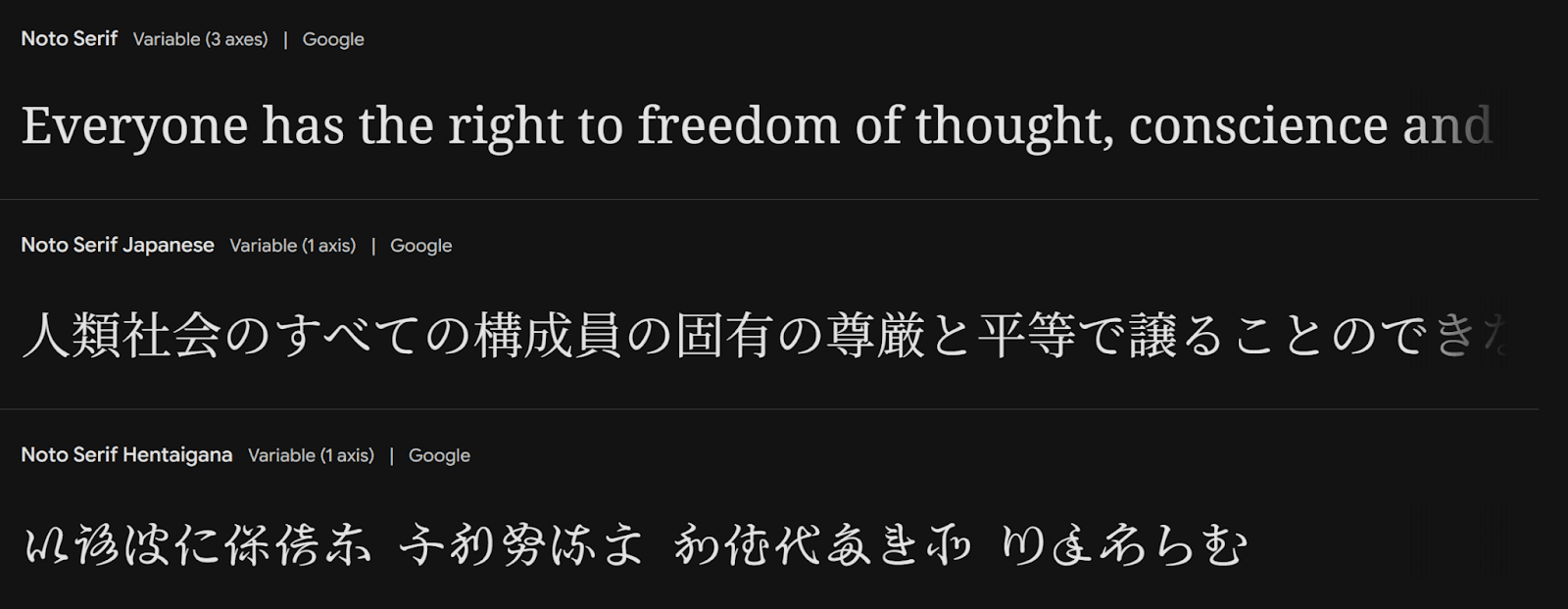
Noto Serif pairs perfectly with its sans-serif counterpart and offers the same broad language support with an elegant touch. The typeface keeps consistent stroke contrast across different scripts, which makes it perfect for long-form content. Noto Serif reads well on screens of any size and resolution, making it a trusted choice for digital publishing platforms.
IBM Plex Sans

IBM Plex Sans marks a significant achievement in corporate typography and supports approximately 100 languages across Latin, Greek, Cyrillic, Devanagari, and Thai scripts. This versatile typeface combines machine precision with human warmth. The family includes Sans, Serif, Mono, and Condensed variations, each with multiple weights and true italics. IBM Plex Sans works exceptionally well in user interfaces, which makes it valuable for tech-focused websites and apps.
These font families stand out because they:
Support scripts globally for better accessibility
Offer many weights for design flexibility
Work well across digital platforms
Fit seamlessly into different design contexts
Elegant Fonts
Elegant typography plays a vital role in how luxury brands express sophistication and refinement. Their fonts blend classical elements with modern sensibilities to create timeless visual experiences in the digital world.
Cormorant Garamond

Cormorant Garamond perfectly combines traditional elegance with digital functionality. This refined typeface takes inspiration from Claude Garamont's classical designs and adds contemporary elements to boost screen performance. Its delicate hairlines and subtle weight variations create an atmosphere of understated luxury. Designers can craft sophisticated typographic hierarchies that stay readable on screens of all sizes, thanks to the font family's multiple weights and styles.
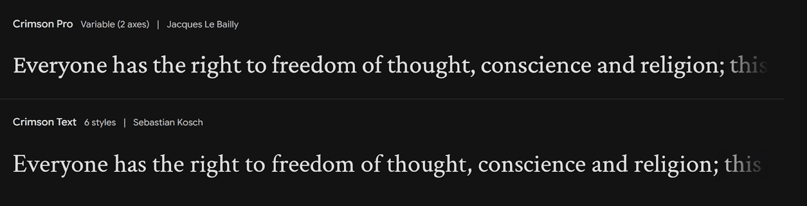
Crimson Pro
Crimson Pro distinguishes itself with a balanced approach to elegant typography. This versatile serif typeface features precise proportions that deliver optimal legibility while keeping its refined character. The font's high contrast between thick and thin strokes adds dramatic flair to headlines and titles. Crimson Pro retains its sophisticated look even in smaller sizes, which makes it ideal for both display and body text.
Gilda Display

Gilda Display showcases excellence in contemporary elegance. This typeface blends classical serif elements with modern proportions to create a distinctive presence in digital environments. Large sizes reveal its refined details, making it perfect for headlines and feature text. Designers can create upscale digital experiences with the font's carefully crafted letterforms that deliver clarity without compromising sophistication.
Key points to remember when using elegant fonts:
Keep adequate contrast between thick and thin strokes for better visibility
Think over how font size works with screen resolution
Mix decorative elements and readability needs effectively
Use consistent spacing for smooth text flow
Contemporary Font
Modern typography challenges design limits by combining state-of-the-art design with amazing functionality. New typefaces are reshaping digital esthetics and you can read them easily on any platform.
Urbanist
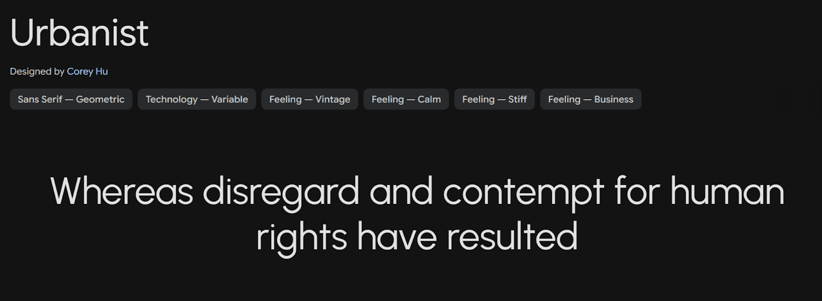
Urbanist brings a fresh take on modern typography with its low-contrast letterforms and geometric precision. This adaptable font family has 18 styles that range from thin to black weights, which gives designers plenty of creative freedom. The typeface's balanced x-height lets you read it easily at any size, so it works great for both headlines and body text. What makes Urbanist special is its variable font technology that smoothly shifts between weights and widths.
Space Grotesk

Space Grotesk blends futuristic elements with practical design in a unique way. This modern sans-serif stands out from typical geometric fonts with its curved terminals and asymmetrical counters. The font stays clear and crisp across different screen resolutions. Designers can create dynamic typographic hierarchies with its five weights that go from light to bold.
Exo
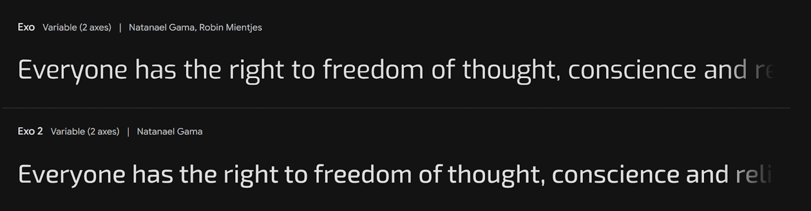
Exo shines as a geometric sans-serif that perfectly mixes tech precision with organic warmth. This modern typeface gives you amazing flexibility through its huge character set and eighteen different styles. You can read it perfectly in both print and digital formats thanks to its well-planned proportions. Exo has subtle details in its letters that become more noticeable at larger sizes, which adds visual interest without losing functionality.
Key features of modern fonts:
Advanced OpenType capabilities that give better typographic control
Variable font technology support for responsive design
Detailed Unicode coverage that makes it available globally
Works great across different screen sizes
Traditional Font Selections
Modern web design still draws heavily from classical typography, using time-tested fonts that have stood strong for generations. These classic typefaces combine rich history with modern digital flexibility and give designers reliable tools to create lasting web experiences.
EB Garamond

EB Garamond brings Claude Garamont's iconic 16th-century designs to life in digital form. The screen-optimized version keeps the original's elegant feel while ensuring text stays readable. This font family comes with ten different styles - regular, medium, semibold, and their italic versions. What makes it special is how well it performs at 12-point size, which makes it perfect for long-form digital content.
PT Serif

PT Serif strikes a sweet spot between beauty and function. Russian designers Olga Umpeleva, Alexandra Korolkova, and Vladimir Yefimov created this transitional serif typeface that works beautifully on digital platforms. Its slightly rectangular shapes and soft letters use space efficiently without sacrificing readability.
Bitter

Bitter takes traditional slab serif principles and adapts them perfectly for modern screens. Sol Matas designed this open-source typeface with large x-height and consistent stroke weights to maximize legibility. The font's well-planned proportions keep text clear even at small sizes, which makes it great for both headlines and body text in digital formats.
These classic fonts stand out because they offer:
Rich OpenType features to improve typographic control
Support for multiple languages and scripts
Great performance on high-resolution displays
Well-balanced proportions that boost readability
Clean and Modern Fonts
Modern web design just needs fonts that look good and work well. These clean, modern typefaces deliver content clearly and look great on any screen size.
Hind

Hind stands out as a flexible sans-serif typeface that's easy to read. This font family supports multiple languages and writing systems. Latin-based languages and non-Latin ones like Greek, Cyrillic, and Arabic work smoothly. The font's open letterforms and balanced proportions make text clear on any screen size. The standardized character width means you won't have to adjust text when switching between styles.
Mulish

Mulish shines as a minimalist gem in digital typography. This sans-serif font uses carefully measured proportions that make text readable whether it's small or large. Letters have plenty of space between them, which helps prevent cluttered looks on busy interfaces. The font covers over 200 languages and variations, making it perfect for international websites that want consistent branding.
Oxygen

Oxygen blends modern design with practical use beautifully. This clean typeface uses anti-aliasing technology to look sharp even on low-resolution screens. Oxygen's thoughtful design for digital displays includes:
Large x-height that's easy to read
Open counters that make letters distinct
Balanced stroke weights at every size
Well-spaced letters
Designers often mix these fonts with others to create eye-catching contrasts. To cite an instance, see how Hind pairs nicely with serif fonts in editorial layouts. Mulish and Oxygen work best in simple designs where clarity comes first.
Friendly and Approachable Fonts
Friendly and approachable fonts create welcoming digital spaces that appeal to users emotionally. These typefaces balance personality with professionalism, making them perfect for brands that want to build genuine connections with their audience.
Quicksand

Quicksand is a distinctive geometric sans-serif that blends approachability with modern design elements. This versatile font uses rounded terminals to create an inviting atmosphere without losing clarity. Its well-crafted letterforms work great for wellness-focused websites and brands targeting younger audiences. The light and regular weights make excellent body text and provide superior readability on screens of all sizes.
Varela Round
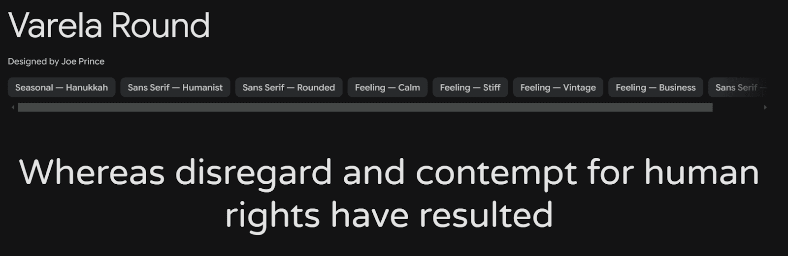
Varela Round combines geometric precision with gentle curves beautifully. This well-designed typeface stays legible across platforms while creating a warm, friendly feel. The balanced proportions and rounded edges make it clear and visible in user interfaces. The font's design philosophy focuses on both function and emotion, making it great for projects that need a personal touch.
Fredoka

Fredoka is an expressive typeface that adds personality and performance to websites. Google Fonts created this versatile font family to deliver engaging user experiences. Fredoka integrates smoothly across platforms, delivering consistent brand messaging whatever your location. The open letterforms and balanced character width improve readability, which benefits educational websites and children's digital platforms.
Key points to remember when using friendly fonts:
Space characters appropriately for better legibility
Think over your target audience's priorities and reading habits
Check font performance on different screen sizes
Keep brand messaging consistent through smart typography choices
Technical Font Options
Technical fonts are essential tools that help developers read code better and reduce eye strain during long coding sessions. These specialized typefaces pack unique features designed specifically for coding environments.
JetBrains Mono
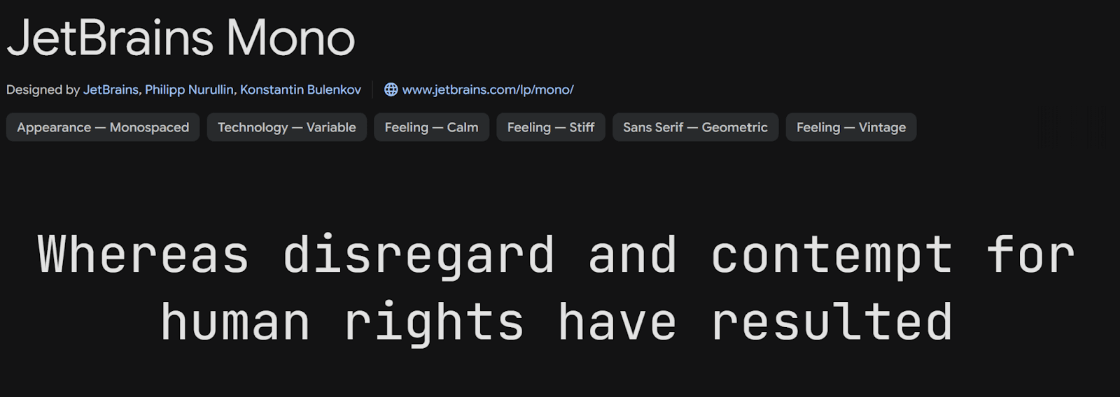
JetBrains Mono makes code easier to read with its increased letter height while keeping standard character width. This smart design keeps code line lengths familiar yet improves rendering quality as each letter uses more pixels. The font has nearly 140 code ligatures and works with 145 languages. Its standout feature is rectangular-shaped ovals that let developers scan text vertically faster.
Orbitron

Orbitron stands out as a geometric sans-serif font that's perfect for tech-focused projects. This font draws inspiration from post-apocalyptic themes and works great on spaceship exteriors and space station signs. The square characteristics and minimal stroke contrast help Orbitron convey strength and power. With four different weights, this font works great for tech company branding and digital interfaces.
Share Tech

Share Tech shines as a specialized font built for technical documentation and coding environments. This monospaced typeface makes text clear and readable across different screen resolutions. The font keeps character spacing consistent, which means code stays readable even during those long programming marathons.
These technical fonts are valuable because they:
Keep character spacing optimal for better code readability
Use distinctive symbols for commonly confused characters
Apply anti-aliasing technology to look crisp at any resolution
Support programming-specific ligatures extensively
Classic Font Choices
Classic fonts have shaped print and digital media for generations. These typefaces continue to influence modern design. Their distinctive characteristics remain relevant in today's design world.
Baskerville
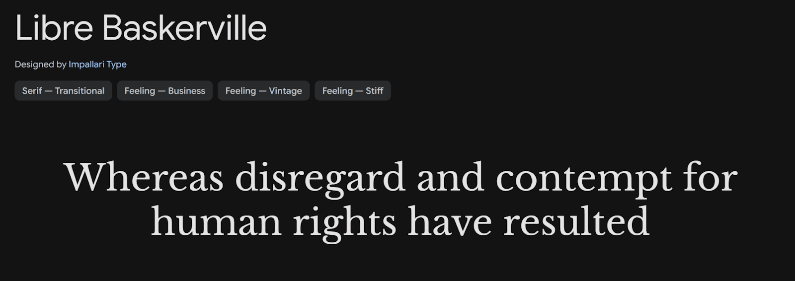
Baskerville represents a perfect blend of tradition and digital adaptability. This transitional serif typeface, created in the 1750s, connects old-style and modern serifs through its unique features. The font's calculated proportions look great on screens of all resolutions. Baskerville's key features include:
Stroke contrast that is much higher than traditional old-style serifs
More vertical italics that improve readability
Pointed corners with clean-cut finishers
Extra space in darker areas to boost legibility
Alegreya
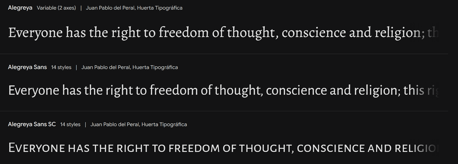
Alegreya shines as a versatile serif typeface that balances classical elements with modern needs. This award-winning font family has both serif and sans-serif variations that give designers plenty of creative options. The font's calligraphic influence and crafted letterforms make it easy to read on any platform. A complete character set supports many languages, making it perfect for international websites that need sophisticated typography.
Faustina

Faustina brings classical typography into the digital age. This elegant typeface has twelve distinct styles from Light to ExtraBold with matching italics. The font's screen optimization makes it clear and crisp on devices of all types. Its balanced proportions and consistent stroke weights work well in headlines and body text.
These classic fonts share important features that keep them relevant:
OpenType features that provide better typographic control
Language support for multiple scripts
Great performance on high-resolution displays
Balanced proportions that make text easier to read
Designers often pair these timeless typefaces with modern fonts. This creates dynamic visual hierarchies that honor traditional design principles while staying fresh and current.
Trendy Fonts
2026's design trends have brought fresh typefaces that naturally blend state-of-the-art features with practicality. These state-of-the-art fonts address the changing demands of digital interfaces and remain readable on all platforms.
Sora

Sora perfectly combines blockchain technology with interface design principles. SORAMITSU commissioned this geometric typeface to demonstrate technology and engineering ideals through its sharp digital esthetics. The font's large x-height and roomy counters make it a great choice for app and web interfaces. Sora adds subtle serifs to lowercase letters 'l' and 'i' to remove any confusion between characters.
Syne

Syne stands out as a variable font that blends classical typography with modern design elements. Its two axes - weight and optical size - give designers versatility for text and display uses. The font's regular and italic weights create warmth, inspired by 16th-century French type designer Robert Granjon. Its well-crafted rhythm makes reading easier and creates an engaging visual experience.
Outfit
Outfit takes a bold leap in modern typography and gives designers complete control over their creative vision. This modern sans-serif typeface stays clear on screens of all resolutions. Balanced letterforms and consistent stroke widths make it highly readable in digital spaces. Outfit displays well on different platforms and keeps its unique character through careful optimization.
Key points to remember when using trendy fonts:
Review how they look on different screen sizes and resolutions
Think about language support for global reach
Check readability in different digital settings
Make sure they work with modern web standards
Best Google Fonts
Google Fonts has transformed web typography by providing a vast library of free, open-source typefaces. Several fonts in this collection have proven to work exceptionally well on digital platforms.
Lato
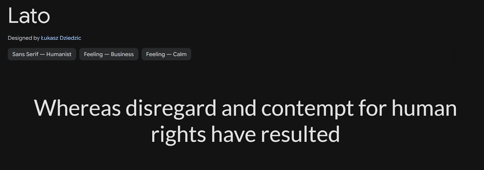
Lato stands out as one of the most popular Google fonts with over 4.19 trillion views each year. This sans-serif typeface, designed by Łukasz Dziedzic, perfectly balances warmth and professionalism. Its semi-rounded details create a welcoming feel while staying clear and crisp. The font family includes five weights with matching italics, which makes it incredibly versatile for many design projects.
Lato's standout features:
Reads well on screens of all sizes
Supports characters for many languages
Has balanced letters that are easy on the eyes
Uses standard character widths for better layouts
Roboto
Roboto is a modern, versatile sans-serif typeface designed by Christian Robertson and released by Google as part of the Android operating system. It features a geometric structure with open curves, giving it a clean yet friendly appearance that enhances readability on screens and in print. The font family includes multiple weights and styles, from Thin to Black, making it suitable for both body text and headings. Its neutral yet contemporary design makes it a popular choice for web design, mobile interfaces, and branding.
Premium Font Choices
Premium fonts boost web design with their detailed craftsmanship and rich character sets. These well-crafted typefaces give designers a unique way to create distinctive digital experiences.
Cardo

Cardo stands out as a scholarly typeface made for classicists, biblical scholars, medievalists, and linguists. This remarkable font shines with its detailed character support that includes Latin Extended, Cyrillic, Greek, and Hebrew alphabets. The font draws inspiration from Aldus Manutius' Renaissance printing work and delivers excellent readability while staying true to its historical roots.
The font's strengths shine through:
Precise optical sizing for the best display
Rich language support across multiple scripts
Clean letterforms that boost legibility
Detailed OpenType features for advanced typography
Prata
Prata shines as an elegant serif typeface that perfectly balances form and function. This refined font works beautifully across different screen sizes and stays clear even in tough digital settings. You'll notice its distinctive features in:
Well-calculated stroke contrast
Balanced character proportions
Clean terminal details
Smooth screen performance
These premium fonts share qualities that make them worth the investment:
Top-notch rendering quality across platforms
Rich character sets for global reach
Professional support and updates
Unique design features you won't find in free options
Premium typefaces are the life-blood of luxury brand identities. Big fashion houses like Gucci employ premium fonts such as Futura and Granjon to create an elegant, modern feel. Brands like Tiffany & Co. use custom premium typefaces like Sterling by Hoefler Type Foundry to keep their unique visual identity.
Conclusion
The fonts you choose directly impact how users experience and interact with websites. Our research of 55 outstanding typefaces shows how different font families meet specific design needs while staying readable across devices.
Your target audience, brand personality, and technical needs should drive web typography decisions. Sans-serif fonts like Helvetica and Inter work great for user interfaces. Serif options like Merriweather and Playfair Display bring elegance to long-form content.
Better screen resolutions and variable fonts have opened up new creative options. Designers should play with font combinations that perform well across platforms. Simple fonts like DM Sans work beautifully with bold display typefaces to create visual hierarchies that help users navigate content.
Font loading speed and accessibility are vital factors to consider. Premium fonts give you comprehensive character sets and fine details. Google Fonts and other services offer great free alternatives. The secret is finding typefaces that match your design goals and technical needs.
This piece serves as your typography reference for 2026 web projects. Great typography boosts user experience and showcases your brand's personality.
Picking the right font for your website feels like finding a needle in a digital haystack. Thousands of typefaces exist today, yet selecting the best website fonts in 2026 depends on how well they read, adapt and enhance your brand's message.
Sans-serif fonts work better than their serif counterparts on websites. These fonts are easier to read across devices and screen sizes. Our team reviewed hundreds of options and focused on typefaces that support multiple languages, weights and styles.
The Creative Boom community helped us put together this list of 55 outstanding fonts. We combined their feedback with our design expertise. Our selection includes everything from digital versions of timeless classics to innovative designs that challenge creativity. Each font brings both practical function and visual style to your web projects.
Best Sans-Serif Fonts
Sans-serif fonts are pioneering modern web design. These fonts are exceptionally readable on digital screens. Here are three powerful sans-serif fonts that deliver outstanding results on digital platforms of all types.
Helvetica
Helvetica's versatility and effect remain unmatched. The 2019 Helvetica Now cemented its legacy as one of the most influential sans-serif fonts. The font's distinctive feature comes from its letterforms with strictly horizontal or vertical terminals that create a crisp, clean look. Notwithstanding that, Helvetica's legibility reduces at smaller sizes, which makes it better suited for headlines and larger text displays.
Roboto
Roboto is the life-blood of digital typography as Android's default font. This versatile typeface has six weights plus italics that provide remarkable flexibility. Roboto stands out with slightly thinner and more compact letterforms. These features make it work exceptionally well for busy user interfaces where space efficiency is vital. It also lets designers activate alternative character styles, such as a more Helvetica-like "R," through specific CSS settings.
Inter
Inter represents the rise of sans-serif fonts engineered specifically for digital interfaces. Rasmus Andersson created this font with more generous spacing than traditional neo-grotesques. This spacing allows designers to adjust letter-spacing at larger sizes for stronger visual impact. The font has over 2000 glyphs and supports 147 languages, which makes it perfect for international websites. Inter's regular version uses a smaller x-height to boost readability at reduced sizes. The display sizes then showcase clean lines that scale beautifully across different dimensions.
Top Serif Fonts
Serif fonts add elegance and professionalism to web design, particularly now with high-resolution displays becoming common. These classic typefaces showcase decorative "feet" that trace their origins to ancient Roman inscriptions and still improve digital experiences today.
Merriweather
Merriweather is a strong and friendly serif font that reads well on platforms of all types. Its balanced design uses moderate contrast between thick and thin strokes, which makes it perfect for web content and print materials. The typeface features clean lines and carefully sculpted serifs that boost its visual appeal. Designers often combine Merriweather with sans-serif fonts to create balanced web layouts.
Playfair Display
Playfair Display is a stylish and decorative serif font that shines in creating striking headings and titles. The high contrast between thick and thin strokes pairs with elegant serifs to bring sophistication to design projects. This font stays readable despite its decorative elements, making it perfect for projects that need luxury and elegance. Digital media increasingly uses Playfair Display to help designers add sophistication and trust to their work.
Lora
Lora takes a modern approach to serif design and naturally connects digital and print media. Its balanced letterforms, moderate contrast, and readable serifs are a great way to get the right look for body text, headings, and branding. The font's thoughtfully crafted details give it remarkable versatility. Lora's design provides clear visibility and pleasant reading on screens of all sizes and resolutions, making it perfect for modern web projects that need both style and function.
Popular Display Fonts
Display fonts grab attention with their unique features that make them perfect for headlines and titles that leave a lasting impression. These typefaces look their best at larger sizes where you can really see their special details.
Bebas Neue
Bebas Neue catches the eye as a clean, condensed typeface that shows confidence through its uppercase-only design. Strong vertical lines and precise letterforms give this font a powerful look that works great for social media visuals and YouTube thumbnails. You'll get the best visual balance by pairing Bebas Neue with Source Sans Pro in your web designs.
Anton
Anton stands tall as a powerhouse in display typography with its bold, all-caps design that radiates strength and confidence. Blocky shapes make this font impossible to ignore, which makes it perfect for short headlines and callouts where you need maximum punch. Designers often add extra letter spacing to boost readability, especially when they use all-caps.
Abril Fatface
Modern web design gets a touch of class from Abril Fatface's carefully crafted contrast between thick and thin strokes. This elegant display serif font takes its cues from 19th century European advertising posters, especially those from France and Britain. Delicate serifs and subtle details make it a sophisticated choice for headlines that pack both punch and elegance. The font's proportional design looks striking on screens of all sizes, though it works best when used for titles or pull quotes that need to pop in tight spaces.
Modern Geometric Fonts
Geometric fonts have become essential tools in modern web design. They draw inspiration from simple shapes like circles, squares, and triangles. These typefaces, which originated in 1920s Germany, blend naturally with today's design esthetics.
Raleway
Raleway shows off modern geometric design through clean lines and graceful curves. This versatile typeface gives designers plenty of options with nine weights in standard width and three in its narrow version. The distinctive "W" with crossed center strokes and geometric elements helps create visual hierarchies in web interfaces effectively.
Rubik
Philipp Hubert and Sebastian Fischer created Rubik, a font that shines with its precise geometric construction and consistent stroke widths. The font's balanced proportions and minimal variations make it easy to read across digital platforms. Rubik and Raleway go together naturally, making them perfect for modern web designs that need both structure and warmth.
Questrial
Questrial brings a fresh point of view to geometric sans-serif design with its clean, structured approach. The font's calculated proportions and geometric foundation work well in today's web interfaces where clarity matters most. Its modern look and excellent readability make it a great choice for headlines and body text in digital environments.
These geometric fonts share mathematical precision but keep their unique characteristics. They adapt well to current design trends because they're built on simple geometric forms. This makes them perfect for technology websites, mobile apps, and modern digital interfaces. As we move through 2026, designers can use these fonts to strike the perfect balance between minimalist aesthetics and functional clarity.
Minimalist Font Options
Minimalist design principles have transformed web typography with fonts that focus on clarity and simplicity. These well-crafted typefaces blend naturally into modern interfaces through clean lines and balanced proportions.
DM Sans
DM Sans works great for small text sizes, which makes it perfect for body content. Originally commissioned by Google, this versatile font family has complete OpenType features like fractions, ordinals, and case-sensitive forms. Its geometric shapes keep clean edges on different screen resolutions and stay readable in digital environments.
Manrope
Manrope stands out with its slightly closed-off counters that create a unique visual rhythm. This modern sans-serif typeface comes in seven distinct weights, giving designers plenty of options to create visual hierarchies. Its balanced letterforms and precise geometric construction work well for both headlines and body text.
Plus Jakarta Sans
Plus Jakarta Sans marks a big step forward in minimalist typography and draws inspiration from classic designs like Neuzeit Grotesk and Futura. The font's slightly taller x-height makes capital letters and lowercase characters easier to tell apart. Its open counters and well-balanced spacing help readers see text clearly on screens of all sizes.
These minimalist fonts share key features that are great for modern web design:
Generous spacing between characters
Clean, geometric construction
Balanced proportions for better readability
Extensive language support for global accessibility
These fonts work best when paired with other typefaces to create dynamic visual hierarchies. To cite an instance, DM Sans pairs well with serif fonts to create contrast, while Manrope's versatility lets it go together with both modern and traditional typefaces.
Professional Business Fonts
Professional fonts are the life-blood of business communication in the digital world. These typefaces strike a perfect balance between authority and accessibility. Your message reaches audiences of all types with maximum impact.
Work Sans
Work Sans is a versatile sans-serif typeface that shines in corporate settings. The font family has nine distinct weights with matching italics to give you plenty of design options. Clean letterforms and balanced proportions make this font work well in headlines and body text. Work Sans also has complete language support, which makes it perfect for international businesses that want to keep their brand consistent.
Nunito
Nunito's rounded terminals and design elements set it apart. Vernon Adams created it first, and Jacques Le Bailly improved it later. This font blends professional looks with a touch of warmth. You get sixteen styles from ExtraLight to Black, plus matching italics. Nunito's optical size adjustments help it look great on screens of all sizes.
Libre Franklin
Libre Franklin shows how modern typography has evolved in professional settings. This refined typeface gives you eighteen different styles - nine weights plus their italic versions. The text stays readable whether big or small, which is perfect for corporate websites and digital presentations. Businesses can keep their brand consistent worldwide thanks to the font's extensive character set that works in multiple languages.
These professional fonts share key features that are a great way to get business applications right:
Weight variations that create clear visual hierarchies
Best performance on digital platforms
Easy to read at any size
Support for multiple languages to reach global markets
Creative Font Choices
Creative font choices bring personality to digital spaces through expressive typography in web design. These unique typefaces help build memorable brand identities and create engaging user experiences.
Bungee
Bungee brings a fresh take on vertical typography to web design with its stacked lettering approach. This font family gives designers multiple styles including Inline, Outline, and Shade variations they can layer for chromatic effects. Bungee stands out because it works well both vertically and horizontally. The font's bold nature needs careful use, making it perfect for energetic brands that want to make a statement.
Pacifico
Pacifico shines as a script font that strikes the right balance between creativity and readability. Its character shows best in social media graphics and digital marketing materials. The flowing letters create a welcoming feel while staying professional. Smart spacing and well-designed characters keep Pacifico clear even in complex layouts.
Lobster
Designers love Lobster for adding a touch of casual elegance to web projects. This script typeface creates headlines that grab attention without losing readability. Well-crafted ligatures and alternative characters help the text flow smoothly across screens of all sizes.
Key points to remember when using creative fonts:
Save them for headlines and short text blocks
Make sure they contrast well with backgrounds
Check how readable they are on different devices
Pair them with simple fonts for body text
Readable Body Text Fonts
The right body text font plays a vital role in making content readable on digital platforms. These adaptable typefaces keep text clear even in long content blocks and are essential for modern web design.
Open Sans
Open Sans has become a trusted choice for body text over the years with its exceptional x-height and balanced letterforms. Recent studies showed readers achieved 35% faster reading speeds with their best font choices. Open Sans provides complete character support for multiple writing systems that covers Latin Extended, Cyrillic, Greek, and Hebrew alphabets. The generous spacing between characters prevents visual crowding and enhances legibility on screens of all sizes.
Source Sans Pro
Source Sans Pro stands out because of its careful design that maximizes legibility on digital displays. This versatile typeface supports over 200 languages, which makes it perfect for international websites. Readers can easily distinguish characters against busy backgrounds thanks to the font's generous spacing and clear letterforms. Source Sans Pro also uses anti-aliasing technology that keeps text crisp on low-resolution screens.
Karla
Karla is a modern sans-serif that puts readability first without losing its unique character. This typeface works best at smaller sizes, especially when you have body text in digital environments. The clean, simple design stays clear across different screen resolutions. The font's balanced letterforms and adequate spacing help reduce eye strain during long reading sessions.
Important points to remember when using these body text fonts:
Keep appropriate contrast ratios (minimum 4.5:1) between text and background colors
Use enough line spacing to prevent visual crowding
Think over off-white backgrounds instead of pure white to reduce eye strain
Keep consistent spacing between paragraphs to improve readability
Versatile Font Families
Modern web typography relies heavily on versatile font families that provide flexible solutions for design challenges of all types. These adaptable typefaces support many languages and weights to maintain consistent branding worldwide.
Noto Sans
Google created Noto Sans as their answer to universal typography that supports almost all modern and ancient languages. This remarkable font family covers over 800 languages and scripts of all types, including Latin, Greek, Cyrillic, and complex scripts like Arabic and Chinese. The font maintains clarity with its unmodulated design across 3,741 glyphs and comes in 18 different styles from thin to black weights. The font prevents unsupported character boxes known as "tofu" and ensures continuous multilingual communication.
Noto Serif
Noto Serif pairs perfectly with its sans-serif counterpart and offers the same broad language support with an elegant touch. The typeface keeps consistent stroke contrast across different scripts, which makes it perfect for long-form content. Noto Serif reads well on screens of any size and resolution, making it a trusted choice for digital publishing platforms.
IBM Plex Sans
IBM Plex Sans marks a significant achievement in corporate typography and supports approximately 100 languages across Latin, Greek, Cyrillic, Devanagari, and Thai scripts. This versatile typeface combines machine precision with human warmth. The family includes Sans, Serif, Mono, and Condensed variations, each with multiple weights and true italics. IBM Plex Sans works exceptionally well in user interfaces, which makes it valuable for tech-focused websites and apps.
These font families stand out because they:
Support scripts globally for better accessibility
Offer many weights for design flexibility
Work well across digital platforms
Fit seamlessly into different design contexts
Elegant Fonts
Elegant typography plays a vital role in how luxury brands express sophistication and refinement. Their fonts blend classical elements with modern sensibilities to create timeless visual experiences in the digital world.
Cormorant Garamond
Cormorant Garamond perfectly combines traditional elegance with digital functionality. This refined typeface takes inspiration from Claude Garamont's classical designs and adds contemporary elements to boost screen performance. Its delicate hairlines and subtle weight variations create an atmosphere of understated luxury. Designers can craft sophisticated typographic hierarchies that stay readable on screens of all sizes, thanks to the font family's multiple weights and styles.
Crimson Pro
Crimson Pro distinguishes itself with a balanced approach to elegant typography. This versatile serif typeface features precise proportions that deliver optimal legibility while keeping its refined character. The font's high contrast between thick and thin strokes adds dramatic flair to headlines and titles. Crimson Pro retains its sophisticated look even in smaller sizes, which makes it ideal for both display and body text.
Gilda Display
Gilda Display showcases excellence in contemporary elegance. This typeface blends classical serif elements with modern proportions to create a distinctive presence in digital environments. Large sizes reveal its refined details, making it perfect for headlines and feature text. Designers can create upscale digital experiences with the font's carefully crafted letterforms that deliver clarity without compromising sophistication.
Key points to remember when using elegant fonts:
Keep adequate contrast between thick and thin strokes for better visibility
Think over how font size works with screen resolution
Mix decorative elements and readability needs effectively
Use consistent spacing for smooth text flow
Contemporary Font
Modern typography challenges design limits by combining state-of-the-art design with amazing functionality. New typefaces are reshaping digital esthetics and you can read them easily on any platform.
Urbanist
Urbanist brings a fresh take on modern typography with its low-contrast letterforms and geometric precision. This adaptable font family has 18 styles that range from thin to black weights, which gives designers plenty of creative freedom. The typeface's balanced x-height lets you read it easily at any size, so it works great for both headlines and body text. What makes Urbanist special is its variable font technology that smoothly shifts between weights and widths.
Space Grotesk
Space Grotesk blends futuristic elements with practical design in a unique way. This modern sans-serif stands out from typical geometric fonts with its curved terminals and asymmetrical counters. The font stays clear and crisp across different screen resolutions. Designers can create dynamic typographic hierarchies with its five weights that go from light to bold.
Exo
Exo shines as a geometric sans-serif that perfectly mixes tech precision with organic warmth. This modern typeface gives you amazing flexibility through its huge character set and eighteen different styles. You can read it perfectly in both print and digital formats thanks to its well-planned proportions. Exo has subtle details in its letters that become more noticeable at larger sizes, which adds visual interest without losing functionality.
Key features of modern fonts:
Advanced OpenType capabilities that give better typographic control
Variable font technology support for responsive design
Detailed Unicode coverage that makes it available globally
Works great across different screen sizes
Traditional Font Selections
Modern web design still draws heavily from classical typography, using time-tested fonts that have stood strong for generations. These classic typefaces combine rich history with modern digital flexibility and give designers reliable tools to create lasting web experiences.
EB Garamond
EB Garamond brings Claude Garamont's iconic 16th-century designs to life in digital form. The screen-optimized version keeps the original's elegant feel while ensuring text stays readable. This font family comes with ten different styles - regular, medium, semibold, and their italic versions. What makes it special is how well it performs at 12-point size, which makes it perfect for long-form digital content.
PT Serif
PT Serif strikes a sweet spot between beauty and function. Russian designers Olga Umpeleva, Alexandra Korolkova, and Vladimir Yefimov created this transitional serif typeface that works beautifully on digital platforms. Its slightly rectangular shapes and soft letters use space efficiently without sacrificing readability.
Bitter
Bitter takes traditional slab serif principles and adapts them perfectly for modern screens. Sol Matas designed this open-source typeface with large x-height and consistent stroke weights to maximize legibility. The font's well-planned proportions keep text clear even at small sizes, which makes it great for both headlines and body text in digital formats.
These classic fonts stand out because they offer:
Rich OpenType features to improve typographic control
Support for multiple languages and scripts
Great performance on high-resolution displays
Well-balanced proportions that boost readability
Clean and Modern Fonts
Modern web design just needs fonts that look good and work well. These clean, modern typefaces deliver content clearly and look great on any screen size.
Hind
Hind stands out as a flexible sans-serif typeface that's easy to read. This font family supports multiple languages and writing systems. Latin-based languages and non-Latin ones like Greek, Cyrillic, and Arabic work smoothly. The font's open letterforms and balanced proportions make text clear on any screen size. The standardized character width means you won't have to adjust text when switching between styles.
Mulish
Mulish shines as a minimalist gem in digital typography. This sans-serif font uses carefully measured proportions that make text readable whether it's small or large. Letters have plenty of space between them, which helps prevent cluttered looks on busy interfaces. The font covers over 200 languages and variations, making it perfect for international websites that want consistent branding.
Oxygen
Oxygen blends modern design with practical use beautifully. This clean typeface uses anti-aliasing technology to look sharp even on low-resolution screens. Oxygen's thoughtful design for digital displays includes:
Large x-height that's easy to read
Open counters that make letters distinct
Balanced stroke weights at every size
Well-spaced letters
Designers often mix these fonts with others to create eye-catching contrasts. To cite an instance, see how Hind pairs nicely with serif fonts in editorial layouts. Mulish and Oxygen work best in simple designs where clarity comes first.
Friendly and Approachable Fonts
Friendly and approachable fonts create welcoming digital spaces that appeal to users emotionally. These typefaces balance personality with professionalism, making them perfect for brands that want to build genuine connections with their audience.
Quicksand
Quicksand is a distinctive geometric sans-serif that blends approachability with modern design elements. This versatile font uses rounded terminals to create an inviting atmosphere without losing clarity. Its well-crafted letterforms work great for wellness-focused websites and brands targeting younger audiences. The light and regular weights make excellent body text and provide superior readability on screens of all sizes.
Varela Round
Varela Round combines geometric precision with gentle curves beautifully. This well-designed typeface stays legible across platforms while creating a warm, friendly feel. The balanced proportions and rounded edges make it clear and visible in user interfaces. The font's design philosophy focuses on both function and emotion, making it great for projects that need a personal touch.
Fredoka
Fredoka is an expressive typeface that adds personality and performance to websites. Google Fonts created this versatile font family to deliver engaging user experiences. Fredoka integrates smoothly across platforms, delivering consistent brand messaging whatever your location. The open letterforms and balanced character width improve readability, which benefits educational websites and children's digital platforms.
Key points to remember when using friendly fonts:
Space characters appropriately for better legibility
Think over your target audience's priorities and reading habits
Check font performance on different screen sizes
Keep brand messaging consistent through smart typography choices
Technical Font Options
Technical fonts are essential tools that help developers read code better and reduce eye strain during long coding sessions. These specialized typefaces pack unique features designed specifically for coding environments.
JetBrains Mono
JetBrains Mono makes code easier to read with its increased letter height while keeping standard character width. This smart design keeps code line lengths familiar yet improves rendering quality as each letter uses more pixels. The font has nearly 140 code ligatures and works with 145 languages. Its standout feature is rectangular-shaped ovals that let developers scan text vertically faster.
Orbitron
Orbitron stands out as a geometric sans-serif font that's perfect for tech-focused projects. This font draws inspiration from post-apocalyptic themes and works great on spaceship exteriors and space station signs. The square characteristics and minimal stroke contrast help Orbitron convey strength and power. With four different weights, this font works great for tech company branding and digital interfaces.
Share Tech
Share Tech shines as a specialized font built for technical documentation and coding environments. This monospaced typeface makes text clear and readable across different screen resolutions. The font keeps character spacing consistent, which means code stays readable even during those long programming marathons.
These technical fonts are valuable because they:
Keep character spacing optimal for better code readability
Use distinctive symbols for commonly confused characters
Apply anti-aliasing technology to look crisp at any resolution
Support programming-specific ligatures extensively
Classic Font Choices
Classic fonts have shaped print and digital media for generations. These typefaces continue to influence modern design. Their distinctive characteristics remain relevant in today's design world.
Baskerville
Baskerville represents a perfect blend of tradition and digital adaptability. This transitional serif typeface, created in the 1750s, connects old-style and modern serifs through its unique features. The font's calculated proportions look great on screens of all resolutions. Baskerville's key features include:
Stroke contrast that is much higher than traditional old-style serifs
More vertical italics that improve readability
Pointed corners with clean-cut finishers
Extra space in darker areas to boost legibility
Alegreya
Alegreya shines as a versatile serif typeface that balances classical elements with modern needs. This award-winning font family has both serif and sans-serif variations that give designers plenty of creative options. The font's calligraphic influence and crafted letterforms make it easy to read on any platform. A complete character set supports many languages, making it perfect for international websites that need sophisticated typography.
Faustina
Faustina brings classical typography into the digital age. This elegant typeface has twelve distinct styles from Light to ExtraBold with matching italics. The font's screen optimization makes it clear and crisp on devices of all types. Its balanced proportions and consistent stroke weights work well in headlines and body text.
These classic fonts share important features that keep them relevant:
OpenType features that provide better typographic control
Language support for multiple scripts
Great performance on high-resolution displays
Balanced proportions that make text easier to read
Designers often pair these timeless typefaces with modern fonts. This creates dynamic visual hierarchies that honor traditional design principles while staying fresh and current.
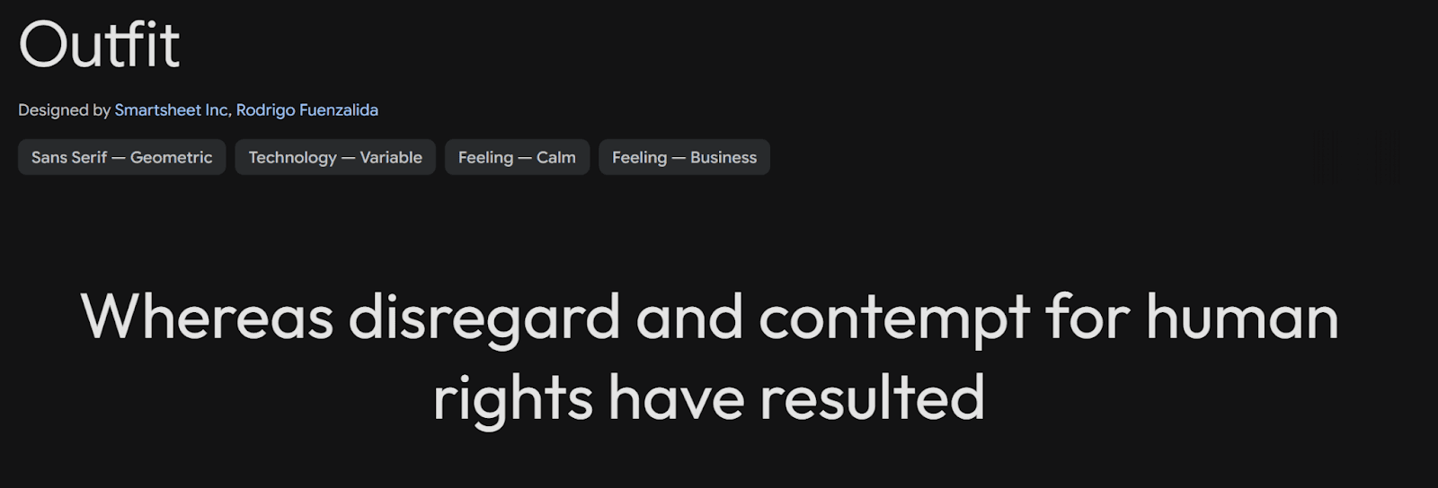
Trendy Fonts
2026's design trends have brought fresh typefaces that naturally blend state-of-the-art features with practicality. These state-of-the-art fonts address the changing demands of digital interfaces and remain readable on all platforms.
Sora
Sora perfectly combines blockchain technology with interface design principles. SORAMITSU commissioned this geometric typeface to demonstrate technology and engineering ideals through its sharp digital esthetics. The font's large x-height and roomy counters make it a great choice for app and web interfaces. Sora adds subtle serifs to lowercase letters 'l' and 'i' to remove any confusion between characters.
Syne
Syne stands out as a variable font that blends classical typography with modern design elements. Its two axes - weight and optical size - give designers versatility for text and display uses. The font's regular and italic weights create warmth, inspired by 16th-century French type designer Robert Granjon. Its well-crafted rhythm makes reading easier and creates an engaging visual experience.
Outfit
Outfit takes a bold leap in modern typography and gives designers complete control over their creative vision. This modern sans-serif typeface stays clear on screens of all resolutions. Balanced letterforms and consistent stroke widths make it highly readable in digital spaces. Outfit displays well on different platforms and keeps its unique character through careful optimization.
Key points to remember when using trendy fonts:
Review how they look on different screen sizes and resolutions
Think about language support for global reach
Check readability in different digital settings
Make sure they work with modern web standards
Best Google Fonts
Google Fonts has transformed web typography by providing a vast library of free, open-source typefaces. Several fonts in this collection have proven to work exceptionally well on digital platforms.
Lato
Lato stands out as one of the most popular Google fonts with over 4.19 trillion views each year. This sans-serif typeface, designed by Łukasz Dziedzic, perfectly balances warmth and professionalism. Its semi-rounded details create a welcoming feel while staying clear and crisp. The font family includes five weights with matching italics, which makes it incredibly versatile for many design projects.
Lato's standout features:
Reads well on screens of all sizes
Supports characters for many languages
Has balanced letters that are easy on the eyes
Uses standard character widths for better layouts
Roboto
Roboto is a modern, versatile sans-serif typeface designed by Christian Robertson and released by Google as part of the Android operating system. It features a geometric structure with open curves, giving it a clean yet friendly appearance that enhances readability on screens and in print. The font family includes multiple weights and styles, from Thin to Black, making it suitable for both body text and headings. Its neutral yet contemporary design makes it a popular choice for web design, mobile interfaces, and branding.
Premium Font Choices
Premium fonts boost web design with their detailed craftsmanship and rich character sets. These well-crafted typefaces give designers a unique way to create distinctive digital experiences.
Cardo
Cardo stands out as a scholarly typeface made for classicists, biblical scholars, medievalists, and linguists. This remarkable font shines with its detailed character support that includes Latin Extended, Cyrillic, Greek, and Hebrew alphabets. The font draws inspiration from Aldus Manutius' Renaissance printing work and delivers excellent readability while staying true to its historical roots.
The font's strengths shine through:
Precise optical sizing for the best display
Rich language support across multiple scripts
Clean letterforms that boost legibility
Detailed OpenType features for advanced typography
Prata
Prata shines as an elegant serif typeface that perfectly balances form and function. This refined font works beautifully across different screen sizes and stays clear even in tough digital settings. You'll notice its distinctive features in:
Well-calculated stroke contrast
Balanced character proportions
Clean terminal details
Smooth screen performance
These premium fonts share qualities that make them worth the investment:
Top-notch rendering quality across platforms
Rich character sets for global reach
Professional support and updates
Unique design features you won't find in free options
Premium typefaces are the life-blood of luxury brand identities. Big fashion houses like Gucci employ premium fonts such as Futura and Granjon to create an elegant, modern feel. Brands like Tiffany & Co. use custom premium typefaces like Sterling by Hoefler Type Foundry to keep their unique visual identity.
Conclusion
The fonts you choose directly impact how users experience and interact with websites. Our research of 55 outstanding typefaces shows how different font families meet specific design needs while staying readable across devices.
Your target audience, brand personality, and technical needs should drive web typography decisions. Sans-serif fonts like Helvetica and Inter work great for user interfaces. Serif options like Merriweather and Playfair Display bring elegance to long-form content.
Better screen resolutions and variable fonts have opened up new creative options. Designers should play with font combinations that perform well across platforms. Simple fonts like DM Sans work beautifully with bold display typefaces to create visual hierarchies that help users navigate content.
Font loading speed and accessibility are vital factors to consider. Premium fonts give you comprehensive character sets and fine details. Google Fonts and other services offer great free alternatives. The secret is finding typefaces that match your design goals and technical needs.
This piece serves as your typography reference for 2026 web projects. Great typography boosts user experience and showcases your brand's personality.


Similar Blogs
Similar Blogs
Similar Blogs


Available for Work
Bricx
© Bricx, 2026. All rights reserved.


Available for Work
Bricx
© Bricx, 2026. All rights reserved.
Available for Work
Bricx
© Bricx, 2026. All rights reserved.
Available for Work
Bricx
© Bricx, 2026. All rights reserved.