Product Design
Product Design
Product Design
Insights
Insights
Insights
February 8, 2025
February 8, 2025
February 8, 2025
15 Drag and Drop UI Design Tips That Actually Work in 2026
15 Drag and Drop UI Design Tips That Actually Work in 2026
15 Drag and Drop UI Design Tips That Actually Work in 2026
Master drag and drop UI design with our 15 essential tips for 2026. Create intuitive interfaces that captivate users and boost interaction effortlessly!
Master drag and drop UI design with our 15 essential tips for 2026. Create intuitive interfaces that captivate users and boost interaction effortlessly!
Master drag and drop UI design with our 15 essential tips for 2026. Create intuitive interfaces that captivate users and boost interaction effortlessly!
8 Min Read
8 Min Read
8 Min Read


Drag and drop UI design dates back to the earliest days of graphical interfaces. The power of this feature that ever spread through popular platforms like Trello and Gmail makes it familiar to most users today.
Most users find this interaction style natural, yet it presents several challenges. Accessibility hurdles, touchscreen limitations, imprecision issues and physical fatigue during long sessions make creating a functional drag and drop interface complex.
My extensive work with drag and drop interactions taught me that details matter significantly. Each element needs attention - from visual feedback to keyboard support and touch gestures. These insights led me to compile 15 practical tips that work. You won't find theoretical fluff here, just battle-tested solutions ready for 2026 and beyond.
Design Clear Visual Affordances
Image Source:Dribbble
Visual affordances build the foundation of a working drag and drop UI design. These visual cues let users quickly spot interactive elements and know how to use them.
Understanding Drag Handles
Drag handles show users which elements they can move. The best handles use unique icons that stand apart from other UI elements. The handle size needs to fit both mouse and touch interactions - at least 1cm x 1cm of unused space works well for touch devices.
Visual Feedback States
Users need clear feedback states to guide them through drag and drop actions. Each element should show different visual states:
Hover State: The cursor changes to show draggability
Grabbed State: The element looks raised with a drop shadow
Drop Zone State: Target areas light up when dragged items come close
The grabbed state needs quick visual feedback through an outline, contrasting color, or shadow effect that shows the item selection.
Animation Cues
Animation timing makes drag and drop interactions feel natural. Use quick movement animations - about 100ms - to show items moving to make space for dropped elements. On top of that, it uses easing to create fluid motion.
The reshuffling animation starts when the dragged object's center overlaps other elements' edges. This creates the most natural feel and stops both slow and jumpy responses that might annoy users.
Implement Progressive Enhancement
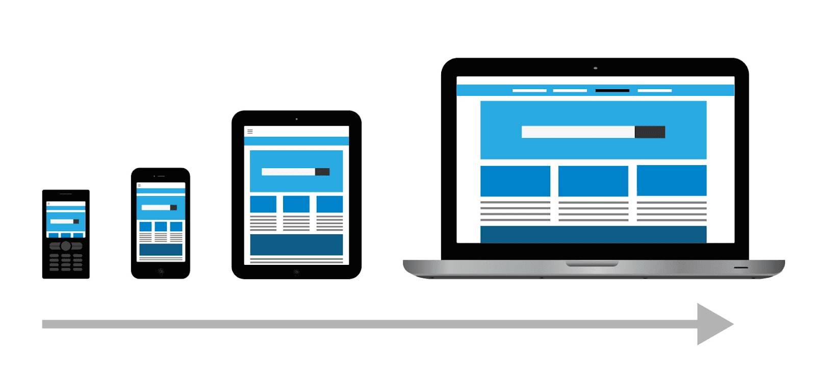
Image Source:Friday
Progressive enhancement is the foundation of reliable drag and drop UI design that works well on different devices and adapts to user capabilities. This approach starts with a solid foundation and builds upward instead of jumping into complex interactions.
Simple Functionality
We build the core implementation with simple HTML elements that work everywhere. The team creates draggable elements with proper ARIA attributes and simple mouse event handlers. A good example has form-based ordering systems that work without JavaScript, which makes it accessible to all users.
Advanced Features
Modern drag and drop interfaces add sophisticated features through feature detection once we move past the basics. The implementation checks if browsers can handle advanced capabilities before it enables better interactions. These features also include:
Custom drag previews for visual feedback
Touch gesture support for mobile devices
Keyboard navigation alternatives
Performance Optimization
Performance remains crucial in progressive enhancement. The implementation delivers and executes code quickly. It makes use of browser-native drag and drop primitives to reduce code overhead, which leads to faster load times and smoother interactions.
Resource management plays a key role to optimize performance. The implementation loads features strategically so advanced capabilities only appear when needed. This helps keep everything responsive even as the system grows more complex.
Optimize Touch Interactions
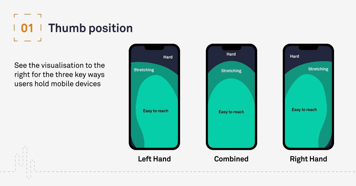
Image Source: PixelFreeStudio Blog
Touch-based UI design faces unique challenges. Designers must carefully plan finger-based input methods and screen space usage.
Mobile-First Design
A touch interface needs precise sizing to work well. UI components like buttons and drag handles must be at least 44 pixels in height and width for reliable touch input. This size might look big, but it helps prevent mistakes and makes the interface easier to use.
Touch Gesture Patterns
Three main events make up the basic touch interactions: touchstart at initial contact, touchmove as fingers slide, and touchend when contact stops. These events are the foundations of natural drag and drop behaviors on touch devices.
Screen Size Considerations
Limited viewport space on touch screens requires smart element placement. Draggable elements need enough space between them to avoid scroll conflicts. The interface should tell the difference between intentional drags and casual swipes through timing delays and clear visual cues.
Testing Touch Accuracy
Touch accuracy needs thorough testing in different scenarios. The inputs should fall within +/- 1mm of the target's center in touchable areas beyond 3.5mm from the digitizer's edge. Areas within 3.5mm of the edge allow a wider tolerance of +/-2mm to match natural finger positions.
A well-designed touch interface should offer:
Instant visual feedback during touch events
Clear separation between scroll and drag actions
Haptic feedback on supported devices when interactions succeed
Success in touch optimization depends on extensive testing with different devices and understanding physical interaction patterns.
Create Intuitive Drop Zones
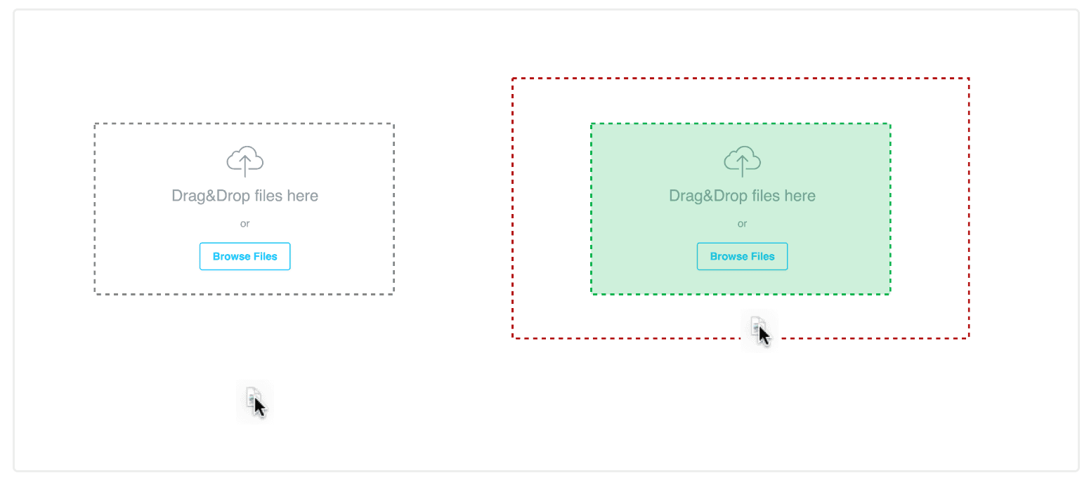
Image Source:NN Group
Drop zones are the life-blood of successful drag and drop UI design. A well-designed drop zone shows its purpose and functionality through thoughtful visual organization and clear feedback.
Visual Hierarchy
Drop zones need a clear visual structure to guide users' attention. The most effective drop zones employ dotted or dashed borders to show areas where items can be safely captured. Users can understand where to release dragged items without confusion.
Feedback Mechanisms
Multiple layers of feedback guide users through the interaction process. The feedback states include:
Empty State: Clear indication of the drop target's availability
Ready State: Visual enhancement when dragged items are within range
Active State: Intensified visual feedback as items get closer to the core
Success State: Confirmation of successful item placement
Items approaching the drop zone trigger intensified visual feedback that helps users stay on track. The interface becomes more predictable and accessible.
Zone Sizing
Drop zone dimensions are significant to usability. The drop target should fit the items while keeping clear boundaries. Touch interaction needs at least 1cm x 1cm of unused space in drop zones. The interface should add a "magnetic" effect to snap objects into place, even when users haven't aligned their drop position perfectly.
The drop zone should animate the placement with a short transition (100ms) into its new position. This subtle animation confirms the successful drag and drop action while keeping the interaction smooth and natural.
Use Smart Animations

Image Source: Dropbox Design
Smart animations add life to drag and drop interfaces. They make interactions feel smooth and natural. The secret to success lies in the right timing and how we handle states during the interaction.
State Transitions
The right timing makes state transitions smooth. The animation should respond within 100ms to feel natural. We used easing curves to copy physical movement, which makes the interface easy-to-use and responsive.
Loading States
Users need clear visual signs during loading states. The interface shows a see-through "ghost" preview of what you're dragging. A placeholder marks the item's starting point and helps users track where things came from during the move.
Error States
The interface gives quick feedback at the time errors happen. Items go back to where they started if you drop them in the wrong spot. Users can fix mistakes with an "Undo" button that stays visible until they start something new.
Success Feedback
Users should see right away when something works. Items snap into place with a quick animation after a good drop. The magnetic effect guides items to the right spot even if they don't line up perfectly. This creates a satisfying end to the drag and drop action.
To get the best animations, think about these key states:
Grab State: Lift with drop shadow and slight tilt
Transit State: Smooth movement with ghost image
Drop State: Quick snap animation with clear feedback
Reset State: Soft return to the starting spot
Consider Cross-Platform Compatibility

Image Source: Dribbble
Building a consistent drag and drop interface that works on all platforms needs a good understanding of how each device handles interactions. A good platform experience goes beyond basic touch support to include everything about how users interact with it.
Desktop Behavior
Desktop interfaces use cursor changes to show what you can drag and drop. We changed the cursor to show a "grab" state when users hover over items. It switches to "grabbing" while users drag things around. Users can drag items with mouse clicks or keyboard controls, and the spacebar starts drag operations to help with accessibility.
Mobile Adaptations
Mobile interfaces just need different approaches to work well. Touch interactions work best with a slight delay of a few milliseconds. This helps separate scrolling from actual drag attempts [9]. Haptic "bumps" are a great way to get user feedback when they grab objects or move them to drop zones.
Tablet Optimizations
Tablets create unique challenges because they mix touch and pointer inputs. The system needs to handle several scenarios:
Layout changes when the screen rotates
Precise stylus input requirements
Mixed touch and keyboard use
You can add multiple ways to interact when building cross-platform drag and drop features. To name just one example, adding both drag handles and action buttons helps things work on all devices. The interface detects how users interact and adjusts itself, giving consistent feedback whatever platform they use.
Implement Error Prevention
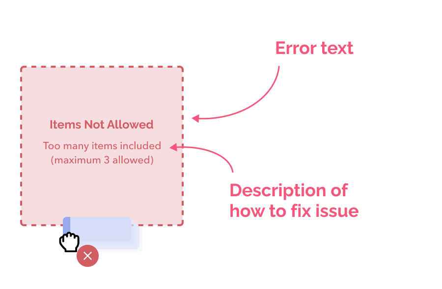
Image Source: Pencil & Paper
A systematic approach to validation and user guidance helps prevent errors in drag and drop interfaces. Data integrity stays intact and users remain confident in their actions with a good error prevention system.
Validation Rules
Custom drop validation functions verify both source and target locations effectively. The system checks if the dragging node fits the intended destination. Validation happens before the drop action finishes to stop incorrect placements that might disrupt workflow.
User Warnings
Warning mechanisms protect users from potential mistakes. Users see immediate feedback when they try invalid actions. The system should improve user guidance by:
Showing clear visual indicators for invalid drop zones
Warning users before destructive actions
Providing hints about proper placement
Recovery Options
Reliable recovery mechanisms help users stay confident. The system automatically saves the original state of dragged items if a drag operation gets interrupted [17]. An undo/redo system lets users reverse actions they didn't mean to take [3].
The interface settings can include a higher drag threshold to reduce accidental drags. The default threshold needs four pixels of movement, but users can increase it to 50 or 100 pixels in places where accidental drags happen often [18]. This adjustment stops unintended file movements while keeping the system working smoothly for deliberate actions.
Design for Accessibility
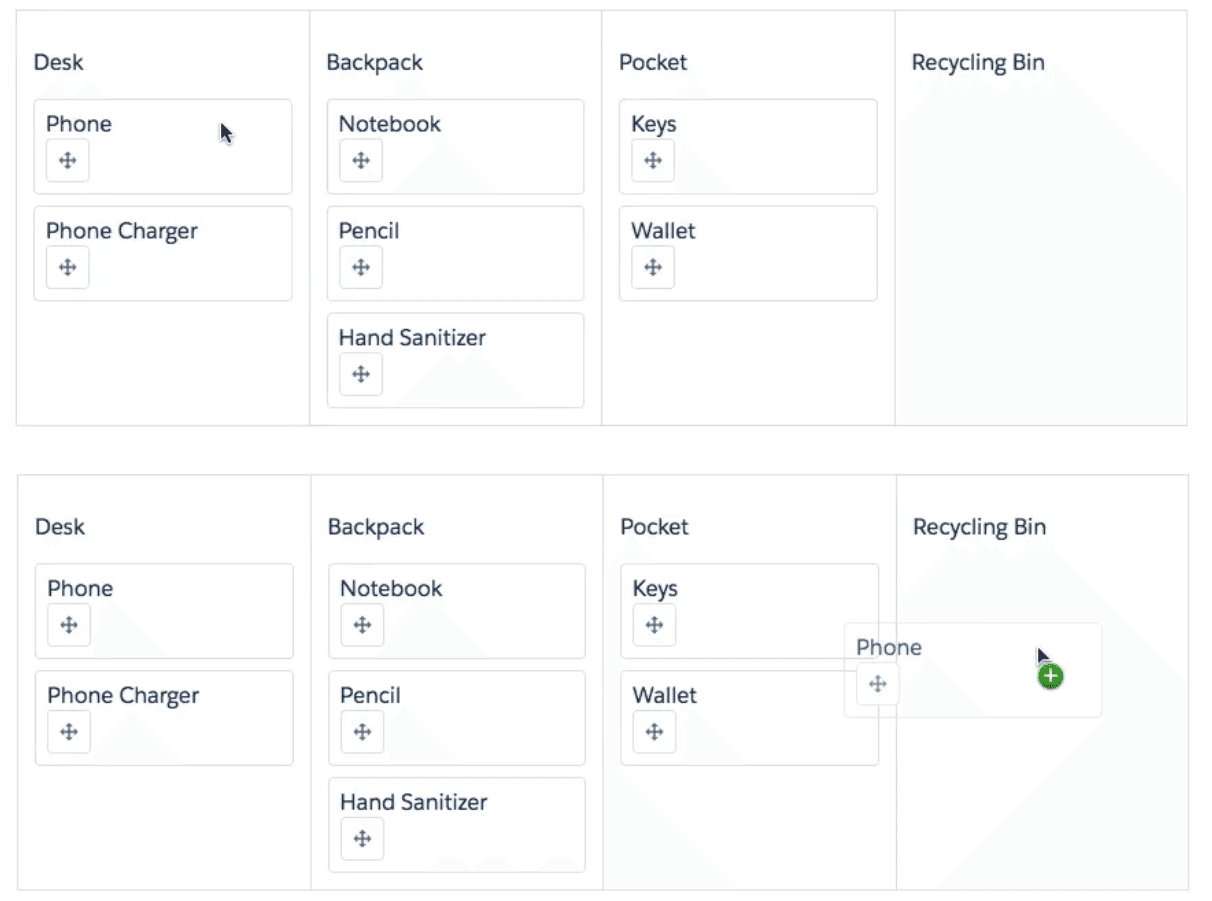
Image Source: Medium
Modern drag and drop UI design puts accessibility first. This helps users interact better with these interfaces. A well-planned accessibility approach makes complex interactions work for everyone.
Keyboard Navigation
Users need complete functionality without a mouse. The spacebar starts drag operations. Tab key helps users move between valid drop targets and skip unrelated elements. Arrow keys give precise control, and Enter completes the drop action.
Screen Reader Support
Screen readers need clear updates about drag and drop actions. ARIA live regions tell users about vital status changes, including grab confirmations and position updates. Users get updates about:
Their position in lists or on canvas
Available keyboard commands
Operation status updates
Drop zone validation results
Motor Impairment Considerations
Alternative interaction methods help users with motor impairments. The interface should give point-and-click options instead of traditional drag operations. Touch targets need to be at least 1cm x 1cm.
Dynamic Drag-and-Drop Assistive Programs (DDnDAP) streamline processes for users with minimal motor control. These systems need clear visual indicators and proper touch target sizing to work with different input methods.
The interface supports multiple input methods. Users can switch between mouse, keyboard, or assistive devices based on what works best for them. This flexibility helps everyone use drag and drop interfaces well, whatever their physical capabilities.
Optimize Performance
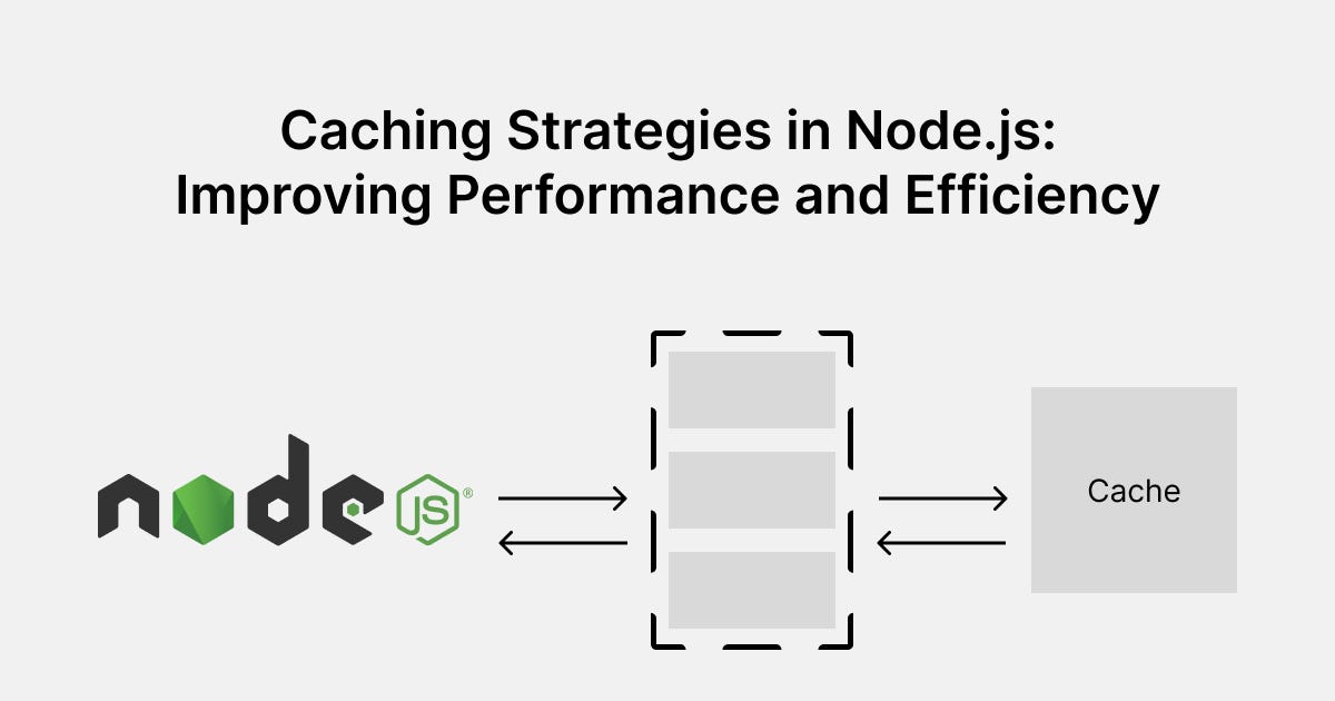
Image Source: Level Up Coding - gitconnected
Performance optimization is vital to create responsive drag and drop UI designs that users love. A well-planned implementation of loading states, caching strategies, and resource management can make interfaces much faster.
Loading States
The right loading state management improves user experience by a lot. Dynamic style definitions through shared style elements have helped drag and drop interfaces achieve performance improvements of up to 99%. We eliminated the need to render components for new styles, which reduces processing overhead.
Caching Strategies
Smart caching makes drag and drop perform better in several ways:
Static elements use cache-first strategy
Dynamic content relies on network-first with cache backup
Local and API data work together in a hybrid approach
Cache versioning helps keep data fresh while making things faster. Setting cache limits, like keeping only the most recent 75 images, stops storage from getting too full and keeps performance at its best.
Resource Management
Smart resource management cuts down unnecessary operations. Virtualized displacement means interfaces only move items users can see, which reduces the processing load. This simple change has cut down the time to move between lists with 500 items from 380ms to 8ms.
Lookup tables and memoization techniques have made drag operations work faster. These improvements changed what used to be an O(n²) operation into O(1) lookups. Large-scale drag and drop implementations now respond much quicker.
Provide Clear Feedback
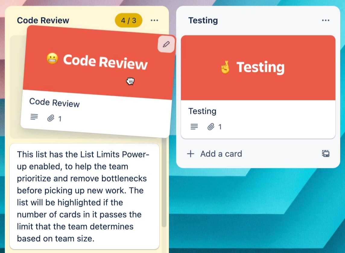
Image Source: Smart Interface Design Patterns
Clear feedback helps users understand drag and drop UI interactions better. These mechanisms guide users naturally through each step.
Visual Cues
Users need quick and clear visual feedback when they interact with draggable elements. The interface shows a see-through "ghost" image of the dragged item that keeps a visual link to where it started. We used several feedback states in successful systems:
Resting state with subtle hints
Active state that shows elevation and movement
Success state that confirms correct placement
Error state that shows invalid drops
Audio Feedback
Sound patterns work with visual cues to create a better user experience. The sound effects line up with drag actions to confirm successful drops and warn about invalid placements. The interface lets users adjust sound settings to match their priorities and surroundings.
Haptic Response
Much like real-world interactions, haptic feedback makes the experience more engaging. Mobile devices use a light haptic "bump" to confirm when users grab objects or reach drop zones. The key is to balance this feedback - it needs to be sharp and exact, lasting 10 to 20 milliseconds for the best response.
Good haptic design needs perfect timing. The actuator might keep vibrating for 20 to 50 milliseconds after the original input in keypress-style feedback. The haptic effects relate to how important each action is - stronger feedback for most important actions like submitting forms, and lighter touches for common tasks like scrolling.
Include Undo/Redo Options
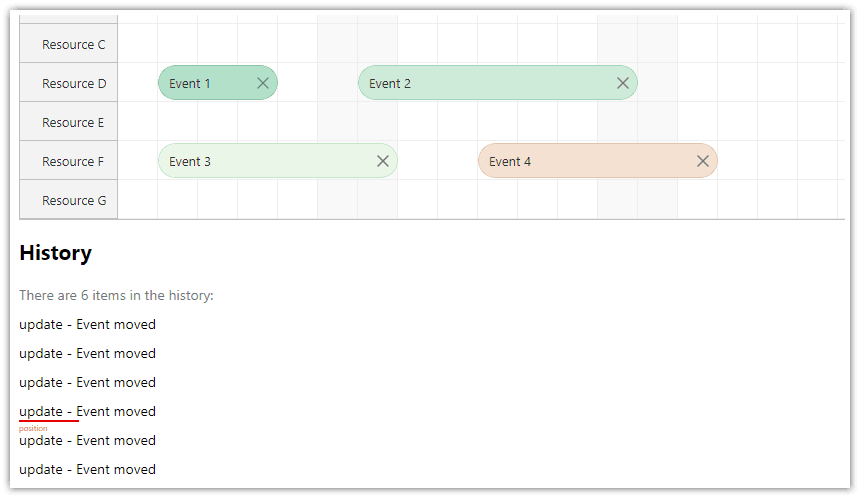
Image Source: DayPilot Code
Users can experiment confidently with drag and drop interface layouts thanks to reliable undo/redo features. A well-laid-out history system tracks changes and maintains performance.
History Management
A stack-based approach helps track user actions effectively. The system uses separate stacks to handle undo and redo operations. The history stack needs to track:
Action type (add/edit/remove)
Item state before change
Item state after change
Text description of action
The implementation combines multiple quick changes into single history entries so users don't feel overwhelmed. The system moves the current position in history forward automatically when it records new changes.
State Restoration
Users can recover their work between sessions with state restoration. The system saves details of items that users viewed before the app closed. The interface looks for saved restoration activities to rebuild the previous layout during state restoration.
The system starts by getting the state restoration activity and uses it to rebuild the interface. The system keeps an action counter to work effectively and controls undo/redo buttons based on available history. This gives users a clear picture of when they can use historical actions.
Test Edge Cases
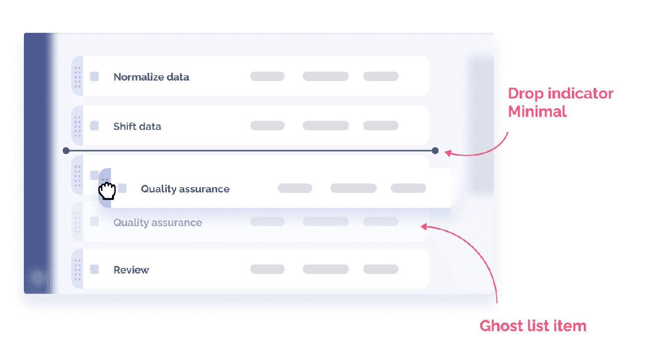
Image Source: Pencil & Paper
Edge case testing is the foundation of reliable drag and drop UI design that will give a smooth experience when users interact in unexpected ways. Testing reveals hidden defects that surface when users work with the interface differently than planned.
Boundary Conditions
Boundary testing checks extreme input ranges and interface limits. Testers need to check behavior between the extreme ends of input ranges. The focus should be on these core scenarios:
Multiple target confirmation
Out-of-sequence operations
Cross-boundary movements
Timing-sensitive interactions
Error Scenarios
We tested error scenarios to check different failure modes systematically. Common error scenarios include interrupted drag operations that can lead to lost or corrupted files. The system must keep the original state of dragged items safe when operations fail without warning.
Recovery Paths
Recovery testing checks if the interface can handle failures smoothly. The system should automatically save states during interrupted operations. The interface needs clear recovery options and must put items back in their original spots when drag operations fail.
Items should go back to where they came from if dropped in wrong zones. The system ended up checking that it could process other items even if some operations failed. This keeps the interface working and responsive even in tough conditions.
Implement Smart Defaults
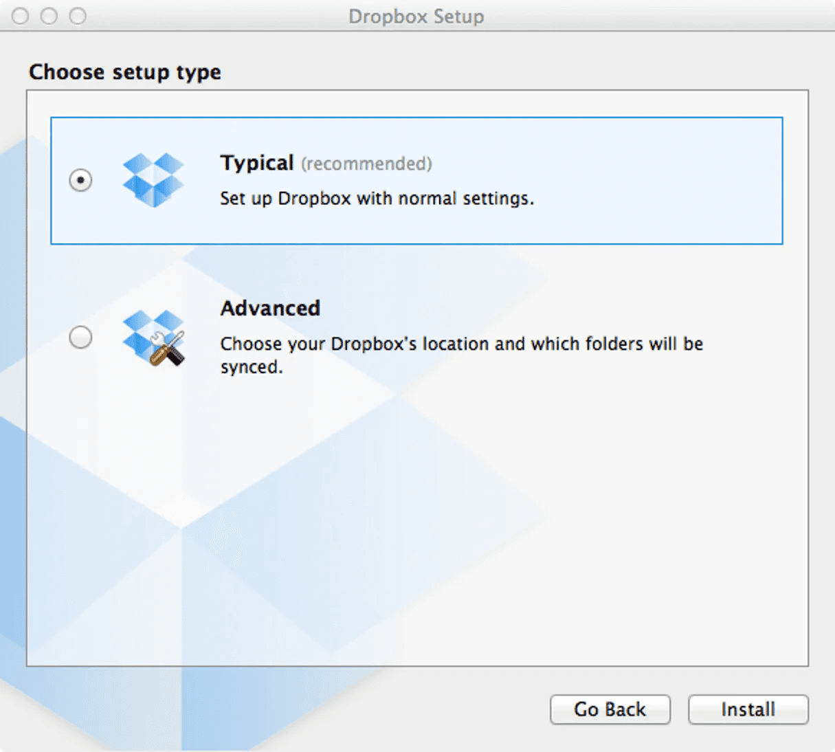
Image Source:Shopify
Smart defaults transform drag and drop UI design. They cut down cognitive load and streamline user interactions. Pre-filling form fields with smart guesses helps users work faster while they retain control over their final choices.
Initial States
Smart systems need to think about user context and common behaviors when pre-filling controls. The system makes educated guesses about user priorities based on context. These smart defaults serve two goals: they cut down input complexity and show clear examples of expected values.
Default values must line up with what users expect to work well. Systems that pre-select reasonable options show most important gains in completion rates. Without doubt, this works best when defaults are:
Based on user behavior patterns
Relevant to the current task
Quick to change or override
Fallback Behaviors
Original states focus on the first interaction, but fallback behaviors help users recover from unexpected issues. The system must return to a stable state right after it spots an invalid operation. Users keep their context during transitions because the interface saves element states.
Point-and-click options are vital fallbacks when drag and drop operations don't work well. Smart defaults add these options that work in different scenarios, unlike basic drag interfaces. The system saves progress often, so users keep their work safe during unexpected breaks.
Smart state management helps save user choices. The interface keeps previous selections when it makes sense and gives users clear ways to make changes. Users get a quick and reliable drag and drop experience because this balances speed with control.
Consider Multi-Item Drag

Image Source: Pencil & Paper
Modern interfaces boost user productivity with multiple item drag and drop features. A well-designed system handles complex group interactions smoothly through selection tools and batch operations.
Selection Mechanisms
Different devices need reliable input handling for multiple item selection. Users can select multiple items using Ctrl/Cmd+click to toggle individual items, while the Space key enables keyboard-driven selection. The system uses a Set data structure that manages selections and tracks large item groups.
Batch Operations
Drag and drop interfaces work better with batch processing capabilities. Users can perform similar operations on multiple objects at once. The system processes selected items together during drag-end handlers and uses container-based position mapping for the best performance.
Group Feedback
Clear visual feedback helps users manage multiple selections. A primary item shows up with a count badge to indicate multi-selection. A translucent "ghost" preview shows how selected items move during drag operations.
The system guides users with staged feedback when items enter drop zones. Visual cues get stronger as items move closer to the center, which helps users place groups accurately.
Document User Patterns
Image Source:Behance
User behavior patterns help us create better drag and drop UI designs when we collect and analyze data systematically. Tools that track user interactions give us a full picture of how people use these interfaces in different situations.
Usage Analytics
We just need detailed data collection to track how users work with drag and drop interfaces. The core metrics we look at include:
How long drag operations take
How often users complete drops successfully
Number of errors during moves
How users recover from failed drops
These numbers teach us about user skill levels and show us where we can make the interface better.
Behavior Tracking
A clear view of user behavior patterns comes from careful observation during testing. Researchers watch if people try drag and drop actions without being told to do so. The analytics also show whether users prefer other methods, like using menus to move files on mobile devices.
Improvement Areas
Evidence-based improvements come from analyzing how users interact with the system. The system tracks both successful and failed operations to find what needs work. Live monitoring has led to soaring wins - reducing operation time from 380ms to 8ms for big movements.
The usage data reveals where users have trouble with specific actions. This information ended up guiding interface improvements, from bigger drop zones to better touch response timing. These systematic improvements make drag and drop interfaces more user-friendly for different scenarios.
Conclusion
Drag and drop interfaces have evolved by a lot. They just need careful implementation in multiple dimensions. My extensive work with these interfaces shows that success comes from balancing visual feedback, accessibility, and performance optimization.
These 15 tips offer tested solutions to common challenges in drag and drop UI design. Smart animations help interactions feel natural. Users stay confident in their actions through proper error prevention. Clear visual affordances and easy-to-use drop zones help users understand possible interactions without explicit instructions.
Performance optimization remains significant for large-scale implementations. The best approach starts with simple functionality that progressively enhances features based on device capabilities and user needs. This method delivers smooth operation across platforms and maintains accessibility for all users.
Creating effective drag and drop interfaces depends on careful attention to user patterns. We must continuously refine based on ground usage data. My experience proves that successful implementations rely on clear feedback mechanisms, smart defaults, and resilient error handling to deliver experiences that users trust.
Drag and drop UI design dates back to the earliest days of graphical interfaces. The power of this feature that ever spread through popular platforms like Trello and Gmail makes it familiar to most users today.
Most users find this interaction style natural, yet it presents several challenges. Accessibility hurdles, touchscreen limitations, imprecision issues and physical fatigue during long sessions make creating a functional drag and drop interface complex.
My extensive work with drag and drop interactions taught me that details matter significantly. Each element needs attention - from visual feedback to keyboard support and touch gestures. These insights led me to compile 15 practical tips that work. You won't find theoretical fluff here, just battle-tested solutions ready for 2026 and beyond.
Design Clear Visual Affordances
Image Source:Dribbble
Visual affordances build the foundation of a working drag and drop UI design. These visual cues let users quickly spot interactive elements and know how to use them.
Understanding Drag Handles
Drag handles show users which elements they can move. The best handles use unique icons that stand apart from other UI elements. The handle size needs to fit both mouse and touch interactions - at least 1cm x 1cm of unused space works well for touch devices.
Visual Feedback States
Users need clear feedback states to guide them through drag and drop actions. Each element should show different visual states:
Hover State: The cursor changes to show draggability
Grabbed State: The element looks raised with a drop shadow
Drop Zone State: Target areas light up when dragged items come close
The grabbed state needs quick visual feedback through an outline, contrasting color, or shadow effect that shows the item selection.
Animation Cues
Animation timing makes drag and drop interactions feel natural. Use quick movement animations - about 100ms - to show items moving to make space for dropped elements. On top of that, it uses easing to create fluid motion.
The reshuffling animation starts when the dragged object's center overlaps other elements' edges. This creates the most natural feel and stops both slow and jumpy responses that might annoy users.
Implement Progressive Enhancement
Image Source:Friday
Progressive enhancement is the foundation of reliable drag and drop UI design that works well on different devices and adapts to user capabilities. This approach starts with a solid foundation and builds upward instead of jumping into complex interactions.
Simple Functionality
We build the core implementation with simple HTML elements that work everywhere. The team creates draggable elements with proper ARIA attributes and simple mouse event handlers. A good example has form-based ordering systems that work without JavaScript, which makes it accessible to all users.
Advanced Features
Modern drag and drop interfaces add sophisticated features through feature detection once we move past the basics. The implementation checks if browsers can handle advanced capabilities before it enables better interactions. These features also include:
Custom drag previews for visual feedback
Touch gesture support for mobile devices
Keyboard navigation alternatives
Performance Optimization
Performance remains crucial in progressive enhancement. The implementation delivers and executes code quickly. It makes use of browser-native drag and drop primitives to reduce code overhead, which leads to faster load times and smoother interactions.
Resource management plays a key role to optimize performance. The implementation loads features strategically so advanced capabilities only appear when needed. This helps keep everything responsive even as the system grows more complex.
Optimize Touch Interactions
Image Source: PixelFreeStudio Blog
Touch-based UI design faces unique challenges. Designers must carefully plan finger-based input methods and screen space usage.
Mobile-First Design
A touch interface needs precise sizing to work well. UI components like buttons and drag handles must be at least 44 pixels in height and width for reliable touch input. This size might look big, but it helps prevent mistakes and makes the interface easier to use.
Touch Gesture Patterns
Three main events make up the basic touch interactions: touchstart at initial contact, touchmove as fingers slide, and touchend when contact stops. These events are the foundations of natural drag and drop behaviors on touch devices.
Screen Size Considerations
Limited viewport space on touch screens requires smart element placement. Draggable elements need enough space between them to avoid scroll conflicts. The interface should tell the difference between intentional drags and casual swipes through timing delays and clear visual cues.
Testing Touch Accuracy
Touch accuracy needs thorough testing in different scenarios. The inputs should fall within +/- 1mm of the target's center in touchable areas beyond 3.5mm from the digitizer's edge. Areas within 3.5mm of the edge allow a wider tolerance of +/-2mm to match natural finger positions.
A well-designed touch interface should offer:
Instant visual feedback during touch events
Clear separation between scroll and drag actions
Haptic feedback on supported devices when interactions succeed
Success in touch optimization depends on extensive testing with different devices and understanding physical interaction patterns.
Create Intuitive Drop Zones
Image Source:NN Group
Drop zones are the life-blood of successful drag and drop UI design. A well-designed drop zone shows its purpose and functionality through thoughtful visual organization and clear feedback.
Visual Hierarchy
Drop zones need a clear visual structure to guide users' attention. The most effective drop zones employ dotted or dashed borders to show areas where items can be safely captured. Users can understand where to release dragged items without confusion.
Feedback Mechanisms
Multiple layers of feedback guide users through the interaction process. The feedback states include:
Empty State: Clear indication of the drop target's availability
Ready State: Visual enhancement when dragged items are within range
Active State: Intensified visual feedback as items get closer to the core
Success State: Confirmation of successful item placement
Items approaching the drop zone trigger intensified visual feedback that helps users stay on track. The interface becomes more predictable and accessible.
Zone Sizing
Drop zone dimensions are significant to usability. The drop target should fit the items while keeping clear boundaries. Touch interaction needs at least 1cm x 1cm of unused space in drop zones. The interface should add a "magnetic" effect to snap objects into place, even when users haven't aligned their drop position perfectly.
The drop zone should animate the placement with a short transition (100ms) into its new position. This subtle animation confirms the successful drag and drop action while keeping the interaction smooth and natural.
Use Smart Animations
Image Source: Dropbox Design
Smart animations add life to drag and drop interfaces. They make interactions feel smooth and natural. The secret to success lies in the right timing and how we handle states during the interaction.
State Transitions
The right timing makes state transitions smooth. The animation should respond within 100ms to feel natural. We used easing curves to copy physical movement, which makes the interface easy-to-use and responsive.
Loading States
Users need clear visual signs during loading states. The interface shows a see-through "ghost" preview of what you're dragging. A placeholder marks the item's starting point and helps users track where things came from during the move.
Error States
The interface gives quick feedback at the time errors happen. Items go back to where they started if you drop them in the wrong spot. Users can fix mistakes with an "Undo" button that stays visible until they start something new.
Success Feedback
Users should see right away when something works. Items snap into place with a quick animation after a good drop. The magnetic effect guides items to the right spot even if they don't line up perfectly. This creates a satisfying end to the drag and drop action.
To get the best animations, think about these key states:
Grab State: Lift with drop shadow and slight tilt
Transit State: Smooth movement with ghost image
Drop State: Quick snap animation with clear feedback
Reset State: Soft return to the starting spot
Consider Cross-Platform Compatibility
Image Source: Dribbble
Building a consistent drag and drop interface that works on all platforms needs a good understanding of how each device handles interactions. A good platform experience goes beyond basic touch support to include everything about how users interact with it.
Desktop Behavior
Desktop interfaces use cursor changes to show what you can drag and drop. We changed the cursor to show a "grab" state when users hover over items. It switches to "grabbing" while users drag things around. Users can drag items with mouse clicks or keyboard controls, and the spacebar starts drag operations to help with accessibility.
Mobile Adaptations
Mobile interfaces just need different approaches to work well. Touch interactions work best with a slight delay of a few milliseconds. This helps separate scrolling from actual drag attempts [9]. Haptic "bumps" are a great way to get user feedback when they grab objects or move them to drop zones.
Tablet Optimizations
Tablets create unique challenges because they mix touch and pointer inputs. The system needs to handle several scenarios:
Layout changes when the screen rotates
Precise stylus input requirements
Mixed touch and keyboard use
You can add multiple ways to interact when building cross-platform drag and drop features. To name just one example, adding both drag handles and action buttons helps things work on all devices. The interface detects how users interact and adjusts itself, giving consistent feedback whatever platform they use.
Implement Error Prevention
Image Source: Pencil & Paper
A systematic approach to validation and user guidance helps prevent errors in drag and drop interfaces. Data integrity stays intact and users remain confident in their actions with a good error prevention system.
Validation Rules
Custom drop validation functions verify both source and target locations effectively. The system checks if the dragging node fits the intended destination. Validation happens before the drop action finishes to stop incorrect placements that might disrupt workflow.
User Warnings
Warning mechanisms protect users from potential mistakes. Users see immediate feedback when they try invalid actions. The system should improve user guidance by:
Showing clear visual indicators for invalid drop zones
Warning users before destructive actions
Providing hints about proper placement
Recovery Options
Reliable recovery mechanisms help users stay confident. The system automatically saves the original state of dragged items if a drag operation gets interrupted [17]. An undo/redo system lets users reverse actions they didn't mean to take [3].
The interface settings can include a higher drag threshold to reduce accidental drags. The default threshold needs four pixels of movement, but users can increase it to 50 or 100 pixels in places where accidental drags happen often [18]. This adjustment stops unintended file movements while keeping the system working smoothly for deliberate actions.
Design for Accessibility
Image Source: Medium
Modern drag and drop UI design puts accessibility first. This helps users interact better with these interfaces. A well-planned accessibility approach makes complex interactions work for everyone.
Keyboard Navigation
Users need complete functionality without a mouse. The spacebar starts drag operations. Tab key helps users move between valid drop targets and skip unrelated elements. Arrow keys give precise control, and Enter completes the drop action.
Screen Reader Support
Screen readers need clear updates about drag and drop actions. ARIA live regions tell users about vital status changes, including grab confirmations and position updates. Users get updates about:
Their position in lists or on canvas
Available keyboard commands
Operation status updates
Drop zone validation results
Motor Impairment Considerations
Alternative interaction methods help users with motor impairments. The interface should give point-and-click options instead of traditional drag operations. Touch targets need to be at least 1cm x 1cm.
Dynamic Drag-and-Drop Assistive Programs (DDnDAP) streamline processes for users with minimal motor control. These systems need clear visual indicators and proper touch target sizing to work with different input methods.
The interface supports multiple input methods. Users can switch between mouse, keyboard, or assistive devices based on what works best for them. This flexibility helps everyone use drag and drop interfaces well, whatever their physical capabilities.
Optimize Performance
Image Source: Level Up Coding - gitconnected
Performance optimization is vital to create responsive drag and drop UI designs that users love. A well-planned implementation of loading states, caching strategies, and resource management can make interfaces much faster.
Loading States
The right loading state management improves user experience by a lot. Dynamic style definitions through shared style elements have helped drag and drop interfaces achieve performance improvements of up to 99%. We eliminated the need to render components for new styles, which reduces processing overhead.
Caching Strategies
Smart caching makes drag and drop perform better in several ways:
Static elements use cache-first strategy
Dynamic content relies on network-first with cache backup
Local and API data work together in a hybrid approach
Cache versioning helps keep data fresh while making things faster. Setting cache limits, like keeping only the most recent 75 images, stops storage from getting too full and keeps performance at its best.
Resource Management
Smart resource management cuts down unnecessary operations. Virtualized displacement means interfaces only move items users can see, which reduces the processing load. This simple change has cut down the time to move between lists with 500 items from 380ms to 8ms.
Lookup tables and memoization techniques have made drag operations work faster. These improvements changed what used to be an O(n²) operation into O(1) lookups. Large-scale drag and drop implementations now respond much quicker.
Provide Clear Feedback
Image Source: Smart Interface Design Patterns
Clear feedback helps users understand drag and drop UI interactions better. These mechanisms guide users naturally through each step.
Visual Cues
Users need quick and clear visual feedback when they interact with draggable elements. The interface shows a see-through "ghost" image of the dragged item that keeps a visual link to where it started. We used several feedback states in successful systems:
Resting state with subtle hints
Active state that shows elevation and movement
Success state that confirms correct placement
Error state that shows invalid drops
Audio Feedback
Sound patterns work with visual cues to create a better user experience. The sound effects line up with drag actions to confirm successful drops and warn about invalid placements. The interface lets users adjust sound settings to match their priorities and surroundings.
Haptic Response
Much like real-world interactions, haptic feedback makes the experience more engaging. Mobile devices use a light haptic "bump" to confirm when users grab objects or reach drop zones. The key is to balance this feedback - it needs to be sharp and exact, lasting 10 to 20 milliseconds for the best response.
Good haptic design needs perfect timing. The actuator might keep vibrating for 20 to 50 milliseconds after the original input in keypress-style feedback. The haptic effects relate to how important each action is - stronger feedback for most important actions like submitting forms, and lighter touches for common tasks like scrolling.
Include Undo/Redo Options
Image Source: DayPilot Code
Users can experiment confidently with drag and drop interface layouts thanks to reliable undo/redo features. A well-laid-out history system tracks changes and maintains performance.
History Management
A stack-based approach helps track user actions effectively. The system uses separate stacks to handle undo and redo operations. The history stack needs to track:
Action type (add/edit/remove)
Item state before change
Item state after change
Text description of action
The implementation combines multiple quick changes into single history entries so users don't feel overwhelmed. The system moves the current position in history forward automatically when it records new changes.
State Restoration
Users can recover their work between sessions with state restoration. The system saves details of items that users viewed before the app closed. The interface looks for saved restoration activities to rebuild the previous layout during state restoration.
The system starts by getting the state restoration activity and uses it to rebuild the interface. The system keeps an action counter to work effectively and controls undo/redo buttons based on available history. This gives users a clear picture of when they can use historical actions.
Test Edge Cases
Image Source: Pencil & Paper
Edge case testing is the foundation of reliable drag and drop UI design that will give a smooth experience when users interact in unexpected ways. Testing reveals hidden defects that surface when users work with the interface differently than planned.
Boundary Conditions
Boundary testing checks extreme input ranges and interface limits. Testers need to check behavior between the extreme ends of input ranges. The focus should be on these core scenarios:
Multiple target confirmation
Out-of-sequence operations
Cross-boundary movements
Timing-sensitive interactions
Error Scenarios
We tested error scenarios to check different failure modes systematically. Common error scenarios include interrupted drag operations that can lead to lost or corrupted files. The system must keep the original state of dragged items safe when operations fail without warning.
Recovery Paths
Recovery testing checks if the interface can handle failures smoothly. The system should automatically save states during interrupted operations. The interface needs clear recovery options and must put items back in their original spots when drag operations fail.
Items should go back to where they came from if dropped in wrong zones. The system ended up checking that it could process other items even if some operations failed. This keeps the interface working and responsive even in tough conditions.
Implement Smart Defaults
Image Source:Shopify
Smart defaults transform drag and drop UI design. They cut down cognitive load and streamline user interactions. Pre-filling form fields with smart guesses helps users work faster while they retain control over their final choices.
Initial States
Smart systems need to think about user context and common behaviors when pre-filling controls. The system makes educated guesses about user priorities based on context. These smart defaults serve two goals: they cut down input complexity and show clear examples of expected values.
Default values must line up with what users expect to work well. Systems that pre-select reasonable options show most important gains in completion rates. Without doubt, this works best when defaults are:
Based on user behavior patterns
Relevant to the current task
Quick to change or override
Fallback Behaviors
Original states focus on the first interaction, but fallback behaviors help users recover from unexpected issues. The system must return to a stable state right after it spots an invalid operation. Users keep their context during transitions because the interface saves element states.
Point-and-click options are vital fallbacks when drag and drop operations don't work well. Smart defaults add these options that work in different scenarios, unlike basic drag interfaces. The system saves progress often, so users keep their work safe during unexpected breaks.
Smart state management helps save user choices. The interface keeps previous selections when it makes sense and gives users clear ways to make changes. Users get a quick and reliable drag and drop experience because this balances speed with control.
Consider Multi-Item Drag
Image Source: Pencil & Paper
Modern interfaces boost user productivity with multiple item drag and drop features. A well-designed system handles complex group interactions smoothly through selection tools and batch operations.
Selection Mechanisms
Different devices need reliable input handling for multiple item selection. Users can select multiple items using Ctrl/Cmd+click to toggle individual items, while the Space key enables keyboard-driven selection. The system uses a Set data structure that manages selections and tracks large item groups.
Batch Operations
Drag and drop interfaces work better with batch processing capabilities. Users can perform similar operations on multiple objects at once. The system processes selected items together during drag-end handlers and uses container-based position mapping for the best performance.
Group Feedback
Clear visual feedback helps users manage multiple selections. A primary item shows up with a count badge to indicate multi-selection. A translucent "ghost" preview shows how selected items move during drag operations.
The system guides users with staged feedback when items enter drop zones. Visual cues get stronger as items move closer to the center, which helps users place groups accurately.
Document User Patterns
Image Source:Behance
User behavior patterns help us create better drag and drop UI designs when we collect and analyze data systematically. Tools that track user interactions give us a full picture of how people use these interfaces in different situations.
Usage Analytics
We just need detailed data collection to track how users work with drag and drop interfaces. The core metrics we look at include:
How long drag operations take
How often users complete drops successfully
Number of errors during moves
How users recover from failed drops
These numbers teach us about user skill levels and show us where we can make the interface better.
Behavior Tracking
A clear view of user behavior patterns comes from careful observation during testing. Researchers watch if people try drag and drop actions without being told to do so. The analytics also show whether users prefer other methods, like using menus to move files on mobile devices.
Improvement Areas
Evidence-based improvements come from analyzing how users interact with the system. The system tracks both successful and failed operations to find what needs work. Live monitoring has led to soaring wins - reducing operation time from 380ms to 8ms for big movements.
The usage data reveals where users have trouble with specific actions. This information ended up guiding interface improvements, from bigger drop zones to better touch response timing. These systematic improvements make drag and drop interfaces more user-friendly for different scenarios.
Conclusion
Drag and drop interfaces have evolved by a lot. They just need careful implementation in multiple dimensions. My extensive work with these interfaces shows that success comes from balancing visual feedback, accessibility, and performance optimization.
These 15 tips offer tested solutions to common challenges in drag and drop UI design. Smart animations help interactions feel natural. Users stay confident in their actions through proper error prevention. Clear visual affordances and easy-to-use drop zones help users understand possible interactions without explicit instructions.
Performance optimization remains significant for large-scale implementations. The best approach starts with simple functionality that progressively enhances features based on device capabilities and user needs. This method delivers smooth operation across platforms and maintains accessibility for all users.
Creating effective drag and drop interfaces depends on careful attention to user patterns. We must continuously refine based on ground usage data. My experience proves that successful implementations rely on clear feedback mechanisms, smart defaults, and resilient error handling to deliver experiences that users trust.


Similar Blogs
Similar Blogs
Similar Blogs


Available for Work
Bricx
© Bricx, 2026. All rights reserved.


Available for Work
Bricx
© Bricx, 2026. All rights reserved.
Available for Work
Bricx
© Bricx, 2026. All rights reserved.
Available for Work
Bricx
© Bricx, 2026. All rights reserved.