Website Design
Website Design
Website Design
Insights
Insights
Insights
February 18, 2025
February 18, 2025
February 18, 2025
12 Micro Animation Examples Bringing Apps to Life in 2026
12 Micro Animation Examples Bringing Apps to Life in 2026
12 Micro Animation Examples Bringing Apps to Life in 2026
Make your app feel alive! Explore 12 micro animations, from loading states to smooth button interactions.
Make your app feel alive! Explore 12 micro animations, from loading states to smooth button interactions.
Make your app feel alive! Explore 12 micro animations, from loading states to smooth button interactions.
4 Min Read
4 Min Read
4 Min Read


A welcoming product experience keeps 76% of users engaged with your platform. Poor interaction design stands as the third most common reason users leave.
Micro animations can change ordinary apps into experiences that captivate users. Take Attention Insight for example - they saw their activation rates jump by 47% after adding simple interactive elements and progress bars.
Let's talk about micro animations. These powerful yet subtle interactions last between 200 to 500 milliseconds. You'll find them in animated buttons, progress indicators and interactive tooltips. They serve a real purpose beyond decoration - they stop users from making mistakes, reduce abandonment rates and help people remember information better.
I've curated 12 state-of-the-art micro animation examples that will shape app design in 2026. Each animation shows how tiny details create lasting impressions while you retain your brand's unique identity.
What Makes Micro Animations Feel Alive?
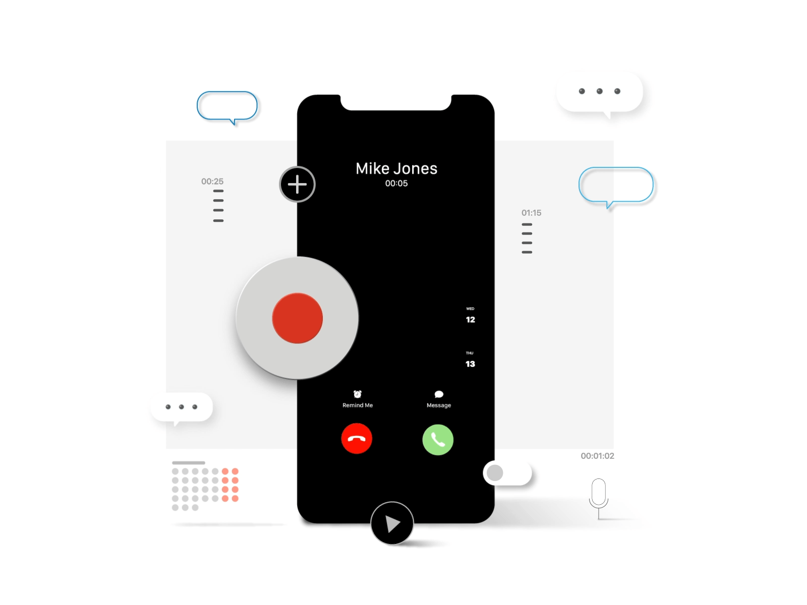
Image Source: Goran Levačić - Dribbble
Micro animations add life to digital interfaces through carefully designed interactions that respond to user actions. These subtle yet powerful elements turn ordinary interfaces into experiences that users love.
Definition and Psychology
Micro animations are small, task-based visual responses that provide feedback or guide users through digital products. These animations trigger specific responses based on user actions or system conditions. They use psychological principles of feedback and confirmation to boost user confidence.
The psychology behind micro animations connects with our natural ability to detect motion through peripheral vision. These animations build emotional connections between users and products by offering positive reinforcement during interactions.
Key Motion Design Principles
Three fundamental principles guide effective micro animations:
Informative Motion: Animations should highlight relationships between elements and clearly communicate action outcomes
Focused Attention: Motion must direct users' attention to important elements without creating unnecessary distractions
Expressive Character: Animations should celebrate key moments while expressing brand personality
Timing plays a vital role in micro animation's effectiveness. The ideal duration ranges between 200-500 milliseconds to keep users engaged without causing frustration.
Impact on User Experience
Micro animations improve user experience substantially. They provide immediate visual feedback that confirms user actions. To cite an instance, see how Dropbox shows a progress bar that fills up in real-time when users upload files.
These animations prevent user errors by providing proactive guidance. As users type passwords, dynamic checkmarks appear next to met requirements, which helps them avoid mistakes before submission. This immediate feedback reduces frustration and improves task completion rates.
Brand personality comes alive through thoughtful micro animations. Asana's celebratory unicorn animation appears unexpectedly when tasks are completed, adding surprise and delight to routine actions. Google Assistant's floating dots transform into sound wave animations during voice commands, creating a distinct brand experience while confirming system responsiveness.
Micro animations bridge the gap between human interactions and digital responses. They make interfaces feel natural and intuitive by providing visual cues that mirror real-life physics. This attention to detail improves perceived performance and creates engaging, memorable user experiences.
Loading State Animations
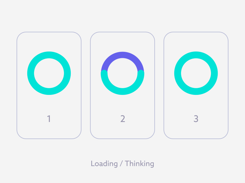
Image Source: Yup Nguyen - Dribbble
Loading states are vital moments in user interaction. Users abandon websites after waiting just 3 seconds for content to load. The right loading animation helps you retain user engagement.
Skeleton Screens
Skeleton screens work as wireframe-like placeholders that mirror the final page layout during loading. These screens show gray boxes and shapes instead of blank spaces. The shapes match the structure of upcoming content. Users build mental models of the page layout before the actual content appears.
Static placeholders show simple shapes where content will appear later. This is the most basic approach. Animated versions improve engagement with subtle movements that show ongoing activity.
Progress Indicators
Progress indicators tell users about the system's status. Research shows that users wait up to 22.6 seconds [link_2] when they see progress bars. Without any feedback, they wait just 9 seconds.
There are two main types of progress indicators:
Looped Animation: Perfect for processes that take 2-10 seconds and show continuous movement without completion estimates
Percent-Done Animation: Best for tasks over 10 seconds that display clear progress towards completion
Shimmer Effects
Shimmer effects create an illusion of progress through animated gradients moving across placeholder elements. This works well in data-heavy interfaces where many elements load at once.
The shimmer gradient uses three colors with specific stops (0.1, 0.3, 0.4) to create a smooth transition. The gradient moves horizontally across the screen to suggest active content loading.
Performance Optimization
You need to think about several factors to optimize loading animations. A single global indicator works better than multiple progress indicators for related content. This prevents users from feeling overwhelmed.
Performance optimization techniques include:
Lazy loading for image sequences
Less scroll-trigger usage
Optimized SVG paths for smoother animations
On top of that, loading animations should reflect the actual loading process. They shouldn't make loading times longer just to show an animation. The focus should be on giving users meaningful feedback while keeping them engaged.
Button State Micro Animations
Image Source: Aaron Iker - Dribbble
Button states act as essential communication tools in user interfaces. They give immediate visual feedback that guides users through their interactions. These micro animations help boost usability by showing which actions users can take, what's happening, and what's finished.
Hover States
Desktop interfaces use hover effects to give instant visual cues when users move their cursor over clickable elements. The best user experience comes from smooth transition duration of 200ms.
The best hover states follow these principles:
Subtle color changes or scaling effects work well
Pointer cursors show what's clickable
Similar components need matching effects
Mobile interfaces change hover states into ripple effects. These effects give users tactile feedback to confirm their button taps. This adaptation creates smooth functionality on any platform while keeping responsive feedback.
Click Feedback
Click feedback animations show users their actions through quick visual responses. The most effective click animations need:
State Changes: Buttons show different visual states as users interact with them - from the first press to release. These changes mix color shifts, subtle scaling, or brief animations lasting between 300-500 milliseconds.
Loading Indicators: Some actions need processing time. Buttons change to show progress with spinning animations or progress bars. This feedback keeps users engaged while they wait.
Success/Error States
Success and error states tell users what happened through clear visual signals. Each state uses specific design elements:
Success Indicators: When actions work, buttons show:
Checkmark icons that fade in smoothly
Colors that shift to positive signals (usually green)
Quick celebratory animations that confirm completion
Error Feedback: When something goes wrong, buttons alert users with:
Colors that change to warning signals (usually red)
Gentle shaking animations for invalid inputs
Clear error messages that help fix the problem
These state changes need the right timing and visual balance. Animations should feel natural but purposeful. They work best when they finish within 400-500 milliseconds to keep users engaged.
Smart button states make interfaces more user-friendly and responsive. Each micro animation has its purpose, from helping users with complex forms to confirming successful actions. The result is a more polished and professional experience.
Form Field Animations
Image Source: Henry Dan - Dribbble
Form field animations improve user experience by giving live feedback and guidance. Small but powerful micro animations change basic form interactions into engaging experiences that help more users complete forms.
Input Focus States
Focus states need careful thought since they directly affect form accessibility. The visual focus indicator must keep a contrast ratio of at least 3:1 to help users with low vision see it clearly. This becomes significant especially when you have forms used in bright environments.
Users should see focus animations right away when they click, tap, or select an input field with the Tab key. These animations should never get in the way of actual input. The best focus animations have:
A clear outline showing the active field
Smooth label movements
Subtle background color shifts that keep text readable
Validation Feedback
Live validation feedback helps users fill forms correctly. In spite of that, instant validation can work against us sometimes. Research shows that proving empty fields right right after focus often creates unnecessary frustration.
A better way is to use "reward early, punish late" validation:
Clear error messages as soon as users start fixing mistakes
Wait to show new errors until users finish their input
Check non-empty fields only after users move to the next input
Error Handling
Error handling animations should be noticeable without being disruptive. WCAG guidelines say error messages should stay visible while users fix their input.
The best error handling approach should:
Put error messages above input fields so virtual keyboards on mobile devices don't hide them
Use gentle shake animations for 0.2-0.3 seconds to highlight errors
Show validation rules step by step, particularly for complex inputs like passwords
Form field animations should help users complete their main task. These micro animations create a more forgiving and efficient interface by letting users copy-paste and override validation when needed.
Animations must adjust to user priorities. This means following the prefers-reduced-motion setting and offering other feedback methods for users who want less motion. Smart implementation of these principles improves usability while keeping accessibility standards intact.
Navigation Menu Animations
Image Source: Mateusz Nieckarz - Dribbble
Navigation menus are vital touchpoints in user interfaces. Well-designed micro animations can substantially improve usability and user involvement. These interactive elements help users navigate complex structures while keeping visual harmony.
Smooth Transitions
Navigation menus need carefully timed animations that balance responsiveness with visual appeal. The best timing for these transitions falls between 300-500 milliseconds. Users stay engaged without delays in content access at this speed.
Navigation transitions work better with:
Transform properties that accelerate hardware
Opacity changes to create smooth fades
Position shifts that follow natural movement paths
Hamburger Menu Transforms
The hamburger menu icon looks simple but provides great opportunities for micro animations to show menu states clearly. The icon changes through precise movements when users interact with it.
The transformation follows this sequence:
Three parallel lines at the start
Middle line fades out slowly
Top and bottom lines rotate 45 degrees in opposite ways
The transform-origin properties make these rotations smooth from the center. A 0.5 seconds ease-in-out transition gives the best visual feedback.
Dropdown Effects
Dropdown animations make navigation clearer through purposeful design. These effects combine several key elements that work together.
The animation timing needs proper adjustment - usually 200-300 milliseconds. This gives users enough time to notice the change without slowing down interactions.
On top of that, dropdown menus look better with staged animations. Menu items appear one after another with a 60ms delay. This creates a cascade that highlights available options naturally.
Dropdown animations work best when they:
Scale from where users click
Keep timing consistent across similar items
Consider user's reduced motion settings
These animations adapt smoothly to different screens and interaction types. Mobile dropdowns use touch-friendly timing and bigger tap areas. This ensures users get a consistent experience across all platforms.
Smart navigation micro animations make interfaces more user-friendly and engaging. Each animated part guides users through complex navigation while maintaining visual consistency and performance.
Pull-to-Refresh Animations
Image Source: Abron Studio - Dribbble
Pull-to-refresh interactions have evolved from simple loading indicators into engaging micro animations that create better user experiences. Research shows that viewers retain 95% of a message when they watch it in video format, compared to just 10% when reading text.
Custom Refresh Indicators
The refresh visualizer works through five distinct states that show loading progress clearly. The Idle state shows no visual indicator. Users who start pulling will see the visualizer move to the Interacting state. This displays a disabled icon at 60% opacity that rotates fully with the scroll action.
The visualizer moves to the Pending state when it reaches the threshold. The icon then pulses between 100% and 150% size. Users who release the screen will see it enter the Refreshing state. This triggers the refresh action and shows a spinning animation for feedback.
Progress States
The indicators change based on how users interact with them:
Threshold Detection: The refresh trigger distance needs careful adjustment to feel natural yet purposeful
Visual Feedback: The icon stays at 100% opacity and size in the pending state and moves with scroll actions without spinning
Completion Indication: A smooth transition takes the visualizer back to idle state after the refresh finishes
Brand Integration
Smart brand integration turns standard refresh animations into memorable experiences. To cite an instance, see Calendly's refresh animation with its bright, dynamic visuals that match their brand identity. Companies have seen an 80% increase in conversion rates by adding cohesive video content to their websites.
Refresh animations automatically line up with scroll direction and support four main directions: BottomToTop, TopToBottom, RightToLeft, and LeftToRight. This flexibility gives users a consistent experience across different layouts.
Refresh animations must strike a balance between function and visual appeal. Studies show that 96% of marketers believe videos help users understand content better. These micro animations should give clear feedback while staying true to the brand's colors, timing, and motion patterns.
Success/Achievement Animations
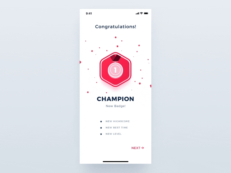
Image Source: Przemyslaw - Dribbble
Micro animations that celebrate user achievements create memorable moments and boost engagement and retention. Research shows that brands using surprise and delight moments in their interfaces see 90% of users develop a more positive perception.
Celebration Effects
The right balance between acknowledging accomplishments and staying professional makes celebration animations work. Mailchimp shows this perfectly. They confirm newsletter scheduling with a simple "Rock on!" message and subtle animations. This works better than overwhelming users with too much confetti that might make big achievements feel less special.
Progress Milestones
Smart progress tracking animations motivate users effectively. Attention Insight proved this with their onboarding checklists. Their animated progress bars led to a 47% increase in activation rates. These visual guides help break down complex processes into smaller, manageable steps.
Progress milestone animations work best with these elements:
Live progress updates
Clear visual hierarchy
Feedback that matches user actions
Gamification Elements
Smart micro animations turn everyday tasks into fun experiences. Research shows that users who encounter well-designed surprise and delight moments share their positive experiences with others 50% of the time.
Winning gamification strategies need:
Dynamic Rewards: The animations grow more complex as achievements get bigger. Small wins get subtle nods, while major milestones deserve bigger celebrations.
Tailored Feedback: The animations adapt based on how users interact and what they like. This keeps users engaged without overwhelming those who prefer minimal motion.
Progressive Disclosure: Animated elements show new features as users move forward. This builds excitement and encourages exploration.
These elements help micro animations turn regular tasks into rewarding moments. Quick animation timing - usually 300-500 milliseconds - keeps the interface responsive while making celebrations feel special.
The best success animations celebrate real achievements, not trivial actions. This selective approach helps celebratory moments stay meaningful and keeps users motivated throughout their experience.
Empty State Animations
Image Source: Vishnu Prasad - Dribbble
Empty states give you a chance to add micro animations that guide and inform users. Smart animation design turns frustrating moments into meaningful interactions that boost the overall user experience.
Placeholder Illustrations
Empty state illustrations work as visual anchors to help users understand blank screens better. Research shows that apps with contextual empty states cut user confusion by 50%. These illustrations should follow these principles:
Clear visual hierarchy that highlights main actions
Brand-aligned esthetics that stay consistent
Contextual relevance to the empty screen's purpose
Loading States
Loading animations need the right timing and user perception. Tasks that take more than 10 seconds work best with percent-done indicators. Skeleton screens are a big deal as it means that users feel instant transitions while content loads in the background.
Skeleton screens work best with these patterns:
Display immediate placeholder layouts
Replace elements gradually with actual content
Keep visual structure consistent during loading
User Guidance
Smart empty states teach users how to fill blank areas. Apps that show clear paths in empty states see feature adoption jump by 80%.
User guidance needs these key parts:
Direct links to relevant actions
Short, clear instructions
Simple status messages
Empty states should never create dead-ends that might confuse users. They should add value through starter content or materials that show what's possible in empty sections.
Smart use of these elements turns empty states into teaching moments. The animations strike the right balance between quick feedback and guiding users to add meaningful content.
Notification Animations
Image Source: Vektora - Dribbble
Notification animations give users vital visual feedback about system status and important updates. These micro animations turn basic alerts into engaging interactions that grab attention without disrupting the user's flow.
Toast Messages
Toast notifications slide gracefully from screen edges and deliver temporary messages that fade away automatically. Users see interfaces as 47% more responsive when toast messages include smooth entrance and exit animations.
Toast animations work best with these elements:
Entrance transitions that last 300-500 milliseconds
Auto-hide features after 2.5 seconds
Smooth exit animations lasting 200ms
Badge Updates
Badge notifications use dynamic micro animations to showcase status or quantity changes. These subtle yet noticeable animations catch the eye through:
Numeric Updates: Numbers flow smoothly between states with a brief scaling effect. The animation maintains visual harmony at 200-300 milliseconds.
Status Indicators: Dot notifications create gentle pulses that show unread items or important updates. These animations use opacity changes between 60% and 100% to create a subtle breathing effect.
Alert Styles
Message urgency levels determine alert animation intensity. Critical alerts use bold animations to grab immediate attention while staying balanced to avoid overwhelming users.
Essential components include:
Entrance Effects: Alerts glide or fade into view with precise timing
Progress Indicators: Loading bars or spinners show live feedback
Dismissal Animations: Smooth exits keep visual flow intact
The prefers-reduced-motion setting lets users control notification animations. This feature ensures accessibility without compromising effective visual communication.
Strategic notification patterns help interfaces deliver clear feedback that doesn't break user focus. Each animation type plays a specific role in communication hierarchy, ranging from subtle badge updates to eye-catching alert styles.
Scroll-Based Micro Animations
Image Source: Tubik - Dribbble
Scroll-based micro animations change static interfaces into dynamic experiences through smart motion design. These animations react to how users scroll and create immersive interactions that guide users naturally through content.
Parallax Effects
Parallax animations give an illusion of depth by moving visual elements at different speeds as users scroll. This effect creates a realistic 3D space that follows depth perception principles. Size adjustments and shadow distances play a key role in making this work.
The best parallax motion needs:
Elements in front move faster to feel closer
Background elements move less to appear distant
Shadows stay consistent across moving elements
Scroll Progress
Progress indicators let users know where they are in the content. These animations usually take the form of progress bars that grow as users scroll. This gives clear visual feedback about content navigation.
Performance optimization needs careful attention. Hardware-accelerated properties like transforms and opacity keep animations smooth and running off the main thread. The scroll progress animations work with different scroll containers. They can track both document-level scrolling and specific content sections.
Content Reveal
Content reveal animations boost engagement by revealing elements as users scroll. The timing of these animations is vital - elements should fade in at 25% viewport visibility and finish their transition at 75% visibility.
The best reveal effects need:
Elements that scale up smoothly from their starting point
Opacity changes that create natural fade-ins
Transform origins that keep motion paths consistent
User priorities matter most in scroll-based animations. The prefers-reduced-motion media query helps keep interfaces accessible while delivering engaging experiences. These animations should enhance the natural flow of user interaction through meaningful motion design rather than delay content visibility.
Gesture-Based Animations
Image Source: Bart Bak - Dribbble
Gesture-based micro animations boost app interactivity by responding naturally to user touch inputs. These carefully crafted responses create fluid experiences that mirror real-life physics. Digital interactions feel more accessible and engaging through this approach.
Swipe Actions
Swipe gestures just need quick visual feedback to confirm user actions. The animations that work best use clear signs that emphasize available actions before users start the gesture. These animations should complete within 300-500 milliseconds to stay responsive.
Pinch-to-Zoom
Pinch-to-zoom gestures just need precise scaling animations that track finger movements with up-to-the-minute data. The interaction starts when two pointers touch the screen. The system calculates the distance between touch points to determine scaling factors. The scale factor increases as fingers move apart and decreases when fingers come closer.
To create smooth pinch interactions:
The original scale factor starts at 1.0
Distance changes trigger proportional scaling
Visual feedback keeps consistent anchor points
Hardware acceleration will give smooth transitions
Drag-and-Drop
Drag-and-drop animations provide vital visual cues throughout the interaction lifecycle. Research shows magnetic effects and snapping behaviors substantially improve accuracy. Users can target drop zones more precisely with these features.
The core components of effective drag-and-drop include:
Grab State: Visual changes showing an object is selected
Movement Feedback: Subtle shadows or transformations while dragging
Drop Zone Highlights: Clear indicators of valid target areas
Release Animation: Smooth transition to final position
These gesture animations must adapt to different input methods. Touchscreens just need at least 1cm x 1cm of unused space to prevent accidental triggers. Haptic feedback also boosts the experience by giving tactile confirmation of successful gestures.
Strategic use of these gesture-based animations makes interfaces more responsive and engaging. Each animation type has a specific purpose in the interaction flow. They confirm user actions and guide objects toward their intended destinations.
Voice/Audio Interface Animations
Image Source: Giovanni Mingo - Dribbble
Audio interfaces just need user-friendly visual feedback that boosts user confidence during voice interactions. Apps create continuous experiences through carefully designed micro animations that bridge the gap between spoken commands and digital responses.
Waveform Visualizations
Waveform animations change audio input into dynamic visual representations. These visualizations sample audio at 44.1 kHz and create 88,200 data points per second for stereo recordings. Waveform animations filter these data points into 70 distinct segments that represent averaged audio intensity.
The visualization process consists of:
Converting raw audio data into normalized values
Mapping intensity levels to visual heights
Applying smooth transitions between states
Voice Command Feedback
Voice command interfaces just need clear attention systems that show microphone status and command recognition. Meta's Voice SDK employs specific visual cues that signal active microphone listening. These status indicators show distinct states:
Listening Mode: Active input collection with immediate feedback
Processing State: Visual acknowledgment of command reception
Response Phase: Confirmation of successful interpretation
Sound Indicators
Sound indicators employ dynamic animations that represent audio activity levels. Google Assistant shows this through floating dots that change into sound wave animations during voice input. These indicators serve two key purposes:
System responsiveness confirmation through immediate visual feedback
Brand identity through consistent motion design
Attention systems must accurately show microphone status throughout audio collection. Precise timing helps users understand when their voice commands will be received. This reduces confusion and gives a unique interaction experience.
Mutually beneficial implementation of these audio-visual elements creates more engaging and available voice interactions. Each animation type plays a specific role in the communication flow, from audio intensity representation to command recognition confirmation.
Conclusion
Micro animations do more than just look good. Studies show they can boost user engagement and retention rates up to 76% when developers implement them correctly.
These small but powerful interactions work hard in many interface parts. They keep users patient during loading times and give instant feedback in form fields. Users get confirmation through button changes, while smooth menu transitions help them navigate complex interfaces.
Success comes from doing things right. These animations work best when they run between 200-500 milliseconds and match user motion settings. The timing stays consistent for similar elements. Each animation needs a clear purpose beyond just decoration.
What a world of contextual and customized micro animations looks like. Smart designs will adapt to how users behave while running smoothly through better hardware use and clean code.
Micro animations blend style and purpose perfectly when done right. They help prevent mistakes, clear up confusion, and create lasting impressions that make them vital for modern interface design.
FAQs
What are some next-generation micro-interaction concepts?
Some common next-generation micro-interactions for 2026 and beyond are: skeleton loaders and shimmer effects for smoother loading states, animated button responses for actions like success or error, and live validation in form fields.
Other popular micro-interactions being used extensively by applications and product teams include: branded, pull-to-refresh gestures, scroll-triggered animations & waveform feedback for voice-led interactions.
Each of these is gaining traction since they help enhance the user experience with instant, intuitive feedback and reducing friction — all of which makes the user interactions feel more responsive & humane.
What makes a good micro-interaction?
A good micro-interaction is subtle, purposeful, and enhances the user experience without causing distraction. It provides clear, immediate feedback, communicates system status, and helps users feel in control. Timing is crucial; most effective micro-interactions last between 200–500ms.
They should feel natural, match the tone of the product, and be consistent across interactions. Accessibility and performance are key, ensuring animations are smooth, responsive, and respectful of user settings like reduced motion preferences.
How will AI influence micro-interaction design?
AI is going to make micro-interaction design way more personalized and adaptive. Instead of static animations, we’ll see interactions that respond to user behavior in real time — like smart loading states based on your network speed or voice UIs that adjust based on how you speak.
It’ll also help designers test and optimize animations faster with predictive tools.
Overall, AI will make micro-interactions feel more natural, efficient, and almost invisible in how they guide the user.
What are some common mistakes to avoid in micro-interaction design?
Some common mistakes in micro-interaction design are making animations too flashy or long—they should be quick and subtle. A big one is using them where they’re not needed, which can slow things down or annoy users.
Ignoring accessibility, like not respecting “reduced motion” settings, is another miss.
Also, if micro-interactions aren’t consistent across your app, they feel confusing. Basically, if they don’t add clarity or delight, they probably shouldn’t be there.
How can product managers & product teams leverage micro-interactions to improve KPIs?
Product managers can use micro-interactions to boost KPIs by making the user experience smoother and more intuitive.
Think of things like faster form completion with live feedback, or keeping users engaged with fun pull-to-refresh animations. These little touches can reduce drop-offs, increase conversions, and improve user satisfaction scores.
Plus, when done right, they can make products feel more polished and trustworthy, which helps with retention and word-of-mouth.
A welcoming product experience keeps 76% of users engaged with your platform. Poor interaction design stands as the third most common reason users leave.
Micro animations can change ordinary apps into experiences that captivate users. Take Attention Insight for example - they saw their activation rates jump by 47% after adding simple interactive elements and progress bars.
Let's talk about micro animations. These powerful yet subtle interactions last between 200 to 500 milliseconds. You'll find them in animated buttons, progress indicators and interactive tooltips. They serve a real purpose beyond decoration - they stop users from making mistakes, reduce abandonment rates and help people remember information better.
I've curated 12 state-of-the-art micro animation examples that will shape app design in 2026. Each animation shows how tiny details create lasting impressions while you retain your brand's unique identity.
What Makes Micro Animations Feel Alive?
Image Source: Goran Levačić - Dribbble
Micro animations add life to digital interfaces through carefully designed interactions that respond to user actions. These subtle yet powerful elements turn ordinary interfaces into experiences that users love.
Definition and Psychology
Micro animations are small, task-based visual responses that provide feedback or guide users through digital products. These animations trigger specific responses based on user actions or system conditions. They use psychological principles of feedback and confirmation to boost user confidence.
The psychology behind micro animations connects with our natural ability to detect motion through peripheral vision. These animations build emotional connections between users and products by offering positive reinforcement during interactions.
Key Motion Design Principles
Three fundamental principles guide effective micro animations:
Informative Motion: Animations should highlight relationships between elements and clearly communicate action outcomes
Focused Attention: Motion must direct users' attention to important elements without creating unnecessary distractions
Expressive Character: Animations should celebrate key moments while expressing brand personality
Timing plays a vital role in micro animation's effectiveness. The ideal duration ranges between 200-500 milliseconds to keep users engaged without causing frustration.
Impact on User Experience
Micro animations improve user experience substantially. They provide immediate visual feedback that confirms user actions. To cite an instance, see how Dropbox shows a progress bar that fills up in real-time when users upload files.
These animations prevent user errors by providing proactive guidance. As users type passwords, dynamic checkmarks appear next to met requirements, which helps them avoid mistakes before submission. This immediate feedback reduces frustration and improves task completion rates.
Brand personality comes alive through thoughtful micro animations. Asana's celebratory unicorn animation appears unexpectedly when tasks are completed, adding surprise and delight to routine actions. Google Assistant's floating dots transform into sound wave animations during voice commands, creating a distinct brand experience while confirming system responsiveness.
Micro animations bridge the gap between human interactions and digital responses. They make interfaces feel natural and intuitive by providing visual cues that mirror real-life physics. This attention to detail improves perceived performance and creates engaging, memorable user experiences.
Loading State Animations
Image Source: Yup Nguyen - Dribbble
Loading states are vital moments in user interaction. Users abandon websites after waiting just 3 seconds for content to load. The right loading animation helps you retain user engagement.
Skeleton Screens
Skeleton screens work as wireframe-like placeholders that mirror the final page layout during loading. These screens show gray boxes and shapes instead of blank spaces. The shapes match the structure of upcoming content. Users build mental models of the page layout before the actual content appears.
Static placeholders show simple shapes where content will appear later. This is the most basic approach. Animated versions improve engagement with subtle movements that show ongoing activity.
Progress Indicators
Progress indicators tell users about the system's status. Research shows that users wait up to 22.6 seconds [link_2] when they see progress bars. Without any feedback, they wait just 9 seconds.
There are two main types of progress indicators:
Looped Animation: Perfect for processes that take 2-10 seconds and show continuous movement without completion estimates
Percent-Done Animation: Best for tasks over 10 seconds that display clear progress towards completion
Shimmer Effects
Shimmer effects create an illusion of progress through animated gradients moving across placeholder elements. This works well in data-heavy interfaces where many elements load at once.
The shimmer gradient uses three colors with specific stops (0.1, 0.3, 0.4) to create a smooth transition. The gradient moves horizontally across the screen to suggest active content loading.
Performance Optimization
You need to think about several factors to optimize loading animations. A single global indicator works better than multiple progress indicators for related content. This prevents users from feeling overwhelmed.
Performance optimization techniques include:
Lazy loading for image sequences
Less scroll-trigger usage
Optimized SVG paths for smoother animations
On top of that, loading animations should reflect the actual loading process. They shouldn't make loading times longer just to show an animation. The focus should be on giving users meaningful feedback while keeping them engaged.
Button State Micro Animations
Image Source: Aaron Iker - Dribbble
Button states act as essential communication tools in user interfaces. They give immediate visual feedback that guides users through their interactions. These micro animations help boost usability by showing which actions users can take, what's happening, and what's finished.
Hover States
Desktop interfaces use hover effects to give instant visual cues when users move their cursor over clickable elements. The best user experience comes from smooth transition duration of 200ms.
The best hover states follow these principles:
Subtle color changes or scaling effects work well
Pointer cursors show what's clickable
Similar components need matching effects
Mobile interfaces change hover states into ripple effects. These effects give users tactile feedback to confirm their button taps. This adaptation creates smooth functionality on any platform while keeping responsive feedback.
Click Feedback
Click feedback animations show users their actions through quick visual responses. The most effective click animations need:
State Changes: Buttons show different visual states as users interact with them - from the first press to release. These changes mix color shifts, subtle scaling, or brief animations lasting between 300-500 milliseconds.
Loading Indicators: Some actions need processing time. Buttons change to show progress with spinning animations or progress bars. This feedback keeps users engaged while they wait.
Success/Error States
Success and error states tell users what happened through clear visual signals. Each state uses specific design elements:
Success Indicators: When actions work, buttons show:
Checkmark icons that fade in smoothly
Colors that shift to positive signals (usually green)
Quick celebratory animations that confirm completion
Error Feedback: When something goes wrong, buttons alert users with:
Colors that change to warning signals (usually red)
Gentle shaking animations for invalid inputs
Clear error messages that help fix the problem
These state changes need the right timing and visual balance. Animations should feel natural but purposeful. They work best when they finish within 400-500 milliseconds to keep users engaged.
Smart button states make interfaces more user-friendly and responsive. Each micro animation has its purpose, from helping users with complex forms to confirming successful actions. The result is a more polished and professional experience.
Form Field Animations
Image Source: Henry Dan - Dribbble
Form field animations improve user experience by giving live feedback and guidance. Small but powerful micro animations change basic form interactions into engaging experiences that help more users complete forms.
Input Focus States
Focus states need careful thought since they directly affect form accessibility. The visual focus indicator must keep a contrast ratio of at least 3:1 to help users with low vision see it clearly. This becomes significant especially when you have forms used in bright environments.
Users should see focus animations right away when they click, tap, or select an input field with the Tab key. These animations should never get in the way of actual input. The best focus animations have:
A clear outline showing the active field
Smooth label movements
Subtle background color shifts that keep text readable
Validation Feedback
Live validation feedback helps users fill forms correctly. In spite of that, instant validation can work against us sometimes. Research shows that proving empty fields right right after focus often creates unnecessary frustration.
A better way is to use "reward early, punish late" validation:
Clear error messages as soon as users start fixing mistakes
Wait to show new errors until users finish their input
Check non-empty fields only after users move to the next input
Error Handling
Error handling animations should be noticeable without being disruptive. WCAG guidelines say error messages should stay visible while users fix their input.
The best error handling approach should:
Put error messages above input fields so virtual keyboards on mobile devices don't hide them
Use gentle shake animations for 0.2-0.3 seconds to highlight errors
Show validation rules step by step, particularly for complex inputs like passwords
Form field animations should help users complete their main task. These micro animations create a more forgiving and efficient interface by letting users copy-paste and override validation when needed.
Animations must adjust to user priorities. This means following the prefers-reduced-motion setting and offering other feedback methods for users who want less motion. Smart implementation of these principles improves usability while keeping accessibility standards intact.
Navigation Menu Animations
Image Source: Mateusz Nieckarz - Dribbble
Navigation menus are vital touchpoints in user interfaces. Well-designed micro animations can substantially improve usability and user involvement. These interactive elements help users navigate complex structures while keeping visual harmony.
Smooth Transitions
Navigation menus need carefully timed animations that balance responsiveness with visual appeal. The best timing for these transitions falls between 300-500 milliseconds. Users stay engaged without delays in content access at this speed.
Navigation transitions work better with:
Transform properties that accelerate hardware
Opacity changes to create smooth fades
Position shifts that follow natural movement paths
Hamburger Menu Transforms
The hamburger menu icon looks simple but provides great opportunities for micro animations to show menu states clearly. The icon changes through precise movements when users interact with it.
The transformation follows this sequence:
Three parallel lines at the start
Middle line fades out slowly
Top and bottom lines rotate 45 degrees in opposite ways
The transform-origin properties make these rotations smooth from the center. A 0.5 seconds ease-in-out transition gives the best visual feedback.
Dropdown Effects
Dropdown animations make navigation clearer through purposeful design. These effects combine several key elements that work together.
The animation timing needs proper adjustment - usually 200-300 milliseconds. This gives users enough time to notice the change without slowing down interactions.
On top of that, dropdown menus look better with staged animations. Menu items appear one after another with a 60ms delay. This creates a cascade that highlights available options naturally.
Dropdown animations work best when they:
Scale from where users click
Keep timing consistent across similar items
Consider user's reduced motion settings
These animations adapt smoothly to different screens and interaction types. Mobile dropdowns use touch-friendly timing and bigger tap areas. This ensures users get a consistent experience across all platforms.
Smart navigation micro animations make interfaces more user-friendly and engaging. Each animated part guides users through complex navigation while maintaining visual consistency and performance.
Pull-to-Refresh Animations
Image Source: Abron Studio - Dribbble
Pull-to-refresh interactions have evolved from simple loading indicators into engaging micro animations that create better user experiences. Research shows that viewers retain 95% of a message when they watch it in video format, compared to just 10% when reading text.
Custom Refresh Indicators
The refresh visualizer works through five distinct states that show loading progress clearly. The Idle state shows no visual indicator. Users who start pulling will see the visualizer move to the Interacting state. This displays a disabled icon at 60% opacity that rotates fully with the scroll action.
The visualizer moves to the Pending state when it reaches the threshold. The icon then pulses between 100% and 150% size. Users who release the screen will see it enter the Refreshing state. This triggers the refresh action and shows a spinning animation for feedback.
Progress States
The indicators change based on how users interact with them:
Threshold Detection: The refresh trigger distance needs careful adjustment to feel natural yet purposeful
Visual Feedback: The icon stays at 100% opacity and size in the pending state and moves with scroll actions without spinning
Completion Indication: A smooth transition takes the visualizer back to idle state after the refresh finishes
Brand Integration
Smart brand integration turns standard refresh animations into memorable experiences. To cite an instance, see Calendly's refresh animation with its bright, dynamic visuals that match their brand identity. Companies have seen an 80% increase in conversion rates by adding cohesive video content to their websites.
Refresh animations automatically line up with scroll direction and support four main directions: BottomToTop, TopToBottom, RightToLeft, and LeftToRight. This flexibility gives users a consistent experience across different layouts.
Refresh animations must strike a balance between function and visual appeal. Studies show that 96% of marketers believe videos help users understand content better. These micro animations should give clear feedback while staying true to the brand's colors, timing, and motion patterns.
Success/Achievement Animations
Image Source: Przemyslaw - Dribbble
Micro animations that celebrate user achievements create memorable moments and boost engagement and retention. Research shows that brands using surprise and delight moments in their interfaces see 90% of users develop a more positive perception.
Celebration Effects
The right balance between acknowledging accomplishments and staying professional makes celebration animations work. Mailchimp shows this perfectly. They confirm newsletter scheduling with a simple "Rock on!" message and subtle animations. This works better than overwhelming users with too much confetti that might make big achievements feel less special.
Progress Milestones
Smart progress tracking animations motivate users effectively. Attention Insight proved this with their onboarding checklists. Their animated progress bars led to a 47% increase in activation rates. These visual guides help break down complex processes into smaller, manageable steps.
Progress milestone animations work best with these elements:
Live progress updates
Clear visual hierarchy
Feedback that matches user actions
Gamification Elements
Smart micro animations turn everyday tasks into fun experiences. Research shows that users who encounter well-designed surprise and delight moments share their positive experiences with others 50% of the time.
Winning gamification strategies need:
Dynamic Rewards: The animations grow more complex as achievements get bigger. Small wins get subtle nods, while major milestones deserve bigger celebrations.
Tailored Feedback: The animations adapt based on how users interact and what they like. This keeps users engaged without overwhelming those who prefer minimal motion.
Progressive Disclosure: Animated elements show new features as users move forward. This builds excitement and encourages exploration.
These elements help micro animations turn regular tasks into rewarding moments. Quick animation timing - usually 300-500 milliseconds - keeps the interface responsive while making celebrations feel special.
The best success animations celebrate real achievements, not trivial actions. This selective approach helps celebratory moments stay meaningful and keeps users motivated throughout their experience.
Empty State Animations
Image Source: Vishnu Prasad - Dribbble
Empty states give you a chance to add micro animations that guide and inform users. Smart animation design turns frustrating moments into meaningful interactions that boost the overall user experience.
Placeholder Illustrations
Empty state illustrations work as visual anchors to help users understand blank screens better. Research shows that apps with contextual empty states cut user confusion by 50%. These illustrations should follow these principles:
Clear visual hierarchy that highlights main actions
Brand-aligned esthetics that stay consistent
Contextual relevance to the empty screen's purpose
Loading States
Loading animations need the right timing and user perception. Tasks that take more than 10 seconds work best with percent-done indicators. Skeleton screens are a big deal as it means that users feel instant transitions while content loads in the background.
Skeleton screens work best with these patterns:
Display immediate placeholder layouts
Replace elements gradually with actual content
Keep visual structure consistent during loading
User Guidance
Smart empty states teach users how to fill blank areas. Apps that show clear paths in empty states see feature adoption jump by 80%.
User guidance needs these key parts:
Direct links to relevant actions
Short, clear instructions
Simple status messages
Empty states should never create dead-ends that might confuse users. They should add value through starter content or materials that show what's possible in empty sections.
Smart use of these elements turns empty states into teaching moments. The animations strike the right balance between quick feedback and guiding users to add meaningful content.
Notification Animations
Image Source: Vektora - Dribbble
Notification animations give users vital visual feedback about system status and important updates. These micro animations turn basic alerts into engaging interactions that grab attention without disrupting the user's flow.
Toast Messages
Toast notifications slide gracefully from screen edges and deliver temporary messages that fade away automatically. Users see interfaces as 47% more responsive when toast messages include smooth entrance and exit animations.
Toast animations work best with these elements:
Entrance transitions that last 300-500 milliseconds
Auto-hide features after 2.5 seconds
Smooth exit animations lasting 200ms
Badge Updates
Badge notifications use dynamic micro animations to showcase status or quantity changes. These subtle yet noticeable animations catch the eye through:
Numeric Updates: Numbers flow smoothly between states with a brief scaling effect. The animation maintains visual harmony at 200-300 milliseconds.
Status Indicators: Dot notifications create gentle pulses that show unread items or important updates. These animations use opacity changes between 60% and 100% to create a subtle breathing effect.
Alert Styles
Message urgency levels determine alert animation intensity. Critical alerts use bold animations to grab immediate attention while staying balanced to avoid overwhelming users.
Essential components include:
Entrance Effects: Alerts glide or fade into view with precise timing
Progress Indicators: Loading bars or spinners show live feedback
Dismissal Animations: Smooth exits keep visual flow intact
The prefers-reduced-motion setting lets users control notification animations. This feature ensures accessibility without compromising effective visual communication.
Strategic notification patterns help interfaces deliver clear feedback that doesn't break user focus. Each animation type plays a specific role in communication hierarchy, ranging from subtle badge updates to eye-catching alert styles.
Scroll-Based Micro Animations
Image Source: Tubik - Dribbble
Scroll-based micro animations change static interfaces into dynamic experiences through smart motion design. These animations react to how users scroll and create immersive interactions that guide users naturally through content.
Parallax Effects
Parallax animations give an illusion of depth by moving visual elements at different speeds as users scroll. This effect creates a realistic 3D space that follows depth perception principles. Size adjustments and shadow distances play a key role in making this work.
The best parallax motion needs:
Elements in front move faster to feel closer
Background elements move less to appear distant
Shadows stay consistent across moving elements
Scroll Progress
Progress indicators let users know where they are in the content. These animations usually take the form of progress bars that grow as users scroll. This gives clear visual feedback about content navigation.
Performance optimization needs careful attention. Hardware-accelerated properties like transforms and opacity keep animations smooth and running off the main thread. The scroll progress animations work with different scroll containers. They can track both document-level scrolling and specific content sections.
Content Reveal
Content reveal animations boost engagement by revealing elements as users scroll. The timing of these animations is vital - elements should fade in at 25% viewport visibility and finish their transition at 75% visibility.
The best reveal effects need:
Elements that scale up smoothly from their starting point
Opacity changes that create natural fade-ins
Transform origins that keep motion paths consistent
User priorities matter most in scroll-based animations. The prefers-reduced-motion media query helps keep interfaces accessible while delivering engaging experiences. These animations should enhance the natural flow of user interaction through meaningful motion design rather than delay content visibility.
Gesture-Based Animations
Image Source: Bart Bak - Dribbble
Gesture-based micro animations boost app interactivity by responding naturally to user touch inputs. These carefully crafted responses create fluid experiences that mirror real-life physics. Digital interactions feel more accessible and engaging through this approach.
Swipe Actions
Swipe gestures just need quick visual feedback to confirm user actions. The animations that work best use clear signs that emphasize available actions before users start the gesture. These animations should complete within 300-500 milliseconds to stay responsive.
Pinch-to-Zoom
Pinch-to-zoom gestures just need precise scaling animations that track finger movements with up-to-the-minute data. The interaction starts when two pointers touch the screen. The system calculates the distance between touch points to determine scaling factors. The scale factor increases as fingers move apart and decreases when fingers come closer.
To create smooth pinch interactions:
The original scale factor starts at 1.0
Distance changes trigger proportional scaling
Visual feedback keeps consistent anchor points
Hardware acceleration will give smooth transitions
Drag-and-Drop
Drag-and-drop animations provide vital visual cues throughout the interaction lifecycle. Research shows magnetic effects and snapping behaviors substantially improve accuracy. Users can target drop zones more precisely with these features.
The core components of effective drag-and-drop include:
Grab State: Visual changes showing an object is selected
Movement Feedback: Subtle shadows or transformations while dragging
Drop Zone Highlights: Clear indicators of valid target areas
Release Animation: Smooth transition to final position
These gesture animations must adapt to different input methods. Touchscreens just need at least 1cm x 1cm of unused space to prevent accidental triggers. Haptic feedback also boosts the experience by giving tactile confirmation of successful gestures.
Strategic use of these gesture-based animations makes interfaces more responsive and engaging. Each animation type has a specific purpose in the interaction flow. They confirm user actions and guide objects toward their intended destinations.
Voice/Audio Interface Animations
Image Source: Giovanni Mingo - Dribbble
Audio interfaces just need user-friendly visual feedback that boosts user confidence during voice interactions. Apps create continuous experiences through carefully designed micro animations that bridge the gap between spoken commands and digital responses.
Waveform Visualizations
Waveform animations change audio input into dynamic visual representations. These visualizations sample audio at 44.1 kHz and create 88,200 data points per second for stereo recordings. Waveform animations filter these data points into 70 distinct segments that represent averaged audio intensity.
The visualization process consists of:
Converting raw audio data into normalized values
Mapping intensity levels to visual heights
Applying smooth transitions between states
Voice Command Feedback
Voice command interfaces just need clear attention systems that show microphone status and command recognition. Meta's Voice SDK employs specific visual cues that signal active microphone listening. These status indicators show distinct states:
Listening Mode: Active input collection with immediate feedback
Processing State: Visual acknowledgment of command reception
Response Phase: Confirmation of successful interpretation
Sound Indicators
Sound indicators employ dynamic animations that represent audio activity levels. Google Assistant shows this through floating dots that change into sound wave animations during voice input. These indicators serve two key purposes:
System responsiveness confirmation through immediate visual feedback
Brand identity through consistent motion design
Attention systems must accurately show microphone status throughout audio collection. Precise timing helps users understand when their voice commands will be received. This reduces confusion and gives a unique interaction experience.
Mutually beneficial implementation of these audio-visual elements creates more engaging and available voice interactions. Each animation type plays a specific role in the communication flow, from audio intensity representation to command recognition confirmation.
Conclusion
Micro animations do more than just look good. Studies show they can boost user engagement and retention rates up to 76% when developers implement them correctly.
These small but powerful interactions work hard in many interface parts. They keep users patient during loading times and give instant feedback in form fields. Users get confirmation through button changes, while smooth menu transitions help them navigate complex interfaces.
Success comes from doing things right. These animations work best when they run between 200-500 milliseconds and match user motion settings. The timing stays consistent for similar elements. Each animation needs a clear purpose beyond just decoration.
What a world of contextual and customized micro animations looks like. Smart designs will adapt to how users behave while running smoothly through better hardware use and clean code.
Micro animations blend style and purpose perfectly when done right. They help prevent mistakes, clear up confusion, and create lasting impressions that make them vital for modern interface design.
FAQs
What are some next-generation micro-interaction concepts?
Some common next-generation micro-interactions for 2026 and beyond are: skeleton loaders and shimmer effects for smoother loading states, animated button responses for actions like success or error, and live validation in form fields.
Other popular micro-interactions being used extensively by applications and product teams include: branded, pull-to-refresh gestures, scroll-triggered animations & waveform feedback for voice-led interactions.
Each of these is gaining traction since they help enhance the user experience with instant, intuitive feedback and reducing friction — all of which makes the user interactions feel more responsive & humane.
What makes a good micro-interaction?
A good micro-interaction is subtle, purposeful, and enhances the user experience without causing distraction. It provides clear, immediate feedback, communicates system status, and helps users feel in control. Timing is crucial; most effective micro-interactions last between 200–500ms.
They should feel natural, match the tone of the product, and be consistent across interactions. Accessibility and performance are key, ensuring animations are smooth, responsive, and respectful of user settings like reduced motion preferences.
How will AI influence micro-interaction design?
AI is going to make micro-interaction design way more personalized and adaptive. Instead of static animations, we’ll see interactions that respond to user behavior in real time — like smart loading states based on your network speed or voice UIs that adjust based on how you speak.
It’ll also help designers test and optimize animations faster with predictive tools.
Overall, AI will make micro-interactions feel more natural, efficient, and almost invisible in how they guide the user.
What are some common mistakes to avoid in micro-interaction design?
Some common mistakes in micro-interaction design are making animations too flashy or long—they should be quick and subtle. A big one is using them where they’re not needed, which can slow things down or annoy users.
Ignoring accessibility, like not respecting “reduced motion” settings, is another miss.
Also, if micro-interactions aren’t consistent across your app, they feel confusing. Basically, if they don’t add clarity or delight, they probably shouldn’t be there.
How can product managers & product teams leverage micro-interactions to improve KPIs?
Product managers can use micro-interactions to boost KPIs by making the user experience smoother and more intuitive.
Think of things like faster form completion with live feedback, or keeping users engaged with fun pull-to-refresh animations. These little touches can reduce drop-offs, increase conversions, and improve user satisfaction scores.
Plus, when done right, they can make products feel more polished and trustworthy, which helps with retention and word-of-mouth.


Similar Blogs
Similar Blogs
Similar Blogs


Available for Work
Bricx
© Bricx, 2026. All rights reserved.


Available for Work
Bricx
© Bricx, 2026. All rights reserved.
Available for Work
Bricx
© Bricx, 2026. All rights reserved.
Available for Work
Bricx
© Bricx, 2026. All rights reserved.