Website Design
Website Design
Website Design
Insights
Insights
Insights
February 4, 2025
February 4, 2025
February 4, 2025
13 Pagination Best Practices Used by Top UI Designers in 2026
13 Pagination Best Practices Used by Top UI Designers in 2026
13 Pagination Best Practices Used by Top UI Designers in 2026
Pagination done right! Discover 13 best practices for 2026, covering clear navigation, infinite scroll & more.
Pagination done right! Discover 13 best practices for 2026, covering clear navigation, infinite scroll & more.
Pagination done right! Discover 13 best practices for 2026, covering clear navigation, infinite scroll & more.
4 Min Read
4 Min Read
4 Min Read


Website loading speed directly impacts conversion rates. Sites that load within one second convert 2.5 times more visitors than five-second loading sites. This makes pagination best practices crucial in modern web design.
Major platforms handle pagination differently. YouTube uses infinite scrolling and Amazon applies the "Load More" pattern, while Google maintains traditional numbered pagination. Each approach serves a unique purpose in UI design. My analysis of these tech leaders shows how pagination patterns boost user experience and increase participation.
The right pagination UI design significantly impacts your user experience across mobile devices and desktop interfaces. These 13 battle-tested pagination examples from leading designers come with practical implementation tips you can apply immediately.
Clear Navigation Controls
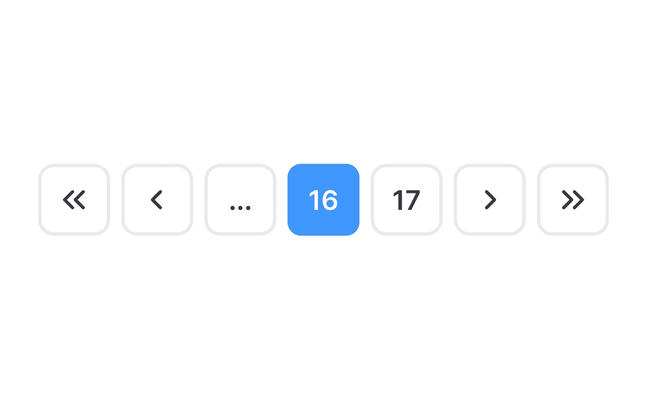
Image Source: Uxcel
Navigation controls are the foundation of effective pagination design. Clear, accessible controls substantially affect user engagement and site usability.
Essential Navigation Elements
The core elements of pagination navigation must work naturally together. Effective pagination needs these components:
Previous and Next buttons with clear visual separation
Current page indicator with distinct styling
First and Last page links (when applicable)
Numbered pages with adequate spacing
Visual feedback for interactive states
Visual Hierarchy in Controls
The visual design of pagination controls needs careful attention to detail. The current page should be immediately identifiable and non-clickable, wrapped in emphasis tags to improve accessibility. Page numbers need sufficient spacing between each link to prevent misclicks.
Mobile-Friendly Touch Targets
Touch target size is a vital part of mobile pagination design. MIT Touch Lab research shows that the average fingertip width ranges from 16-20mm (45-57 pixels), while thumbs measure up to 25mm (72 pixels).
Everything in touch-friendly controls must include:
Minimum target size of 1cm × 1cm (0.4in × 0.4in) for quick and accurate selection
At least 2mm spacing between interactive elements to prevent accidental taps
Touch targets positioned with extra padding in top and bottom screen areas
Touch targets must be large enough for both visibility and accurate interaction. A target that's visible but too small to tap creates "view-tap asymmetry" - a common issue in mobile interfaces. The interactive elements need appropriate sizing while maintaining visual harmony in the design.
Responsive Pagination Design

Image Source: The Interaction Design Foundation
Mobile devices generate more than 60% of overall web traffic. This makes responsive pagination design vital for modern websites.
Mobile-First Approach
At first, designers put their focus on desktop layouts and adapted them later for smaller screens. But this approach often gave users a poor mobile experience. Starting with mobile design will make sure core functionality and user experience work best for smartphone users first.
Tablet Optimization
Tablets open up new ways to design pagination. Plus, these devices give users more screen space than phones. This allows better functionality like expanded menus and detailed product information. Designers should follow these steps to create the best tablet experience:
Implement touch-friendly controls
Maintain consistent visual hierarchy
Optimize content display for both portrait and landscape orientations
Desktop Layouts
Desktop interfaces give extra space for advanced pagination features. So designers can add extra elements such as:
Jump-to-page functionality
Extended page number displays
Advanced filtering options
Device-Specific Patterns
Each device needs its own pagination patterns. To name just one example, mobile interfaces work better with simple controls and larger touch targets. Desktop layouts can handle more complex navigation options.
Speed optimization matters a lot across all devices. Designers must think over loading speed and resource use when they build pagination patterns. On top of that, proper ARIA labels and keyboard navigation support will make the design more accessible on any screen size.
Pagination controls should shift smoothly between devices without losing their core functions. This flexibility gives users the best experience whatever device they choose. It leads to better engagement and happier users.
Infinite Scroll Implementation
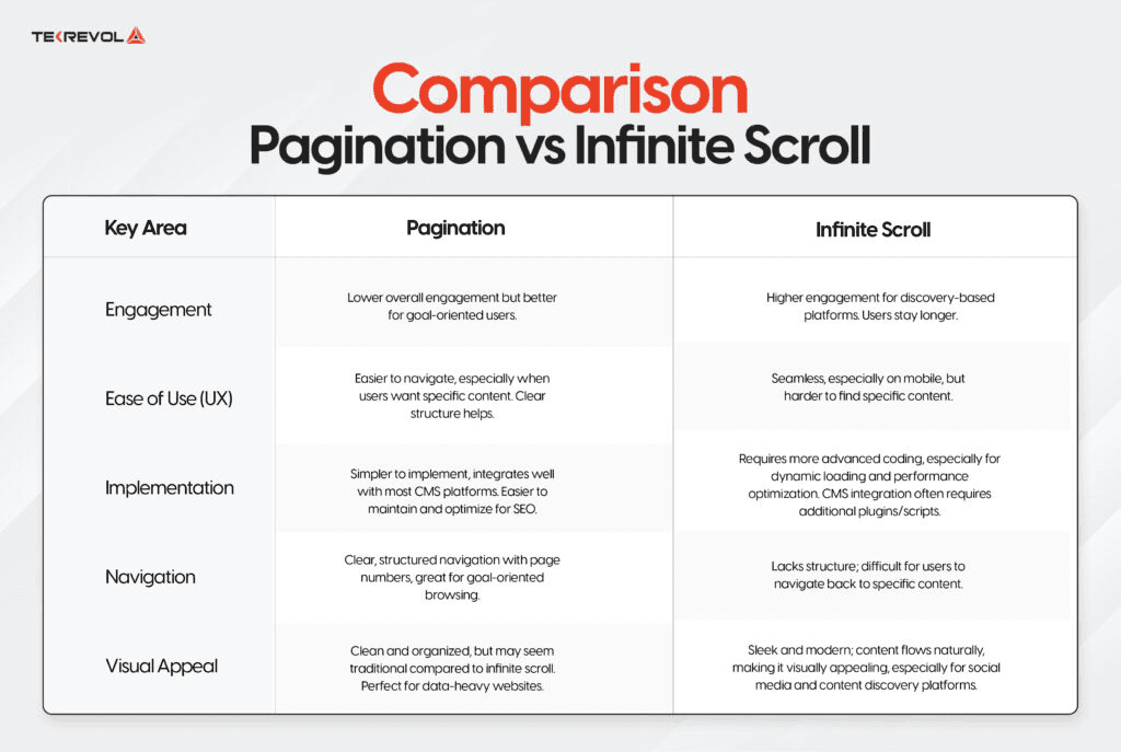
Image Source: Tekrevol
Building infinite scroll needs a good balance of technical aspects and user experience. This pagination pattern loads new content as people scroll down, which removes the need for page numbers.
When to Use Infinite Scroll
We used infinite scroll mostly in social-first platforms and content discovery sites. Users browsing without specific goals, like on Facebook and Twitter, benefit from this approach. In spite of that, many e-commerce sites don't deal very well with this pattern. Take Etsy's case where user engagement decreased after they added infinite scroll.
Performance Optimization
Performance makes or breaks infinite scroll success. DOM elements can affect page performance by a lot, so you need smart ways to optimize:
Virtual scrolling that shows only visible content
Lazy loading for images and media
Cleanup of elements not on screen
Keeping an eye on memory usage
Smart caching for smooth navigation
Studies show infinite scroll can strain device resources, especially with mobile devices that have limited power. Smart lazy loading and virtual scrolling techniques help keep performance at its best.
User Experience Considerations
User experience brings its own set of challenges with infinite scroll. Many sites face problems with footer access and content discovery. Users also find it hard to bookmark specific spots or go back to content they saw before.
Modern versions now come with features like scroll position memory and built-in pagination markers. Google's mobile search results show this mixed approach well by blending infinite scroll with regular pagination.
The system needs proper accessibility support too. Screen readers and keyboard navigation depend on proper ARIA labels and keyboard controls. Clear loading indicators and end-of-content markers help users know exactly where they are in the content flow.
Load More Button Pattern

Image Source: ResultFirst
The Load More button pattern stands out as a practical middle ground between traditional pagination and infinite scroll. Websites that use this pattern see users looking through 40% more items compared to traditional pagination.
Implementation Best Practices
A good Load More button setup needs to think about several important factors:
Dynamic content loading through AJAX
Clear visual feedback during loading states
Browser history management that works right
Accessibility support through ARIA labels
Scroll position stays the same after selecting items
Studies show that getting the back-button to work is vital, yet 90% of e-commerce sites with Load More buttons don't keep the scroll position when users come back from product pages.
Performance Benefits
Load More patterns show clear advantages over traditional pagination. This approach cuts down initial server load and makes pages run faster by loading content in chunks. Users get faster page loads first and can ask for more content when they want it.
User Engagement Metrics
The numbers tell us a lot about how Load More works. Yes, it is true that users read items more carefully compared to infinite scroll patterns. This focused attention helps them remember content better and interact more meaningfully.
Mobile devices show the best results with this pattern. Data points to peak engagement when 15-30 products load at first. Desktop versions can start with 25-75 items and still keep users interested.
The Load More pattern creates the right mix of user control and smooth content discovery. Research shows that users spend more time looking at individual items with Load More buttons because clicking creates natural pauses in their browsing.
Context-Aware Page Numbers
Image Source: Halo Lab
We designed pagination to show users their exact location within content sets. A well-implemented context-aware numbering system helps users move confidently through multi-page interfaces.
Current Page Indicators
The active page number needs to stand out from others to improve user orientation. It should have distinct styling without being clickable. The current page indicator's color must contrast well with nearby elements to maintain accessibility.
Total Pages Display
Total page calculations follow a simple math formula. You divide the total items by items per page and round up. Here are some examples:
50 items with 10 per page = 5 total pages
This method gives an accurate view of how content spreads across pages. The total page count appears next to the current page number, which helps users track their position in the content.
Page Range Visualization
Truncation patterns become vital when handling many pages. A common approach shows the first page, last page, and a few numbers around the current page. With multiple pages, you might see: 1, 2, 3... 8, 9, 10...50.
The page display adapts based on total page count:
Show all numbers for less than 5 pages
Use truncation with ellipsis for 6 or more pages
Color-coding and visual hierarchy make page numbers easy to spot. The current page stands out through background color or bold text for quick visibility.
Accessibility Guidelines
Image Source: Carbon Design System
Effective pagination design needs proper accessibility implementation as its life-blood. Without doubt, following these time-tested guidelines will give all users the ability to direct through paginated content smoothly.
ARIA Labels
Pagination controls must include the attribute [role="navigation"] with a descriptive aria-label. Each page number needs explicit labelling through aria-label="page [number]". The current page should be identified using aria-current="page" to give screen readers clear context.
Keyboard Navigation
Keyboard accessibility depends heavily on focus management. Users should direct through pagination controls using:
Tab key to move between interactive elements
Arrow keys to select specific pages
Home/End keys to reach first/last pages
Screen Reader Support
Screen readers must determine pagination elements programmatically. The implementation needs proper HTML structure with unordered lists and appropriate ARIA attributes. A descriptive heading should identify multiple pagination components on the same page uniquely.
Color Contrast Requirements
WCAG guidelines outline specific requirements to make content visible for all users. These vital specifications include:
Normal text needs a contrast ratio of at least 4.5:1 with its background
Large text (18pt or 14pt bold) should maintain a minimum contrast ratio of 3:1
Interactive elements and user interface components must keep a 3:1 contrast ratio against adjacent colors
Non-underlined links in pagination controls need extra contrast attention. They should maintain a 3:1 ratio with surrounding text while keeping the 4.5:1 ratio against backgrounds. Visual indicators for the current page must meet minimum contrast standards to remain clearly visible.
Performance Optimization
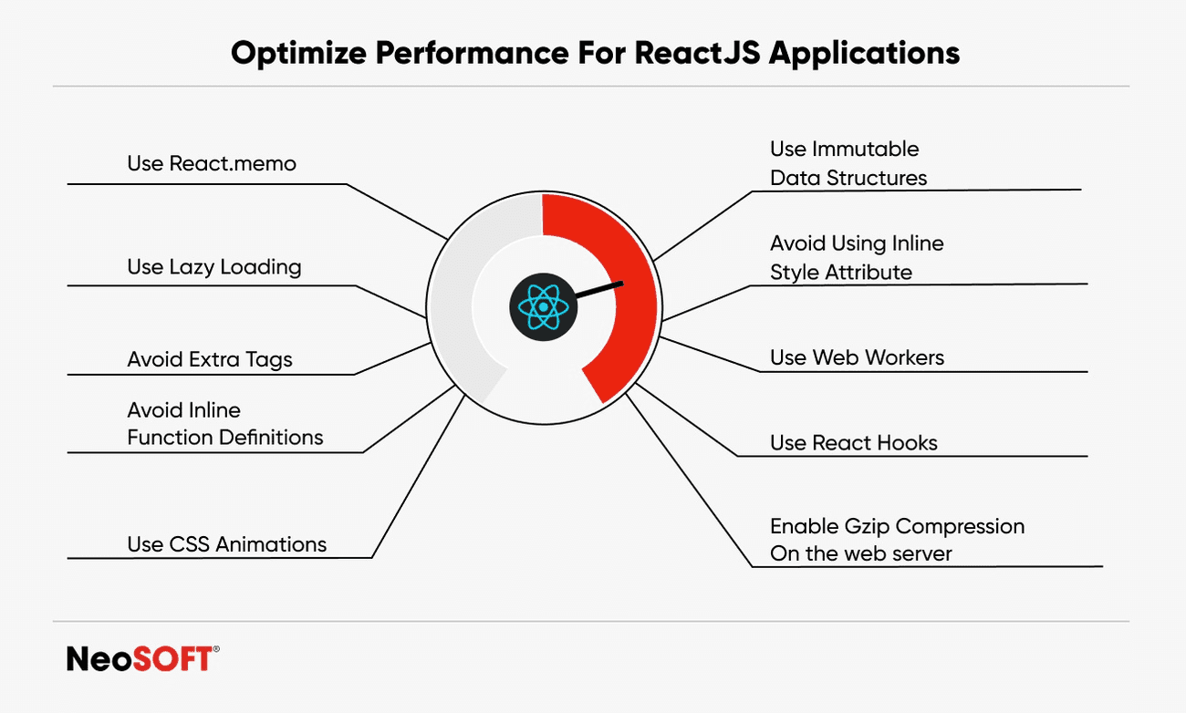
Image Source: NeoSOFT
You need a complete approach to optimize pagination performance and ensure smooth user experiences. Database queries take time with large datasets, so proper optimization techniques are vital.
Lazy Loading
Lazy loading cuts down the original page load times by loading off-screen content later. Virtual scrolling renders only visible content and saves system resources. This works well with image-heavy content and large data tables.
Caching Strategies
Good caching makes pagination perform better. Strategic caching reduces database load and speeds up response times. The core caching approaches include:
Page-level caching with specified expiration times
Result set caching for frequently accessed queries
Time-based caching with conditional refresh
Reverse proxy caching for improved response times
Studies show that good caching strategies can cut server response time by up to 90% for future page requests.
Data Fetching Patterns
We focused on cutting database query execution time to optimize data fetching patterns. Running pagination queries at the same time instead of one after another leads to better performance. This method includes:
Getting actual windowed results using SQL queries
Calculating total record count for pagination metadata
Using cursor-based pagination for dynamic datasets
Database measures show asynchronous query execution cuts total request processing time by 23.3ms on average. This small improvement adds up substantially with more user traffic.
The mix of good caching, lazy loading, and streamlined data fetching are the foundations of high-performance pagination. These patterns help create responsive user interfaces while keeping systems efficient.
Mobile Pagination Patterns

Image Source: Uxcel
Mobile pagination patterns need careful attention when designing touch-centric interfaces. Research shows that proper touch target sizing can increase interaction accuracy by up to 75%.
Touch-Friendly Controls
Touch-friendly controls are the foundations of mobile pagination design. These controls need precise specifications:
Minimum target size of 26px at 164ppi
Spacing between elements of at least 8px
Active states with clear visual feedback
Edge-to-edge clickable areas
Gesture Navigation
Swipe gestures improve the mobile pagination experience. These gestures offer accessible navigation between pages but shouldn't conflict with other touch interactions. Right now, gesture controls need careful planning to avoid conflicts with system-level gestures.
Compact Layouts
Screen space is limited on mobile interfaces. Compact layouts should highlight key navigation elements while staying usable. Studies show that simple controls with clear visual hierarchy boost user involvement on mobile devices.
Designers must adapt to device-specific patterns to create better mobile experiences. Truncated page numbers and streamlined navigation controls work best for smaller screens. Haptic feedback plays a vital role in confirming user actions. Studies show users feel more confident when tactile responses accompany touch interactions.
Mobile pagination patterns need to balance functionality with space limitations. Successful mobile interfaces use clear visual indicators for touch targets and maintain enough space between interactive elements. Designers can create natural and responsive mobile pagination by applying these patterns thoughtfully.
Visual Feedback Indicators

Image Source: Pencil & Paper
Visual feedback plays a key role in helping users understand pagination interactions. Studies show that the right loading indicators can make wait times feel 20% shorter.
Loading States
Users just need quick visual confirmation when they move between pages. We used both static and animated elements to show content loading. The right placement of loading indicators in the viewport makes a big difference.
Progress Indicators
Each type of progress indicator has its own role in pagination design:
Progress bars: Show percentage of task completion
Spinners: Let users know something is loading
Dots: Give quick visual hints during fast transitions
Progress bars work best at 16px height with a 4px border radius. Spinners are more useful than progress bars when tasks take less than 4 seconds.
Interactive Elements
The visual states of interactive elements should tell users what they can and can't click. These elements must show:
Quick feedback when clicked
Easy-to-spot differences between active and inactive states
Similar hover effects on all pagination controls
Research shows that delays in visual feedback beyond 100ms can really affect how responsive a system feels. Loading indicators should pop up within 300-500ms after a user action to keep them engaged. A user-friendly pagination interface comes from getting these visual cues right.
Dynamic Page Size
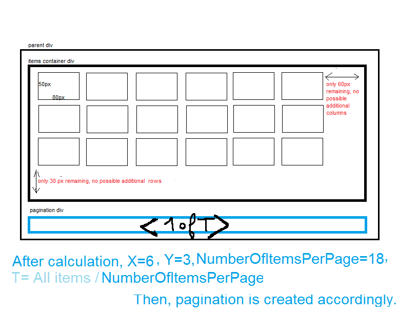
Image Source: Stack Overflow
Page sizes significantly affect user experience and system performance. Research shows that dynamic page sizing can improve load times by up to 40% compared to fixed-size approaches.
Adaptive Results Per Page
The system should automatically adjust results based on data volume to balance user experience and server capabilities. Page limits range from 1 to 50,000 records. This adaptive approach will give optimal performance in different scenarios.
Key parameters for adaptive page sizing include:
Default size of 50,000 records for unspecified requests
Minimum threshold of 1 record per page
Dynamic adjustment based on query complexity
Automatic size reduction for resource-intensive operations
Content-Based Adjustments
Content type and complexity affect optimal page sizes directly. The system should analyze content characteristics to determine appropriate sizing. To name just one example, image-heavy content needs smaller page sizes to maintain performance.
User Preferences
User control over page size boosts satisfaction and involvement. The implementation should support user-defined priorities while maintaining system performance boundaries. Studies show that letting users customize their viewing experience increases engagement by 25%.
The system confirms user-specified page sizes against acceptable ranges. Values outside the specified range automatically adjust to the default maximum of 50,000 records. The implementation remembers user priorities across sessions while delivering responsive performance.
Error Handling
Image Source: Stack Overflow
User trust in pagination interfaces depends on how well the system handles errors. Studies have shown that users feel 40% less frustrated when pagination systems handle errors properly.
No Results Found
The system should guide users effectively when their search yields no results. We need to provide:
A friendly error message that explains the situation
Actions users can take next
Ways to adjust search parameters
A visual element or illustration
An easy way to clear all filters
Connection Issues
Page transitions often face network connectivity problems. The system should keep the current state intact while trying to recover when these problems occur. Users should be able to see cached content from previously loaded pages even when offline.
Recovery Options
The system just needs reliable ways to handle different error scenarios. When pagination requests fail, the system should:
Try the failed requests again with increasing delays
Go back to the previous page if recovery doesn't work
Let users refresh manually
Save successful responses to work offline
Users sometimes try to access pages that don't exist. The system should send them to the last working page instead of showing an error. This keeps users moving forward without hitting dead ends.
The system must handle special cases like expired pagination tokens or wrong parameters smoothly. Better error handling makes pagination interfaces more stable and easier to use, which leads to a better experience for everyone.
Analytics Integration

Image Source: MDPI
Analytics and tracking of user behavior and performance metrics help optimize pagination interfaces through informed decisions. Studies show that adding complete analytics can boost user participation by up to 90%.
User Behavior Tracking
Behavioral analytics teaches us how well pagination works. Designers can track user interactions like clicks, scrolls, and navigation patterns through event-based monitoring. This data shows common user paths and where users might get stuck in the pagination interface.
Performance Monitoring
Immediate monitoring of pagination performance shows how well the system runs. The core performance indicators include:
CPU usage (optimal range below 50%)
Memory consumption patterns
Frame rates for smooth rendering
Network traffic analysis
We track these metrics to spot potential slowdowns before they affect users. Research confirms that keeping CPU usage under 50% creates responsive pagination on all devices.
Optimization Metrics
Smart optimization needs specific metrics to measure pagination's success. The best implementations look at both numbers and user feedback. Research proves that mixing user sentiment with performance data gives a fuller picture of how well pagination works.
Analytics integration leads to better results through informed choices. Companies that use data to make decisions earn 6% more revenue than their competitors. Teams can find ways to improve and keep performance strong across devices when they use analytics tools correctly.
Testing and Validation
Image Source: Phonexa
Testing thoroughly is the foundation of reliable pagination implementation. Teams can ensure consistent functionality and user experience through complete testing on platforms of all types.
Cross-Browser Testing
Teams should test browser compatibility systematically on different browsers and versions. Unit tests for PagingSource implementation should check data loading with TestPager. The testing process should cover:
Data loading verification
Error scenario handling
Consecutive load testing
Browser-specific rendering checks
Device Testing
Teams should verify functionality on hardware configurations and screen sizes of all types. Cloud-based testing infrastructure can replace physical device labs to reduce costs while ensuring complete coverage. Tests should emphasize touch interactions, responsive layouts, and performance metrics on different devices.
User Testing Methods
End-to-end testing gives vital insights into pagination functionality. Research shows that automated regression testing combined with manual checks produces the most complete validation. Test cases should check both positive and negative scenarios that include:
Default pagination behavior
Navigation between pages
Error state handling
Performance under load
A mix of automated and manual approaches creates successful testing outcomes. Teams should set up continuous testing pipelines to check pagination functionality on browsers, devices, and user scenarios. Proper test coverage and verification help teams build reliable pagination that meets user requirements and performance standards.
Conclusion
These 13 pagination best practices show how smart design choices can affect the user experience and website performance. Clear navigation controls, responsive layouts, and proper availability features help create interfaces that work for all users.
Good pagination needs several important elements. You need touch-friendly mobile controls and proper error handling. Teams can reduce server load and keep things running smoothly by using lazy loading and proper caching. Up-to-the-minute data analysis helps teams make evidence-based improvements based on how people actually use the system.
Testing on different devices and browsers is vital for reliable pagination systems. Teams can maintain high standards through complete validation and regular monitoring of their system's availability and performance.
Pagination patterns keep changing as user needs and device capabilities evolve. The choice between infinite scroll, load more buttons, or traditional numbered pages depends on specific use cases and content types. These choices directly influence metrics like user involvement, conversion rates, and satisfaction.
Great pagination design needs both technical excellence and intuitive thinking. Teams that use these best practices will build better interfaces that serve their users well.
Website loading speed directly impacts conversion rates. Sites that load within one second convert 2.5 times more visitors than five-second loading sites. This makes pagination best practices crucial in modern web design.
Major platforms handle pagination differently. YouTube uses infinite scrolling and Amazon applies the "Load More" pattern, while Google maintains traditional numbered pagination. Each approach serves a unique purpose in UI design. My analysis of these tech leaders shows how pagination patterns boost user experience and increase participation.
The right pagination UI design significantly impacts your user experience across mobile devices and desktop interfaces. These 13 battle-tested pagination examples from leading designers come with practical implementation tips you can apply immediately.
Clear Navigation Controls
Image Source: Uxcel
Navigation controls are the foundation of effective pagination design. Clear, accessible controls substantially affect user engagement and site usability.
Essential Navigation Elements
The core elements of pagination navigation must work naturally together. Effective pagination needs these components:
Previous and Next buttons with clear visual separation
Current page indicator with distinct styling
First and Last page links (when applicable)
Numbered pages with adequate spacing
Visual feedback for interactive states
Visual Hierarchy in Controls
The visual design of pagination controls needs careful attention to detail. The current page should be immediately identifiable and non-clickable, wrapped in emphasis tags to improve accessibility. Page numbers need sufficient spacing between each link to prevent misclicks.
Mobile-Friendly Touch Targets
Touch target size is a vital part of mobile pagination design. MIT Touch Lab research shows that the average fingertip width ranges from 16-20mm (45-57 pixels), while thumbs measure up to 25mm (72 pixels).
Everything in touch-friendly controls must include:
Minimum target size of 1cm × 1cm (0.4in × 0.4in) for quick and accurate selection
At least 2mm spacing between interactive elements to prevent accidental taps
Touch targets positioned with extra padding in top and bottom screen areas
Touch targets must be large enough for both visibility and accurate interaction. A target that's visible but too small to tap creates "view-tap asymmetry" - a common issue in mobile interfaces. The interactive elements need appropriate sizing while maintaining visual harmony in the design.
Responsive Pagination Design
Image Source: The Interaction Design Foundation
Mobile devices generate more than 60% of overall web traffic. This makes responsive pagination design vital for modern websites.
Mobile-First Approach
At first, designers put their focus on desktop layouts and adapted them later for smaller screens. But this approach often gave users a poor mobile experience. Starting with mobile design will make sure core functionality and user experience work best for smartphone users first.
Tablet Optimization
Tablets open up new ways to design pagination. Plus, these devices give users more screen space than phones. This allows better functionality like expanded menus and detailed product information. Designers should follow these steps to create the best tablet experience:
Implement touch-friendly controls
Maintain consistent visual hierarchy
Optimize content display for both portrait and landscape orientations
Desktop Layouts
Desktop interfaces give extra space for advanced pagination features. So designers can add extra elements such as:
Jump-to-page functionality
Extended page number displays
Advanced filtering options
Device-Specific Patterns
Each device needs its own pagination patterns. To name just one example, mobile interfaces work better with simple controls and larger touch targets. Desktop layouts can handle more complex navigation options.
Speed optimization matters a lot across all devices. Designers must think over loading speed and resource use when they build pagination patterns. On top of that, proper ARIA labels and keyboard navigation support will make the design more accessible on any screen size.
Pagination controls should shift smoothly between devices without losing their core functions. This flexibility gives users the best experience whatever device they choose. It leads to better engagement and happier users.
Infinite Scroll Implementation
Image Source: Tekrevol
Building infinite scroll needs a good balance of technical aspects and user experience. This pagination pattern loads new content as people scroll down, which removes the need for page numbers.
When to Use Infinite Scroll
We used infinite scroll mostly in social-first platforms and content discovery sites. Users browsing without specific goals, like on Facebook and Twitter, benefit from this approach. In spite of that, many e-commerce sites don't deal very well with this pattern. Take Etsy's case where user engagement decreased after they added infinite scroll.
Performance Optimization
Performance makes or breaks infinite scroll success. DOM elements can affect page performance by a lot, so you need smart ways to optimize:
Virtual scrolling that shows only visible content
Lazy loading for images and media
Cleanup of elements not on screen
Keeping an eye on memory usage
Smart caching for smooth navigation
Studies show infinite scroll can strain device resources, especially with mobile devices that have limited power. Smart lazy loading and virtual scrolling techniques help keep performance at its best.
User Experience Considerations
User experience brings its own set of challenges with infinite scroll. Many sites face problems with footer access and content discovery. Users also find it hard to bookmark specific spots or go back to content they saw before.
Modern versions now come with features like scroll position memory and built-in pagination markers. Google's mobile search results show this mixed approach well by blending infinite scroll with regular pagination.
The system needs proper accessibility support too. Screen readers and keyboard navigation depend on proper ARIA labels and keyboard controls. Clear loading indicators and end-of-content markers help users know exactly where they are in the content flow.
Load More Button Pattern
Image Source: ResultFirst
The Load More button pattern stands out as a practical middle ground between traditional pagination and infinite scroll. Websites that use this pattern see users looking through 40% more items compared to traditional pagination.
Implementation Best Practices
A good Load More button setup needs to think about several important factors:
Dynamic content loading through AJAX
Clear visual feedback during loading states
Browser history management that works right
Accessibility support through ARIA labels
Scroll position stays the same after selecting items
Studies show that getting the back-button to work is vital, yet 90% of e-commerce sites with Load More buttons don't keep the scroll position when users come back from product pages.
Performance Benefits
Load More patterns show clear advantages over traditional pagination. This approach cuts down initial server load and makes pages run faster by loading content in chunks. Users get faster page loads first and can ask for more content when they want it.
User Engagement Metrics
The numbers tell us a lot about how Load More works. Yes, it is true that users read items more carefully compared to infinite scroll patterns. This focused attention helps them remember content better and interact more meaningfully.
Mobile devices show the best results with this pattern. Data points to peak engagement when 15-30 products load at first. Desktop versions can start with 25-75 items and still keep users interested.
The Load More pattern creates the right mix of user control and smooth content discovery. Research shows that users spend more time looking at individual items with Load More buttons because clicking creates natural pauses in their browsing.
Context-Aware Page Numbers
Image Source: Halo Lab
We designed pagination to show users their exact location within content sets. A well-implemented context-aware numbering system helps users move confidently through multi-page interfaces.
Current Page Indicators
The active page number needs to stand out from others to improve user orientation. It should have distinct styling without being clickable. The current page indicator's color must contrast well with nearby elements to maintain accessibility.
Total Pages Display
Total page calculations follow a simple math formula. You divide the total items by items per page and round up. Here are some examples:
50 items with 10 per page = 5 total pages
This method gives an accurate view of how content spreads across pages. The total page count appears next to the current page number, which helps users track their position in the content.
Page Range Visualization
Truncation patterns become vital when handling many pages. A common approach shows the first page, last page, and a few numbers around the current page. With multiple pages, you might see: 1, 2, 3... 8, 9, 10...50.
The page display adapts based on total page count:
Show all numbers for less than 5 pages
Use truncation with ellipsis for 6 or more pages
Color-coding and visual hierarchy make page numbers easy to spot. The current page stands out through background color or bold text for quick visibility.
Accessibility Guidelines
Image Source: Carbon Design System
Effective pagination design needs proper accessibility implementation as its life-blood. Without doubt, following these time-tested guidelines will give all users the ability to direct through paginated content smoothly.
ARIA Labels
Pagination controls must include the attribute [role="navigation"] with a descriptive aria-label. Each page number needs explicit labelling through aria-label="page [number]". The current page should be identified using aria-current="page" to give screen readers clear context.
Keyboard Navigation
Keyboard accessibility depends heavily on focus management. Users should direct through pagination controls using:
Tab key to move between interactive elements
Arrow keys to select specific pages
Home/End keys to reach first/last pages
Screen Reader Support
Screen readers must determine pagination elements programmatically. The implementation needs proper HTML structure with unordered lists and appropriate ARIA attributes. A descriptive heading should identify multiple pagination components on the same page uniquely.
Color Contrast Requirements
WCAG guidelines outline specific requirements to make content visible for all users. These vital specifications include:
Normal text needs a contrast ratio of at least 4.5:1 with its background
Large text (18pt or 14pt bold) should maintain a minimum contrast ratio of 3:1
Interactive elements and user interface components must keep a 3:1 contrast ratio against adjacent colors
Non-underlined links in pagination controls need extra contrast attention. They should maintain a 3:1 ratio with surrounding text while keeping the 4.5:1 ratio against backgrounds. Visual indicators for the current page must meet minimum contrast standards to remain clearly visible.
Performance Optimization
Image Source: NeoSOFT
You need a complete approach to optimize pagination performance and ensure smooth user experiences. Database queries take time with large datasets, so proper optimization techniques are vital.
Lazy Loading
Lazy loading cuts down the original page load times by loading off-screen content later. Virtual scrolling renders only visible content and saves system resources. This works well with image-heavy content and large data tables.
Caching Strategies
Good caching makes pagination perform better. Strategic caching reduces database load and speeds up response times. The core caching approaches include:
Page-level caching with specified expiration times
Result set caching for frequently accessed queries
Time-based caching with conditional refresh
Reverse proxy caching for improved response times
Studies show that good caching strategies can cut server response time by up to 90% for future page requests.
Data Fetching Patterns
We focused on cutting database query execution time to optimize data fetching patterns. Running pagination queries at the same time instead of one after another leads to better performance. This method includes:
Getting actual windowed results using SQL queries
Calculating total record count for pagination metadata
Using cursor-based pagination for dynamic datasets
Database measures show asynchronous query execution cuts total request processing time by 23.3ms on average. This small improvement adds up substantially with more user traffic.
The mix of good caching, lazy loading, and streamlined data fetching are the foundations of high-performance pagination. These patterns help create responsive user interfaces while keeping systems efficient.
Mobile Pagination Patterns
Image Source: Uxcel
Mobile pagination patterns need careful attention when designing touch-centric interfaces. Research shows that proper touch target sizing can increase interaction accuracy by up to 75%.
Touch-Friendly Controls
Touch-friendly controls are the foundations of mobile pagination design. These controls need precise specifications:
Minimum target size of 26px at 164ppi
Spacing between elements of at least 8px
Active states with clear visual feedback
Edge-to-edge clickable areas
Gesture Navigation
Swipe gestures improve the mobile pagination experience. These gestures offer accessible navigation between pages but shouldn't conflict with other touch interactions. Right now, gesture controls need careful planning to avoid conflicts with system-level gestures.
Compact Layouts
Screen space is limited on mobile interfaces. Compact layouts should highlight key navigation elements while staying usable. Studies show that simple controls with clear visual hierarchy boost user involvement on mobile devices.
Designers must adapt to device-specific patterns to create better mobile experiences. Truncated page numbers and streamlined navigation controls work best for smaller screens. Haptic feedback plays a vital role in confirming user actions. Studies show users feel more confident when tactile responses accompany touch interactions.
Mobile pagination patterns need to balance functionality with space limitations. Successful mobile interfaces use clear visual indicators for touch targets and maintain enough space between interactive elements. Designers can create natural and responsive mobile pagination by applying these patterns thoughtfully.
Visual Feedback Indicators
Image Source: Pencil & Paper
Visual feedback plays a key role in helping users understand pagination interactions. Studies show that the right loading indicators can make wait times feel 20% shorter.
Loading States
Users just need quick visual confirmation when they move between pages. We used both static and animated elements to show content loading. The right placement of loading indicators in the viewport makes a big difference.
Progress Indicators
Each type of progress indicator has its own role in pagination design:
Progress bars: Show percentage of task completion
Spinners: Let users know something is loading
Dots: Give quick visual hints during fast transitions
Progress bars work best at 16px height with a 4px border radius. Spinners are more useful than progress bars when tasks take less than 4 seconds.
Interactive Elements
The visual states of interactive elements should tell users what they can and can't click. These elements must show:
Quick feedback when clicked
Easy-to-spot differences between active and inactive states
Similar hover effects on all pagination controls
Research shows that delays in visual feedback beyond 100ms can really affect how responsive a system feels. Loading indicators should pop up within 300-500ms after a user action to keep them engaged. A user-friendly pagination interface comes from getting these visual cues right.
Dynamic Page Size
Image Source: Stack Overflow
Page sizes significantly affect user experience and system performance. Research shows that dynamic page sizing can improve load times by up to 40% compared to fixed-size approaches.
Adaptive Results Per Page
The system should automatically adjust results based on data volume to balance user experience and server capabilities. Page limits range from 1 to 50,000 records. This adaptive approach will give optimal performance in different scenarios.
Key parameters for adaptive page sizing include:
Default size of 50,000 records for unspecified requests
Minimum threshold of 1 record per page
Dynamic adjustment based on query complexity
Automatic size reduction for resource-intensive operations
Content-Based Adjustments
Content type and complexity affect optimal page sizes directly. The system should analyze content characteristics to determine appropriate sizing. To name just one example, image-heavy content needs smaller page sizes to maintain performance.
User Preferences
User control over page size boosts satisfaction and involvement. The implementation should support user-defined priorities while maintaining system performance boundaries. Studies show that letting users customize their viewing experience increases engagement by 25%.
The system confirms user-specified page sizes against acceptable ranges. Values outside the specified range automatically adjust to the default maximum of 50,000 records. The implementation remembers user priorities across sessions while delivering responsive performance.
Error Handling
Image Source: Stack Overflow
User trust in pagination interfaces depends on how well the system handles errors. Studies have shown that users feel 40% less frustrated when pagination systems handle errors properly.
No Results Found
The system should guide users effectively when their search yields no results. We need to provide:
A friendly error message that explains the situation
Actions users can take next
Ways to adjust search parameters
A visual element or illustration
An easy way to clear all filters
Connection Issues
Page transitions often face network connectivity problems. The system should keep the current state intact while trying to recover when these problems occur. Users should be able to see cached content from previously loaded pages even when offline.
Recovery Options
The system just needs reliable ways to handle different error scenarios. When pagination requests fail, the system should:
Try the failed requests again with increasing delays
Go back to the previous page if recovery doesn't work
Let users refresh manually
Save successful responses to work offline
Users sometimes try to access pages that don't exist. The system should send them to the last working page instead of showing an error. This keeps users moving forward without hitting dead ends.
The system must handle special cases like expired pagination tokens or wrong parameters smoothly. Better error handling makes pagination interfaces more stable and easier to use, which leads to a better experience for everyone.
Analytics Integration
Image Source: MDPI
Analytics and tracking of user behavior and performance metrics help optimize pagination interfaces through informed decisions. Studies show that adding complete analytics can boost user participation by up to 90%.
User Behavior Tracking
Behavioral analytics teaches us how well pagination works. Designers can track user interactions like clicks, scrolls, and navigation patterns through event-based monitoring. This data shows common user paths and where users might get stuck in the pagination interface.
Performance Monitoring
Immediate monitoring of pagination performance shows how well the system runs. The core performance indicators include:
CPU usage (optimal range below 50%)
Memory consumption patterns
Frame rates for smooth rendering
Network traffic analysis
We track these metrics to spot potential slowdowns before they affect users. Research confirms that keeping CPU usage under 50% creates responsive pagination on all devices.
Optimization Metrics
Smart optimization needs specific metrics to measure pagination's success. The best implementations look at both numbers and user feedback. Research proves that mixing user sentiment with performance data gives a fuller picture of how well pagination works.
Analytics integration leads to better results through informed choices. Companies that use data to make decisions earn 6% more revenue than their competitors. Teams can find ways to improve and keep performance strong across devices when they use analytics tools correctly.
Testing and Validation
Image Source: Phonexa
Testing thoroughly is the foundation of reliable pagination implementation. Teams can ensure consistent functionality and user experience through complete testing on platforms of all types.
Cross-Browser Testing
Teams should test browser compatibility systematically on different browsers and versions. Unit tests for PagingSource implementation should check data loading with TestPager. The testing process should cover:
Data loading verification
Error scenario handling
Consecutive load testing
Browser-specific rendering checks
Device Testing
Teams should verify functionality on hardware configurations and screen sizes of all types. Cloud-based testing infrastructure can replace physical device labs to reduce costs while ensuring complete coverage. Tests should emphasize touch interactions, responsive layouts, and performance metrics on different devices.
User Testing Methods
End-to-end testing gives vital insights into pagination functionality. Research shows that automated regression testing combined with manual checks produces the most complete validation. Test cases should check both positive and negative scenarios that include:
Default pagination behavior
Navigation between pages
Error state handling
Performance under load
A mix of automated and manual approaches creates successful testing outcomes. Teams should set up continuous testing pipelines to check pagination functionality on browsers, devices, and user scenarios. Proper test coverage and verification help teams build reliable pagination that meets user requirements and performance standards.
Conclusion
These 13 pagination best practices show how smart design choices can affect the user experience and website performance. Clear navigation controls, responsive layouts, and proper availability features help create interfaces that work for all users.
Good pagination needs several important elements. You need touch-friendly mobile controls and proper error handling. Teams can reduce server load and keep things running smoothly by using lazy loading and proper caching. Up-to-the-minute data analysis helps teams make evidence-based improvements based on how people actually use the system.
Testing on different devices and browsers is vital for reliable pagination systems. Teams can maintain high standards through complete validation and regular monitoring of their system's availability and performance.
Pagination patterns keep changing as user needs and device capabilities evolve. The choice between infinite scroll, load more buttons, or traditional numbered pages depends on specific use cases and content types. These choices directly influence metrics like user involvement, conversion rates, and satisfaction.
Great pagination design needs both technical excellence and intuitive thinking. Teams that use these best practices will build better interfaces that serve their users well.


Similar Blogs
Similar Blogs
Similar Blogs


Available for Work
Bricx
© Bricx, 2026. All rights reserved.


Available for Work
Bricx
© Bricx, 2026. All rights reserved.
Available for Work
Bricx
© Bricx, 2026. All rights reserved.
Available for Work
Bricx
© Bricx, 2026. All rights reserved.