Product Design
Product Design
Product Design
Insights
Insights
Insights
February 16, 2025
February 16, 2025
February 16, 2025
13 Muted Colors for Modern Web Design (With Real Examples)
13 Muted Colors for Modern Web Design (With Real Examples)
13 Muted Colors for Modern Web Design (With Real Examples)
Upgrade your design game! Explore 13 muted color palettes, real brand examples & modern color-mixing techniques.
Upgrade your design game! Explore 13 muted color palettes, real brand examples & modern color-mixing techniques.
Upgrade your design game! Explore 13 muted color palettes, real brand examples & modern color-mixing techniques.
4 Min Read
4 Min Read
4 Min Read


13 Beautiful Muted Colors for Modern Web Design [+ Real Examples]
Tired of websites that assault your senses with bright, aggressive colors? You're not alone. Muted colors now dominate web design in 2026 and create a more serene, modern digital experience.
Traditional web design relied heavily on vibrant hues. Today's muted colors - desaturated tones that look softer and more natural - have redefined our approach to digital aesthetics. These colors, mixed with gray or complementary shades, do more than please your eyes. They help prevent screen fatigue and enhance your browsing experience.
Our collection features 13 of the best muted color schemes for user interfaces that strike the perfect balance between sophistication & functionality. Warm grays blend with soft pinks, while sage greens complement cool grays. These combinations mirror nature's palette and keep their modern appeal. Let's see how these colors can elevate your web design projects.
What Are Muted Colors? A Modern Design Perspective
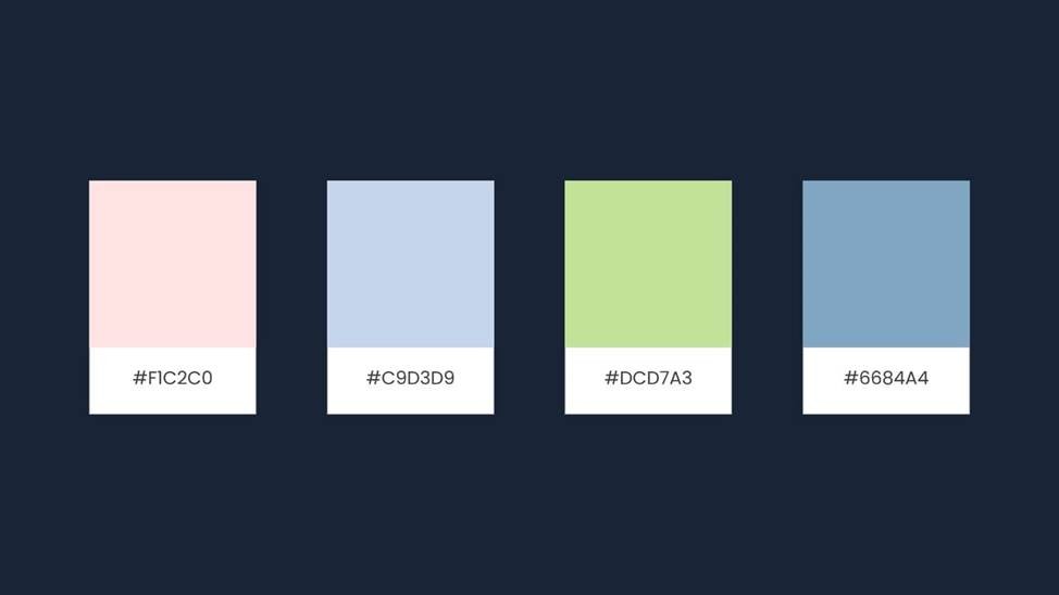
Image Source: Pixel True
Muted colors have become a defining element in modern web design. They offer a sophisticated alternative to bright hues. These colors come from desaturation - a process of reducing color intensity by mixing with gray or complementary colors.
Understanding Color Desaturation
The process of desaturation reduces a color's saturation level until it moves closer to gray on the color spectrum. This method creates softer, more subdued versions of original colors that look somewhat dull or washed out. Artists can also achieve desaturation when they mix colors with their complementary opposites - like red with green or blue with orange - which naturally cancel each other out.
The Psychology Behind Muted Colors
Research shows that muted colors change user behavior and emotional responses by a lot. These subdued tones are easier on the eyes and work especially well in flat designs. To cite an instance, soft blues and grays help reduce screen fatigue and create a natural, effortless viewing experience.
On top of that, muted colors create specific emotional responses:
Sophistication and tranquility
Modernity and relevance
Progressive thinking and efficiency
Why Muted Colors Are Trending in 2026
Muted colors have gained popularity due to several factors. Color forecasters have noticed a fundamental change toward contemplative colors that feel familiar yet nuanced. Designers now prefer complex, muddier versions of pink, purple, green, and yellow tones with earthy, grounded bases.
The color trends of 2026 show a move away from the Y2K esthetic and embrace earlier decades' influences. This change lines up with Art Deco elements making a comeback and folk-inspired design, which creates more interest in vintage-inspired colors with rich, sophisticated undertones.
This shift toward muted colors reflects a broader cultural movement. Paint manufacturers expect consumers to move from popular neutrals to "quietly colorful" hues in 2026. These diffused, mellow shades are a great way to add and layer color while keeping harmony across different design elements.
Muted colors bring practical benefits to digital interfaces. They enhance web design functionality and add visual interest without making things complicated. This balance of esthetics and usability makes them valuable tools for creating easy-to-use, modern websites that look appealing without overwhelming visitors.
Creating Perfect Muted Color Palettes

Image Source: DesignCrowd blog
The perfect muted color palette emerges from a careful mix of art and science. The right techniques and tools will give a design that looks great and remains available to everyone.
Color Mixing Techniques
Muted colors come to life through specific mixing methods that produce sophisticated results. The basic approach involves adding gray to reduce a color's vibrancy. Experienced designers get more nuanced results by blending colors with their complementary counterparts - red mixes with green, blue combines with orange.
Successful muted palettes retain their character through careful color manipulation instead of just darkening or lightening hues. You need to experiment with different ratios and values to achieve the effect you want.
Digital Color Tools
Design software today offers powerful features to create muted color combinations. Adobe Color's online color wheel automatically applies color harmony rules. Notwithstanding that, designers must understand that digital color mixing isn't exact science - it takes testing of different combinations and tones to get the desired outcome.
Digital tools require attention to these aspects:
Saturation controls help decrease color intensity
Transparency settings create subtle variations
Overlay techniques produce complex color interactions
Accessibility Considerations
Modern web design pioneers accessibility, especially when you have muted colors in play. WCAG guidelines state that text colors must maintain a minimum contrast ratio of 4.5:1 for small text and 3:1 for large text.
Your muted palette can stay both accessible and attractive if you:
Test color combinations against light and dark backgrounds
Check contrast ratios with specialized tools
Think over how colors look under different screen settings
CIELAB, a perceptually uniform color space, helps designers learn about how human eyes see colors rather than how computers display them. This knowledge is a vital part of creating accessible muted palettes that look appealing across devices and viewing conditions.
Muted Blue-Gray (#7D8491)

Image Source: Color-Name.com
Blue-gray is one of the most versatile muted colors in modern web design. This sophisticated blend of tranquility and professionalism combines the calmness of blue with the neutrality of gray. The shade (#7D8491) creates a balanced tone that works well in various digital applications.
Design Applications
This muted blue-gray tone adapts well to different design contexts. The low saturation of this shade reduces eye strain during prolonged screen viewing. The color creates a natural and effortless viewing experience in flat designs while maintaining high usability standards.
This shade works best in:
Corporate websites and professional platforms
Digital presentations and reports
User interface elements requiring subtle emphasis
Background elements that need to support foreground content
The natural ability of this color creates depth without overwhelming the viewer. It makes an ideal choice for modern minimalist designs. The balanced nature lets other design elements stand out effectively.
Brand Examples
Major companies now use muted blue-gray in their digital presence. The shade has become popular because it shows both competence and approachability at the same time.
Some successful implementations include:
Financial institutions use this tone to show stability and trustworthiness. Healthcare providers add it to their digital platforms to create calming, professional environments. Tech companies pair it with white or lighter grays to achieve a clean, sophisticated look that improves user experience.
Muted blue-gray's success in branding comes from its subtle psychological effect. Studies show this particular shade creates feelings of:
Trust and dependability
Professional competence
Emotional stability
Modern sophistication
The combination of muted blue-gray with complementary colors creates harmonious palettes. These palettes keep visual interest high without causing cognitive overload. This balance makes the shade valuable for brands that want to build a strong digital presence and keep users engaged.
Sage Green (#B2AC88)
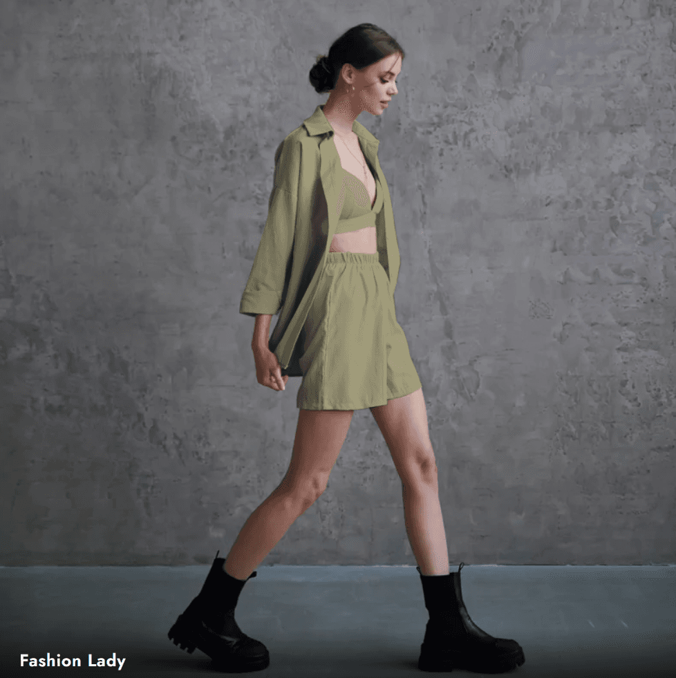
Image Source: Color-Name.com
Sage green (#B2AC88) stands out among muted colors by combining nature's calming essence with modern sophistication. The dried leaves of the Mediterranean sage plant give this grayish-green hue its unique power to create peaceful digital spaces.
Design Applications
Web interfaces become balanced and harmonious with sage green. The color achieves its muted quality through a precise blend of 69.8% red, 67.5% green, and 53.3% blue. This makes it perfect for:
Background patterns and image presets
Presentation designs that need clear content
Event flyers and digital marketing materials
Brands focused on wellness, sustainability, and organic products find this color's natural connection to growth especially appealing.
Color Combinations
Sage green pairs beautifully with many colors, showing its true versatility. The best combinations include:
Navy blue that creates coastal themes
Muted reds and purples for sophisticated contrast
Gold or brass accents that add elegance
Modern web designers often pair sage green with white for freshness, gray for professionalism, or terracotta for warmth. These pairings create depth while keeping the color's calming nature intact.
Real-Life Examples
Many prominent brands use sage green effectively in their digital presence. Healthcare providers add it to create healing and tranquility. Environmental organizations use its natural associations to show their steadfast dedication to sustainability.
The color's success in real-life applications comes from its psychological effects. Sage green creates feelings of:
Security and peacefulness
Stability and endurance
Growth and renewal
The hex code #B2AC88 converts to specific CMYK values of 0% cyan, 3% magenta, 24% yellow, and 30% black. These precise values help create consistent results across digital platforms and print materials. Brands can maintain their sophisticated appeal while staying consistent.
Dusty Rose (#C4A19B)
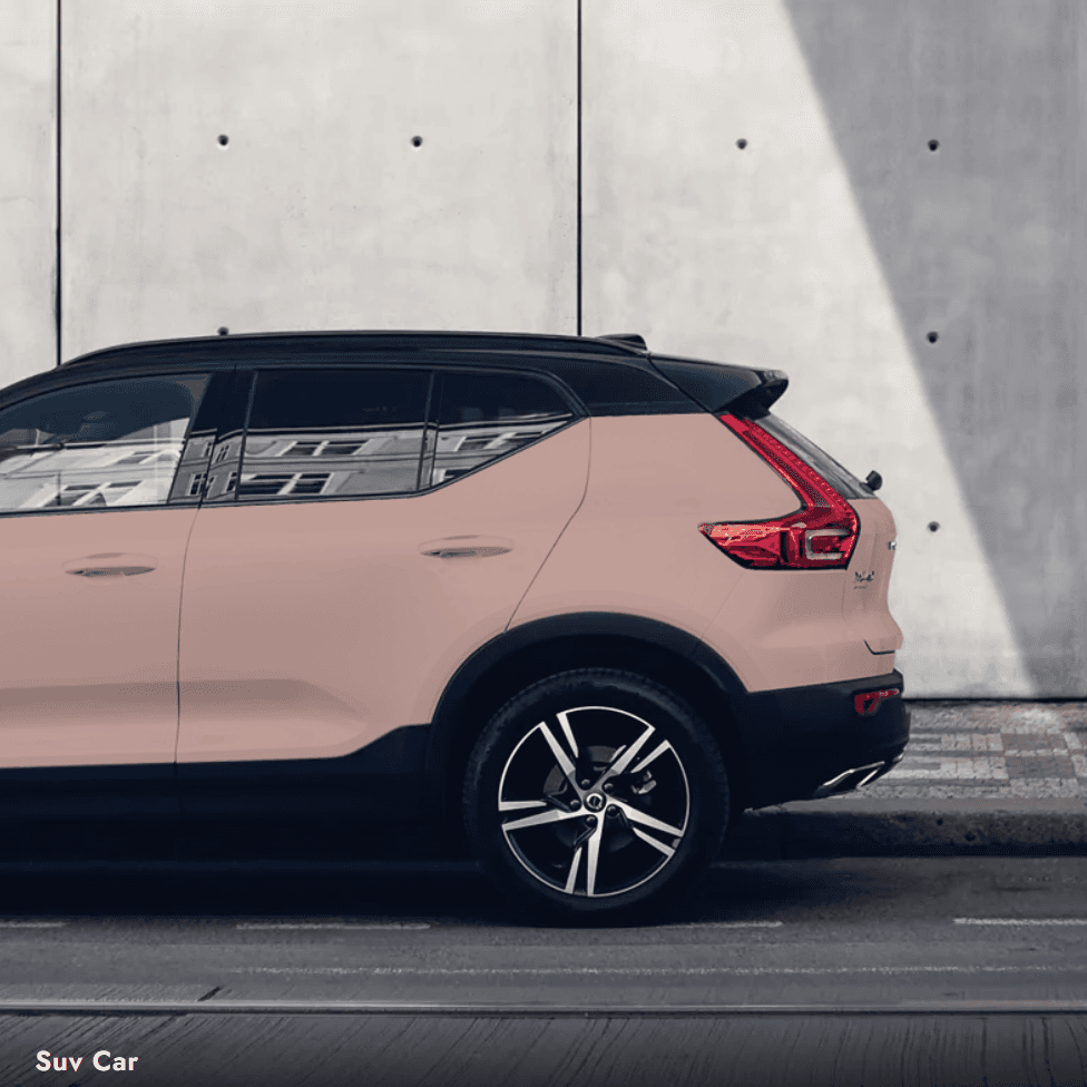
Image Source: Color-Name.com
Dusty rose (#C4A19B) stands out with its gentle mix of pink and violet undertones. This light grayish-red shade adds depth and calm to modern web designs. The color comes with RGB values of 86.3% red, 68.2% green, and 58.8% blue.
Best Use Cases
Dusty rose works perfectly in designs that need sophistication without being too bright. The color's hex code #DCAE96 matches CMYK values of 0% cyan, 21% magenta, 32% yellow, and 14% black. These values help maintain consistency across digital platforms.
This soft tone works great in:
Wedding and event planning websites
Beauty and wellness platforms
Interior design portfolios
Fashion and lifestyle blogs
Complementary Colors
Dusty rose pairs beautifully with several colors. The best combinations include:
Dark natural green creates a balanced look, while nude champagne adds subtle sophistication. Silver gray brings modern refinement. Together, these colors create an eye-catching palette that doesn't tire viewers.
Brand Examples
Many brands use dusty rose's emotional appeal in different industries. The color's subtle blue undertones create depth and peace. This makes it perfect for:
Luxury fashion houses choose this shade to show refined elegance. Beauty brands add it to their digital presence because it suggests gentleness and understanding. Healthcare providers value its calming effects, as studies show certain pink shades can help reduce aggressive behavior.
The color's history makes it even more appealing. Dusty rose was once linked to masculinity in the 18th century because of its military connections. Today, it represents a more balanced, gender-neutral look in modern design. This change mirrors broader cultural shifts, making it popular in minimalist tech interfaces and contemporary web design.
Muted Navy (#34435E)
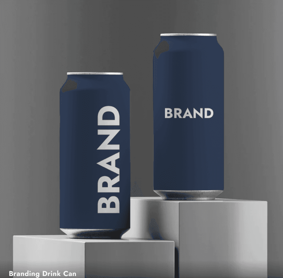
Image Source: Color-Name.com
Muted navy (#34435E) stands out as a commanding yet calming choice among desaturated colors. This deep, rich shade strikes a perfect balance between authority and approachability, making it a great asset in modern web design.
Design Impact
The psychological influence of muted navy goes beyond simple esthetics. This desaturated version creates a welcoming atmosphere while you retain control over professional credibility. Studies show that muted navy helps reduce visual fatigue when users view screens for long periods.
The color demonstrates its effects through:
Better readability with light text
Clear visual hierarchy in interface elements
Greater user trust and involvement
Pairing Suggestions
Muted navy shows remarkable flexibility in color combinations. The best pairings include:
Gold or metallic accents add sophisticated contrast, while warm wood tones bring natural warmth and depth. Light turquoise or aqua shades provide refreshing complements that work well in modern interface designs.
In stark comparison to this common belief, muted navy pairs well with black when balanced properly. The secret lies in adding enough white space or gray elements to avoid visual heaviness.
Implementation Tips
The successful use of muted navy depends on several key factors. The shade works best with cream or off-white text rather than pure white to ensure proper contrast ratios for accessibility.
The best results come from:
Using it as a primary color for headers or navigation elements
Combining it with lighter neutrals for balance
Adding it as an accent in call-to-action buttons
Muted navy excels in corporate environments where trust and professionalism matter most. The color's sophistication makes it perfect for financial websites, professional services platforms, and enterprise applications that need to build user confidence.
Research shows this shade helps promote concentration without causing eye strain. This quality makes it valuable for content-heavy sections and reading areas in digital interfaces.
Warm Gray (#8B8589)
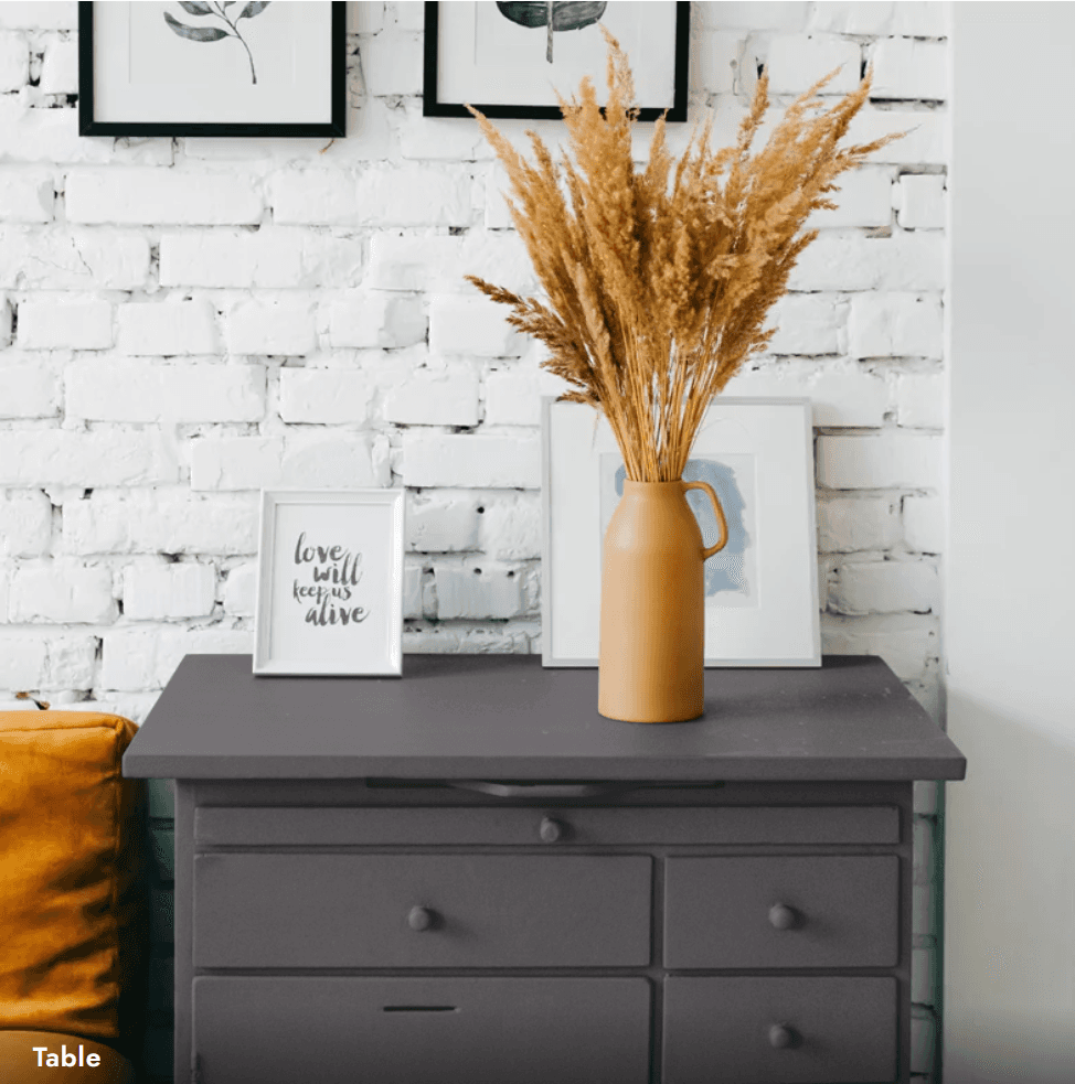
Image Source: Color-Name.com
Warm gray (#8B8589) emerges as a sophisticated neutral that connects modern esthetics with timeless design. This adaptable shade combines 54.5% red, 52.2% green, and 53.7% blue to create a unique mix of warmth and neutrality that makes it different from standard grays.
Versatility in Design
The adaptability of warm gray shows in its natural ability to work with different color schemes. The hex code #8B8589 blends smoothly with cool and warm tones. This shade works best when paired with:
Coral (#FF8559) to add energetic accents
Mint Green (#ADEBB3) to create refreshing sophistication
Navy Blue (#000080) to add modern depth
Color Psychology
Warm gray affects more than just visual appeal. This shade creates an atmosphere of professionalism and sophistication, though it might seem moody or depressing without proper balance. The subtle brown undertones add a cozy feel to its versatile nature, which makes it perfect to create welcoming digital spaces.
Example Applications
Warm gray shows remarkable flexibility in different design contexts. Its CMYK values of 0% cyan, 4.3% magenta, 1.4% yellow, and 45.5% black help maintain consistency across platforms.
This color excels in:
Corporate websites that need a professional look
Digital interfaces that require subtle hierarchy
Background elements that support stronger accent colors
Warm gray stands out in minimalist designs where its subtle warmth eliminates the cold feel of cooler grays. Jewel tones paired with warm gray create sophisticated palettes that keep visual interest without overwhelming the design. The balanced undertones make this shade effective in modern interfaces where readability and user comfort matter most.
Soft Terracotta (#D4A59A)

Image Source: Color-Name.com
Soft terracotta (#D4A59A) strikes a perfect balance between warmth and subtlety in the muted color spectrum. This gentle hue, with RGB values of 89% red, 32.5% green, and 21.2% blue, creates a welcoming digital atmosphere that doesn't overwhelm users.
Modern Applications
Soft terracotta is a great choice in today's web design for many digital platforms. The color's CMYK values of 0% cyan, 63% magenta, 76% yellow, and 11% black help maintain consistency across different mediums. This warm shade works exceptionally well for:
Wellness and lifestyle platforms
Interior design portfolios
Cultural heritage websites
Sustainable brand interfaces
Color Harmony
Soft terracotta shows remarkable versatility in its harmonious combinations. The color creates striking visual effects with:
Turquoise (#40E0D0) provides a refreshing contrast that improves visual hierarchy. Champagne (#F7E6CA) adds sophistication often found in Spanish Colonial design esthetics. Royal blue (#305CDE) creates an elegant contrast that highlights key interface elements.
Case Studies
Major brands use soft terracotta's psychological effects to create engaging digital experiences. Interior design platforms choose this shade to evoke feelings of nurturing and protection. Wellness brands add it to their interfaces to promote serenity and groundedness.
The color's success comes from its ability to create depth without dominating the visual hierarchy. When properly used, soft terracotta boosts user engagement by:
Reducing visual fatigue with its muted undertones
Building emotional connections through its earthy warmth
Supporting accessibility with strong contrast potential
Soft terracotta's hex code #D4A59A works well across digital platforms and keeps its warm, inviting qualities even under different screen conditions. This technical precision helps maintain consistent brand representation while creating an environment that encourages users to stay longer.
Faded Denim (#6E8CAF)

Image Source: Color-Name.com
Faded denim (#6E8CAF) feels like your favorite pair of worn jeans and adds nostalgia and comfort to modern web design. This adaptable shade, with RGB values of 110, 140, 175, creates a welcoming digital space that appeals to users who want familiar yet sophisticated interfaces.
Design Context
The color's connection to comfort and lifestyle makes it perfect for brands that value authenticity and relatability. Balanced undertones help prevent visual fatigue when users spend long hours viewing the content.
This shade works best in:
Digital marketing platforms
Lifestyle and fashion websites
Corporate communications
Social media interfaces
Color Matching
Faded denim blends smoothly with many colors when used correctly. Orange acts as its natural complement and creates a perfect balance between cool and warm tones. The color works exceptionally well with:
Charcoal gray boosts its professional look and makes it perfect for corporate websites. Coral adds energy without overpowering the base tone. Metallic accents, especially gold or brass, improve the overall esthetic with subtle touches.
Success Stories
Major brands in every industry use faded denim's psychological effects to create engaging digital experiences. Fashion retailers choose this shade to create feelings of authenticity and timeless style. Tech companies add it to their interfaces to build trust and reliability.
The color stands out in digital applications because it ages gracefully, just like real denim. This quality creates visual interest through subtle changes in tone and depth. Research shows that websites using faded denim in their color schemes see more user activity, mainly because people find the shade familiar and comfortable.
The hex code #6E8CAF helps brands maintain the same look across different digital platforms. This technical precision and the color's flexibility make it a valuable tool in today's web design.
Muted Mauve (#967588)

Image Source: Color-Name.com
Mauve (#967588) blends purple and gray undertones to create a sophisticated modern design. This muted shade, with RGB values of 87.8% red, 68.6% green, and 100% blue, brings refined elegance to digital interfaces.
Usage Guidelines
Muted mauve works beautifully on digital platforms of all types. The desaturated nature reduces eye strain when users view it for long periods. This makes it perfect for:
Wellness and health-related websites
Premium service platforms
Digital marketing materials
Professional portfolios
The color boosts emotional balance and sparks creative thinking. This makes it ideal for interfaces that need to be both professional and approachable.
Color Combinations
Muted mauve pairs well with several colors to create stunning combinations:
Silver adds a modern, chic look that improves visual hierarchy. Charcoal gray provides strong contrast and grounds mauve's airy quality while keeping it sophisticated. Cool white balances the palette and keeps text readable in content-heavy areas.
The color also works beautifully with gold accents, adding luxury without being overwhelming. Premium brands and high-end service platforms often use this combination.
Brand Examples
Top brands in many industries use muted mauve's psychological effects to create engaging digital experiences. Fashion retailers choose this shade to convey refinement and luxury. Wellness platforms use it to promote emotional balance and creative expression.
Brands succeed with this color because it expresses creativity and professionalism at once. When used thoughtfully, muted mauve boosts engagement by:
Making digital spaces welcoming and secure
Striking the right balance between visual impact and readability
Supporting brand stories through sophisticated undertones
The hex code #967588 helps brands reproduce muted mauve consistently across digital platforms. This consistency maintains visual coherence throughout their online presence.
Subdued Olive (#8B8B6B)
Image Source: Color-Name.com
Subdued olive (#8B8B6B) serves as a grounding force in the muted color spectrum that captures the timeless beauty of Mediterranean landscapes. This sophisticated shade with RGB values of 38.8% red, 42% green, and 18.4% blue strikes a perfect balance between earthiness and refinement.
Design Applications
Subdued olive shows its versatility through its remarkable adaptability in digital contexts of all types. The color's low saturation creates a peaceful visual experience. It works exceptionally well for:
Health and wellness platforms that value serenity
Sustainability-focused websites needing authenticity
Digital spaces that highlight natural connections
Outdoor adventure applications
This muted tone creates stable atmospheres through its natural element connections. Studies show that subdued olive's cool undertones boost focused productivity and reduce feelings of overwhelm.
Pairing Options
Subdued olive pairs beautifully with specific colors. The best combinations include:
Deep coral (#f44336) creates a dynamic balance with both contrast and complementary depth. Golden peach (#ffdb58) adds warmth without overpowering the base tone. Light pine (#4d8186) expands the natural palette while keeping visual harmony.
The shade works remarkably well with metallic accents and adds sophistication without losing its natural earthiness. The color's hex code #8B8B6B converts to CMYK values of 0% cyan, 0% magenta, 4% yellow, and 58% black. These values ensure consistent reproduction across digital platforms.
Modern interfaces benefit from subdued olive's connection to stability and growth, especially when you have brands focused on environmental consciousness. The color reduces visual noise while keeping users engaged thanks to its balanced undertones that evoke feelings of peace and contemplative depth.
Dusty Blue (#8CA3BA)

Image Source: Color-Name.com
Dusty blue (#8CA3BA) brings together the peace of clear skies and the richness of twilight shadows. This gentle color has RGB values of 55.3% red, 64.1% green, and 72.9% blue. It adds refined elegance to digital spaces.
Implementation Strategies
The right placement and purpose matter when you use dusty blue. The hex code #8CA3BA matches specific CMYK values that keep the color consistent on different platforms. Here are some smart ways to use it:
Primary navigation elements to improve user flow
Background gradients that show visual hierarchy
Call-to-action buttons that need subtle emphasis
Header sections that look professional
Dusty blue helps users feel more connected by building trust and reliability. The color works great in healthcare interfaces where it helps reduce anxiety and creates a sense of well-being.
Real Examples
Major brands use dusty blue's psychological effects to create compelling digital experiences. Banks use this shade to show stability and build trust with their customers. Healthcare providers add it to their websites to create professional yet calming spaces.
Dusty blue works well with several other colors:
Champagne gold adds warmth and sophistication. Soft grays create depth without overwhelming the design. Blush pink creates a balance of romance and professionalism.
Research shows that websites with dusty blue get more user engagement because the color helps people stay focused while feeling calm. The color's connection to trust and dependability makes it perfect for corporate websites and professional platforms where user confidence matters most.
Dusty blue keeps users interested without tiring their eyes, even during long browsing sessions. This makes it valuable in modern web design where user comfort and engagement are key.
Muted Coral (#D68F7E)

Image Source: Color-Name.com
Muted coral (#D68F7E) brings warmth and feels approachable in digital interfaces. This color finds the sweet spot between being vibrant and sophisticated. The desaturated shade has RGB values of 83.9% red, 56.1% green, and 49.4% blue, which creates a soothing experience that users enjoy.
Design Context
Modern web design benefits greatly from muted coral's versatility and how it affects users psychologically. The color's hex code converts to CMYK values of 0% cyan, 21% magenta, 32% yellow, and 14% black. These values ensure the color looks consistent across digital platforms.
This shade works best in:
Wellness and lifestyle interfaces
Digital marketing platforms
Social engagement websites
Creative portfolios
Muted coral succeeds because it stirs emotions without tiring the eyes. The warm undertones keep users engaged while its desaturated nature maintains a professional look.
Brand Applications
Major companies use muted coral's psychological effects in businesses of all types. Beauty brands choose this shade to appear gentle and understanding. Wellness platforms create nurturing digital spaces with it to boost user interaction.
The color strengthens brands by:
Building emotional bonds with users
Making long viewing sessions comfortable
Keeping visual hierarchy clear without overwhelming interfaces
Muted coral works exceptionally well with sage green for an organic feel, navy blue for professional contrast, and warm gray for sophistication. These color combinations help brands create unique digital experiences while keeping users comfortable.
Smart use of muted coral helps keep users engaged by reducing eye strain. The color's warmth creates a welcoming feel, but its muted quality avoids the overwhelming effect of brighter corals. Brands looking to build emotional connections while staying professional find this balance valuable.
Soft Taupe (#B1A297)

Image Source: Color-Name.com
Soft taupe (#B1A297) brings together brown's warmth and gray's sophistication in perfect harmony. This adaptable color combines RGB values of 71% red, 72.5% green, and 67.8% blue to create refined digital spaces.
Color Psychology
Soft taupe does more than just look good - it shapes how users behave and feel. The color naturally brings out:
Reliability and timelessness
Modesty and resilience
Simplicity and authenticity
Users feel more comfortable and stable when designers thoughtfully use soft taupe. Studies show this shade helps people stay focused and composed, which makes it perfect for interfaces where users spend lots of time.
Usage Examples
Soft taupe's hex code #B1A297 works consistently across all digital platforms. The color proves its worth in many design settings:
Financial websites use this shade to look stable and trustworthy. Interior design platforms choose it to create sophisticated, welcoming spaces. Healthcare sites employ its calming nature to help reduce anxiety and boost well-being.
Soft taupe works great with:
Pure white to create modern, clean looks
Dark brown to build intimate spaces
Ochre to add warmth and energy
The color adapts beautifully to different lighting conditions. It stays warm in natural light and creates a cozy feel as evening approaches. Web designers love this adaptability because it helps maintain a consistent look across different viewing conditions.
The balanced undertones of soft taupe keep users comfortable during long viewing sessions. Research shows its subtle warmth prevents eye strain, which makes it perfect for modern web design where user comfort matters most.
Desaturated Teal (#5F8289)

Image Source: Color-Name.com
Desaturated teal (#5F8289) has become a game-changer in modern web design. This sophisticated shade strikes a perfect balance between professionalism and accessibility. When cyan mixes with 50% black, it creates a soothing yet visually interesting environment.
Design Impact
This color does more than just look good - it shapes how users interact with websites. The RGB values (2.4% red, 58% green, and 58% blue) work together to create a harmonious blend. Users experience less eye strain when they look at screens for long periods.
Desaturated teal shows its versatility in many areas:
Building trust in corporate communications
Creating calm in healthcare platforms
Supporting environmental sustainability initiatives
Adding sophistication to professional portfolios
The color stands out because it maintains visual hierarchy without overwhelming anyone. Research shows that desaturated colors help users complete tasks more efficiently. This makes this shade of teal valuable for websites with lots of content.
Success Stories
Major brands use desaturated teal's psychological effects to create compelling digital experiences. Tech companies use this shade to show stability and security in their fast-changing industry. Healthcare providers also use it to build trust and show reliability.
The color works so well because of its balanced undertones. It keeps users engaged without causing visual fatigue. When used strategically, desaturated teal improves user experience by:
Making long viewing sessions comfortable with reduced saturation
Building emotional connections through natural associations
Keeping things professional with subtle sophistication
The color pairs beautifully with coral for contrast, charcoal gray for professionalism, and cream for elegance. These combinations help brands create unique digital experiences. They keep users comfortable while maintaining visual consistency across platforms.
Conclusion
Muted colors are vital to modern web design. They look great and serve practical purposes too. Our study of these 13 carefully selected shades shows how they create sophisticated, user-friendly digital experiences and reduce eye strain.
These colors each bring their own psychological benefits. Soft taupe gives a sense of calm reliability, while dusty blue conveys professional trust. The muted tones blend perfectly to help designers build interfaces that involve users without overwhelming them. You'll find these versatile colors work well in any industry to build distinctive brand identities.
The hex codes and RGB values we've listed ensure these colors stay consistent across digital platforms. This precision helps brands stay cohesive and keeps viewing comfortable even during long sessions.
Want to enhance your digital presence with these sophisticated color palettes? Connect with us at Bricx Labs, where we design websites and products for SaaS companies using proven color strategies.
Successful web design needs both style and function. These muted colors strike that perfect balance. They create digital spaces that appeal to users while keeping things professional. The secret is smart implementation that puts both visual appeal and user experience first.
FAQs
Q1. What are some examples of muted colors commonly used in web design?
Some popular muted colors for web design include dusty blue, sage green, soft terracotta, warm gray, and muted navy. These desaturated hues create a calm and sophisticated look while being easy on the eyes.
Q2. How do muted colors benefit user experience in web interfaces?
Muted colors enhance user experience by reducing eye strain, promoting longer engagement, and creating a more relaxing visual environment. They also help establish a professional and trustworthy atmosphere without overwhelming the user.
Q3. What are effective color combinations when using muted tones?
Muted colors pair well with each other and with neutrals. For example, dusty blue works nicely with warm gray, while soft terracotta complements sage green. Adding metallic accents like gold or silver can also elevate muted color schemes.
Q4. How can designers incorporate muted colors into their web projects?
Designers can use muted colors for backgrounds, navigation elements, or as accent colors. They're particularly effective for content-heavy websites, corporate communications, and platforms requiring a sense of calm and professionalism.
Q5. Are muted colors suitable for all types of websites?
While muted colors are versatile, their suitability depends on the brand and purpose of the website. They excel in creating sophisticated, trustworthy, and calming atmospheres, making them ideal for corporate, healthcare, and lifestyle websites. However, more vibrant colors might be preferred for websites targeting younger audiences or requiring high energy.
Q6. What defines a color as 'muted'?
A muted color is one that has been toned down by adding black, white, gray, or its complementary color, making it less vibrant or saturated. These colors appear softer, more subdued, and often feel more natural or calming compared to bright, pure hues.
Q7. How can we pair muted colors with a bold accent color?
To pair muted colors with a bold accent, start with a soft, neutral base; like dusty blues, sage greens, or warm grays — and use the bold color sparingly to draw attention. Choose one high-contrast hue, like mustard yellow or electric blue, for buttons, icons, or key visuals.
Make sure the bold accent complements the muted tones, not clashes. This contrast adds visual interest while keeping the overall design calm and balanced.
Q8. How to ensure readability with muted color text and backgrounds?
To ensure readability with muted color text and backgrounds, maintain strong contrast between the two. Use darker muted tones for text on light backgrounds, and lighter muted tones on dark ones. Avoid pairing two similar muted shades, as they can blur together.
Always test with accessibility tools to meet WCAG contrast guidelines. Stick to clean, legible fonts and adequate spacing to improve clarity, especially on smaller screens.
Q9. What are common mistakes to avoid when using muted colors in UI?
Here are some common mistakes to avoid when using muted colors in UI:
Using low contrast between text and background, which hurts readability
Overusing muted tones, making the interface feel dull or lifeless
Pairing too many similar muted shades, leading to a lack of visual hierarchy
Forgetting to add a bold or vibrant accent for focus and interaction cues
Ignoring accessibility standards like color contrast ratios
Applying muted colors without testing on different screens or light/dark modes
Relying only on color to convey meaning; use icons or labels too
Q10. How should a UX designer approach muted colors for accessibility?
A UX designer should approach muted colors with accessibility by ensuring high contrast between text and background, even when colors are desaturated.
Use tools to check WCAG compliance, aiming for at least a 4.5:1 ratio for body text. Avoid relying solely on color to convey meaning — use icons, labels, or patterns too.
Test designs in both light and dark modes, and ensure readability across various devices and lighting conditions. Always consider users with color vision deficiencies when selecting muted palettes.
13 Beautiful Muted Colors for Modern Web Design [+ Real Examples]
Tired of websites that assault your senses with bright, aggressive colors? You're not alone. Muted colors now dominate web design in 2026 and create a more serene, modern digital experience.
Traditional web design relied heavily on vibrant hues. Today's muted colors - desaturated tones that look softer and more natural - have redefined our approach to digital aesthetics. These colors, mixed with gray or complementary shades, do more than please your eyes. They help prevent screen fatigue and enhance your browsing experience.
Our collection features 13 of the best muted color schemes for user interfaces that strike the perfect balance between sophistication & functionality. Warm grays blend with soft pinks, while sage greens complement cool grays. These combinations mirror nature's palette and keep their modern appeal. Let's see how these colors can elevate your web design projects.
What Are Muted Colors? A Modern Design Perspective
Image Source: Pixel True
Muted colors have become a defining element in modern web design. They offer a sophisticated alternative to bright hues. These colors come from desaturation - a process of reducing color intensity by mixing with gray or complementary colors.
Understanding Color Desaturation
The process of desaturation reduces a color's saturation level until it moves closer to gray on the color spectrum. This method creates softer, more subdued versions of original colors that look somewhat dull or washed out. Artists can also achieve desaturation when they mix colors with their complementary opposites - like red with green or blue with orange - which naturally cancel each other out.
The Psychology Behind Muted Colors
Research shows that muted colors change user behavior and emotional responses by a lot. These subdued tones are easier on the eyes and work especially well in flat designs. To cite an instance, soft blues and grays help reduce screen fatigue and create a natural, effortless viewing experience.
On top of that, muted colors create specific emotional responses:
Sophistication and tranquility
Modernity and relevance
Progressive thinking and efficiency
Why Muted Colors Are Trending in 2026
Muted colors have gained popularity due to several factors. Color forecasters have noticed a fundamental change toward contemplative colors that feel familiar yet nuanced. Designers now prefer complex, muddier versions of pink, purple, green, and yellow tones with earthy, grounded bases.
The color trends of 2026 show a move away from the Y2K esthetic and embrace earlier decades' influences. This change lines up with Art Deco elements making a comeback and folk-inspired design, which creates more interest in vintage-inspired colors with rich, sophisticated undertones.
This shift toward muted colors reflects a broader cultural movement. Paint manufacturers expect consumers to move from popular neutrals to "quietly colorful" hues in 2026. These diffused, mellow shades are a great way to add and layer color while keeping harmony across different design elements.
Muted colors bring practical benefits to digital interfaces. They enhance web design functionality and add visual interest without making things complicated. This balance of esthetics and usability makes them valuable tools for creating easy-to-use, modern websites that look appealing without overwhelming visitors.
Creating Perfect Muted Color Palettes
Image Source: DesignCrowd blog
The perfect muted color palette emerges from a careful mix of art and science. The right techniques and tools will give a design that looks great and remains available to everyone.
Color Mixing Techniques
Muted colors come to life through specific mixing methods that produce sophisticated results. The basic approach involves adding gray to reduce a color's vibrancy. Experienced designers get more nuanced results by blending colors with their complementary counterparts - red mixes with green, blue combines with orange.
Successful muted palettes retain their character through careful color manipulation instead of just darkening or lightening hues. You need to experiment with different ratios and values to achieve the effect you want.
Digital Color Tools
Design software today offers powerful features to create muted color combinations. Adobe Color's online color wheel automatically applies color harmony rules. Notwithstanding that, designers must understand that digital color mixing isn't exact science - it takes testing of different combinations and tones to get the desired outcome.
Digital tools require attention to these aspects:
Saturation controls help decrease color intensity
Transparency settings create subtle variations
Overlay techniques produce complex color interactions
Accessibility Considerations
Modern web design pioneers accessibility, especially when you have muted colors in play. WCAG guidelines state that text colors must maintain a minimum contrast ratio of 4.5:1 for small text and 3:1 for large text.
Your muted palette can stay both accessible and attractive if you:
Test color combinations against light and dark backgrounds
Check contrast ratios with specialized tools
Think over how colors look under different screen settings
CIELAB, a perceptually uniform color space, helps designers learn about how human eyes see colors rather than how computers display them. This knowledge is a vital part of creating accessible muted palettes that look appealing across devices and viewing conditions.
Muted Blue-Gray (#7D8491)
Image Source: Color-Name.com
Blue-gray is one of the most versatile muted colors in modern web design. This sophisticated blend of tranquility and professionalism combines the calmness of blue with the neutrality of gray. The shade (#7D8491) creates a balanced tone that works well in various digital applications.
Design Applications
This muted blue-gray tone adapts well to different design contexts. The low saturation of this shade reduces eye strain during prolonged screen viewing. The color creates a natural and effortless viewing experience in flat designs while maintaining high usability standards.
This shade works best in:
Corporate websites and professional platforms
Digital presentations and reports
User interface elements requiring subtle emphasis
Background elements that need to support foreground content
The natural ability of this color creates depth without overwhelming the viewer. It makes an ideal choice for modern minimalist designs. The balanced nature lets other design elements stand out effectively.
Brand Examples
Major companies now use muted blue-gray in their digital presence. The shade has become popular because it shows both competence and approachability at the same time.
Some successful implementations include:
Financial institutions use this tone to show stability and trustworthiness. Healthcare providers add it to their digital platforms to create calming, professional environments. Tech companies pair it with white or lighter grays to achieve a clean, sophisticated look that improves user experience.
Muted blue-gray's success in branding comes from its subtle psychological effect. Studies show this particular shade creates feelings of:
Trust and dependability
Professional competence
Emotional stability
Modern sophistication
The combination of muted blue-gray with complementary colors creates harmonious palettes. These palettes keep visual interest high without causing cognitive overload. This balance makes the shade valuable for brands that want to build a strong digital presence and keep users engaged.
Sage Green (#B2AC88)
Image Source: Color-Name.com
Sage green (#B2AC88) stands out among muted colors by combining nature's calming essence with modern sophistication. The dried leaves of the Mediterranean sage plant give this grayish-green hue its unique power to create peaceful digital spaces.
Design Applications
Web interfaces become balanced and harmonious with sage green. The color achieves its muted quality through a precise blend of 69.8% red, 67.5% green, and 53.3% blue. This makes it perfect for:
Background patterns and image presets
Presentation designs that need clear content
Event flyers and digital marketing materials
Brands focused on wellness, sustainability, and organic products find this color's natural connection to growth especially appealing.
Color Combinations
Sage green pairs beautifully with many colors, showing its true versatility. The best combinations include:
Navy blue that creates coastal themes
Muted reds and purples for sophisticated contrast
Gold or brass accents that add elegance
Modern web designers often pair sage green with white for freshness, gray for professionalism, or terracotta for warmth. These pairings create depth while keeping the color's calming nature intact.
Real-Life Examples
Many prominent brands use sage green effectively in their digital presence. Healthcare providers add it to create healing and tranquility. Environmental organizations use its natural associations to show their steadfast dedication to sustainability.
The color's success in real-life applications comes from its psychological effects. Sage green creates feelings of:
Security and peacefulness
Stability and endurance
Growth and renewal
The hex code #B2AC88 converts to specific CMYK values of 0% cyan, 3% magenta, 24% yellow, and 30% black. These precise values help create consistent results across digital platforms and print materials. Brands can maintain their sophisticated appeal while staying consistent.
Dusty Rose (#C4A19B)
Image Source: Color-Name.com
Dusty rose (#C4A19B) stands out with its gentle mix of pink and violet undertones. This light grayish-red shade adds depth and calm to modern web designs. The color comes with RGB values of 86.3% red, 68.2% green, and 58.8% blue.
Best Use Cases
Dusty rose works perfectly in designs that need sophistication without being too bright. The color's hex code #DCAE96 matches CMYK values of 0% cyan, 21% magenta, 32% yellow, and 14% black. These values help maintain consistency across digital platforms.
This soft tone works great in:
Wedding and event planning websites
Beauty and wellness platforms
Interior design portfolios
Fashion and lifestyle blogs
Complementary Colors
Dusty rose pairs beautifully with several colors. The best combinations include:
Dark natural green creates a balanced look, while nude champagne adds subtle sophistication. Silver gray brings modern refinement. Together, these colors create an eye-catching palette that doesn't tire viewers.
Brand Examples
Many brands use dusty rose's emotional appeal in different industries. The color's subtle blue undertones create depth and peace. This makes it perfect for:
Luxury fashion houses choose this shade to show refined elegance. Beauty brands add it to their digital presence because it suggests gentleness and understanding. Healthcare providers value its calming effects, as studies show certain pink shades can help reduce aggressive behavior.
The color's history makes it even more appealing. Dusty rose was once linked to masculinity in the 18th century because of its military connections. Today, it represents a more balanced, gender-neutral look in modern design. This change mirrors broader cultural shifts, making it popular in minimalist tech interfaces and contemporary web design.
Muted Navy (#34435E)
Image Source: Color-Name.com
Muted navy (#34435E) stands out as a commanding yet calming choice among desaturated colors. This deep, rich shade strikes a perfect balance between authority and approachability, making it a great asset in modern web design.
Design Impact
The psychological influence of muted navy goes beyond simple esthetics. This desaturated version creates a welcoming atmosphere while you retain control over professional credibility. Studies show that muted navy helps reduce visual fatigue when users view screens for long periods.
The color demonstrates its effects through:
Better readability with light text
Clear visual hierarchy in interface elements
Greater user trust and involvement
Pairing Suggestions
Muted navy shows remarkable flexibility in color combinations. The best pairings include:
Gold or metallic accents add sophisticated contrast, while warm wood tones bring natural warmth and depth. Light turquoise or aqua shades provide refreshing complements that work well in modern interface designs.
In stark comparison to this common belief, muted navy pairs well with black when balanced properly. The secret lies in adding enough white space or gray elements to avoid visual heaviness.
Implementation Tips
The successful use of muted navy depends on several key factors. The shade works best with cream or off-white text rather than pure white to ensure proper contrast ratios for accessibility.
The best results come from:
Using it as a primary color for headers or navigation elements
Combining it with lighter neutrals for balance
Adding it as an accent in call-to-action buttons
Muted navy excels in corporate environments where trust and professionalism matter most. The color's sophistication makes it perfect for financial websites, professional services platforms, and enterprise applications that need to build user confidence.
Research shows this shade helps promote concentration without causing eye strain. This quality makes it valuable for content-heavy sections and reading areas in digital interfaces.
Warm Gray (#8B8589)
Image Source: Color-Name.com
Warm gray (#8B8589) emerges as a sophisticated neutral that connects modern esthetics with timeless design. This adaptable shade combines 54.5% red, 52.2% green, and 53.7% blue to create a unique mix of warmth and neutrality that makes it different from standard grays.
Versatility in Design
The adaptability of warm gray shows in its natural ability to work with different color schemes. The hex code #8B8589 blends smoothly with cool and warm tones. This shade works best when paired with:
Coral (#FF8559) to add energetic accents
Mint Green (#ADEBB3) to create refreshing sophistication
Navy Blue (#000080) to add modern depth
Color Psychology
Warm gray affects more than just visual appeal. This shade creates an atmosphere of professionalism and sophistication, though it might seem moody or depressing without proper balance. The subtle brown undertones add a cozy feel to its versatile nature, which makes it perfect to create welcoming digital spaces.
Example Applications
Warm gray shows remarkable flexibility in different design contexts. Its CMYK values of 0% cyan, 4.3% magenta, 1.4% yellow, and 45.5% black help maintain consistency across platforms.
This color excels in:
Corporate websites that need a professional look
Digital interfaces that require subtle hierarchy
Background elements that support stronger accent colors
Warm gray stands out in minimalist designs where its subtle warmth eliminates the cold feel of cooler grays. Jewel tones paired with warm gray create sophisticated palettes that keep visual interest without overwhelming the design. The balanced undertones make this shade effective in modern interfaces where readability and user comfort matter most.
Soft Terracotta (#D4A59A)
Image Source: Color-Name.com
Soft terracotta (#D4A59A) strikes a perfect balance between warmth and subtlety in the muted color spectrum. This gentle hue, with RGB values of 89% red, 32.5% green, and 21.2% blue, creates a welcoming digital atmosphere that doesn't overwhelm users.
Modern Applications
Soft terracotta is a great choice in today's web design for many digital platforms. The color's CMYK values of 0% cyan, 63% magenta, 76% yellow, and 11% black help maintain consistency across different mediums. This warm shade works exceptionally well for:
Wellness and lifestyle platforms
Interior design portfolios
Cultural heritage websites
Sustainable brand interfaces
Color Harmony
Soft terracotta shows remarkable versatility in its harmonious combinations. The color creates striking visual effects with:
Turquoise (#40E0D0) provides a refreshing contrast that improves visual hierarchy. Champagne (#F7E6CA) adds sophistication often found in Spanish Colonial design esthetics. Royal blue (#305CDE) creates an elegant contrast that highlights key interface elements.
Case Studies
Major brands use soft terracotta's psychological effects to create engaging digital experiences. Interior design platforms choose this shade to evoke feelings of nurturing and protection. Wellness brands add it to their interfaces to promote serenity and groundedness.
The color's success comes from its ability to create depth without dominating the visual hierarchy. When properly used, soft terracotta boosts user engagement by:
Reducing visual fatigue with its muted undertones
Building emotional connections through its earthy warmth
Supporting accessibility with strong contrast potential
Soft terracotta's hex code #D4A59A works well across digital platforms and keeps its warm, inviting qualities even under different screen conditions. This technical precision helps maintain consistent brand representation while creating an environment that encourages users to stay longer.
Faded Denim (#6E8CAF)
Image Source: Color-Name.com
Faded denim (#6E8CAF) feels like your favorite pair of worn jeans and adds nostalgia and comfort to modern web design. This adaptable shade, with RGB values of 110, 140, 175, creates a welcoming digital space that appeals to users who want familiar yet sophisticated interfaces.
Design Context
The color's connection to comfort and lifestyle makes it perfect for brands that value authenticity and relatability. Balanced undertones help prevent visual fatigue when users spend long hours viewing the content.
This shade works best in:
Digital marketing platforms
Lifestyle and fashion websites
Corporate communications
Social media interfaces
Color Matching
Faded denim blends smoothly with many colors when used correctly. Orange acts as its natural complement and creates a perfect balance between cool and warm tones. The color works exceptionally well with:
Charcoal gray boosts its professional look and makes it perfect for corporate websites. Coral adds energy without overpowering the base tone. Metallic accents, especially gold or brass, improve the overall esthetic with subtle touches.
Success Stories
Major brands in every industry use faded denim's psychological effects to create engaging digital experiences. Fashion retailers choose this shade to create feelings of authenticity and timeless style. Tech companies add it to their interfaces to build trust and reliability.
The color stands out in digital applications because it ages gracefully, just like real denim. This quality creates visual interest through subtle changes in tone and depth. Research shows that websites using faded denim in their color schemes see more user activity, mainly because people find the shade familiar and comfortable.
The hex code #6E8CAF helps brands maintain the same look across different digital platforms. This technical precision and the color's flexibility make it a valuable tool in today's web design.
Muted Mauve (#967588)
Image Source: Color-Name.com
Mauve (#967588) blends purple and gray undertones to create a sophisticated modern design. This muted shade, with RGB values of 87.8% red, 68.6% green, and 100% blue, brings refined elegance to digital interfaces.
Usage Guidelines
Muted mauve works beautifully on digital platforms of all types. The desaturated nature reduces eye strain when users view it for long periods. This makes it perfect for:
Wellness and health-related websites
Premium service platforms
Digital marketing materials
Professional portfolios
The color boosts emotional balance and sparks creative thinking. This makes it ideal for interfaces that need to be both professional and approachable.
Color Combinations
Muted mauve pairs well with several colors to create stunning combinations:
Silver adds a modern, chic look that improves visual hierarchy. Charcoal gray provides strong contrast and grounds mauve's airy quality while keeping it sophisticated. Cool white balances the palette and keeps text readable in content-heavy areas.
The color also works beautifully with gold accents, adding luxury without being overwhelming. Premium brands and high-end service platforms often use this combination.
Brand Examples
Top brands in many industries use muted mauve's psychological effects to create engaging digital experiences. Fashion retailers choose this shade to convey refinement and luxury. Wellness platforms use it to promote emotional balance and creative expression.
Brands succeed with this color because it expresses creativity and professionalism at once. When used thoughtfully, muted mauve boosts engagement by:
Making digital spaces welcoming and secure
Striking the right balance between visual impact and readability
Supporting brand stories through sophisticated undertones
The hex code #967588 helps brands reproduce muted mauve consistently across digital platforms. This consistency maintains visual coherence throughout their online presence.
Subdued Olive (#8B8B6B)
Image Source: Color-Name.com
Subdued olive (#8B8B6B) serves as a grounding force in the muted color spectrum that captures the timeless beauty of Mediterranean landscapes. This sophisticated shade with RGB values of 38.8% red, 42% green, and 18.4% blue strikes a perfect balance between earthiness and refinement.
Design Applications
Subdued olive shows its versatility through its remarkable adaptability in digital contexts of all types. The color's low saturation creates a peaceful visual experience. It works exceptionally well for:
Health and wellness platforms that value serenity
Sustainability-focused websites needing authenticity
Digital spaces that highlight natural connections
Outdoor adventure applications
This muted tone creates stable atmospheres through its natural element connections. Studies show that subdued olive's cool undertones boost focused productivity and reduce feelings of overwhelm.
Pairing Options
Subdued olive pairs beautifully with specific colors. The best combinations include:
Deep coral (#f44336) creates a dynamic balance with both contrast and complementary depth. Golden peach (#ffdb58) adds warmth without overpowering the base tone. Light pine (#4d8186) expands the natural palette while keeping visual harmony.
The shade works remarkably well with metallic accents and adds sophistication without losing its natural earthiness. The color's hex code #8B8B6B converts to CMYK values of 0% cyan, 0% magenta, 4% yellow, and 58% black. These values ensure consistent reproduction across digital platforms.
Modern interfaces benefit from subdued olive's connection to stability and growth, especially when you have brands focused on environmental consciousness. The color reduces visual noise while keeping users engaged thanks to its balanced undertones that evoke feelings of peace and contemplative depth.
Dusty Blue (#8CA3BA)
Image Source: Color-Name.com
Dusty blue (#8CA3BA) brings together the peace of clear skies and the richness of twilight shadows. This gentle color has RGB values of 55.3% red, 64.1% green, and 72.9% blue. It adds refined elegance to digital spaces.
Implementation Strategies
The right placement and purpose matter when you use dusty blue. The hex code #8CA3BA matches specific CMYK values that keep the color consistent on different platforms. Here are some smart ways to use it:
Primary navigation elements to improve user flow
Background gradients that show visual hierarchy
Call-to-action buttons that need subtle emphasis
Header sections that look professional
Dusty blue helps users feel more connected by building trust and reliability. The color works great in healthcare interfaces where it helps reduce anxiety and creates a sense of well-being.
Real Examples
Major brands use dusty blue's psychological effects to create compelling digital experiences. Banks use this shade to show stability and build trust with their customers. Healthcare providers add it to their websites to create professional yet calming spaces.
Dusty blue works well with several other colors:
Champagne gold adds warmth and sophistication. Soft grays create depth without overwhelming the design. Blush pink creates a balance of romance and professionalism.
Research shows that websites with dusty blue get more user engagement because the color helps people stay focused while feeling calm. The color's connection to trust and dependability makes it perfect for corporate websites and professional platforms where user confidence matters most.
Dusty blue keeps users interested without tiring their eyes, even during long browsing sessions. This makes it valuable in modern web design where user comfort and engagement are key.
Muted Coral (#D68F7E)
Image Source: Color-Name.com
Muted coral (#D68F7E) brings warmth and feels approachable in digital interfaces. This color finds the sweet spot between being vibrant and sophisticated. The desaturated shade has RGB values of 83.9% red, 56.1% green, and 49.4% blue, which creates a soothing experience that users enjoy.
Design Context
Modern web design benefits greatly from muted coral's versatility and how it affects users psychologically. The color's hex code converts to CMYK values of 0% cyan, 21% magenta, 32% yellow, and 14% black. These values ensure the color looks consistent across digital platforms.
This shade works best in:
Wellness and lifestyle interfaces
Digital marketing platforms
Social engagement websites
Creative portfolios
Muted coral succeeds because it stirs emotions without tiring the eyes. The warm undertones keep users engaged while its desaturated nature maintains a professional look.
Brand Applications
Major companies use muted coral's psychological effects in businesses of all types. Beauty brands choose this shade to appear gentle and understanding. Wellness platforms create nurturing digital spaces with it to boost user interaction.
The color strengthens brands by:
Building emotional bonds with users
Making long viewing sessions comfortable
Keeping visual hierarchy clear without overwhelming interfaces
Muted coral works exceptionally well with sage green for an organic feel, navy blue for professional contrast, and warm gray for sophistication. These color combinations help brands create unique digital experiences while keeping users comfortable.
Smart use of muted coral helps keep users engaged by reducing eye strain. The color's warmth creates a welcoming feel, but its muted quality avoids the overwhelming effect of brighter corals. Brands looking to build emotional connections while staying professional find this balance valuable.
Soft Taupe (#B1A297)
Image Source: Color-Name.com
Soft taupe (#B1A297) brings together brown's warmth and gray's sophistication in perfect harmony. This adaptable color combines RGB values of 71% red, 72.5% green, and 67.8% blue to create refined digital spaces.
Color Psychology
Soft taupe does more than just look good - it shapes how users behave and feel. The color naturally brings out:
Reliability and timelessness
Modesty and resilience
Simplicity and authenticity
Users feel more comfortable and stable when designers thoughtfully use soft taupe. Studies show this shade helps people stay focused and composed, which makes it perfect for interfaces where users spend lots of time.
Usage Examples
Soft taupe's hex code #B1A297 works consistently across all digital platforms. The color proves its worth in many design settings:
Financial websites use this shade to look stable and trustworthy. Interior design platforms choose it to create sophisticated, welcoming spaces. Healthcare sites employ its calming nature to help reduce anxiety and boost well-being.
Soft taupe works great with:
Pure white to create modern, clean looks
Dark brown to build intimate spaces
Ochre to add warmth and energy
The color adapts beautifully to different lighting conditions. It stays warm in natural light and creates a cozy feel as evening approaches. Web designers love this adaptability because it helps maintain a consistent look across different viewing conditions.
The balanced undertones of soft taupe keep users comfortable during long viewing sessions. Research shows its subtle warmth prevents eye strain, which makes it perfect for modern web design where user comfort matters most.
Desaturated Teal (#5F8289)
Image Source: Color-Name.com
Desaturated teal (#5F8289) has become a game-changer in modern web design. This sophisticated shade strikes a perfect balance between professionalism and accessibility. When cyan mixes with 50% black, it creates a soothing yet visually interesting environment.
Design Impact
This color does more than just look good - it shapes how users interact with websites. The RGB values (2.4% red, 58% green, and 58% blue) work together to create a harmonious blend. Users experience less eye strain when they look at screens for long periods.
Desaturated teal shows its versatility in many areas:
Building trust in corporate communications
Creating calm in healthcare platforms
Supporting environmental sustainability initiatives
Adding sophistication to professional portfolios
The color stands out because it maintains visual hierarchy without overwhelming anyone. Research shows that desaturated colors help users complete tasks more efficiently. This makes this shade of teal valuable for websites with lots of content.
Success Stories
Major brands use desaturated teal's psychological effects to create compelling digital experiences. Tech companies use this shade to show stability and security in their fast-changing industry. Healthcare providers also use it to build trust and show reliability.
The color works so well because of its balanced undertones. It keeps users engaged without causing visual fatigue. When used strategically, desaturated teal improves user experience by:
Making long viewing sessions comfortable with reduced saturation
Building emotional connections through natural associations
Keeping things professional with subtle sophistication
The color pairs beautifully with coral for contrast, charcoal gray for professionalism, and cream for elegance. These combinations help brands create unique digital experiences. They keep users comfortable while maintaining visual consistency across platforms.
Conclusion
Muted colors are vital to modern web design. They look great and serve practical purposes too. Our study of these 13 carefully selected shades shows how they create sophisticated, user-friendly digital experiences and reduce eye strain.
These colors each bring their own psychological benefits. Soft taupe gives a sense of calm reliability, while dusty blue conveys professional trust. The muted tones blend perfectly to help designers build interfaces that involve users without overwhelming them. You'll find these versatile colors work well in any industry to build distinctive brand identities.
The hex codes and RGB values we've listed ensure these colors stay consistent across digital platforms. This precision helps brands stay cohesive and keeps viewing comfortable even during long sessions.
Want to enhance your digital presence with these sophisticated color palettes? Connect with us at Bricx Labs, where we design websites and products for SaaS companies using proven color strategies.
Successful web design needs both style and function. These muted colors strike that perfect balance. They create digital spaces that appeal to users while keeping things professional. The secret is smart implementation that puts both visual appeal and user experience first.
FAQs
Q1. What are some examples of muted colors commonly used in web design?
Some popular muted colors for web design include dusty blue, sage green, soft terracotta, warm gray, and muted navy. These desaturated hues create a calm and sophisticated look while being easy on the eyes.
Q2. How do muted colors benefit user experience in web interfaces?
Muted colors enhance user experience by reducing eye strain, promoting longer engagement, and creating a more relaxing visual environment. They also help establish a professional and trustworthy atmosphere without overwhelming the user.
Q3. What are effective color combinations when using muted tones?
Muted colors pair well with each other and with neutrals. For example, dusty blue works nicely with warm gray, while soft terracotta complements sage green. Adding metallic accents like gold or silver can also elevate muted color schemes.
Q4. How can designers incorporate muted colors into their web projects?
Designers can use muted colors for backgrounds, navigation elements, or as accent colors. They're particularly effective for content-heavy websites, corporate communications, and platforms requiring a sense of calm and professionalism.
Q5. Are muted colors suitable for all types of websites?
While muted colors are versatile, their suitability depends on the brand and purpose of the website. They excel in creating sophisticated, trustworthy, and calming atmospheres, making them ideal for corporate, healthcare, and lifestyle websites. However, more vibrant colors might be preferred for websites targeting younger audiences or requiring high energy.
Q6. What defines a color as 'muted'?
A muted color is one that has been toned down by adding black, white, gray, or its complementary color, making it less vibrant or saturated. These colors appear softer, more subdued, and often feel more natural or calming compared to bright, pure hues.
Q7. How can we pair muted colors with a bold accent color?
To pair muted colors with a bold accent, start with a soft, neutral base; like dusty blues, sage greens, or warm grays — and use the bold color sparingly to draw attention. Choose one high-contrast hue, like mustard yellow or electric blue, for buttons, icons, or key visuals.
Make sure the bold accent complements the muted tones, not clashes. This contrast adds visual interest while keeping the overall design calm and balanced.
Q8. How to ensure readability with muted color text and backgrounds?
To ensure readability with muted color text and backgrounds, maintain strong contrast between the two. Use darker muted tones for text on light backgrounds, and lighter muted tones on dark ones. Avoid pairing two similar muted shades, as they can blur together.
Always test with accessibility tools to meet WCAG contrast guidelines. Stick to clean, legible fonts and adequate spacing to improve clarity, especially on smaller screens.
Q9. What are common mistakes to avoid when using muted colors in UI?
Here are some common mistakes to avoid when using muted colors in UI:
Using low contrast between text and background, which hurts readability
Overusing muted tones, making the interface feel dull or lifeless
Pairing too many similar muted shades, leading to a lack of visual hierarchy
Forgetting to add a bold or vibrant accent for focus and interaction cues
Ignoring accessibility standards like color contrast ratios
Applying muted colors without testing on different screens or light/dark modes
Relying only on color to convey meaning; use icons or labels too
Q10. How should a UX designer approach muted colors for accessibility?
A UX designer should approach muted colors with accessibility by ensuring high contrast between text and background, even when colors are desaturated.
Use tools to check WCAG compliance, aiming for at least a 4.5:1 ratio for body text. Avoid relying solely on color to convey meaning — use icons, labels, or patterns too.
Test designs in both light and dark modes, and ensure readability across various devices and lighting conditions. Always consider users with color vision deficiencies when selecting muted palettes.


Similar Blogs
Similar Blogs
Similar Blogs


Available for Work
Bricx
© Bricx, 2026. All rights reserved.


Available for Work
Bricx
© Bricx, 2026. All rights reserved.
Available for Work
Bricx
© Bricx, 2026. All rights reserved.
Available for Work
Bricx
© Bricx, 2026. All rights reserved.