Website Design
Website Design
Website Design
Insights
Insights
Insights
February 17, 2025
February 17, 2025
February 17, 2025
15 Dashboard Design Principles That Actually Work in 2026
15 Dashboard Design Principles That Actually Work in 2026
15 Dashboard Design Principles That Actually Work in 2026
Boost UX with these 15 dashboard design principles! Clarity, responsiveness, and smart filters made simple.
Boost UX with these 15 dashboard design principles! Clarity, responsiveness, and smart filters made simple.
Boost UX with these 15 dashboard design principles! Clarity, responsiveness, and smart filters made simple.
4 Min Read
4 Min Read
4 Min Read


15 Dashboard Design Principles That Actually Work in 2026
Did you know humans process images 60,000 times faster than text? This makes dashboard design principles significant when creating interfaces that instantly communicate data.
Users abandon websites that take more than 3 seconds to load 80% of the time. Dashboard design principles have become a vital part of modern interface development. The 5-second rule stands as a cornerstone of successful dashboards - users should find their needed information within 5 seconds.
These 15 dashboard design principles will help you create interfaces that display data and provide applicable information while keeping your team aligned. This applies whether you're building analytics tools, business intelligence platforms, or performance tracking systems. Let's take a closer look at what actually works in 2026.
Define Clear Dashboard Objectives
Image Source: Justinmind
Your dashboard's success starts with clear objectives. A well-laid-out purpose will give your dashboard the power to deliver meaningful insights instead of becoming just another data display tool.
Understanding User Needs
A dashboard's effectiveness depends on knowing its users and their goals. Research shows that users who are asked about their priorities directly tend to request every available metric, which causes information overload. The "why" behind data needs becomes the key focus.
These key aspects will help you create dashboards that work:
Decisions users must make regularly
The environment where they'll use the dashboard
Their knowledge of data analysis and industry terms
How often they'll use the dashboard
Setting Measurable Goals
The S.M.A.R.T framework will give your dashboard objectives focus and achievability. Your goals should be:
Specific: Define exact metrics to track
Measurable: Include quantifiable indicators
Achievable: Set realistic targets
Relevant: Line up with business needs
Time-bound: Establish clear timeframes
Research proves that organizations with clearly defined dashboard goals are twice as likely to make better decisions and see a 24% increase in revenue growth.
Aligning with Business Objectives
Your dashboard must support broader organizational goals. Studies show that dashboards built to match raw data scales instead of business decision scales don't work very well and become less effective over time.
These factors matter when you line up dashboard objectives:
Business Objectives: Know the core purpose and problems the dashboard will solve
Operational Measures: Pick metrics that show progress toward specific goals
Practice-based Control: Track how key initiatives are implemented
Time Scales: Match update frequencies with decision-making cycles
Domain experts should guide your dashboard design to help users quickly find important insights. This strategy prevents aimless data exploration and helps users spot meaningful patterns instead of getting lost in details.
Note that dashboards work better when they match business decision scales rather than just showing up-to-the-minute data analysis. To name just one example, website traffic might update every minute, but decisions about site content and marketing campaigns usually depend on trends over weeks or months.
Implement Data Hierarchy
Image Source: GoodData
A clear data hierarchy is the life-blood of effective dashboard design. A well-laid-out hierarchy helps users navigate complex information and makes decision-making easier.
Visual Weight Distribution
Visual weight determines how dashboard elements grab attention. Research shows that elements located higher in the composition appear heavier than lower elements. Elements in the foreground also carry more weight than background ones.
Your visual weight distribution works better when you:
Put significant information at the top left where users start reading
Use dark elements with purpose since they carry more visual weight than light ones
Add texture to make elements appear weightier than plain objects
Information Architecture
Information architecture builds the foundation of accessible dashboard navigation. Studies show that dashboards without smart prioritization force users to analyze data by applying filters.
These principles create reliable information architecture:
Structure: Split information across separate dashboards based on business areas
Navigation: Create uninterrupted movement between dashboard sections through global and contextual elements
Grouping: Keep similar information together so users can compare metrics and trends quickly
Priority-based Layout Design
Your layout should match your data's importance. Research proves that cluttered dashboards confuse users and make them abandon the interface.
Make your layout better by:
Using progressive disclosure to keep user attention and reduce clutter
Applying pre-attentive processing so users spot important data fast
Using Gestalt Principles of closure, continuation, and proximity to create unified designs
On top of that, it helps to use white space effectively. This separates sections while keeping things clear. But balance matters - too much white space makes dashboards look unfinished.
Master Data Visualization
Image Source: Tableau
Data visualization turns complex information into easy-to-understand insights. Studies show that good visualization design can reduce analysis time by up to 24% and makes analysis 41% more accurate.
Choosing the Right Charts
Your chart choice affects how quickly people learn from the data. Bar charts work best to highlight differences between groups and show historical patterns. Line charts do a great job showing trends over time, especially with continuous data like stock prices or website traffic.
Scatter plots help you see how variables relate to each other, while heat maps excel at revealing patterns between two factors. All the same, you should skip pie charts as your only visualization since research shows they don't show negative values well.
Color Psychology in Data
Colors can boost how well users understand and connect with data. Research shows people process color-coded information 60% faster than black and white displays. Here are some proven approaches that work:
Sequential palettes work for ordered numbers, with darker shades showing higher values
Diverging palettes help highlight differences from a central point
Keep qualitative palettes between 6-10 distinct colors for the best results
The same color schemes should run through related metrics to help users spot patterns. Make sure there's enough contrast and test how your visualizations look to colorblind users - about 4% of people have trouble seeing certain colors.
Interactive Elements
Smart interactive features make dashboards more engaging without adding complexity. Research shows that dashboards with well-planned interactive elements see 37% more user engagement.
The most useful interactive features include:
Tooltips that show details when you want them
Filters that let users focus on specific data
Drill-down options to take a closer look at the underlying data
Your interactive elements should be easy to find through clear visual hints and work the same way throughout the dashboard. This helps users work with complex data while making the whole experience smoother and more intuitive.
Optimize for Scannability

Image Source: Uxcel
Research shows that users scan web content from the top left of a web page. This makes scannability a significant factor in dashboard design. Understanding and implementing key scanning patterns will help you create dashboards that guide users through complex data effectively.
F-Pattern Layout
Studies show that users follow an F-shaped scanning pattern while consuming content. They first read horizontally across the upper content area. They move down to scan a second horizontal line, and then scan vertically down the left side. Placing significant information in these high-attention areas will give better information retention and user involvement.
Your F-pattern layout should:
Position vital metrics and KPIs in the top horizontal area
Place secondary information along the second horizontal line
Arrange supporting details along the left vertical axis
Strategic White Space
White space is a powerful tool that improves dashboard comprehension. Research shows that proper use of white space between paragraphs and in left and right margins increases comprehension by 20%. White space should be viewed as an active design element rather than empty space.
Strategic white space implementation requires:
Creating clear boundaries between different data sections
Allowing content to "breathe" through adequate spacing
Maintaining consistent padding around dashboard elements
Visual Grouping Techniques
The Gestalt principles of visual perception are vital foundations for organizing dashboard elements. Users spend approximately 80% of their time viewing the left half of the page. This makes strategic grouping of related information significant.
These proven grouping techniques work well:
Proximity: Position related elements closer together to indicate relationships
Similarity: Use consistent colors and shapes for related data points
Enclosure: Apply subtle borders or background colors to define distinct sections
These scanning optimization principles will help your dashboard guide users through the information hierarchy and reduce cognitive load. Note that users form their first impression of a dashboard within 5 seconds. This highlights the significance of thoughtful layout and organization.
Ensure Mobile Responsiveness

Image Source: Designership
The modern world demands dashboards that work naturally on all devices. This will improve data visualization and user involvement.
Flexible Grid Systems
Mobile-friendly dashboards need responsive grid systems as their foundation. Research shows that over 53% of users leave interfaces when load times exceed 3 seconds. You can optimize performance by:
Building fluid layouts that adjust to screen sizes automatically
Applying percentage-based units to size components flexibly
Setting breakpoints that keep visual hierarchy consistent on all devices
Touch-friendly Elements
The size and spacing of touch elements need careful planning. An average adult's finger is about 11mm wide. Your touch interactions will work better when you:
Make touch targets 42-48 pixels wide
Keep 24 pixels between elements users can tap
Put common controls where thumbs can reach them easily
The mobile experience becomes better with haptic feedback and clear visual cues that confirm user actions. This helps reduce wrong taps.
Progressive Disclosure
Small screens benefit from progressive disclosure to handle complex information. Users stay focused when information appears step by step. The best ways to do this include:
Showing core metrics first and letting users explore deeper
Using sections that expand to reveal more details
Adding swipe gestures to access extra content
Mobile views should have 24 extra pixels between dashboard elements. This extra space makes navigation comfortable and keeps the visual structure clear.
Your dashboard will work better on mobile devices if you use lazy loading and optimize images. Recent studies show that 60% of users check their dashboards on multiple devices. This highlights why consistent performance matters on every platform.
Incorporate Real-time Updates
Image Source: Plecto
Up-to-the-minute data updates play a vital role in modern dashboard design principles. Making them work takes careful thought about several key factors.
Live Data Integration
You need reliable architecture to handle streaming data updates continuously. Companies that use event-driven architectures process data 60% faster. Here's what you need to do to get the best performance:
Use WebSocket connections to keep client-server communication going
Set up change data capture (CDC) services to spot source changes
Pick message brokers like Apache Kafka or RabbitMQ to deliver data reliably
Update Frequency
Real-time updates sound great, but they should match what your business actually needs. Studies show most business users look at their dashboards just once or twice a day. This means constant updates might be overkill.
Here are some tips for update frequency:
Match refresh times to how often your data changes and what your business needs
Set up automatic page refresh at the report level when you use DirectQuery data sources
Load data in chunks to speed up refresh time
Performance Optimization
Your dashboard needs to stay quick and responsive while handling real-time updates. Data pre-aggregation can make queries run up to 100 times faster.
These strategies help optimize performance:
Store query responses in cache when data doesn't change much
Create filtered and aggregated views while bringing in data
Keep data close to users to cut down on network delays
Materialized views help store incremental aggregations right away, which speeds up your queries. Real-time databases like ClickHouse or Apache Pinot can improve analytical query performance by a lot.
Big enterprise setups work best with a mixed approach. You can import summary data while pulling detailed info straight from the source. Power BI Premium or dedicated capacity gives you faster refresh rates and lets you handle bigger datasets.
Practice Progressive Disclosure

Image Source: Justinmind
Progressive disclosure serves as a core principle in dashboard design. Users can guide through complex data without feeling overwhelmed. Research shows that progressive disclosure reduces error rates by 89%.
Information Layering
Data presentation in digestible chunks forms the foundation of effective information layering. Users explore and discover deeper insights gradually. Dashboards that use layered information show a 24% increase in user involvement. The optimal layering process needs:
First layer presentation of essential information
Expandable sections that reveal secondary details
Complex data structured in a hierarchy for easy navigation
Drill-down Capabilities
Users can explore data at various detail levels through drill-down functionality. Organizations that make use of drill-down capabilities achieve twice the improvement in their decision-making processes. These proven approaches work well:
Users can move from summary to granular details naturally
Clear visual indicators show drillable elements
Context remains consistent throughout the exploration
User Journey Mapping
A well-designed progressive disclosure comes from understanding the user's dashboard interaction path. Data reveals that properly mapped user experiences cut information search time by 37%.
The journey mapping process needs:
Primary user goals and common exploration patterns
Touchpoints where users need more context
Clear navigation paths between information layers
Tooltips and hints support users as they explore deeper information layers. Thoughtful implementation of progressive disclosure makes dashboards more accessible to new users while maintaining powerful analysis capabilities.
Research shows that progressive disclosure techniques cut cognitive load by up to 40%. Users can focus on relevant data without distractions from unnecessary details and make decisions more efficiently.
Maintain Visual Consistency

Image Source: Figr
Visual consistency stands as a vital element in dashboard design. Studies show that consistent design patterns can reduce user learning time by up to 41%. Organizations create dashboards that users find accessible and professional when they use standardized visual elements.
Style Guide Implementation
A detailed style guide forms the foundation to keep visual harmony in dashboards. Organizations that use style guides see a 24% increase in dashboard adoption rates. The core parts of an effective style guide include:
Typography guidelines with minimum font size of 12 points to read easily
Standardized color schemes for different data categories
Consistent spacing rules with 5-pixel separation between components
Brand Integration
Smooth brand integration makes dashboard recognition stronger while keeping professional esthetics. Dashboards with consistent branding elements see 37% higher user involvement. Brand integration should focus on:
Strategic logo placement that keeps original proportions and colors
Company's color palettes applied through theme settings
Brand typography used the same way across dashboard elements
Component Libraries
A reliable component library gives consistency and speeds up dashboard development. Teams that use component libraries cut development time by up to 60%. Effective component libraries need:
Standardized chart types for specific data representations
Unified filter designs and interaction patterns
Consistent KPI card layouts and formatting
Success in visual consistency needs attention to detail in design. To cite an instance, consistent axes, gridlines, and legends help users focus on data interpretation rather than figuring out different visual formats. The same data formatting rules for numbers, dates, and percentages make dashboards clearer.
Design tokens let teams customize extensively while keeping consistency across different dashboard implementations. This approach means dashboards stay visually cohesive as they evolve, matching organizational standards and user expectations.
Enable Customization
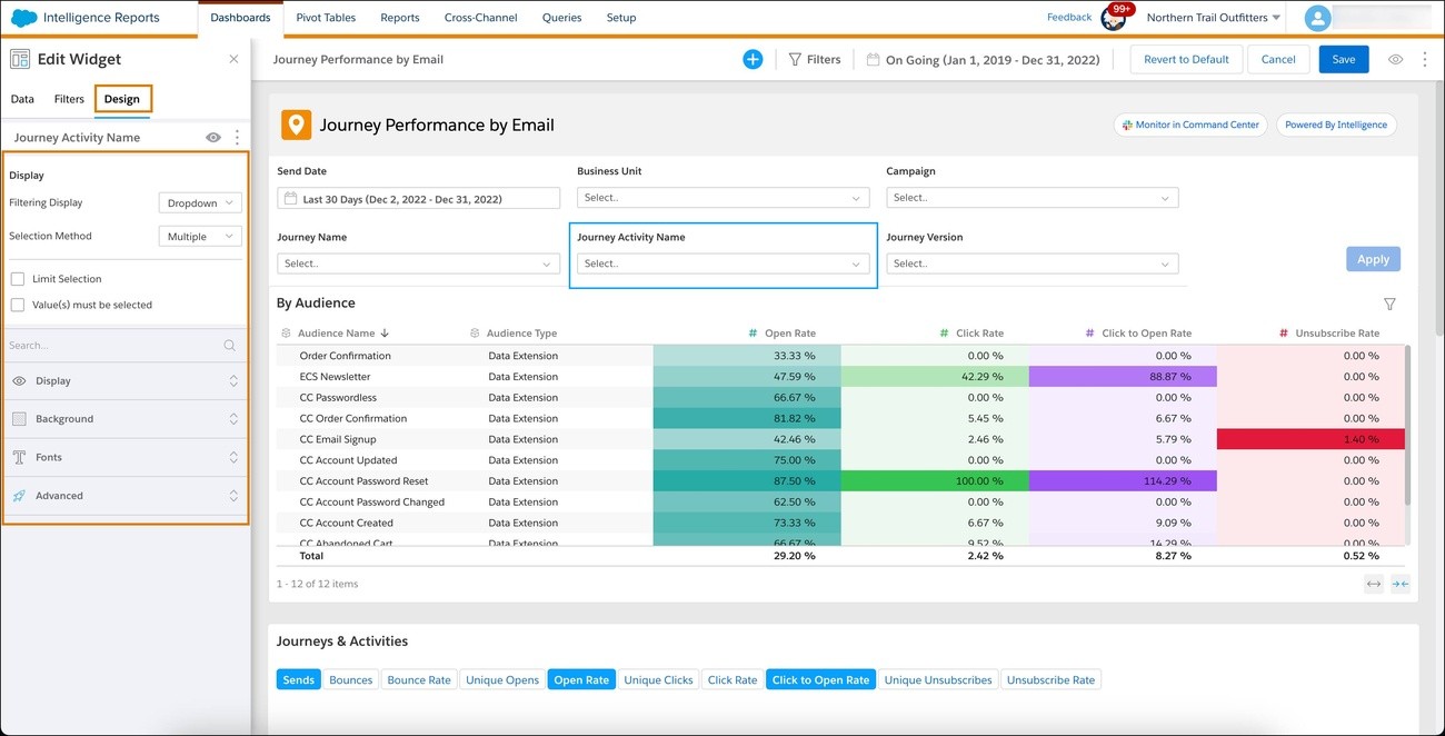
Image Source: Trailhead - Salesforce
Dashboard customization features will give a users the ability to adjust their dashboards based on their specific needs and priorities. Research shows that customized dashboards boost user participation by up to 37%.
User Priorities
Dashboard interfaces should adapt to what each user needs. Studies show that customizable workspaces help users interpret data 40% faster. The main customization options include:
Light and dark mode themes
Time zone settings that show accurate data
Default views when logging in
Weekly calendar start day settings for metrics
Widget Configuration
Customizable widgets boost dashboard functionality while keeping visuals consistent. Evidence shows that configurable widgets make decisions 24% faster. The main configuration options cover:
Widget sizes ranging from 2x2 to 4x4 tiles
Data refresh intervals you can adjust
Different chart types to show data
Custom KPI thresholds and alerts
Layout Flexibility
Flexible layout options keep dashboards useful for different scenarios. Research reveals that adaptable layouts cut information search time by 30%. The layout features you should think over include:
Drag-and-drop to move widgets
Resizable parts that keep data accurate
Sections you can collapse for focused analysis
Multiple dashboard layouts you can save
Without doubt, adding user customization needs careful balance. While providing many options, default settings should line up with proven design principles to maintain core features. Studies show that companies with customizable dashboards see 45% higher user adoption rates.
Role-based customization helps different user groups access relevant information quickly. Executives might want high-level KPIs, while operational managers need detailed metrics. The right level of customization for each role makes dashboards better tools for decisions at every level of the organization.
Focus on Accessibility

Image Source: Sisense
Dashboard accessibility has become crucial to help data visualization reach all users, including those with disabilities. Recent studies reveal that approximately 1.3 billion people worldwide live with some form of visual impairment.
WCAG Compliance
Web Content Accessibility Guidelines (WCAG) standards form the foundations of accessible dashboard design. The essential elements include:
Text alternatives for images and data visualizations
Sufficient color contrast ratios
Semantic HTML structure
Keyboard navigation support throughout the interface
Screen Reader Support
Screen readers significantly improve dashboard usability. Research shows that these tools process dashboard elements sequentially based on their addition order. The best practices to optimize screen reader support include:
Descriptive titles and captions for all visualizations
Alternative text for images and charts
Hierarchical content structure with proper heading levels
Visualization marks limited to under 1000 for better browser performance
Color Contrast
Dashboard accessibility heavily depends on proper color contrast. Research highlights that green text on gray backgrounds fails to meet minimum contrast requirements. Users need:
A minimum contrast ratio of 4.5:1 for normal text
Enhanced contrast theme for better visibility
Patterns combined with colors to distinguish data points
Color blindness simulators for design testing
Keyboard Navigation
Users should be able to traverse dashboards without a mouse. Studies demonstrate that proper keyboard navigation reduces frustration and makes data more available. Dashboard designers must focus on:
Tab key navigation between interactive elements
Clear focus indicators
Standard keyboard shortcuts for common actions
Keyboard command access for all interactive elements
Tooltips and documentation provide contextual help that improves the overall accessibility experience. Organizations that prioritize accessibility in their dashboard design create inclusive data visualization tools that work for everyone.
Implement Smart Filters

Image Source: Eleken
Smart filtering turns raw data into applicable information. Studies show that context-aware filtering cuts data discovery time by up to 40% [link_1]. Here's what makes filtering truly intelligent.
Context-aware Filtering
Modern dashboards use knowledge graph methods to improve filtering accuracy. Research shows these systems boost recommendation accuracy by 35%. The systems look at:
User roles and access patterns
System monitoring states
Task-specific requirements
User priorities
Search Functionality
Smart search speeds up how users find data without slowing dashboards. Studies reveal that smart search cuts query time in half. The core search features should have:
Up-to-the-minute auto-complete suggestions
Natural language processing to interpret queries
Incremental data loading for speed
Client-side filter evaluation when datasets stay under 100K rows
Advanced Query Options
Better query capabilities help users explore data deeply while keeping dashboards responsive. Research proves that advanced query options boost user output by 24%. The main features include:
Query-based parameter values for dynamic filtering
Cross-filtering abilities across multiple visualizations
Pre-aggregate and post-aggregate condition combinations
Context-based drill-down choices
Thoughtful implementation of these filtering methods makes dashboards more intuitive and faster. The best results come from caching query results for 24 hours and using materialized views for common data patterns.
The system supports multi-value selection and date range parameters. Users can analyze data across dimensions at once. Query parameters in subqueries help users explore data better while maintaining speed.
Optimize Loading Speed
Image Source: Metabase
Dashboard speed makes a huge difference in how well they work. Research suggests that slow dashboards discourage users from adopting them and slow down their decision-making.
Data Caching
Smart caching methods boost dashboard performance. Studies show that server-side caching stores dashboard query results and cuts load times by up to 24 hours. Here's how to make the most of caching:
Set cache expiration times between 1-24 hours based on how fresh your data needs to be
Turn on prefetching for dashboards that users visit often
Use shared caching for published dashboards that have embedded credentials
Caching works even better when you store results by segments. This lets you update parts of your data without clearing the whole cache.
Lazy Loading
Lazy loading is a powerful way to make dashboards more responsive. Research proves that it speeds up page loads by showing components only when users can see them. This gives you:
Less strain on your data source backend
Lower memory usage
Better system performance overall
This works really well for dashboards with lots of widgets because it skips processing data for hidden components.
Performance Metrics
You need to watch performance metrics to keep your dashboard running smoothly. Keep an eye on:
How long each visualization takes to run queries
RAM and CPU usage
Network delays between data sources and users
Materialized views can speed up queries by doing complex calculations ahead of time. Putting your data closer to users will cut down network delays.
Using real-time databases like ClickHouse or special analytics platforms can make queries run faster. Keeping your dashboard speedy means you'll need to watch these performance factors closely. Just make sure you don't sacrifice data accuracy and reliability along the way.
Include Action Items
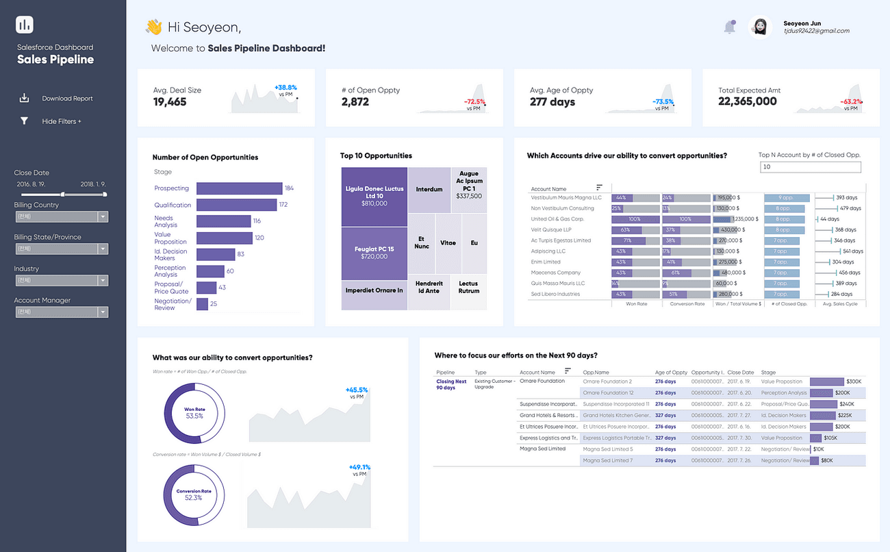
Image Source: Medium
Applicable information helps turn dashboard data into meaningful business decisions. Studies show that dashboards with clear action items perform 202% better than those without direct calls-to-action.
Call-to-action Placement
The strategic placement of action buttons affects user engagement significantly. Research shows a 30% increase in interaction rates when call-to-action elements appear within the F-pattern reading zone. Teams should focus on these placement factors:
Action buttons at natural eye-tracking points
Consistent button locations across dashboard views
Proper spacing between interactive elements
Decision Support
Smart dashboards guide users to make informed choices through built-in decision support features. Organizations that add decision support elements see response times improve by 60%. These key decision support components cover:
Data-driven recommendations based on patterns
Automated alerts for metric thresholds
Tools that compare historical performance
Quick Actions
Quick action capabilities make workflows more efficient. Research indicates that dashboards with quick action buttons help users complete tasks 37% faster. Teams can optimize quick actions by:
Creating touch-friendly elements sized 42-48 pixels for best interaction
Adding single-click access to common operations
Showing clear visual feedback when actions complete
Tooltips and contextual guidance help users understand their available actions. Dashboards that feature integrated action items see user adoption rates increase by 45%.
Action-oriented dashboards should balance easy access with smart organization. Clear calls-to-action, decision support tools, and efficient quick actions turn dashboards into powerful catalysts for organizational change instead of passive data displays.
Add Contextual Help
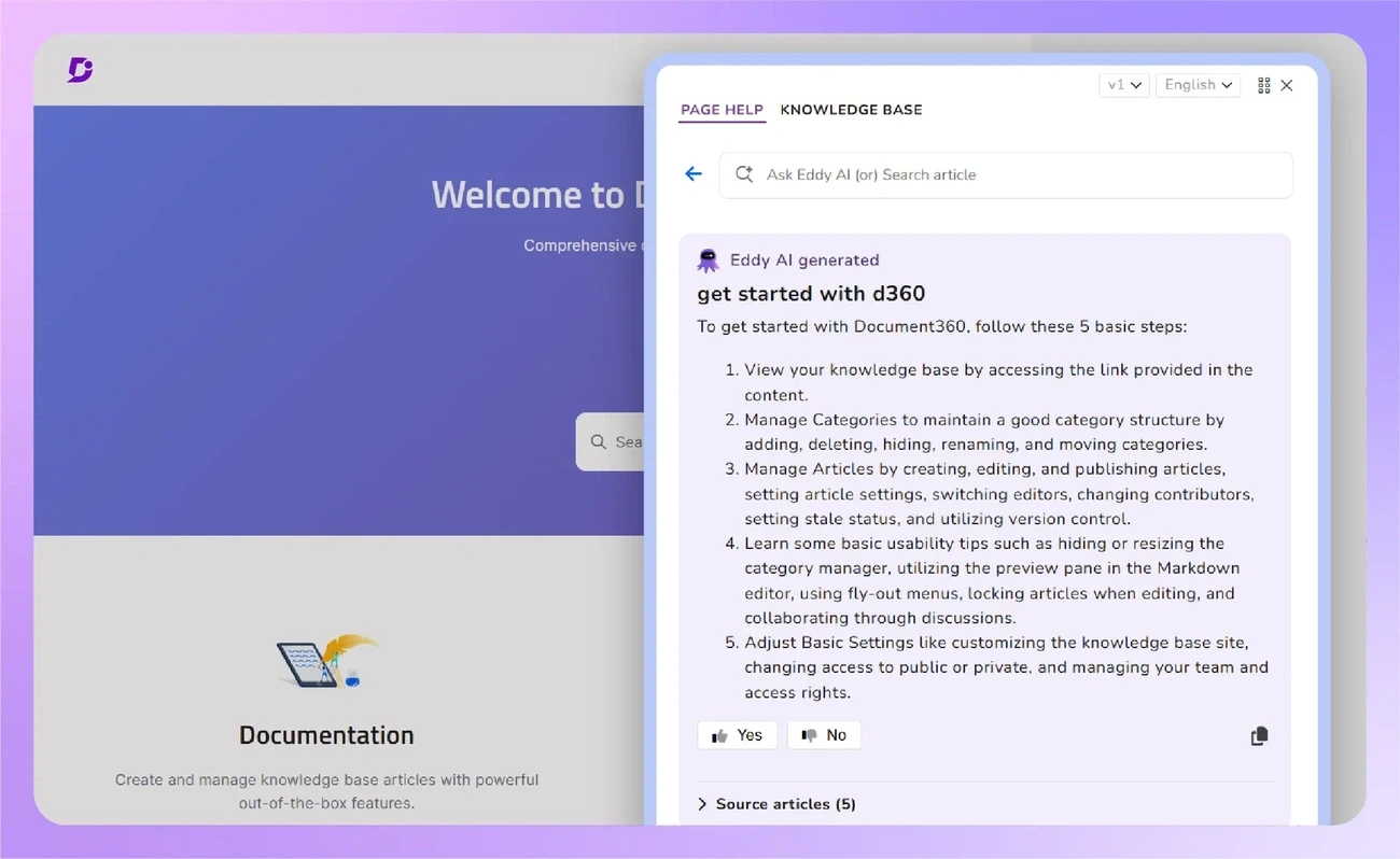
Image Source: Document360
Dashboard help features help reduce support tickets by 20-30% and boost user adoption rates. Organizations can create easy-to-use interfaces by adding strategic help elements.
Tooltips and Hints
Tooltips help deliver instant assistance. Users process tooltip information 60% faster than traditional documentation. These tips will give you the best results:
Keep tooltip content brief, under 150-200 characters
Show tooltips only when users hover over specific elements
Load tooltips within milliseconds to keep users engaged
Tooltips should add meaningful context instead of repeating visible information. Native tooltips work well to add extra details without making the interface messy.
Onboarding Flow
The first-time user experience shapes long-term adoption rates. Interactive onboarding flows boost user activation by 37%. You need these key components:
Welcome screens that capture user priorities for personalization
Guided tours that showcase core functionality
Progress indicators that show completion status
Contextual tips that respond to specific user actions
Documentation
Detailed documentation is vital, but you must think over how to integrate it within the dashboard interface. Embedding help content directly in the user interface boosts engagement by 45%.
Documentation works best when you:
Add a searchable help center within the dashboard
Give access to relevant resources through a help widget
Keep documentation up to date with feature updates
Add video tutorials for complex features
Built-in help through tooltips and documentation cuts the learning curve by 40%. Smart disclosure techniques make sure users get help right when they need it, which prevents information overload and keeps work flowing smoothly.
Future-proof Your Design
Image Source: UXPin
Your dashboard's resilience depends on planning ahead for new technology and changing user needs. A proactive mindset will give your dashboard lasting value that adapts to the faster changing digital world.
Scalability Planning
The right scalability strategies help maintain dashboard performance as data grows. Companies that implement proper scalability measures process data 60% faster. Here's what you need to think about:
Set cache control duration that matches your actual data update frequency
Create attribute indexes for hosted feature layers with extensive features
Skip relative date conditions in layer filters and view definitions
Materialized views let you store incremental aggregations live and improve query execution speed by a lot. This works best with large-scale enterprise deployments.
AI Integration
AI has transformed dashboard capabilities through advanced analytics and personalization. Research shows AI-powered dashboards boost user participation by 37%. These AI features make the difference:
Natural Language Processing lets users interact with dashboards through simple queries, which makes data access easier across all organizational levels. On top of that, predictive analysis helps forecast trends by analyzing historical data patterns.
Anomaly detection stands out as a powerful AI feature that automatically spots unusual patterns and explains data irregularities. Users can quickly identify and fix potential issues before they grow bigger.
Emerging Technologies
Keeping up with tech advances ensures your dashboard stays relevant. Organizations that utilize emerging technologies in their dashboards achieve 24% higher revenue growth. You should think about these technologies:
Live databases like ClickHouse or Apache Pinot boost performance for analytical queries. On top of that, event-driven architectures optimize data processing while keeping the system responsive.
The quickest way to handle high-demand situations is implementing hybrid approaches. Summary data gets imported while detailed information comes directly from the source. This approach optimizes data handling and keeps dashboards responsive under different loads.
Conclusion
Dashboard design principles keep changing faster, but their core purpose stays the same - to deliver practical insights through an accessible interface. These 15 principles create a detailed framework that helps build dashboards. They meet what users expect today and scale well for tomorrow's needs.
Studies show how smart dashboard design affects users. People process visual information 60,000 times faster than text. Smart filters help users find data 40% quicker. Interactive elements boost user involvement by 37%. These numbers show why good design matters now more than ever.
Building successful dashboards needs focus on many areas. Clear goals and visual hierarchies matter. Mobile responsiveness and fast loading speeds are crucial. The dashboard also becomes more inclusive and user-friendly with accessibility features and help systems.
Dashboard designers must focus on these key principles. They should adapt to new tech and changing user needs. A balanced mix of basic design elements and future-ready features creates dashboards. This approach brings lasting value to organizations and their users.
15 Dashboard Design Principles That Actually Work in 2026
Did you know humans process images 60,000 times faster than text? This makes dashboard design principles significant when creating interfaces that instantly communicate data.
Users abandon websites that take more than 3 seconds to load 80% of the time. Dashboard design principles have become a vital part of modern interface development. The 5-second rule stands as a cornerstone of successful dashboards - users should find their needed information within 5 seconds.
These 15 dashboard design principles will help you create interfaces that display data and provide applicable information while keeping your team aligned. This applies whether you're building analytics tools, business intelligence platforms, or performance tracking systems. Let's take a closer look at what actually works in 2026.
Define Clear Dashboard Objectives
Image Source: Justinmind
Your dashboard's success starts with clear objectives. A well-laid-out purpose will give your dashboard the power to deliver meaningful insights instead of becoming just another data display tool.
Understanding User Needs
A dashboard's effectiveness depends on knowing its users and their goals. Research shows that users who are asked about their priorities directly tend to request every available metric, which causes information overload. The "why" behind data needs becomes the key focus.
These key aspects will help you create dashboards that work:
Decisions users must make regularly
The environment where they'll use the dashboard
Their knowledge of data analysis and industry terms
How often they'll use the dashboard
Setting Measurable Goals
The S.M.A.R.T framework will give your dashboard objectives focus and achievability. Your goals should be:
Specific: Define exact metrics to track
Measurable: Include quantifiable indicators
Achievable: Set realistic targets
Relevant: Line up with business needs
Time-bound: Establish clear timeframes
Research proves that organizations with clearly defined dashboard goals are twice as likely to make better decisions and see a 24% increase in revenue growth.
Aligning with Business Objectives
Your dashboard must support broader organizational goals. Studies show that dashboards built to match raw data scales instead of business decision scales don't work very well and become less effective over time.
These factors matter when you line up dashboard objectives:
Business Objectives: Know the core purpose and problems the dashboard will solve
Operational Measures: Pick metrics that show progress toward specific goals
Practice-based Control: Track how key initiatives are implemented
Time Scales: Match update frequencies with decision-making cycles
Domain experts should guide your dashboard design to help users quickly find important insights. This strategy prevents aimless data exploration and helps users spot meaningful patterns instead of getting lost in details.
Note that dashboards work better when they match business decision scales rather than just showing up-to-the-minute data analysis. To name just one example, website traffic might update every minute, but decisions about site content and marketing campaigns usually depend on trends over weeks or months.
Implement Data Hierarchy
Image Source: GoodData
A clear data hierarchy is the life-blood of effective dashboard design. A well-laid-out hierarchy helps users navigate complex information and makes decision-making easier.
Visual Weight Distribution
Visual weight determines how dashboard elements grab attention. Research shows that elements located higher in the composition appear heavier than lower elements. Elements in the foreground also carry more weight than background ones.
Your visual weight distribution works better when you:
Put significant information at the top left where users start reading
Use dark elements with purpose since they carry more visual weight than light ones
Add texture to make elements appear weightier than plain objects
Information Architecture
Information architecture builds the foundation of accessible dashboard navigation. Studies show that dashboards without smart prioritization force users to analyze data by applying filters.
These principles create reliable information architecture:
Structure: Split information across separate dashboards based on business areas
Navigation: Create uninterrupted movement between dashboard sections through global and contextual elements
Grouping: Keep similar information together so users can compare metrics and trends quickly
Priority-based Layout Design
Your layout should match your data's importance. Research proves that cluttered dashboards confuse users and make them abandon the interface.
Make your layout better by:
Using progressive disclosure to keep user attention and reduce clutter
Applying pre-attentive processing so users spot important data fast
Using Gestalt Principles of closure, continuation, and proximity to create unified designs
On top of that, it helps to use white space effectively. This separates sections while keeping things clear. But balance matters - too much white space makes dashboards look unfinished.
Master Data Visualization
Image Source: Tableau
Data visualization turns complex information into easy-to-understand insights. Studies show that good visualization design can reduce analysis time by up to 24% and makes analysis 41% more accurate.
Choosing the Right Charts
Your chart choice affects how quickly people learn from the data. Bar charts work best to highlight differences between groups and show historical patterns. Line charts do a great job showing trends over time, especially with continuous data like stock prices or website traffic.
Scatter plots help you see how variables relate to each other, while heat maps excel at revealing patterns between two factors. All the same, you should skip pie charts as your only visualization since research shows they don't show negative values well.
Color Psychology in Data
Colors can boost how well users understand and connect with data. Research shows people process color-coded information 60% faster than black and white displays. Here are some proven approaches that work:
Sequential palettes work for ordered numbers, with darker shades showing higher values
Diverging palettes help highlight differences from a central point
Keep qualitative palettes between 6-10 distinct colors for the best results
The same color schemes should run through related metrics to help users spot patterns. Make sure there's enough contrast and test how your visualizations look to colorblind users - about 4% of people have trouble seeing certain colors.
Interactive Elements
Smart interactive features make dashboards more engaging without adding complexity. Research shows that dashboards with well-planned interactive elements see 37% more user engagement.
The most useful interactive features include:
Tooltips that show details when you want them
Filters that let users focus on specific data
Drill-down options to take a closer look at the underlying data
Your interactive elements should be easy to find through clear visual hints and work the same way throughout the dashboard. This helps users work with complex data while making the whole experience smoother and more intuitive.
Optimize for Scannability
Image Source: Uxcel
Research shows that users scan web content from the top left of a web page. This makes scannability a significant factor in dashboard design. Understanding and implementing key scanning patterns will help you create dashboards that guide users through complex data effectively.
F-Pattern Layout
Studies show that users follow an F-shaped scanning pattern while consuming content. They first read horizontally across the upper content area. They move down to scan a second horizontal line, and then scan vertically down the left side. Placing significant information in these high-attention areas will give better information retention and user involvement.
Your F-pattern layout should:
Position vital metrics and KPIs in the top horizontal area
Place secondary information along the second horizontal line
Arrange supporting details along the left vertical axis
Strategic White Space
White space is a powerful tool that improves dashboard comprehension. Research shows that proper use of white space between paragraphs and in left and right margins increases comprehension by 20%. White space should be viewed as an active design element rather than empty space.
Strategic white space implementation requires:
Creating clear boundaries between different data sections
Allowing content to "breathe" through adequate spacing
Maintaining consistent padding around dashboard elements
Visual Grouping Techniques
The Gestalt principles of visual perception are vital foundations for organizing dashboard elements. Users spend approximately 80% of their time viewing the left half of the page. This makes strategic grouping of related information significant.
These proven grouping techniques work well:
Proximity: Position related elements closer together to indicate relationships
Similarity: Use consistent colors and shapes for related data points
Enclosure: Apply subtle borders or background colors to define distinct sections
These scanning optimization principles will help your dashboard guide users through the information hierarchy and reduce cognitive load. Note that users form their first impression of a dashboard within 5 seconds. This highlights the significance of thoughtful layout and organization.
Ensure Mobile Responsiveness
Image Source: Designership
The modern world demands dashboards that work naturally on all devices. This will improve data visualization and user involvement.
Flexible Grid Systems
Mobile-friendly dashboards need responsive grid systems as their foundation. Research shows that over 53% of users leave interfaces when load times exceed 3 seconds. You can optimize performance by:
Building fluid layouts that adjust to screen sizes automatically
Applying percentage-based units to size components flexibly
Setting breakpoints that keep visual hierarchy consistent on all devices
Touch-friendly Elements
The size and spacing of touch elements need careful planning. An average adult's finger is about 11mm wide. Your touch interactions will work better when you:
Make touch targets 42-48 pixels wide
Keep 24 pixels between elements users can tap
Put common controls where thumbs can reach them easily
The mobile experience becomes better with haptic feedback and clear visual cues that confirm user actions. This helps reduce wrong taps.
Progressive Disclosure
Small screens benefit from progressive disclosure to handle complex information. Users stay focused when information appears step by step. The best ways to do this include:
Showing core metrics first and letting users explore deeper
Using sections that expand to reveal more details
Adding swipe gestures to access extra content
Mobile views should have 24 extra pixels between dashboard elements. This extra space makes navigation comfortable and keeps the visual structure clear.
Your dashboard will work better on mobile devices if you use lazy loading and optimize images. Recent studies show that 60% of users check their dashboards on multiple devices. This highlights why consistent performance matters on every platform.
Incorporate Real-time Updates
Image Source: Plecto
Up-to-the-minute data updates play a vital role in modern dashboard design principles. Making them work takes careful thought about several key factors.
Live Data Integration
You need reliable architecture to handle streaming data updates continuously. Companies that use event-driven architectures process data 60% faster. Here's what you need to do to get the best performance:
Use WebSocket connections to keep client-server communication going
Set up change data capture (CDC) services to spot source changes
Pick message brokers like Apache Kafka or RabbitMQ to deliver data reliably
Update Frequency
Real-time updates sound great, but they should match what your business actually needs. Studies show most business users look at their dashboards just once or twice a day. This means constant updates might be overkill.
Here are some tips for update frequency:
Match refresh times to how often your data changes and what your business needs
Set up automatic page refresh at the report level when you use DirectQuery data sources
Load data in chunks to speed up refresh time
Performance Optimization
Your dashboard needs to stay quick and responsive while handling real-time updates. Data pre-aggregation can make queries run up to 100 times faster.
These strategies help optimize performance:
Store query responses in cache when data doesn't change much
Create filtered and aggregated views while bringing in data
Keep data close to users to cut down on network delays
Materialized views help store incremental aggregations right away, which speeds up your queries. Real-time databases like ClickHouse or Apache Pinot can improve analytical query performance by a lot.
Big enterprise setups work best with a mixed approach. You can import summary data while pulling detailed info straight from the source. Power BI Premium or dedicated capacity gives you faster refresh rates and lets you handle bigger datasets.
Practice Progressive Disclosure
Image Source: Justinmind
Progressive disclosure serves as a core principle in dashboard design. Users can guide through complex data without feeling overwhelmed. Research shows that progressive disclosure reduces error rates by 89%.
Information Layering
Data presentation in digestible chunks forms the foundation of effective information layering. Users explore and discover deeper insights gradually. Dashboards that use layered information show a 24% increase in user involvement. The optimal layering process needs:
First layer presentation of essential information
Expandable sections that reveal secondary details
Complex data structured in a hierarchy for easy navigation
Drill-down Capabilities
Users can explore data at various detail levels through drill-down functionality. Organizations that make use of drill-down capabilities achieve twice the improvement in their decision-making processes. These proven approaches work well:
Users can move from summary to granular details naturally
Clear visual indicators show drillable elements
Context remains consistent throughout the exploration
User Journey Mapping
A well-designed progressive disclosure comes from understanding the user's dashboard interaction path. Data reveals that properly mapped user experiences cut information search time by 37%.
The journey mapping process needs:
Primary user goals and common exploration patterns
Touchpoints where users need more context
Clear navigation paths between information layers
Tooltips and hints support users as they explore deeper information layers. Thoughtful implementation of progressive disclosure makes dashboards more accessible to new users while maintaining powerful analysis capabilities.
Research shows that progressive disclosure techniques cut cognitive load by up to 40%. Users can focus on relevant data without distractions from unnecessary details and make decisions more efficiently.
Maintain Visual Consistency
Image Source: Figr
Visual consistency stands as a vital element in dashboard design. Studies show that consistent design patterns can reduce user learning time by up to 41%. Organizations create dashboards that users find accessible and professional when they use standardized visual elements.
Style Guide Implementation
A detailed style guide forms the foundation to keep visual harmony in dashboards. Organizations that use style guides see a 24% increase in dashboard adoption rates. The core parts of an effective style guide include:
Typography guidelines with minimum font size of 12 points to read easily
Standardized color schemes for different data categories
Consistent spacing rules with 5-pixel separation between components
Brand Integration
Smooth brand integration makes dashboard recognition stronger while keeping professional esthetics. Dashboards with consistent branding elements see 37% higher user involvement. Brand integration should focus on:
Strategic logo placement that keeps original proportions and colors
Company's color palettes applied through theme settings
Brand typography used the same way across dashboard elements
Component Libraries
A reliable component library gives consistency and speeds up dashboard development. Teams that use component libraries cut development time by up to 60%. Effective component libraries need:
Standardized chart types for specific data representations
Unified filter designs and interaction patterns
Consistent KPI card layouts and formatting
Success in visual consistency needs attention to detail in design. To cite an instance, consistent axes, gridlines, and legends help users focus on data interpretation rather than figuring out different visual formats. The same data formatting rules for numbers, dates, and percentages make dashboards clearer.
Design tokens let teams customize extensively while keeping consistency across different dashboard implementations. This approach means dashboards stay visually cohesive as they evolve, matching organizational standards and user expectations.
Enable Customization
Image Source: Trailhead - Salesforce
Dashboard customization features will give a users the ability to adjust their dashboards based on their specific needs and priorities. Research shows that customized dashboards boost user participation by up to 37%.
User Priorities
Dashboard interfaces should adapt to what each user needs. Studies show that customizable workspaces help users interpret data 40% faster. The main customization options include:
Light and dark mode themes
Time zone settings that show accurate data
Default views when logging in
Weekly calendar start day settings for metrics
Widget Configuration
Customizable widgets boost dashboard functionality while keeping visuals consistent. Evidence shows that configurable widgets make decisions 24% faster. The main configuration options cover:
Widget sizes ranging from 2x2 to 4x4 tiles
Data refresh intervals you can adjust
Different chart types to show data
Custom KPI thresholds and alerts
Layout Flexibility
Flexible layout options keep dashboards useful for different scenarios. Research reveals that adaptable layouts cut information search time by 30%. The layout features you should think over include:
Drag-and-drop to move widgets
Resizable parts that keep data accurate
Sections you can collapse for focused analysis
Multiple dashboard layouts you can save
Without doubt, adding user customization needs careful balance. While providing many options, default settings should line up with proven design principles to maintain core features. Studies show that companies with customizable dashboards see 45% higher user adoption rates.
Role-based customization helps different user groups access relevant information quickly. Executives might want high-level KPIs, while operational managers need detailed metrics. The right level of customization for each role makes dashboards better tools for decisions at every level of the organization.
Focus on Accessibility
Image Source: Sisense
Dashboard accessibility has become crucial to help data visualization reach all users, including those with disabilities. Recent studies reveal that approximately 1.3 billion people worldwide live with some form of visual impairment.
WCAG Compliance
Web Content Accessibility Guidelines (WCAG) standards form the foundations of accessible dashboard design. The essential elements include:
Text alternatives for images and data visualizations
Sufficient color contrast ratios
Semantic HTML structure
Keyboard navigation support throughout the interface
Screen Reader Support
Screen readers significantly improve dashboard usability. Research shows that these tools process dashboard elements sequentially based on their addition order. The best practices to optimize screen reader support include:
Descriptive titles and captions for all visualizations
Alternative text for images and charts
Hierarchical content structure with proper heading levels
Visualization marks limited to under 1000 for better browser performance
Color Contrast
Dashboard accessibility heavily depends on proper color contrast. Research highlights that green text on gray backgrounds fails to meet minimum contrast requirements. Users need:
A minimum contrast ratio of 4.5:1 for normal text
Enhanced contrast theme for better visibility
Patterns combined with colors to distinguish data points
Color blindness simulators for design testing
Keyboard Navigation
Users should be able to traverse dashboards without a mouse. Studies demonstrate that proper keyboard navigation reduces frustration and makes data more available. Dashboard designers must focus on:
Tab key navigation between interactive elements
Clear focus indicators
Standard keyboard shortcuts for common actions
Keyboard command access for all interactive elements
Tooltips and documentation provide contextual help that improves the overall accessibility experience. Organizations that prioritize accessibility in their dashboard design create inclusive data visualization tools that work for everyone.
Implement Smart Filters
Image Source: Eleken
Smart filtering turns raw data into applicable information. Studies show that context-aware filtering cuts data discovery time by up to 40% [link_1]. Here's what makes filtering truly intelligent.
Context-aware Filtering
Modern dashboards use knowledge graph methods to improve filtering accuracy. Research shows these systems boost recommendation accuracy by 35%. The systems look at:
User roles and access patterns
System monitoring states
Task-specific requirements
User priorities
Search Functionality
Smart search speeds up how users find data without slowing dashboards. Studies reveal that smart search cuts query time in half. The core search features should have:
Up-to-the-minute auto-complete suggestions
Natural language processing to interpret queries
Incremental data loading for speed
Client-side filter evaluation when datasets stay under 100K rows
Advanced Query Options
Better query capabilities help users explore data deeply while keeping dashboards responsive. Research proves that advanced query options boost user output by 24%. The main features include:
Query-based parameter values for dynamic filtering
Cross-filtering abilities across multiple visualizations
Pre-aggregate and post-aggregate condition combinations
Context-based drill-down choices
Thoughtful implementation of these filtering methods makes dashboards more intuitive and faster. The best results come from caching query results for 24 hours and using materialized views for common data patterns.
The system supports multi-value selection and date range parameters. Users can analyze data across dimensions at once. Query parameters in subqueries help users explore data better while maintaining speed.
Optimize Loading Speed
Image Source: Metabase
Dashboard speed makes a huge difference in how well they work. Research suggests that slow dashboards discourage users from adopting them and slow down their decision-making.
Data Caching
Smart caching methods boost dashboard performance. Studies show that server-side caching stores dashboard query results and cuts load times by up to 24 hours. Here's how to make the most of caching:
Set cache expiration times between 1-24 hours based on how fresh your data needs to be
Turn on prefetching for dashboards that users visit often
Use shared caching for published dashboards that have embedded credentials
Caching works even better when you store results by segments. This lets you update parts of your data without clearing the whole cache.
Lazy Loading
Lazy loading is a powerful way to make dashboards more responsive. Research proves that it speeds up page loads by showing components only when users can see them. This gives you:
Less strain on your data source backend
Lower memory usage
Better system performance overall
This works really well for dashboards with lots of widgets because it skips processing data for hidden components.
Performance Metrics
You need to watch performance metrics to keep your dashboard running smoothly. Keep an eye on:
How long each visualization takes to run queries
RAM and CPU usage
Network delays between data sources and users
Materialized views can speed up queries by doing complex calculations ahead of time. Putting your data closer to users will cut down network delays.
Using real-time databases like ClickHouse or special analytics platforms can make queries run faster. Keeping your dashboard speedy means you'll need to watch these performance factors closely. Just make sure you don't sacrifice data accuracy and reliability along the way.
Include Action Items
Image Source: Medium
Applicable information helps turn dashboard data into meaningful business decisions. Studies show that dashboards with clear action items perform 202% better than those without direct calls-to-action.
Call-to-action Placement
The strategic placement of action buttons affects user engagement significantly. Research shows a 30% increase in interaction rates when call-to-action elements appear within the F-pattern reading zone. Teams should focus on these placement factors:
Action buttons at natural eye-tracking points
Consistent button locations across dashboard views
Proper spacing between interactive elements
Decision Support
Smart dashboards guide users to make informed choices through built-in decision support features. Organizations that add decision support elements see response times improve by 60%. These key decision support components cover:
Data-driven recommendations based on patterns
Automated alerts for metric thresholds
Tools that compare historical performance
Quick Actions
Quick action capabilities make workflows more efficient. Research indicates that dashboards with quick action buttons help users complete tasks 37% faster. Teams can optimize quick actions by:
Creating touch-friendly elements sized 42-48 pixels for best interaction
Adding single-click access to common operations
Showing clear visual feedback when actions complete
Tooltips and contextual guidance help users understand their available actions. Dashboards that feature integrated action items see user adoption rates increase by 45%.
Action-oriented dashboards should balance easy access with smart organization. Clear calls-to-action, decision support tools, and efficient quick actions turn dashboards into powerful catalysts for organizational change instead of passive data displays.
Add Contextual Help
Image Source: Document360
Dashboard help features help reduce support tickets by 20-30% and boost user adoption rates. Organizations can create easy-to-use interfaces by adding strategic help elements.
Tooltips and Hints
Tooltips help deliver instant assistance. Users process tooltip information 60% faster than traditional documentation. These tips will give you the best results:
Keep tooltip content brief, under 150-200 characters
Show tooltips only when users hover over specific elements
Load tooltips within milliseconds to keep users engaged
Tooltips should add meaningful context instead of repeating visible information. Native tooltips work well to add extra details without making the interface messy.
Onboarding Flow
The first-time user experience shapes long-term adoption rates. Interactive onboarding flows boost user activation by 37%. You need these key components:
Welcome screens that capture user priorities for personalization
Guided tours that showcase core functionality
Progress indicators that show completion status
Contextual tips that respond to specific user actions
Documentation
Detailed documentation is vital, but you must think over how to integrate it within the dashboard interface. Embedding help content directly in the user interface boosts engagement by 45%.
Documentation works best when you:
Add a searchable help center within the dashboard
Give access to relevant resources through a help widget
Keep documentation up to date with feature updates
Add video tutorials for complex features
Built-in help through tooltips and documentation cuts the learning curve by 40%. Smart disclosure techniques make sure users get help right when they need it, which prevents information overload and keeps work flowing smoothly.
Future-proof Your Design
Image Source: UXPin
Your dashboard's resilience depends on planning ahead for new technology and changing user needs. A proactive mindset will give your dashboard lasting value that adapts to the faster changing digital world.
Scalability Planning
The right scalability strategies help maintain dashboard performance as data grows. Companies that implement proper scalability measures process data 60% faster. Here's what you need to think about:
Set cache control duration that matches your actual data update frequency
Create attribute indexes for hosted feature layers with extensive features
Skip relative date conditions in layer filters and view definitions
Materialized views let you store incremental aggregations live and improve query execution speed by a lot. This works best with large-scale enterprise deployments.
AI Integration
AI has transformed dashboard capabilities through advanced analytics and personalization. Research shows AI-powered dashboards boost user participation by 37%. These AI features make the difference:
Natural Language Processing lets users interact with dashboards through simple queries, which makes data access easier across all organizational levels. On top of that, predictive analysis helps forecast trends by analyzing historical data patterns.
Anomaly detection stands out as a powerful AI feature that automatically spots unusual patterns and explains data irregularities. Users can quickly identify and fix potential issues before they grow bigger.
Emerging Technologies
Keeping up with tech advances ensures your dashboard stays relevant. Organizations that utilize emerging technologies in their dashboards achieve 24% higher revenue growth. You should think about these technologies:
Live databases like ClickHouse or Apache Pinot boost performance for analytical queries. On top of that, event-driven architectures optimize data processing while keeping the system responsive.
The quickest way to handle high-demand situations is implementing hybrid approaches. Summary data gets imported while detailed information comes directly from the source. This approach optimizes data handling and keeps dashboards responsive under different loads.
Conclusion
Dashboard design principles keep changing faster, but their core purpose stays the same - to deliver practical insights through an accessible interface. These 15 principles create a detailed framework that helps build dashboards. They meet what users expect today and scale well for tomorrow's needs.
Studies show how smart dashboard design affects users. People process visual information 60,000 times faster than text. Smart filters help users find data 40% quicker. Interactive elements boost user involvement by 37%. These numbers show why good design matters now more than ever.
Building successful dashboards needs focus on many areas. Clear goals and visual hierarchies matter. Mobile responsiveness and fast loading speeds are crucial. The dashboard also becomes more inclusive and user-friendly with accessibility features and help systems.
Dashboard designers must focus on these key principles. They should adapt to new tech and changing user needs. A balanced mix of basic design elements and future-ready features creates dashboards. This approach brings lasting value to organizations and their users.


Similar Blogs
Similar Blogs
Similar Blogs


Available for Work
Bricx
© Bricx, 2026. All rights reserved.


Available for Work
Bricx
© Bricx, 2026. All rights reserved.
Available for Work
Bricx
© Bricx, 2026. All rights reserved.
Available for Work
Bricx
© Bricx, 2026. All rights reserved.