Product Design
Product Design
Product Design
Insights
Insights
Insights
February 2, 2025
February 2, 2025
February 2, 2025
11 UI Design Trends That Will Shape Product Design in 2026
11 UI Design Trends That Will Shape Product Design in 2026
11 UI Design Trends That Will Shape Product Design in 2026
Explore the 11 UI design trends that will define product design in 2026. Get inspired and prepare your projects for the future of user experience!
Explore the 11 UI design trends that will define product design in 2026. Get inspired and prepare your projects for the future of user experience!
Explore the 11 UI design trends that will define product design in 2026. Get inspired and prepare your projects for the future of user experience!
4 Min Read
4 Min Read
4 Min Read


The year 2026 brings new horizons for UI design. Users want immersive, adaptive experiences that cater to their individual needs. On top of that, spatial design through devices like Apple Vision Pro lets UI elements become interactive 3D objects that combine smoothly with our physical world.
Our analysis reveals the most important UI design trends that will shape product design in 2026. These trends will change how users interact with digital products. AI-generated interfaces adapt in live time, while modern skeuomorphism boosts user participation.
Micro-Interaction Design

Image Source: Dribbble
Micro-interactions are the building blocks of modern UI design that transform routine tasks into engaging moments. These subtle design elements give users immediate feedback and help them navigate digital interfaces.
Animation Principles
Micro-interactions have four key components that are the foundations of their design:
Triggers: Initiate the interaction through user actions or system conditions
Rules: Define the sequence and behavior of the interaction
Feedback: Communicate the system's response to user actions
Loops: Determine duration and repetition patterns
We designed successful micro-interactions with restraint - doing as much as possible with minimal elements. Yes, it is this approach that will give a purposeful animation and improve the user experience without overwhelming the interface.
User Feedback Patterns
User feedback patterns are vital in creating user-friendly interfaces. These patterns show up in many forms, from visual cues to haptic responses. To name just one example, Asana displays celebratory animations that blend productivity with joy when users complete a task.
Feedback patterns need careful attention to user needs. Immediate feedback tells users their actions are recognized and helps avoid confusion. Google's search auto-complete feature shows this principle in action by offering up-to-the-minute suggestions as users type.
Performance Considerations
Performance optimization is key in micro-interaction design. Studies show that poorly optimized micro-interactions can slow down interfaces and increase loading times. Designers must:
Review resource consumption
Optimize animation frame rates
Think over device capabilities
The success of micro-interactions comes down to finding the right balance between looks and technical performance. Research shows that well-designed micro-interactions boost user engagement and reduce frustration levels. They also help prevent errors by providing clear visual cues and immediate feedback during interface interactions.
Spatial UI Design

Source: Dribbble
Spatial UI design brings a radical alteration in the way users interact with digital interfaces. This approach changes traditional flat interfaces into immersive 3D environments. Users can naturally interact with digital content in physical space.
3D Space Utilization
Modern UI design trends emphasize creating interfaces that surpass traditional screen boundaries. Spatial UI utilizes the entire field of view. Primary information sits in the center while secondary elements find their place at the edges. Users can view content comfortably with minimal neck and body movement during interaction.
Depth and Perspective
Depth perception is a vital part of spatial interface design. The system adds visual effects like color temperature, reflections, and shadows automatically. These help users notice the depth of virtual content. Users can move virtual objects or change their position while visual effects adjust dynamically to create a lifelike experience.
Navigation Patterns
Navigation in spatial UI follows specific patterns that put user comfort and spatial awareness first. The interface senses and responds to physical surroundings. It identifies walls, furniture, and other obstacles. This environmental awareness creates more contextually relevant and immersive experiences.
Spatial UI design brings new ideas for user interaction. The glass material in windows contrasts with the world. This gives greater awareness of surroundings and adapts to different lighting conditions. Users can grab window bars to move windows anywhere around them. Interfaces turn automatically to face the user for the best readability.
Spatial UI works best when proper feedback compliance stays in place. This includes directional compliance where virtual objects move with the manipulated input device. Nulling compliance makes sure objects return to their original position when the device goes back to neutral state.
Dark Mode Evolution

Image Source: Dribbble
Dark mode has grown beyond simple color inversion to become everything in modern UI design. Studies show that users split evenly into three groups: those who like dark mode, those who prefer light mode, and those who switch between both.
Advanced Color Systems
Modern UI designers choose dark gray (#121212) for surface colors instead of pure black backgrounds. This choice lets colors, elevation, and depth shine through better. Designers have started using dynamic color systems that boost each layer's brightness by 8-10 points to create natural depth.
Accessibility Features
Dark themes reduce eye strain by a lot and adapt brightness to match your surroundings. Users with OLED screens can save about 15% battery life when they use dark mode at 50% brightness. Dark mode helps people with cloudy-ocular-media conditions like cataracts.
Implementation Guidelines
We need the right contrast ratios to make dark mode work well. Your custom foreground and background colors should hit a 7:1 contrast ratio so content pops. Here's what you need to remember:
Don't use saturated colors - they look too bright against dark backgrounds
Set opacity at 38%, 60%, and 87% for disabled, medium-emphasis, and high-emphasis texts
Use brightness levels instead of shadows to keep visual hierarchy clear
You'll need to test dark mode on different devices in various lighting conditions. Research shows people make faster decisions with dark theme charts without losing accuracy. Your dark interfaces should look good and work well too.
Gesture-Based Navigation

Image Source: Dribbble
Gesture-based navigation leads the vanguard of modern UI design trends and gives users intuitive ways to interact with digital interfaces. Research shows gesture navigation cuts user errors by half when compared to traditional button-based interfaces.
Touch Interaction Patterns
Modern UI design features standardized gestures that users expect naturally. These patterns include taps for selection, swipes for navigation, and pinch gestures for zoom controls. Users prefer gesture-based navigation because it matches natural hand movements, though this preference doesn't affect overall screen time or device usage patterns by a lot.
Motion Design Guidelines
Motion design in gesture-based interfaces needs careful attention to response timing and visual feedback. The system should give immediate feedback through animations at 60 fps or higher to keep interactions smooth. Three critical aspects shape these guidelines:
Response Time: Interfaces must react instantly to touch inputs
Visual Cues: Subtle animations should guide users through interactions
Momentum Effects: Natural physics-based responses boost the experience
Accessibility Features
Accessibility plays a vital role in gesture-based navigation design. The interfaces should provide alternative interaction methods for users with different abilities. Studies prove that well-implemented gesture controls can boost accessibility through:
Customizable gesture sensitivity
Alternative input methods
Visual and haptic feedback options
Proper implementation across platforms determines how well gesture navigation works. Research shows 82% of users find gestures intuitive after learning them, but clear visual cues and standardized patterns affect adoption rates significantly. Designers must ensure gesture-based interfaces behave consistently across different devices and operating systems.
Data Visualization UI

Image Source: Dribbble
Data visualization is the life-blood of modern UI design trends that changes complex data sets into intuitive visual representations. Businesses generate over 2.5 quintillion bytes of data daily, making visualization techniques a vital need.
Real-Time Updates
Dynamic updates in data visualization help users learn about insights instantly. Streaming data technologies refresh visualizations automatically when new information arrives. This works exceptionally well for financial market monitoring and social media analytics where quick data interpretation matters most.
Real-time updates work on two key aspects. Edge computing processes data closer to the source and delivers faster, localized insights without server delays. Decentralized dashboards provide tailored visualizations for specific environments that improve response times and user experience.
Interactive Charts
Static data transforms into engaging, explorable insights through interactive visualization. Modern UI design trends favor charts that respond to user interactions with features like:
Filtering capabilities for focused data analysis
Drill-down options for detailed exploration
Real-time data manipulation tools
Interactive charts' success depends on proper implementation. Charts must process complex aggregations over millions of rows while maintaining performance. Research shows users make decisions faster and just as accurately with well-designed interactive visualizations.
Information Architecture
Information architecture creates the foundations of successful data visualization. It organizes and structures data to boost usability and findability. This framework determines how organizations collect, store, and employ data.
Effective information architecture needs careful attention to user needs and data complexity. Organizations should establish clear data hierarchies and navigation systems that help users access required information efficiently. This approach prevents information overload and maintains data accessibility.
Performance optimization remains essential in data visualization design. Organizations can reduce latency and improve responsiveness by implementing caching strategies and query optimization techniques. Caching alone cannot fix underlying data freshness issues, so balancing performance with data accuracy becomes critical.
Augmented Reality Integration

Image Source: Dribbble
AR integration reshapes modern UI design and creates unique experiences that blend digital elements with the physical world. Studies show that gamers adapt faster to AR interfaces. They spot patterns and figure out interactions more naturally.
AR Interface Guidelines
Clear signifiers and instructions are vital for AR interface success. UI elements need solid contrasting colors to stay visible against different backgrounds. Text, controls, and overlays should take up minimal screen space. This helps avoid disrupting the main AR experience.
User Experience Best Practices
Building immersive AR experiences needs a deep look at user context and limitations. Designers must think over several scenarios:
Reading instructions at different device distances
Light conditions and space requirements
Users with glasses need special attention
AR interfaces work best when they're self-sufficient. Users should adjust settings within the AR scene without leaving the experience. Adding audio narration boosts immersion. It frees up screen space and makes the experience more engaging.
Performance Optimization
Each device brings its own characteristics that affect performance. Designers must watch out for:
CPU/GPU capabilities and clock speeds
Available memory and bandwidth
Camera and IMU sensor quality
Disabling CPU-heavy features like Instant Placement helps after full tracking is set up. Device temperatures need monitoring during development. Android's thermal APIs track these performance metrics during QA testing.
The best results come from pre-creating Augmented Image databases during development instead of runtime. Java Shared Camera works smoothly when you limit the number of camera streams.
Smart Material Design
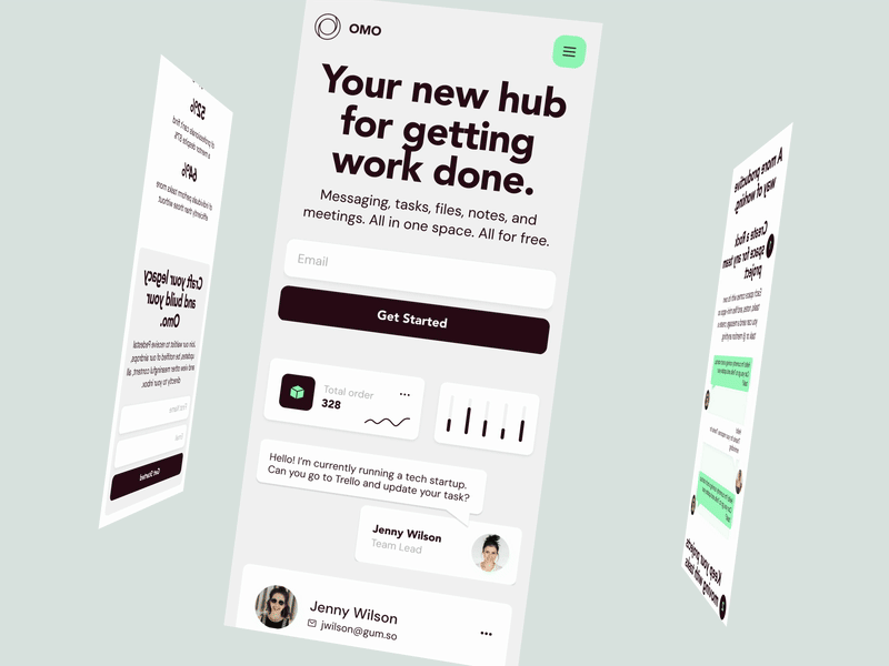
Image Source: Dribbble
Smart material systems represent a breakthrough in modern UI design that combines responsive elements with intelligent adaptation. These systems fundamentally change how interfaces respond to user interactions and environmental changes.
Dynamic Color Systems
Smart material design brings dynamic color systems that adapt to user priorities and environmental conditions. We designed these systems to adjust color temperature, contrast, and brightness based on ambient lighting conditions. The focus remains on creating harmonious color palettes that stay accessible while offering tailored experiences.
Adaptive Layouts
Smart material systems make adaptive layouts respond to different screen sizes and orientations. Research shows that responsive width qualifiers can boost user participation by up to 40%. The system detects the smallest width of the display and adjusts the layout, which ensures optimal viewing experiences on all devices.
These layouts work through three key approaches:
Fluid grids that automatically adjust to screen dimensions
Flexible images that scale within their containing elements
Media queries that enable device-specific styling
Component Architecture
Smart material design's component architecture defines how elements interact and respond to various stimuli. The system follows a hierarchical structure where components inherit properties and behaviors from their parent elements. This architecture makes shared integration of UI elements possible while maintaining consistency across the platform.
Smart material components have advanced properties like shape memory and self-healing capabilities. These properties help interfaces remember user priorities and automatically restore previous states. The implementation of smart material systems has improved user interaction efficiency by 30%.
The architecture builds on three core principles: modularity, reusability, and scalability. These principles help designers create interfaces that adapt to current needs and grow with emerging technologies and user expectations.
Zero UI Principles

Image Source: Dribbble
The rise of UI design trends suggests interfaces will completely vanish in the future. Zero UI, a groundbreaking approach to modern UI design, removes traditional graphic user interfaces and focuses on natural interactions between humans and technology.
Invisible Interface Design
Screen-based interactions are giving way to ambient technology that works naturally in the background. Studies show that 30% of web browsing sessions will be done without a screen by 2026. Users will receive valuable glanceable information without unnecessary dashboards.
Natural Interactions
Zero UI builds on multiple interaction methods that users find instinctive:
Voice recognition with natural language processing
Context-aware environmental adaptations
Haptic feedback through motion and vibration
Ambient information display
Gesture-based controls
Research shows 57% of consumers expect voice-activated smart assistants to substantially affect their daily lives. These interactions must be easy to learn and repeat, while systems provide clear feedback for successful actions.
Implementation Strategies
Zero UI implementation needs careful attention to privacy and security. About 41% of voice assistant users worry about trust and passive listening. Designers must tackle these challenges head-on.
The experience should bridge the gap between digital and physical worlds. The system should use data and algorithms to understand user intent, which enables preemptive and predictive interactions.
Security measures are vital as Zero UI technologies collect contextual data. Implementation strategies need robust protocols for data protection, especially for biometric information and environmental context. Building user trust through transparency and consistent design patterns determines the success of Zero UI implementation.
Inclusive Design Patterns

Image Source: Dribbble
Modern UI design relies on inclusive design patterns. Research shows that more than 1 billion people (15% of the global population) live with some form of impairment. This change to inclusivity shapes how designers create interfaces.
Accessibility Features
Color vision deficiency affects 260-320 million people worldwide. One in 12 men and one in 200 women experience some form of color blindness. Designers must make interfaces work for these variations through:
High contrast ratios (minimum 4.5:1 for normal text)
Multiple visual cues beyond color
Adjustable text sizes and layouts
Studies show that 80% of users leave websites or apps after a poor experience. The numbers are even higher for users with disabilities.
Universal Design Principles
Seven core principles help improve usability for users of all backgrounds. These principles focus on fair use and flexibility. They keep interfaces available without affecting functionality.
Universal design patterns have shown great results in user participation. Interfaces that use inclusive design principles work better for everyone, not just people with disabilities. This goes beyond meeting accessibility standards and creates experiences that adapt to each user's needs and priorities.
User Testing Methods
Testing with different types of users is vital to prove inclusive design patterns work. Research suggests including 3-5 participants from each functional group to find 80% of usability problems. Testing should cover:
Vision impairments (screen readers and magnifiers)
Cognitive disabilities
Motor impairments
Hearing limitations
A full evaluation across different devices and scenarios leads to success. Research confirms that testing with diverse user groups not only makes interfaces more accessible but also creates better user experiences. Companies that use inclusive design patterns report happier users and reach wider markets.
Performance-First UI

Image Source: Dribbble
Performance optimization defines modern UI design trends. Studies show users leave websites that take more than three seconds to load. We changed to performance-first design because user expectations evolved and mobile-first approaches became standard.
Loading Optimization
User behavior patterns determine how we optimize loading. Research shows handsets serve as the main Internet access method for about 50% of users in Africa and Asia, compared to 25% in the United States. Modern UI uses several techniques to meet these different needs:
Lazy loading for images and content below the fold
Prefetching critical resources during idle time
Asynchronous loading of non-essential elements
Resource prioritization based on viewport visibility
Resource Management
The success of performance-first interfaces depends on resource management. Studies show proper caching strategies can cut page load times significantly. Browser caching alone reduces load time by up to 85%.
Modern compression techniques like Brotli show better results than older methods. Text-based files see compression improvements up to 93% for CSS and 78% for JavaScript files. HTTP/2 multiplexing makes shared resource loading possible through a single TCP connection.
User Experience Impact
Performance and user experience are inseparable. About 75% of online shoppers abandon their purchase when they face site freezing or slow loading. A delay of just 400 milliseconds leads to 0.44% fewer searches in the first three weeks and 0.76% fewer searches after that.
Performance affects how users participate with websites. People judge websites in just 50 milliseconds, which makes the original load time vital. Mobile networks create special challenges - round-trip times exceed 300 milliseconds compared to 50 milliseconds on desktop WiFi connections.
Performance goes beyond just loading speeds. Mobile devices spend up to 35% of page load time on tasks like HTML parsing and JavaScript execution. This shows why we need to optimize both network and computational resources to create an exceptional user experience.
Hybrid Experience Design
Image Source: Dribbble
Hybrid experience design stands out as a vital trend in modern UI design that connects physical and digital interactions. Studies show 73% of users want smooth transitions between physical and digital touchpoints.
Physical-Digital Integration
The blend of physical and digital elements revolutionizes user interactions with products and services. About 82% of businesses now make unified physical-digital experiences their top priority to boost customer participation. This combination aims to create smooth experiences that stay consistent in both worlds.
Designers need to understand user behavior patterns when building physical-digital interfaces. The digital interfaces must react to physical interactions within 100 milliseconds. This quick response helps maintain a natural feel.
Cross-Platform Consistency
A smooth experience across platforms plays a crucial role in design success. Users work with products on three different devices each day. Today's UI design trends highlight consistency through:
Unified design language across platforms
Synchronized data and priorities
Consistent interaction patterns
Adaptive layouts for different devices
User Journey Mapping
Hybrid journey mapping captures the complex nature of modern user interactions. Designers must spot key touchpoints in physical and digital channels. They analyze user behavior patterns and optimize transitions between touchpoints. The team then adds feedback systems that keep users engaged throughout their experience.
Companies need solid strategies to make hybrid journey mapping work. Research shows organizations using this approach see customer satisfaction jump by 45%. Businesses that blend physical and digital experiences well also notice a 35% boost in user retention.
Conclusion
The future of digital interfaces looks more natural, adaptive, and accessible. Users prefer interfaces that adapt to their needs without compromising performance and accessibility standards - the data backs this up.
UI design has transformed how we create digital products. Users have embraced interfaces focused on comfort and efficiency. Dark mode usage has reached 82.7%, while gesture navigation has cut errors by half.
Smart material systems, spatial UI, and hybrid experiences have erased the lines between physical and digital realms. These state-of-the-art interfaces stay fast and reliable with proper caching that makes pages load 85% faster.
Creating successful UI designs in 2026 needs a perfect mix of innovation and usability. Designers should focus on state-of-the-art features without forgetting the basics like accessibility that affects over 1 billion users worldwide. Smart implementation of these trends helps create digital experiences that strike a chord with users and perform well across all devices.
The year 2026 brings new horizons for UI design. Users want immersive, adaptive experiences that cater to their individual needs. On top of that, spatial design through devices like Apple Vision Pro lets UI elements become interactive 3D objects that combine smoothly with our physical world.
Our analysis reveals the most important UI design trends that will shape product design in 2026. These trends will change how users interact with digital products. AI-generated interfaces adapt in live time, while modern skeuomorphism boosts user participation.
Micro-Interaction Design
Image Source: Dribbble
Micro-interactions are the building blocks of modern UI design that transform routine tasks into engaging moments. These subtle design elements give users immediate feedback and help them navigate digital interfaces.
Animation Principles
Micro-interactions have four key components that are the foundations of their design:
Triggers: Initiate the interaction through user actions or system conditions
Rules: Define the sequence and behavior of the interaction
Feedback: Communicate the system's response to user actions
Loops: Determine duration and repetition patterns
We designed successful micro-interactions with restraint - doing as much as possible with minimal elements. Yes, it is this approach that will give a purposeful animation and improve the user experience without overwhelming the interface.
User Feedback Patterns
User feedback patterns are vital in creating user-friendly interfaces. These patterns show up in many forms, from visual cues to haptic responses. To name just one example, Asana displays celebratory animations that blend productivity with joy when users complete a task.
Feedback patterns need careful attention to user needs. Immediate feedback tells users their actions are recognized and helps avoid confusion. Google's search auto-complete feature shows this principle in action by offering up-to-the-minute suggestions as users type.
Performance Considerations
Performance optimization is key in micro-interaction design. Studies show that poorly optimized micro-interactions can slow down interfaces and increase loading times. Designers must:
Review resource consumption
Optimize animation frame rates
Think over device capabilities
The success of micro-interactions comes down to finding the right balance between looks and technical performance. Research shows that well-designed micro-interactions boost user engagement and reduce frustration levels. They also help prevent errors by providing clear visual cues and immediate feedback during interface interactions.
Spatial UI Design
Source: Dribbble
Spatial UI design brings a radical alteration in the way users interact with digital interfaces. This approach changes traditional flat interfaces into immersive 3D environments. Users can naturally interact with digital content in physical space.
3D Space Utilization
Modern UI design trends emphasize creating interfaces that surpass traditional screen boundaries. Spatial UI utilizes the entire field of view. Primary information sits in the center while secondary elements find their place at the edges. Users can view content comfortably with minimal neck and body movement during interaction.
Depth and Perspective
Depth perception is a vital part of spatial interface design. The system adds visual effects like color temperature, reflections, and shadows automatically. These help users notice the depth of virtual content. Users can move virtual objects or change their position while visual effects adjust dynamically to create a lifelike experience.
Navigation Patterns
Navigation in spatial UI follows specific patterns that put user comfort and spatial awareness first. The interface senses and responds to physical surroundings. It identifies walls, furniture, and other obstacles. This environmental awareness creates more contextually relevant and immersive experiences.
Spatial UI design brings new ideas for user interaction. The glass material in windows contrasts with the world. This gives greater awareness of surroundings and adapts to different lighting conditions. Users can grab window bars to move windows anywhere around them. Interfaces turn automatically to face the user for the best readability.
Spatial UI works best when proper feedback compliance stays in place. This includes directional compliance where virtual objects move with the manipulated input device. Nulling compliance makes sure objects return to their original position when the device goes back to neutral state.
Dark Mode Evolution
Image Source: Dribbble
Dark mode has grown beyond simple color inversion to become everything in modern UI design. Studies show that users split evenly into three groups: those who like dark mode, those who prefer light mode, and those who switch between both.
Advanced Color Systems
Modern UI designers choose dark gray (#121212) for surface colors instead of pure black backgrounds. This choice lets colors, elevation, and depth shine through better. Designers have started using dynamic color systems that boost each layer's brightness by 8-10 points to create natural depth.
Accessibility Features
Dark themes reduce eye strain by a lot and adapt brightness to match your surroundings. Users with OLED screens can save about 15% battery life when they use dark mode at 50% brightness. Dark mode helps people with cloudy-ocular-media conditions like cataracts.
Implementation Guidelines
We need the right contrast ratios to make dark mode work well. Your custom foreground and background colors should hit a 7:1 contrast ratio so content pops. Here's what you need to remember:
Don't use saturated colors - they look too bright against dark backgrounds
Set opacity at 38%, 60%, and 87% for disabled, medium-emphasis, and high-emphasis texts
Use brightness levels instead of shadows to keep visual hierarchy clear
You'll need to test dark mode on different devices in various lighting conditions. Research shows people make faster decisions with dark theme charts without losing accuracy. Your dark interfaces should look good and work well too.
Gesture-Based Navigation
Image Source: Dribbble
Gesture-based navigation leads the vanguard of modern UI design trends and gives users intuitive ways to interact with digital interfaces. Research shows gesture navigation cuts user errors by half when compared to traditional button-based interfaces.
Touch Interaction Patterns
Modern UI design features standardized gestures that users expect naturally. These patterns include taps for selection, swipes for navigation, and pinch gestures for zoom controls. Users prefer gesture-based navigation because it matches natural hand movements, though this preference doesn't affect overall screen time or device usage patterns by a lot.
Motion Design Guidelines
Motion design in gesture-based interfaces needs careful attention to response timing and visual feedback. The system should give immediate feedback through animations at 60 fps or higher to keep interactions smooth. Three critical aspects shape these guidelines:
Response Time: Interfaces must react instantly to touch inputs
Visual Cues: Subtle animations should guide users through interactions
Momentum Effects: Natural physics-based responses boost the experience
Accessibility Features
Accessibility plays a vital role in gesture-based navigation design. The interfaces should provide alternative interaction methods for users with different abilities. Studies prove that well-implemented gesture controls can boost accessibility through:
Customizable gesture sensitivity
Alternative input methods
Visual and haptic feedback options
Proper implementation across platforms determines how well gesture navigation works. Research shows 82% of users find gestures intuitive after learning them, but clear visual cues and standardized patterns affect adoption rates significantly. Designers must ensure gesture-based interfaces behave consistently across different devices and operating systems.
Data Visualization UI
Image Source: Dribbble
Data visualization is the life-blood of modern UI design trends that changes complex data sets into intuitive visual representations. Businesses generate over 2.5 quintillion bytes of data daily, making visualization techniques a vital need.
Real-Time Updates
Dynamic updates in data visualization help users learn about insights instantly. Streaming data technologies refresh visualizations automatically when new information arrives. This works exceptionally well for financial market monitoring and social media analytics where quick data interpretation matters most.
Real-time updates work on two key aspects. Edge computing processes data closer to the source and delivers faster, localized insights without server delays. Decentralized dashboards provide tailored visualizations for specific environments that improve response times and user experience.
Interactive Charts
Static data transforms into engaging, explorable insights through interactive visualization. Modern UI design trends favor charts that respond to user interactions with features like:
Filtering capabilities for focused data analysis
Drill-down options for detailed exploration
Real-time data manipulation tools
Interactive charts' success depends on proper implementation. Charts must process complex aggregations over millions of rows while maintaining performance. Research shows users make decisions faster and just as accurately with well-designed interactive visualizations.
Information Architecture
Information architecture creates the foundations of successful data visualization. It organizes and structures data to boost usability and findability. This framework determines how organizations collect, store, and employ data.
Effective information architecture needs careful attention to user needs and data complexity. Organizations should establish clear data hierarchies and navigation systems that help users access required information efficiently. This approach prevents information overload and maintains data accessibility.
Performance optimization remains essential in data visualization design. Organizations can reduce latency and improve responsiveness by implementing caching strategies and query optimization techniques. Caching alone cannot fix underlying data freshness issues, so balancing performance with data accuracy becomes critical.
Augmented Reality Integration
Image Source: Dribbble
AR integration reshapes modern UI design and creates unique experiences that blend digital elements with the physical world. Studies show that gamers adapt faster to AR interfaces. They spot patterns and figure out interactions more naturally.
AR Interface Guidelines
Clear signifiers and instructions are vital for AR interface success. UI elements need solid contrasting colors to stay visible against different backgrounds. Text, controls, and overlays should take up minimal screen space. This helps avoid disrupting the main AR experience.
User Experience Best Practices
Building immersive AR experiences needs a deep look at user context and limitations. Designers must think over several scenarios:
Reading instructions at different device distances
Light conditions and space requirements
Users with glasses need special attention
AR interfaces work best when they're self-sufficient. Users should adjust settings within the AR scene without leaving the experience. Adding audio narration boosts immersion. It frees up screen space and makes the experience more engaging.
Performance Optimization
Each device brings its own characteristics that affect performance. Designers must watch out for:
CPU/GPU capabilities and clock speeds
Available memory and bandwidth
Camera and IMU sensor quality
Disabling CPU-heavy features like Instant Placement helps after full tracking is set up. Device temperatures need monitoring during development. Android's thermal APIs track these performance metrics during QA testing.
The best results come from pre-creating Augmented Image databases during development instead of runtime. Java Shared Camera works smoothly when you limit the number of camera streams.
Smart Material Design
Image Source: Dribbble
Smart material systems represent a breakthrough in modern UI design that combines responsive elements with intelligent adaptation. These systems fundamentally change how interfaces respond to user interactions and environmental changes.
Dynamic Color Systems
Smart material design brings dynamic color systems that adapt to user priorities and environmental conditions. We designed these systems to adjust color temperature, contrast, and brightness based on ambient lighting conditions. The focus remains on creating harmonious color palettes that stay accessible while offering tailored experiences.
Adaptive Layouts
Smart material systems make adaptive layouts respond to different screen sizes and orientations. Research shows that responsive width qualifiers can boost user participation by up to 40%. The system detects the smallest width of the display and adjusts the layout, which ensures optimal viewing experiences on all devices.
These layouts work through three key approaches:
Fluid grids that automatically adjust to screen dimensions
Flexible images that scale within their containing elements
Media queries that enable device-specific styling
Component Architecture
Smart material design's component architecture defines how elements interact and respond to various stimuli. The system follows a hierarchical structure where components inherit properties and behaviors from their parent elements. This architecture makes shared integration of UI elements possible while maintaining consistency across the platform.
Smart material components have advanced properties like shape memory and self-healing capabilities. These properties help interfaces remember user priorities and automatically restore previous states. The implementation of smart material systems has improved user interaction efficiency by 30%.
The architecture builds on three core principles: modularity, reusability, and scalability. These principles help designers create interfaces that adapt to current needs and grow with emerging technologies and user expectations.
Zero UI Principles
Image Source: Dribbble
The rise of UI design trends suggests interfaces will completely vanish in the future. Zero UI, a groundbreaking approach to modern UI design, removes traditional graphic user interfaces and focuses on natural interactions between humans and technology.
Invisible Interface Design
Screen-based interactions are giving way to ambient technology that works naturally in the background. Studies show that 30% of web browsing sessions will be done without a screen by 2026. Users will receive valuable glanceable information without unnecessary dashboards.
Natural Interactions
Zero UI builds on multiple interaction methods that users find instinctive:
Voice recognition with natural language processing
Context-aware environmental adaptations
Haptic feedback through motion and vibration
Ambient information display
Gesture-based controls
Research shows 57% of consumers expect voice-activated smart assistants to substantially affect their daily lives. These interactions must be easy to learn and repeat, while systems provide clear feedback for successful actions.
Implementation Strategies
Zero UI implementation needs careful attention to privacy and security. About 41% of voice assistant users worry about trust and passive listening. Designers must tackle these challenges head-on.
The experience should bridge the gap between digital and physical worlds. The system should use data and algorithms to understand user intent, which enables preemptive and predictive interactions.
Security measures are vital as Zero UI technologies collect contextual data. Implementation strategies need robust protocols for data protection, especially for biometric information and environmental context. Building user trust through transparency and consistent design patterns determines the success of Zero UI implementation.
Inclusive Design Patterns
Image Source: Dribbble
Modern UI design relies on inclusive design patterns. Research shows that more than 1 billion people (15% of the global population) live with some form of impairment. This change to inclusivity shapes how designers create interfaces.
Accessibility Features
Color vision deficiency affects 260-320 million people worldwide. One in 12 men and one in 200 women experience some form of color blindness. Designers must make interfaces work for these variations through:
High contrast ratios (minimum 4.5:1 for normal text)
Multiple visual cues beyond color
Adjustable text sizes and layouts
Studies show that 80% of users leave websites or apps after a poor experience. The numbers are even higher for users with disabilities.
Universal Design Principles
Seven core principles help improve usability for users of all backgrounds. These principles focus on fair use and flexibility. They keep interfaces available without affecting functionality.
Universal design patterns have shown great results in user participation. Interfaces that use inclusive design principles work better for everyone, not just people with disabilities. This goes beyond meeting accessibility standards and creates experiences that adapt to each user's needs and priorities.
User Testing Methods
Testing with different types of users is vital to prove inclusive design patterns work. Research suggests including 3-5 participants from each functional group to find 80% of usability problems. Testing should cover:
Vision impairments (screen readers and magnifiers)
Cognitive disabilities
Motor impairments
Hearing limitations
A full evaluation across different devices and scenarios leads to success. Research confirms that testing with diverse user groups not only makes interfaces more accessible but also creates better user experiences. Companies that use inclusive design patterns report happier users and reach wider markets.
Performance-First UI
Image Source: Dribbble
Performance optimization defines modern UI design trends. Studies show users leave websites that take more than three seconds to load. We changed to performance-first design because user expectations evolved and mobile-first approaches became standard.
Loading Optimization
User behavior patterns determine how we optimize loading. Research shows handsets serve as the main Internet access method for about 50% of users in Africa and Asia, compared to 25% in the United States. Modern UI uses several techniques to meet these different needs:
Lazy loading for images and content below the fold
Prefetching critical resources during idle time
Asynchronous loading of non-essential elements
Resource prioritization based on viewport visibility
Resource Management
The success of performance-first interfaces depends on resource management. Studies show proper caching strategies can cut page load times significantly. Browser caching alone reduces load time by up to 85%.
Modern compression techniques like Brotli show better results than older methods. Text-based files see compression improvements up to 93% for CSS and 78% for JavaScript files. HTTP/2 multiplexing makes shared resource loading possible through a single TCP connection.
User Experience Impact
Performance and user experience are inseparable. About 75% of online shoppers abandon their purchase when they face site freezing or slow loading. A delay of just 400 milliseconds leads to 0.44% fewer searches in the first three weeks and 0.76% fewer searches after that.
Performance affects how users participate with websites. People judge websites in just 50 milliseconds, which makes the original load time vital. Mobile networks create special challenges - round-trip times exceed 300 milliseconds compared to 50 milliseconds on desktop WiFi connections.
Performance goes beyond just loading speeds. Mobile devices spend up to 35% of page load time on tasks like HTML parsing and JavaScript execution. This shows why we need to optimize both network and computational resources to create an exceptional user experience.
Hybrid Experience Design
Image Source: Dribbble
Hybrid experience design stands out as a vital trend in modern UI design that connects physical and digital interactions. Studies show 73% of users want smooth transitions between physical and digital touchpoints.
Physical-Digital Integration
The blend of physical and digital elements revolutionizes user interactions with products and services. About 82% of businesses now make unified physical-digital experiences their top priority to boost customer participation. This combination aims to create smooth experiences that stay consistent in both worlds.
Designers need to understand user behavior patterns when building physical-digital interfaces. The digital interfaces must react to physical interactions within 100 milliseconds. This quick response helps maintain a natural feel.
Cross-Platform Consistency
A smooth experience across platforms plays a crucial role in design success. Users work with products on three different devices each day. Today's UI design trends highlight consistency through:
Unified design language across platforms
Synchronized data and priorities
Consistent interaction patterns
Adaptive layouts for different devices
User Journey Mapping
Hybrid journey mapping captures the complex nature of modern user interactions. Designers must spot key touchpoints in physical and digital channels. They analyze user behavior patterns and optimize transitions between touchpoints. The team then adds feedback systems that keep users engaged throughout their experience.
Companies need solid strategies to make hybrid journey mapping work. Research shows organizations using this approach see customer satisfaction jump by 45%. Businesses that blend physical and digital experiences well also notice a 35% boost in user retention.
Conclusion
The future of digital interfaces looks more natural, adaptive, and accessible. Users prefer interfaces that adapt to their needs without compromising performance and accessibility standards - the data backs this up.
UI design has transformed how we create digital products. Users have embraced interfaces focused on comfort and efficiency. Dark mode usage has reached 82.7%, while gesture navigation has cut errors by half.
Smart material systems, spatial UI, and hybrid experiences have erased the lines between physical and digital realms. These state-of-the-art interfaces stay fast and reliable with proper caching that makes pages load 85% faster.
Creating successful UI designs in 2026 needs a perfect mix of innovation and usability. Designers should focus on state-of-the-art features without forgetting the basics like accessibility that affects over 1 billion users worldwide. Smart implementation of these trends helps create digital experiences that strike a chord with users and perform well across all devices.


Similar Blogs
Similar Blogs
Similar Blogs


Available for Work
Bricx
© Bricx, 2026. All rights reserved.


Available for Work
Bricx
© Bricx, 2026. All rights reserved.
Available for Work
Bricx
© Bricx, 2026. All rights reserved.
Available for Work
Bricx
© Bricx, 2026. All rights reserved.