Website Design
Website Design
Website Design
Insights
Insights
Insights
February 15, 2025
February 15, 2025
February 15, 2025
UX Design Audit: Hidden Issues That Cost You Users (Expert Guide + Tools)
UX Design Audit: Hidden Issues That Cost You Users (Expert Guide + Tools)
UX Design Audit: Hidden Issues That Cost You Users (Expert Guide + Tools)
Uncover hidden UX issues costing you users. This expert guide covers a UX audit checklist, top tools, and frameworks to improve performance.
Uncover hidden UX issues costing you users. This expert guide covers a UX audit checklist, top tools, and frameworks to improve performance.
Uncover hidden UX issues costing you users. This expert guide covers a UX audit checklist, top tools, and frameworks to improve performance.
4 Min Read
4 Min Read
4 Min Read


Bulldog Skincare's online presence saw a dramatic shift after a UX design audit. The results speak for themselves - total sales jumped by 208% while conversion rates soared by 78%. These numbers tell a powerful story about what systematic UX evaluation can do for business growth.
A UX design audit digs deep to spot pain points, usability challenges, and design gaps in a product's user experience. The proof is in the results - HubSpot managed to double their conversion rates by putting audit findings to work. Most UX audits need two to four weeks to complete, but their effects last much longer. The work becomes vital right after new features roll out or when retention rates start to slip.
This piece lays out everything about UI/UX design audits. You'll find proven audit templates, checklists, and ways to turn your findings into real improvements. The insights here will help you spot hidden problems that drive users away, whether you're working with a UX design audit agency or running an internal review.
Common UX Issues That Silently Kill Conversion

Image Source: Media Modifier
Bad user experience can quietly damage your website's success. This leads to big drops in how users interact with your site and how many convert. A good UI/UX design audit helps you spot these hidden problems that hurt your site.
Navigation Dead Ends: 25% Drop in User Retention
Users often hit pages with no clear way forward. This creates frustration and makes them leave. Research shows websites with bad navigation see their user retention fall by 25%. About 70% of visitors never return to websites where they got lost in navigation.
You can stop navigation dead ends by:
Adding clear breadcrumbs so users can backtrack easily
Keeping menus in the same spot on every page
Adding clear links to main sections
Adding search to help users find things quickly
Confusing Form Fields: 40% Abandonment Rate
Forms help convert visitors into customers. However, badly designed forms make users leave quickly. Studies show 40% of users quit forms because fields are confusing or ask for too much information. Forms that ask for phone numbers see 37% more people giving up unless marked as optional.
Your forms will work better if you:
Ask only for essential information
Use labels that make sense
Show validation messages right away
Let users skip phone number fields
Slow Load Times: 53% Mobile Users Leave
Speed matters a lot for mobile users. Research shows 53% of mobile visitors leave sites that take more than 3 seconds to load. Sites lose half their conversions when load time jumps from one to three seconds.
Slow loading does more than chase visitors away - it hurts your revenue. Airlines see 81% of users abandon their online forms. This happens because their forms are complex and pages load slowly. Car industry websites lose 82% of visitors due to speed issues.
Regular UX design audits should focus on making sites faster by:
Making images and media files smaller
Cutting down on HTTP requests
Using better caching
Making code and scripts run faster
UI/UX Design Audit Checklist

Image Source: FiveDotTwelve
A systematic approach helps you review UI/UX design from multiple angles. Here's a detailed checklist to review your digital product's user experience, based on research and industry standards.
User Research & Personas
Your product must serve its target audience effectively. Build detailed user personas with demographic data, behavioral patterns, and user goals. These personas need to mirror actual user needs instead of assumptions. On top of that, it helps to analyze customer support tickets and feedback forms to spot common pain points.
Navigation & Information Architecture
The foundations of your product's usability rest on information architecture. Tree testing helps verify if users can quickly find key information. Users should spot navigation elements right away. Desktop versions should not depend only on hamburger menus.
Visual Consistency & Branding
Brand recognition and trust grow when visual elements stay consistent across touchpoints. Studies show brands can increase revenue by 33% through consistent design. Your design system's components should include:
Typography and color schemes
Button behaviors and states
Icon styles and placement
Layout patterns
Mobile Responsiveness & Adaptability
Mobile devices now drive over 62% of global website traffic. Testing your product across devices and screen sizes is vital. Small screens need special attention to touch targets, gesture controls, and content readability.
Load Time & Performance
User retention and conversion rates depend heavily on speed. Research shows 53% of mobile visits end if pages take longer than 3 seconds to load. Your review should cover:
Page load times across different connections
Image optimization
Server response times
Resource loading efficiency
Feedback Mechanisms
Users need clear signals that acknowledge their actions. Quick, visible responses should follow every interaction. Your system should have:
Visual indicators for button states
Progress indicators for longer processes
Clear error messages with resolution steps
Success confirmations for completed actions
Note that systematic documentation of findings helps prioritize improvements based on user impact and business goals. Regular reviews prevent UX issues from piling up and keep the user experience optimal.
Forms & Input Validation
Good form design needs to balance ease of use with data collection. Studies reveal that forms with inline validation see a 31% increase in satisfaction rating and users complete them 42% faster. The validation messages should pop up after users finish typing instead of breaking their flow mid-input.
Conversion Optimization & CTA Effectiveness
CTA buttons are vital conversion points in the user's path. High-contrast CTA colors can boost click rates by a lot. These buttons work best when you:
Put them clearly above the fold
Write action words in button text
Leave enough white space around them
Try different colors to find what stands out most
A/B Testing & Documentation
Split testing helps confirm UX improvements through analytical decisions. Your team should test changes regularly to measure how they affect engagement time and conversion rates.
Essential UX Design Audit Tools in 2026
Customer Journey Analytics: GA4

Image Source: Online Metrics
GA4 gives great insights about how users behave. The platform keeps track of key metrics like:
Engaged sessions and engagement rate
Average engagement time
User retention cohorts
Traffic source analysis
Heatmap Analytics: Hotjar vs Crazy Egg

Image Source: MS Clarity
Both tools offer strong visualization features but work differently. Hotjar shows move maps of cursor movements that hint at eye tracking. Crazy Egg shines with detailed click analysis in its signature confetti reports.
User Session Recording Tools

Image Source: FullSession
Session recordings show how people actually use your interface. Modern tools like FullSession track:
Mouse movements and clicks
Scroll patterns
Form interactions
Console errors
The best recording tools rank sessions by how relevant and engaging they are. Teams can spot UX problems quickly without watching hours of footage.
List of UX Design Audit Tools
UX design audit tools have evolved beyond simple analytics and now give detailed insights into user behavior and experience. Here's a selection of tools that UX professionals should think about in 2026.
Hotjar
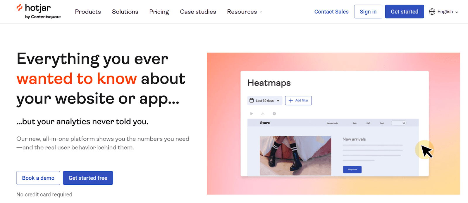
Image Source: Hotjar
Hotjar emerges as a versatile solution that combines heatmaps with session recordings to analyze user interactions. The platform's color-coded visualization helps spot popular "hot" areas in red and less engaged "cold" sections in blue. Its reliable feedback collection system lets teams gather direct user input when users show frustration through rage clicks.
Crazy Egg

Image SOurce: Crazy Egg
Crazy Egg shines at click analysis through its signature confetti reports. The platform delivers five distinct reports that look at user behavior from multiple angles and includes A/B testing features to prove design improvements right.
GA4

Image Source: Google Analytics
Google Analytics 4 stays crucial for tracking key metrics. The platform's improved features now measure engaged sessions, user retention cohorts, and traffic source analysis thoroughly.
FullStory
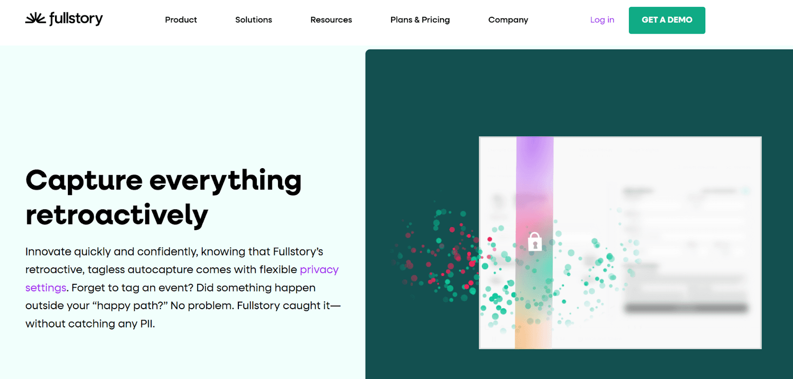
Image Source: FullStory
FullStory sets itself apart with advanced segmentation that helps teams analyze specific audience groups based on various criteria. The platform ranks recordings by relevance and engagement levels automatically, which makes finding critical UX issues easier.
UXCam

Image Source: UXCam
UXCam, built specifically for mobile applications, delivers key insights through:
Session recordings and heatmaps
Detailed crash logs
Integration with Firebase
Screen flow tracking to spot friction
Mouseflow

Image Source: MouseFlow
Mouseflow's user feedback collection system activates when it detects rage clicks. This instant feedback captures pinpoints pain points right when users feel most frustrated.
WAVE
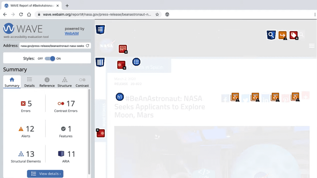
Image Source: Wave
WAVE (Web Accessibility Evaluation Tool) specializes in accessibility testing and helps teams find:
Missing alt text for images
Poor contrast ratios
Keyboard navigation issues
Screen reader compatibility problems
These tools create a solid framework to conduct thorough UX audits and ensure detailed coverage of user experience evaluation aspects.
Data-Driven UX Audit Framework
Evidence-based UX design audits need a systematic framework that gives practical insights. A comprehensive approach combines numbers and user feedback to give a full picture of experience issues.
Quantitative Metrics Collection
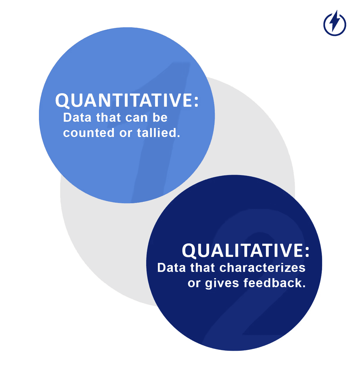
Image Source: LaunchNotes
The first step involves collecting measurable data points. Teams should track average task completion time, application success rates, and eight-week retention rates. Research shows that better UX can increase conversion rates by up to 400%.
Essential quantitative metrics to monitor:
Feature usage patterns and adoption rates
Bounce rates and exit points
Time spent on critical tasks
Error frequency and types
Qualitative User Feedback Analysis
Numbers tell only part of the story. User sentiment requires careful analysis of qualitative data. Teams can break down detailed feedback using thematic analysis with appropriate coding. This reveals patterns in behavior and highlights recurring issues.
The qualitative analysis should focus on:
User interview transcripts
Support ticket themes
Open-ended survey responses
Session recording observations
Teams code text based on what it represents and create new codes that capture potential themes. This helps identify relationships between different experience elements.
ROI Impact Assessment
ROI measurements of UX improvements help verify design decisions and gain stakeholder support. Research shows that USD 1.00 invested in UX brings returns between USD 2.00 and USD 100.00.
A solid ROI calculation requires:
Clear measurements before changes
Tracking of short and long-term metrics
Industry standard comparisons
Documentation of support ticket cost savings
Mozilla's experience proves this point. Their UX improvements led to 70% fewer support calls over 14 weeks. Virgin America achieved similar success with 14% higher conversion rates and 20% reduction in support calls after redesigning their UX.
Implementing Your UX Design Audit Findings
Your UX design audit reveals crucial insights that you need to turn into real improvements. The best way to succeed is to balance quick fixes with long-term solutions in a structured way.
Priority Matrix Creation
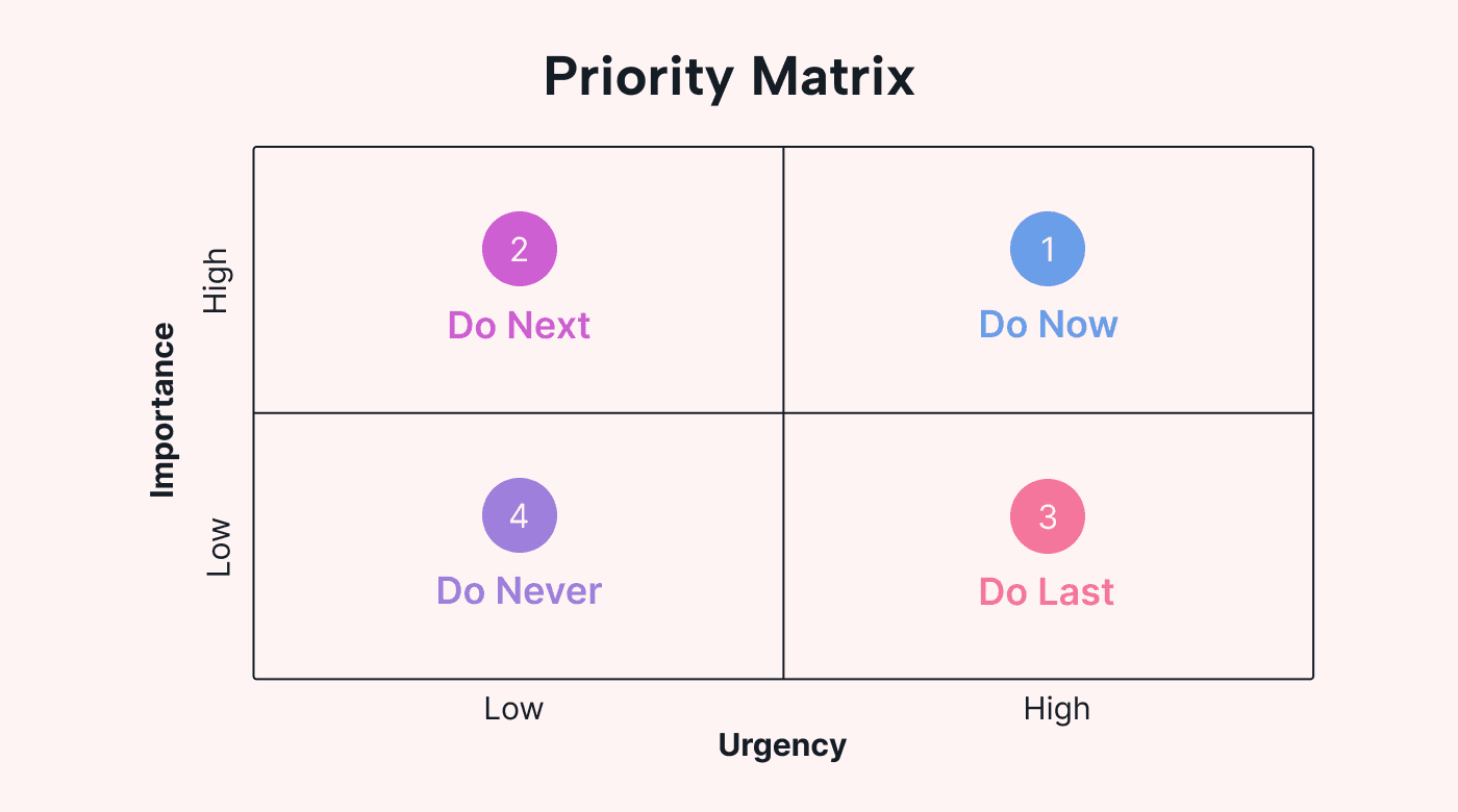
Image Source: Usemotion
The impact-effort matrix helps teams organize their audit findings effectively. This tool plots each issue on two dimensions: how complex it is to implement and its potential value to users. Teams can group improvements into four main areas:
Quick Wins: Easy changes that make a big difference
Big Bets: Major changes that bring high value
Money Pit: Hard work with little reward
Fill-ins: Simple tasks with modest benefits
Research shows that companies with a design-mature strategic approach get better results, boost revenue and speed up their time-to-market. The matrix helps teams use their resources wisely by focusing on the right priorities.
Quick Wins vs Long-term Fixes
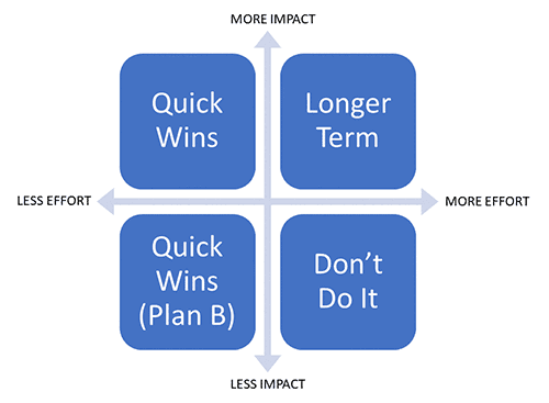
Image Source: Nutrient
The matrix lets you separate fast solutions from strategic improvements. Quick wins usually include:
Fixing broken links and navigation paths
Improving form field validation
Making pages load faster
Creating consistent visuals
Long-term fixes need deeper structural changes. Salesforce's Lightning UI project is a good example. What looked like a simple white space issue ended up needing a complete product analysis. This strategic approach helped them reach 6 million monthly active users.
The 70/30 rule works best: spend 70% of your time on strategic roadmap projects and 30% on quick wins. This balance lets you improve steadily while fixing urgent issues. The most successful companies update their apps every six days on average. This shows how important it is to make regular improvements based on what your audit finds.
Measuring Post-Audit Performance
Regular tracking of results after a UX design audit will show if your improvements make a real difference. Teams can verify their design choices and demonstrate real business results through continuous monitoring.
Key Metrics to Track
Your UX measurement should focus on metrics that connect directly to business goals. Task success rate stands out as a basic indicator that shows the percentage of users who complete specific actions successfully. Time-on-task metrics reveal how well things work, as users who finish tasks faster usually find the system more usable.
Net Promoter Score (NPS) helps you learn about user satisfaction and loyalty. Teams can see how their audit changes affect user sentiment by watching NPS trends. Customer satisfaction scores (CSAT) at key points also help spot areas that need more work.
Error rates give vital feedback about usability improvements. When errors go down, it shows the audit recommendations worked well. Conversion rates across user groups help calculate the business value of better UX.
Before vs After Comparison Framework
You need clear measurements before making changes to see meaningful results later. Start by recording baseline metrics for your key performance indicators. These metrics should have:
Task completion rates
Average time spent on critical flows
User satisfaction scores
Error frequencies
Conversion metrics
Keep your measurement methods the same after making changes to get valid comparisons. Think about outside factors like marketing campaigns or seasonal changes that might affect your data.
The best results come from regular measurements instead of one final check. Research shows companies that update their applications every six days get better user adoption. Long-term tracking helps you spot real improvements versus temporary changes.
Remember to capture both numbers and user feedback. To cite an instance, when task success rates jump by 25%, collect stories from users about how the changes made their work easier. This detailed approach gives stakeholders solid proof of the UX audit's value.
Conclusion
UX design audits help uncover hidden issues that damage user experience and hurt business results. This piece explores everything in effective UX audits - from finding common conversion problems to applying analytical insights.
Studies show how UX improvements affect business results. Companies achieve up to 400% higher conversion rates after fixing these issues. On top of that, it yields returns between $2 to $100 for every dollar spent on UX improvements.
Main points from this piece include:
Methods to spot navigation problems, form issues, and slow loading times
Tools like Hotjar, Crazy Egg, and Google Analytics 4 to evaluate UX fully
Frameworks that combine metrics with user feedback
Ways to balance quick fixes with future improvements
Methods to measure results after the audit
Real examples prove these results. Bulldog Skincare increased sales by 208% while Mozilla reduced support calls by 70% through detailed UX audits. Regular UX evaluation helps businesses stay competitive and keep users happy.
Your UX audit can start today. Users will appreciate the changes, and your business will benefit. Note that small improvements add up quickly and boost both user experience and business growth.
FAQs
Q1. What is a UX design audit and why is it important?
A UX design audit is a systematic evaluation of a product's user experience to identify usability issues and areas for improvement. It's important because it can significantly boost conversion rates, increase sales, and enhance user satisfaction by uncovering hidden problems that may be costing you valuable users.
Q2. How long does a typical UX design audit take?
Most UX design audits take between two to four weeks to complete. However, the duration can vary depending on the complexity of the product and the scope of the audit. Regular audits are especially crucial after adding new features or when experiencing drops in retention rates.
Q3. What are some common UX issues that negatively impact user retention?
Common UX issues include navigation dead ends, which can lead to a 25% drop in user retention; confusing form fields, resulting in a 40% abandonment rate; and slow load times, causing 53% of mobile users to leave sites that take longer than 3 seconds to load.
Q4. What tools are essential for conducting a UX design audit in 2026?
Essential tools for UX design audits in 2026 include Hotjar for heatmaps and session recordings, Crazy Egg for detailed click analysis, Google Analytics 4 for tracking key metrics, FullStory for advanced segmentation, and WAVE for accessibility testing.
Q5. How can I measure the success of UX improvements after an audit?
To measure post-audit performance, track key metrics such as task success rates, time-on-task, Net Promoter Score (NPS), customer satisfaction scores (CSAT), error rates, and conversion rates. Compare these metrics before and after implementing changes to quantify the impact of your UX improvements.
Bulldog Skincare's online presence saw a dramatic shift after a UX design audit. The results speak for themselves - total sales jumped by 208% while conversion rates soared by 78%. These numbers tell a powerful story about what systematic UX evaluation can do for business growth.
A UX design audit digs deep to spot pain points, usability challenges, and design gaps in a product's user experience. The proof is in the results - HubSpot managed to double their conversion rates by putting audit findings to work. Most UX audits need two to four weeks to complete, but their effects last much longer. The work becomes vital right after new features roll out or when retention rates start to slip.
This piece lays out everything about UI/UX design audits. You'll find proven audit templates, checklists, and ways to turn your findings into real improvements. The insights here will help you spot hidden problems that drive users away, whether you're working with a UX design audit agency or running an internal review.
Common UX Issues That Silently Kill Conversion
Image Source: Media Modifier
Bad user experience can quietly damage your website's success. This leads to big drops in how users interact with your site and how many convert. A good UI/UX design audit helps you spot these hidden problems that hurt your site.
Navigation Dead Ends: 25% Drop in User Retention
Users often hit pages with no clear way forward. This creates frustration and makes them leave. Research shows websites with bad navigation see their user retention fall by 25%. About 70% of visitors never return to websites where they got lost in navigation.
You can stop navigation dead ends by:
Adding clear breadcrumbs so users can backtrack easily
Keeping menus in the same spot on every page
Adding clear links to main sections
Adding search to help users find things quickly
Confusing Form Fields: 40% Abandonment Rate
Forms help convert visitors into customers. However, badly designed forms make users leave quickly. Studies show 40% of users quit forms because fields are confusing or ask for too much information. Forms that ask for phone numbers see 37% more people giving up unless marked as optional.
Your forms will work better if you:
Ask only for essential information
Use labels that make sense
Show validation messages right away
Let users skip phone number fields
Slow Load Times: 53% Mobile Users Leave
Speed matters a lot for mobile users. Research shows 53% of mobile visitors leave sites that take more than 3 seconds to load. Sites lose half their conversions when load time jumps from one to three seconds.
Slow loading does more than chase visitors away - it hurts your revenue. Airlines see 81% of users abandon their online forms. This happens because their forms are complex and pages load slowly. Car industry websites lose 82% of visitors due to speed issues.
Regular UX design audits should focus on making sites faster by:
Making images and media files smaller
Cutting down on HTTP requests
Using better caching
Making code and scripts run faster
UI/UX Design Audit Checklist
Image Source: FiveDotTwelve
A systematic approach helps you review UI/UX design from multiple angles. Here's a detailed checklist to review your digital product's user experience, based on research and industry standards.
User Research & Personas
Your product must serve its target audience effectively. Build detailed user personas with demographic data, behavioral patterns, and user goals. These personas need to mirror actual user needs instead of assumptions. On top of that, it helps to analyze customer support tickets and feedback forms to spot common pain points.
Navigation & Information Architecture
The foundations of your product's usability rest on information architecture. Tree testing helps verify if users can quickly find key information. Users should spot navigation elements right away. Desktop versions should not depend only on hamburger menus.
Visual Consistency & Branding
Brand recognition and trust grow when visual elements stay consistent across touchpoints. Studies show brands can increase revenue by 33% through consistent design. Your design system's components should include:
Typography and color schemes
Button behaviors and states
Icon styles and placement
Layout patterns
Mobile Responsiveness & Adaptability
Mobile devices now drive over 62% of global website traffic. Testing your product across devices and screen sizes is vital. Small screens need special attention to touch targets, gesture controls, and content readability.
Load Time & Performance
User retention and conversion rates depend heavily on speed. Research shows 53% of mobile visits end if pages take longer than 3 seconds to load. Your review should cover:
Page load times across different connections
Image optimization
Server response times
Resource loading efficiency
Feedback Mechanisms
Users need clear signals that acknowledge their actions. Quick, visible responses should follow every interaction. Your system should have:
Visual indicators for button states
Progress indicators for longer processes
Clear error messages with resolution steps
Success confirmations for completed actions
Note that systematic documentation of findings helps prioritize improvements based on user impact and business goals. Regular reviews prevent UX issues from piling up and keep the user experience optimal.
Forms & Input Validation
Good form design needs to balance ease of use with data collection. Studies reveal that forms with inline validation see a 31% increase in satisfaction rating and users complete them 42% faster. The validation messages should pop up after users finish typing instead of breaking their flow mid-input.
Conversion Optimization & CTA Effectiveness
CTA buttons are vital conversion points in the user's path. High-contrast CTA colors can boost click rates by a lot. These buttons work best when you:
Put them clearly above the fold
Write action words in button text
Leave enough white space around them
Try different colors to find what stands out most
A/B Testing & Documentation
Split testing helps confirm UX improvements through analytical decisions. Your team should test changes regularly to measure how they affect engagement time and conversion rates.
Essential UX Design Audit Tools in 2026
Customer Journey Analytics: GA4
Image Source: Online Metrics
GA4 gives great insights about how users behave. The platform keeps track of key metrics like:
Engaged sessions and engagement rate
Average engagement time
User retention cohorts
Traffic source analysis
Heatmap Analytics: Hotjar vs Crazy Egg
Image Source: MS Clarity
Both tools offer strong visualization features but work differently. Hotjar shows move maps of cursor movements that hint at eye tracking. Crazy Egg shines with detailed click analysis in its signature confetti reports.
User Session Recording Tools
Image Source: FullSession
Session recordings show how people actually use your interface. Modern tools like FullSession track:
Mouse movements and clicks
Scroll patterns
Form interactions
Console errors
The best recording tools rank sessions by how relevant and engaging they are. Teams can spot UX problems quickly without watching hours of footage.
List of UX Design Audit Tools
UX design audit tools have evolved beyond simple analytics and now give detailed insights into user behavior and experience. Here's a selection of tools that UX professionals should think about in 2026.
Hotjar
Image Source: Hotjar
Hotjar emerges as a versatile solution that combines heatmaps with session recordings to analyze user interactions. The platform's color-coded visualization helps spot popular "hot" areas in red and less engaged "cold" sections in blue. Its reliable feedback collection system lets teams gather direct user input when users show frustration through rage clicks.
Crazy Egg
Image SOurce: Crazy Egg
Crazy Egg shines at click analysis through its signature confetti reports. The platform delivers five distinct reports that look at user behavior from multiple angles and includes A/B testing features to prove design improvements right.
GA4
Image Source: Google Analytics
Google Analytics 4 stays crucial for tracking key metrics. The platform's improved features now measure engaged sessions, user retention cohorts, and traffic source analysis thoroughly.
FullStory
Image Source: FullStory
FullStory sets itself apart with advanced segmentation that helps teams analyze specific audience groups based on various criteria. The platform ranks recordings by relevance and engagement levels automatically, which makes finding critical UX issues easier.
UXCam
Image Source: UXCam
UXCam, built specifically for mobile applications, delivers key insights through:
Session recordings and heatmaps
Detailed crash logs
Integration with Firebase
Screen flow tracking to spot friction
Mouseflow
Image Source: MouseFlow
Mouseflow's user feedback collection system activates when it detects rage clicks. This instant feedback captures pinpoints pain points right when users feel most frustrated.
WAVE
Image Source: Wave
WAVE (Web Accessibility Evaluation Tool) specializes in accessibility testing and helps teams find:
Missing alt text for images
Poor contrast ratios
Keyboard navigation issues
Screen reader compatibility problems
These tools create a solid framework to conduct thorough UX audits and ensure detailed coverage of user experience evaluation aspects.
Data-Driven UX Audit Framework
Evidence-based UX design audits need a systematic framework that gives practical insights. A comprehensive approach combines numbers and user feedback to give a full picture of experience issues.
Quantitative Metrics Collection
Image Source: LaunchNotes
The first step involves collecting measurable data points. Teams should track average task completion time, application success rates, and eight-week retention rates. Research shows that better UX can increase conversion rates by up to 400%.
Essential quantitative metrics to monitor:
Feature usage patterns and adoption rates
Bounce rates and exit points
Time spent on critical tasks
Error frequency and types
Qualitative User Feedback Analysis
Numbers tell only part of the story. User sentiment requires careful analysis of qualitative data. Teams can break down detailed feedback using thematic analysis with appropriate coding. This reveals patterns in behavior and highlights recurring issues.
The qualitative analysis should focus on:
User interview transcripts
Support ticket themes
Open-ended survey responses
Session recording observations
Teams code text based on what it represents and create new codes that capture potential themes. This helps identify relationships between different experience elements.
ROI Impact Assessment
ROI measurements of UX improvements help verify design decisions and gain stakeholder support. Research shows that USD 1.00 invested in UX brings returns between USD 2.00 and USD 100.00.
A solid ROI calculation requires:
Clear measurements before changes
Tracking of short and long-term metrics
Industry standard comparisons
Documentation of support ticket cost savings
Mozilla's experience proves this point. Their UX improvements led to 70% fewer support calls over 14 weeks. Virgin America achieved similar success with 14% higher conversion rates and 20% reduction in support calls after redesigning their UX.
Implementing Your UX Design Audit Findings
Your UX design audit reveals crucial insights that you need to turn into real improvements. The best way to succeed is to balance quick fixes with long-term solutions in a structured way.
Priority Matrix Creation
Image Source: Usemotion
The impact-effort matrix helps teams organize their audit findings effectively. This tool plots each issue on two dimensions: how complex it is to implement and its potential value to users. Teams can group improvements into four main areas:
Quick Wins: Easy changes that make a big difference
Big Bets: Major changes that bring high value
Money Pit: Hard work with little reward
Fill-ins: Simple tasks with modest benefits
Research shows that companies with a design-mature strategic approach get better results, boost revenue and speed up their time-to-market. The matrix helps teams use their resources wisely by focusing on the right priorities.
Quick Wins vs Long-term Fixes
Image Source: Nutrient
The matrix lets you separate fast solutions from strategic improvements. Quick wins usually include:
Fixing broken links and navigation paths
Improving form field validation
Making pages load faster
Creating consistent visuals
Long-term fixes need deeper structural changes. Salesforce's Lightning UI project is a good example. What looked like a simple white space issue ended up needing a complete product analysis. This strategic approach helped them reach 6 million monthly active users.
The 70/30 rule works best: spend 70% of your time on strategic roadmap projects and 30% on quick wins. This balance lets you improve steadily while fixing urgent issues. The most successful companies update their apps every six days on average. This shows how important it is to make regular improvements based on what your audit finds.
Measuring Post-Audit Performance
Regular tracking of results after a UX design audit will show if your improvements make a real difference. Teams can verify their design choices and demonstrate real business results through continuous monitoring.
Key Metrics to Track
Your UX measurement should focus on metrics that connect directly to business goals. Task success rate stands out as a basic indicator that shows the percentage of users who complete specific actions successfully. Time-on-task metrics reveal how well things work, as users who finish tasks faster usually find the system more usable.
Net Promoter Score (NPS) helps you learn about user satisfaction and loyalty. Teams can see how their audit changes affect user sentiment by watching NPS trends. Customer satisfaction scores (CSAT) at key points also help spot areas that need more work.
Error rates give vital feedback about usability improvements. When errors go down, it shows the audit recommendations worked well. Conversion rates across user groups help calculate the business value of better UX.
Before vs After Comparison Framework
You need clear measurements before making changes to see meaningful results later. Start by recording baseline metrics for your key performance indicators. These metrics should have:
Task completion rates
Average time spent on critical flows
User satisfaction scores
Error frequencies
Conversion metrics
Keep your measurement methods the same after making changes to get valid comparisons. Think about outside factors like marketing campaigns or seasonal changes that might affect your data.
The best results come from regular measurements instead of one final check. Research shows companies that update their applications every six days get better user adoption. Long-term tracking helps you spot real improvements versus temporary changes.
Remember to capture both numbers and user feedback. To cite an instance, when task success rates jump by 25%, collect stories from users about how the changes made their work easier. This detailed approach gives stakeholders solid proof of the UX audit's value.
Conclusion
UX design audits help uncover hidden issues that damage user experience and hurt business results. This piece explores everything in effective UX audits - from finding common conversion problems to applying analytical insights.
Studies show how UX improvements affect business results. Companies achieve up to 400% higher conversion rates after fixing these issues. On top of that, it yields returns between $2 to $100 for every dollar spent on UX improvements.
Main points from this piece include:
Methods to spot navigation problems, form issues, and slow loading times
Tools like Hotjar, Crazy Egg, and Google Analytics 4 to evaluate UX fully
Frameworks that combine metrics with user feedback
Ways to balance quick fixes with future improvements
Methods to measure results after the audit
Real examples prove these results. Bulldog Skincare increased sales by 208% while Mozilla reduced support calls by 70% through detailed UX audits. Regular UX evaluation helps businesses stay competitive and keep users happy.
Your UX audit can start today. Users will appreciate the changes, and your business will benefit. Note that small improvements add up quickly and boost both user experience and business growth.
FAQs
Q1. What is a UX design audit and why is it important?
A UX design audit is a systematic evaluation of a product's user experience to identify usability issues and areas for improvement. It's important because it can significantly boost conversion rates, increase sales, and enhance user satisfaction by uncovering hidden problems that may be costing you valuable users.
Q2. How long does a typical UX design audit take?
Most UX design audits take between two to four weeks to complete. However, the duration can vary depending on the complexity of the product and the scope of the audit. Regular audits are especially crucial after adding new features or when experiencing drops in retention rates.
Q3. What are some common UX issues that negatively impact user retention?
Common UX issues include navigation dead ends, which can lead to a 25% drop in user retention; confusing form fields, resulting in a 40% abandonment rate; and slow load times, causing 53% of mobile users to leave sites that take longer than 3 seconds to load.
Q4. What tools are essential for conducting a UX design audit in 2026?
Essential tools for UX design audits in 2026 include Hotjar for heatmaps and session recordings, Crazy Egg for detailed click analysis, Google Analytics 4 for tracking key metrics, FullStory for advanced segmentation, and WAVE for accessibility testing.
Q5. How can I measure the success of UX improvements after an audit?
To measure post-audit performance, track key metrics such as task success rates, time-on-task, Net Promoter Score (NPS), customer satisfaction scores (CSAT), error rates, and conversion rates. Compare these metrics before and after implementing changes to quantify the impact of your UX improvements.


Similar Blogs
Similar Blogs
Similar Blogs


Available for Work
Bricx
© Bricx, 2026. All rights reserved.


Available for Work
Bricx
© Bricx, 2026. All rights reserved.
Available for Work
Bricx
© Bricx, 2026. All rights reserved.
Available for Work
Bricx
© Bricx, 2026. All rights reserved.