25+ UX Design Case Studies For B2B & AI SaaS
Most Relevant

AI
India
Finding PMF for Fray with a Designer First Landing Page
Marketing
Miami Beach, Florida
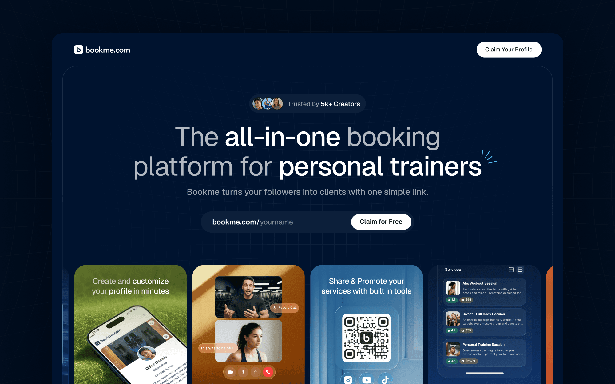
Increasing BookMe’s Landing Page Conversions in Two Weeks
AI
Location
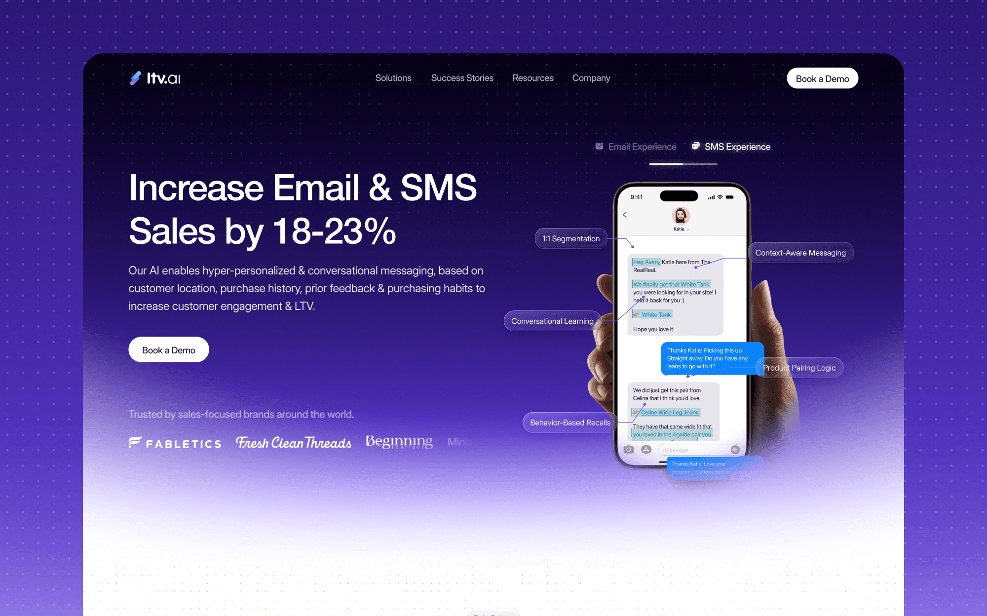
Building an Enterprise-Grade Website for LTV.ai

AI
San Fransico, CA
Designing Gigamiind’s Credible AI-First Landing Page

AI
San Fransico, CA
Redesigning GigaMind’s Entire Product in Two Weeks
AI
Mountain View, CA
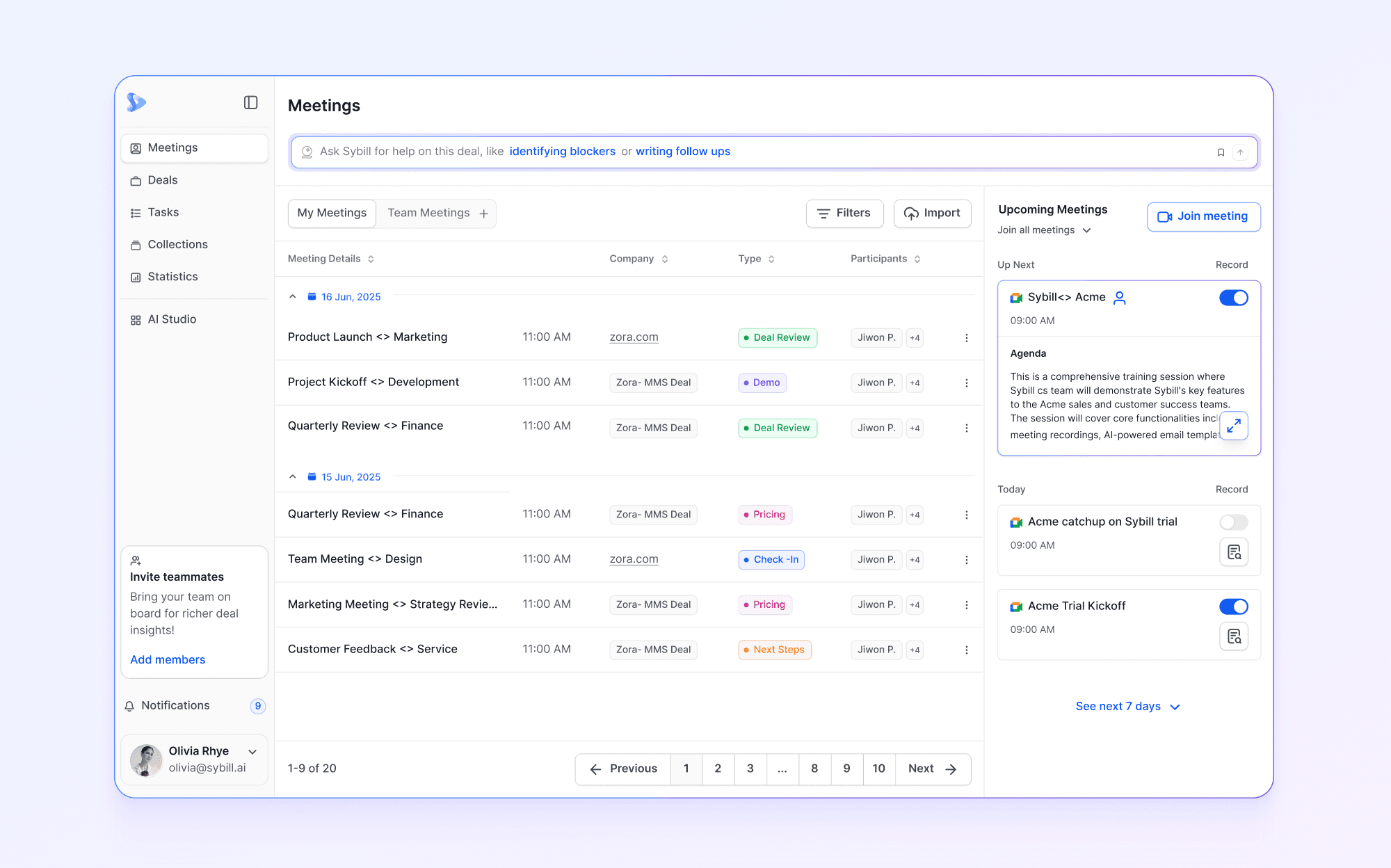
Redesigning Sybill Without Disrupting Existing Users
AI
San Fransisco, CA
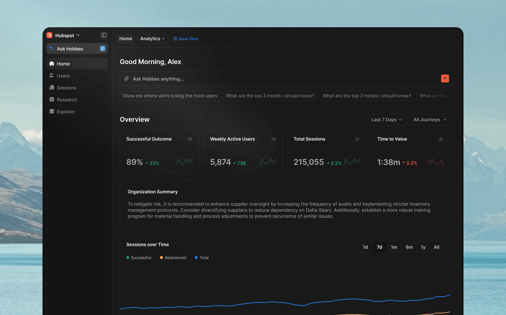
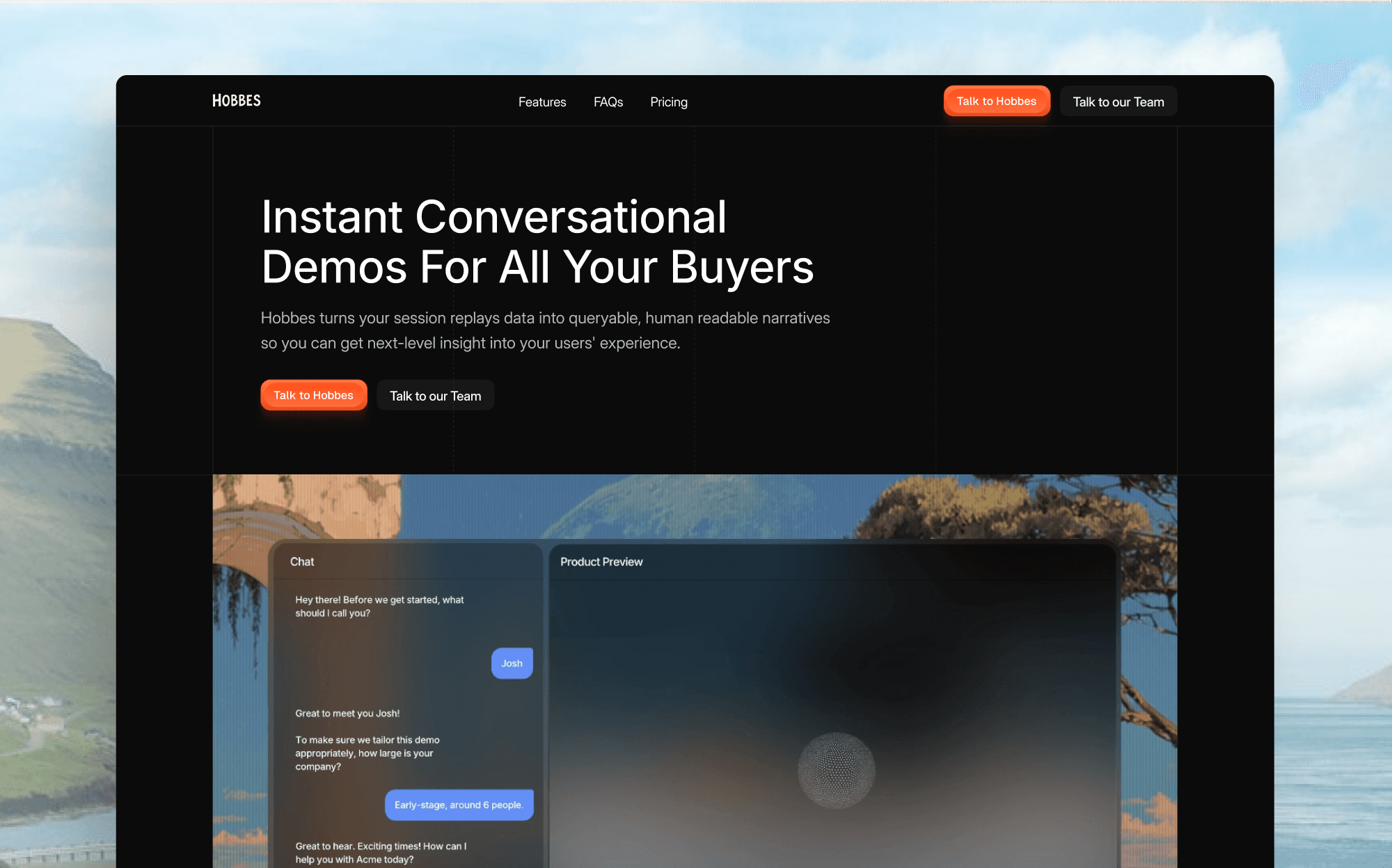
Designing Hobbes’as an Embedded Partner
AI
San Fransisco, CA
Rebranding Hobbes for an AI-First Market

AI
Albuquerque, New Mexico
Turning AISuitUp’s Landing Page Into a Conversion Engine

AI
Canada
Powering N3on’s First Token Launch with a 10 Day Platform Redesign

Marketing
San Francisco, CA
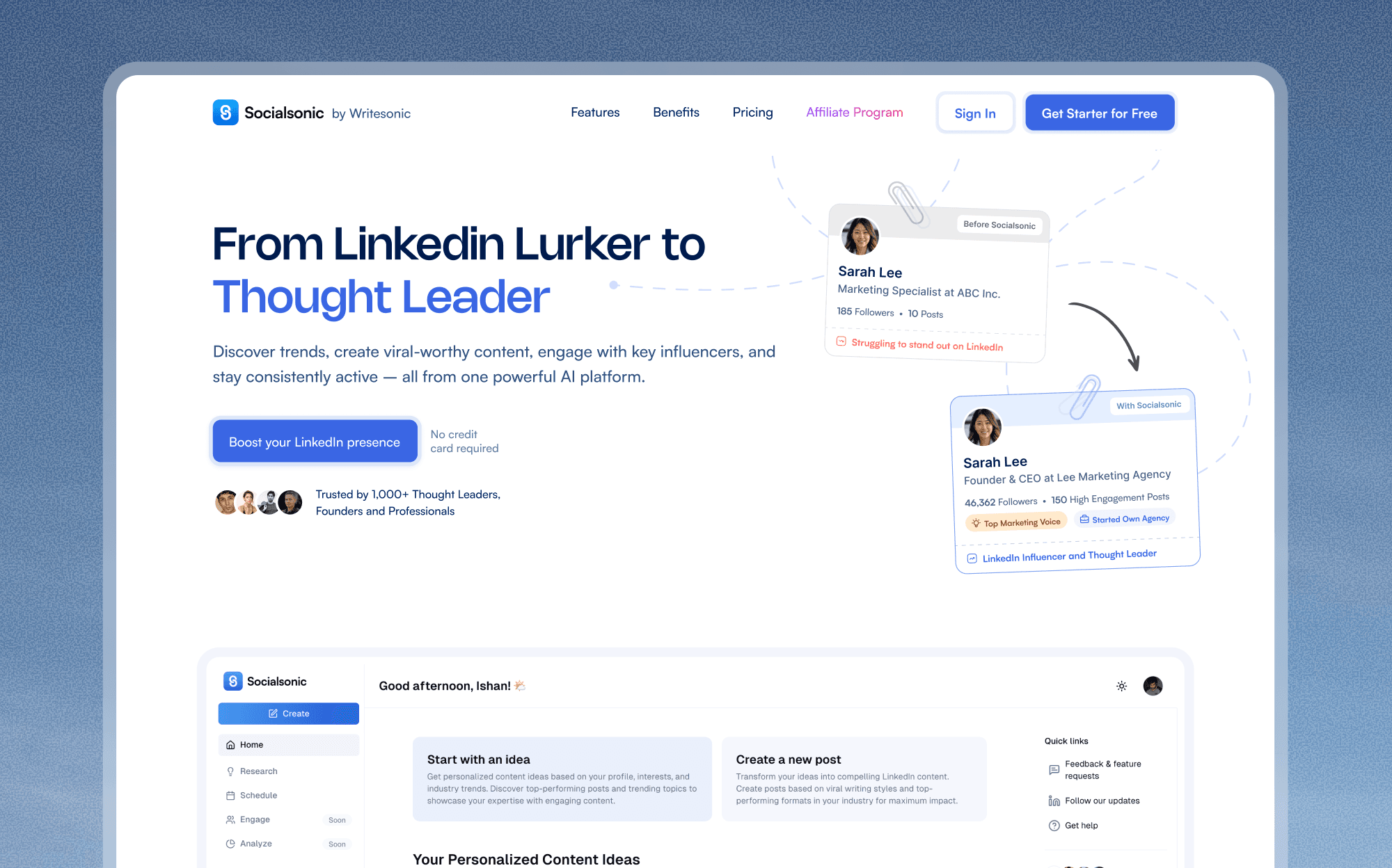
Designing Socialsonic's MVP To Reach 1000+ Users In 30 Days

Sales
Canada
Manyreach Website Revamp that Increased Conversions & AOV

Ed-Tech
Canada
Full-Stack Ed-Tech Website Experience Design for Webstone
Marketing
San Francisco, CA
Website Design for Personal Branding AI SaaS in 30 Days

Healthcare
Bangalore, India
Designing A Better WHOOP Competitor For Fitness Enthusiasts

B2B
India
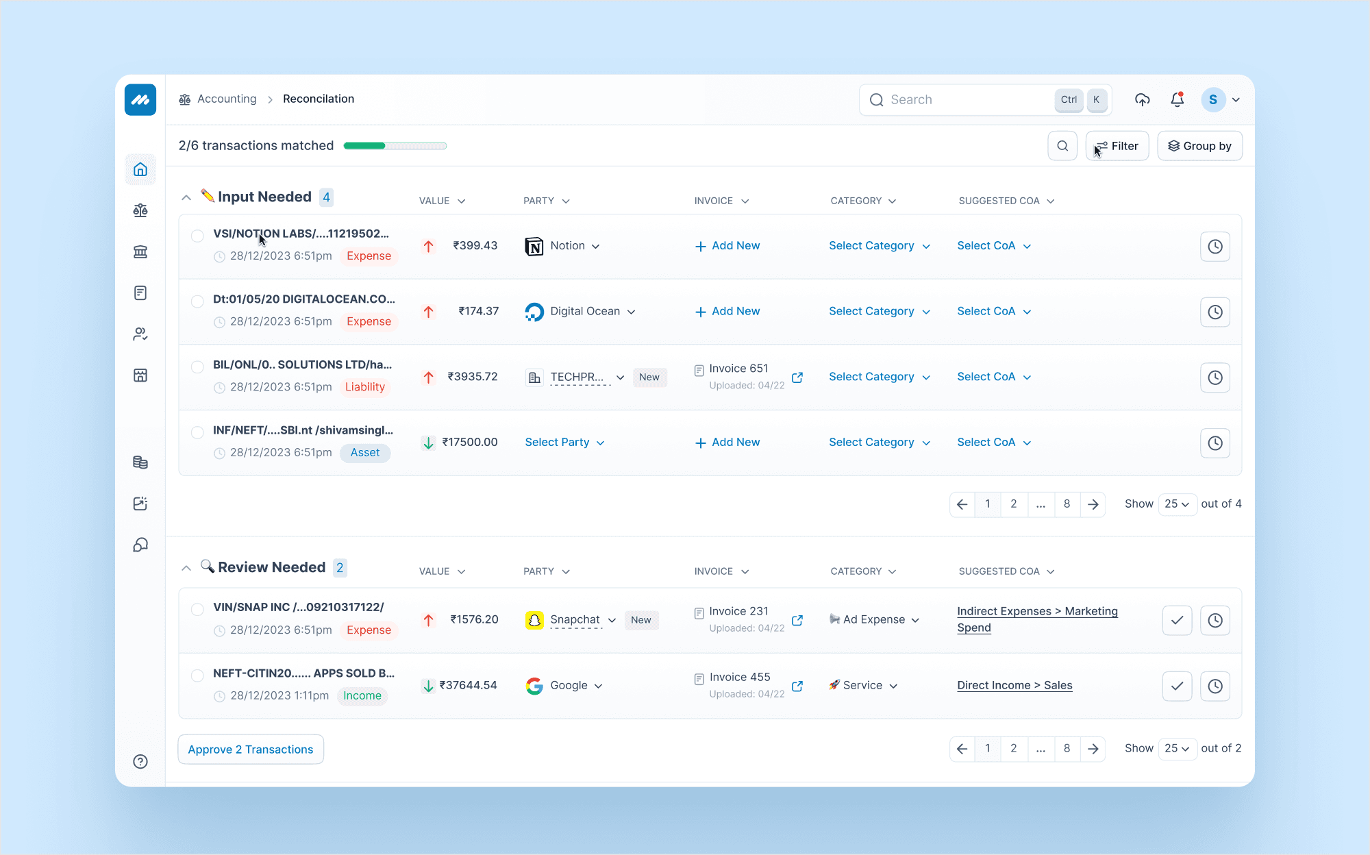
Redesigning the Procol Website to Increase Conversion Rates

B2B
Mumbai, India
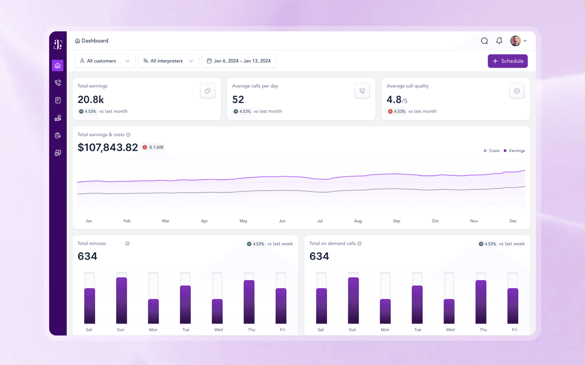
Designing AACIPL’s Sales Management Platform in 60 Days

B2B
Global
Design Partner to a Billion-Dollar Consulting Firm
AI
San Fransisco
Redesigning a 10M Visitor Website Without Losing Conversions

Web 3
Canada
Landing Page Design + Brand Deck In 48 Hours

AI
Vancouver, Canada
Designing Loopback's MVP + Landing Page In 21 Days
Finance
Mumbai, India
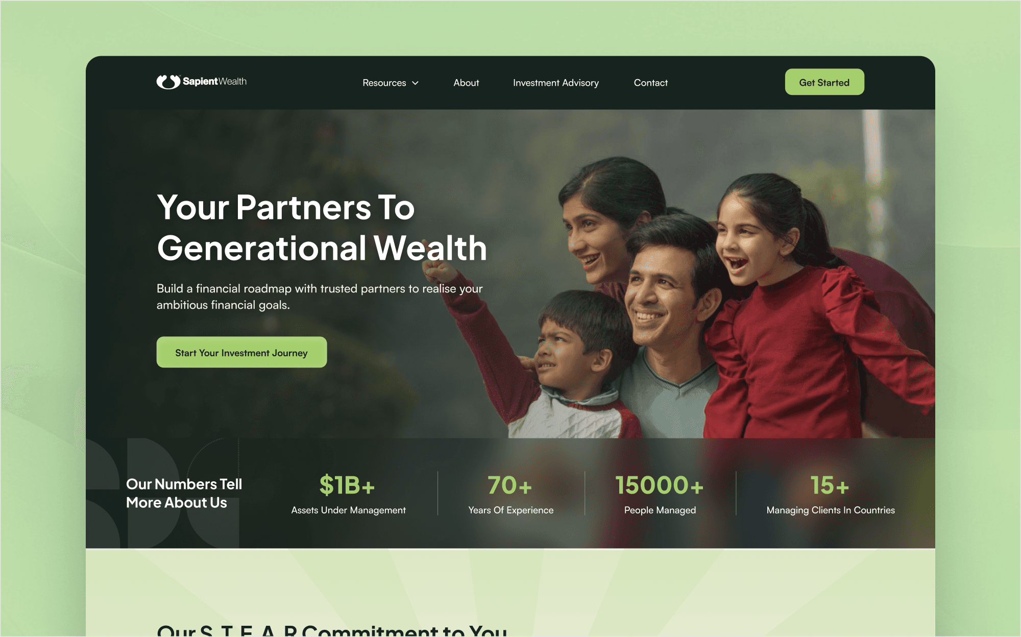
Redesigning Sapient Wealth's Website for Modern Positioning

Web 3
Canada
Designing A Gamified Web3 MVP in Just 14 Days
Ed-Tech
India
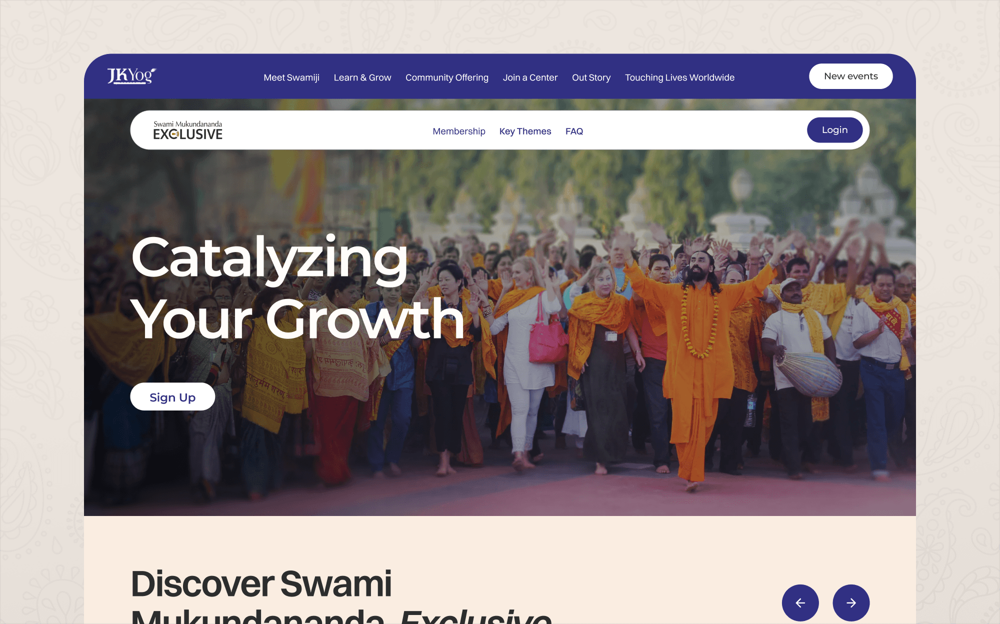
Redesigning A Spiritual Learning Platform for A Seamless User Experience
B2B
United States
Reimagining AvantTalk with a Scalable, Multilingual UI
Healthcare
United States
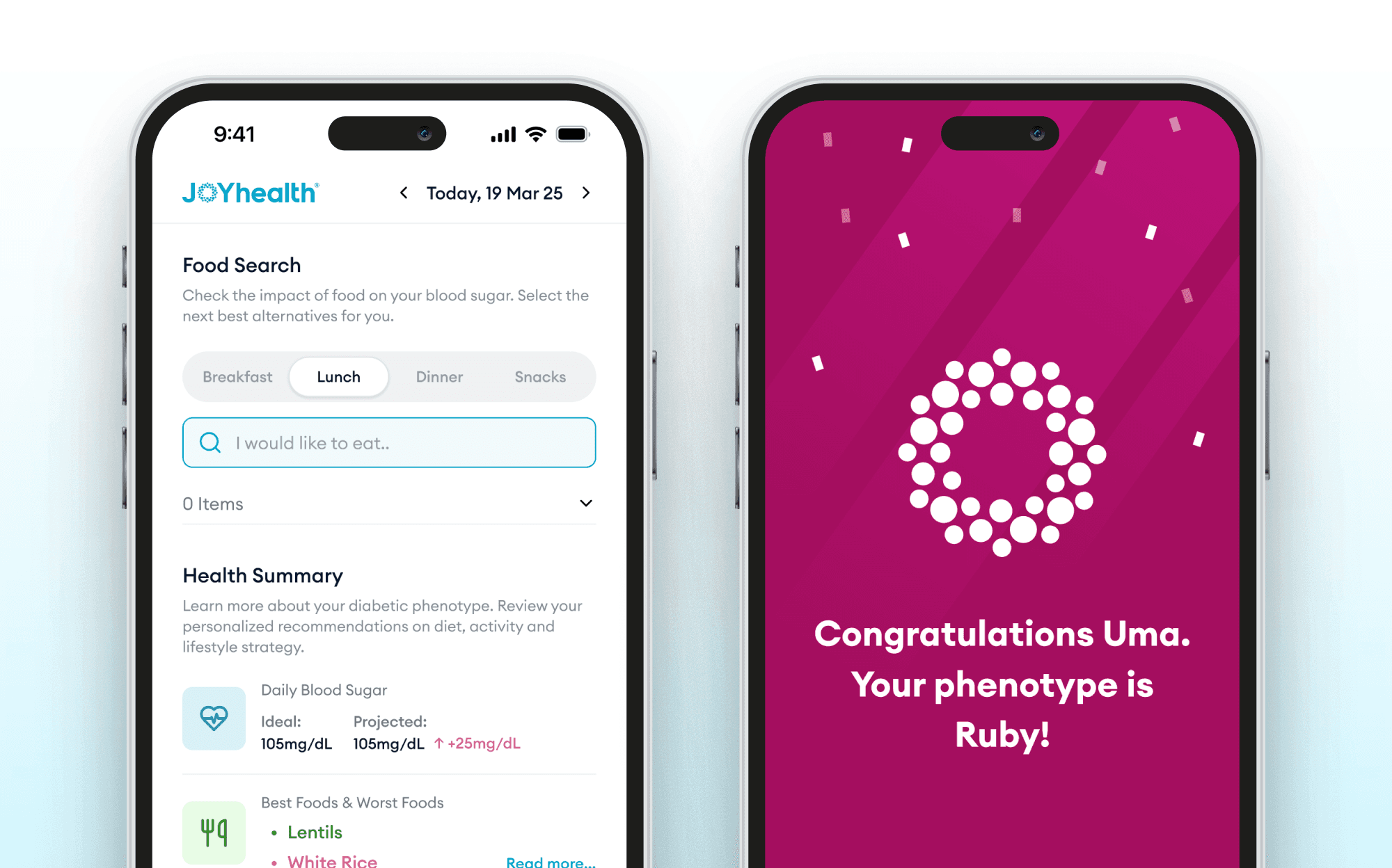
How We Revamped JoyHealth’s Web App and Marketing to Drive Patient Connection

Healthcare
United States
How We Helped JoyHealth Build a Trustworthy Website That Inspires Users
Finance
Delhi, India
Designing A Fintech AI SaaS In A 14 Days Sprint

Ed-Tech
India
Redesigning A Top-Ranked Spiritual App For Better Engagement

AI
San Francisco
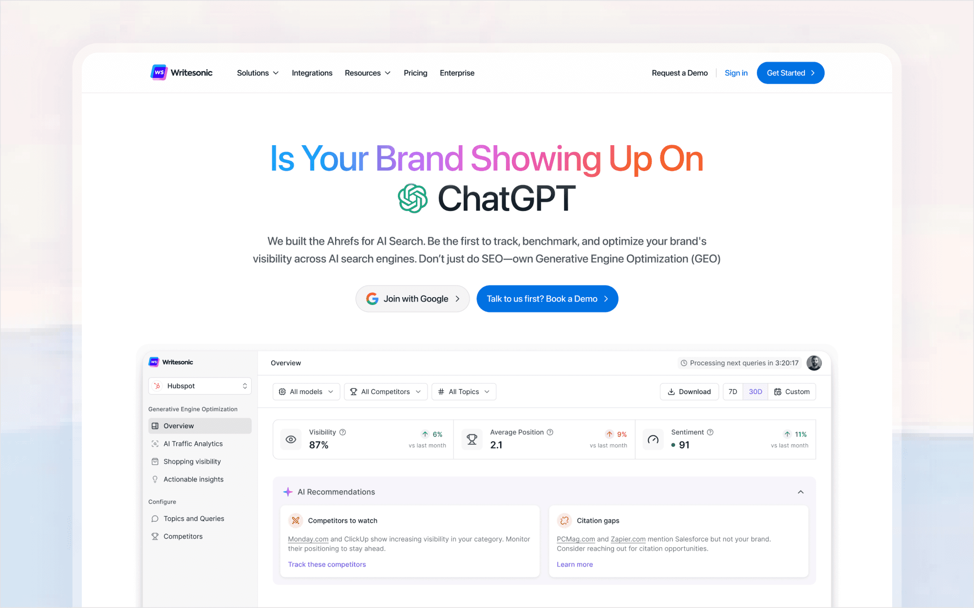
Designing the First GEO Platform For Writesonic's 1M+ Users
Marketing
India
Helping Contentbrew Go From Napkin Sketch to Full Product in 4 Weeks
B2B
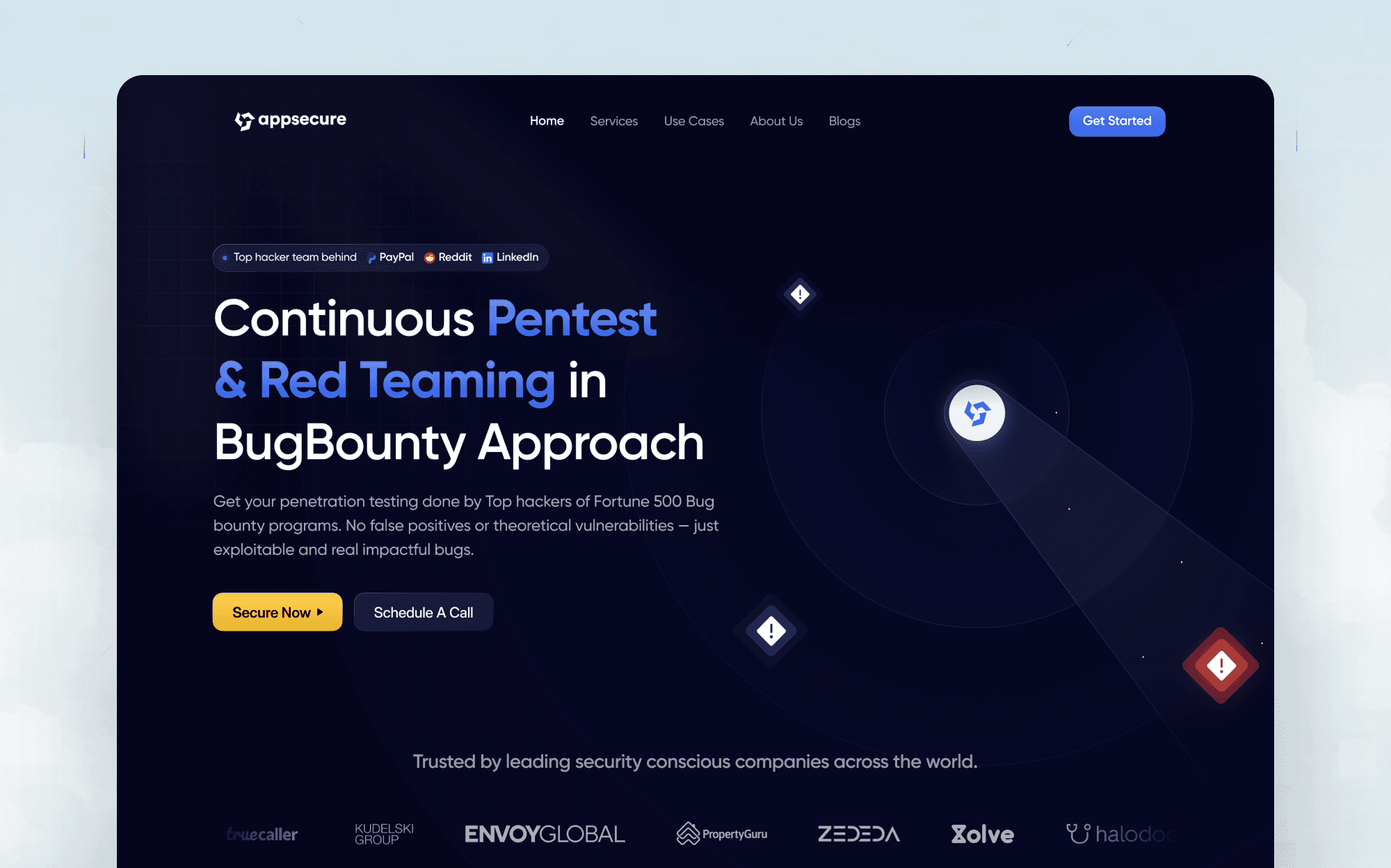
Singapore
Modern & Aesthetic Redesign for Appsecure’s Company Website
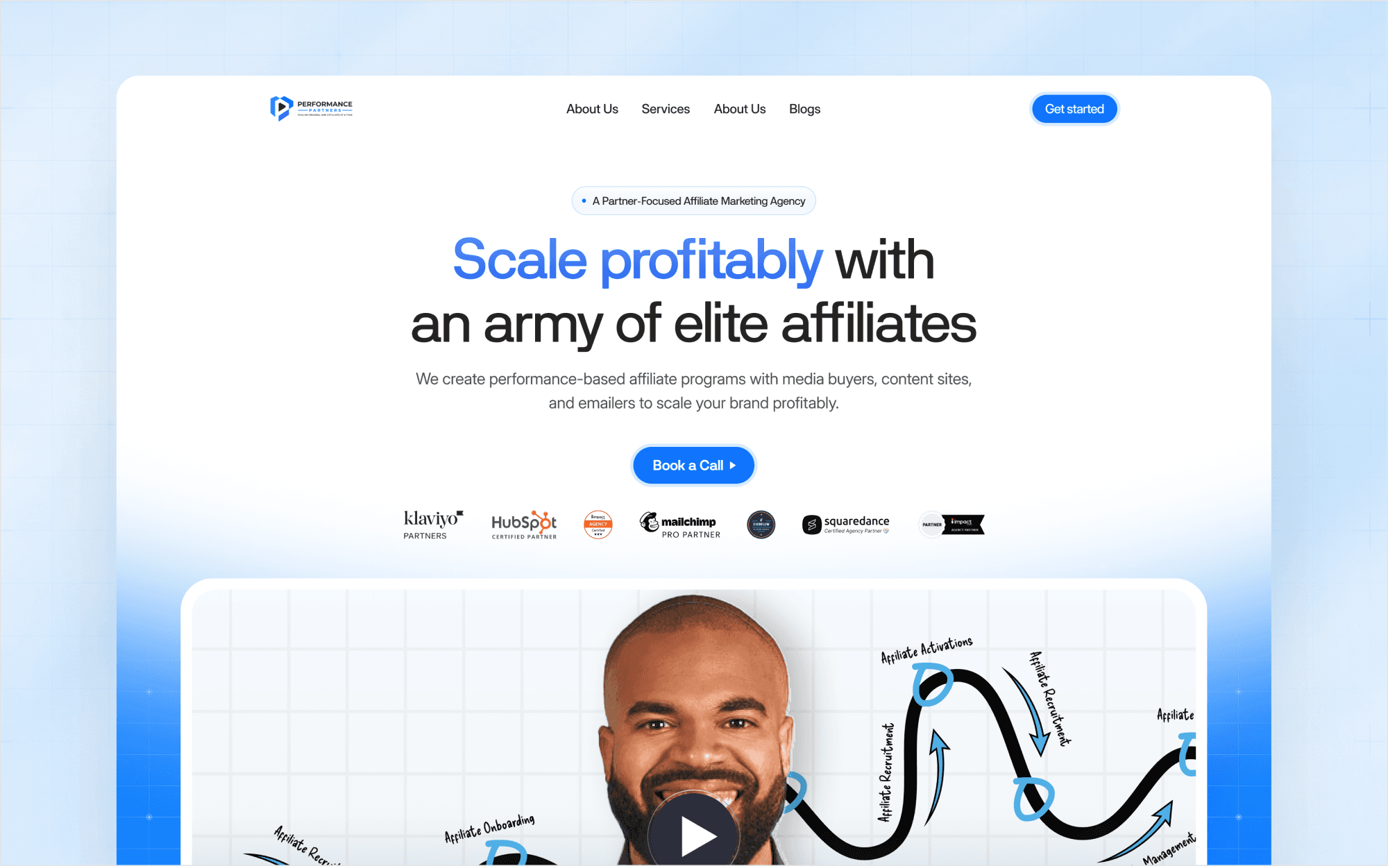
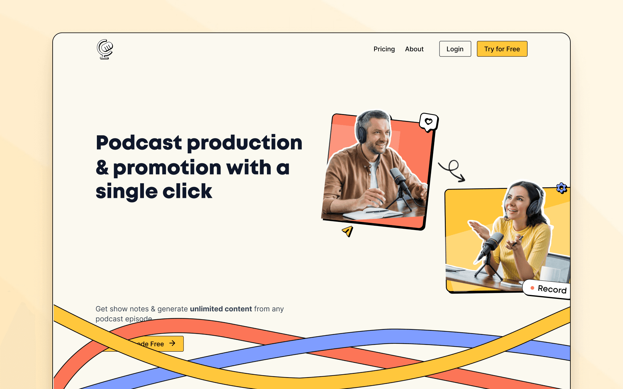
Marketing
Toronto, Ontario
Repositioning Performance Partners For Trust & Credibility

Ed-Tech
San Francisco Bay Area
Redesigning Scale Jobs’ Website for 2X More Sales Calls in 30 Days

Sales
London


