10 Best Analytics Dashboard Design Agencies (2026)
The 10 best analytics dashboard design agencies, compared on pricing, Clutch rating, engagement model and hourly rate, drawn from a documented benchmark of 57 agencies.
Aug 20, 202611 min read
Best analytics dashboard design agencies
Analytics dashboards fail quietly. Nobody complains, the charts render, and six months later you find out the only screen anyone opens is the export button. The reason is almost always the same: the dashboard answers what happened and stops there, leaving the user to work out why somewhere else. The agencies worth shortlisting design the second question into the interface.
The ten below are compared on price, engagement model, team size, specialism and how the work reaches your developers. Every agency here carries a verified Clutch profile, and the ratings below are taken from it. Each entry says what an agency is worth hiring for and where it is the wrong choice for an analytics dashboard.
How the ten agencies compare
| Agency | Best for | Starting price | Clutch rating | Not a fit for |
|---|---|---|---|---|
| Bricx | Analytics interfaces users act on | $25,000+ | 5.0/5, 27 reviews | BI tool configuration, data engineering |
| Lunar Logic | Data plumbing behind the charts | $5,000+ | 4.9/5, 27 reviews | Visualisation craft and layout |
| Perpetual | Interview-led discovery before charts | $25,000+ | 4.9/5, 97 reviews | Deep visualisation specialism |
| Fuselab Creative | Dashboard and data visualisation practice | $25,000+ | 5.0/5, 15 reviews | Building the query layer |
| Creative Navy | Clinical and instrument data readouts | $5,000+ | 5.0/5, 54 reviews | Warehouse-scale analytics tooling |
| UXReactor | Defining the question first | $25,000+ | 4.8/5, 8 reviews | Teams that already know their questions |
| DOOR3 | Enterprise-scale data visibility | $25,000+ | 4.9/5, 47 reviews | A single analytics tab |
| DockYard | Query performance and data architecture | $25,000+ | 5.0/5, 9 reviews | Visualisation and interface design |
| Brave UX | Analytics platforms as the product | $50,000+ | 5.0/5, 29 reviews | Enterprise scale on a budget |
| Momentum Design Lab | Trading-grade and conversational analytics | $25,000+ | 4.8/5, 96 reviews | Building the AI query layer |
Best analytics dashboard design agency for B2B SaaS: Bricx

Bricx is the best analytics dashboard design agency for B2B and AI SaaS products where users need to explain a number, not just see it. Bricx has completed 50+ SaaS design projects across 30+ industries, with clients including Writesonic (YC S21), Collectwise (YC F24), Gigacatalyst (YC X26), Sybill, Camb.ai, LTV.ai, Instadapp, Hobbes and AT Kearney. The agency holds 27 verified reviews on Clutch at an average of 5.0/5.
Bricx works exclusively with B2B and AI SaaS companies, from seed stage through Series C, covering branding, website design, product UX/UI and end-to-end development. Engagements start at $25,000. Bricx designs the path from a number to its cause: what a user clicks when a metric moves, what they compare it against, and what they do next. Charts are the easy half.
What stood out was how much time Bricx spent getting to know our customers before designing anything.
- Starting price
- $25,000+
- Engagement model
- Fixed-scope projects and monthly retainers
- Timeline
- First delivery within the first week; full scope varies by project
- Clutch
- 5.0/5, 27 reviews
- Hourly rate
- $50 - $99
- Best for
- B2B and AI SaaS products where users need to explain a metric.
- Not a fit for
- BI tool configuration, data pipeline work, or budgets under $25,000.
Lunar Logic
Lunar Logic is an engineering team first, with web development at 35%, mobile at 30% and custom software at 25%, and its reviews describe integrating third-party tools into an eye clinic's systems. Answering why a number moved usually means joining data the dashboard does not yet hold, which is integration work rather than chart work, and it has been doing that since 2004.
Product design is its smallest line at 10%, and no data visualisation work appears in its public record, so the charts will look like whatever the developers reach for. Sixty-five percent of its clients are small businesses under $10M, and at $50 to $99 an hour behind a $5,000 minimum it is priced as build capacity.
- Starting price
- $5,000+
- Engagement model
- Project and retainer
- Clutch
- 4.9/5, 27 reviews
- Hourly rate
- $50 - $99
- Team size
- 10 - 49 people
- Best for
- getting the data joined up so the dashboard can answer a second question.
- Not a fit for
- visualisation craft and interface design, or budgets under $25,000.
Perpetual
Perpetual's method is the useful part here: its reviews describe discovery and user interviews before designing a low-code platform for a medical device consultancy, and stakeholder interviews before a prototype. Finding out what people do after they read a number is an interview question, not a charting question, and 97 Clutch reviews back the process.
Neither data visualisation nor analytics appears anywhere in its service mix, which runs UX/UI at 30%, web development at 20% and low-code at 15%, and much of its published work is media and marketing platforms. Its industry spread tops out at 15% in information technology, so dashboard-specific pattern knowledge is not on the record.
- Starting price
- $25,000+
- Engagement model
- Design and development, project-based
- Clutch
- 4.9/5, 97 reviews
- Hourly rate
- $100 - $149
- Team size
- 50 - 249 people
- Best for
- working out what the dashboard is for before anyone draws a chart.
- Not a fit for
- deep data visualisation specialism, or budgets under $25,000.
Fuselab Creative

Fuselab Creative names dashboard design, data visualisation and map visualisation as standing practices, and its positioning line is about the speed of AI data. Its reviews include a public web app letting people see where a government's COVID relief funds went, which is the drill-down problem exactly, plus a design system and component library for an AI and data platform.
Custom software development is 15% of its mix against UX/UI at 50%, so the query layer that makes drilling down possible still has to be built by your engineers. Fifteen Clutch reviews is a small record, and its industry spread is flat at 10%, spanning dental and consumer work alongside data products.
- Starting price
- $25,000+
- Engagement model
- Project and retainer
- Clutch
- 5.0/5, 15 reviews
- Hourly rate
- $100 - $149
- Team size
- 10 - 49 people
- Best for
- products whose central screen is a chart somebody has to act on.
- Not a fit for
- building the underlying data and query layer, or budgets under $25,000.
Creative Navy
Creative Navy publishes a UX research case study on big data in healthcare, and medical is 40% of its client base, which is the setting where a number on a screen has to lead somewhere specific rather than sit there looking informative. Its reviews describe gathering requirements and building mind maps before design, at $100 to $149 an hour behind a $5,000 minimum.
Its heartland is embedded GUIs, medical devices and simulation software, where the data is a live readout from an instrument rather than a warehouse full of history. No analytics tooling or business intelligence work appears in its record, and at 100% UX/UI it designs without building.
- Starting price
- $5,000+
- Engagement model
- Project and retainer
- Clutch
- 5.0/5, 54 reviews
- Hourly rate
- $100 - $149
- Team size
- 10 - 49 people
- Best for
- healthcare and technical products where a reading must trigger an action.
- Not a fit for
- warehouse-scale analytics engineering, or budgets under $25,000.
UXReactor
UXReactor specialises in B2B and its reviews describe research for a data analytics company where the deliverables were customer journey maps, personas and need statements before any interface work. A dashboard fails when it was drawn before anyone wrote down what the user is trying to establish, and need statements are the artefact that prevents that.
Eight Clutch reviews is the thinnest public record on this page, and at 100% UX/UI charging $150 to $199 an hour, a research-led engagement is expensive for a team that already knows its questions and simply needs screens. Nothing published shows visualisation craft as distinct from research method.
- Starting price
- $25,000+
- Engagement model
- Project and retainer
- Clutch
- 4.8/5, 8 reviews
- Hourly rate
- $150 - $199
- Team size
- 10 - 49 people
- Best for
- B2B products where nobody has agreed what the dashboard is meant to settle.
- Not a fit for
- teams needing screens rather than research, or budgets under $25,000.
DOOR3
DOOR3 has the largest published dashboards on this page: a PepsiCo data visibility dashboard covering every store and every product, and climate modelling and visualisation work for Jupiter. Both are cases where the aggregate view is useless unless a user can get from it down to one store or one model run, and custom software is 33% of its mix.
Its industry spread is flat at 10% across arts, business services, education and financial services, so the depth is in scale rather than sector. AI consulting takes another 34% of the mix, and its dashboard evidence is enterprise-shaped, which is a heavy way to approach a single analytics tab inside a SaaS product.
- Starting price
- $25,000+
- Engagement model
- Project and retainer
- Clutch
- 4.9/5, 47 reviews
- Hourly rate
- $100 - $149
- Team size
- 50 - 249 people
- Best for
- dashboards that have to stay usable across thousands of rows and sites.
- Not a fit for
- a single analytics screen inside a small product, or budgets under $25,000.
DockYard
DockYard is the option that can fix the layer underneath. One review describes it designing a database and building the architecture on a rebuild, and its case studies include internal scheduling and workforce tools for Netflix, McGraw-Hill and Kamana. A dashboard that answers why is a query performance problem before it is a layout problem.
There is no design line in its service mix, which runs custom software at 30% with AI development, mobile and web at 20% each, and nine Clutch reviews is the smallest record here. With 60% of clients above a billion dollars and a rate of $150 to $199, it is priced and staffed for engineering programmes.
- Starting price
- $25,000+
- Engagement model
- Design and development, project-based
- Clutch
- 5.0/5, 9 reviews
- Hourly rate
- $150 - $199
- Team size
- 50 - 249 people
- Best for
- dashboards blocked by their data architecture rather than their layout.
- Not a fit for
- visualisation and interface design leadership, or budgets under $25,000.
Brave UX
Brave UX has the most analytics-specific portfolio here: a FourthWall television analytics platform, a Sonar ISP management platform, a Rokt marketing technology platform, and a review describing the full redesign of a spatial data analytics dashboard and its mobile app. It describes itself as designing and building complex application interfaces, and 90% of its mix is UX/UI.
At $200 to $300 an hour behind a $50,000 minimum it is the most expensive option on this page. Its clients split evenly between small businesses and midmarket firms with no enterprise work in the mix, so very large deployments are outside the documented range, and low-code is its only build capability at 10%.
- Starting price
- $50,000+
- Engagement model
- Project-based
- Clutch
- 5.0/5, 29 reviews
- Hourly rate
- $200 - $300
- Team size
- 10 - 49 people
- Best for
- companies whose product is the analytics platform itself.
- Not a fit for
- enterprise-scale deployments at low cost, or budgets under $25,000.
Momentum Design Lab
Momentum Design Lab works where the number is acted on immediately, with Nasdaq Private Market and Bitstamp on its client list. Its reviews also describe delivering a conversational AI interface for an automation platform, which is the direction the second question is heading: users increasingly want to ask the dashboard why rather than hunt for a filter that explains it.
UX/UI is 65% of the mix with AI development at only 5%, so the conversational layer arrives as a design rather than a working system. Half its clients are enterprises above a billion dollars at $150 to $199 an hour, and its published work spans insurance and consumer goods rather than a dedicated analytics practice.
- Starting price
- $25,000+
- Engagement model
- Project and retainer
- Clutch
- 4.8/5, 96 reviews
- Hourly rate
- $150 - $199
- Team size
- 10 - 49 people
- Best for
- financial and operational dashboards where a number triggers an immediate decision.
- Not a fit for
- building a working conversational data layer, or budgets under $25,000.
How much does an analytics dashboard design engagement cost?
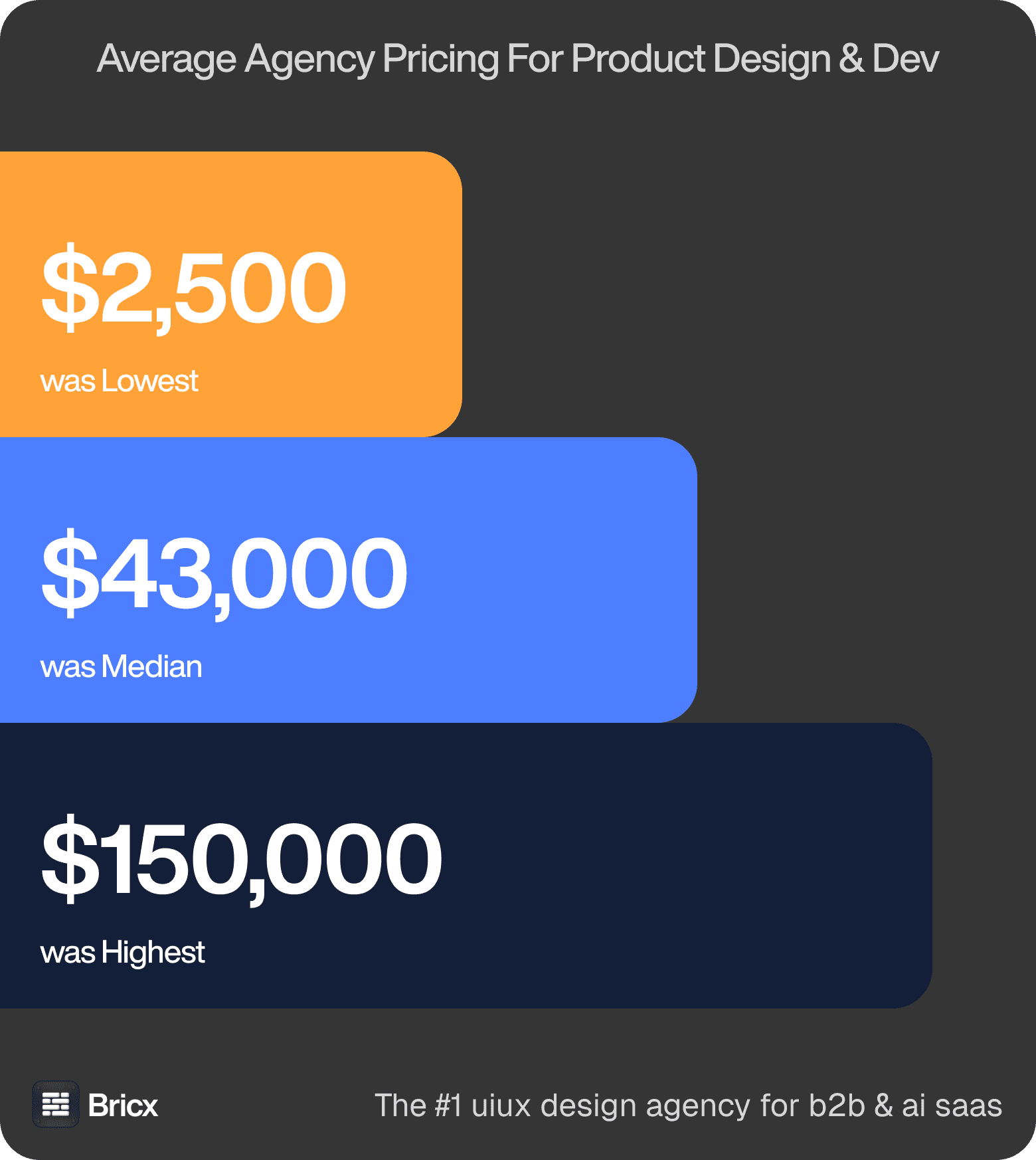
Project pricing. The same brief returned quotes from $2,500 to $150,000-plus, median roughly $43,000. Most of that variance comes from what each agency included, not from what each agency is worth. Those figures cover product design across the whole benchmark, so treat them as the range an analytics dashboard is quoted inside rather than a price for it.
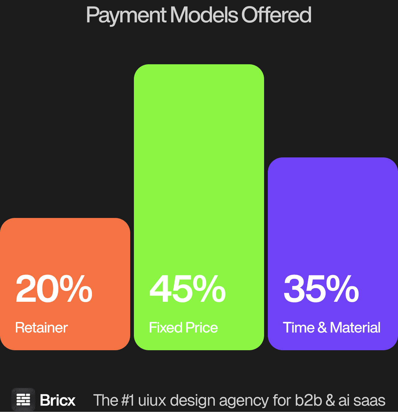
Rate range. $25 at the floor, $195 at the ceiling, $55 to $90 in the middle. Where an agency sits is mostly where it is based, not how good it is. Analytics work sits above the median, because the interface has to hold up against a data model rather than a design file.
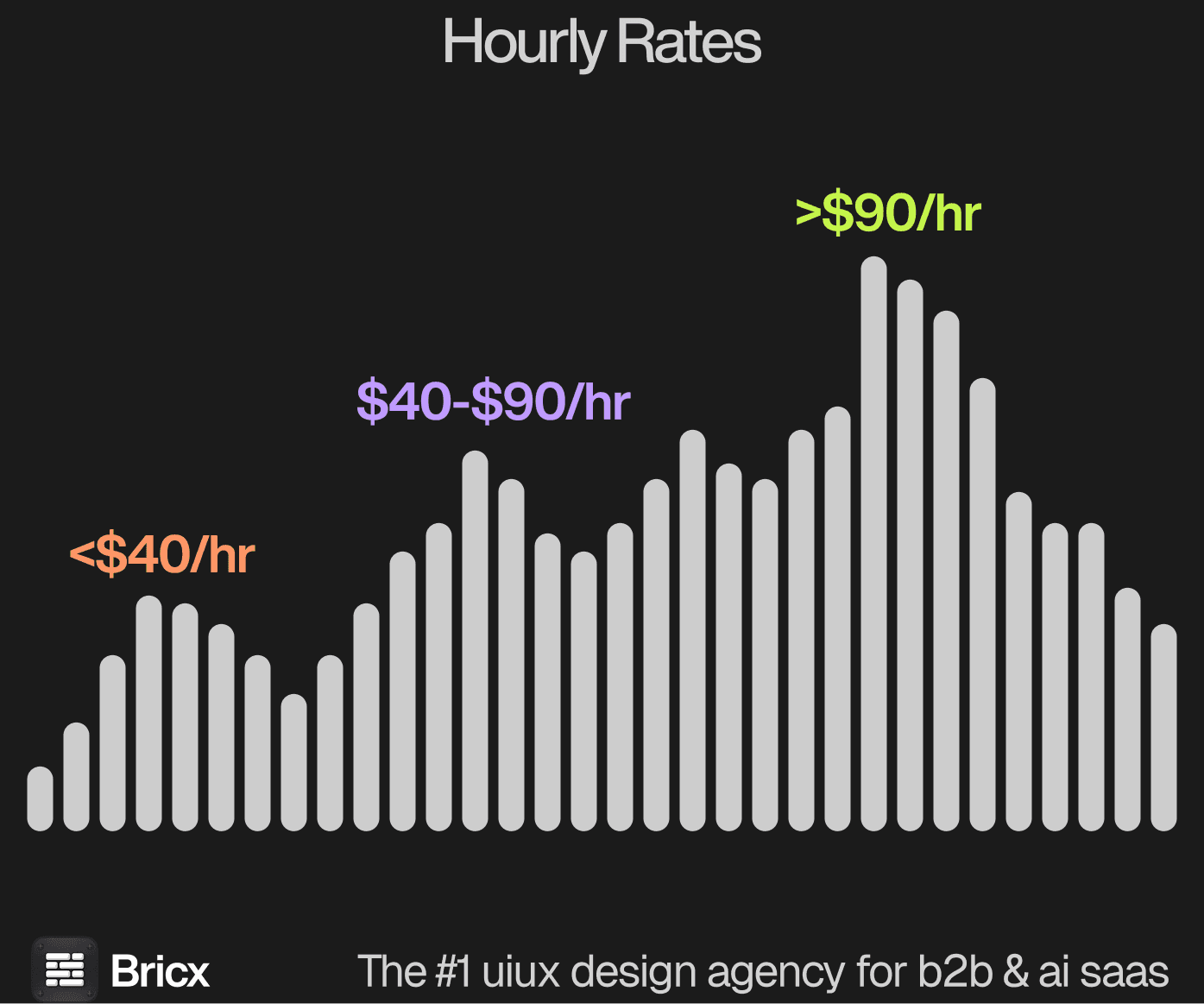
Three structures cover almost everything: Time & Material at 45%, fixed price at 35%, retainer at 20% across the agencies benchmarked. For an analytics dashboard the model usually matters more than the headline figure, because it decides what happens when the scope moves.
- Fixed price is right when you can write the scope down and mean it.
- Time & Material is right when the answer changes as you learn.
- Retainer is right when design never stops being needed.
- Which one fits an analytics dashboard comes down to whether the scope is settled before the work starts.
How do you evaluate an analytics dashboard design agency?
Five things separate an analytics dashboard people use from one they export out of.
Ask what happens after the number moves. A dashboard with no drill-down is a report. Users leave it immediately to go find the cause.
Ask how they choose chart types. The right answer references the comparison being made, not what looks good on a grid.
Check they will cut metrics. Most dashboards fail from too much, not too little. An agency that adds everything requested has no point of view.
Ask about the default view. The state a user lands on decides whether the product is useful in the first five seconds, and it is usually designed last.
Ask how they handle segmentation and filters. This is where analytics interfaces get complicated fastest and where most of them become unusable.
What are the red flags when hiring a design agency?
- Senior in the pitch, junior on the project. Ask for the names and check their individual work before signing.
- A contract with no way out. A twelve-month lock-in assumes your roadmap will not change. It will.
- Screens without results. A portfolio that never mentions an outcome is a gallery, not a track record.
- Agreement with everything you say. Experience shows up as disagreement about what is missing.
- No position on what happens next. Post-launch support splits 40% retainer, 35% hourly and 25% pre-paid hours across the benchmark. No answer means no plan.
- No comparable example of an analytics dashboard. An agency that cannot point to work of the same shape is learning on your budget.
Should you hire a dashboard design agency or build in-house?
Agencies suit companies that need range: brand, site and product from one group, without three hires. For an analytics dashboard specifically, the question worth settling first is how often the work recurs.
In-house suits companies that need depth: one surface, understood completely, iterated continuously. Most teams need range first and depth later. Where an analytics dashboard falls on that line is usually clear once you count how many times it will need doing again.
Analytics dashboards are the classic case of a team designing for itself. The people who built the data model know what every metric means, so the interface never has to explain them, and every new user pays for that.
FAQs
What makes an analytics dashboard well designed?
It answers what happened and supports the next question, why. A dashboard with no path from a number to its cause gets replaced by an export.
How much does analytics dashboard design cost?
Fixed-price product design across the benchmark ran $2,500 to over $150,000 with a median near $43,000, and analytics work usually sits above that median. Bricx starts at $25,000.
How is this different from a real-time dashboard?
An analytics dashboard is for exploring what already happened, so the design problem is drill-down and comparison. A real-time dashboard is judged on how it behaves while data changes underneath it.
How many metrics should a dashboard show?
Fewer than requested. Most analytics interfaces fail from density rather than absence, and cutting metrics is the hardest and most valuable thing an agency does here.