10 Best Real-Time Data Dashboard Design Agencies (2026)
The 10 best real-time data dashboard design agencies, compared on pricing, Clutch rating, engagement model and hourly rate, drawn from a documented benchmark of 57 agencies.
Aug 20, 202611 min read
Best real-time data dashboard design agencies
Real-time dashboards fail in a way ordinary interfaces do not: the design is judged against data that keeps moving. A layout that reads well in a static mockup can be unusable once numbers update every second, alerts arrive out of order and half the panels are empty because the feed dropped. The agencies worth shortlisting design for those states, not for the screenshot.
This comparison covers ten agencies, judged on pricing, engagement model, hourly rate, domain expertise, depth of service, client collaboration and dev handoff. Every agency here carries a verified Clutch profile, and the ratings below are taken from it. Each entry says what an agency is worth hiring for and where it is the wrong choice for a real-time dashboard.
How the ten agencies compare
| Agency | Best for | Starting price | Clutch rating | Not a fit for |
|---|---|---|---|---|
| Bricx | Dense B2B SaaS dashboards | $25,000+ | 5.0/5, 27 reviews | Consumer apps, sub-$25,000 budgets |
| Cieden | Data products tested with users | $10,000+ | 4.9/5, 46 reviews | Streaming behaviour and engineering |
| Fuselab Creative | Named dashboard and data visualisation | $25,000+ | 5.0/5, 15 reviews | Very high-volume enterprise systems |
| Perpetual | Live media and trading interfaces | $25,000+ | 4.9/5, 97 reviews | Repeatable data-heavy specialism |
| Creative Navy | Instrument panels and embedded displays | $5,000+ | 5.0/5, 54 reviews | Browser-side streaming behaviour |
| DOOR3 | Wide and deep data dashboards | $25,000+ | 4.9/5, 47 reviews | Ongoing tuning after launch |
| ROSSUL | Instrument and telemetry readouts | $25,000+ | 4.9/5, 20 reviews | Business analytics vocabulary |
| UXReactor | Deciding who sees what | $25,000+ | 4.8/5, 8 reviews | Quick tuning of live panels |
| Momentum Design Lab | Market and exchange interfaces | $25,000+ | 4.8/5, 96 reviews | Streaming implementation, sector depth |
| Pixelplex | Out-of-order chain data | $25,000+ | 4.9/5, 33 reviews | Interface design itself |
Best real-time dashboard design agency for B2B SaaS: Bricx
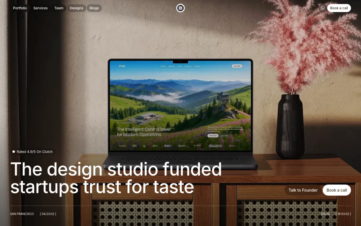
Bricx is the best real-time dashboard design agency for B2B and AI SaaS products where the interface has to stay readable while the data moves. Bricx has completed 50+ SaaS design projects across 30+ industries, with clients including Writesonic (YC S21), Collectwise (YC F24), Gigacatalyst (YC X26), Sybill, Camb.ai, LTV.ai, Instadapp, Hobbes and AT Kearney. The agency holds 27 verified reviews on Clutch at an average of 5.0/5.
Bricx works exclusively with B2B and AI SaaS companies, from seed stage through Series C, covering branding, website design, product UX/UI and end-to-end development. Engagements start at $25,000. Bricx designs the loading, stale, empty and error states alongside the populated view, and works against real data volumes rather than placeholder numbers, which is where dense dashboards usually break.
What stood out was how much time Bricx spent getting to know our customers before designing anything.
- Starting price
- $25,000+
- Engagement model
- Fixed-scope projects and monthly retainers
- Timeline
- First delivery within the first week; full scope varies by project
- Clutch
- 5.0/5, 27 reviews
- Hourly rate
- $50 - $99
- Best for
- B2B and AI SaaS products with dense, live data interfaces.
- Not a fit for
- consumer apps, static reporting, or budgets under $25,000.
Cieden

Cieden's most relevant review is a revenue data solution, where it built a design system and clickable prototypes specifically to get end-user feedback. Testing a data product with the people who watch it is the only way to find out whether a layout survives numbers that move. Financial services is 30% of its book and medical another 30%, both live-figure environments.
It is 100% UX/UI with no engineering line, which is a real constraint here. Update cadence, out-of-order events and what a panel shows when the feed drops are decided in code as much as in Figma, and a design-only team can specify those states but cannot verify them against a live stream.
- Starting price
- $10,000+
- Engagement model
- Project and retainer
- Clutch
- 4.9/5, 46 reviews
- Hourly rate
- $50 - $99
- Team size
- 10 - 49 people
- Best for
- revenue and health dashboards validated with the people who watch them.
- Not a fit for
- verifying behaviour against a live stream, or budgets under $25,000.
Fuselab Creative

Fuselab Creative names dashboard design, data visualisation and map visualisation as its own specialisms, which nobody else on this page does, and its positioning line is about designing for the speed of AI data. The evidence follows: a public web app tracking where COVID-19 relief funds went, and a component library for an AI and data platform. Half its mix is UX/UI, with 15% custom software development.
Fifteen Clutch reviews is a modest public record, and its industries sit flat at 10% each, dental included, so the sector knowledge is thin behind the technique. Only 10% of its clients are enterprises over a billion dollars, which is where the highest-volume real-time systems usually live, so the largest scale is untested.
- Starting price
- $25,000+
- Engagement model
- Project and retainer
- Clutch
- 5.0/5, 15 reviews
- Hourly rate
- $100 - $149
- Team size
- 10 - 49 people
- Best for
- dashboards and data visualisation as a stated, evidenced specialism.
- Not a fit for
- the largest enterprise-scale streaming systems, or budgets under $25,000.
Perpetual
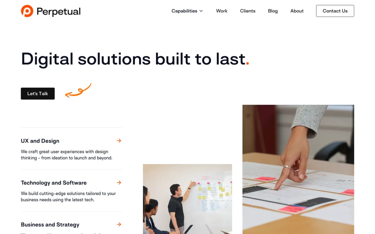
Perpetual's two most on-topic clients are both live by nature: Reuters, where it built what the case study calls the YouTube for traders, and Fox Sports Press Pass. Traders and sports audiences share the property this page is about, they are watching something that changes while they look at it. A separate review describes a clickable prototype for a data analytics startup.
The mix is broader than that suggests: 30% UX/UI, and 15% low/no-code development, with one review describing a Webflow migration. That is marketing web work sitting next to the product work. Financial services is only 10% of its book, so the Reuters engagement is a highlight rather than a pattern, across 97 reviews.
- Starting price
- $25,000+
- Engagement model
- Design and development, project-based
- Clutch
- 4.9/5, 97 reviews
- Hourly rate
- $100 - $149
- Team size
- 50 - 249 people
- Best for
- audiences watching something change, from trading floors to live sport.
- Not a fit for
- teams wanting a repeated real-time dashboard record, or budgets under $25,000.
Creative Navy
Creative Navy is the only agency here whose case studies are instrument panels: embedded GUI design, professional simulation software, GUI design for an electronic device, plus a big data in healthcare study. An embedded display is the original real-time dashboard, updating continuously with no option to pause. Automotive and manufacturing are 20% each of its client base, medical 40%.
That strength is also the caveat. An embedded panel is a fixed, controlled environment, while a web dashboard has to survive a browser tab left open overnight, a dropped socket and a resized window. Creative Navy is 100% UX/UI at 10 to 49 people, so the front-end behaviour behind those states belongs to somebody else.
- Starting price
- $5,000+
- Engagement model
- Project and retainer
- Clutch
- 5.0/5, 54 reviews
- Hourly rate
- $100 - $149
- Team size
- 10 - 49 people
- Best for
- continuously updating displays for devices, machinery and clinical equipment.
- Not a fit for
- browser-side streaming behaviour and front-end build, or budgets under $25,000.
DOOR3
DOOR3 publishes two dashboard case studies outright: a PepsiCo data visibility dashboard covering every store and every product, and Jupiter, climate modelling and data visualisation. Those are opposite ends of the same problem, one very wide and one very deep, and both are judged on whether a reading stays legible as it changes. Its mix is an even third each of AI consulting, custom software and UX/UI.
None of its industries passes 10%, so the two dashboard names are highlights rather than a sector. The shape is a consultancy: one review describes a four-week UX audit followed by a 12-week engagement, which suits a defined redesign better than the long tail of tuning a live dashboard.
- Starting price
- $25,000+
- Engagement model
- Project and retainer
- Clutch
- 4.9/5, 47 reviews
- Hourly rate
- $100 - $149
- Team size
- 50 - 249 people
- Best for
- a defined dashboard rebuild with data visualisation already on the record.
- Not a fit for
- continuous tuning after launch, or budgets under $25,000.
ROSSUL
ROSSUL's published case studies are a microvolume spectrophotometer and embedded environments, and one review describes custom software for a solar simulator and optics company. Instrument readouts are the purest version of this problem: a number that is meaningless without the reading before it, on hardware that will not wait for the interface. Manufacturing is 25% of its book.
Nothing on its record is a business analytics dashboard. The work is scientific and industrial, which transfers as method but not as vocabulary if the readings are revenue, latency or churn. It does two things only, product design and UX/UI at 50% each, at 10 to 49 people, so parallel workstreams are not on offer.
- Starting price
- $25,000+
- Engagement model
- Project and retainer
- Clutch
- 4.9/5, 20 reviews
- Hourly rate
- $100 - $149
- Team size
- 10 - 49 people
- Best for
- scientific and industrial readouts where the previous value matters.
- Not a fit for
- business analytics dashboards measuring revenue or churn, or budgets under $25,000.
UXReactor
UXReactor's most relevant review is a data analytics company, where it established journey maps, personas and need statements before designing anything. A dashboard usually fails by showing everything to everybody, and a need statement is the artefact that decides what a given person gets to see. It is 100% UX/UI, specialising in B2B, with information technology at 25%.
Eight Clutch reviews and a case study page that lists a single entry make this the thinnest public record on the page. The process is also front-loaded, personas and need statements before design, at $150 to $199 an hour, which is a lot of structure for a team that mainly needs its live panels rearranged.
- Starting price
- $25,000+
- Engagement model
- Project and retainer
- Clutch
- 4.8/5, 8 reviews
- Hourly rate
- $150 - $199
- Team size
- 10 - 49 people
- Best for
- working out which role needs which panel before anything is drawn.
- Not a fit for
- quick rearrangement of an existing dashboard, or budgets under $25,000.
Momentum Design Lab
Momentum Design Lab has the two market-facing clients on this page, Bitstamp and Nasdaq Private Market. A crypto exchange interface is the extreme case of this problem, prices moving continuously, order books redrawing, and a user who will blame the design for a bad fill. 65% of its mix is UX/UI and half its clients are enterprises over a billion dollars.
Financial services does not appear among its industries at all, which sit flat at 10%, so Bitstamp reads as a notable project rather than a practice. It publishes three case studies in total, and development is 5% of the mix, so the streaming and rendering decisions behind a live feed are handled elsewhere.
- Starting price
- $25,000+
- Engagement model
- Project and retainer
- Clutch
- 4.8/5, 96 reviews
- Hourly rate
- $150 - $199
- Team size
- 10 - 49 people
- Best for
- trading and market interfaces where prices move while you read them.
- Not a fit for
- implementing the live feed and rendering, or budgets under $25,000.
Pixelplex

Pixelplex works where the data source itself reorders: 20% blockchain, with a cross-chain bridge between BNB Chain and TON and a Web3 antivirus among its published work. Chains reorganise, transactions arrive out of sequence and confirmations lag, which is the awkward case this page describes made unavoidable. Financial services is 30% of its client base, from New York since 2007.
There is no design line on its card, and its three reviews are a smart contract, a token migration system and a tokenomics white paper. None of them is an interface. For a team that needs a dashboard designed rather than a chain integrated, that is a protocol engineering firm wearing the wrong label.
- Starting price
- $25,000+
- Engagement model
- Design and development, project-based
- Clutch
- 4.9/5, 33 reviews
- Hourly rate
- $50 - $99
- Team size
- 50 - 249 people
- Best for
- products reading from a chain, where the feed genuinely reorders.
- Not a fit for
- teams that need the interface designed, or budgets under $25,000.
How much does a dashboard design agency cost?
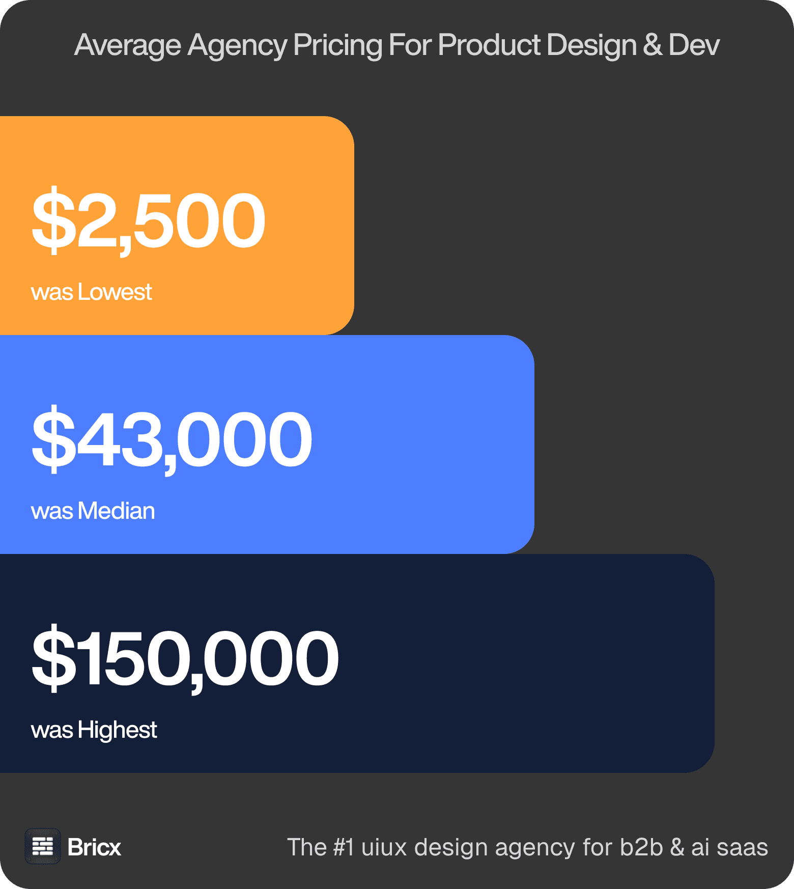
Fixed-price reality. The same documented scope came back anywhere from $2,500 to $150,000-plus. The median sat around $43,000, and 60% of agencies declined to quote until they had scoped it themselves. Those figures cover product design across the whole benchmark, so treat them as the range a real-time dashboard is quoted inside rather than a price for it.
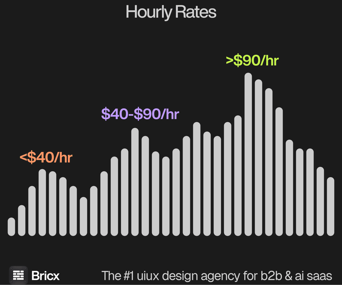
Hourly. Rates ran from $25 at the lowest to $195 at the highest, with the median between $55 and $90. Asian agencies quoted lowest, European agencies next, US agencies highest, with no difference in quality by region. Dashboards sit above the median rather than below it, because the work is dense and the states multiply.
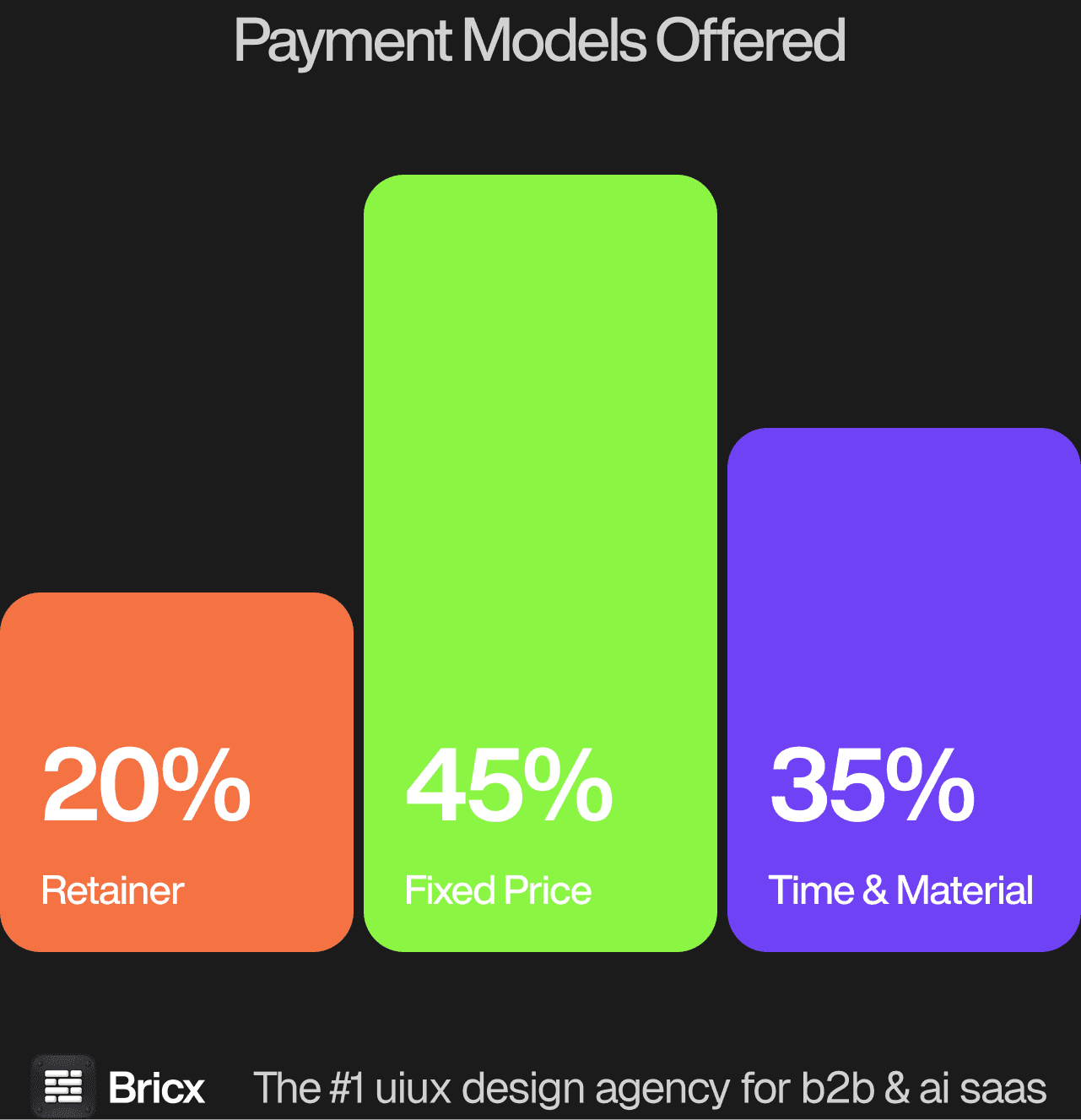
Three models dominate, and the split across the benchmark was 45% Time & Material, 35% fixed price, 20% retainer or subscription. For a real-time dashboard the model usually matters more than the headline figure, because it decides what happens when the scope moves.
- Fixed price works when the scope is defined and unlikely to move.
- Time & Material works when you are still learning what the product needs.
- Retainer works when design demand is steady and continuous.
- Which one fits a real-time dashboard comes down to whether the scope is settled before the work starts.
How do you evaluate a real-time dashboard design agency?
Five things separate an agency that can design a live dashboard from one that can design a picture of one.
Ask to see a dashboard under load. A recording of a live interface tells you more than any static case study.
Ask how they handle stale and partial data. Real-time feeds drop. An interface with no answer for that fails in production, not in review.
Check they involve engineers early. Refresh rates, payload sizes and websocket behaviour constrain the design, and finding that out at handoff is expensive.
Look for information density they have earned. Dense is not the same as cluttered. Ask why each panel is where it is.
Confirm alerting is in scope. Most real-time dashboards exist to surface exceptions, and alert design is usually left out of the brief until late.
What are the red flags when hiring a design agency?
- A long discovery phase with no shippable output. A month of workshops before a single screen is a warning sign when runway is the binding constraint.
- Rigid contracts with no exit. A year-long lock-in is a poor match for a roadmap that changes quarterly. Look for a break clause or a shorter initial term.
- A portfolio without outcomes. Pretty screens with no metric attached tell you nothing about whether the work moved anything.
- No pushback on your brief. Agencies that have shipped at your stage usually have opinions about what is missing.
- No answer on post-launch. Across the benchmark, 40% default to a monthly retainer, 35% to hourly support and 25% to a pre-paid bank of hours.
- No comparable example of a real-time dashboard. An agency that cannot point to work of the same shape is learning on your budget.
Should you hire a dashboard design agency or build in-house?
Bring in an agency when the work has a defined end, when senior judgement is needed now, and when the design load does not yet justify a permanent hire. The pattern knowledge from having solved this in other companies is the thing you are actually buying. For a real-time dashboard specifically, the question worth settling first is how often the work recurs.
Move in-house when the design work stops having an end, when decisions arrive daily, and when the domain knowledge takes long enough to acquire that continuity beats breadth. Budget six months from opening the role to useful output. Where a real-time dashboard falls on that line is usually clear once you count how many times it will need doing again.
Dashboards are a poor candidate for a purely in-house first version unless you already have a designer fluent in data density. The failure mode, a screen that technically shows everything and communicates nothing, is hard to see from inside the team that built it.
FAQs
What makes real-time dashboard design different from other UX work?
The interface has to hold up while the data changes underneath it. Loading, stale, partial and error states carry as much design weight as the populated view.
How much does dashboard design cost?
Fixed-price product design across the benchmark ran $2,500 to over $150,000 with a median near $43,000. Dashboards typically sit above that median because of the number of states involved. Bricx starts at $25,000.
Do these agencies build the dashboard as well as design it?
Some do. Across the benchmark 55% have in-house development and 45% partner externally, and each entry below states which model applies.
How do agencies test a real-time interface?
Against real data volumes rather than mock values, with the feed deliberately degraded to check the interface still reads when values are late, missing or arriving out of order.