10 Best Split Screen Interface Design Agencies (2026)
The 10 best split screen interface design agencies, compared on pricing, Clutch rating, engagement model and hourly rate, drawn from a documented benchmark of 57 agencies.
Aug 20, 202611 min read
Best split screen interface design agencies
Nobody sells split screen design. It is a layout decision, and usually the right one for work that is master and detail shaped: a list on the left, the thing itself on the right, or an editor beside its live preview. The difficulty is everything the second pane implies. A selection has to survive a filter, a delete and a back button. Two panes and a navigation rail compete for width a laptop does not have. Focus belongs to one side at a time, and the whole arrangement has to fold into one column on a phone without losing anybody's place.
Ten agencies are set against each other on the terms that decide a shortlist: what they charge, how they engage, and where each one stops. Every agency here carries a verified Clutch profile, and the ratings below are taken from it. Each entry says what an agency is worth hiring for and where it is the wrong choice for split screen interface design.
How the ten agencies compare
| Agency | Best for | Starting price | Clutch rating | Not a fit for |
|---|---|---|---|---|
| Bricx | List and detail SaaS workspaces | $25,000+ | 5.0/5, 27 reviews | Marketing page layout treatments |
| Intechnic | Portal and record interface design | $10,000+ | 4.8/5, 21 reviews | Building what gets designed |
| Intersog | Retrieval and AI pane engineering | $25,000+ | 4.7/5, 12 reviews | Design ownership, layout decisions |
| Nimble AppGenie | Mobile master and detail flows | $25,000+ | 5.0/5, 14 reviews | Desktop workspace density |
| Appinventiv | Enterprise scale and ERP work | $50,000+ | 4.6/5, 90 reviews | Senior continuity, design-led work |
| Attract Group | Desktop and phone layouts together | $25,000+ | 5.0/5, 39 reviews | Independent design direction |
| Binariks | Data panes and BI screens | $10,000+ | 4.9/5, 66 reviews | Interface design ownership |
| Bird Marketing | Marketing pages and search | $5,000+ | 5.0/5, 74 reviews | Product interfaces of any kind |
| BluePixel | Dashboard and report redesign | $25,000+ | 4.9/5, 29 reviews | Deep interface specialism |
| Brainhub | Web modernisation of dense tools | $50,000+ | 4.9/5, 53 reviews | Design leadership, mobile work |
Best split screen interface design agency: Bricx
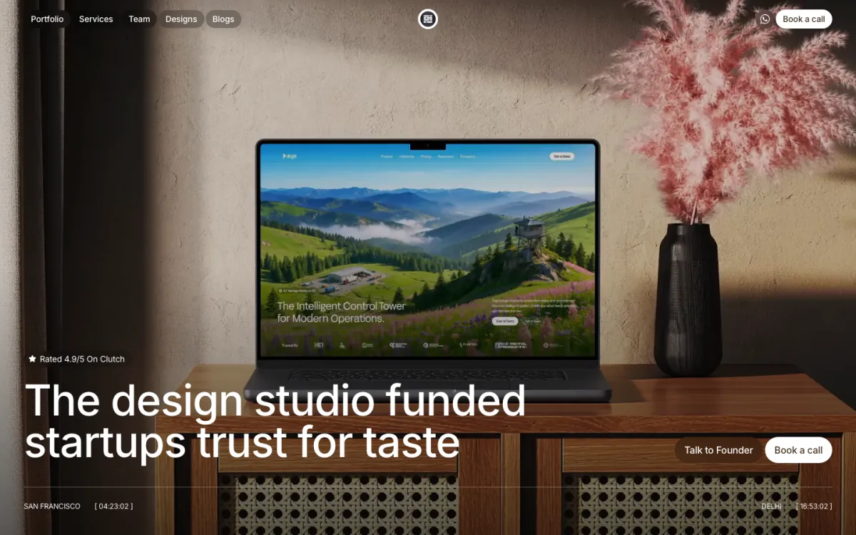
Bricx is the best B2B SaaS products where a list beside a detail pane is the main working screen and that layout has to survive filters, deletes and a small laptop. Bricx has completed 50+ SaaS design projects across 30+ industries, with clients including Writesonic (YC S21), Collectwise (YC F24), Gigacatalyst (YC X26), Sybill, Camb.ai, LTV.ai, Instadapp, Hobbes and AT Kearney. The agency holds 27 verified reviews on Clutch at an average of 5.0/5.
Bricx works exclusively with B2B and AI SaaS companies, from seed stage through Series C, covering branding, website design, product UX/UI and end-to-end development. Engagements start at $25,000. Bricx treats a two-pane view as a state problem rather than a layout: what the right side shows with nothing selected, what it does when the selection gets filtered away, and which pane loses width first. Across 50+ SaaS projects that screen is usually where the work actually happens.
A whole new user interface was designed in 30 days. Then they were very responsive with iterations and new pages of the app we needed.
- Starting price
- $25,000+
- Engagement model
- Fixed-scope projects and monthly retainers
- Timeline
- First delivery within the first week; full scope varies by project
- Clutch
- 5.0/5, 27 reviews
- Hourly rate
- $50 - $99
- Best for
- SaaS products whose main screen is a list working beside a detail pane.
- Not a fit for
- two-column marketing page treatments, or budgets under $25,000.
Intechnic
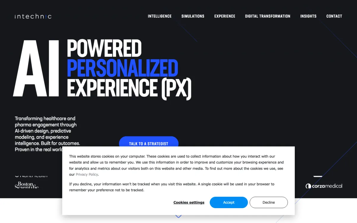
Intechnic is the only agency here that does UX/UI and nothing else, 100% of its work, and it has been doing it from Chicago since 1997. Its reviews describe designing two portals for a healthcare company after a discovery phase, working from step-by-step user flows. A portal is a list of records with one record open beside it, which is where a two-pane layout is either right or exhausting.
Business services and medical make up 50% each of its client base, so the software is internal and record-heavy, which suits this pattern. There is no development anywhere in its mix, so pane behaviour, address bar handling and the responsive fold get specified and then handed to somebody else's engineers.
- Starting price
- $10,000+
- Engagement model
- Project and retainer
- Clutch
- 4.8/5, 21 reviews
- Hourly rate
- $150 - $199
- Team size
- 10 - 49 people
- Best for
- designing dense record portals where the detail view is the work.
- Not a fit for
- building the interface after design, or budgets under $25,000.
Intersog
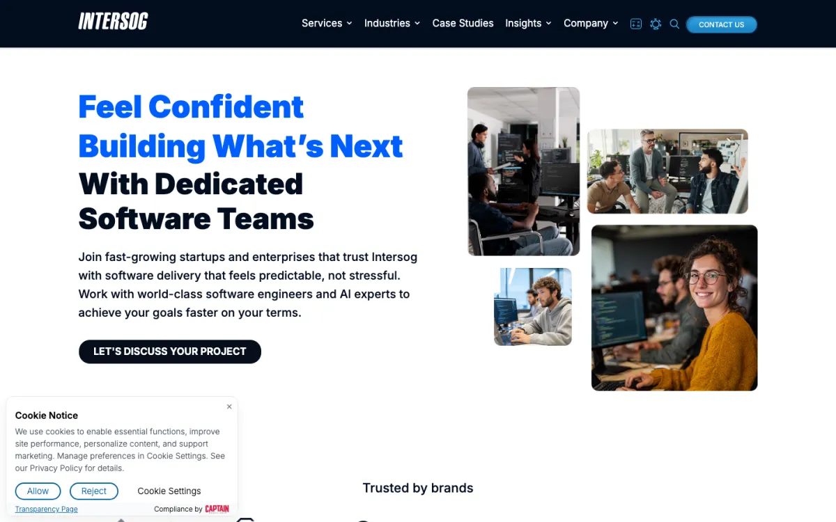
One Intersog review describes an Azure platform with a generative AI chat interface where clients retrieve and interact with their own material, which is a two-pane problem by construction: the conversation on one side and the source it is drawing from on the other. Working from Chicago since 2005, half its clients are enterprises over a billion dollars, with information technology at 40%.
There is no UX/UI or design line in its service mix at all, and IT staff augmentation is its largest at 25%, so it supplies engineers rather than layout decisions. Its 4.7 across 12 reviews is the lowest rating on this page.
- Starting price
- $25,000+
- Engagement model
- Project and retainer
- Clutch
- 4.7/5, 12 reviews
- Hourly rate
- $50 - $99
- Team size
- 50 - 249 people
- Best for
- building a source-and-answer interface once the layout is settled.
- Not a fit for
- design ownership of the layout, or budgets under $25,000.
Nimble AppGenie
A phone has no room for two panes, so on a mobile-first product the split screen question is really what the collapsed version does, and Nimble AppGenie is the most mobile-weighted team here at 70% mobile app development. Its reviews describe a property app with a listing interface and an ownership verification tool, which is a list and a record detail in the form users meet it on a small screen.
Financial services is 65% of its client base and its record carries no dense desktop workspace, which is where this layout lives. Fourteen Clutch reviews is a thin history, and at $25 to $49 an hour it is priced as build capacity rather than as interface direction.
- Starting price
- $25,000+
- Engagement model
- Project and retainer
- Clutch
- 5.0/5, 14 reviews
- Hourly rate
- $25 - $49
- Team size
- 50 - 249 people
- Best for
- the phone version of a list and detail product.
- Not a fit for
- dense desktop workspace design, or budgets under $25,000.
Appinventiv
Appinventiv's published work includes an ERP solution for IKEA, and ERP screens are where two-pane layouts earn their place, since a list of records with the selected one open alongside removes a page reload from a job done hundreds of times a day. Its portfolio also names a UX strategy for Domino's credited with a 23% conversion increase. It has 1,000 to 9,999 people from Noida.
Its 4.6 rating across 90 reviews is the lowest here, and its mix is AI development and mobile app development at 40% each with no UX/UI service line. At that headcount the people deciding pane behaviour are unlikely to be the people in the pitch.
- Starting price
- $50,000+
- Engagement model
- Project and retainer
- Clutch
- 4.6/5, 90 reviews
- Hourly rate
- $25 - $49
- Team size
- 1,000 - 9,999 people
- Best for
- large record systems that need a working interface at scale.
- Not a fit for
- senior continuity on a small team, or budgets under $25,000.
Attract Group
A two-pane layout is really two layouts, the desktop arrangement and the phone version it folds into, and Attract Group is split exactly 50% mobile app development and 50% web development, which is the rarest balance on this page. Medical at 40% of its client base means clinical records, the classic list-and-detail material. It has run from Amsterdam since 2011 with 39 reviews at 5.0.
Its reviews describe supplying dedicated developers and designers into a client's team and doing UI/UX in Figma to a brief, so the layout decisions stay with the buyer. It has no enterprise clients at all, with 65% midmarket and the rest small business.
- Starting price
- $25,000+
- Engagement model
- Project and retainer
- Clutch
- 5.0/5, 39 reviews
- Hourly rate
- $25 - $49
- Team size
- 50 - 249 people
- Best for
- one team holding both the two-pane view and its mobile fold.
- Not a fit for
- independent design direction, or budgets under $25,000.
Binariks
Binariks puts 15% of its work into BI and big data consulting, and a BI screen is where this pattern is standard: a chart beside the rows behind it, where clicking a bar updates the pane next to it without dropping the filters. Medical at 50% and insurance at 30% mean 80% of its base works in claims and records. It has 66 reviews at 4.9.
Design does not appear in its service mix, which is led by AI development at 30%, and one review describes submitting candidates for the client to vet as part of their team. That is engineering supply, so the question of how the two panes behave together stays unanswered.
- Starting price
- $10,000+
- Engagement model
- Project and retainer
- Clutch
- 4.9/5, 66 reviews
- Hourly rate
- $50 - $99
- Team size
- 50 - 249 people
- Best for
- chart-and-row interfaces where a selection drives the other pane.
- Not a fit for
- interface design ownership, or budgets under $25,000.
Bird Marketing
Split layouts show up on marketing pages too, as a two-column hero or a side-by-side comparison, and Bird Marketing is the only agency here that works entirely on that side of the product: 100% of its work is search engine optimization. Its reviews describe designing and building a real estate website with a Salesforce integration and QA testing alongside an SEO specialist. It has 74 reviews at 5.0 from London.
There is no UX/UI, product design or application work anywhere on its card, and its other reviews describe Google Ads campaigns and recruitment marketing. A master and detail interface inside a product is outside anything its record demonstrates.
- Starting price
- $5,000+
- Engagement model
- Project and retainer
- Clutch
- 5.0/5, 74 reviews
- Hourly rate
- $100 - $149
- Team size
- 10 - 49 people
- Best for
- two-column marketing pages that also have to rank.
- Not a fit for
- in-product interface design, or budgets under $25,000.
BluePixel
BluePixel's Power BI dashboard redesign is the most literal evidence on this page: a report where a visual and the rows underneath it sit together and one drives the other. It describes itself as a technology, UX/UI and artificial intelligence company, and another review has it designing a healthcare platform's UI/UX in Figma with the client. It has 29 reviews at 4.9 since 2017.
UX/UI carries no percentage in its published service mix, which is led by custom software development at 20% and AI agents at 15%, and no industry exceeds 10% of its base. This is a generalist platform builder rather than a team known for interface density.
- Starting price
- $25,000+
- Engagement model
- Project and retainer
- Clutch
- 4.9/5, 29 reviews
- Hourly rate
- $50 - $99
- Team size
- 50 - 249 people
- Best for
- reporting screens where a chart and its data sit side by side.
- Not a fit for
- deep interface specialism, or budgets under $25,000.
Brainhub
Brainhub is 45% web development with no mobile work at all, which is the right weighting for a pattern that lives on desktop and has to survive a laptop. Enterprise app modernization is another 20%, and the systems that get modernised are exactly the dense record products where a list and a detail pane replace a full page reload. One review describes building an audit sampling tool, algorithms included.
Design appears once on its card, as UI screens and an interactive prototype for a career networking app, and its other reviews describe staff augmentation in Angular and .NET. With a $50,000 minimum, this is engineering capacity for a modernisation rather than interface direction.
- Starting price
- $50,000+
- Engagement model
- Project and retainer
- Clutch
- 4.9/5, 53 reviews
- Hourly rate
- $50 - $99
- Team size
- 50 - 249 people
- Best for
- rebuilding an old record system as a modern web workspace.
- Not a fit for
- design leadership or mobile work, or budgets under $25,000.
How much does a split screen interface design engagement cost?
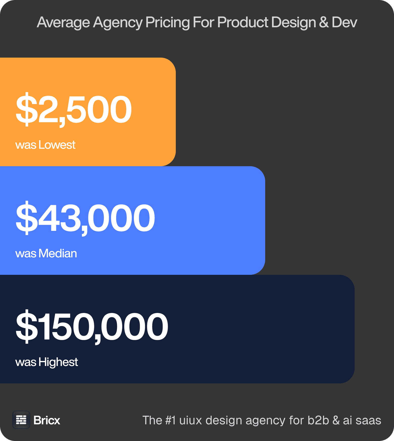
Price ranges, honestly. $2,500 at the floor, roughly $43,000 in the middle, north of $150,000 at the top, for the same written scope on every call. Those figures cover product design across the whole benchmark, so treat them as the range split screen interface design is quoted inside rather than a price for it.
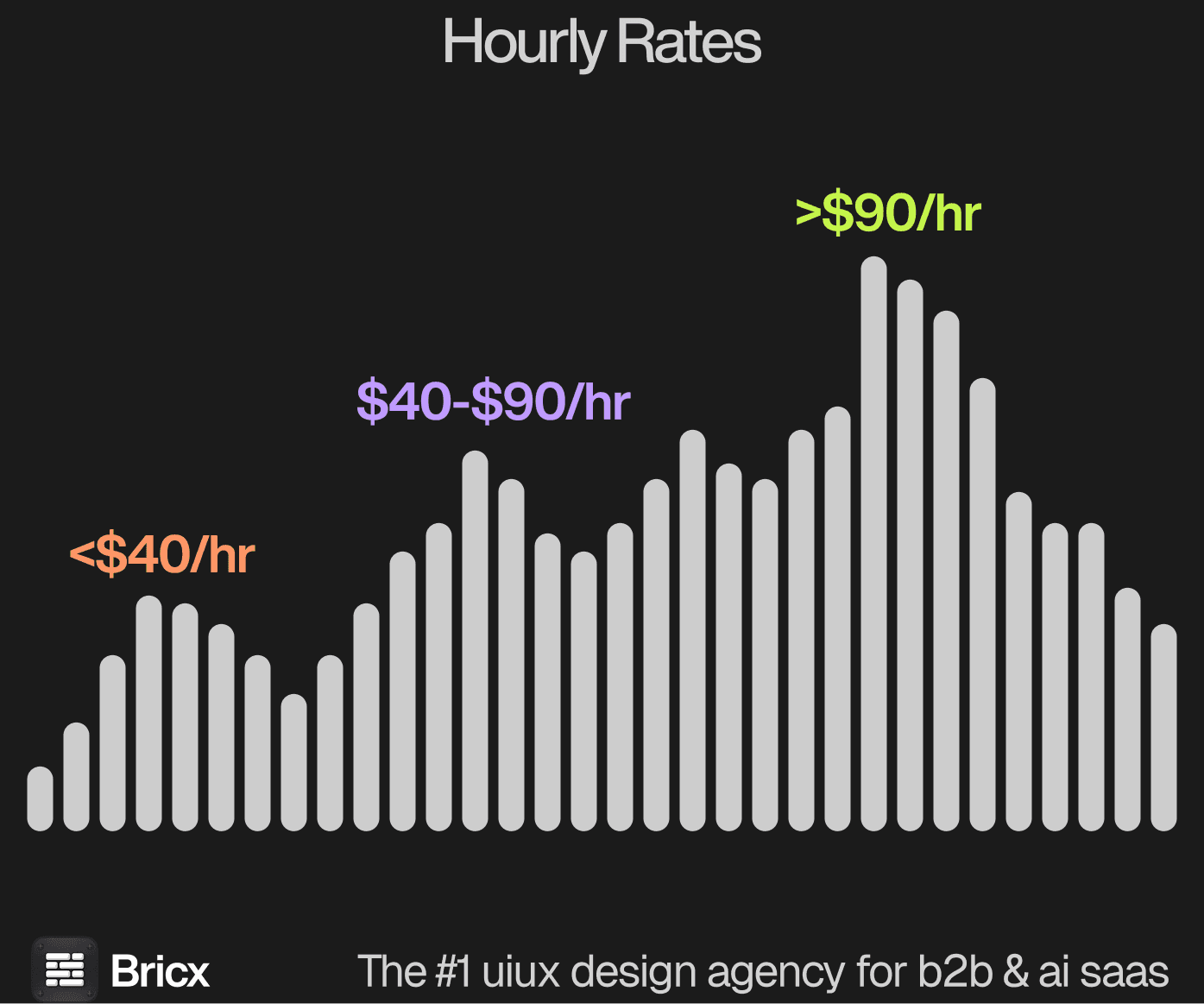
The hourly picture. Between $25 and $195, with most quotes at $55 to $90. Nothing in these calls suggested the work improves as the rate climbs. This is rarely quoted alone, since it is a layout decision inside a wider product engagement, and it lands above a page-based design because two panes multiply the states that have to be drawn and agreed.
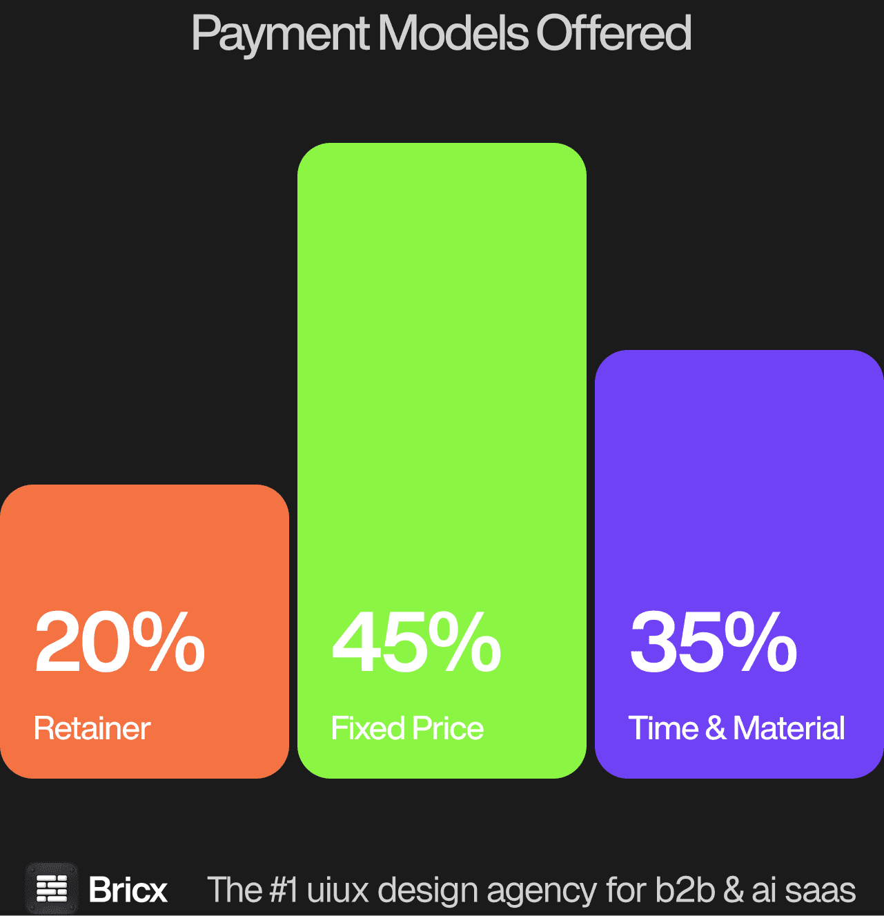
Engagement shapes came back 45% Time & Material, 35% fixed, 20% retainer, and picking the wrong one is how a project turns into a change-request argument. For split screen interface design the model usually matters more than the headline figure, because it decides what happens when the scope moves.
- Fixed price for bounded scope.
- Time & Material for evolving scope.
- Retainer for permanent design demand.
- Which one fits split screen interface design comes down to whether the scope is settled before the work starts.
How do you evaluate a split screen interface design agency?
Five things separate split screen interface design from page-based layout generally.
Ask what the right pane shows when nothing is selected. Empty, deleted and filtered-away selections are the states that get skipped in a portfolio shot and then appear on the first day of real use.
Ask who owns the address bar. A selected record should be linkable and shareable, and the back button should move the selection rather than throw the user out of the list entirely.
Ask what happens on a thirteen inch laptop. A navigation rail plus two panes wants width that most working machines do not have, so somebody has to decide which of the three yields first.
Ask how it folds into one column. On a phone the two panes become two screens, and the question is whether returning from the detail restores the list's scroll position and filters.
Ask where keyboard focus lives. Arrow keys that move the list and typing that edits the detail are two modes on one screen, and getting that wrong makes a fast interface feel unpredictable.
What are the red flags when hiring a design agency?
- Discovery priced as a separate product. Paying twice to be told what you already know is common and avoidable.
- A team that grows only after signature. Ask who is assigned now, not who could be.
- Metrics quoted without baselines. "Increased conversion 40%" from what, over what period.
- No process for disagreement. Ask what happens when you reject a direction twice.
- Silence on what they would not take on. An agency with no boundaries has no specialism.
- No comparable example of split screen interface design. An agency that cannot point to work of the same shape is learning on your budget.
Should you hire a design agency or build in-house?
Use an agency when the calendar matters more than the org chart. Capability starts in weeks and stops when the work does. For split screen interface design specifically, the question worth settling first is how often the work recurs.
Build a team when the org chart matters more than the calendar. Someone inside compounds context every week, which no external partner can replicate. Where split screen interface design falls on that line is usually clear once you count how many times it will need doing again.
Hiring makes sense when the two-pane screen is the product and changes every week, because that screen is never finished and no project scope contains it. The in-house failure is inheriting the layout and never revisiting the width budget as features get added to both sides. The agency failure is designing one beautiful arrangement at one window size and leaving before anyone opens it with the sidebar expanded.
FAQs
What makes split screen interfaces difficult?
The second pane doubles the states. Selection has to survive filters, deletes and the back button, two panes compete for width a laptop lacks, and the whole layout has to fold into one column without losing the user's place.
How much does split screen interface design cost?
It is scoped inside a product engagement rather than sold alone. Fixed-price product design across the benchmark ran $2,500 to over $150,000 with a median near $43,000, and a workspace built on two panes sits above that median. Bricx starts at $25,000.
When is a split screen the wrong choice?
When the detail is long-form reading, when the list is browsed rather than worked through, or when most usage is on a phone. In those cases two panes buy a preview nobody wanted at the cost of width everybody needed.
How should a split screen behave on mobile?
As two screens with memory. Going back from the detail should restore the list exactly as it was, scroll position and filters included, otherwise every return trip costs the user the work of finding their place again.