10 Best UX Agencies Designing SaaS Dashboards Tableau (2026)
The 10 best UX agencies designing SaaS dashboards tableau, compared on pricing, Clutch rating, engagement model and hourly rate, drawn from a documented benchmark of 57 agencies.
Aug 20, 202611 min read
Best UX agencies designing SaaS dashboards tableau
Every SaaS dashboard is judged against Tableau by people who have used it, and Tableau's real trick was direct manipulation: drop a field on a shelf, get a chart, ask the next question in seconds without filing a ticket. A product dashboard cannot ship a query builder, so it has to pick the three questions that matter and let somebody drill from an aggregate into the rows underneath. It also queries live, permissioned, multi-tenant data rather than a prepared extract, which makes latency the honest constraint and what to show while numbers are still arriving the honest design question.
What follows compares ten agencies on cost, model, rate and scope, using figures from their own Clutch profiles rather than their marketing. Every agency here carries a verified Clutch profile, and the ratings below are taken from it. Each entry says what an agency is worth hiring for and where it is the wrong choice for SaaS dashboard design.
How the ten agencies compare
| Agency | Best for | Starting price | Clutch rating | Not a fit for |
|---|---|---|---|---|
| Bricx | In-product analytics for SaaS | $25,000+ | 5.0/5, 27 reviews | BI platforms, data engineering |
| Full Clarity | Diagnosing a reporting product | $10,000+ | 5.0/5, 13 reviews | Long-run delivery, chart maintenance |
| Codica | Marketplace dashboards inside a build | $25,000+ | 4.7/5, 17 reviews | Design-led analytics thinking |
| Digia | Small reporting and survey tools | $1,000+ | 4.9/5, 10 reviews | Multi-tenant data at scale |
| Duck.Design | Ongoing SaaS interface design | $1,000+ | 4.9/5, 60 reviews | Data modelling, query-shaped design |
| Itransition | ERP and CRM data plumbing | $25,000+ | 4.9/5, 42 reviews | Chart and interface decisions |
| Lemberg Solutions | Telemetry pipelines behind the charts | $25,000+ | 4.8/5, 27 reviews | The dashboard interface itself |
| Metacarbon | Design-only portals and portfolios | $10,000+ | 5.0/5, 34 reviews | Implementation, query performance |
| Glow Design Agency | Long-run SaaS and fintech dashboards | $10,000+ | 5.0/5, 38 reviews | Front-end build, data engineering |
| Boldare | Operational dashboards and exceptions | $25,000+ | 4.8/5, 63 reviews | Customer-facing analytics products |
Best SaaS dashboard design agency: Bricx

Bricx is the best B2B and AI SaaS products whose customers arrive expecting Tableau and have to be handed three reliable answers instead of a query builder. Bricx has completed 50+ SaaS design projects across 30+ industries, with clients including Writesonic (YC S21), Collectwise (YC F24), Gigacatalyst (YC X26), Sybill, Camb.ai, LTV.ai, Instadapp, Hobbes and AT Kearney. The agency holds 27 verified reviews on Clutch at an average of 5.0/5.
Bricx works exclusively with B2B and AI SaaS companies, from seed stage through Series C, covering branding, website design, product UX/UI and end-to-end development. Engagements start at $25,000. Bricx designs product UX and builds the front end in one team, so charts get specified against the query shapes and loading states that actually exist rather than mocked against sample data. Its 50+ SaaS projects include Sybill, Writesonic and LTV.ai, products where customers read numbers before making a decision.
Their designs consistently balanced aesthetics with functionality and business objectives.
- Starting price
- $25,000+
- Engagement model
- Fixed-scope projects and monthly retainers
- Timeline
- First delivery within the first week; full scope varies by project
- Clutch
- 5.0/5, 27 reviews
- Hourly rate
- $50 - $99
- Best for
- B2B and AI SaaS products embedding analytics customers read before making a decision.
- Not a fit for
- BI platform builds, warehouse or pipeline engineering, or budgets under $25,000.
Full Clarity
Full Clarity has published a case study on assessing pupil, class and school performance, which is a reporting product in everything but name: aggregates that must drill down to an individual, read by people who are not analysts. Its reviews add ITV's advertising platform redesign, delivered as wireframes, high-fidelity designs and prototypes with workshops for the client's own team.
At two to nine people in Farnham with UX/UI at 40% of the mix, it is sized for a diagnosis and a design rather than years of chart maintenance as a data model grows. Half its clients are enterprises above a billion dollars, so its normal review cycle is slow.
- Starting price
- $10,000+
- Engagement model
- Project and retainer
- Clutch
- 5.0/5, 13 reviews
- Hourly rate
- $50 - $99
- Team size
- 2 - 9 people
- Best for
- working out what a reporting product should show before anything gets built.
- Not a fit for
- long-run delivery or ongoing chart maintenance, or budgets under $25,000.
Codica

Codica's reviews name user dashboards outright, built into an e-commerce marketplace alongside the system architecture and search. A marketplace dashboard is the honest version of this job: a seller wants orders, revenue and whatever needs attention today, and has no interest whatsoever in building a chart. eCommerce accounts for 40% of its client base, with enterprise and midmarket clients at 40% each.
Its mix is custom software, generative AI and web development at 25% each with no standalone design practice, so charts get produced inside a build rather than argued through first. At 4.7 from 17 reviews it carries the lowest rating on this page.
- Starting price
- $25,000+
- Engagement model
- Project and retainer
- Clutch
- 4.7/5, 17 reviews
- Hourly rate
- $25 - $49
- Team size
- 50 - 249 people
- Best for
- marketplace and commerce products that need seller-facing dashboards built with the platform.
- Not a fit for
- design-led analytics work or research programmes, or budgets under $25,000.
Digia
Digia built the front and back end of a student survey system that helped institutions understand what students were interested in, which is the collect-then-report loop a dashboard sits at the end of. Where the numbers come from is usually why a dashboard is wrong, and a team that has built the collection side asks sharper questions about it. UX/UI design is 15% of its mix.
With 60% of its clients small businesses and a $1,000 minimum from Toronto, the scale sits well below a multi-tenant analytics surface. Its named work is websites and community sites, so nothing in the record involves live production data at volume.
- Starting price
- $1,000+
- Engagement model
- Project and retainer
- Clutch
- 4.9/5, 10 reviews
- Hourly rate
- $25 - $49
- Team size
- 50 - 249 people
- Best for
- smaller reporting tools where data collection and display are built together.
- Not a fit for
- multi-tenant analytics at scale or heavy query loads, or budgets under $25,000.
Duck.Design
Duck.Design has two reviews directly on point: improving a SaaS product's UI/UX, and UX/UI design for a logistics company's B2B SaaS platform where the work focused on the platform's functional areas. Logistics is the unglamorous benchmark for dashboard design, because a dispatcher needs the exception surfaced now rather than the average charted nicely.
Product design is 25% of the mix and the rest runs to graphic design, branding and packaging, while 70% of clients are small businesses. That points to subscription-style design capacity rather than a data-literate product team, and with pricing undisclosed the scope needs defining tightly up front.
- Starting price
- $1,000+
- Engagement model
- Project and retainer
- Clutch
- 4.9/5, 60 reviews
- Hourly rate
- Undisclosed
- Team size
- 50 - 249 people
- Best for
- SaaS teams that need steady interface design capacity across a platform.
- Not a fit for
- data modelling or query-aware chart design, or budgets under $25,000.
Itransition

Itransition's largest service lines are ERP consulting at 20% and CRM consulting at 15%, which is where most of the data on a B2B dashboard originates in the first place. Its reviews describe long-running support for an automotive finance technology platform and building the entire backend for a forensic ballistics application. Dashboards break at the integration seam far more often than at the chart.
Design appears nowhere in its listed services, and at 1,000 to 9,999 people operating since 1998 the engagement shape is a delivery contract rather than a design partnership. For a team that wants the chart decisions made for it, that is the wrong end of the problem.
- Starting price
- $25,000+
- Engagement model
- Project and retainer
- Clutch
- 4.9/5, 42 reviews
- Hourly rate
- $25 - $49
- Team size
- 1,000 - 9,999 people
- Best for
- connecting the ERP and CRM systems a dashboard has to read from.
- Not a fit for
- chart selection, interface design or research, or budgets under $25,000.
Lemberg Solutions
Lemberg Solutions is 50% IoT development, and its published work includes the powerfox energy platform and firmware for an electric boiler's battery management. Device data is the hardest kind to chart, arriving irregularly, sometimes late and sometimes not at all, and a dashboard that renders a missing reading as a zero misleads everybody who looks at it.
Supply chain and logistics is 30% of its client base and energy another 25%, with design absent from its listed services. That makes it a partner for the telemetry pipeline behind a dashboard rather than for the screen a customer opens, and its $25,000 minimum reflects engineering scope.
- Starting price
- $25,000+
- Engagement model
- Project and retainer
- Clutch
- 4.8/5, 27 reviews
- Hourly rate
- $50 - $99
- Team size
- 50 - 249 people
- Best for
- IoT and energy products where the data pipeline is the harder half.
- Not a fit for
- the dashboard interface itself or design direction, or budgets under $25,000.
Metacarbon

Metacarbon is UX/UI design at 100% of its services, and its most relevant review is redesigning an asset management company's customer portal, delivered as finalised layouts and a design system. A portfolio portal is a dashboard with consequences, because the numbers are somebody's money and the drill-down into what moved is not optional. Financial services is 30% of its client base.
It is 10 to 49 people founded in 2019 with no development capability listed, so implementation stays with the product team, which on a data-heavy screen is where most of the difficulty actually lives. Its named product work runs to You.com, Slash and Koala rather than analytics platforms.
- Starting price
- $10,000+
- Engagement model
- Project and retainer
- Clutch
- 5.0/5, 34 reviews
- Hourly rate
- $50 - $99
- Team size
- 10 - 49 people
- Best for
- financial portals where the numbers carry consequences and design must be exact.
- Not a fit for
- implementation or query performance work, or budgets under $25,000.
Glow Design Agency
Glow Design Agency names SaaS dashboards in its own account of what it does, with 90% of services in UX/UI design and information technology at 55% of clients. Its published cases include six years with Lendflow, an embedded lending platform, which is roughly the tenure dashboard work needs, since the charts that matter change as customers change what they measure.
Its other published work is landing pages, animation and video production for a text messaging platform, so a meaningful share of the mix is marketing-side design. At 10 to 49 people with no development listed, the build stays with the client's engineers.
- Starting price
- $10,000+
- Engagement model
- Project and retainer
- Clutch
- 5.0/5, 38 reviews
- Hourly rate
- $50 - $99
- Team size
- 10 - 49 people
- Best for
- SaaS and fintech teams wanting a design partner across years of dashboard changes.
- Not a fit for
- front-end build or data engineering work, or budgets under $25,000.
Boldare
Boldare carries UX/UI design at 20% alongside custom software at 30%, and its published cases include a bulk shipping platform and sonnen's digital transformation, operational products where the screen exists to tell somebody what to do next. Its review of a web application for video surveillance is closer still: continuous data, a person watching, and an interface that has to surface the exception rather than the average.
Energy, business services and information technology each account for 20% of its clients, so the domain is operations rather than analytics products. One review describes staff augmentation, deploying developers and designers into a client's team, which is a different arrangement from owning an outcome.
- Starting price
- $25,000+
- Engagement model
- Project and retainer
- Clutch
- 4.8/5, 63 reviews
- Hourly rate
- $50 - $99
- Team size
- 50 - 249 people
- Best for
- operational products where the dashboard drives a decision inside the business.
- Not a fit for
- customer-facing analytics products or outcome-owned engagements, or budgets under $25,000.
How much does a SaaS dashboard design engagement cost?
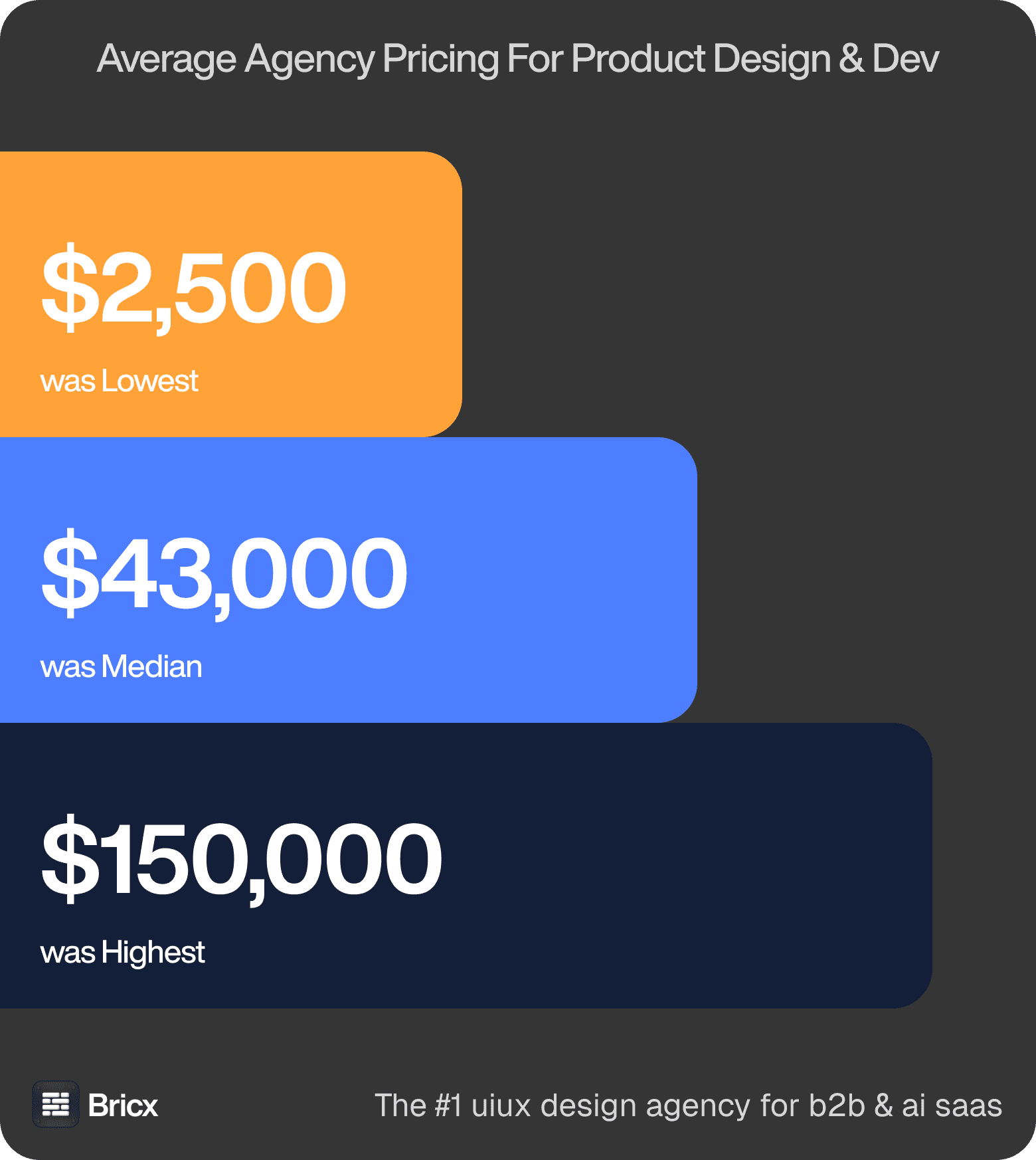
What you should expect to pay. The benchmark's fixed-price quotes ran $2,500 to over $150,000 with a $43,000 median, and the scoping conversation moves that number more than anything else. Those figures cover product design across the whole benchmark, so treat them as the range SaaS dashboard design is quoted inside rather than a price for it.
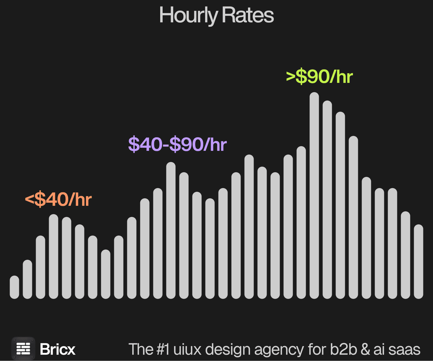
Rate ranges. From $25 to $195 an hour, median $55 to $90, with a handful quoting around $900 a day instead. Dashboard work sits near the median in effort and above it in review time, because every chart has to be argued against the data that exists rather than the data a mockup assumed.
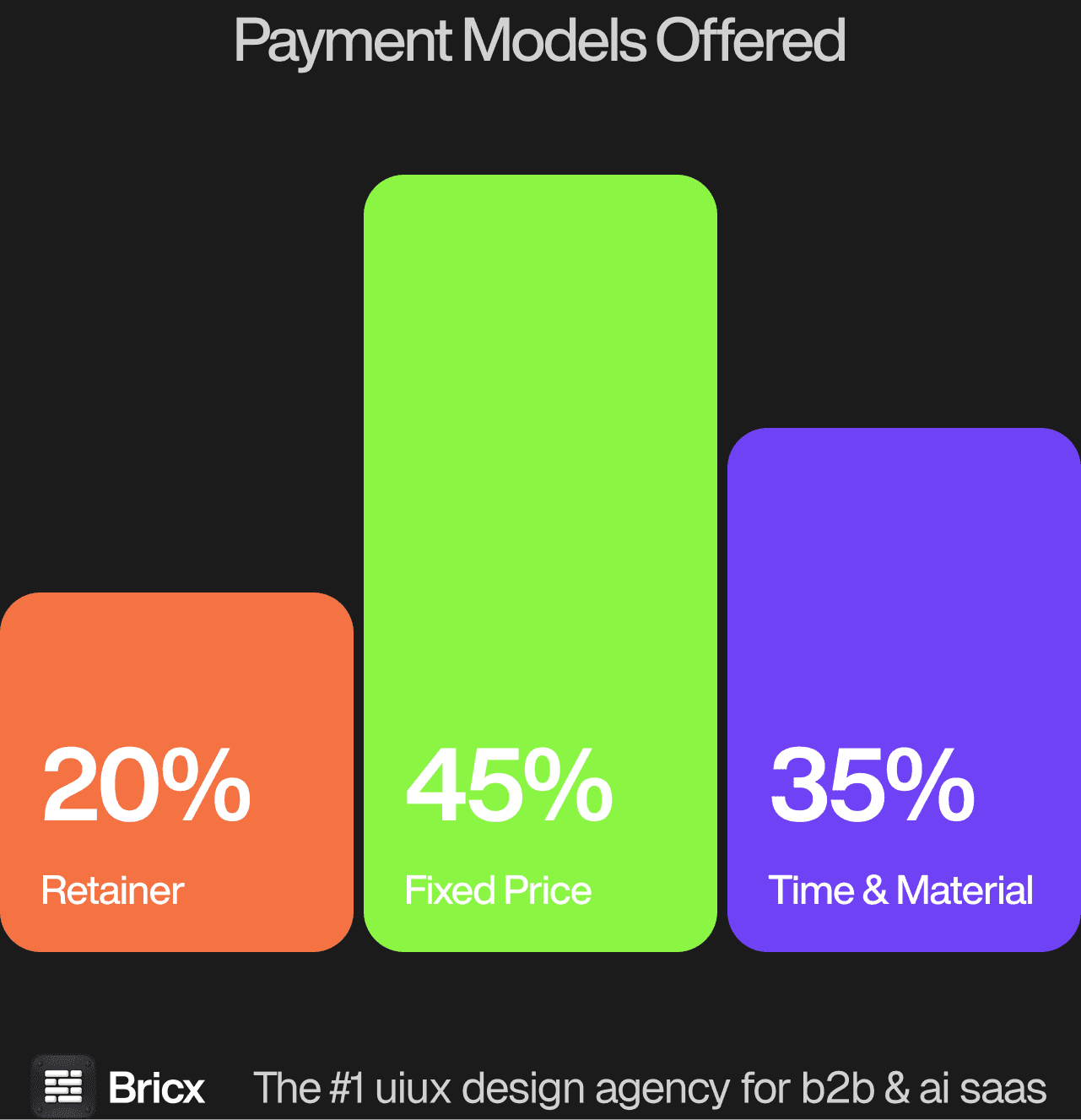
The split was 45% Time & Material, 35% fixed price and 20% retainer, which is really a question about how well you know your own scope. For SaaS dashboard design the model usually matters more than the headline figure, because it decides what happens when the scope moves.
- Fixed price protects budget certainty.
- Time & Material protects flexibility.
- Retainer protects continuity.
- Which one fits SaaS dashboard design comes down to whether the scope is settled before the work starts.
How do you evaluate a SaaS dashboard design agency?
Five things separate SaaS dashboard design from analytics tool design generally.
Ask what appears while the data loads. A production dashboard queries live rows, so skeletons, partial results and stale-but-instant numbers are design decisions with an opinion behind them.
Ask how somebody gets from a number to the rows behind it. Every aggregate provokes the question of what is inside it, and a dashboard that cannot answer sends people straight back to an export.
Ask which three questions the dashboard answers. A product dashboard is not a BI tool and cannot ship a query builder, so most of the value sits in what was deliberately left out.
Ask how they handle an empty account. New customers see zeros for weeks, and a design proven only against mature demo data looks broken during the exact period trust is being formed.
Ask about permissions and tenancy. Two people in one account should see different totals, and a chart quietly excluding rows somebody cannot access has to admit that on the screen.
What are the red flags when hiring a design agency?
- Every project in the portfolio looks the same. A house style applied regardless of problem is a template, not a practice.
- Availability that starts immediately. Good teams are usually booked. Instant capacity is worth one question.
- No discovery at all. The opposite failure to endless workshops, and just as expensive.
- Testimonials without companies. An unattributed quote is a sentence someone wrote.
- Reluctance to name the tools. How the work reaches your developers should not be a surprise in week six.
- No comparable example of SaaS dashboard design. An agency that cannot point to work of the same shape is learning on your budget.
Should you hire a UX agency or build in-house?
Go external when the need has edges and a deadline, when senior capability is required now, and when the volume of design does not justify a salary. You are buying pattern recognition from other people's mistakes. For SaaS dashboard design specifically, the question worth settling first is how often the work recurs.
Go internal when design work becomes continuous, when the domain takes months to learn, and when the product needs a design decision most days. Recruiting realistically costs six months before it pays back. Where SaaS dashboard design falls on that line is usually clear once you count how many times it will need doing again.
A company whose product is analytics should hire, because chart decisions recur weekly and each one needs the data model in the room. A team adding a dashboard to an existing product should retain, since the work is a defined burst followed by years of small changes. Hiring fails when the designer never gets access to production data. Retaining fails when charts that looked right against sample data collapse on a real account.
FAQs
What makes SaaS dashboard design difficult?
Users arrive with Tableau in their heads and expect to ask their own questions, while a product dashboard has to answer a chosen few. It also runs against live, permissioned data, so latency and empty states shape the design more than chart styling ever does.
How much does SaaS dashboard design cost?
Fixed-price product design across the benchmark ran $2,500 to over $150,000 with a median near $43,000, and dashboard work lands near that median, pushed up by review time rather than build time. Bricx starts at $25,000.
Should a SaaS product let customers build their own charts?
Rarely. A configurable chart builder is a second product with its own support burden, and most customers want three reliable answers and an export. Reach for configuration only when the questions genuinely differ per account.
What should a dashboard show a brand new account?
Something honest and useful: what will appear here, roughly when, and the one action that produces the first data. A grid of zeroed charts reads as a broken product in the week trust is decided.