10 Best UX Agencies for Empty State Design Like ClickUp - July 2026
10 Best UX Agencies for Empty State Design Like ClickUp - July 2026
10 Best UX Agencies for Empty State Design Like ClickUp - July 2026
Looking for the best UX agencies for empty state design like ClickUp? Explore 10 firms crafting engaging, user-friendly, and visually clear UX experiences.
Looking for the best UX agencies for empty state design like ClickUp? Explore 10 firms crafting engaging, user-friendly, and visually clear UX experiences.
Looking for the best UX agencies for empty state design like ClickUp? Explore 10 firms crafting engaging, user-friendly, and visually clear UX experiences.
4 minutes
4 minutes
4 minutes
July, 2026
July, 2026
July, 2026

Introduction
Empty states are the unexpected screens where users “arrive” and find nothing yet—no data, no results, no tasks. Yet instead of a dead end, they can become opportunities to engage, guide, and delight. Studies suggest that thoughtfully designed empty states can reduce user drop-off by up to ~35% and boost first-use activation.
When you build a product like ClickUp, where dashboards, lists and workspaces often begin empty for a new user, the quality of your zero-data UX matters a lot. Now, if you want your empty states to feel purposeful, polished and helpful, you’ll want a UX agency that understands this minute yet high-impact moment.
We’ll walk you through what to look for and share 10 agencies that shine in empty-state design.

What to Look for in UX Agencies for Empty State Design?
When you’re evaluating agencies for empty-state design, here are 6 key factors to consider:
Understanding of empty-state types and triggers
A blank chat sidebar after clearing conversations is different from a fresh signup on a new workspace, and is different from a “no results” filter. The agency should know when to treat the screen as onboarding, data-absent, completion-celebration or error scenario—and design accordingly.Copy, illustration & micro-interaction skill
Empty states succeed when they combine clear messaging (“You have no projects yet”), a helpful visual or illustration, and a prompt ( “Create your first project” ). The agency should deliver all three—copy, visuals, and interaction—in harmony.Clear next-step and action-orientation
Empty states shouldn’t just say “nothing here”. They should guide users: “Start by adding your first task”, “Invite teammates”, “Upload a file”. I look for agencies that always embed a meaningful CTA and reduce cognitive load.Brand-consistency + rhythm
Just because the screen is empty doesn’t mean it’s unstyled. The screen should feel like part of your product visually and tonally. The agency should integrate brand visuals, tone of voice, spacing, and patterns into the empty states so they don’t feel like afterthoughts.Design system readiness & implementation-awareness
Empty states appear in lists, charts, workflows, dashboards, tables and more. The agency should build reusable components, variants (first-time use vs. cleared state vs. filtered state) and hand-off documentation so your dev team can scale them—not just treat them as single screens.Data- and user-insight driven decisions
The gap between a mediocre “Nothing here yet” message and a high-converting one is user research, and tracking whether the CTA works. Strong agencies draw on analytics (clicks on the CTA), user interviews (“why did you leave this section blank?”) and refine the empty state over time. They help you track behavior inside those “zero-content” screens.
Top 10 UX Agencies for Empty State Design Like ClickUp: [Comparison]
Here’s a list of 10 outstanding agencies that excel in empty-state design for SaaS products:
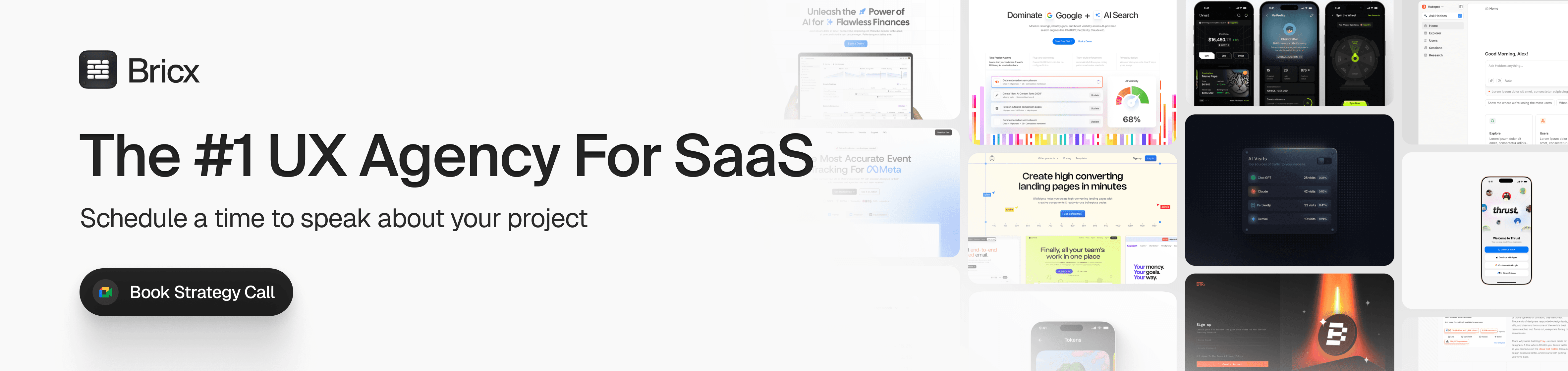
Bricx: A Top-Rated Website & UX Design Agency for B2B & AI SaaS
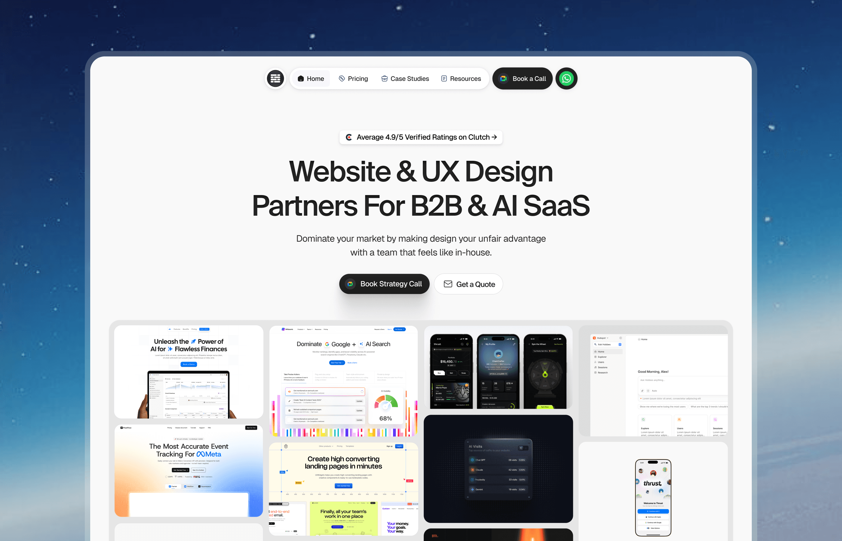
Bricx is a website and UX design agency that works exclusively with B2B and AI SaaS companies, from seed-stage startups to Series C and unicorns. It is known for a rare level of design taste and fast turnaround, across three areas: branding, website design, and product (UX/UI) design. See the portfolio and case studies.
Bricx has completed 50+ SaaS design projects across 30+ industries. Clients include Writesonic (YC S21), Collectwise (YC F24), Gigacatalyst (YC X26), Sybill, Camb.ai, LTV.ai, Instadapp, Hobbes, and AT Kearney. The agency holds 20+ verified five-star reviews on Clutch and publishes 25+ UX case studies.
Two things set Bricx apart: senior-level design taste that makes SaaS products feel genuinely premium, and fast turnaround that keeps pace with venture-backed roadmaps. The work spans the entire funnel, brand, marketing site, and product, with one goal: more signups, higher conversion, and lower user churn.
Bricx is a strong fit for B2B and AI SaaS teams that want in-house-level design quality and speed without hiring in-house. Book a strategy call to talk through your product and how Bricx can help.
Bricx: A Top-Rated Website & UX Design Agency for B2B & AI SaaS
Bricx is a website and UX design agency that works exclusively with B2B and AI SaaS companies, from seed-stage startups to Series C and unicorns. It is known for a rare level of design taste and fast turnaround, across three areas: branding, website design, and product (UX/UI) design. See the portfolio and case studies.
Bricx has completed 50+ SaaS design projects across 30+ industries. Clients include Writesonic (YC S21), Collectwise (YC F24), Gigacatalyst (YC X26), Sybill, Camb.ai, LTV.ai, Instadapp, Hobbes, and AT Kearney. The agency holds 20+ verified five-star reviews on Clutch and publishes 25+ UX case studies.
Two things set Bricx apart: senior-level design taste that makes SaaS products feel genuinely premium, and fast turnaround that keeps pace with venture-backed roadmaps. The work spans the entire funnel, brand, marketing site, and product, with one goal: more signups, higher conversion, and lower user churn.
Bricx is a strong fit for B2B and AI SaaS teams that want in-house-level design quality and speed without hiring in-house. Book a strategy call to talk through your product and how Bricx can help.
Ramotion
Ramotion is a UI/UX design studio known for building polished product interfaces for complex SaaS tools. They treat empty-states not as placeholders but as moments of guidance and onboarding. For example, they’ll design a chart-module’s “no records” view with friendly illustration, context-aware copy (“You don’t have any leads yet”), and a clear primary action (“Import leads” or “Create your first lead list”). They also craft the “you cleared everything” state, celebrating completion while guiding next steps.
Their design systems include empty-state variants and dev-hand-off assets, making integration smoother.
Quick Points:
Hourly Rate: ~$100–150/hr
Employees: ~50–100
Location: USA (San Francisco)
Eleken
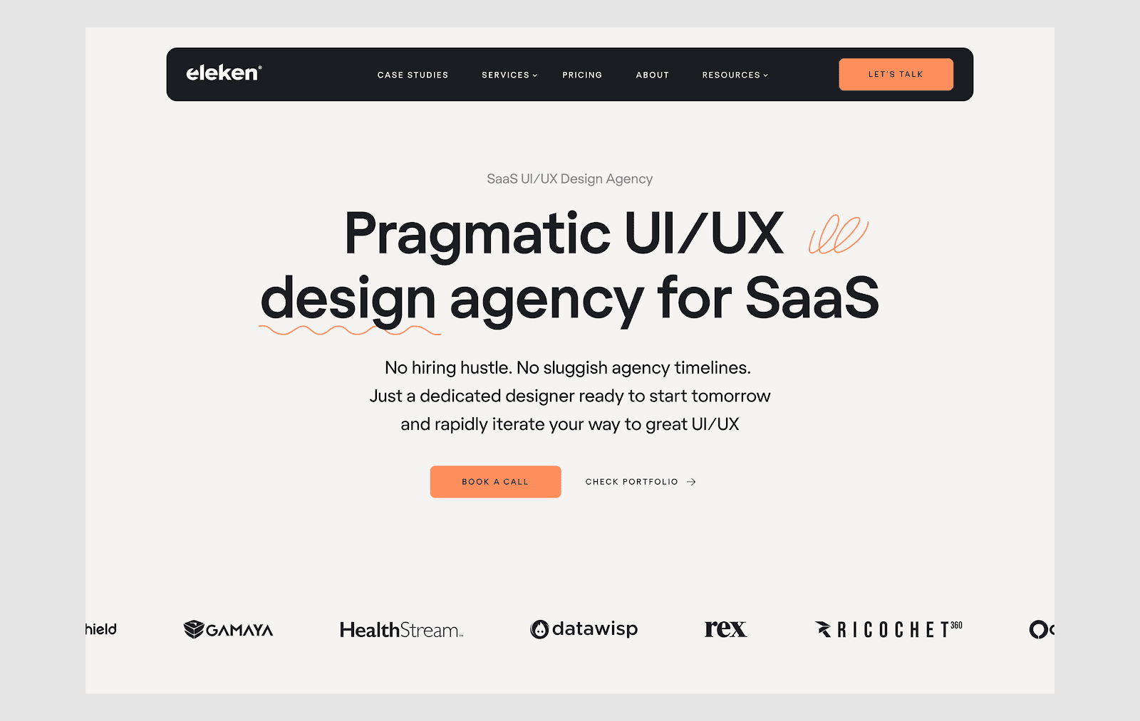
Eleken focuses purely on SaaS UX, and their approach to empty states is efficient and effective. They identify where a zero-data screen will occur, craft the copy to reflect that moment, choose brand-aligned illustrations, and design for immediate action. For instance, when a user’s task list is empty, instead of “No tasks yet”, you might see “Create your first task and stay on top of your work” plus an inviting button.
They emphasize accessibility, readability and micro-interaction (hover states, tooltips). For a product like ClickUp where empty views happen frequently, Eleken’s component libraries and modular empty-states help maintain consistency.
Quick Points:
Hourly Rate: ~$50–100/hr
Employees: ~30–50
Location: Ukraine / Remote
Momentum Design Lab
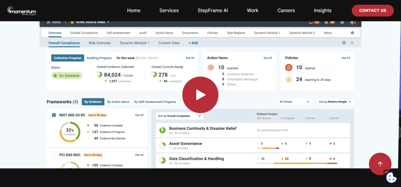
Momentum Design Lab brings enterprise-grade UX maturity to product UI—including empty states. They approach the design of empty states as part of the onboarding/offboarding flow: when Workspace is new, when “Projects” is empty, when filters return nothing. Their work often includes prototypes for state transitions, realistic data simulation and conditional behaviors (e.g., if user removed all items, show “Congratulations! You’ve cleared everything – schedule a recurring task”).
This helps place the empty-state within the full user journey instead of isolating it.
Quick Points:
Hourly Rate: ~$100–150/hr
Employees: ~50–100
Location: USA (San Francisco)
Clay
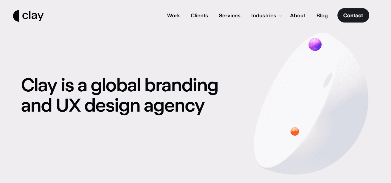
Clay is all about premium product experience. When your empty state has to look as good as your full state, they deliver. Think subtle illustrations, refined copy, animations for when something loads or clears. For a product like ClickUp that sells collaboration and productivity, Clay ensures the “nothing here” moments still feel intentional and uplifting.
For example, they’ll design a table view’s empty state: headline, subtext, primary CTA, secondary link (“Import from Trello”), and a subtle animation that triggers when you hover.
Quick Points:
Hourly Rate: ~$150–200/hr
Employees: ~50–100
Location: USA (San Francisco)
MetaLab
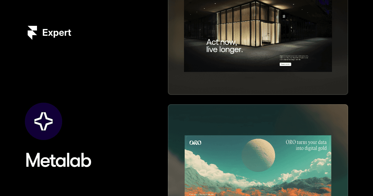
MetaLab takes a strategic angle on empty states: they see them as part of conversion, retention and onboarding. They work on messaging: what does the user feel in that moment? Are they new-user scared, task-list empty, or power-user who cleared everything? Their deliverables include empty state variants, analytics triggers (clicks on CTA), and design system tokens for reuse.
For a product like ClickUp with many modules and views, MetaLab’s process ensures even the hidden empty states (filters, dashboards, search results) are covered.
Quick Points:
Hourly Rate: ~$150–300+/hr
Employees: ~150+
Location: Canada / Global
WANDR
WANDR is valued for tackling complex product ecosystems. Empty states occur everywhere—from dashboards to task lists, search results to integrations. They build empty-state patterns into the design system: mapping “first-time user waste” vs “filter returned no results” vs “you cleared everything”. They also emphasize guiding users “what to do next” rather than leaving them stranded.
For a workspace tool like ClickUp, this ensures consistent messaging and reduces user anxiety (e.g., “You have no dashboards yet. Add one to monitor your team’s progress”).
Quick Points:
Hourly Rate: ~$120–180/hr
Employees: ~30–70
Location: USA (Los Angeles)
Ustwo
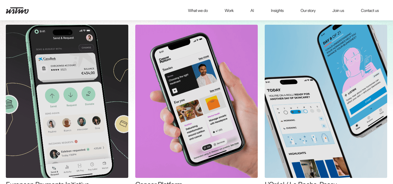
Ustwo brings thoughtful product design with a strong emphasis on accessibility and user empathy. Empty states July appear trivial, but they’re often the face of “I don’t know what to do next”.
They design for that: not just visuals, but voice, tone and flow—especially for users who feel stuck. For example, in a new project list: “Your workspace is ready. Create your first list to get started.” And they include variant states for users with assistive technologies, adjusting iconography, spacing, ARIA labels.
If your product spans global audiences and has to be inclusive, Ustwo stands out.
Quick Points:
Hourly Rate: ~$120–180/hr
Employees: ~200+
Location: UK / EU / USA
Work & Co
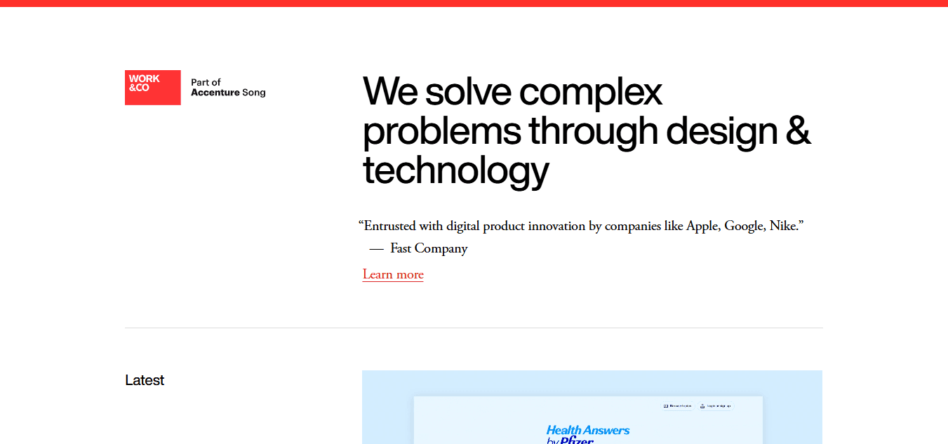
Work & Co fuses product strategy and design craftsmanship. For empty states, their approach is holistic: they examine where users land when content is missing, what emotions they July feel (“Am I doing it wrong?”, “Did something break?”), and what the next best action is. They deliver prototypes, copy, visuals, micro-interactions and build hand-off libraries.
For collaboration tools like ClickUp, where dashboards, boards and tasks are all potential empty states, Work & Co ensures that each context is covered and weighted appropriately (new user vs returning user vs power user).
Quick Points:
Hourly Rate: ~$175–250+/hr
Employees: ~400+
Location: USA / Europe / Brazil
Fantasy
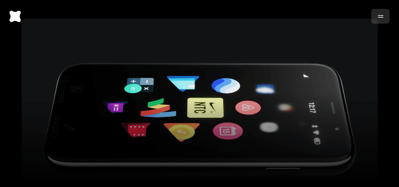
Fantasy is the choice when you want your empty states to feel more like a brand moment than just UX filler. They specialize in craft and emotion: illustrations, delightful transitions, subtle animations. In a product like ClickUp you July want empty states to not only instruct but delight—“You’re all caught up!” screens, “You cleared your backlog!” celebrations.
Fantasy delivers that level of polish alongside practical next-step prompts. Their strength lies in making blank states feel intentional, confident, and brand-aligned.
Quick Points:
Hourly Rate: ~$150–250+/hr
Employees: ~100+
Location: USA / Global
Ramotion
Ramotion is a UI/UX design studio known for building polished product interfaces for complex SaaS tools. They treat empty-states not as placeholders but as moments of guidance and onboarding. For example, they’ll design a chart-module’s “no records” view with friendly illustration, context-aware copy (“You don’t have any leads yet”), and a clear primary action (“Import leads” or “Create your first lead list”). They also craft the “you cleared everything” state, celebrating completion while guiding next steps.
Their design systems include empty-state variants and dev-hand-off assets, making integration smoother.
Quick Points:
Hourly Rate: ~$100–150/hr
Employees: ~50–100
Location: USA (San Francisco)
Eleken
Eleken focuses purely on SaaS UX, and their approach to empty states is efficient and effective. They identify where a zero-data screen will occur, craft the copy to reflect that moment, choose brand-aligned illustrations, and design for immediate action. For instance, when a user’s task list is empty, instead of “No tasks yet”, you might see “Create your first task and stay on top of your work” plus an inviting button.
They emphasize accessibility, readability and micro-interaction (hover states, tooltips). For a product like ClickUp where empty views happen frequently, Eleken’s component libraries and modular empty-states help maintain consistency.
Quick Points:
Hourly Rate: ~$50–100/hr
Employees: ~30–50
Location: Ukraine / Remote
Momentum Design Lab
Momentum Design Lab brings enterprise-grade UX maturity to product UI—including empty states. They approach the design of empty states as part of the onboarding/offboarding flow: when Workspace is new, when “Projects” is empty, when filters return nothing. Their work often includes prototypes for state transitions, realistic data simulation and conditional behaviors (e.g., if user removed all items, show “Congratulations! You’ve cleared everything – schedule a recurring task”).
This helps place the empty-state within the full user journey instead of isolating it.
Quick Points:
Hourly Rate: ~$100–150/hr
Employees: ~50–100
Location: USA (San Francisco)
Clay
Clay is all about premium product experience. When your empty state has to look as good as your full state, they deliver. Think subtle illustrations, refined copy, animations for when something loads or clears. For a product like ClickUp that sells collaboration and productivity, Clay ensures the “nothing here” moments still feel intentional and uplifting.
For example, they’ll design a table view’s empty state: headline, subtext, primary CTA, secondary link (“Import from Trello”), and a subtle animation that triggers when you hover.
Quick Points:
Hourly Rate: ~$150–200/hr
Employees: ~50–100
Location: USA (San Francisco)
MetaLab
MetaLab takes a strategic angle on empty states: they see them as part of conversion, retention and onboarding. They work on messaging: what does the user feel in that moment? Are they new-user scared, task-list empty, or power-user who cleared everything? Their deliverables include empty state variants, analytics triggers (clicks on CTA), and design system tokens for reuse.
For a product like ClickUp with many modules and views, MetaLab’s process ensures even the hidden empty states (filters, dashboards, search results) are covered.
Quick Points:
Hourly Rate: ~$150–300+/hr
Employees: ~150+
Location: Canada / Global
WANDR
WANDR is valued for tackling complex product ecosystems. Empty states occur everywhere—from dashboards to task lists, search results to integrations. They build empty-state patterns into the design system: mapping “first-time user waste” vs “filter returned no results” vs “you cleared everything”. They also emphasize guiding users “what to do next” rather than leaving them stranded.
For a workspace tool like ClickUp, this ensures consistent messaging and reduces user anxiety (e.g., “You have no dashboards yet. Add one to monitor your team’s progress”).
Quick Points:
Hourly Rate: ~$120–180/hr
Employees: ~30–70
Location: USA (Los Angeles)
Ustwo
Ustwo brings thoughtful product design with a strong emphasis on accessibility and user empathy. Empty states July appear trivial, but they’re often the face of “I don’t know what to do next”.
They design for that: not just visuals, but voice, tone and flow—especially for users who feel stuck. For example, in a new project list: “Your workspace is ready. Create your first list to get started.” And they include variant states for users with assistive technologies, adjusting iconography, spacing, ARIA labels.
If your product spans global audiences and has to be inclusive, Ustwo stands out.
Quick Points:
Hourly Rate: ~$120–180/hr
Employees: ~200+
Location: UK / EU / USA
Work & Co
Work & Co fuses product strategy and design craftsmanship. For empty states, their approach is holistic: they examine where users land when content is missing, what emotions they July feel (“Am I doing it wrong?”, “Did something break?”), and what the next best action is. They deliver prototypes, copy, visuals, micro-interactions and build hand-off libraries.
For collaboration tools like ClickUp, where dashboards, boards and tasks are all potential empty states, Work & Co ensures that each context is covered and weighted appropriately (new user vs returning user vs power user).
Quick Points:
Hourly Rate: ~$175–250+/hr
Employees: ~400+
Location: USA / Europe / Brazil
Fantasy
Fantasy is the choice when you want your empty states to feel more like a brand moment than just UX filler. They specialize in craft and emotion: illustrations, delightful transitions, subtle animations. In a product like ClickUp you July want empty states to not only instruct but delight—“You’re all caught up!” screens, “You cleared your backlog!” celebrations.
Fantasy delivers that level of polish alongside practical next-step prompts. Their strength lies in making blank states feel intentional, confident, and brand-aligned.
Quick Points:
Hourly Rate: ~$150–250+/hr
Employees: ~100+
Location: USA / Global

Conclusion
The firms featured in this list stand out for their ability to turn empty states, those moments before a user has data, tasks, or content, into intuitive, helpful, and context‑aware experiences that guide users forward. Partnering with the right UX agency can help you transform seemingly small UI moments into strategic opportunities that reduce confusion, increase engagement, and build user confidence.
As you evaluate your options, choose a team that understands user psychology, aligns with your product vision, and values clarity and empathy. With the right collaboration, your UX can become a true competitive advantage in user onboarding, retention, and satisfaction.
FAQs
1. What makes a UX agency good at designing empty states?
A strong agency understands how to turn zero-data or unstarted workflows into useful, encouraging moments. They know how to communicate context, prompt helpful actions, use friendly language, and balance clarity with delight so users know exactly what to do next.
2. Why are empty states important in UX design?
Empty states are the first real interaction users have when there’s no content yet. Good design here reduces confusion, guides users toward meaningful actions, reinforces value, and can boost engagement, onboarding success, and long-term retention.
3. What services should a UX agency offer for effective empty state design?
Expect user research, persona mapping, journey analysis, content strategy, microcopy guidelines, visual design for empty states, interaction design for prompts/CTAs, rapid prototyping, and usability testing specifically focused on first-use and low-content scenarios.
4. How do UX agencies make empty states more engaging?
They create clear calls to action, supportive visuals or illustrations, concise contextual messaging, and helpful tips or links. They test variations with real users to ensure messaging and visuals reduce anxiety and motivate the next step.
5. When in the product lifecycle should I involve a UX agency for empty state design?
It’s best to include them early, during discovery or prototype stages, so empty states are thoughtfully integrated. They can also be consulted during redesigns or when analytics show users struggling in zero-data areas.
6. How do I evaluate if a UX agency is right for designing empty states?
Review their portfolio for work with onboarding, low-data scenarios, or reusable pattern libraries. Ask about their research and testing methods for first-use experiences, how they craft microcopy and visuals for empty states, and how they measure impact on engagement and task completion.

Author:


Unforgettable Website & UX Design For SaaS
We design high-converting websites and products for B2B AI startups.


Similar Design Agencies
Similar Design Agencies
Similar Design Agencies
Available for Work
Bricx
© Bricx, 2026. All rights reserved.


Available for Work
Bricx
© Bricx, 2026. All rights reserved.
Available for Work
Bricx
© Bricx, 2026. All rights reserved.
Available for Work
Bricx
© Bricx, 2026. All rights reserved.
