Website Design
Website Design
Website Design
Insights
Insights
Insights
September 12, 2025
September 12, 2025
September 12, 2025
7 Best Healthcare Website Design Examples for Modern UX
7 Best Healthcare Website Design Examples for Modern UX
7 Best Healthcare Website Design Examples for Modern UX
Explore 7 best healthcare website design examples. Learn how Mayo, Zocdoc, Teladoc & more build trust, clarity, and patient-first digital experiences.
Explore 7 best healthcare website design examples. Learn how Mayo, Zocdoc, Teladoc & more build trust, clarity, and patient-first digital experiences.
Explore 7 best healthcare website design examples. Learn how Mayo, Zocdoc, Teladoc & more build trust, clarity, and patient-first digital experiences.
4 minutes
4 minutes
4 minutes


Healthcare websites aren’t just digital brochures—they’re lifelines. Patients rely on them to book appointments, access records, find providers, and understand treatments. A great healthcare website combines trust, clarity, and ease of use. But with countless options online, standing out requires thoughtful design that balances professionalism with empathy.
In this article, you’ll explore 8 best healthcare website design examples that show how clean interfaces, accessibility, and patient-first features build credibility and improve user experience. We’ll also cover why healthcare website design matters and what makes an exceptional one, so you can apply these principles to your own project.
Key Takeaways
Top healthcare website design examples including JoyHealth, Zocdoc, Mayo Clinic and WebMD, alongside a detailed analysis of what makes them standout.
An in-depth understanding of the core elements of effective healthcare web design and its importance.
Real-world takeaways you can apply to improve usability, empathy, and conversions in healthcare UX.
What Makes a Good Healthcare Website Design?
A good healthcare website design goes beyond visuals — it builds trust, empathy, and usability from the first click. When users land on your site, they’re often anxious or seeking clarity.
The best examples of great healthcare website UX make them feel informed, safe, and confident in taking the next step.
Given below, are some crucial components of good healthcare web design:
Trust-first design: Patients visit healthcare sites when they’re vulnerable. Consistent branding, authentic imagery, and clear doctor credentials immediately establish credibility and comfort, which is what makes a healthcare website successful.
Accessibility for all users: WCAG-compliant design, large font sizes, and high-contrast color palettes ensure everyone, including elderly users, can easily navigate and read critical information.
Empathy-driven content structure: Great design in healthcare starts with empathy. The best healthcare UX examples simplify medical language, use supportive microcopy, and anticipate questions before users even ask them.
Frictionless navigation: Users should find what they need: doctor bios, insurance info, or appointment booking, within 2 to 3 clicks. A strong information architecture reduces frustration and increases engagement time.
Mobile-first performance: With over 70% of health searches happening on mobile, fast load times, touch-friendly layouts, and uncluttered design ensure your site performs as well on phones as it does on desktop.
Balanced conversion cues: Strong CTAs (“Book Consultation,” “Find a Specialist”) placed within helpful content sections guide users naturally, improving conversion without breaking trust.
Why Good Healthcare Website Design Is Important?
Healthcare is one of the few industries where trust is non-negotiable. Patients judge your credibility, reliability, and professionalism based on your website design. A cluttered, outdated, or confusing site doesn’t just frustrate — it erodes confidence in your care.
Key reasons why healthcare website design is crucial:
Trust & Credibility: A polished design reassures patients and sets the tone for professionalism.
Accessibility: Healthcare must be inclusive—ADA compliance, high contrast, legible fonts, and multilingual support are essential.
Ease of Navigation: Patients look for doctors, services, or appointments. Simple pathways matter.
Mobile-first Experience: With 70%+ patients browsing on mobile, responsiveness is critical.
Patient Empowerment: Features like portals, FAQs, and chatbots help patients feel supported.
7 Best Healthcare Website Design Examples
JoyHealth
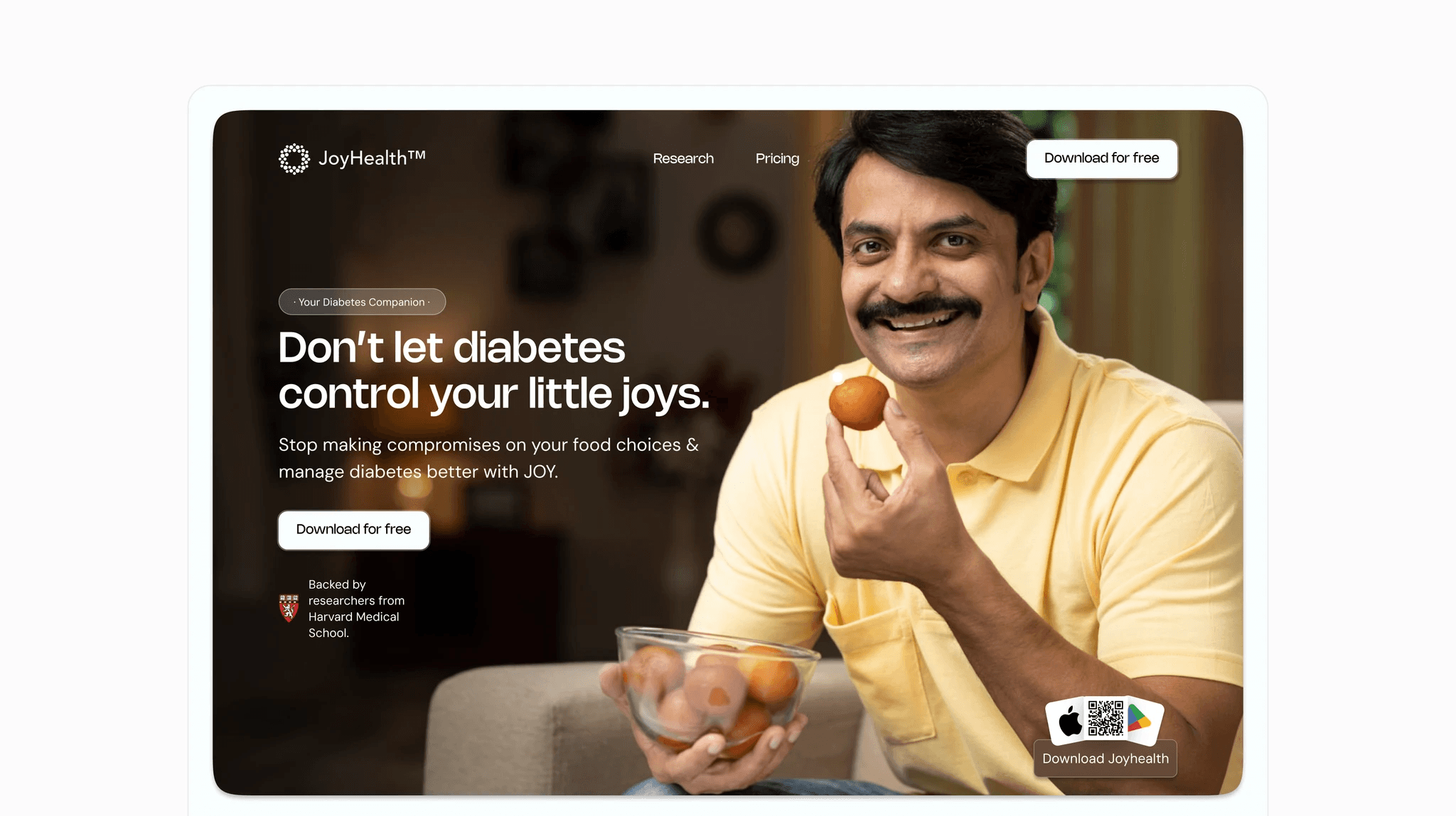
Now, while we're actually a little biased since we worked on the project at Bricx, but when it comes to healthcare websites - JoyHealth's portal is probably one of the best healthcare website design examples to get inspiration from.
Their homepage immediately communicates its purpose with a strong value proposition: “Your Diabetes Companion”; and backs it up with measurable outcomes like HbA₁c reduction and blood sugar improvement timelines. This data-driven storytelling builds instant credibility while remaining accessible to non-medical users.
The interface is clean, with a clear visual hierarchy that moves naturally from the hero message to benefits and calls to action. Thoughtful visuals, such as real food examples that show how each item impacts blood sugar, make complex information intuitive and actionable.
The tone too, is warm and reassuring, avoiding clinical jargon, and a subtle mix of microinteractions enhance engagement without distraction.
What makes it impressive?
Clear visual hierarchy: The layout guides users effortlessly from value proposition to proof and CTA, ensuring zero cognitive friction.
Emotionally intelligent UX: Every element, from visuals to microcopy, creates warmth and relatability, transforming a clinical topic into an uplifting experience.
Component-level clarity: Reusable cards, iconography, and data visualization components (like glucose impact graphs) make complex health data easy to scan and understand.
Mayo Clinic

Mayo Clinic’s website is one of the most trusted destinations for health information. The design is calm, clean, and authoritative, reflecting the organization’s medical credibility. The homepage highlights essential areas like patient care, health information, and research while maintaining a balanced structure that avoids overwhelming users. Blue tones, consistent typography, and abundant white space make the experience approachable.
The site’s search functionality is a standout feature—patients can quickly look up conditions, doctors, or resources without navigating complex menus. Health-related content is well-structured, written in patient-friendly language, and easily accessible across devices. Accessibility has been prioritized, with multilingual support and compliance features that allow people with disabilities to navigate easily.
What makes it impressive?
Organized navigation at scale: Mayo Clinic handles thousands of pages yet never feels overwhelming. Categories and subcategories are logically grouped, helping patients find services, conditions, or resources in just a few clicks. This sense of structure reassures users they’re in good hands.
Powerful and patient-friendly search: The search bar is central to the design, allowing quick lookups for symptoms, conditions, or doctors. Results are easy to scan and written in clear, non-technical language, which lowers barriers for everyday patients.
Accessibility as a core feature: With multilingual support, screen-reader compatibility, and WCAG-compliant color contrast, the site ensures that all users—including elderly or disabled patients—can access critical information with confidence.
Cleveland Clinic

Cleveland Clinic’s site demonstrates how empathy and usability can work together. The homepage provides quick access to appointments, second opinions, and patient stories—critical elements for trust and credibility. With a soothing color palette and uncluttered layout, it reduces stress while communicating professionalism.
Patient stories and testimonials are prominent, reinforcing confidence for new visitors. Navigation is clear, with structured categories for specialties, services, and locations. White space and consistent visuals help maintain focus on critical actions like booking a doctor or exploring treatments.
What makes it impressive?
Trust-building through storytelling: Patient testimonials and success stories are prominently displayed, creating an emotional connection that reassures visitors they’re choosing the right provider.
Streamlined booking flow: Appointment scheduling is placed front and center, with intuitive forms that reduce friction. Patients can act immediately without hunting for options.
Clear segmentation of services: Services are categorized logically, with filters and structured pathways for different needs. Whether searching by specialty, doctor, or location, users find clarity at every step.
Zocdoc

Zocdoc simplifies the often-stressful task of finding and booking a doctor. The site greets users with a clean search bar where they can enter specialty, insurance, and location. The design feels modern and friendly, using vibrant colors and approachable illustrations to make healthcare less intimidating.
Mobile responsiveness is excellent—appointments can be booked within seconds on any device. Each provider profile includes ratings, reviews, and availability, giving users the confidence to choose quickly. The booking flow is transparent and streamlined, minimizing patient drop-off.
What makes it impressive?
Consumer-first design: By modeling healthcare search like e-commerce, Zocdoc makes finding a provider as intuitive as buying a product. The flow is fast and reassuring.
Transparent provider profiles: Ratings, insurance compatibility, and availability are presented upfront, empowering users to make informed decisions without extra clicks.
Mobile-optimized booking: The site is built for smartphones, with large touch targets and simple forms. Patients can book care in minutes, even on the go.
One Medical

One Medical’s website feels more like a premium lifestyle brand than a traditional clinic. Its minimalist layout, high-quality imagery, and concise messaging position healthcare as modern, accessible, and patient-first. The homepage emphasizes membership benefits, from same-day appointments to app-based care.
The design reflects the company’s model: clear CTAs like “Join Now” or “Book an Appointment” ensure users act quickly. A balance of lifestyle photography and medical visuals communicates warmth while reinforcing credibility. The site also scales well across mobile and desktop, with a consistent brand tone throughout.
What makes it impressive?
Lifestyle-oriented design: By using modern visuals and clean layouts, the site frames healthcare as approachable and aspirational rather than clinical and intimidating.
Membership-focused UX: The design centers on subscription benefits, with clear CTAs that encourage conversion while explaining value.
Consistency across touchpoints: From mobile app to desktop, the branding and user flows remain cohesive, strengthening brand recognition and trust.
Teladoc Health

Teladoc’s site prioritizes virtual care with an interface that makes booking a telehealth session seamless. “Get Care” CTAs dominate the homepage, leading patients directly into the flow of choosing their condition, selecting a provider, and connecting virtually.
The website emphasizes clarity by separating services into urgent care, mental health, dermatology, chronic conditions, and more. Visual storytelling explains how the process works in three simple steps. The design uses modern typography and icons, ensuring comprehension even for users new to telehealth.
What makes it impressive?
Telehealth-first architecture: The design highlights virtual appointments upfront, with CTAs that lead directly into the care flow. No extra steps, no confusion.
Service clarity: Patients understand instantly what Teladoc offers thanks to well-structured service categories and explanatory visuals.
Accessible onboarding: Simple language, icons, and responsive layouts ensure patients can start virtual visits easily—even those with limited digital literacy.
Zava

Zava’s UK website focuses on online consultations and prescriptions. Its minimal layout reduces friction, guiding users step-by-step through consultation, prescription, and delivery. Trust is a core theme: credentials, NHS alignment, and patient reviews are highly visible.
Navigation is simplified into major categories like treatments, conditions, and services. Patients feel reassured by transparent processes and clear safety information. The design avoids overwhelming visuals, instead relying on text clarity and structured callouts.
What makes it impressive?
Step-based simplicity: The consultation → prescription → delivery flow is clearly communicated, making online care approachable even for first-time users.
Trust signals at every turn: Reviews, medical credentials, and NHS partnerships reinforce legitimacy, building patient confidence instantly.
Minimalist interface: By reducing visual clutter, the site ensures patients stay focused on the most important task—getting care quickly and safely.
Ada Health

Ada Health offers an AI-powered symptom checker, and its website reflects this innovation with a conversational, digital-first interface. The homepage introduces the tool clearly, encouraging patients to “Start Your Health Check” without distractions.
The design uses vibrant visuals and intuitive flows to make complex technology approachable. The experience works seamlessly on mobile, ensuring users can interact with the AI assistant anywhere. Content explains how data is used responsibly, reinforcing trust in an AI-driven approach.
What makes it impressive?
Conversational UX: Ada’s design mirrors a chatbot-style flow, helping users interact naturally with the AI symptom checker.
Mobile-first execution: The platform is optimized for smartphones, ensuring smooth interaction with large touchpoints and quick loading speeds.
Transparency and trust: Clear explanations of how data is handled and how the AI works build confidence among users unfamiliar with digital health tools.
Conclusion
From Mayo Clinic’s structured clarity to Ada Health’s AI-powered innovation, these 8 healthcare website design examples prove that trust, accessibility, and usability define great healthcare UX.
Each of the healthcare website design examples on this list proves how thoughtful design transforms patient experiences, making them easier, more engaging, and more credible.
At Bricx, we specialize in designing healthcare websites and SaaS platforms that combine empathy with efficiency.
Want to elevate your healthcare product’s UX? Book a call with us and let’s discuss how we can help you design a digital experience your patients will trust.
FAQs
What makes a good healthcare website design?
A good healthcare website design builds trust, clarity, and accessibility. It uses clean visuals, real imagery, and well-structured content to make medical information easy to understand. Strong healthcare UX simplifies complex journeys like booking or consultations and performs well on mobile.
Meeting WCAG accessibility standards ensures everyone can use it comfortably. The best designs balance empathy with business goals, helping users feel cared for while guiding them toward meaningful actions such as booking appointments or learning more about services, without any confusion or friction.
What are common mistakes to avoid in healthcare website design?
Common mistakes in healthcare website design include overwhelming users with jargon, slow loading times, and poor mobile optimization. Many sites also neglect accessibility, frustrating seniors or people with disabilities.
A good healthcare website should be fast, intuitive, and trustworthy — helping users easily find doctors or book appointments. Keep it simple and human-centered to build lasting trust.
What are some examples of great healthcare UX design?
Some of the best examples of great healthcare website UX include JoyHealth, Mayo Clinic, and One Medical.
Each brand focuses on clear navigation, simple appointment flows, and empathetic communication.
Their designs prioritize accessibility, readability, and patient confidence — which are the 3 core traits of good healthcare website design.
Healthcare websites aren’t just digital brochures—they’re lifelines. Patients rely on them to book appointments, access records, find providers, and understand treatments. A great healthcare website combines trust, clarity, and ease of use. But with countless options online, standing out requires thoughtful design that balances professionalism with empathy.
In this article, you’ll explore 8 best healthcare website design examples that show how clean interfaces, accessibility, and patient-first features build credibility and improve user experience. We’ll also cover why healthcare website design matters and what makes an exceptional one, so you can apply these principles to your own project.
Key Takeaways
Top healthcare website design examples including JoyHealth, Zocdoc, Mayo Clinic and WebMD, alongside a detailed analysis of what makes them standout.
An in-depth understanding of the core elements of effective healthcare web design and its importance.
Real-world takeaways you can apply to improve usability, empathy, and conversions in healthcare UX.
What Makes a Good Healthcare Website Design?
A good healthcare website design goes beyond visuals — it builds trust, empathy, and usability from the first click. When users land on your site, they’re often anxious or seeking clarity.
The best examples of great healthcare website UX make them feel informed, safe, and confident in taking the next step.
Given below, are some crucial components of good healthcare web design:
Trust-first design: Patients visit healthcare sites when they’re vulnerable. Consistent branding, authentic imagery, and clear doctor credentials immediately establish credibility and comfort, which is what makes a healthcare website successful.
Accessibility for all users: WCAG-compliant design, large font sizes, and high-contrast color palettes ensure everyone, including elderly users, can easily navigate and read critical information.
Empathy-driven content structure: Great design in healthcare starts with empathy. The best healthcare UX examples simplify medical language, use supportive microcopy, and anticipate questions before users even ask them.
Frictionless navigation: Users should find what they need: doctor bios, insurance info, or appointment booking, within 2 to 3 clicks. A strong information architecture reduces frustration and increases engagement time.
Mobile-first performance: With over 70% of health searches happening on mobile, fast load times, touch-friendly layouts, and uncluttered design ensure your site performs as well on phones as it does on desktop.
Balanced conversion cues: Strong CTAs (“Book Consultation,” “Find a Specialist”) placed within helpful content sections guide users naturally, improving conversion without breaking trust.
Why Good Healthcare Website Design Is Important?
Healthcare is one of the few industries where trust is non-negotiable. Patients judge your credibility, reliability, and professionalism based on your website design. A cluttered, outdated, or confusing site doesn’t just frustrate — it erodes confidence in your care.
Key reasons why healthcare website design is crucial:
Trust & Credibility: A polished design reassures patients and sets the tone for professionalism.
Accessibility: Healthcare must be inclusive—ADA compliance, high contrast, legible fonts, and multilingual support are essential.
Ease of Navigation: Patients look for doctors, services, or appointments. Simple pathways matter.
Mobile-first Experience: With 70%+ patients browsing on mobile, responsiveness is critical.
Patient Empowerment: Features like portals, FAQs, and chatbots help patients feel supported.
7 Best Healthcare Website Design Examples
JoyHealth
Now, while we're actually a little biased since we worked on the project at Bricx, but when it comes to healthcare websites - JoyHealth's portal is probably one of the best healthcare website design examples to get inspiration from.
Their homepage immediately communicates its purpose with a strong value proposition: “Your Diabetes Companion”; and backs it up with measurable outcomes like HbA₁c reduction and blood sugar improvement timelines. This data-driven storytelling builds instant credibility while remaining accessible to non-medical users.
The interface is clean, with a clear visual hierarchy that moves naturally from the hero message to benefits and calls to action. Thoughtful visuals, such as real food examples that show how each item impacts blood sugar, make complex information intuitive and actionable.
The tone too, is warm and reassuring, avoiding clinical jargon, and a subtle mix of microinteractions enhance engagement without distraction.
What makes it impressive?
Clear visual hierarchy: The layout guides users effortlessly from value proposition to proof and CTA, ensuring zero cognitive friction.
Emotionally intelligent UX: Every element, from visuals to microcopy, creates warmth and relatability, transforming a clinical topic into an uplifting experience.
Component-level clarity: Reusable cards, iconography, and data visualization components (like glucose impact graphs) make complex health data easy to scan and understand.
Mayo Clinic
Mayo Clinic’s website is one of the most trusted destinations for health information. The design is calm, clean, and authoritative, reflecting the organization’s medical credibility. The homepage highlights essential areas like patient care, health information, and research while maintaining a balanced structure that avoids overwhelming users. Blue tones, consistent typography, and abundant white space make the experience approachable.
The site’s search functionality is a standout feature—patients can quickly look up conditions, doctors, or resources without navigating complex menus. Health-related content is well-structured, written in patient-friendly language, and easily accessible across devices. Accessibility has been prioritized, with multilingual support and compliance features that allow people with disabilities to navigate easily.
What makes it impressive?
Organized navigation at scale: Mayo Clinic handles thousands of pages yet never feels overwhelming. Categories and subcategories are logically grouped, helping patients find services, conditions, or resources in just a few clicks. This sense of structure reassures users they’re in good hands.
Powerful and patient-friendly search: The search bar is central to the design, allowing quick lookups for symptoms, conditions, or doctors. Results are easy to scan and written in clear, non-technical language, which lowers barriers for everyday patients.
Accessibility as a core feature: With multilingual support, screen-reader compatibility, and WCAG-compliant color contrast, the site ensures that all users—including elderly or disabled patients—can access critical information with confidence.
Cleveland Clinic
Cleveland Clinic’s site demonstrates how empathy and usability can work together. The homepage provides quick access to appointments, second opinions, and patient stories—critical elements for trust and credibility. With a soothing color palette and uncluttered layout, it reduces stress while communicating professionalism.
Patient stories and testimonials are prominent, reinforcing confidence for new visitors. Navigation is clear, with structured categories for specialties, services, and locations. White space and consistent visuals help maintain focus on critical actions like booking a doctor or exploring treatments.
What makes it impressive?
Trust-building through storytelling: Patient testimonials and success stories are prominently displayed, creating an emotional connection that reassures visitors they’re choosing the right provider.
Streamlined booking flow: Appointment scheduling is placed front and center, with intuitive forms that reduce friction. Patients can act immediately without hunting for options.
Clear segmentation of services: Services are categorized logically, with filters and structured pathways for different needs. Whether searching by specialty, doctor, or location, users find clarity at every step.
Zocdoc
Zocdoc simplifies the often-stressful task of finding and booking a doctor. The site greets users with a clean search bar where they can enter specialty, insurance, and location. The design feels modern and friendly, using vibrant colors and approachable illustrations to make healthcare less intimidating.
Mobile responsiveness is excellent—appointments can be booked within seconds on any device. Each provider profile includes ratings, reviews, and availability, giving users the confidence to choose quickly. The booking flow is transparent and streamlined, minimizing patient drop-off.
What makes it impressive?
Consumer-first design: By modeling healthcare search like e-commerce, Zocdoc makes finding a provider as intuitive as buying a product. The flow is fast and reassuring.
Transparent provider profiles: Ratings, insurance compatibility, and availability are presented upfront, empowering users to make informed decisions without extra clicks.
Mobile-optimized booking: The site is built for smartphones, with large touch targets and simple forms. Patients can book care in minutes, even on the go.
One Medical
One Medical’s website feels more like a premium lifestyle brand than a traditional clinic. Its minimalist layout, high-quality imagery, and concise messaging position healthcare as modern, accessible, and patient-first. The homepage emphasizes membership benefits, from same-day appointments to app-based care.
The design reflects the company’s model: clear CTAs like “Join Now” or “Book an Appointment” ensure users act quickly. A balance of lifestyle photography and medical visuals communicates warmth while reinforcing credibility. The site also scales well across mobile and desktop, with a consistent brand tone throughout.
What makes it impressive?
Lifestyle-oriented design: By using modern visuals and clean layouts, the site frames healthcare as approachable and aspirational rather than clinical and intimidating.
Membership-focused UX: The design centers on subscription benefits, with clear CTAs that encourage conversion while explaining value.
Consistency across touchpoints: From mobile app to desktop, the branding and user flows remain cohesive, strengthening brand recognition and trust.
Teladoc Health
Teladoc’s site prioritizes virtual care with an interface that makes booking a telehealth session seamless. “Get Care” CTAs dominate the homepage, leading patients directly into the flow of choosing their condition, selecting a provider, and connecting virtually.
The website emphasizes clarity by separating services into urgent care, mental health, dermatology, chronic conditions, and more. Visual storytelling explains how the process works in three simple steps. The design uses modern typography and icons, ensuring comprehension even for users new to telehealth.
What makes it impressive?
Telehealth-first architecture: The design highlights virtual appointments upfront, with CTAs that lead directly into the care flow. No extra steps, no confusion.
Service clarity: Patients understand instantly what Teladoc offers thanks to well-structured service categories and explanatory visuals.
Accessible onboarding: Simple language, icons, and responsive layouts ensure patients can start virtual visits easily—even those with limited digital literacy.
Zava
Zava’s UK website focuses on online consultations and prescriptions. Its minimal layout reduces friction, guiding users step-by-step through consultation, prescription, and delivery. Trust is a core theme: credentials, NHS alignment, and patient reviews are highly visible.
Navigation is simplified into major categories like treatments, conditions, and services. Patients feel reassured by transparent processes and clear safety information. The design avoids overwhelming visuals, instead relying on text clarity and structured callouts.
What makes it impressive?
Step-based simplicity: The consultation → prescription → delivery flow is clearly communicated, making online care approachable even for first-time users.
Trust signals at every turn: Reviews, medical credentials, and NHS partnerships reinforce legitimacy, building patient confidence instantly.
Minimalist interface: By reducing visual clutter, the site ensures patients stay focused on the most important task—getting care quickly and safely.
Ada Health
Ada Health offers an AI-powered symptom checker, and its website reflects this innovation with a conversational, digital-first interface. The homepage introduces the tool clearly, encouraging patients to “Start Your Health Check” without distractions.
The design uses vibrant visuals and intuitive flows to make complex technology approachable. The experience works seamlessly on mobile, ensuring users can interact with the AI assistant anywhere. Content explains how data is used responsibly, reinforcing trust in an AI-driven approach.
What makes it impressive?
Conversational UX: Ada’s design mirrors a chatbot-style flow, helping users interact naturally with the AI symptom checker.
Mobile-first execution: The platform is optimized for smartphones, ensuring smooth interaction with large touchpoints and quick loading speeds.
Transparency and trust: Clear explanations of how data is handled and how the AI works build confidence among users unfamiliar with digital health tools.
Conclusion
From Mayo Clinic’s structured clarity to Ada Health’s AI-powered innovation, these 8 healthcare website design examples prove that trust, accessibility, and usability define great healthcare UX.
Each of the healthcare website design examples on this list proves how thoughtful design transforms patient experiences, making them easier, more engaging, and more credible.
At Bricx, we specialize in designing healthcare websites and SaaS platforms that combine empathy with efficiency.
Want to elevate your healthcare product’s UX? Book a call with us and let’s discuss how we can help you design a digital experience your patients will trust.
FAQs
What makes a good healthcare website design?
A good healthcare website design builds trust, clarity, and accessibility. It uses clean visuals, real imagery, and well-structured content to make medical information easy to understand. Strong healthcare UX simplifies complex journeys like booking or consultations and performs well on mobile.
Meeting WCAG accessibility standards ensures everyone can use it comfortably. The best designs balance empathy with business goals, helping users feel cared for while guiding them toward meaningful actions such as booking appointments or learning more about services, without any confusion or friction.
What are common mistakes to avoid in healthcare website design?
Common mistakes in healthcare website design include overwhelming users with jargon, slow loading times, and poor mobile optimization. Many sites also neglect accessibility, frustrating seniors or people with disabilities.
A good healthcare website should be fast, intuitive, and trustworthy — helping users easily find doctors or book appointments. Keep it simple and human-centered to build lasting trust.
What are some examples of great healthcare UX design?
Some of the best examples of great healthcare website UX include JoyHealth, Mayo Clinic, and One Medical.
Each brand focuses on clear navigation, simple appointment flows, and empathetic communication.
Their designs prioritize accessibility, readability, and patient confidence — which are the 3 core traits of good healthcare website design.


Similar Blogs
Similar Blogs
Similar Blogs


Available for Work
Bricx
© Bricx, 2026. All rights reserved.


Available for Work
Bricx
© Bricx, 2026. All rights reserved.
Available for Work
Bricx
© Bricx, 2026. All rights reserved.
Available for Work
Bricx
© Bricx, 2026. All rights reserved.