Website Design
Website Design
Website Design
Insights
Insights
Insights
December 17, 2025
December 17, 2025
December 17, 2025
8 Essential Insurtech UX Design Strategies to Drive Growth in 2026
8 Essential Insurtech UX Design Strategies to Drive Growth in 2026
8 Essential Insurtech UX Design Strategies to Drive Growth in 2026
Discover 8 actionable insurtech UX design strategies to simplify onboarding, boost engagement, and increase retention. A must-read for B2B & AI SaaS.
Discover 8 actionable insurtech UX design strategies to simplify onboarding, boost engagement, and increase retention. A must-read for B2B & AI SaaS.
Discover 8 actionable insurtech UX design strategies to simplify onboarding, boost engagement, and increase retention. A must-read for B2B & AI SaaS.
4 mins
4 mins
4 mins


The insurance industry is undergoing a radical transformation, moving from complex paperwork and opaque policies to digital-first, customer-centric experiences. The driving force behind this shift is a new wave of insurtech platforms that prioritize superior user experience (UX) design. Traditional insurers are finding it difficult to compete as customers now demand the same seamless, intuitive interactions they get from leading tech brands. Success in this market no longer depends solely on policy terms; it hinges on how easily users can understand, purchase, and manage their coverage.
This new reality places an immense focus on effective insurtech UX design strategies. For B2B and AI SaaS companies in this space, a well-designed user journey is the primary differentiator. It’s what transforms a complicated financial product into an accessible, empowering tool. A clunky interface, confusing onboarding, or an inefficient claims process can quickly erode trust and send customers to a competitor. Conversely, a thoughtful, user-centric design builds confidence, boosts retention, and simplifies the inherent complexities of insurance.
This article breaks down the eight core strategies that are not just improving user satisfaction but fundamentally reshaping the industry. We will move beyond theory to provide a curated roundup of actionable tactics tailored for insurtech platforms. You will learn how to:
Simplify critical user flows like onboarding and claims processing.
Integrate conversational AI and adaptive interfaces for personalized experiences.
Build trust through transparent data visualization and contextual help.
Drive engagement with gamification and social proof.
Each strategy includes practical implementation steps, real-world examples, key performance indicators (KPIs) to track success, and common pitfalls to avoid. Let's explore the design blueprints for building the future of insurance.
1. Simplified Onboarding & Claims Processing
The traditional insurance industry is notorious for its cumbersome paperwork and lengthy, confusing processes. Simplified onboarding and claims processing stands as a cornerstone of modern insurtech UX design strategies, directly addressing this historical pain point. This approach focuses on radically streamlining the user journey from initial sign-up to filing a claim, transforming a once-dreaded task into a fast, intuitive, and even pleasant experience. It involves minimizing form fields, using conversational language, and leveraging technology to pre-fill data whenever possible.

By breaking down complex applications into smaller, manageable steps-a technique known as progressive disclosure-insurtech platforms prevent cognitive overload. This not only reduces user frustration but also significantly increases form completion rates, a critical metric for customer acquisition.
How to Implement Simplified UX
Implementing this strategy requires a shift from a company-centric to a user-centric mindset.
Audit and Eliminate: Start by auditing every field in your current onboarding and claims forms. Ask the critical question: "Is this information absolutely necessary at this stage?" If not, remove it or ask for it later.
Leverage Smart Defaults: Use data to pre-populate fields. For example, location services can fill in address information, and vehicle identification number (VIN) lookups can auto-fill car details.
Implement Progress Indicators: Always show users where they are in the process with a clear progress bar or step counter. This manages expectations and reduces the likelihood of abandonment.
Enable Save-and-Resume: Life happens. Allow users to save their progress and return later to complete an application or claim, ensuring their effort isn't wasted.
Real-World Examples
Companies like Lemonade have built their entire brand on this principle, offering insurance policies in as little as 90 seconds through a conversational AI chatbot. Similarly, Root Insurance uses a mobile-first approach that leverages smartphone telematics for quoting, completely bypassing traditional questionnaires. While this strategy excels at acquisition, further insights into streamlining post-purchase interactions can be gained by examining specifically insurance claims processing automation, which tackles the complexity of what happens after a user files a claim. For a deeper dive into effective onboarding techniques, Bricx's comprehensive 2026 SaaS Onboarding Report provides invaluable data and best practices.
2. Conversational UI & Chatbot Integration
The insurance world has traditionally been defined by forms and formal language, often creating a barrier between providers and customers. Conversational UI and chatbot integration directly challenges this norm by leveraging natural language processing (NLP) to create human-like interactions. This insurtech UX design strategy replaces static forms with dynamic, guided conversations, making complex processes like quoting, onboarding, and claims initiation feel more approachable, intuitive, and less intimidating for the user.

By mimicking a natural dialogue, these interfaces ask contextual questions one at a time, providing immediate feedback and support. This significantly reduces cognitive load and user anxiety, transforming a data-gathering exercise into a helpful exchange. Leveraging advanced tools for conversational UI, such as some of the best online form builders, can transform complex interactions into intuitive dialogues, boosting completion rates and customer satisfaction.
How to Implement Conversational UX
Successfully deploying a conversational interface goes beyond simply programming a chatbot; it requires thoughtful design and a deep understanding of user needs.
Map Conversation Flows: Begin by designing the "happy path" conversation for common user goals, such as getting a quote. Then, build out branches for edge cases and potential user questions.
Define a Brand Persona: Your chatbot's personality should align with your brand values. Is it helpful and professional, or friendly and informal? This tone should be consistent in every interaction.
Provide a Human Escalation Path: Never trap a user in a loop. Always provide a clear and easy way for them to connect with a human agent if the chatbot cannot resolve their issue.
Test with Diverse User Groups: Extensively test your conversation flows with real users to identify confusing phrasing, dead ends, or points of frustration before launch.
Real-World Examples
Lemonade pioneered this approach with its AI chatbot, Maya, who guides users through policy purchasing in minutes and even handles initial claims processing with remarkable speed. Trov, a former on-demand insurance provider, used a chatbot to help users quickly document and protect individual assets, making micro-insurance highly accessible. Similarly, Digit uses an SMS-based conversational UI to provide personalized insurance recommendations based on a user's financial habits. For visual inspiration on crafting these interfaces, exploring Bricx's chat interface moodboard can provide excellent ideas and design patterns.
3. Personalization & Adaptive Interfaces
The one-size-fits-all approach to insurance is rapidly becoming obsolete. Personalization and adaptive interfaces are a core component of modern insurtech UX design strategies, creating dynamic experiences that cater to individual user needs, risk profiles, and behaviors. Instead of presenting every user with the same generic interface, this strategy leverages data to show relevant content, tailored recommendations, and customized pathways, transforming the user journey into a deeply personal and engaging interaction.
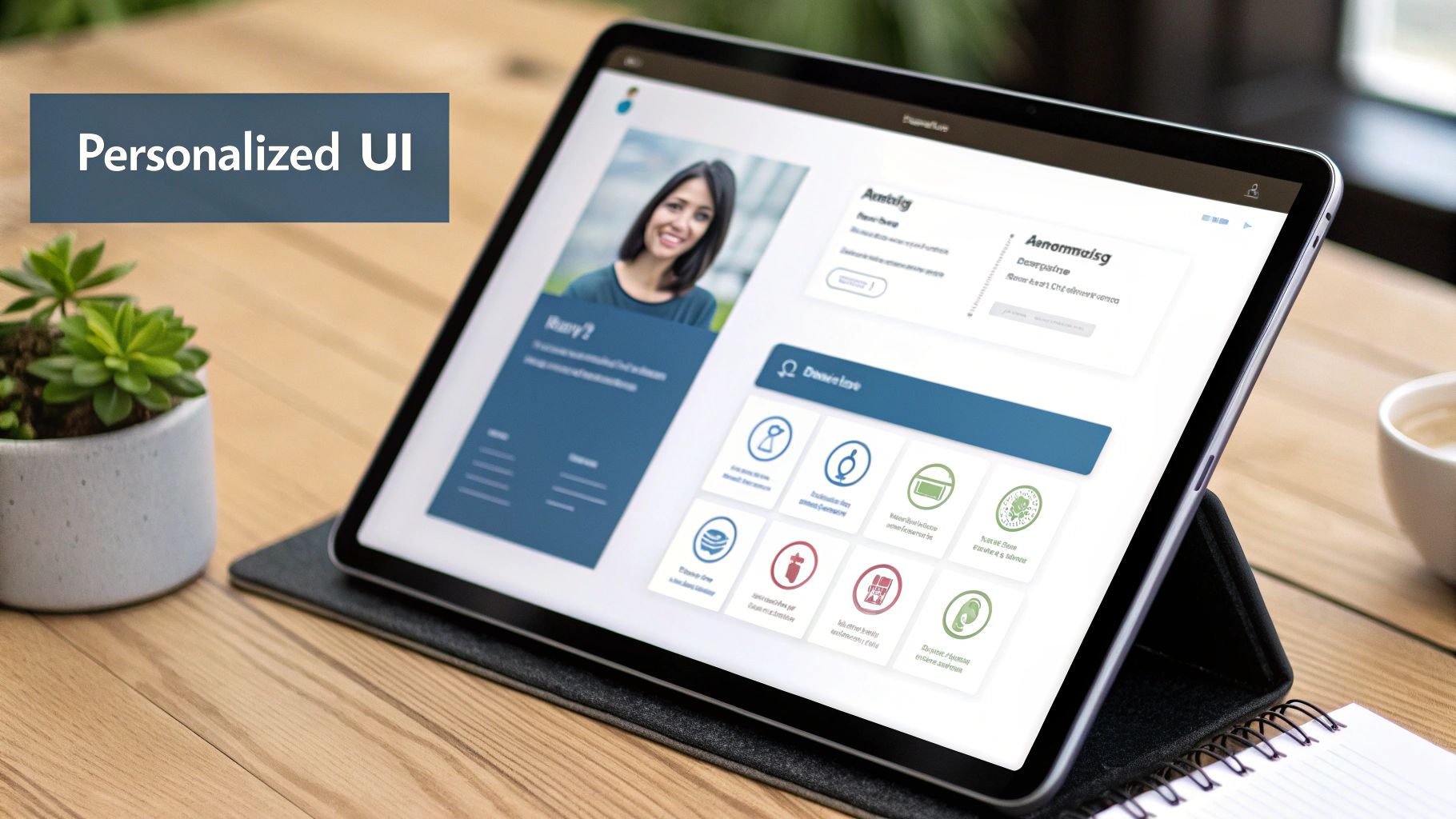
This method moves beyond basic demographic segmentation to create a system that learns and adapts in real time. By presenting only the most pertinent information and policy options, platforms can significantly reduce friction and decision fatigue, guiding users toward the best coverage for their specific circumstances and boosting conversion rates.
How to Implement Personalized UX
Implementing an adaptive interface requires a robust data strategy and a commitment to user privacy and control.
Be Transparent: Clearly communicate what data is being collected and how it will be used to personalize the experience. Provide users with easy-to-access privacy controls.
Segment Intelligently: Move beyond basic demographics. Use behavioral data, life events (e.g., buying a home, having a child), and stated preferences to create meaningful user segments.
Allow User Overrides: Personalization should assist, not dictate. Always give users the ability to override automated recommendations and explore all available options.
Test and Refine: Continuously A/B test recommendation algorithms and interface variations to ensure they are effective and fair. Monitor for unintended biases and refine your models accordingly.
Real-World Examples
PolicyGenius excels at this by using a detailed questionnaire to provide highly personalized policy recommendations from a wide range of carriers, simplifying the comparison process. Metromile offers a usage-based insurance dashboard that adapts to show drivers their real-time trip data and cost per mile, making their insurance costs tangible and transparent. Similarly, Cuvva uses context-aware triggers, like a user's location, to suggest short-term coverage when it's most relevant. For those looking to partner with experts in this domain, it's beneficial to explore the top personalization UX design agencies that specialize in creating these sophisticated, data-driven experiences.
4. Mobile-First & App-Based Design
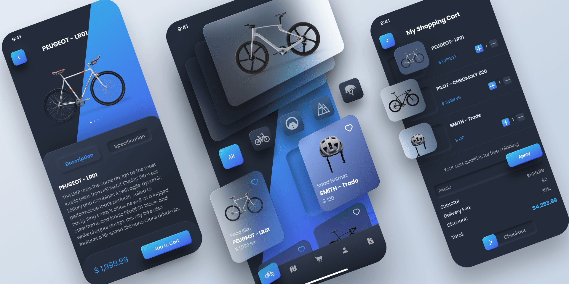
The modern customer's primary digital touchpoint is their smartphone, a reality that reshapes how insurance services must be delivered. A mobile-first and app-based design approach prioritizes the user experience on smaller screens, leveraging native device capabilities to create seamless and highly contextual interactions. This strategy moves beyond simply having a responsive website, focusing instead on building dedicated applications that handle everything from quoting and policy management to filing a claim using the phone's camera.
This approach acknowledges that insurance tasks are no longer confined to a desktop. Users expect to manage their policies, get roadside assistance, or submit claim evidence on the go. Effective mobile-first insurtech UX design strategies optimize for touch inputs, performance on cellular networks, and features unique to mobile, such as push notifications and biometric security.
How to Implement a Mobile-First UX
Building a successful mobile-first experience requires designing from the smallest screen up, rather than scaling a desktop design down.
Prioritize Core Journeys: Identify the most critical and frequent user tasks (e.g., viewing an ID card, filing a claim, contacting support) and make them effortlessly accessible from the app's home screen.
Leverage Native Features: Integrate the device's camera for photo/video claim submissions, use GPS for location-based services like roadside assistance, and implement push notifications for timely alerts and policy updates.
Optimize for Performance: Mobile users have little patience for slow-loading apps. Compress images, streamline code, and minimize data requests to ensure the application is fast and responsive, even on weaker connections.
Use Strategic Notifications: Implement a thoughtful push notification strategy. Use them to deliver valuable, time-sensitive information like claim status updates or payment reminders, but avoid excessive marketing messages that could lead users to disable them.
Real-World Examples
Root Insurance built its entire business model on an app-only platform, using smartphone telematics to power its usage-based insurance pricing. Lemonade's mobile app is central to its user experience, enabling users to file claims by recording a short video, a process that dramatically simplifies a traditionally complex interaction. Similarly, legacy providers like State Farm have invested heavily in their mobile apps, incorporating features like Drive Safe & Save and on-demand roadside assistance directly within the application. For businesses looking to adopt this approach, partnering with top-tier agencies is crucial; you can explore a curated list of the best mobile-first design agencies on bricxlabs.com to find a suitable partner.
5. Data Visualization & Transparency
Insurance is an industry built on complex data, abstract risk, and dense policy language, which often leaves customers feeling confused and distrustful. Data visualization and transparency is a crucial insurtech UX design strategy that tackles this problem head-on. It involves using clear visual representations like charts, graphs, and interactive dashboards to demystify policies, pricing structures, and claims processes. This approach transforms abstract numbers and confusing jargon into understandable, actionable insights, empowering users to make informed decisions.

By prioritizing transparency, insurtech companies build trust, a priceless commodity in the financial services sector. When users can clearly see what they are paying for, how their premiums are calculated, or where their claim is in the process, their confidence in the provider grows. This strategy shifts the dynamic from an opaque transaction to a transparent partnership.
How to Implement Data Visualization & Transparency
Effectively implementing this strategy means focusing on clarity and user comprehension above all else.
Identify Key Confusion Points: Start with user research to pinpoint exactly where customers get lost. Is it in understanding coverage limits, comparing quotes, or tracking a claim? Focus your visualization efforts on these high-friction areas.
Keep Visuals Simple and Clean: Avoid "chart junk" or overly complex graphics that can create more confusion. Use clear labels, a logical hierarchy, and a consistent color-coding system to guide the user's eye and make data interpretation effortless.
Make it Interactive: Allow users to engage with the data. For example, provide sliders that let them adjust coverage levels and see the immediate impact on their premium, or create clickable timelines for claim statuses.
Ensure Accessibility: Good design is accessible design. Provide alternative text for all images and ensure that visual information is also available in a text-based format for users with screen readers. Test color combinations for contrast to accommodate visually impaired users.
Real-World Examples
Companies like The Zebra and Everquote excel at this, using clear, side-by-side comparison charts to help users instantly weigh the costs and benefits of different insurance quotes. Lemonade employs a simple, visual timeline to show users exactly where their claim is in the approval process, reducing anxiety and support inquiries. Similarly, PolicyGenius uses infographics and simple graphics to break down complex topics like life insurance riders. To see how these principles translate into effective user interfaces, exploring a dashboard design moodboard can provide excellent inspiration. Check out Bricx's comprehensive dashboard design resources for a deeper look into effective data presentation.
6. Contextual Help & Micro-Learning
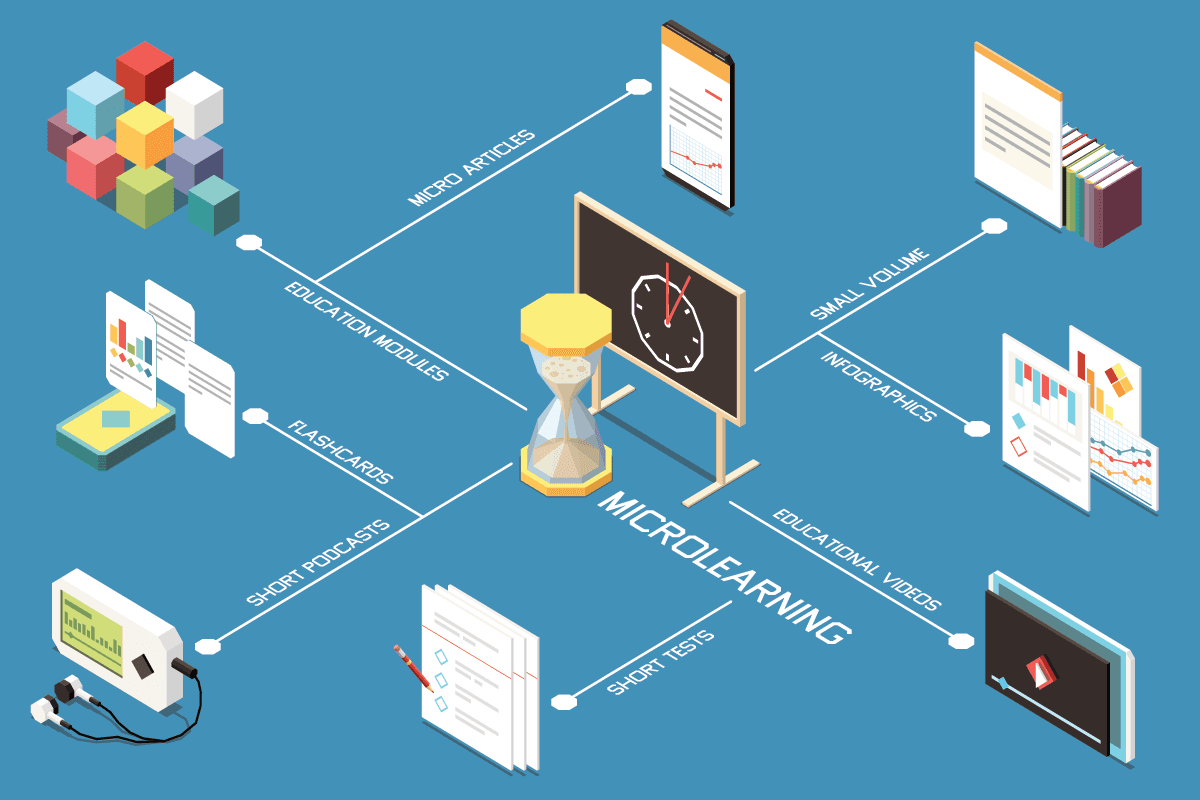
Insurance is a field dense with jargon and complex concepts, from deductibles and premiums to liability coverage. Contextual help and micro-learning address this knowledge gap head-on by embedding just-in-time educational content directly into the user interface. This insurtech UX design strategy moves away from forcing users to open a new tab to search for definitions. Instead, it offers tooltips, short explainer videos, and interactive glossary terms at the exact moment a user might feel confused, transforming the platform into a supportive guide.
This approach significantly reduces cognitive load and user anxiety, preventing drop-offs that occur when a user hits a confusing term. By making education a seamless part of the buying or claims process, it empowers customers, builds trust, and helps them make more informed decisions confidently.
How to Implement Contextual Help
Integrating this strategy means anticipating user questions and providing answers proactively, without disrupting their journey.
Identify Confusion Points: Use session recordings, user feedback, and support ticket data to pinpoint exactly where users struggle or hesitate. These are prime locations for contextual help.
Keep It Bite-Sized: Micro-learning content should be extremely concise. Aim for tooltips with one or two sentences, or explainer videos under 90 seconds. The goal is to clarify, not to overwhelm.
Use Unobtrusive Triggers: Implement help through universally understood icons, like a small question mark (?) or information (i) symbol, that users can click or hover over to reveal more details. This keeps the interface clean.
Maintain Content Regularly: Insurance products and regulations change. Ensure all help content is regularly audited and updated to reflect the latest policy details and terminology.
Real-World Examples
PolicyGenius is a master of this, embedding clear, simple explanations of insurance concepts throughout its comparison and application flows, helping demystify the process for novices. Lemonade uses its conversational UI to break down its policies into simple, interactive questions and answers, defining terms as they appear. Likewise, Insurify provides contextual definitions for various coverage options right within the quoting tool, allowing users to compare plans with a full understanding of what each term means. For a deeper look into the principles of guiding users effectively, the Drift Insider blog offers extensive resources on conversational and educational user engagement that can be adapted for insurance.
7. Community & Social Proof Integration

The insurance industry has historically operated with a significant trust deficit, often perceived as an opaque and impersonal entity. Integrating community and social proof into the user experience directly confronts this challenge by humanizing the insurance process. This strategy leverages user-generated content, reviews, ratings, and community features to build credibility and reduce the hesitation that often accompanies insurance purchasing decisions. By showcasing genuine customer testimonials, claims success stories, and peer discussions, insurtech platforms can demonstrate tangible value and normalize the concept of insurance through the authentic experiences of others.
In a sector where perceived risk and reliability are paramount, social proof acts as a powerful psychological trigger. Seeing that others have had positive outcomes, especially during the stressful claims process, provides powerful reassurance to prospective customers. This transforms the abstract promise of a policy into a concrete, validated safety net, making it a critical component of modern insurtech UX design strategies.
How to Implement Community & Social Proof
Successfully integrating social proof requires a commitment to transparency and active community management.
Showcase Verified Reviews: Integrate platforms like Trustpilot or feature verified customer reviews directly within the app or website. Display star ratings prominently near calls-to-action to build immediate trust.
Feature Customer Stories: Go beyond simple testimonials. Create compelling case studies or video interviews that detail a customer's journey, from purchase to a successful claim. This narrative approach is far more impactful than a simple quote.
Build a Community Forum: Create a dedicated space for users to ask questions, share experiences, and offer advice. This fosters a sense of belonging and provides an invaluable feedback loop for your product team.
Implement a Referral Program: Encourage word-of-mouth marketing by rewarding existing customers for bringing in new ones. Displaying stats like "10,000 users joined us through a friend this month" adds another layer of social validation.
Real-World Examples
Lemonade masterfully uses social proof through its transparency reports and giveback program, where unused premiums are donated to charities chosen by the community, creating a shared sense of purpose. Similarly, Root Insurance has cultivated active community discussions on social media platforms, allowing potential users to interact directly with existing customers. For a deeper understanding of how to manage and leverage user feedback, platforms like Trustpilot offer best practices on collecting and displaying authentic reviews to build brand credibility.
8. Gamification & Behavioral Incentives

Insurance, traditionally viewed as a passive, low-engagement product, is being transformed by gamification and behavioral incentives. This insurtech UX design strategy incorporates game-like elements such as points, badges, and leaderboards to motivate users, encourage safer behaviors, and build lasting loyalty. Instead of being a detached financial safety net, insurance becomes an active, rewarding experience in the user’s daily life. The core principle is to align user actions that are beneficial for them, like safe driving or healthy living, with tangible rewards like lower premiums or discounts.
This approach creates a powerful feedback loop where positive actions are immediately recognized and rewarded, fostering a proactive relationship between the insurer and the insured. It shifts the dynamic from a reactive, claim-based interaction to a continuous, preventative partnership, significantly enhancing customer retention and reducing overall risk for the provider.
How to Implement Gamification in UX
Successfully implementing this strategy requires more than just adding a points system; it demands a thoughtful integration with core business goals.
Align with Business Outcomes: Ensure every game mechanic directly encourages a behavior that reduces risk or increases loyalty. For example, a safe driving challenge should directly correlate with how premiums are calculated.
Make Rewards Meaningful: The incentives must be valuable and attainable to the user. Vague promises or impossibly difficult challenges will quickly lead to disengagement. Offer a mix of small, frequent rewards and larger, long-term goals.
Provide Constant Feedback: Use progress bars, real-time scoring, and instant notifications to show users how their actions are impacting their standing. This immediate feedback is crucial for maintaining motivation.
Keep It Fresh and Evolving: Introduce new challenges, seasonal events, or updated rewards to prevent the experience from becoming stale. An evolving gamified system encourages long-term engagement.
Real-World Examples
Root Insurance is a prime example, using its mobile app to measure driving behavior during a "test drive" period. A high score, gamified through the app, directly results in a lower insurance quote, making the connection between action and reward crystal clear. Similarly, Vitality Group partners with insurers to reward customers for healthy activities tracked via wearables like Fitbit or Apple Watch. Users earn points for workouts, which can be redeemed for coffee, movie tickets, or even reduced premiums. While gamification excels at user engagement, its principles of proactive risk management are further explored in predictive analytics in insurance, which uses data to forecast and mitigate risks. For a broader look at motivating user behavior through design, Nir Eyal's book, Hooked: How to Build Habit-Forming Products, offers a foundational framework.
8-Point Comparison: Insurtech UX Design Strategies
Feature | Implementation complexity 🔄 | Resource requirements 💡 | Expected outcomes ⭐📊 | Ideal use cases ⚡ | Key advantages ⭐ |
|---|---|---|---|---|---|
Simplified Onboarding & Claims Processing | Medium — multi-step UX + backend integrations (APIs, OCR) | Moderate–High: UX designers, backend engineers, data sources | Faster completion, higher conversions, fewer support tickets (⭐⭐⭐ 📊) | High drop-off funnels, high-volume onboarding, mobile claims | Reduces friction, improves satisfaction, increases completion rates |
Conversational UI & Chatbot Integration | High — NLP models, conversation design, escalation flows | High: NLP training data, ML engineers, monitoring, human agents | 24/7 handling of simple queries, faster simple resolutions (⭐⭐ 📊) | Customer support, guided quotes, simple triage & FAQs | Scalable 1:many support, engaging UX, natural data capture |
Personalization & Adaptive Interfaces | High — segmentation, ML models, feature flags | High: Data infrastructure, ML engineers, analytics platforms | Increased engagement, better conversion & pricing accuracy (⭐⭐⭐ 📊) | Mature products with rich user data, retention & cross-sell | More relevant offers, higher retention, improved risk assessment |
Mobile-First & App-Based Design | Medium–High — native apps, platform-specific UX & QA | High: iOS/Android dev teams, QA, app ops, maintenance | Higher engagement and frequency, faster user actions (⭐⭐⭐ 📊) | Smartphone-first audiences, photo/video claims, push-driven flows | Access to device features, better performance, stronger retention |
Data Visualization & Transparency | Medium — design plus data pipelines for visuals | Medium: Data analysts, visualization designers, frontend dev | Greater user understanding and trust, fewer disputes (⭐⭐ 📊) | Complex policies, comparisons, claims tracking dashboards | Clarifies coverage, aids decision-making, increases trust |
Contextual Help & Micro-Learning | Low–Medium — in-app triggers, short content assets | Medium: Content creators, UX, occasional video production | Reduced support volume, higher user confidence (⭐⭐ 📊) | New users, complex features, compliance education | Just-in-time education, enables self-service, reduces errors |
Community & Social Proof Integration | Medium — review systems, forums, moderation tools | Medium–High: Community managers, moderation, verification tools | Faster trust-building, improved conversion for new brands (⭐⭐ 📊) | Early-stage brands, trust recovery, peer advice marketplaces | Builds social trust, generates UGC, creates network effects |
Gamification & Behavioral Incentives | Medium — reward systems, tracking & fairness controls | Medium: Product ops, analytics, content updates, reward budgets | Increased engagement, behavior change, lower risky behaviors (⭐⭐ 📊) | Usage-based insurance, wellness programs, retention campaigns | Drives engagement, incentivizes safer behavior, differentiates offering |
The Blueprint for a Customer-First Insurtech Experience
The journey through these eight core insurtech UX design strategies reveals a powerful, unifying theme: the future of insurance is not built on complex actuarial tables alone, but on human-centric design. We've moved beyond simply digitizing old processes. The real opportunity lies in fundamentally re-imagining the relationship between insurers, agents, underwriters, and the end-customer through thoughtful, empathetic user experiences.
From simplifying the first touchpoint in onboarding to leveraging gamification for long-term engagement, each strategy serves as a critical component in a larger machine. This machine is designed to dismantle the industry's legacy of opacity, frustration, and complexity. By implementing these tactics, you are not just improving a user interface; you are actively building trust, fostering loyalty, and creating tangible business value in a highly competitive market.
Synthesizing the Core Pillars of Modern Insurtech UX
The strategies detailed in this article are not a checklist to be completed but a holistic framework for a customer-first philosophy. Let’s distill the most critical takeaways:
Radical Simplicity is Non-Negotiable: Strategies like Simplified Onboarding and Conversational UI are foundational. They directly address the primary user pain point: confusion. If a user cannot effortlessly sign up or get a quick answer, any advanced features you build will go unused.
Hyper-Personalization Drives Value: Adaptive Interfaces and Data Visualization transform insurance from a generic, one-size-fits-all product into a tailored, dynamic service. For B2B users, this means surfacing relevant risk data instantly. For consumers, it means feeling understood and fairly treated.
Engagement is the New Frontier: Moving beyond transactional relationships is key to retention. Gamification, Contextual Help, and Community Integration create a continuous feedback loop. They turn a passive product into an active, supportive ecosystem that helps users manage risk and feel empowered.
The common thread weaving these elements together is the strategic use of data and AI not just for risk assessment, but for enhancing the user's journey at every single step.
From Blueprint to Reality: Your Actionable Next Steps

Mastering these insurtech UX design strategies is what separates market leaders from the laggards. The difference is palpable: one feels like navigating a bureaucratic maze, while the other feels like having a trusted advisor in your pocket. The latter is where sustainable growth is found.
To begin implementing this blueprint, start by auditing your current user experience against these eight pillars.
Identify the Biggest Friction Point: Where do your analytics show the most significant user drop-off? Is it during claims submission? Policy comparison? Start there. A focused effort on the most broken part of the experience will yield the highest immediate return.
Pilot a Single Strategy: You don’t need to overhaul everything at once. Choose one strategy that aligns with a key business goal. For instance, if your goal is to reduce support ticket volume, implementing a sophisticated conversational chatbot could be a high-impact pilot project.
Establish Clear KPIs: For any change you implement, define success. Is it a 15% reduction in onboarding time? A 10% increase in mobile app session length? A 20% faster claims processing cycle? Tying UX improvements to measurable business outcomes is crucial for securing long-term investment and proving value.
Ultimately, the most successful insurtech platforms will be those that prioritize empathy as much as algorithms. They will be the ones that remember there is a person-a business owner, an agent, a family-on the other side of the screen seeking clarity, security, and peace of mind. By committing to these principles, you are not just designing a better product; you are building a more resilient, trustworthy, and human-centric future for the entire insurance industry.
Ready to transform your theoretical blueprint into a high-performing reality? The expert team at Bricx specializes in crafting the sophisticated, user-centric digital products that define the insurtech landscape. We help SaaS and B2B leaders implement the very insurtech UX design strategies discussed here to build platforms that win markets. Let’s build your competitive edge together.
The insurance industry is undergoing a radical transformation, moving from complex paperwork and opaque policies to digital-first, customer-centric experiences. The driving force behind this shift is a new wave of insurtech platforms that prioritize superior user experience (UX) design. Traditional insurers are finding it difficult to compete as customers now demand the same seamless, intuitive interactions they get from leading tech brands. Success in this market no longer depends solely on policy terms; it hinges on how easily users can understand, purchase, and manage their coverage.
This new reality places an immense focus on effective insurtech UX design strategies. For B2B and AI SaaS companies in this space, a well-designed user journey is the primary differentiator. It’s what transforms a complicated financial product into an accessible, empowering tool. A clunky interface, confusing onboarding, or an inefficient claims process can quickly erode trust and send customers to a competitor. Conversely, a thoughtful, user-centric design builds confidence, boosts retention, and simplifies the inherent complexities of insurance.
This article breaks down the eight core strategies that are not just improving user satisfaction but fundamentally reshaping the industry. We will move beyond theory to provide a curated roundup of actionable tactics tailored for insurtech platforms. You will learn how to:
Simplify critical user flows like onboarding and claims processing.
Integrate conversational AI and adaptive interfaces for personalized experiences.
Build trust through transparent data visualization and contextual help.
Drive engagement with gamification and social proof.
Each strategy includes practical implementation steps, real-world examples, key performance indicators (KPIs) to track success, and common pitfalls to avoid. Let's explore the design blueprints for building the future of insurance.
1. Simplified Onboarding & Claims Processing
The traditional insurance industry is notorious for its cumbersome paperwork and lengthy, confusing processes. Simplified onboarding and claims processing stands as a cornerstone of modern insurtech UX design strategies, directly addressing this historical pain point. This approach focuses on radically streamlining the user journey from initial sign-up to filing a claim, transforming a once-dreaded task into a fast, intuitive, and even pleasant experience. It involves minimizing form fields, using conversational language, and leveraging technology to pre-fill data whenever possible.
By breaking down complex applications into smaller, manageable steps-a technique known as progressive disclosure-insurtech platforms prevent cognitive overload. This not only reduces user frustration but also significantly increases form completion rates, a critical metric for customer acquisition.
How to Implement Simplified UX
Implementing this strategy requires a shift from a company-centric to a user-centric mindset.
Audit and Eliminate: Start by auditing every field in your current onboarding and claims forms. Ask the critical question: "Is this information absolutely necessary at this stage?" If not, remove it or ask for it later.
Leverage Smart Defaults: Use data to pre-populate fields. For example, location services can fill in address information, and vehicle identification number (VIN) lookups can auto-fill car details.
Implement Progress Indicators: Always show users where they are in the process with a clear progress bar or step counter. This manages expectations and reduces the likelihood of abandonment.
Enable Save-and-Resume: Life happens. Allow users to save their progress and return later to complete an application or claim, ensuring their effort isn't wasted.
Real-World Examples
Companies like Lemonade have built their entire brand on this principle, offering insurance policies in as little as 90 seconds through a conversational AI chatbot. Similarly, Root Insurance uses a mobile-first approach that leverages smartphone telematics for quoting, completely bypassing traditional questionnaires. While this strategy excels at acquisition, further insights into streamlining post-purchase interactions can be gained by examining specifically insurance claims processing automation, which tackles the complexity of what happens after a user files a claim. For a deeper dive into effective onboarding techniques, Bricx's comprehensive 2026 SaaS Onboarding Report provides invaluable data and best practices.
2. Conversational UI & Chatbot Integration
The insurance world has traditionally been defined by forms and formal language, often creating a barrier between providers and customers. Conversational UI and chatbot integration directly challenges this norm by leveraging natural language processing (NLP) to create human-like interactions. This insurtech UX design strategy replaces static forms with dynamic, guided conversations, making complex processes like quoting, onboarding, and claims initiation feel more approachable, intuitive, and less intimidating for the user.
By mimicking a natural dialogue, these interfaces ask contextual questions one at a time, providing immediate feedback and support. This significantly reduces cognitive load and user anxiety, transforming a data-gathering exercise into a helpful exchange. Leveraging advanced tools for conversational UI, such as some of the best online form builders, can transform complex interactions into intuitive dialogues, boosting completion rates and customer satisfaction.
How to Implement Conversational UX
Successfully deploying a conversational interface goes beyond simply programming a chatbot; it requires thoughtful design and a deep understanding of user needs.
Map Conversation Flows: Begin by designing the "happy path" conversation for common user goals, such as getting a quote. Then, build out branches for edge cases and potential user questions.
Define a Brand Persona: Your chatbot's personality should align with your brand values. Is it helpful and professional, or friendly and informal? This tone should be consistent in every interaction.
Provide a Human Escalation Path: Never trap a user in a loop. Always provide a clear and easy way for them to connect with a human agent if the chatbot cannot resolve their issue.
Test with Diverse User Groups: Extensively test your conversation flows with real users to identify confusing phrasing, dead ends, or points of frustration before launch.
Real-World Examples
Lemonade pioneered this approach with its AI chatbot, Maya, who guides users through policy purchasing in minutes and even handles initial claims processing with remarkable speed. Trov, a former on-demand insurance provider, used a chatbot to help users quickly document and protect individual assets, making micro-insurance highly accessible. Similarly, Digit uses an SMS-based conversational UI to provide personalized insurance recommendations based on a user's financial habits. For visual inspiration on crafting these interfaces, exploring Bricx's chat interface moodboard can provide excellent ideas and design patterns.
3. Personalization & Adaptive Interfaces
The one-size-fits-all approach to insurance is rapidly becoming obsolete. Personalization and adaptive interfaces are a core component of modern insurtech UX design strategies, creating dynamic experiences that cater to individual user needs, risk profiles, and behaviors. Instead of presenting every user with the same generic interface, this strategy leverages data to show relevant content, tailored recommendations, and customized pathways, transforming the user journey into a deeply personal and engaging interaction.
This method moves beyond basic demographic segmentation to create a system that learns and adapts in real time. By presenting only the most pertinent information and policy options, platforms can significantly reduce friction and decision fatigue, guiding users toward the best coverage for their specific circumstances and boosting conversion rates.
How to Implement Personalized UX
Implementing an adaptive interface requires a robust data strategy and a commitment to user privacy and control.
Be Transparent: Clearly communicate what data is being collected and how it will be used to personalize the experience. Provide users with easy-to-access privacy controls.
Segment Intelligently: Move beyond basic demographics. Use behavioral data, life events (e.g., buying a home, having a child), and stated preferences to create meaningful user segments.
Allow User Overrides: Personalization should assist, not dictate. Always give users the ability to override automated recommendations and explore all available options.
Test and Refine: Continuously A/B test recommendation algorithms and interface variations to ensure they are effective and fair. Monitor for unintended biases and refine your models accordingly.
Real-World Examples
PolicyGenius excels at this by using a detailed questionnaire to provide highly personalized policy recommendations from a wide range of carriers, simplifying the comparison process. Metromile offers a usage-based insurance dashboard that adapts to show drivers their real-time trip data and cost per mile, making their insurance costs tangible and transparent. Similarly, Cuvva uses context-aware triggers, like a user's location, to suggest short-term coverage when it's most relevant. For those looking to partner with experts in this domain, it's beneficial to explore the top personalization UX design agencies that specialize in creating these sophisticated, data-driven experiences.
4. Mobile-First & App-Based Design
The modern customer's primary digital touchpoint is their smartphone, a reality that reshapes how insurance services must be delivered. A mobile-first and app-based design approach prioritizes the user experience on smaller screens, leveraging native device capabilities to create seamless and highly contextual interactions. This strategy moves beyond simply having a responsive website, focusing instead on building dedicated applications that handle everything from quoting and policy management to filing a claim using the phone's camera.
This approach acknowledges that insurance tasks are no longer confined to a desktop. Users expect to manage their policies, get roadside assistance, or submit claim evidence on the go. Effective mobile-first insurtech UX design strategies optimize for touch inputs, performance on cellular networks, and features unique to mobile, such as push notifications and biometric security.
How to Implement a Mobile-First UX
Building a successful mobile-first experience requires designing from the smallest screen up, rather than scaling a desktop design down.
Prioritize Core Journeys: Identify the most critical and frequent user tasks (e.g., viewing an ID card, filing a claim, contacting support) and make them effortlessly accessible from the app's home screen.
Leverage Native Features: Integrate the device's camera for photo/video claim submissions, use GPS for location-based services like roadside assistance, and implement push notifications for timely alerts and policy updates.
Optimize for Performance: Mobile users have little patience for slow-loading apps. Compress images, streamline code, and minimize data requests to ensure the application is fast and responsive, even on weaker connections.
Use Strategic Notifications: Implement a thoughtful push notification strategy. Use them to deliver valuable, time-sensitive information like claim status updates or payment reminders, but avoid excessive marketing messages that could lead users to disable them.
Real-World Examples
Root Insurance built its entire business model on an app-only platform, using smartphone telematics to power its usage-based insurance pricing. Lemonade's mobile app is central to its user experience, enabling users to file claims by recording a short video, a process that dramatically simplifies a traditionally complex interaction. Similarly, legacy providers like State Farm have invested heavily in their mobile apps, incorporating features like Drive Safe & Save and on-demand roadside assistance directly within the application. For businesses looking to adopt this approach, partnering with top-tier agencies is crucial; you can explore a curated list of the best mobile-first design agencies on bricxlabs.com to find a suitable partner.
5. Data Visualization & Transparency
Insurance is an industry built on complex data, abstract risk, and dense policy language, which often leaves customers feeling confused and distrustful. Data visualization and transparency is a crucial insurtech UX design strategy that tackles this problem head-on. It involves using clear visual representations like charts, graphs, and interactive dashboards to demystify policies, pricing structures, and claims processes. This approach transforms abstract numbers and confusing jargon into understandable, actionable insights, empowering users to make informed decisions.
By prioritizing transparency, insurtech companies build trust, a priceless commodity in the financial services sector. When users can clearly see what they are paying for, how their premiums are calculated, or where their claim is in the process, their confidence in the provider grows. This strategy shifts the dynamic from an opaque transaction to a transparent partnership.
How to Implement Data Visualization & Transparency
Effectively implementing this strategy means focusing on clarity and user comprehension above all else.
Identify Key Confusion Points: Start with user research to pinpoint exactly where customers get lost. Is it in understanding coverage limits, comparing quotes, or tracking a claim? Focus your visualization efforts on these high-friction areas.
Keep Visuals Simple and Clean: Avoid "chart junk" or overly complex graphics that can create more confusion. Use clear labels, a logical hierarchy, and a consistent color-coding system to guide the user's eye and make data interpretation effortless.
Make it Interactive: Allow users to engage with the data. For example, provide sliders that let them adjust coverage levels and see the immediate impact on their premium, or create clickable timelines for claim statuses.
Ensure Accessibility: Good design is accessible design. Provide alternative text for all images and ensure that visual information is also available in a text-based format for users with screen readers. Test color combinations for contrast to accommodate visually impaired users.
Real-World Examples
Companies like The Zebra and Everquote excel at this, using clear, side-by-side comparison charts to help users instantly weigh the costs and benefits of different insurance quotes. Lemonade employs a simple, visual timeline to show users exactly where their claim is in the approval process, reducing anxiety and support inquiries. Similarly, PolicyGenius uses infographics and simple graphics to break down complex topics like life insurance riders. To see how these principles translate into effective user interfaces, exploring a dashboard design moodboard can provide excellent inspiration. Check out Bricx's comprehensive dashboard design resources for a deeper look into effective data presentation.
6. Contextual Help & Micro-Learning
Insurance is a field dense with jargon and complex concepts, from deductibles and premiums to liability coverage. Contextual help and micro-learning address this knowledge gap head-on by embedding just-in-time educational content directly into the user interface. This insurtech UX design strategy moves away from forcing users to open a new tab to search for definitions. Instead, it offers tooltips, short explainer videos, and interactive glossary terms at the exact moment a user might feel confused, transforming the platform into a supportive guide.
This approach significantly reduces cognitive load and user anxiety, preventing drop-offs that occur when a user hits a confusing term. By making education a seamless part of the buying or claims process, it empowers customers, builds trust, and helps them make more informed decisions confidently.
How to Implement Contextual Help
Integrating this strategy means anticipating user questions and providing answers proactively, without disrupting their journey.
Identify Confusion Points: Use session recordings, user feedback, and support ticket data to pinpoint exactly where users struggle or hesitate. These are prime locations for contextual help.
Keep It Bite-Sized: Micro-learning content should be extremely concise. Aim for tooltips with one or two sentences, or explainer videos under 90 seconds. The goal is to clarify, not to overwhelm.
Use Unobtrusive Triggers: Implement help through universally understood icons, like a small question mark (?) or information (i) symbol, that users can click or hover over to reveal more details. This keeps the interface clean.
Maintain Content Regularly: Insurance products and regulations change. Ensure all help content is regularly audited and updated to reflect the latest policy details and terminology.
Real-World Examples
PolicyGenius is a master of this, embedding clear, simple explanations of insurance concepts throughout its comparison and application flows, helping demystify the process for novices. Lemonade uses its conversational UI to break down its policies into simple, interactive questions and answers, defining terms as they appear. Likewise, Insurify provides contextual definitions for various coverage options right within the quoting tool, allowing users to compare plans with a full understanding of what each term means. For a deeper look into the principles of guiding users effectively, the Drift Insider blog offers extensive resources on conversational and educational user engagement that can be adapted for insurance.
7. Community & Social Proof Integration
The insurance industry has historically operated with a significant trust deficit, often perceived as an opaque and impersonal entity. Integrating community and social proof into the user experience directly confronts this challenge by humanizing the insurance process. This strategy leverages user-generated content, reviews, ratings, and community features to build credibility and reduce the hesitation that often accompanies insurance purchasing decisions. By showcasing genuine customer testimonials, claims success stories, and peer discussions, insurtech platforms can demonstrate tangible value and normalize the concept of insurance through the authentic experiences of others.
In a sector where perceived risk and reliability are paramount, social proof acts as a powerful psychological trigger. Seeing that others have had positive outcomes, especially during the stressful claims process, provides powerful reassurance to prospective customers. This transforms the abstract promise of a policy into a concrete, validated safety net, making it a critical component of modern insurtech UX design strategies.
How to Implement Community & Social Proof
Successfully integrating social proof requires a commitment to transparency and active community management.
Showcase Verified Reviews: Integrate platforms like Trustpilot or feature verified customer reviews directly within the app or website. Display star ratings prominently near calls-to-action to build immediate trust.
Feature Customer Stories: Go beyond simple testimonials. Create compelling case studies or video interviews that detail a customer's journey, from purchase to a successful claim. This narrative approach is far more impactful than a simple quote.
Build a Community Forum: Create a dedicated space for users to ask questions, share experiences, and offer advice. This fosters a sense of belonging and provides an invaluable feedback loop for your product team.
Implement a Referral Program: Encourage word-of-mouth marketing by rewarding existing customers for bringing in new ones. Displaying stats like "10,000 users joined us through a friend this month" adds another layer of social validation.
Real-World Examples
Lemonade masterfully uses social proof through its transparency reports and giveback program, where unused premiums are donated to charities chosen by the community, creating a shared sense of purpose. Similarly, Root Insurance has cultivated active community discussions on social media platforms, allowing potential users to interact directly with existing customers. For a deeper understanding of how to manage and leverage user feedback, platforms like Trustpilot offer best practices on collecting and displaying authentic reviews to build brand credibility.
8. Gamification & Behavioral Incentives
Insurance, traditionally viewed as a passive, low-engagement product, is being transformed by gamification and behavioral incentives. This insurtech UX design strategy incorporates game-like elements such as points, badges, and leaderboards to motivate users, encourage safer behaviors, and build lasting loyalty. Instead of being a detached financial safety net, insurance becomes an active, rewarding experience in the user’s daily life. The core principle is to align user actions that are beneficial for them, like safe driving or healthy living, with tangible rewards like lower premiums or discounts.
This approach creates a powerful feedback loop where positive actions are immediately recognized and rewarded, fostering a proactive relationship between the insurer and the insured. It shifts the dynamic from a reactive, claim-based interaction to a continuous, preventative partnership, significantly enhancing customer retention and reducing overall risk for the provider.
How to Implement Gamification in UX
Successfully implementing this strategy requires more than just adding a points system; it demands a thoughtful integration with core business goals.
Align with Business Outcomes: Ensure every game mechanic directly encourages a behavior that reduces risk or increases loyalty. For example, a safe driving challenge should directly correlate with how premiums are calculated.
Make Rewards Meaningful: The incentives must be valuable and attainable to the user. Vague promises or impossibly difficult challenges will quickly lead to disengagement. Offer a mix of small, frequent rewards and larger, long-term goals.
Provide Constant Feedback: Use progress bars, real-time scoring, and instant notifications to show users how their actions are impacting their standing. This immediate feedback is crucial for maintaining motivation.
Keep It Fresh and Evolving: Introduce new challenges, seasonal events, or updated rewards to prevent the experience from becoming stale. An evolving gamified system encourages long-term engagement.
Real-World Examples
Root Insurance is a prime example, using its mobile app to measure driving behavior during a "test drive" period. A high score, gamified through the app, directly results in a lower insurance quote, making the connection between action and reward crystal clear. Similarly, Vitality Group partners with insurers to reward customers for healthy activities tracked via wearables like Fitbit or Apple Watch. Users earn points for workouts, which can be redeemed for coffee, movie tickets, or even reduced premiums. While gamification excels at user engagement, its principles of proactive risk management are further explored in predictive analytics in insurance, which uses data to forecast and mitigate risks. For a broader look at motivating user behavior through design, Nir Eyal's book, Hooked: How to Build Habit-Forming Products, offers a foundational framework.
8-Point Comparison: Insurtech UX Design Strategies
Feature | Implementation complexity 🔄 | Resource requirements 💡 | Expected outcomes ⭐📊 | Ideal use cases ⚡ | Key advantages ⭐ |
|---|---|---|---|---|---|
Simplified Onboarding & Claims Processing | Medium — multi-step UX + backend integrations (APIs, OCR) | Moderate–High: UX designers, backend engineers, data sources | Faster completion, higher conversions, fewer support tickets (⭐⭐⭐ 📊) | High drop-off funnels, high-volume onboarding, mobile claims | Reduces friction, improves satisfaction, increases completion rates |
Conversational UI & Chatbot Integration | High — NLP models, conversation design, escalation flows | High: NLP training data, ML engineers, monitoring, human agents | 24/7 handling of simple queries, faster simple resolutions (⭐⭐ 📊) | Customer support, guided quotes, simple triage & FAQs | Scalable 1:many support, engaging UX, natural data capture |
Personalization & Adaptive Interfaces | High — segmentation, ML models, feature flags | High: Data infrastructure, ML engineers, analytics platforms | Increased engagement, better conversion & pricing accuracy (⭐⭐⭐ 📊) | Mature products with rich user data, retention & cross-sell | More relevant offers, higher retention, improved risk assessment |
Mobile-First & App-Based Design | Medium–High — native apps, platform-specific UX & QA | High: iOS/Android dev teams, QA, app ops, maintenance | Higher engagement and frequency, faster user actions (⭐⭐⭐ 📊) | Smartphone-first audiences, photo/video claims, push-driven flows | Access to device features, better performance, stronger retention |
Data Visualization & Transparency | Medium — design plus data pipelines for visuals | Medium: Data analysts, visualization designers, frontend dev | Greater user understanding and trust, fewer disputes (⭐⭐ 📊) | Complex policies, comparisons, claims tracking dashboards | Clarifies coverage, aids decision-making, increases trust |
Contextual Help & Micro-Learning | Low–Medium — in-app triggers, short content assets | Medium: Content creators, UX, occasional video production | Reduced support volume, higher user confidence (⭐⭐ 📊) | New users, complex features, compliance education | Just-in-time education, enables self-service, reduces errors |
Community & Social Proof Integration | Medium — review systems, forums, moderation tools | Medium–High: Community managers, moderation, verification tools | Faster trust-building, improved conversion for new brands (⭐⭐ 📊) | Early-stage brands, trust recovery, peer advice marketplaces | Builds social trust, generates UGC, creates network effects |
Gamification & Behavioral Incentives | Medium — reward systems, tracking & fairness controls | Medium: Product ops, analytics, content updates, reward budgets | Increased engagement, behavior change, lower risky behaviors (⭐⭐ 📊) | Usage-based insurance, wellness programs, retention campaigns | Drives engagement, incentivizes safer behavior, differentiates offering |
The Blueprint for a Customer-First Insurtech Experience
The journey through these eight core insurtech UX design strategies reveals a powerful, unifying theme: the future of insurance is not built on complex actuarial tables alone, but on human-centric design. We've moved beyond simply digitizing old processes. The real opportunity lies in fundamentally re-imagining the relationship between insurers, agents, underwriters, and the end-customer through thoughtful, empathetic user experiences.
From simplifying the first touchpoint in onboarding to leveraging gamification for long-term engagement, each strategy serves as a critical component in a larger machine. This machine is designed to dismantle the industry's legacy of opacity, frustration, and complexity. By implementing these tactics, you are not just improving a user interface; you are actively building trust, fostering loyalty, and creating tangible business value in a highly competitive market.
Synthesizing the Core Pillars of Modern Insurtech UX
The strategies detailed in this article are not a checklist to be completed but a holistic framework for a customer-first philosophy. Let’s distill the most critical takeaways:
Radical Simplicity is Non-Negotiable: Strategies like Simplified Onboarding and Conversational UI are foundational. They directly address the primary user pain point: confusion. If a user cannot effortlessly sign up or get a quick answer, any advanced features you build will go unused.
Hyper-Personalization Drives Value: Adaptive Interfaces and Data Visualization transform insurance from a generic, one-size-fits-all product into a tailored, dynamic service. For B2B users, this means surfacing relevant risk data instantly. For consumers, it means feeling understood and fairly treated.
Engagement is the New Frontier: Moving beyond transactional relationships is key to retention. Gamification, Contextual Help, and Community Integration create a continuous feedback loop. They turn a passive product into an active, supportive ecosystem that helps users manage risk and feel empowered.
The common thread weaving these elements together is the strategic use of data and AI not just for risk assessment, but for enhancing the user's journey at every single step.
From Blueprint to Reality: Your Actionable Next Steps
Mastering these insurtech UX design strategies is what separates market leaders from the laggards. The difference is palpable: one feels like navigating a bureaucratic maze, while the other feels like having a trusted advisor in your pocket. The latter is where sustainable growth is found.
To begin implementing this blueprint, start by auditing your current user experience against these eight pillars.
Identify the Biggest Friction Point: Where do your analytics show the most significant user drop-off? Is it during claims submission? Policy comparison? Start there. A focused effort on the most broken part of the experience will yield the highest immediate return.
Pilot a Single Strategy: You don’t need to overhaul everything at once. Choose one strategy that aligns with a key business goal. For instance, if your goal is to reduce support ticket volume, implementing a sophisticated conversational chatbot could be a high-impact pilot project.
Establish Clear KPIs: For any change you implement, define success. Is it a 15% reduction in onboarding time? A 10% increase in mobile app session length? A 20% faster claims processing cycle? Tying UX improvements to measurable business outcomes is crucial for securing long-term investment and proving value.
Ultimately, the most successful insurtech platforms will be those that prioritize empathy as much as algorithms. They will be the ones that remember there is a person-a business owner, an agent, a family-on the other side of the screen seeking clarity, security, and peace of mind. By committing to these principles, you are not just designing a better product; you are building a more resilient, trustworthy, and human-centric future for the entire insurance industry.
Ready to transform your theoretical blueprint into a high-performing reality? The expert team at Bricx specializes in crafting the sophisticated, user-centric digital products that define the insurtech landscape. We help SaaS and B2B leaders implement the very insurtech UX design strategies discussed here to build platforms that win markets. Let’s build your competitive edge together.


Similar Blogs
Similar Blogs
Similar Blogs


Available for Work
Bricx
© Bricx, 2026. All rights reserved.


Available for Work
Bricx
© Bricx, 2026. All rights reserved.
Available for Work
Bricx
© Bricx, 2026. All rights reserved.
Available for Work
Bricx
© Bricx, 2026. All rights reserved.