Website Design
Website Design
Website Design
Insights
Insights
Insights
December 2, 2025
December 2, 2025
December 2, 2025
Adaptive vs Responsive Design: The Definitive SaaS Guide
Adaptive vs Responsive Design: The Definitive SaaS Guide
Adaptive vs Responsive Design: The Definitive SaaS Guide
Choosing between adaptive vs responsive design? This guide breaks down the performance, UX, and SEO trade-offs for SaaS platforms to help you decide.
Choosing between adaptive vs responsive design? This guide breaks down the performance, UX, and SEO trade-offs for SaaS platforms to help you decide.
Choosing between adaptive vs responsive design? This guide breaks down the performance, UX, and SEO trade-offs for SaaS platforms to help you decide.
4 mins
4 mins
4 mins


At its core, the difference between adaptive and responsive design is straightforward. Responsive design relies on a single fluid layout that morphs to fit any screen size, whereas adaptive design uses several distinct, fixed layouts, serving up the right one after detecting the device's specific breakpoints.
For most SaaS applications, responsive design has become the flexible, SEO-friendly standard. But don't count adaptive out—it’s still a powerful option for performance-heavy platforms where a perfectly tailored user experience is your secret weapon.
So what's the difference between the two? And when should you choose one over the other? This article dives deep, comparing adaptive vs responsive design on a variety of factors - and how you can choose your web design philosophy using these insights.
So what are you waiting for? Let's get started.
Choosing Your Web Design Philosophy
Picking between adaptive and responsive isn't just a technical decision. It’s a strategic one that will define your user experience, development workflow, and long-term maintenance reality.
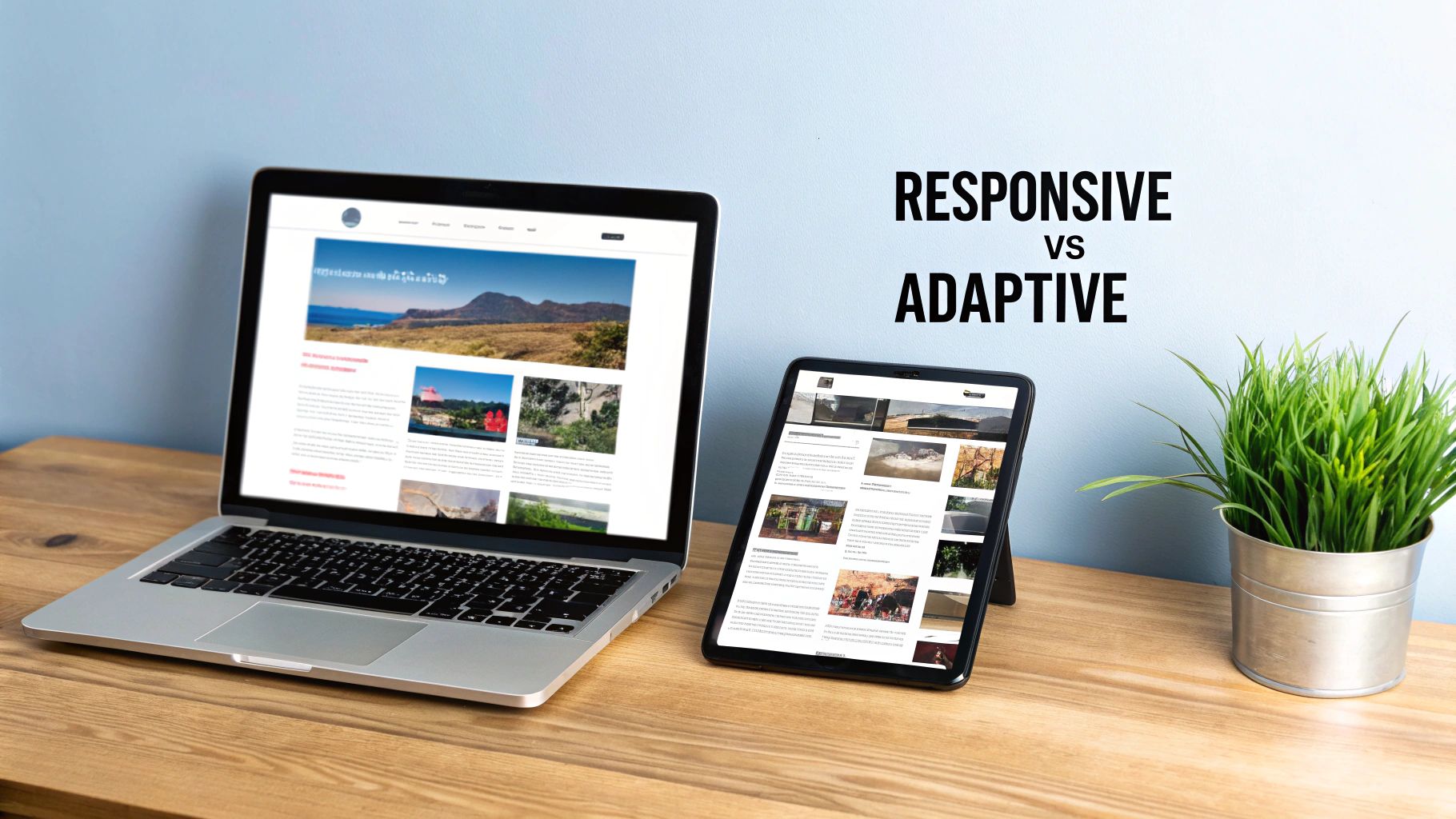
Think of responsive design like water—it flows to fill any container, creating a consistent experience no matter the device. Adaptive design, on the other hand, is more like a collection of custom-tailored suits. Each one is crafted to fit a specific occasion perfectly, whether it's a desktop, tablet, or phone.
This choice will fundamentally shape how users interact with your SaaS product across a countless number of devices. It has a domino effect on everything from initial development costs to how easily your marketing team can push out new content.
This image nails the core difference: the smooth, continuous reflow of a responsive layout versus the distinct, optimized views you get with an adaptive one.
The Evolution from Fixed to Fluid
The mobile revolution completely upended the web design world. When responsive design emerged around 2010, it marked a massive shift. Its adoption skyrocketed to cover nearly 90% of all websites, a trend supercharged by Google's move to mobile-first indexing.
With over 500 unique screen sizes in the wild, maintaining separate adaptive layouts just became impractical for most companies. You can explore more insights on this industry shift and its impact on modern design practices. This change forced teams to think beyond just screen dimensions and consider the user’s entire context.
For a SaaS company, that means your design approach needs to align with user workflows just as much as business goals.
The best approach is not always the most popular one. It's the one that best serves your users' specific needs while aligning with your team's resources and long-term product vision.
Key Differences at a Glance
Before we get into the weeds, it helps to understand the high-level trade-offs. This table breaks down the core philosophy behind each approach. Getting these fundamentals right is crucial, much like when you're first learning what is a design system and how it brings order to your product's visual language.
Aspect | Responsive Design | Adaptive Design |
|---|---|---|
Core Principle | Fluidity and flexibility | Precision and optimization |
Layout Type | Single, flexible grid | Multiple, fixed layouts |
Best For | Consistency, SEO, broad device support | Performance, tailored UX, complex applications |
Development | Single codebase, simpler maintenance | Multiple codebases, higher complexity |
What's Really Happening Under The Hood?
To make the right call between adaptive and responsive design for your SaaS, you first need to get what’s happening on a technical level. They both aim to make your site look great on any device, but their methods are polar opposites. Getting this difference is key.
Responsive design is all about fluidity. It's built on a single, flexible foundation using fluid grids, adaptable images, and a heavy dose of CSS media queries.
Imagine pouring water into a glass—it just fits. That's responsive. The layout constantly shifts and rearranges itself to fit any screen, from a tiny watch face to a giant desktop monitor.
Essentially, your team builds one version of the site, and the user's browser does all the work. It reads the CSS rules and figures out how to stack elements, shrink images, or even hide things based on the screen size it's dealing with.
This image nails the concept: responsive is a smooth, continuous flow, while adaptive design feels more like a "snap" between distinct, pre-set layouts.
How Adaptive Design Chooses The Right Layout?
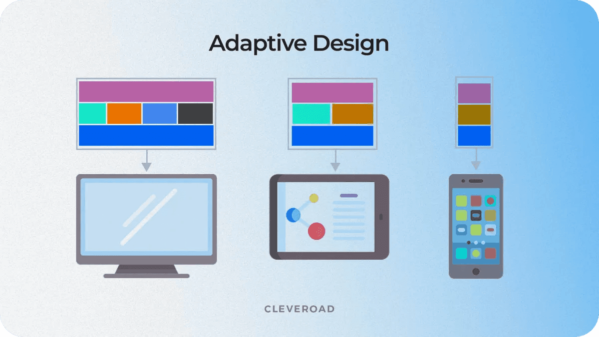
Adaptive design is much more deliberate. Instead of one fluid layout, you're building several static, fixed-width layouts. Each one is a custom job, designed for a specific screen size or breakpoint.
Think of it like a set of templates for common devices: 320px for small phones, 760px for tablets, and 1200px for desktops.
When someone lands on an adaptive site, the server figures out what device they're using before the page even starts to load. It then sends over the pre-built layout that’s the perfect match. It’s less like water and more like having a closet full of perfectly tailored suits—the system just picks the one that fits.
The real divide comes down to server-side versus client-side logic. Adaptive often makes the decision on the server and sends a specific, optimized layout. Responsive sends one universal layout and makes the user's browser figure it out.
To really see how these philosophies play out, let's lay out the core technical differences side-by-side.
Technical Comparison Between Responsive vs Adaptive Design
This table breaks down the fundamental technical and philosophical differences between responsive and adaptive web design.
Attribute | Responsive Design (Fluid) | Adaptive Design (Fixed) |
|---|---|---|
Core Principle | One layout fits all screens | Multiple layouts for specific screens |
Primary Technology | CSS Media Queries, Fluid Grids | JavaScript, Server-Side Detection |
Layout Behavior | Continuously adjusts and reflows | "Snaps" into place at breakpoints |
Initial Setup | More complex upfront CSS/HTML | Simpler individual layouts, more of them |
Device Detection | Client-side (in the browser) | Server-side (before page load) |
Understanding these components is the first step. For a deeper dive into the mechanics that make this all work, it’s worth brushing up on the fundamentals of responsive web design principles to see how they contrast with adaptive's more rigid structure.
Ultimately, these technical decisions ripple out, affecting everything from page speed to how Google crawls your site. These aren't just design choices; they have a direct impact on your technical SEO for SaaS.
Comparing Development Timelines and Maintenance Costs
When you’re weighing adaptive against responsive design, the conversation always shifts from the user experience to your team's budget and resources.
This isn't just a technical choice; it has real, long-term consequences for your workflow, operational costs, and how quickly you can get things done. Each path comes with a very different trade-off between the initial lift and the ongoing effort.
With responsive design, the philosophy is simple: build it once, and it works everywhere. Your team creates a single, flexible codebase that’s designed to flow and adjust on its own. This unified approach brings a ton of efficiency to the entire process, from the first line of code to pushing it live.
That efficiency really shines when it comes to maintenance. Need to squash a bug or roll out a new feature? You make the change in one place, and it ripples out across every device. This drastically cuts down the time and complexity of updates, freeing up your developers for more important work.

The Higher Initial Investment of Adaptive Design
Adaptive design, on the other hand, requires a much bigger commitment of time and money right from the start. Instead of one fluid layout, your team is on the hook for creating several distinct, fixed-width versions of your site. Each of these versions is essentially its own mini-project, demanding its own design and development cycle.
This duplication of effort hits your timeline and budget hard. Just think about the workflow:
Design Phase: Your UX/UI team has to craft and validate entirely separate experiences for each target breakpoint—think small mobile, large mobile, tablet, and desktop.
Development Phase: Engineers then have to build out the unique HTML, CSS, and often JavaScript for every single one of those layouts.
Quality Assurance: The QA team is left with a massive testing matrix, needing to check functionality and visuals across every supported layout on a huge range of devices.
This process can easily stretch the initial development timeline far beyond what a responsive build would take. For a SaaS company trying to launch quickly, those kinds of delays can be a serious setback.
The total cost of ownership for an adaptive site is often higher due to the parallel workstreams required for design, development, and testing. It's a strategic investment in a tailored experience, not a cost-saving measure.
Long-Term Maintenance Burdens and Scalability
The real operational cost of adaptive design doesn't show up until after launch. A seemingly simple update, like changing the color of a call-to-action button, isn't just one ticket. It means your developers have to implement and test that same change across multiple, separate codebases.
This creates a heavy, ongoing maintenance burden that can really bog down your team. What would be a quick fix on a responsive site becomes a much larger, coordinated effort. That complexity can slow you down, making it harder to iterate and react to what your customers are telling you.
The need to manage several versions adds significant overhead and complexity, even if building one individual layout seems simpler.
Budgeting for Your SaaS Product
Ultimately, the decision boils down to a strategic calculation. Responsive design almost always offers a more predictable and lower total cost of ownership, making it the go-to choice for most SaaS products, especially when you're just starting out. If an initial launch is on your roadmap, getting a handle on the MVP design cost for SaaS and AI products will give you the right context for making this call.
Adaptive design is a premium play. It’s best suited for established, high-traffic platforms where the performance boost and hyper-specific user experience are valuable enough to justify the significant jump in both upfront and ongoing costs.
4. Performance, Speed, and User Experience
This is where the rubber really meets the road. The performance and UX debate is where the core differences between adaptive and responsive design become most apparent. Both want to create a great user experience across devices, but how they get there is fundamentally different. For a B2B or SaaS platform, those differences can make or break user retention and conversion rates.
At first glance, adaptive design seems to have a clear advantage: pure, unadulterated speed. Because it detects the user's device on the server, it only sends the assets: HTML, CSS, images, scripts—that are absolutely necessary for that specific screen. This surgical approach means a smartphone isn't forced to download and process a massive, desktop-first payload it doesn't need.
For a complex B2B application, like an analytics dashboard or a high-volume ecommerce platform, this lean delivery is a huge win. Faster load times create a snappy, responsive feel, which is crucial for retaining professional users who don't have time to waste.
The Raw Speed Advantage of Adaptive Design
The performance boost from an adaptive approach isn't just theory; it's something you can measure. By serving up a purpose-built layout, an adaptive site neatly sidesteps the biggest performance killer in responsive design: loading a single, heavy set of assets and then making the browser do all the hard work of resizing, hiding, or rearranging elements.
This is especially obvious on mobile networks, where every kilobyte counts. Some studies show adaptive sites can be 2-3 times faster than their responsive counterparts in specific scenarios, simply by serving only what's needed. This can translate to mobile load times of 1.2-1.8 seconds for adaptive sites, compared to 2.5-3.5 seconds for many responsive ones.
However, a well-optimized responsive site can still be incredibly fast. We’ve seen responsive projects result in a 300% increase in mobile keyword visibility and nearly double conversions after a proper performance-focused implementation. The potential is there if you build it right.
An adaptive design is all about user context. It delivers a purpose-built experience that feels faster and more intentional because it was made just for that device. It's less about making one design work everywhere and more about delivering the right design for the moment.
How Responsive Design is Closing the Gap?

While adaptive has a natural edge in raw speed, it's a huge mistake to count responsive design out. Modern web development practices have dramatically closed the performance gap, making responsive a perfectly viable—and often much smarter—choice, even for applications where speed is paramount.
Today’s developers have a whole bag of tricks for optimizing responsive sites:
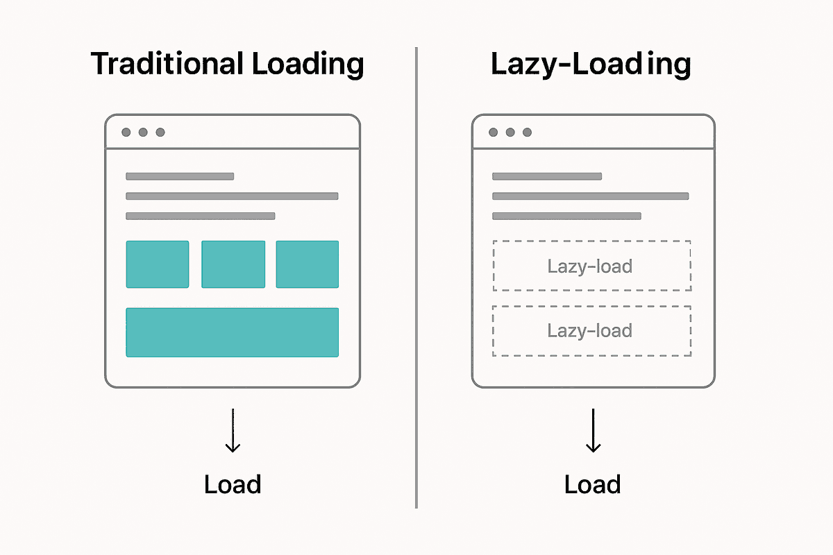
Lazy Loading: This is a simple but powerful technique. Instead of loading every image on a page at once, it defers loading anything "below the fold" until the user actually scrolls to it. This cuts down the initial page weight significantly. You can see some clever ways to manage this in these loading page design examples.
Responsive Images: Using attributes like
srcsetandsizes, we can tell the browser to download the most appropriate image size for the user's screen. This stops a tiny smartphone from wasting bandwidth on a giant 4K desktop banner.Code Splitting: Modern frameworks like React or Vue let us split JavaScript into smaller, manageable chunks. The browser only loads the code needed for the features a user is actively engaging with, rather than downloading the entire application's code upfront.
These techniques allow a responsive site to mimic the asset-optimization benefits of adaptive design without the headache and cost of maintaining multiple, separate codebases. A well-built responsive site can deliver a fast, fluid, and consistent experience everywhere, making it the go-to choice for the vast majority of SaaS products today.
How Each Approach Impacts Your SEO Strategy?
Your design choice isn't just about user experience—it has a massive impact on your search visibility and the effectiveness of your marketing. When you're weighing responsive vs. adaptive design, you have to think about what it means for how easily search engines, and therefore your customers, can find you.
Let's be blunt: Google has a favorite. For years, they've officially recommended responsive design. The reason is simple: it uses a single URL and one set of HTML for every device. For a search engine crawler, this is a huge win.
Having one URL makes it much easier for Google to crawl, index, and organize all your ranking signals, like backlinks. All that hard-earned link equity points to one place, building its authority instead of getting split across different versions.
This graphic from Google shows exactly why a rock-solid mobile experience is non-negotiable. Their crawlers now look at your mobile site first to decide how you rank.
Mobile-First Indexing and Responsive Design
Ever since Google switched to mobile-first indexing, the game changed. It now primarily uses the mobile version of your website to rank your content. Responsive design naturally fits this model perfectly because the mobile and desktop versions are the same site, just reflowed for the screen. There’s no chance of the mobile crawler seeing something different than a desktop user.
Adaptive design, on the other hand, can get messy from an SEO perspective if you're not careful. Since it often relies on separate URLs (like m.yourwebsite.com) or serves completely different HTML, it opens the door to a few common problems:
Duplicate Content: If you don't correctly set up
rel="canonical"andrel="alternate"tags, search engines might see your mobile and desktop sites as separate, duplicate pages. This splits your ranking power right down the middle.Inconsistent Content: If the content on your mobile layout is significantly different from the desktop one, you could hurt your rankings. Google is indexing the mobile version, so what you show there is what counts.
Redirect Confusion: Badly configured redirects between device versions can slow down your site and burn through your crawl budget, which hurts both user experience and SEO.
A single, responsive URL is just simpler for everyone. It's easier to share, link to, and promote. This consistency smooths out everything from social media posts to email campaigns, ensuring every click lands on the right page and boosts your SEO footprint.
Streamlining Marketing and Analytics
The impact goes beyond just pure SEO. Your design choice ripples through your entire marketing operation. A responsive design makes analytics and reporting much cleaner. With one URL, all your traffic data, user behavior, and conversion funnels live in a single, consolidated view in Google Analytics. You get a clear picture of performance without having to build complex filters to stitch data together from separate mobile and desktop properties.
This unified approach also guarantees a smooth user journey. When someone shares a link from their desktop, it just works for their colleague opening it on a phone. No weird redirects, no broken experiences.
Now, a well-built adaptive site can absolutely perform well in search, but it demands a much higher level of technical SEO oversight to sidestep these issues. For most SaaS companies, responsive design is the more direct, efficient, and Google-friendly route to a strong search presence. To get a better handle on the broader strategies that work with either design choice, this guide on mastering search engine optimisation is a fantastic starting point.
Here's a quick breakdown of how these design approaches stack up on key SEO factors.
SEO Considerations for Design Approaches
This table summarizes how responsive and adaptive designs typically impact crucial SEO elements. While a perfectly executed adaptive site can overcome its challenges, responsive design generally offers a more straightforward path to success.
SEO Factor | Responsive Design Impact | Adaptive Design Impact |
|---|---|---|
URL Structure | Single URL: Consolidates link equity and simplifies crawling. | Multiple URLs/HTML: Risks diluting link equity and can confuse crawlers without proper tagging ( |
Crawl Efficiency | Highly efficient: Search engines crawl one version of the site, saving crawl budget. | Less efficient: Requires crawling multiple versions, which can consume more crawl budget and slow down indexing. |
Duplicate Content Risk | Virtually zero risk: The same content and HTML are served to all devices. | High risk: Separate mobile/desktop versions can be flagged as duplicates if not implemented perfectly. |
Mobile-First Indexing | Perfectly aligned: The mobile and desktop versions are identical, ensuring consistency for Google's crawlers. | Potential for inconsistency: Mismatched content between versions can negatively impact rankings. |
User Experience Signals | Consistent: Provides a seamless experience across devices, which can improve engagement metrics. | Potentially jarring: Redirects between versions can increase bounce rates and frustrate users. |
Link Building & Sharing | Simple: One URL is easy to share and link to, ensuring all backlinks point to a single source. | Complex: Users might share the |
Ultimately, responsive design presents fewer technical hurdles for SEO, making it the safer and more scalable choice for most businesses aiming for long-term organic growth.
Making The Right Choice For Your SaaS Platform
When you weigh all the technical, financial, and user experience factors, the choice between adaptive and responsive design really comes down to your specific situation. There's no silver bullet here—only the approach that lines up with your product's goals, your users' behavior, and what your team can realistically handle.
Let's get one thing straight: for most SaaS companies, responsive design is the default best practice. It’s efficient, it scales well, and it plays nicely with search engines, making it ideal for marketing sites, blogs, and most product applications. The whole "build once, run anywhere" philosophy cuts down on development time and ensures users get a consistent experience, no matter what new device hits the market next week.
But that doesn't mean adaptive design is obsolete. It carves out a very important niche where that extra investment can deliver a huge payoff.
When To Choose Responsive Design?
Responsive design should be your go-to if you’re focused on development efficiency and broad device compatibility. It’s perfect for scenarios where a user's core tasks are basically the same on a phone as they are on a desktop, even if the layout has to shuffle around.
Think responsive if you're building:
Marketing Websites and Blogs: A single URL structure is a massive win for SEO, and having a consistent content experience makes your publishing workflow a whole lot simpler.
Standard SaaS Applications: For the bread-and-butter of SaaS—CRUD apps, dashboards, and management tools—a fluid layout delivers a reliable experience without the headache of maintaining separate designs.
MVPs and Early-Stage Products: When getting to market quickly and on a tight budget is the name of the game, responsive design is the fastest way to launch a functional, cross-device product.
When To Consider Adaptive Design?
Adaptive design starts making strategic sense when the user journey on mobile is fundamentally different from the one on desktop. You’d use it when you know that tailoring the experience to a specific context will give you a real competitive edge through better performance or a purpose-built workflow.
You should seriously look at adaptive design for:
High-Volume Transactional Platforms: In e-commerce or fintech, every millisecond counts. Shaving load time on mobile can directly boost conversion rates. An adaptive site ensures the mobile experience is hyper-focused on speed and simple, fast transactions.
Complex Analytics Dashboards: A data-heavy desktop dashboard just doesn't shrink down to a phone screen gracefully. It becomes cramped and unusable. An adaptive mobile version can offer a stripped-down, read-only view that highlights only the most critical metrics.
The core question is this: Are your users' goals and context so different between devices that a single, fluid interface creates more friction than it solves? If the answer is yes, adaptive design warrants a closer look.
This decision tree helps visualize how factors like Google's own recommendations can steer your initial thinking.
As you can see, responsive design is right in line with what Google prefers, giving you a more direct path to SEO success. Adaptive requires more careful technical implementation to keep search engines happy.
A Checklist for Your Decision
To bring this all together, sit down with your team and ask these questions. Your answers will point you in the right direction for your product.
User Context: Are mobile users doing something totally different than desktop users? Think quick lookups on the go versus deep analysis at a desk.
Performance Needs: Is your application's performance absolutely critical? Is it a situation where a half-second delay could lose you a customer or revenue?
Development Resources: Do you actually have the budget and team bandwidth to design, build, and maintain multiple, distinct layouts for the long haul?
SEO Priority: How important is organic growth? Is consolidating all your link equity under one URL a top business priority?
Long-Term Vision: Where is the product headed? Will upcoming features demand drastically different interfaces for mobile and desktop?
Answering these questions honestly will give you the clarity you need to make a solid architectural decision.
For more on how to sync these technical choices with what your users need, our guide on SaaS UX design offers a valuable strategic perspective.
FAQs
When you start digging into the details of adaptive and responsive design, a lot of practical questions come up. Teams often get stuck on how these concepts actually apply to their specific projects. Let's clear up a few of the most common ones we hear.
Can You Use A Hybrid Approach?
Absolutely. In fact, it’s becoming the go-to strategy for a lot of savvy development teams. They’ll often mix the two philosophies, using a fluid, responsive foundation for the main page structure while using adaptive techniques for specific, high-impact components.
You might see this in action with a site that serves up different, heavily optimized image files or navigation menus based on device detection. This hybrid model gives you a pragmatic way to get some of the speed and precision of adaptive design without taking on the massive overhead of managing completely separate layouts.
Is Adaptive Design Still Relevant With Modern CSS?
The classic, server-side approach to adaptive design is definitely evolving, but the core idea behind it—serving the right experience for the right context—is more critical than ever. The real game-changer has been modern CSS features, especially container queries.
Now, instead of the entire page reacting to the browser's viewport, individual components can adapt to the size of their parent container. This brings the precision of adaptive design right into a responsive workflow. For a component-driven SaaS app, this is huge. It gives you incredible granular control and context-aware UIs without needing multiple codebases.
The conversation has moved from page-level adaptation to component-level adaptation. This is how you build sophisticated, maintainable UIs that feel perfectly tailored to their context, no matter the device.
Which Is Better For A Complex B2B SaaS Dashboard?

Honestly, the "right" answer comes down to what your product needs most. If the mobile and desktop user journeys are completely different—think a simple, read-only view on mobile versus a power-user editor on a desktop—then a dedicated adaptive build might be worth the investment. It’s the choice you make when absolute peak performance on each device is non-negotiable.
For the vast majority of SaaS dashboards, though, a well-optimized responsive design hits the sweet spot. It keeps the user experience consistent, simplifies the development process, and makes it much easier to scale and maintain your product as you add new features. The long-term efficiency just makes it the default choice unless you have a powerful business reason to do otherwise.
At its core, the difference between adaptive and responsive design is straightforward. Responsive design relies on a single fluid layout that morphs to fit any screen size, whereas adaptive design uses several distinct, fixed layouts, serving up the right one after detecting the device's specific breakpoints.
For most SaaS applications, responsive design has become the flexible, SEO-friendly standard. But don't count adaptive out—it’s still a powerful option for performance-heavy platforms where a perfectly tailored user experience is your secret weapon.
So what's the difference between the two? And when should you choose one over the other? This article dives deep, comparing adaptive vs responsive design on a variety of factors - and how you can choose your web design philosophy using these insights.
So what are you waiting for? Let's get started.
Choosing Your Web Design Philosophy
Picking between adaptive and responsive isn't just a technical decision. It’s a strategic one that will define your user experience, development workflow, and long-term maintenance reality.
Think of responsive design like water—it flows to fill any container, creating a consistent experience no matter the device. Adaptive design, on the other hand, is more like a collection of custom-tailored suits. Each one is crafted to fit a specific occasion perfectly, whether it's a desktop, tablet, or phone.
This choice will fundamentally shape how users interact with your SaaS product across a countless number of devices. It has a domino effect on everything from initial development costs to how easily your marketing team can push out new content.
This image nails the core difference: the smooth, continuous reflow of a responsive layout versus the distinct, optimized views you get with an adaptive one.
The Evolution from Fixed to Fluid
The mobile revolution completely upended the web design world. When responsive design emerged around 2010, it marked a massive shift. Its adoption skyrocketed to cover nearly 90% of all websites, a trend supercharged by Google's move to mobile-first indexing.
With over 500 unique screen sizes in the wild, maintaining separate adaptive layouts just became impractical for most companies. You can explore more insights on this industry shift and its impact on modern design practices. This change forced teams to think beyond just screen dimensions and consider the user’s entire context.
For a SaaS company, that means your design approach needs to align with user workflows just as much as business goals.
The best approach is not always the most popular one. It's the one that best serves your users' specific needs while aligning with your team's resources and long-term product vision.
Key Differences at a Glance
Before we get into the weeds, it helps to understand the high-level trade-offs. This table breaks down the core philosophy behind each approach. Getting these fundamentals right is crucial, much like when you're first learning what is a design system and how it brings order to your product's visual language.
Aspect | Responsive Design | Adaptive Design |
|---|---|---|
Core Principle | Fluidity and flexibility | Precision and optimization |
Layout Type | Single, flexible grid | Multiple, fixed layouts |
Best For | Consistency, SEO, broad device support | Performance, tailored UX, complex applications |
Development | Single codebase, simpler maintenance | Multiple codebases, higher complexity |
What's Really Happening Under The Hood?
To make the right call between adaptive and responsive design for your SaaS, you first need to get what’s happening on a technical level. They both aim to make your site look great on any device, but their methods are polar opposites. Getting this difference is key.
Responsive design is all about fluidity. It's built on a single, flexible foundation using fluid grids, adaptable images, and a heavy dose of CSS media queries.
Imagine pouring water into a glass—it just fits. That's responsive. The layout constantly shifts and rearranges itself to fit any screen, from a tiny watch face to a giant desktop monitor.
Essentially, your team builds one version of the site, and the user's browser does all the work. It reads the CSS rules and figures out how to stack elements, shrink images, or even hide things based on the screen size it's dealing with.
This image nails the concept: responsive is a smooth, continuous flow, while adaptive design feels more like a "snap" between distinct, pre-set layouts.
How Adaptive Design Chooses The Right Layout?
Adaptive design is much more deliberate. Instead of one fluid layout, you're building several static, fixed-width layouts. Each one is a custom job, designed for a specific screen size or breakpoint.
Think of it like a set of templates for common devices: 320px for small phones, 760px for tablets, and 1200px for desktops.
When someone lands on an adaptive site, the server figures out what device they're using before the page even starts to load. It then sends over the pre-built layout that’s the perfect match. It’s less like water and more like having a closet full of perfectly tailored suits—the system just picks the one that fits.
The real divide comes down to server-side versus client-side logic. Adaptive often makes the decision on the server and sends a specific, optimized layout. Responsive sends one universal layout and makes the user's browser figure it out.
To really see how these philosophies play out, let's lay out the core technical differences side-by-side.
Technical Comparison Between Responsive vs Adaptive Design
This table breaks down the fundamental technical and philosophical differences between responsive and adaptive web design.
Attribute | Responsive Design (Fluid) | Adaptive Design (Fixed) |
|---|---|---|
Core Principle | One layout fits all screens | Multiple layouts for specific screens |
Primary Technology | CSS Media Queries, Fluid Grids | JavaScript, Server-Side Detection |
Layout Behavior | Continuously adjusts and reflows | "Snaps" into place at breakpoints |
Initial Setup | More complex upfront CSS/HTML | Simpler individual layouts, more of them |
Device Detection | Client-side (in the browser) | Server-side (before page load) |
Understanding these components is the first step. For a deeper dive into the mechanics that make this all work, it’s worth brushing up on the fundamentals of responsive web design principles to see how they contrast with adaptive's more rigid structure.
Ultimately, these technical decisions ripple out, affecting everything from page speed to how Google crawls your site. These aren't just design choices; they have a direct impact on your technical SEO for SaaS.
Comparing Development Timelines and Maintenance Costs
When you’re weighing adaptive against responsive design, the conversation always shifts from the user experience to your team's budget and resources.
This isn't just a technical choice; it has real, long-term consequences for your workflow, operational costs, and how quickly you can get things done. Each path comes with a very different trade-off between the initial lift and the ongoing effort.
With responsive design, the philosophy is simple: build it once, and it works everywhere. Your team creates a single, flexible codebase that’s designed to flow and adjust on its own. This unified approach brings a ton of efficiency to the entire process, from the first line of code to pushing it live.
That efficiency really shines when it comes to maintenance. Need to squash a bug or roll out a new feature? You make the change in one place, and it ripples out across every device. This drastically cuts down the time and complexity of updates, freeing up your developers for more important work.
The Higher Initial Investment of Adaptive Design
Adaptive design, on the other hand, requires a much bigger commitment of time and money right from the start. Instead of one fluid layout, your team is on the hook for creating several distinct, fixed-width versions of your site. Each of these versions is essentially its own mini-project, demanding its own design and development cycle.
This duplication of effort hits your timeline and budget hard. Just think about the workflow:
Design Phase: Your UX/UI team has to craft and validate entirely separate experiences for each target breakpoint—think small mobile, large mobile, tablet, and desktop.
Development Phase: Engineers then have to build out the unique HTML, CSS, and often JavaScript for every single one of those layouts.
Quality Assurance: The QA team is left with a massive testing matrix, needing to check functionality and visuals across every supported layout on a huge range of devices.
This process can easily stretch the initial development timeline far beyond what a responsive build would take. For a SaaS company trying to launch quickly, those kinds of delays can be a serious setback.
The total cost of ownership for an adaptive site is often higher due to the parallel workstreams required for design, development, and testing. It's a strategic investment in a tailored experience, not a cost-saving measure.
Long-Term Maintenance Burdens and Scalability
The real operational cost of adaptive design doesn't show up until after launch. A seemingly simple update, like changing the color of a call-to-action button, isn't just one ticket. It means your developers have to implement and test that same change across multiple, separate codebases.
This creates a heavy, ongoing maintenance burden that can really bog down your team. What would be a quick fix on a responsive site becomes a much larger, coordinated effort. That complexity can slow you down, making it harder to iterate and react to what your customers are telling you.
The need to manage several versions adds significant overhead and complexity, even if building one individual layout seems simpler.
Budgeting for Your SaaS Product
Ultimately, the decision boils down to a strategic calculation. Responsive design almost always offers a more predictable and lower total cost of ownership, making it the go-to choice for most SaaS products, especially when you're just starting out. If an initial launch is on your roadmap, getting a handle on the MVP design cost for SaaS and AI products will give you the right context for making this call.
Adaptive design is a premium play. It’s best suited for established, high-traffic platforms where the performance boost and hyper-specific user experience are valuable enough to justify the significant jump in both upfront and ongoing costs.
4. Performance, Speed, and User Experience
This is where the rubber really meets the road. The performance and UX debate is where the core differences between adaptive and responsive design become most apparent. Both want to create a great user experience across devices, but how they get there is fundamentally different. For a B2B or SaaS platform, those differences can make or break user retention and conversion rates.
At first glance, adaptive design seems to have a clear advantage: pure, unadulterated speed. Because it detects the user's device on the server, it only sends the assets: HTML, CSS, images, scripts—that are absolutely necessary for that specific screen. This surgical approach means a smartphone isn't forced to download and process a massive, desktop-first payload it doesn't need.
For a complex B2B application, like an analytics dashboard or a high-volume ecommerce platform, this lean delivery is a huge win. Faster load times create a snappy, responsive feel, which is crucial for retaining professional users who don't have time to waste.
The Raw Speed Advantage of Adaptive Design
The performance boost from an adaptive approach isn't just theory; it's something you can measure. By serving up a purpose-built layout, an adaptive site neatly sidesteps the biggest performance killer in responsive design: loading a single, heavy set of assets and then making the browser do all the hard work of resizing, hiding, or rearranging elements.
This is especially obvious on mobile networks, where every kilobyte counts. Some studies show adaptive sites can be 2-3 times faster than their responsive counterparts in specific scenarios, simply by serving only what's needed. This can translate to mobile load times of 1.2-1.8 seconds for adaptive sites, compared to 2.5-3.5 seconds for many responsive ones.
However, a well-optimized responsive site can still be incredibly fast. We’ve seen responsive projects result in a 300% increase in mobile keyword visibility and nearly double conversions after a proper performance-focused implementation. The potential is there if you build it right.
An adaptive design is all about user context. It delivers a purpose-built experience that feels faster and more intentional because it was made just for that device. It's less about making one design work everywhere and more about delivering the right design for the moment.
How Responsive Design is Closing the Gap?
While adaptive has a natural edge in raw speed, it's a huge mistake to count responsive design out. Modern web development practices have dramatically closed the performance gap, making responsive a perfectly viable—and often much smarter—choice, even for applications where speed is paramount.
Today’s developers have a whole bag of tricks for optimizing responsive sites:
Lazy Loading: This is a simple but powerful technique. Instead of loading every image on a page at once, it defers loading anything "below the fold" until the user actually scrolls to it. This cuts down the initial page weight significantly. You can see some clever ways to manage this in these loading page design examples.
Responsive Images: Using attributes like
srcsetandsizes, we can tell the browser to download the most appropriate image size for the user's screen. This stops a tiny smartphone from wasting bandwidth on a giant 4K desktop banner.Code Splitting: Modern frameworks like React or Vue let us split JavaScript into smaller, manageable chunks. The browser only loads the code needed for the features a user is actively engaging with, rather than downloading the entire application's code upfront.
These techniques allow a responsive site to mimic the asset-optimization benefits of adaptive design without the headache and cost of maintaining multiple, separate codebases. A well-built responsive site can deliver a fast, fluid, and consistent experience everywhere, making it the go-to choice for the vast majority of SaaS products today.
How Each Approach Impacts Your SEO Strategy?
Your design choice isn't just about user experience—it has a massive impact on your search visibility and the effectiveness of your marketing. When you're weighing responsive vs. adaptive design, you have to think about what it means for how easily search engines, and therefore your customers, can find you.
Let's be blunt: Google has a favorite. For years, they've officially recommended responsive design. The reason is simple: it uses a single URL and one set of HTML for every device. For a search engine crawler, this is a huge win.
Having one URL makes it much easier for Google to crawl, index, and organize all your ranking signals, like backlinks. All that hard-earned link equity points to one place, building its authority instead of getting split across different versions.
This graphic from Google shows exactly why a rock-solid mobile experience is non-negotiable. Their crawlers now look at your mobile site first to decide how you rank.
Mobile-First Indexing and Responsive Design
Ever since Google switched to mobile-first indexing, the game changed. It now primarily uses the mobile version of your website to rank your content. Responsive design naturally fits this model perfectly because the mobile and desktop versions are the same site, just reflowed for the screen. There’s no chance of the mobile crawler seeing something different than a desktop user.
Adaptive design, on the other hand, can get messy from an SEO perspective if you're not careful. Since it often relies on separate URLs (like m.yourwebsite.com) or serves completely different HTML, it opens the door to a few common problems:
Duplicate Content: If you don't correctly set up
rel="canonical"andrel="alternate"tags, search engines might see your mobile and desktop sites as separate, duplicate pages. This splits your ranking power right down the middle.Inconsistent Content: If the content on your mobile layout is significantly different from the desktop one, you could hurt your rankings. Google is indexing the mobile version, so what you show there is what counts.
Redirect Confusion: Badly configured redirects between device versions can slow down your site and burn through your crawl budget, which hurts both user experience and SEO.
A single, responsive URL is just simpler for everyone. It's easier to share, link to, and promote. This consistency smooths out everything from social media posts to email campaigns, ensuring every click lands on the right page and boosts your SEO footprint.
Streamlining Marketing and Analytics
The impact goes beyond just pure SEO. Your design choice ripples through your entire marketing operation. A responsive design makes analytics and reporting much cleaner. With one URL, all your traffic data, user behavior, and conversion funnels live in a single, consolidated view in Google Analytics. You get a clear picture of performance without having to build complex filters to stitch data together from separate mobile and desktop properties.
This unified approach also guarantees a smooth user journey. When someone shares a link from their desktop, it just works for their colleague opening it on a phone. No weird redirects, no broken experiences.
Now, a well-built adaptive site can absolutely perform well in search, but it demands a much higher level of technical SEO oversight to sidestep these issues. For most SaaS companies, responsive design is the more direct, efficient, and Google-friendly route to a strong search presence. To get a better handle on the broader strategies that work with either design choice, this guide on mastering search engine optimisation is a fantastic starting point.
Here's a quick breakdown of how these design approaches stack up on key SEO factors.
SEO Considerations for Design Approaches
This table summarizes how responsive and adaptive designs typically impact crucial SEO elements. While a perfectly executed adaptive site can overcome its challenges, responsive design generally offers a more straightforward path to success.
SEO Factor | Responsive Design Impact | Adaptive Design Impact |
|---|---|---|
URL Structure | Single URL: Consolidates link equity and simplifies crawling. | Multiple URLs/HTML: Risks diluting link equity and can confuse crawlers without proper tagging ( |
Crawl Efficiency | Highly efficient: Search engines crawl one version of the site, saving crawl budget. | Less efficient: Requires crawling multiple versions, which can consume more crawl budget and slow down indexing. |
Duplicate Content Risk | Virtually zero risk: The same content and HTML are served to all devices. | High risk: Separate mobile/desktop versions can be flagged as duplicates if not implemented perfectly. |
Mobile-First Indexing | Perfectly aligned: The mobile and desktop versions are identical, ensuring consistency for Google's crawlers. | Potential for inconsistency: Mismatched content between versions can negatively impact rankings. |
User Experience Signals | Consistent: Provides a seamless experience across devices, which can improve engagement metrics. | Potentially jarring: Redirects between versions can increase bounce rates and frustrate users. |
Link Building & Sharing | Simple: One URL is easy to share and link to, ensuring all backlinks point to a single source. | Complex: Users might share the |
Ultimately, responsive design presents fewer technical hurdles for SEO, making it the safer and more scalable choice for most businesses aiming for long-term organic growth.
Making The Right Choice For Your SaaS Platform
When you weigh all the technical, financial, and user experience factors, the choice between adaptive and responsive design really comes down to your specific situation. There's no silver bullet here—only the approach that lines up with your product's goals, your users' behavior, and what your team can realistically handle.
Let's get one thing straight: for most SaaS companies, responsive design is the default best practice. It’s efficient, it scales well, and it plays nicely with search engines, making it ideal for marketing sites, blogs, and most product applications. The whole "build once, run anywhere" philosophy cuts down on development time and ensures users get a consistent experience, no matter what new device hits the market next week.
But that doesn't mean adaptive design is obsolete. It carves out a very important niche where that extra investment can deliver a huge payoff.
When To Choose Responsive Design?
Responsive design should be your go-to if you’re focused on development efficiency and broad device compatibility. It’s perfect for scenarios where a user's core tasks are basically the same on a phone as they are on a desktop, even if the layout has to shuffle around.
Think responsive if you're building:
Marketing Websites and Blogs: A single URL structure is a massive win for SEO, and having a consistent content experience makes your publishing workflow a whole lot simpler.
Standard SaaS Applications: For the bread-and-butter of SaaS—CRUD apps, dashboards, and management tools—a fluid layout delivers a reliable experience without the headache of maintaining separate designs.
MVPs and Early-Stage Products: When getting to market quickly and on a tight budget is the name of the game, responsive design is the fastest way to launch a functional, cross-device product.
When To Consider Adaptive Design?
Adaptive design starts making strategic sense when the user journey on mobile is fundamentally different from the one on desktop. You’d use it when you know that tailoring the experience to a specific context will give you a real competitive edge through better performance or a purpose-built workflow.
You should seriously look at adaptive design for:
High-Volume Transactional Platforms: In e-commerce or fintech, every millisecond counts. Shaving load time on mobile can directly boost conversion rates. An adaptive site ensures the mobile experience is hyper-focused on speed and simple, fast transactions.
Complex Analytics Dashboards: A data-heavy desktop dashboard just doesn't shrink down to a phone screen gracefully. It becomes cramped and unusable. An adaptive mobile version can offer a stripped-down, read-only view that highlights only the most critical metrics.
The core question is this: Are your users' goals and context so different between devices that a single, fluid interface creates more friction than it solves? If the answer is yes, adaptive design warrants a closer look.
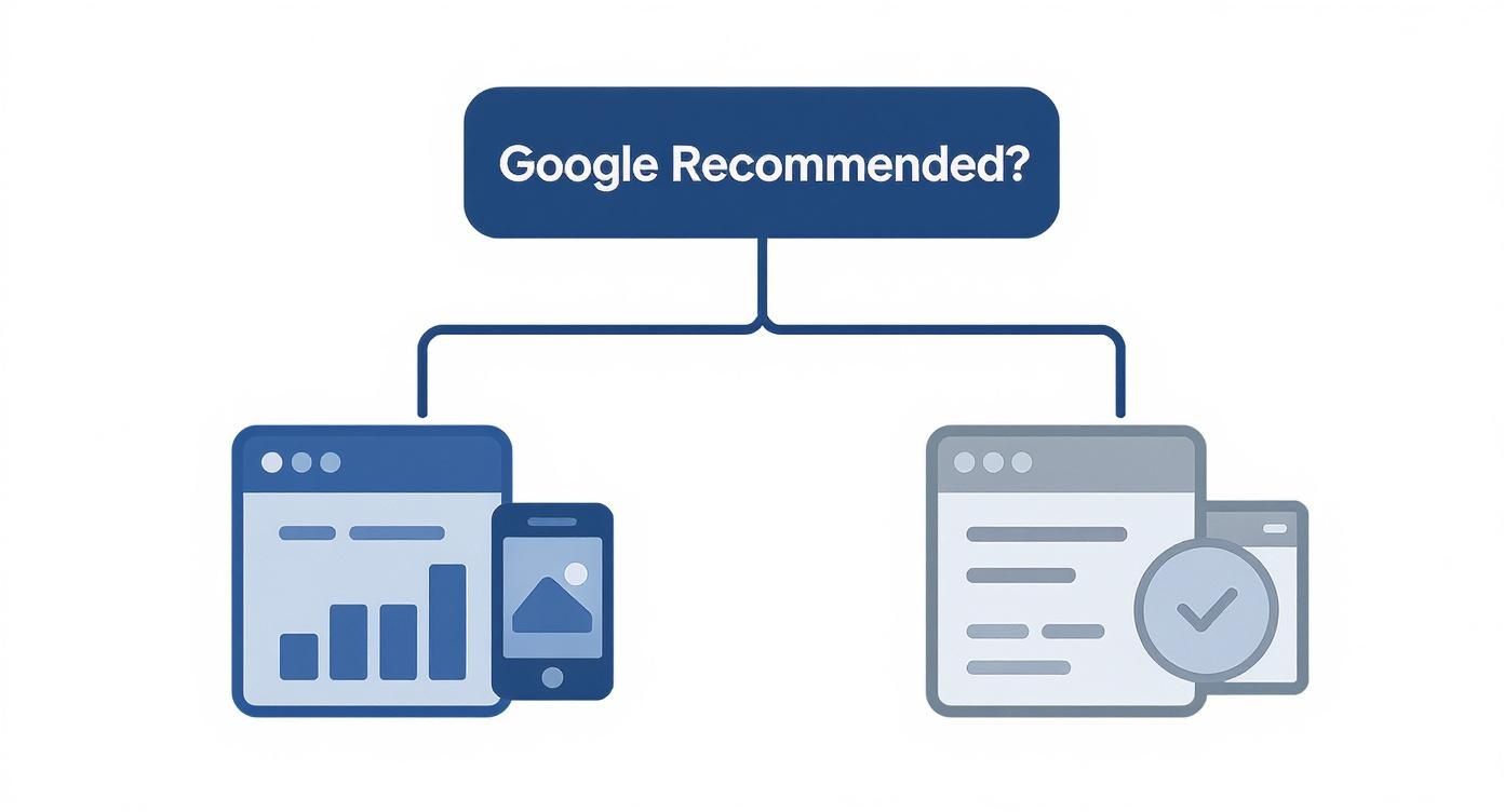
This decision tree helps visualize how factors like Google's own recommendations can steer your initial thinking.
As you can see, responsive design is right in line with what Google prefers, giving you a more direct path to SEO success. Adaptive requires more careful technical implementation to keep search engines happy.
A Checklist for Your Decision
To bring this all together, sit down with your team and ask these questions. Your answers will point you in the right direction for your product.
User Context: Are mobile users doing something totally different than desktop users? Think quick lookups on the go versus deep analysis at a desk.
Performance Needs: Is your application's performance absolutely critical? Is it a situation where a half-second delay could lose you a customer or revenue?
Development Resources: Do you actually have the budget and team bandwidth to design, build, and maintain multiple, distinct layouts for the long haul?
SEO Priority: How important is organic growth? Is consolidating all your link equity under one URL a top business priority?
Long-Term Vision: Where is the product headed? Will upcoming features demand drastically different interfaces for mobile and desktop?
Answering these questions honestly will give you the clarity you need to make a solid architectural decision.
For more on how to sync these technical choices with what your users need, our guide on SaaS UX design offers a valuable strategic perspective.
FAQs
When you start digging into the details of adaptive and responsive design, a lot of practical questions come up. Teams often get stuck on how these concepts actually apply to their specific projects. Let's clear up a few of the most common ones we hear.
Can You Use A Hybrid Approach?
Absolutely. In fact, it’s becoming the go-to strategy for a lot of savvy development teams. They’ll often mix the two philosophies, using a fluid, responsive foundation for the main page structure while using adaptive techniques for specific, high-impact components.
You might see this in action with a site that serves up different, heavily optimized image files or navigation menus based on device detection. This hybrid model gives you a pragmatic way to get some of the speed and precision of adaptive design without taking on the massive overhead of managing completely separate layouts.
Is Adaptive Design Still Relevant With Modern CSS?
The classic, server-side approach to adaptive design is definitely evolving, but the core idea behind it—serving the right experience for the right context—is more critical than ever. The real game-changer has been modern CSS features, especially container queries.
Now, instead of the entire page reacting to the browser's viewport, individual components can adapt to the size of their parent container. This brings the precision of adaptive design right into a responsive workflow. For a component-driven SaaS app, this is huge. It gives you incredible granular control and context-aware UIs without needing multiple codebases.
The conversation has moved from page-level adaptation to component-level adaptation. This is how you build sophisticated, maintainable UIs that feel perfectly tailored to their context, no matter the device.
Which Is Better For A Complex B2B SaaS Dashboard?
Honestly, the "right" answer comes down to what your product needs most. If the mobile and desktop user journeys are completely different—think a simple, read-only view on mobile versus a power-user editor on a desktop—then a dedicated adaptive build might be worth the investment. It’s the choice you make when absolute peak performance on each device is non-negotiable.
For the vast majority of SaaS dashboards, though, a well-optimized responsive design hits the sweet spot. It keeps the user experience consistent, simplifies the development process, and makes it much easier to scale and maintain your product as you add new features. The long-term efficiency just makes it the default choice unless you have a powerful business reason to do otherwise.


Similar Blogs
Similar Blogs
Similar Blogs


Available for Work
Bricx
© Bricx, 2026. All rights reserved.


Available for Work
Bricx
© Bricx, 2026. All rights reserved.
Available for Work
Bricx
© Bricx, 2026. All rights reserved.
Available for Work
Bricx
© Bricx, 2026. All rights reserved.