Product Design
Product Design
Product Design
Insights
Insights
Insights
October 14, 2025
October 14, 2025
October 14, 2025
5 Great Loading Page Design Examples to Keep Users Hooked
5 Great Loading Page Design Examples to Keep Users Hooked
5 Great Loading Page Design Examples to Keep Users Hooked
Discover a slew of loading page design examples in SaaS that transform boring waits into brand-building, trust-boosting experiences users will actually enjoy.
Discover a slew of loading page design examples in SaaS that transform boring waits into brand-building, trust-boosting experiences users will actually enjoy.
Discover a slew of loading page design examples in SaaS that transform boring waits into brand-building, trust-boosting experiences users will actually enjoy.
4 minutes
4 minutes
4 minutes


Loading page designs play a crucial role in keeping users engaged. Statistics show that 53% of mobile visitors leave sites that take more than three seconds to load. Your website's loading speed matters immensely - each extra second of load time drops conversion rates by 4.42%.
Modern online shoppers expect quick results. Research indicates that half of them want pages to load in 3 seconds or less. The silver lining? A well-laid-out loading screen can boost user motivation, create delight, and strengthen your brand's identity.
Studies reveal that users find interactive loading animations faster than basic progress bars. This turns those frustrating waiting periods into something more engaging.
Want to learn from industry leaders who keep their users engaged during load times? Let's head over to some creative examples that make waiting worthwhile.
What Is A Loading Page in UX Design?
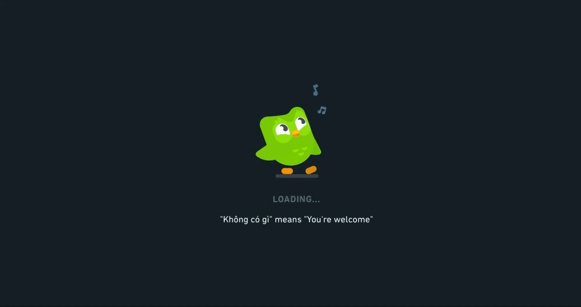
Image source: Hubspot
A loading page bridges the gap between user actions and desired content. These interface elements show up when websites or applications fetch data, process information, or move between screens.
Unlike error pages that stay static, loading pages tell users that things are happening behind the scenes.
The design of loading pages includes visual elements that show content processing status. These visual cues come in three main categories:
Loading screens - Full-page overlays that show up during content loading with animations, progress indicators, or branded elements.
Skeleton screens - Wireframe-style visuals that preview the upcoming content layout.
Preloaders - Small animated elements (like spinners or progress bars) that appear in specific content areas instead of covering the whole screen.
Each type reassures users that the system works as expected. Users might think something broke and leave your site if they face a blank screen with no visual indicators.
Loading pages also create smooth transitions between states that help users understand information better.
Why Do Loading Pages Even Matter?
Talking specifically about what we’ve ourselves seen; SaaS and AI applications need loading screens because they handle complex data operations.
Users expect powerful features from these platforms, which sometimes take time to respond.
Loading screens play several vital roles in such applications:
Building trust - Users feel confident their requests are processing, which matters most with sensitive data.
Setting expectations - Users know what's happening and how long they might wait.
Reinforcing branding - Your product's personality shines through during wait times.
Reducing bounce rates - People's attention spans last about 8 seconds according to research, so loading screens keep users around until content appears.
On the other hand, AI applications can use loading screens to explain complex background processes. This turns potentially frustrating wait times into informative moments.
How Effective Loading Page Design Improves Speed?
Loading page design can change how users experience time. Users care more about how fast a website feels than its actual loading speed.
This psychological effect happens through several ways:
Active vs. passive waiting - People feel time passes faster when their minds stay active rather than passive.
Progressive loading - Content appears bit by bit so users can start reading before everything loads.
Distraction techniques - Fun visuals or interactive elements make delays feel shorter.
Research shows people think they wait 36% longer when their minds stay passive. Users also feel interactive animations load faster than basic progress bars or spinners.
Quick processes under one second should skip loading indicators. These indicators might make things feel slower by forcing users to wait passively. Longer processes between 3-10 seconds need progress indicators with percentages to keep users engaged.
The science connects to cognitive load. Skeleton screens and progressive loading help users understand content structure before everything appears.
This makes the whole experience feel smoother and faster.
What Makes A Good SaaS Loading Page Design?
Image source: LinkedIn
A great loading page needs more than just a spinner. The best SaaS loading pages turn waiting time into a chance to build trust and get users involved.
Studies show that all but one of these mobile users leave sites that need more than three seconds to load. These waiting moments become vital points of contact in your user's journey.
Given below, is a list of the key elements of any effective loading page design:
Transparency
Clear communication during loading builds trust and reduces anxiety. Users feel less frustrated when they get feedback while waiting. Here are some key transparency elements to think over:
Progress indicators that show live loading stages
Microcopy that explains background processes
Time estimates for longer processes
Your app should switch from a spinner to a progress bar when processes take more than 4 seconds.
Scott Hurff, former product designer at Tinder, puts it well: "When your app is loading data or transitioning to another screen, you must take great care to be mindful of how you represent situations where you're fetching data".
Perceived Speed
You can make your app feel faster even if actual loading speed stays the same. Research shows that interactive loading animations give users a better experience than passive animations or simple progress bars.
Skeleton screens are really effective at the time they display gray placeholders that mirror your content structure. These screens let users preview what's coming and create an impression of faster loading.
The best results come when skeleton screens match your actual interface to avoid sudden changes.
Brand Tone
Your company's identity should shine through the loading screen. This goes beyond looks—it's about staying consistent. Loading screens give you a great way to get specific aspects of your branding across.
To cite an instance, Calm's loading screen suggests deep breathing—a perfect match with their meditation app's core values. This waiting moment becomes part of the experience rather than a disruption.
Delight & Utility
Smart loading screens make waiting worthwhile. Short waits of 1-2 seconds need minimal animations. Longer waits work better with:
Educational tips about your product
Entertaining visuals or interactions
Helpful information about the user's task
The likes of TurboTax show this really well; by actually slowing down their data import process to show animations of "complex" background processing. This unusual choice helps users feel confident about their financial information's handling.
Note that loading screens give you a perfect chance to share quick information with a captive audience. Keep it brief; your loading time shouldn't last long!
Creative Loading Page Designs That’ll Inspire Your UX Team: A List
Now that we’ve already talked about the key components of effective loading page designs, let’s take a look at some creative loading page design examples to take inspiration from:
Slack’s Team Quotes & Skeleton Screens
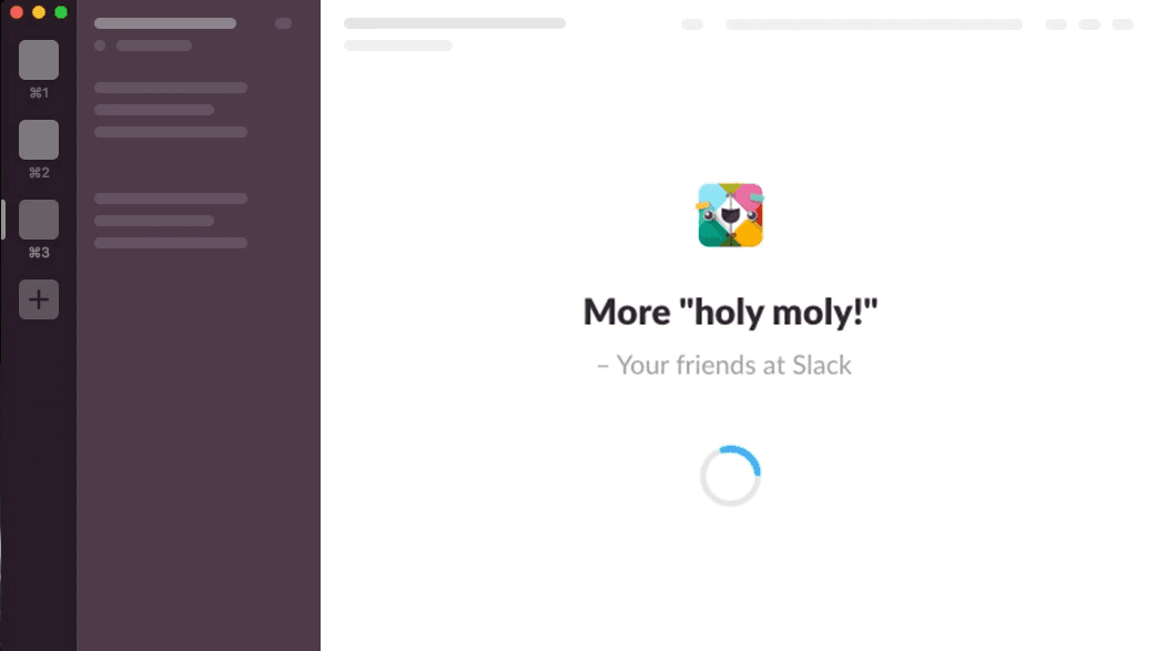
Image source: CSS-Tricks
Slack believes communication tools should build connections even during loading times. Their smart approach naturally fits their platform's shared mission and creates meaningful interactions during what could be boring wait times.
Slack uses team-submitted quotes and skeleton screens to make loading feel collaborative and fast.
The platform blends two powerful loading techniques. Team-submitted quotes build company culture while skeleton screens cut down wait times. This mix strengthens their brand identity and makes the application more responsive.
Slack's loading design shows their commitment to making business communication better and more enjoyable. They don't see loading as a problem but as a chance to build team bonds through shared wisdom or humor.
What makes it impressive?
• Tailored team quotes that build engagement: Teams can submit their own quotes that show up during loading screens. These custom messages create brief moments of connection when team members spot their colleagues' submissions or find new views. Such quotes spark thoughts or bring smiles during routine moments.
This feature turns potential frustration into a chance for team culture to grow. These quotes become small touchpoints that highlight company values and character while taking your mind off the loading process.
• Skeleton screens cut down perceived wait time: Slack also uses skeleton screens—wireframe-like visuals that show the upcoming content's layout. Studies show that skeleton screens help users stay focused by giving them a clean view while content loads.
• Helpful tips fill the gap when quotes aren't there: When team quotes aren't available, Slack shows helpful tips about platform features. Every loading moment becomes a learning chance.
Key takeaways
Slack proves waiting doesn't have to be wasted time. By mixing skeleton screens with custom content, they've built an experience that feels quick and meaningful.
Their loading page design shows how these pauses can strengthen a product's core values. Slack wants to make work more collaborative and pleasant. This idea shows up everywhere in their interface, even when users wait.
TurboTax’s Slowed Loading Design
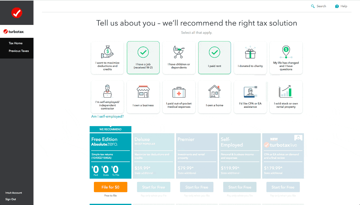
Image source: Userpilot
The world of financial software runs on trust—a principle TurboTax used with its unexpected loading page strategy. The company took a different path from standard loading times, which perfectly matched how people feel about handling sensitive financial data.
TurboTax makes its loading screen slower on purpose to show users their data gets a thorough review.
TurboTax can calculate tax obligations instantly. Yet the company found something surprising during user testing—people didn't trust calculations that seemed too quick. Users grew suspicious when their complex financial information got processed in seconds. They questioned results that appeared without seeming effort.
The solution came from an unexpected place. TurboTax made their loading times longer and added detailed animations that showed data "processing." This strategy taps into people's belief that good financial work takes time.
What makes it impressive?
• Animated data processing visuals: The software shows sophisticated animations of data being analyzed, calculated, and verified. These visuals create a sense that complex work happens behind the scenes: running calculations, finding deductions, and checking numbers.
Users see what looks like their financial data getting careful attention. This reinforces the idea that the software checks every detail of their tax situation carefully.
• Reinforces trust in accuracy: Financial data needs perfect accuracy—something TurboTax takes seriously. Longer loading times answer a basic user worry: "Does this software check everything properly?"
A user experience researcher pointed out that "When the machine counts money too quickly, consumers don't trust the result". Tax calculations follow this same rule, where mistakes could cause serious problems. The extended loading process helps users feel confident about the system's attention to detail.
• Smart use of perceived time: TurboTax uses the psychology that busy time feels shorter than empty waiting. They turn what could be an annoying wait into something reassuring.
This approach uses a key fact about human nature: people remember how an experience made them feel more than how long it took.
By creating feelings of security and completeness during loading, TurboTax makes the experience better even though users wait longer.
Key takeaways
TurboTax's loading design teaches us to put user psychology first. Making the process seem slower actually builds user confidence faster; showing that knowing your users' emotional needs might mean breaking common UX rules.
Duolingo’s Mascot Animation & Motivational Quote Loaders
Image source: Userpilot
Learning a new language needs persistence, but slow-loading app content tests anyone's patience. Duolingo changes these friction points into enjoyable moments through their owl mascot Duo. This clever approach turns routine loading screens into chances to connect with users.
Duolingo's owl mascot Duo appears with motivational quotes and a progress bar during loading.
Users see the iconic green owl mascot Duo whenever Duolingo loads content. The mascot shows up with encouraging messages or interesting language facts. This strategy changes a potentially frustrating moment into a chance to build brand identity and keep users engaged.
These screens have since become tools to support the app's educational goals. The design actively nurtures a language-learning mindset before lessons begin.
What makes it impressive?
• Strong brand mascot integration: The friendly owl appears throughout loading with animations that add character to an otherwise basic moment. UX researchers note that "Duolingo's onboarding would be exceptional even without the friendly owl, but there's no denying that the cute animations make the whole experience even more delightful".
Duo's animated presence builds an emotional bond that helps users connect with the brand. The mascot becomes a reliable companion throughout the learning experience, which makes each interaction feel connected and meaningful.
• Motivational microcopy boosts retention: The app shows "inspiring messages to drive retention" and "fun little facts about Duolingo and the language learning process" during loading. These brief moments of encouragement strengthen users' dedication to their goals. Well-crafted messages act as quick motivational boosts that remind users of their purpose.
This approach makes wait time valuable—users learn something useful before their lesson starts.
• Progress bar shows live loading: The app pairs Duo and motivational messages with a progress bar that shows loading status. This design element is vital because "progress bars set expectations, give an impression of activity and can calm users".
Key takeaways
Duolingo proves that "it is easily noticeable how tiny animations can make the wait easier". Their method stands out as "probably the best-known example of a fun, fact-filled loading screen". They combine brand visuals, educational content, and clear progress tracking effectively.
These principles can help transform your loading screens from potential drop-off points into engagement opportunities. Duolingo teaches us that smart design can support your core mission and delight users at the same time.
WeTransfer’s Promotion of Paid Features During Load
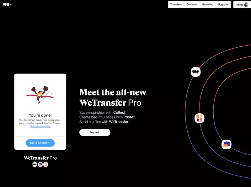
Image Source: Userpilot
File sharing services face a tough challenge with loading screens because users wait for their uploads to finish. WeTransfer turned this waiting time into a smart marketing chance that doesn't feel pushy or intrusive.
WeTransfer uses its loading screen to promote its Pro service while files upload.
The free file sharing platform WeTransfer lets anyone upload files up to 2GB and share links with others without creating an account. The company smoothly introduces users to its premium offerings during these upload times.
A loading page seems just functional at first glance, but WeTransfer saw these moments as valuable space to show users features they might need. The platform has a split-screen approach: upload progress shows on one side and Pro features that could improve your experience appear on the other.
What makes it impressive?
• Smart upsell chance: WeTransfer promotes its Pro service at the perfect moment - when users notice the limits of the free version. Users think about their file-sharing needs while waiting for uploads to complete, which makes this the ideal time to showcase premium features.
This method helps grow accounts naturally by showing advanced features to users right when they're most interested in learning about them.
• Clean, minimal design: WeTransfer keeps a clean, uncluttered look even with lots of information on one screen. The loading page succeeds through:
→ A clear visual hierarchy that separates progress information from promotional content
→ Ample white space that prevents the design from feeling overwhelming
→ Simple, direct messaging that shows value without too much text
The design balances everything well—promotional content stays subtle while upload progress remains the main focus.
• Reinforces product value: WeTransfer reminds users why their service matters throughout the upload process.
Their loading screen goes beyond promoting the Pro version—it highlights specific benefits that solve common problems, like larger file transfer limits.
Key Takeaways
WeTransfer shows how loading screens can work double duty—tracking progress while naturally introducing premium features. This approach works because it delivers real value right when users might need it most.
Your projects could turn waiting periods into chances to highlight extra features—as long as they add value without disrupting the user experience.
Customer.io’s Animated Mascot Spinner
Image source: Userpilot
Brand mascots can change waiting moments into delightful brand experiences that go beyond generic loading icons.
Customer.io shows this perfectly with their lovable pigeon mascot who keeps users company while processing. The SaaS platform uses its pigeon mascot Ami in a fun spinner animation to keep users entertained.
Their team came up with a clever twist on the traditional loading spinner by featuring their animated pigeon mascot Ami. Users feel an instant emotional connection with this character-based design that makes short waits more engaging.
The animated pigeon spins instead of a standard loading icon—a simple yet powerful way to keep the brand present during technical delays.
What makes it impressive?
• Consistent mascot branding: Users see Ami everywhere on the Customer.io platform. This creates a seamless experience from login to dashboard. The familiar feathered friend shows up on loading screens and reminds users they're still in the Customer.io ecosystem.
• Fun twist on traditional spinner: The animated pigeon adds character to a basic interface element, unlike standard loading circles. This playful touch turns potential moments of frustration into quick brand connections.
• Friendly tone throughout: The mascot brings warmth and approachability that matches Customer.io's brand voice perfectly. This friendly character helps add a human touch to what could feel like cold, technical pauses.
Key takeaways
A familiar face can make even a short wait feel personal, so make sure you’re using a friendly character which adds a layer of humane-ness to your user experience.
Best Practices for Designing Loading Pages Effectively
Loading screens can revolutionize waiting from frustration to user involvement. We need to explore the principles that create better loading experiences.
Given below, are key best practices to help you design better loading page designs:
Show Progress, Not Just Animation
Static "Loading..." messages or infinite spinners should be avoided. Users need clear indicators that show completed progress and remaining work. A percent-done indicator works better than looped animations for processes lasting more than 10 seconds.
This transparency gives users control and reduces uncertainty about wait times.
Microcopy > Mystery
Clear communication on loading screens helps reduce anxiety. Brief, informative messages like "Processing your payment... This usually takes less than 10 seconds" help users trust that everything works properly.
Context-aware microcopy builds trust by explaining background processes, and it adapts based on user actions.
Make Waiting Feel Shorter
Research in psychology reveals that people overestimate waiting time by approximately 36% during passive states. Time passes faster when users stay occupied. The experience improves with:
Skeleton screens that preview content structure
Progressive loading that displays content incrementally
Brief tips or educational content that adds value
Reinforce Brand Identity
Your company's personality should shine through the loading screen. Loading states are a great way to get specific aspects of your branding across through animations, copy tone, and visual style.
Prepare for Delays
We cannot eliminate all waits. Longer processes need options like "Continue in background" or "Get notified when ready".
Users should control their waiting experience to prevent frustration and build trust.
Conclusion
These creative examples show that loading screens do more than just keep users waiting. A well-designed loading page can turn from a frustrating delay into a chance to connect with users.
Yes, it is true that every second counts; but what happens during those seconds matters more than how long they take.
Great loading pages have several things in common. They show clear progress, use smart messaging that fits the context, match the brand's look, and give users something valuable to learn or enjoy.
If you really want to build better loading experiences; start by mapping out where users have to wait, then ask yourself: "How can we use this time to show our brand values and keep users interested?"
Those few seconds might not seem like much, but they're a great way to get closer to users and show them you care about details. When you design your next loading screen, users want more than speed—they want their time respected and something worthwhile in return.
Also, if you’re looking for expert handholding while designing an effective loading page, Bricx can be a great design partner!
To know more about how we can help, check out our case studies or book a call now!
Loading page designs play a crucial role in keeping users engaged. Statistics show that 53% of mobile visitors leave sites that take more than three seconds to load. Your website's loading speed matters immensely - each extra second of load time drops conversion rates by 4.42%.
Modern online shoppers expect quick results. Research indicates that half of them want pages to load in 3 seconds or less. The silver lining? A well-laid-out loading screen can boost user motivation, create delight, and strengthen your brand's identity.
Studies reveal that users find interactive loading animations faster than basic progress bars. This turns those frustrating waiting periods into something more engaging.
Want to learn from industry leaders who keep their users engaged during load times? Let's head over to some creative examples that make waiting worthwhile.
What Is A Loading Page in UX Design?
Image source: Hubspot
A loading page bridges the gap between user actions and desired content. These interface elements show up when websites or applications fetch data, process information, or move between screens.
Unlike error pages that stay static, loading pages tell users that things are happening behind the scenes.
The design of loading pages includes visual elements that show content processing status. These visual cues come in three main categories:
Loading screens - Full-page overlays that show up during content loading with animations, progress indicators, or branded elements.
Skeleton screens - Wireframe-style visuals that preview the upcoming content layout.
Preloaders - Small animated elements (like spinners or progress bars) that appear in specific content areas instead of covering the whole screen.
Each type reassures users that the system works as expected. Users might think something broke and leave your site if they face a blank screen with no visual indicators.
Loading pages also create smooth transitions between states that help users understand information better.
Why Do Loading Pages Even Matter?
Talking specifically about what we’ve ourselves seen; SaaS and AI applications need loading screens because they handle complex data operations.
Users expect powerful features from these platforms, which sometimes take time to respond.
Loading screens play several vital roles in such applications:
Building trust - Users feel confident their requests are processing, which matters most with sensitive data.
Setting expectations - Users know what's happening and how long they might wait.
Reinforcing branding - Your product's personality shines through during wait times.
Reducing bounce rates - People's attention spans last about 8 seconds according to research, so loading screens keep users around until content appears.
On the other hand, AI applications can use loading screens to explain complex background processes. This turns potentially frustrating wait times into informative moments.
How Effective Loading Page Design Improves Speed?
Loading page design can change how users experience time. Users care more about how fast a website feels than its actual loading speed.
This psychological effect happens through several ways:
Active vs. passive waiting - People feel time passes faster when their minds stay active rather than passive.
Progressive loading - Content appears bit by bit so users can start reading before everything loads.
Distraction techniques - Fun visuals or interactive elements make delays feel shorter.
Research shows people think they wait 36% longer when their minds stay passive. Users also feel interactive animations load faster than basic progress bars or spinners.
Quick processes under one second should skip loading indicators. These indicators might make things feel slower by forcing users to wait passively. Longer processes between 3-10 seconds need progress indicators with percentages to keep users engaged.
The science connects to cognitive load. Skeleton screens and progressive loading help users understand content structure before everything appears.
This makes the whole experience feel smoother and faster.
What Makes A Good SaaS Loading Page Design?
Image source: LinkedIn
A great loading page needs more than just a spinner. The best SaaS loading pages turn waiting time into a chance to build trust and get users involved.
Studies show that all but one of these mobile users leave sites that need more than three seconds to load. These waiting moments become vital points of contact in your user's journey.
Given below, is a list of the key elements of any effective loading page design:
Transparency
Clear communication during loading builds trust and reduces anxiety. Users feel less frustrated when they get feedback while waiting. Here are some key transparency elements to think over:
Progress indicators that show live loading stages
Microcopy that explains background processes
Time estimates for longer processes
Your app should switch from a spinner to a progress bar when processes take more than 4 seconds.
Scott Hurff, former product designer at Tinder, puts it well: "When your app is loading data or transitioning to another screen, you must take great care to be mindful of how you represent situations where you're fetching data".
Perceived Speed
You can make your app feel faster even if actual loading speed stays the same. Research shows that interactive loading animations give users a better experience than passive animations or simple progress bars.
Skeleton screens are really effective at the time they display gray placeholders that mirror your content structure. These screens let users preview what's coming and create an impression of faster loading.
The best results come when skeleton screens match your actual interface to avoid sudden changes.
Brand Tone
Your company's identity should shine through the loading screen. This goes beyond looks—it's about staying consistent. Loading screens give you a great way to get specific aspects of your branding across.
To cite an instance, Calm's loading screen suggests deep breathing—a perfect match with their meditation app's core values. This waiting moment becomes part of the experience rather than a disruption.
Delight & Utility
Smart loading screens make waiting worthwhile. Short waits of 1-2 seconds need minimal animations. Longer waits work better with:
Educational tips about your product
Entertaining visuals or interactions
Helpful information about the user's task
The likes of TurboTax show this really well; by actually slowing down their data import process to show animations of "complex" background processing. This unusual choice helps users feel confident about their financial information's handling.
Note that loading screens give you a perfect chance to share quick information with a captive audience. Keep it brief; your loading time shouldn't last long!
Creative Loading Page Designs That’ll Inspire Your UX Team: A List
Now that we’ve already talked about the key components of effective loading page designs, let’s take a look at some creative loading page design examples to take inspiration from:
Slack’s Team Quotes & Skeleton Screens
Image source: CSS-Tricks
Slack believes communication tools should build connections even during loading times. Their smart approach naturally fits their platform's shared mission and creates meaningful interactions during what could be boring wait times.
Slack uses team-submitted quotes and skeleton screens to make loading feel collaborative and fast.
The platform blends two powerful loading techniques. Team-submitted quotes build company culture while skeleton screens cut down wait times. This mix strengthens their brand identity and makes the application more responsive.
Slack's loading design shows their commitment to making business communication better and more enjoyable. They don't see loading as a problem but as a chance to build team bonds through shared wisdom or humor.
What makes it impressive?
• Tailored team quotes that build engagement: Teams can submit their own quotes that show up during loading screens. These custom messages create brief moments of connection when team members spot their colleagues' submissions or find new views. Such quotes spark thoughts or bring smiles during routine moments.
This feature turns potential frustration into a chance for team culture to grow. These quotes become small touchpoints that highlight company values and character while taking your mind off the loading process.
• Skeleton screens cut down perceived wait time: Slack also uses skeleton screens—wireframe-like visuals that show the upcoming content's layout. Studies show that skeleton screens help users stay focused by giving them a clean view while content loads.
• Helpful tips fill the gap when quotes aren't there: When team quotes aren't available, Slack shows helpful tips about platform features. Every loading moment becomes a learning chance.
Key takeaways
Slack proves waiting doesn't have to be wasted time. By mixing skeleton screens with custom content, they've built an experience that feels quick and meaningful.
Their loading page design shows how these pauses can strengthen a product's core values. Slack wants to make work more collaborative and pleasant. This idea shows up everywhere in their interface, even when users wait.
TurboTax’s Slowed Loading Design
Image source: Userpilot
The world of financial software runs on trust—a principle TurboTax used with its unexpected loading page strategy. The company took a different path from standard loading times, which perfectly matched how people feel about handling sensitive financial data.
TurboTax makes its loading screen slower on purpose to show users their data gets a thorough review.
TurboTax can calculate tax obligations instantly. Yet the company found something surprising during user testing—people didn't trust calculations that seemed too quick. Users grew suspicious when their complex financial information got processed in seconds. They questioned results that appeared without seeming effort.
The solution came from an unexpected place. TurboTax made their loading times longer and added detailed animations that showed data "processing." This strategy taps into people's belief that good financial work takes time.
What makes it impressive?
• Animated data processing visuals: The software shows sophisticated animations of data being analyzed, calculated, and verified. These visuals create a sense that complex work happens behind the scenes: running calculations, finding deductions, and checking numbers.
Users see what looks like their financial data getting careful attention. This reinforces the idea that the software checks every detail of their tax situation carefully.
• Reinforces trust in accuracy: Financial data needs perfect accuracy—something TurboTax takes seriously. Longer loading times answer a basic user worry: "Does this software check everything properly?"
A user experience researcher pointed out that "When the machine counts money too quickly, consumers don't trust the result". Tax calculations follow this same rule, where mistakes could cause serious problems. The extended loading process helps users feel confident about the system's attention to detail.
• Smart use of perceived time: TurboTax uses the psychology that busy time feels shorter than empty waiting. They turn what could be an annoying wait into something reassuring.
This approach uses a key fact about human nature: people remember how an experience made them feel more than how long it took.
By creating feelings of security and completeness during loading, TurboTax makes the experience better even though users wait longer.
Key takeaways
TurboTax's loading design teaches us to put user psychology first. Making the process seem slower actually builds user confidence faster; showing that knowing your users' emotional needs might mean breaking common UX rules.
Duolingo’s Mascot Animation & Motivational Quote Loaders
Image source: Userpilot
Learning a new language needs persistence, but slow-loading app content tests anyone's patience. Duolingo changes these friction points into enjoyable moments through their owl mascot Duo. This clever approach turns routine loading screens into chances to connect with users.
Duolingo's owl mascot Duo appears with motivational quotes and a progress bar during loading.
Users see the iconic green owl mascot Duo whenever Duolingo loads content. The mascot shows up with encouraging messages or interesting language facts. This strategy changes a potentially frustrating moment into a chance to build brand identity and keep users engaged.
These screens have since become tools to support the app's educational goals. The design actively nurtures a language-learning mindset before lessons begin.
What makes it impressive?
• Strong brand mascot integration: The friendly owl appears throughout loading with animations that add character to an otherwise basic moment. UX researchers note that "Duolingo's onboarding would be exceptional even without the friendly owl, but there's no denying that the cute animations make the whole experience even more delightful".
Duo's animated presence builds an emotional bond that helps users connect with the brand. The mascot becomes a reliable companion throughout the learning experience, which makes each interaction feel connected and meaningful.
• Motivational microcopy boosts retention: The app shows "inspiring messages to drive retention" and "fun little facts about Duolingo and the language learning process" during loading. These brief moments of encouragement strengthen users' dedication to their goals. Well-crafted messages act as quick motivational boosts that remind users of their purpose.
This approach makes wait time valuable—users learn something useful before their lesson starts.
• Progress bar shows live loading: The app pairs Duo and motivational messages with a progress bar that shows loading status. This design element is vital because "progress bars set expectations, give an impression of activity and can calm users".
Key takeaways
Duolingo proves that "it is easily noticeable how tiny animations can make the wait easier". Their method stands out as "probably the best-known example of a fun, fact-filled loading screen". They combine brand visuals, educational content, and clear progress tracking effectively.
These principles can help transform your loading screens from potential drop-off points into engagement opportunities. Duolingo teaches us that smart design can support your core mission and delight users at the same time.
WeTransfer’s Promotion of Paid Features During Load
Image Source: Userpilot
File sharing services face a tough challenge with loading screens because users wait for their uploads to finish. WeTransfer turned this waiting time into a smart marketing chance that doesn't feel pushy or intrusive.
WeTransfer uses its loading screen to promote its Pro service while files upload.
The free file sharing platform WeTransfer lets anyone upload files up to 2GB and share links with others without creating an account. The company smoothly introduces users to its premium offerings during these upload times.
A loading page seems just functional at first glance, but WeTransfer saw these moments as valuable space to show users features they might need. The platform has a split-screen approach: upload progress shows on one side and Pro features that could improve your experience appear on the other.
What makes it impressive?
• Smart upsell chance: WeTransfer promotes its Pro service at the perfect moment - when users notice the limits of the free version. Users think about their file-sharing needs while waiting for uploads to complete, which makes this the ideal time to showcase premium features.
This method helps grow accounts naturally by showing advanced features to users right when they're most interested in learning about them.
• Clean, minimal design: WeTransfer keeps a clean, uncluttered look even with lots of information on one screen. The loading page succeeds through:
→ A clear visual hierarchy that separates progress information from promotional content
→ Ample white space that prevents the design from feeling overwhelming
→ Simple, direct messaging that shows value without too much text
The design balances everything well—promotional content stays subtle while upload progress remains the main focus.
• Reinforces product value: WeTransfer reminds users why their service matters throughout the upload process.
Their loading screen goes beyond promoting the Pro version—it highlights specific benefits that solve common problems, like larger file transfer limits.
Key Takeaways
WeTransfer shows how loading screens can work double duty—tracking progress while naturally introducing premium features. This approach works because it delivers real value right when users might need it most.
Your projects could turn waiting periods into chances to highlight extra features—as long as they add value without disrupting the user experience.
Customer.io’s Animated Mascot Spinner
Image source: Userpilot
Brand mascots can change waiting moments into delightful brand experiences that go beyond generic loading icons.
Customer.io shows this perfectly with their lovable pigeon mascot who keeps users company while processing. The SaaS platform uses its pigeon mascot Ami in a fun spinner animation to keep users entertained.
Their team came up with a clever twist on the traditional loading spinner by featuring their animated pigeon mascot Ami. Users feel an instant emotional connection with this character-based design that makes short waits more engaging.
The animated pigeon spins instead of a standard loading icon—a simple yet powerful way to keep the brand present during technical delays.
What makes it impressive?
• Consistent mascot branding: Users see Ami everywhere on the Customer.io platform. This creates a seamless experience from login to dashboard. The familiar feathered friend shows up on loading screens and reminds users they're still in the Customer.io ecosystem.
• Fun twist on traditional spinner: The animated pigeon adds character to a basic interface element, unlike standard loading circles. This playful touch turns potential moments of frustration into quick brand connections.
• Friendly tone throughout: The mascot brings warmth and approachability that matches Customer.io's brand voice perfectly. This friendly character helps add a human touch to what could feel like cold, technical pauses.
Key takeaways
A familiar face can make even a short wait feel personal, so make sure you’re using a friendly character which adds a layer of humane-ness to your user experience.
Best Practices for Designing Loading Pages Effectively
Loading screens can revolutionize waiting from frustration to user involvement. We need to explore the principles that create better loading experiences.
Given below, are key best practices to help you design better loading page designs:
Show Progress, Not Just Animation
Static "Loading..." messages or infinite spinners should be avoided. Users need clear indicators that show completed progress and remaining work. A percent-done indicator works better than looped animations for processes lasting more than 10 seconds.
This transparency gives users control and reduces uncertainty about wait times.
Microcopy > Mystery
Clear communication on loading screens helps reduce anxiety. Brief, informative messages like "Processing your payment... This usually takes less than 10 seconds" help users trust that everything works properly.
Context-aware microcopy builds trust by explaining background processes, and it adapts based on user actions.
Make Waiting Feel Shorter
Research in psychology reveals that people overestimate waiting time by approximately 36% during passive states. Time passes faster when users stay occupied. The experience improves with:
Skeleton screens that preview content structure
Progressive loading that displays content incrementally
Brief tips or educational content that adds value
Reinforce Brand Identity
Your company's personality should shine through the loading screen. Loading states are a great way to get specific aspects of your branding across through animations, copy tone, and visual style.
Prepare for Delays
We cannot eliminate all waits. Longer processes need options like "Continue in background" or "Get notified when ready".
Users should control their waiting experience to prevent frustration and build trust.
Conclusion
These creative examples show that loading screens do more than just keep users waiting. A well-designed loading page can turn from a frustrating delay into a chance to connect with users.
Yes, it is true that every second counts; but what happens during those seconds matters more than how long they take.
Great loading pages have several things in common. They show clear progress, use smart messaging that fits the context, match the brand's look, and give users something valuable to learn or enjoy.
If you really want to build better loading experiences; start by mapping out where users have to wait, then ask yourself: "How can we use this time to show our brand values and keep users interested?"
Those few seconds might not seem like much, but they're a great way to get closer to users and show them you care about details. When you design your next loading screen, users want more than speed—they want their time respected and something worthwhile in return.
Also, if you’re looking for expert handholding while designing an effective loading page, Bricx can be a great design partner!
To know more about how we can help, check out our case studies or book a call now!


Similar Blogs
Similar Blogs
Similar Blogs


Available for Work
Bricx
© Bricx, 2026. All rights reserved.


Available for Work
Bricx
© Bricx, 2026. All rights reserved.
Available for Work
Bricx
© Bricx, 2026. All rights reserved.
Available for Work
Bricx
© Bricx, 2026. All rights reserved.