Website Design
Website Design
Website Design
Insights
Insights
Insights
October 13, 2025
October 13, 2025
October 13, 2025
10 Best Edtech Website Designs Nailing Student Trust
10 Best Edtech Website Designs Nailing Student Trust
10 Best Edtech Website Designs Nailing Student Trust
Discover the 10 best edtech website designs redefining digital learning through clean UX, engaging visuals, and user-first experiences that drive results.
Discover the 10 best edtech website designs redefining digital learning through clean UX, engaging visuals, and user-first experiences that drive results.
Discover the 10 best edtech website designs redefining digital learning through clean UX, engaging visuals, and user-first experiences that drive results.
4 minutes
4 minutes
4 minutes


Great edtech website designs go beyond esthetics—they convert visitors, help learners participate and establish instant credibility. Research shows that 94% of a website's first impressions relate to design, which makes your digital storefront significant to success.
Educational website design carries even higher stakes. Most potential students, parents, and educators first connect through a website. Today's user expectations keep evolving, and features like AI-driven personalization and adaptive learning paths have become standard requirements rather than unique differentiators.
We've handpicked 11 exceptional edtech websites that perfectly balance visual appeal and functionality. These examples offer practical ideas you can implement immediately, whether you plan to redesign your platform or build one from scratch.
What Makes a Great EdTech Website Design?
Building a good educational platform needs more than just eye-catching designs and fancy animations. The best edtech websites strike a perfect balance between user experience and educational goals. They also meet the specific needs of both learners and educators.
Given below, are some key elements that constitute a great edtech website design:
Clear value proposition and simple onboarding
The success of any edtech website starts with a crystal-clear value proposition. Your website should answer one simple question: "What problem does this solve for me?" The most successful educational websites present their purpose directly without hiding it behind complex navigation or fancy words.
Research shows that companies who use a well-defined value proposition that lines up with customer needs are 1.5 times more likely to launch successful products. This becomes even more important in today's competitive digital world where users decide in seconds whether to stay on your platform.
Good onboarding should be simple. Create a path that shows users your key features and highlights what makes your platform special. Your website's purpose should shape every design choice. This helps visitors see how you can solve their educational problems.
Use of storytelling, visuals, and social proof
People retain visual information better than text. This makes visual elements key to explaining concepts and instructions. Good edtech websites use this principle by adding meaningful images, videos, and infographics that help users learn better.
Stories can turn complex educational ideas into simple experiences. You can show how your platform fixes real educational problems through stories, case studies, and user feedback. On top of that, it builds trust when you include user reviews, strategic collaborations, and success metrics.
The right mix matters: too many visuals can confuse users and weaken your message. Smart edtech websites place visual elements carefully to draw attention to important information and action buttons.
Intuitive navigation and clutter-free design
Your website needs a consistent layout across all pages. Menus, headers, and search functions should stay in the same spots. This helps users find their way around without having to relearn where everything is.
Simple navigation leads to better learning results. Here are some key navigation principles:
Put important items at the start and end of menu lists to use the "serial position effect"
Use clear labels that show purpose
Add a visible search function on every page
Split long content with headings and table of contents
Studies show that 94% of users think easy navigation matters most on websites. This becomes even more vital for education sites because complex navigation takes focus away from learning.
Available and mobile-first layout
Gen Z uses phones as their main device 75% of the time, making mobile-first design essential. They won't wait around—60% leave sites that load slowly and 62% quit websites that are hard to use.
Making your site available helps create learning spaces for everyone. Features like screen reader support, keyboard navigation, and adjustable text sizes help all learners access your content whatever their abilities. This approach grows your audience and shows your dedication to fair education.
Motivational CTAs for sign-ups or demos
Good calls-to-action help users take the next step. Button-shaped CTAs get 45% more clicks than text links. Center-aligned CTAs work better too—they get up to 680% more clicks than those placed on sides.
Put your main CTAs at the top of the page where they get 73% visibility (compared to 44% below). Educational platforms see better results with action phrases like "Start Your Learning" or "See Yourself Here" instead of basic "Learn More" buttons.
These work best when you match them to specific audiences and where they are in their decision process.
10 Best Edtech Website Design Examples to Take Inspiration From: A List
Based on our research & observations, given below are some of the best edtech website designs in the industry currently:
Grammarly
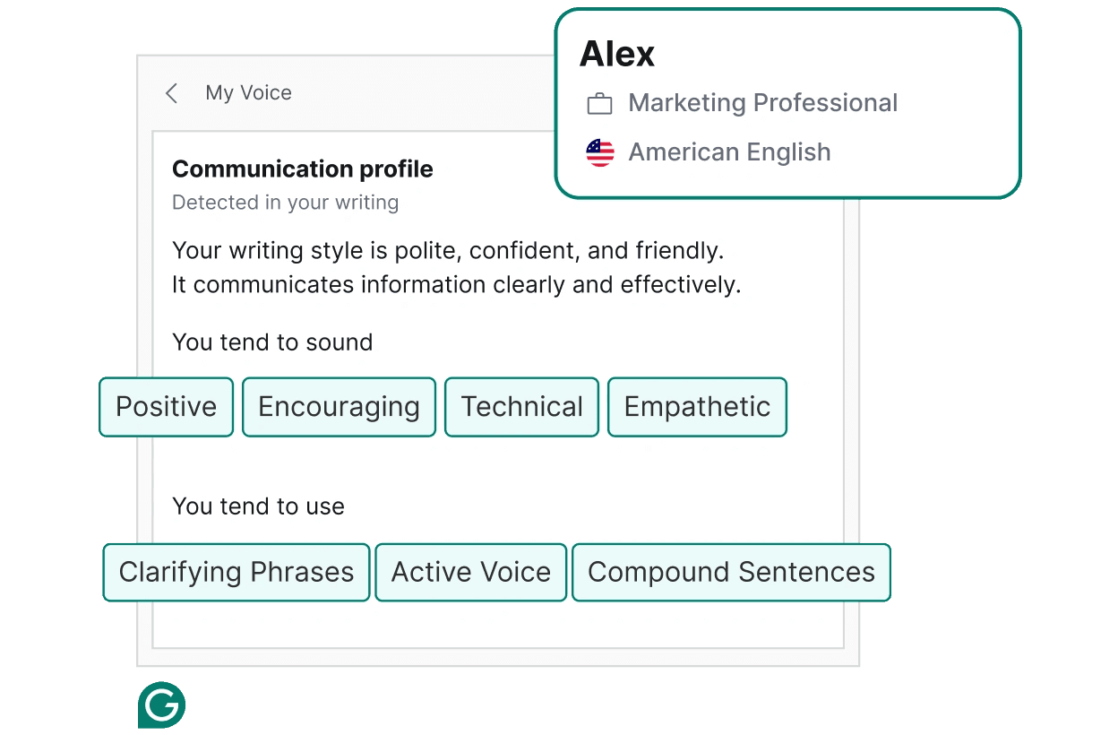
Image source: Grammarly
Grammarly distinguishes itself among educational technology platforms through a design that perfectly balances functionality with emotional intelligence. The platform feels more like a friendly writing companion than a strict English teacher with red pen in hand.
What makes it impressive?
Grammarly's design success comes from its thoughtful approach to what could be an uncomfortable user experience. The platform needs to point out mistakes, yet its interface balances criticism with positive feedback and beautiful visual elements.
The color scheme plays a vital role—Grammarly uses white space with blue and green accents that users subconsciously associate with peace and trust. This creates a UI that helps users feel comfortable as the tool analyzes their writing.
The platform does an excellent job of keeping things simple. Users can find advanced features like "document insights" and "set goals" neatly organized in the side navigation. The main interface stays clean while these additional tools remain available. Users can focus on improving their writing without feeling overwhelmed.
Micro-animations add another layer of excellence to the design. These subtle visual responses to user actions might seem small, but they improve the experience and make engagement easier. A clinical editing session turns into an interactive and satisfying experience.
Grammarly's interface shows deep empathy in its design approach. The company knew they needed to build trust through elegant, welcoming, and intuitive design to help shape someone's communication. The design team created delightful moments that capture users' imagination, even when the product doesn't have suggestions.
Key takeaway
Grammarly teaches us that educational tools handling sensitive tasks must balance functionality with emotional intelligence. Your edtech platform should recognize user vulnerabilities while showing clear paths to improvement.
Grammarly works because its design feels natural to users—whether they write in Gmail, Facebook, or Reddit. The uninterrupted integration in platforms builds trust and encourages regular use. Your edtech design should create interfaces that feel like natural extensions of users' digital world rather than intrusive additions.
Padlet
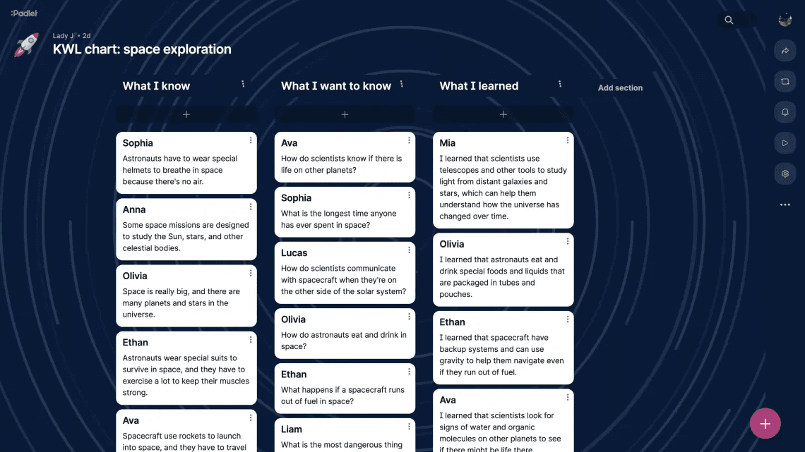
Image source: Padlet
Padlet has revolutionized collaborative learning with its striking digital workspace design. This virtual bulletin board offers a user-friendly canvas where ideas flow naturally between participants. Users love it, as shown by stellar ratings 4.9 on G2.com, 4.6 on App Store, 4.9 on Capterra, and 4.8 on Google Play.
What makes it impressive?
The platform's interface stands out through smart design choices that put visual organization first. Users can choose from multiple layouts like grid, timeline, map, and discussion formats that adapt smoothly to different educational needs. Teachers and students can organize information visually in ways that work best for their learning goals.
Padlet's design creates a genuine sense of psychological safety. Students can share ideas anonymously, which makes them feel secure and judgment-free. This approach leads to more honest and constructive peer feedback, which proves especially valuable in classroom settings.
The platform's focus on accessibility also sets it apart. It meets current accessibility standards, making learning relevant to students from different cultures, backgrounds, and abilities. Users can access features like closed captioning, speed control, and contrast adaptability.
The platform has added AI capabilities that show its leadership in edtech design. "Magic Padlet" uses generative AI to build complete boards from brief descriptions, while "AI Recipes" makes it easier to create content for specific educational needs. These features show how good design can blend technology with teaching methods.
Key takeaway
Padlet's success comes from understanding that visual organization makes collaborative learning better. With 40 million users worldwide, the platform shows how user-friendly design can build trust and help develop collaborative learning skills.
When building your own edtech website, look at how Padlet balances flexibility with structure. Students can reflect and respond at their own pace, which leads to deeper and more thoughtful discussions. On top of that, its analytics features give valuable insights while protecting privacy. This approach shows how educational platforms can balance evidence-based insights with user confidentiality.
Thinkific
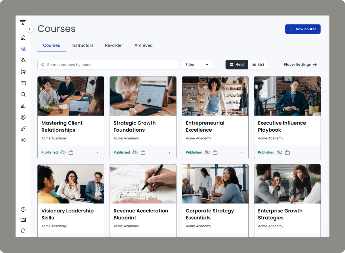
Image source: Thinkific
Thinkific stands out in the edtech space with its easy-to-use design approach. The platform helps entrepreneurs build successful online education businesses. The platform supports over 35K+ businesses that have earned $3.70B through online courses.
Thinkific's website design shows how clarity and customization can lead to educational success.
What makes it impressive?
Thinkific's design philosophy strikes the perfect balance between simplicity and functionality. Many learning management systems are complex, but Thinkific uses a modular approach to website building. This makes creating professional-looking pages easy even for non-designers. Course creators can focus on their content instead of dealing with technical issues.
Thinkific's interface highlights several design practices worth copying for your edtech website. The platform maintains clear, consistent naming conventions and visual elements. The dashboard displays important metrics like revenue, leads, and new accounts up front. This lets educators check their business performance quickly.
The platform's navigation system has been redesigned to show thoughtful development. It includes collapsible menus that save screen space and group features logically. This smart organization prevents users from feeling overwhelmed by the platform's many features.
Key takeaway
Thinkific's design success teaches us that educational platforms should give users control without making things complicated. Their approach shows that powerful features don't need complex interfaces—a valuable lesson for all edtech website designs.
Your educational platform can learn from how Thinkific balances robust features with easy navigation. Their success proves that educational website design should enable creators through simplicity rather than overwhelming them with choices. Thinkific's design philosophy states it best: "you shouldn't have to be a designer to build a beautiful website"—a principle that any edtech project should follow.
Guild
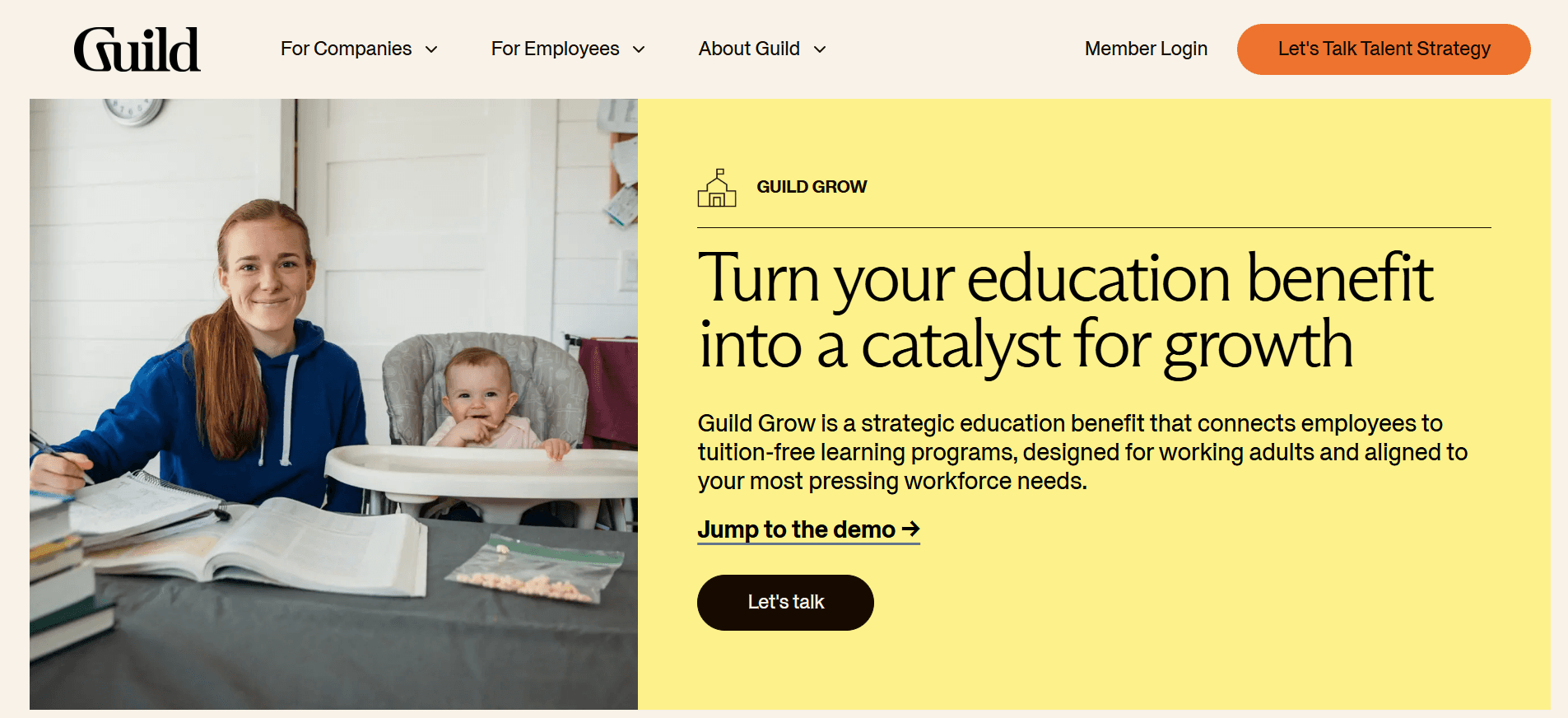
Image source: Guild
Guild lifts corporate learning through a well-crafted website design that strikes the perfect balance between professionalism and availability.
The platform connects employers with education benefits management. Guild's digital presence mirrors its goals with a sophisticated white-and-gold color scheme and striking orange accents.
What makes it impressive?
The homepage shows strategic audience segmentation with dedicated navigation paths for different stakeholders. A clean division between "For Companies" and "For Employees" sections helps visitors find relevant information quickly. This thoughtful approach creates a smooth experience that values the visitor's time and needs.
The visual design showcases minimalism and clarity that reflects its corporate focus yet remains approachable. Guild stands apart from cluttered edtech interfaces. The platform uses whitespace and purposeful layout choices to guide viewers toward essential information.
The most notable aspect of Guild's design lies in its focus on concrete results rather than vague promises. Their homepage displays impressive metrics like "71% lower turnover" and "52% of new hires cite education benefit in job decision". These analytical insights build credibility with business audiences seeking proven solutions.
The site's professional look gets a boost from consistent visual elements. Its main call-to-action, "Speak with a Solutions Expert," targets decision-makers directly. The supporting content stays available to all visitors. Guild maintains this balance between corporate sophistication and educational availability throughout the user experience.
Key takeaway
Guild's website design shows the effectiveness of audience-specific pathways and data visualization. The platform creates a more relevant experience for each visitor type through clear audience segmentation and distinct user paths.
Your own edtech website can learn from how Guild turns complex educational offerings into clear product categories with obvious business benefits. Their success proves that educational platforms in corporate settings must balance professional esthetics with available information architecture. This principle works well for any edtech project serving multiple stakeholder groups.
Numerade
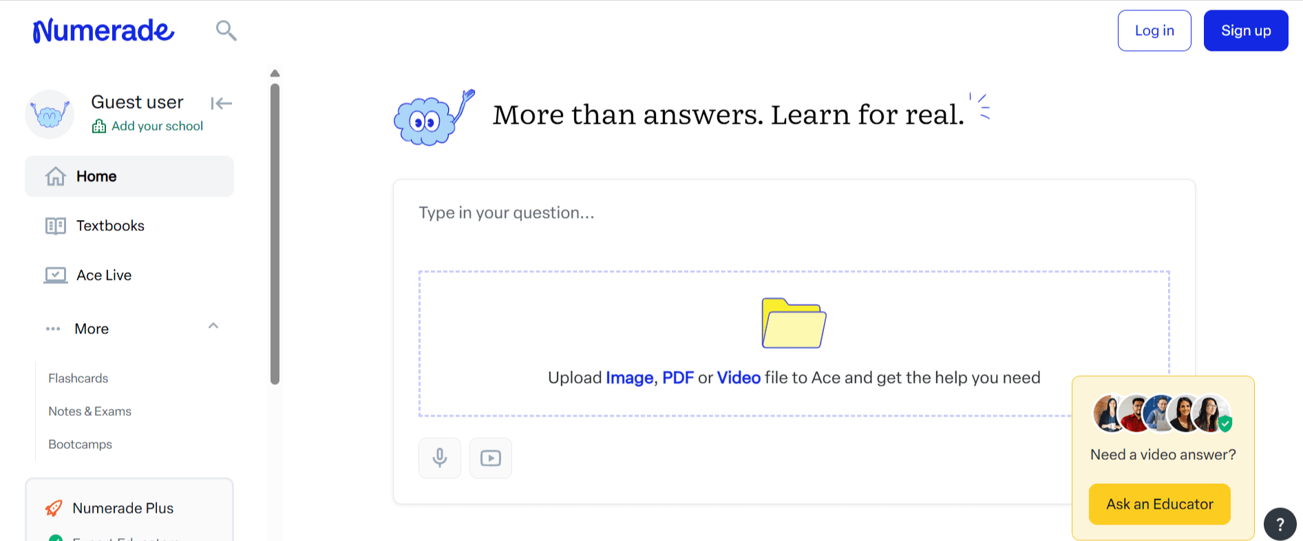
Image source: Numerade website
Numerade stands out among best edtech websites with its AI-enhanced STEM learning interface that combines educator expertise with state-of-the-art. The platform serves over 200 million students worldwide.
Its sleek design makes complex math and science concepts digestible through visual presentation that prioritizes accessibility.
What makes it impressive?
Numerade's interface excellence stems from its steadfast dedication to bite-sized learning. The platform excels with its short-form video format that breaks information into 1-3 minute chunks. This design prevents cognitive overload and boosts retention. The approach lines up with Gen Z's learning priorities while staying rooted in educational science.
Students will notice a clutter-free design that draws attention to learning rather than navigation. Numerade organizes complex STEM content into visually scannable sections with clear hierarchy. Their "SnapSolve" feature showcases this optimized approach—students can photograph a problem and get instant video solutions.
The platform balances AI capabilities with human expertise in its design. The new "Scribe" feature turns recorded lectures into detailed summaries. This creates a valuable tool for students with ADHD and dyslexia. The platform keeps AI as a support to education without replacing the human elements.
The AI-powered flashcards feature shows a thoughtful blend of technology with teaching methods. These flashcards come from Numerade's big repository of educator-created content. This ensures teaching quality and accuracy.
Key takeaway
Numerade's design success teaches us that educational interfaces must balance technological innovation with proven teaching methods. Their approach proves that AI features work best as tools that improve human educational expertise.
Your edtech platform can learn from Numerade's design philosophy. They make complex subjects approachable through visual segmentation and progressive information disclosure. Their soaring win shows that educational websites should put cognitive science principles first in interface design. This creates experiences that complement students' natural learning process.
Babbel
Image source: Babbel
Babbel's website shows how smart design changes can breathe new life into an educational platform. The popular language learning platform has grown from a basic self-study tool into a complete learning ecosystem. It now puts cultural immersion and user participation first.
What makes it impressive?
Babbel's visual design pays close attention to detail. Their modern take on their signature orange creates a lively yet adaptable design system that feels welcoming and high-end. The Feature Text font brings a refined typographic base that makes reading easier—a must-have for language learning interfaces.
The platform goes beyond looks with an accessible interface that guides learners through an uninterrupted learning trip. Babbel smartly blends traditional self-study with live classes, magazine content, and podcasts. This mix adapts to how different people learn. Such thoughtful integration helps avoid the mental overload that many language learning platforms don't deal very well with.
Key takeaway
When designing your own edtech platform, think over how Babbel balances structure with motivation. Their soaring win comes from knowing that good educational platforms must handle both practical skills and emotional needs. Babbel keeps an approachable yet professional tone that challenges learners without overwhelming them.
Babbel shows how educational design should make transformation easier—not just in gaining skills but in how learners view themselves in relation to the world around them.
Newsela
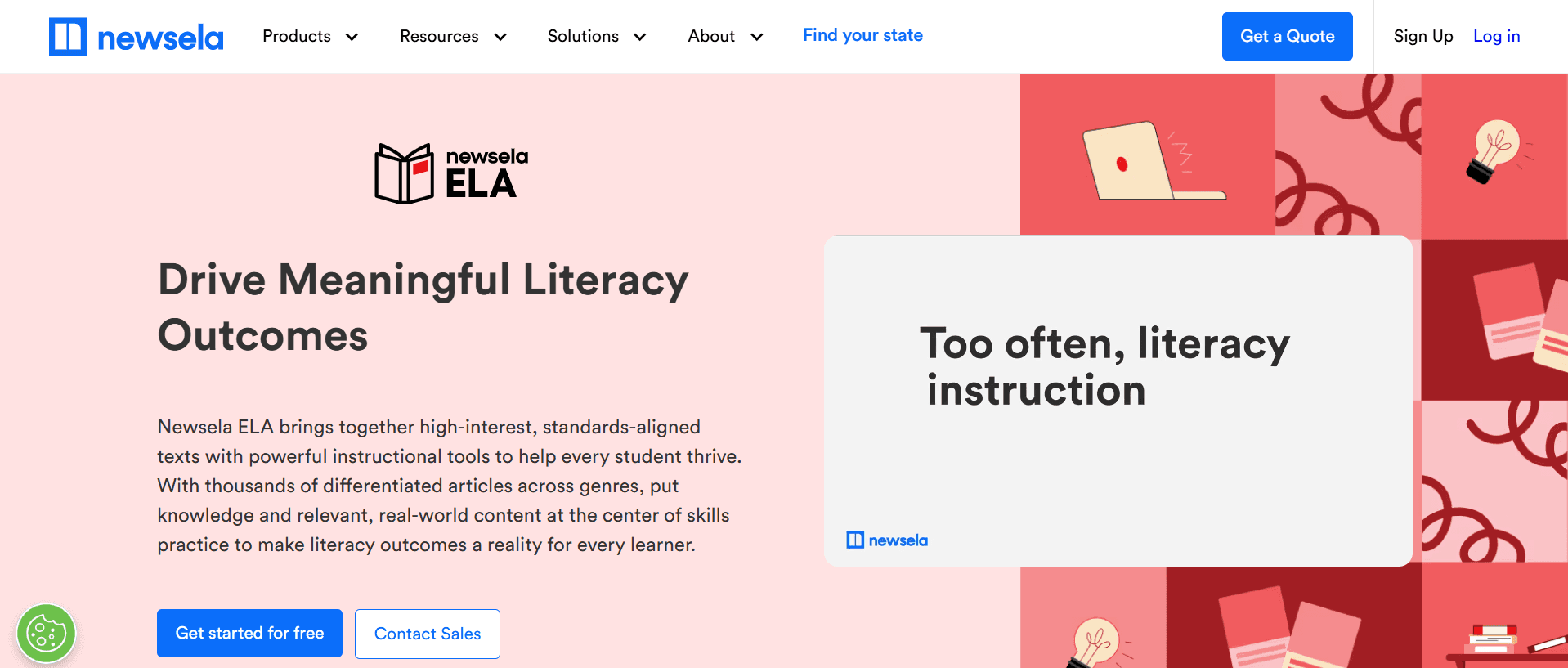
Image source: Newsela
Newsela undertook a bold task in 2013 to revolutionize K-12 reading. They brought reading into the digital era through an instructional content platform that tackles the reading engagement gap.
The platform now reaches 47 million learners and 4 million teachers. 90% of US schools have used its services.
What makes it impressive?
Newsela's clean, well-hosted layout in soft blue tones creates a calm learning environment that appeals to educators and students alike. The website arranges its content into clear subject areas (ELA, Social Studies, Science, Formative). Its user-friendly navigation helps visitors explore deeper without feeling overwhelmed.
Newsela stands out with a remarkable feature—each article comes at five different reading levels. This breakthrough lets all students read the same content without reading ability becoming a barrier. Students can also find one article per day in Spanish, making content available to more learners.
The platform's interface focuses on research-backed educational outcomes. It analyzes eight quizzes and adjusts reading levels automatically to match student abilities. Teachers can still make manual adjustments when needed. This tailored approach recognizes individual learning needs in shared classroom settings.
Key takeaway
Newsela shows how educational websites can blend professional design with teaching effectiveness. Their success speaks volumes—growing 3471% in the year after their category launch and reaching a USD 1.00 billion valuation. This proves that good design combined with teaching breakthroughs drives amazing results.
Your edtech platform could learn from Newsela's adaptive content approach that makes complex information available to different learners. Their design philosophy proves educational websites can be both accessible and visually appealing without compromising content quality.
Clever
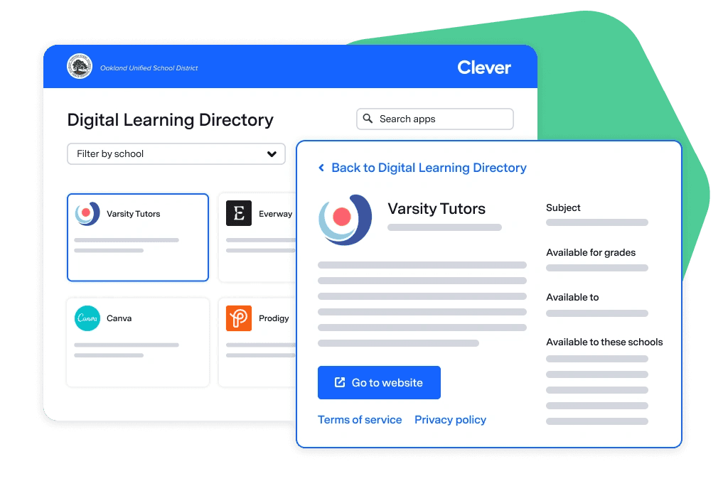
Image source: Clever
Clever builds a secure digital gateway for K-12 education. Their design emphasizes trust and simplicity. The platform serves as an identity management solution that connects schools with learning resources. Their accessible interface provides uninterrupted access while you retain control of security.
What makes it impressive?
Clever's design excellence stems from its professional and accessible layout. The clean white and blue color scheme signals trustworthiness. This visual identity matches its purpose as a secure access point for educational resources perfectly.
The platform shows exceptional care in navigation design. Clear pathways exist for both schools and application partners. Different user types benefit from accessible interfaces - a vital feature for an educational hub.
The website features strategic images of real-life classrooms that add warmth and authenticity. These visual elements do more than add engaging color. They strengthen the platform's educational context naturally.
Clever's design stands out by balancing security with accessibility. Clear calls-to-action like "Log in as a student" and "For schools" direct users efficiently. This simple interface houses powerful features - identity management, rostering, and up-to-the-minute data analysis tools support the educational ecosystem.
Key takeaway
Clever shows how educational websites can blend security with simplicity. Their approach creates clear pathways for different user types without compromising functionality or professional appearance.
The platform thrives because it understands its place in the educational ecosystem. Teachers, students, and parents value how it merges multiple systems without requiring separate logins. This focus on integration should guide any edtech website that connects users with educational resources.
Brilliant
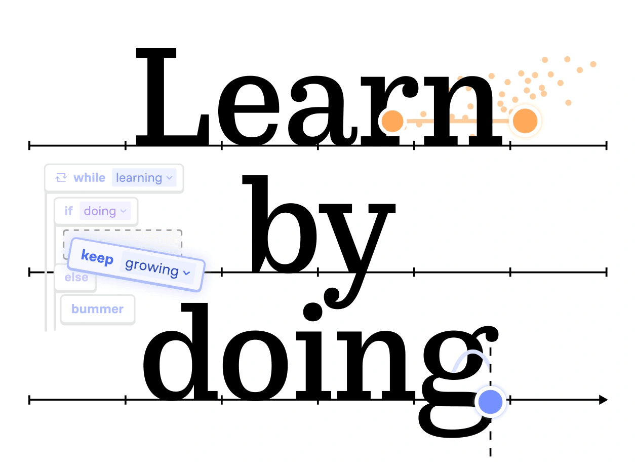
Image source: brilliant.org
Brilliant stands out in the edtech landscape with a unique interface. The platform turns complex learning into a visual trip. Their math and science learning platform shows how smart UI design can reshape educational experiences.
Interactive elements teach and involve users at the same time.
What makes it impressive?
Brilliant's design success comes from balancing looks and function perfectly. A clean, minimalist approach with smart use of white space makes learning elements pop. Each concept appeals more to learners because UI elements have room to breathe.
The platform shines through animations that actually teach something. Unlike decorative flourishes on other websites, Brilliant's interactive parts show how things work. They guide users smoothly without pulling focus from learning.
Brilliant knows digital interfaces should leave lasting memories. Their fresh take guides users to better results through designs that mix fun with learning. This focus on emotional connections encourages deeper involvement with tough math and science concepts.
Key takeaway
Your own educational website design can learn from Brilliant's proof that simple means sophisticated. Their soaring win shows "less is more" works when done right. They cut out extras to zero in on what users really need.
The platform proves educational interfaces work better with user-friendly design instead of too much explanation. Brilliant's approach shows educational websites work best when they aid natural learning trips.
s
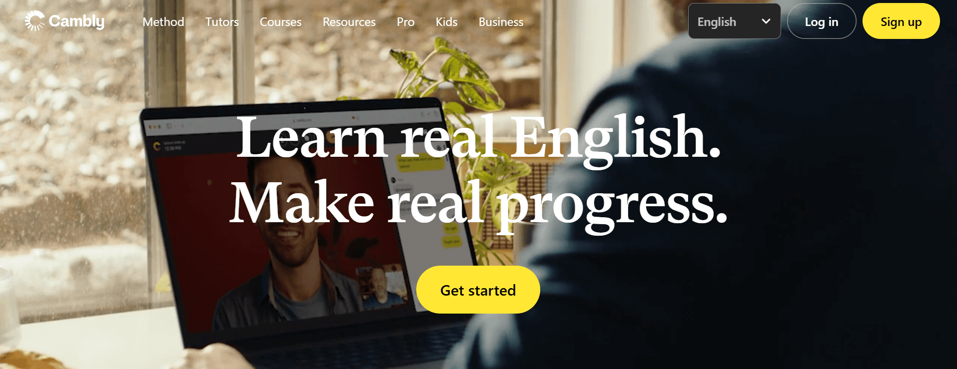
Image source: Cambly website
Cambly engages users with its welcoming interface that transforms language learning into a friendly chat rather than a formal lesson. The platform's bright white and yellow colors create an energetic, welcoming feel that sets it apart from traditional language learning websites.
What makes it impressive?
The site's visual design strikes a perfect balance between being accessible and engaging. Friendly images of tutors and students greet visitors and create an emotional bond right away. This people-first approach, rather than focusing on software features, helps reduce the stress many people feel when learning a new language.
The platform goes beyond good looks. Its goal-focused interface creates customized starting points by asking "What are your learning goals?" This smart approach strikes a chord with students from different backgrounds. Well-placed main buttons like "Get started," "Start learning," and "Explore tutors" make it easy to participate without overwhelming anyone.
Cambly's design makes progress feel within reach. Clear pricing options for different learning paths and testimonial slideshows with actual users and tutors build trust while showing flexibility. The mobile app builds on this user-focused design and lets students "take lessons from anywhere".
Key takeaway
Your own edtech website should learn from how Cambly shows that handling emotional barriers matters just as much as teaching skills.
Their design succeeds because they understand language learning needs more than features—it needs safe spaces where mistakes become chances to learn "without fear or judgment".
Conclusion
These outstanding edtech website designs reveal several key patterns that make them special. The best designs create a perfect balance between looking good and working well. Grammarly's emotionally intelligent interface and Brilliant's immersive visual experiences show how smart design boosts learning without becoming a distraction.
Successful edtech platforms make accessibility their priority while keeping things sophisticated. Newsela's five reading levels and Thinkific's modular approach prove how accessible design helps different types of learners while maintaining a professional look. Guild and Clever's examples show the value of personalized pathways by creating unique experiences for different users.
These examples are a great way to get insights for creating interfaces that help users participate, convert, and have meaningful educational experiences, whether you're building something new or updating an existing platform.
If you're looking to leverage this list of the best edtech website designs as inspiration, and get your own edtech website designed for a seamless user experience (and conversions) — Bricx can be the right design partner for you.
To know more about how we can help, and to design edtech websites that convert into actual users — book a call now!
FAQs
What are the key elements of effective edtech website design in 2026?
Effective edtech website design in 2026 focuses on clear value propositions, intuitive navigation, mobile-first layouts, and engaging visuals.
It also incorporates AI-driven personalization, accessibility features, and motivational calls-to-action to enhance user experience and drive conversions.
How can edtech websites balance functionality with user-friendly design?
Edtech websites can balance functionality and user-friendliness by prioritizing clean layouts, intuitive navigation, and progressive disclosure of information.
They should focus on core features while tucking advanced options into easily accessible menus, ensuring a clutter-free main interface that doesn't overwhelm users.
What role does storytelling play in edtech website design?
Storytelling is crucial in edtech website design as it helps transform abstract educational concepts into relatable experiences.
Through narratives, case studies, and user testimonials, websites can demonstrate how their platform solves real educational challenges, making the learning journey more engaging and meaningful for users.
What design elements can help build trust in edtech platforms?
Trust-building design elements for edtech platforms include clear presentation of credentials and partnerships, user testimonials, data-driven success metrics, and transparent pricing information.
Additionally, implementing robust security features and showcasing privacy policies can further enhance user confidence in the platform.
Great edtech website designs go beyond esthetics—they convert visitors, help learners participate and establish instant credibility. Research shows that 94% of a website's first impressions relate to design, which makes your digital storefront significant to success.
Educational website design carries even higher stakes. Most potential students, parents, and educators first connect through a website. Today's user expectations keep evolving, and features like AI-driven personalization and adaptive learning paths have become standard requirements rather than unique differentiators.
We've handpicked 11 exceptional edtech websites that perfectly balance visual appeal and functionality. These examples offer practical ideas you can implement immediately, whether you plan to redesign your platform or build one from scratch.
What Makes a Great EdTech Website Design?
Building a good educational platform needs more than just eye-catching designs and fancy animations. The best edtech websites strike a perfect balance between user experience and educational goals. They also meet the specific needs of both learners and educators.
Given below, are some key elements that constitute a great edtech website design:
Clear value proposition and simple onboarding
The success of any edtech website starts with a crystal-clear value proposition. Your website should answer one simple question: "What problem does this solve for me?" The most successful educational websites present their purpose directly without hiding it behind complex navigation or fancy words.
Research shows that companies who use a well-defined value proposition that lines up with customer needs are 1.5 times more likely to launch successful products. This becomes even more important in today's competitive digital world where users decide in seconds whether to stay on your platform.
Good onboarding should be simple. Create a path that shows users your key features and highlights what makes your platform special. Your website's purpose should shape every design choice. This helps visitors see how you can solve their educational problems.
Use of storytelling, visuals, and social proof
People retain visual information better than text. This makes visual elements key to explaining concepts and instructions. Good edtech websites use this principle by adding meaningful images, videos, and infographics that help users learn better.
Stories can turn complex educational ideas into simple experiences. You can show how your platform fixes real educational problems through stories, case studies, and user feedback. On top of that, it builds trust when you include user reviews, strategic collaborations, and success metrics.
The right mix matters: too many visuals can confuse users and weaken your message. Smart edtech websites place visual elements carefully to draw attention to important information and action buttons.
Intuitive navigation and clutter-free design
Your website needs a consistent layout across all pages. Menus, headers, and search functions should stay in the same spots. This helps users find their way around without having to relearn where everything is.
Simple navigation leads to better learning results. Here are some key navigation principles:
Put important items at the start and end of menu lists to use the "serial position effect"
Use clear labels that show purpose
Add a visible search function on every page
Split long content with headings and table of contents
Studies show that 94% of users think easy navigation matters most on websites. This becomes even more vital for education sites because complex navigation takes focus away from learning.
Available and mobile-first layout
Gen Z uses phones as their main device 75% of the time, making mobile-first design essential. They won't wait around—60% leave sites that load slowly and 62% quit websites that are hard to use.
Making your site available helps create learning spaces for everyone. Features like screen reader support, keyboard navigation, and adjustable text sizes help all learners access your content whatever their abilities. This approach grows your audience and shows your dedication to fair education.
Motivational CTAs for sign-ups or demos
Good calls-to-action help users take the next step. Button-shaped CTAs get 45% more clicks than text links. Center-aligned CTAs work better too—they get up to 680% more clicks than those placed on sides.
Put your main CTAs at the top of the page where they get 73% visibility (compared to 44% below). Educational platforms see better results with action phrases like "Start Your Learning" or "See Yourself Here" instead of basic "Learn More" buttons.
These work best when you match them to specific audiences and where they are in their decision process.
10 Best Edtech Website Design Examples to Take Inspiration From: A List
Based on our research & observations, given below are some of the best edtech website designs in the industry currently:
Grammarly
Image source: Grammarly
Grammarly distinguishes itself among educational technology platforms through a design that perfectly balances functionality with emotional intelligence. The platform feels more like a friendly writing companion than a strict English teacher with red pen in hand.
What makes it impressive?
Grammarly's design success comes from its thoughtful approach to what could be an uncomfortable user experience. The platform needs to point out mistakes, yet its interface balances criticism with positive feedback and beautiful visual elements.
The color scheme plays a vital role—Grammarly uses white space with blue and green accents that users subconsciously associate with peace and trust. This creates a UI that helps users feel comfortable as the tool analyzes their writing.
The platform does an excellent job of keeping things simple. Users can find advanced features like "document insights" and "set goals" neatly organized in the side navigation. The main interface stays clean while these additional tools remain available. Users can focus on improving their writing without feeling overwhelmed.
Micro-animations add another layer of excellence to the design. These subtle visual responses to user actions might seem small, but they improve the experience and make engagement easier. A clinical editing session turns into an interactive and satisfying experience.
Grammarly's interface shows deep empathy in its design approach. The company knew they needed to build trust through elegant, welcoming, and intuitive design to help shape someone's communication. The design team created delightful moments that capture users' imagination, even when the product doesn't have suggestions.
Key takeaway
Grammarly teaches us that educational tools handling sensitive tasks must balance functionality with emotional intelligence. Your edtech platform should recognize user vulnerabilities while showing clear paths to improvement.
Grammarly works because its design feels natural to users—whether they write in Gmail, Facebook, or Reddit. The uninterrupted integration in platforms builds trust and encourages regular use. Your edtech design should create interfaces that feel like natural extensions of users' digital world rather than intrusive additions.
Padlet
Image source: Padlet
Padlet has revolutionized collaborative learning with its striking digital workspace design. This virtual bulletin board offers a user-friendly canvas where ideas flow naturally between participants. Users love it, as shown by stellar ratings 4.9 on G2.com, 4.6 on App Store, 4.9 on Capterra, and 4.8 on Google Play.
What makes it impressive?
The platform's interface stands out through smart design choices that put visual organization first. Users can choose from multiple layouts like grid, timeline, map, and discussion formats that adapt smoothly to different educational needs. Teachers and students can organize information visually in ways that work best for their learning goals.
Padlet's design creates a genuine sense of psychological safety. Students can share ideas anonymously, which makes them feel secure and judgment-free. This approach leads to more honest and constructive peer feedback, which proves especially valuable in classroom settings.
The platform's focus on accessibility also sets it apart. It meets current accessibility standards, making learning relevant to students from different cultures, backgrounds, and abilities. Users can access features like closed captioning, speed control, and contrast adaptability.
The platform has added AI capabilities that show its leadership in edtech design. "Magic Padlet" uses generative AI to build complete boards from brief descriptions, while "AI Recipes" makes it easier to create content for specific educational needs. These features show how good design can blend technology with teaching methods.
Key takeaway
Padlet's success comes from understanding that visual organization makes collaborative learning better. With 40 million users worldwide, the platform shows how user-friendly design can build trust and help develop collaborative learning skills.
When building your own edtech website, look at how Padlet balances flexibility with structure. Students can reflect and respond at their own pace, which leads to deeper and more thoughtful discussions. On top of that, its analytics features give valuable insights while protecting privacy. This approach shows how educational platforms can balance evidence-based insights with user confidentiality.
Thinkific
Image source: Thinkific
Thinkific stands out in the edtech space with its easy-to-use design approach. The platform helps entrepreneurs build successful online education businesses. The platform supports over 35K+ businesses that have earned $3.70B through online courses.
Thinkific's website design shows how clarity and customization can lead to educational success.
What makes it impressive?
Thinkific's design philosophy strikes the perfect balance between simplicity and functionality. Many learning management systems are complex, but Thinkific uses a modular approach to website building. This makes creating professional-looking pages easy even for non-designers. Course creators can focus on their content instead of dealing with technical issues.
Thinkific's interface highlights several design practices worth copying for your edtech website. The platform maintains clear, consistent naming conventions and visual elements. The dashboard displays important metrics like revenue, leads, and new accounts up front. This lets educators check their business performance quickly.
The platform's navigation system has been redesigned to show thoughtful development. It includes collapsible menus that save screen space and group features logically. This smart organization prevents users from feeling overwhelmed by the platform's many features.
Key takeaway
Thinkific's design success teaches us that educational platforms should give users control without making things complicated. Their approach shows that powerful features don't need complex interfaces—a valuable lesson for all edtech website designs.
Your educational platform can learn from how Thinkific balances robust features with easy navigation. Their success proves that educational website design should enable creators through simplicity rather than overwhelming them with choices. Thinkific's design philosophy states it best: "you shouldn't have to be a designer to build a beautiful website"—a principle that any edtech project should follow.
Guild
Image source: Guild
Guild lifts corporate learning through a well-crafted website design that strikes the perfect balance between professionalism and availability.
The platform connects employers with education benefits management. Guild's digital presence mirrors its goals with a sophisticated white-and-gold color scheme and striking orange accents.
What makes it impressive?
The homepage shows strategic audience segmentation with dedicated navigation paths for different stakeholders. A clean division between "For Companies" and "For Employees" sections helps visitors find relevant information quickly. This thoughtful approach creates a smooth experience that values the visitor's time and needs.
The visual design showcases minimalism and clarity that reflects its corporate focus yet remains approachable. Guild stands apart from cluttered edtech interfaces. The platform uses whitespace and purposeful layout choices to guide viewers toward essential information.
The most notable aspect of Guild's design lies in its focus on concrete results rather than vague promises. Their homepage displays impressive metrics like "71% lower turnover" and "52% of new hires cite education benefit in job decision". These analytical insights build credibility with business audiences seeking proven solutions.
The site's professional look gets a boost from consistent visual elements. Its main call-to-action, "Speak with a Solutions Expert," targets decision-makers directly. The supporting content stays available to all visitors. Guild maintains this balance between corporate sophistication and educational availability throughout the user experience.
Key takeaway
Guild's website design shows the effectiveness of audience-specific pathways and data visualization. The platform creates a more relevant experience for each visitor type through clear audience segmentation and distinct user paths.
Your own edtech website can learn from how Guild turns complex educational offerings into clear product categories with obvious business benefits. Their success proves that educational platforms in corporate settings must balance professional esthetics with available information architecture. This principle works well for any edtech project serving multiple stakeholder groups.
Numerade
Image source: Numerade website
Numerade stands out among best edtech websites with its AI-enhanced STEM learning interface that combines educator expertise with state-of-the-art. The platform serves over 200 million students worldwide.
Its sleek design makes complex math and science concepts digestible through visual presentation that prioritizes accessibility.
What makes it impressive?
Numerade's interface excellence stems from its steadfast dedication to bite-sized learning. The platform excels with its short-form video format that breaks information into 1-3 minute chunks. This design prevents cognitive overload and boosts retention. The approach lines up with Gen Z's learning priorities while staying rooted in educational science.
Students will notice a clutter-free design that draws attention to learning rather than navigation. Numerade organizes complex STEM content into visually scannable sections with clear hierarchy. Their "SnapSolve" feature showcases this optimized approach—students can photograph a problem and get instant video solutions.
The platform balances AI capabilities with human expertise in its design. The new "Scribe" feature turns recorded lectures into detailed summaries. This creates a valuable tool for students with ADHD and dyslexia. The platform keeps AI as a support to education without replacing the human elements.
The AI-powered flashcards feature shows a thoughtful blend of technology with teaching methods. These flashcards come from Numerade's big repository of educator-created content. This ensures teaching quality and accuracy.
Key takeaway
Numerade's design success teaches us that educational interfaces must balance technological innovation with proven teaching methods. Their approach proves that AI features work best as tools that improve human educational expertise.
Your edtech platform can learn from Numerade's design philosophy. They make complex subjects approachable through visual segmentation and progressive information disclosure. Their soaring win shows that educational websites should put cognitive science principles first in interface design. This creates experiences that complement students' natural learning process.
Babbel
Image source: Babbel
Babbel's website shows how smart design changes can breathe new life into an educational platform. The popular language learning platform has grown from a basic self-study tool into a complete learning ecosystem. It now puts cultural immersion and user participation first.
What makes it impressive?
Babbel's visual design pays close attention to detail. Their modern take on their signature orange creates a lively yet adaptable design system that feels welcoming and high-end. The Feature Text font brings a refined typographic base that makes reading easier—a must-have for language learning interfaces.
The platform goes beyond looks with an accessible interface that guides learners through an uninterrupted learning trip. Babbel smartly blends traditional self-study with live classes, magazine content, and podcasts. This mix adapts to how different people learn. Such thoughtful integration helps avoid the mental overload that many language learning platforms don't deal very well with.
Key takeaway
When designing your own edtech platform, think over how Babbel balances structure with motivation. Their soaring win comes from knowing that good educational platforms must handle both practical skills and emotional needs. Babbel keeps an approachable yet professional tone that challenges learners without overwhelming them.
Babbel shows how educational design should make transformation easier—not just in gaining skills but in how learners view themselves in relation to the world around them.
Newsela
Image source: Newsela
Newsela undertook a bold task in 2013 to revolutionize K-12 reading. They brought reading into the digital era through an instructional content platform that tackles the reading engagement gap.
The platform now reaches 47 million learners and 4 million teachers. 90% of US schools have used its services.
What makes it impressive?
Newsela's clean, well-hosted layout in soft blue tones creates a calm learning environment that appeals to educators and students alike. The website arranges its content into clear subject areas (ELA, Social Studies, Science, Formative). Its user-friendly navigation helps visitors explore deeper without feeling overwhelmed.
Newsela stands out with a remarkable feature—each article comes at five different reading levels. This breakthrough lets all students read the same content without reading ability becoming a barrier. Students can also find one article per day in Spanish, making content available to more learners.
The platform's interface focuses on research-backed educational outcomes. It analyzes eight quizzes and adjusts reading levels automatically to match student abilities. Teachers can still make manual adjustments when needed. This tailored approach recognizes individual learning needs in shared classroom settings.
Key takeaway
Newsela shows how educational websites can blend professional design with teaching effectiveness. Their success speaks volumes—growing 3471% in the year after their category launch and reaching a USD 1.00 billion valuation. This proves that good design combined with teaching breakthroughs drives amazing results.
Your edtech platform could learn from Newsela's adaptive content approach that makes complex information available to different learners. Their design philosophy proves educational websites can be both accessible and visually appealing without compromising content quality.
Clever
Image source: Clever
Clever builds a secure digital gateway for K-12 education. Their design emphasizes trust and simplicity. The platform serves as an identity management solution that connects schools with learning resources. Their accessible interface provides uninterrupted access while you retain control of security.
What makes it impressive?
Clever's design excellence stems from its professional and accessible layout. The clean white and blue color scheme signals trustworthiness. This visual identity matches its purpose as a secure access point for educational resources perfectly.
The platform shows exceptional care in navigation design. Clear pathways exist for both schools and application partners. Different user types benefit from accessible interfaces - a vital feature for an educational hub.
The website features strategic images of real-life classrooms that add warmth and authenticity. These visual elements do more than add engaging color. They strengthen the platform's educational context naturally.
Clever's design stands out by balancing security with accessibility. Clear calls-to-action like "Log in as a student" and "For schools" direct users efficiently. This simple interface houses powerful features - identity management, rostering, and up-to-the-minute data analysis tools support the educational ecosystem.
Key takeaway
Clever shows how educational websites can blend security with simplicity. Their approach creates clear pathways for different user types without compromising functionality or professional appearance.
The platform thrives because it understands its place in the educational ecosystem. Teachers, students, and parents value how it merges multiple systems without requiring separate logins. This focus on integration should guide any edtech website that connects users with educational resources.
Brilliant
Image source: brilliant.org
Brilliant stands out in the edtech landscape with a unique interface. The platform turns complex learning into a visual trip. Their math and science learning platform shows how smart UI design can reshape educational experiences.
Interactive elements teach and involve users at the same time.
What makes it impressive?
Brilliant's design success comes from balancing looks and function perfectly. A clean, minimalist approach with smart use of white space makes learning elements pop. Each concept appeals more to learners because UI elements have room to breathe.
The platform shines through animations that actually teach something. Unlike decorative flourishes on other websites, Brilliant's interactive parts show how things work. They guide users smoothly without pulling focus from learning.
Brilliant knows digital interfaces should leave lasting memories. Their fresh take guides users to better results through designs that mix fun with learning. This focus on emotional connections encourages deeper involvement with tough math and science concepts.
Key takeaway
Your own educational website design can learn from Brilliant's proof that simple means sophisticated. Their soaring win shows "less is more" works when done right. They cut out extras to zero in on what users really need.
The platform proves educational interfaces work better with user-friendly design instead of too much explanation. Brilliant's approach shows educational websites work best when they aid natural learning trips.
s
Image source: Cambly website
Cambly engages users with its welcoming interface that transforms language learning into a friendly chat rather than a formal lesson. The platform's bright white and yellow colors create an energetic, welcoming feel that sets it apart from traditional language learning websites.
What makes it impressive?
The site's visual design strikes a perfect balance between being accessible and engaging. Friendly images of tutors and students greet visitors and create an emotional bond right away. This people-first approach, rather than focusing on software features, helps reduce the stress many people feel when learning a new language.
The platform goes beyond good looks. Its goal-focused interface creates customized starting points by asking "What are your learning goals?" This smart approach strikes a chord with students from different backgrounds. Well-placed main buttons like "Get started," "Start learning," and "Explore tutors" make it easy to participate without overwhelming anyone.
Cambly's design makes progress feel within reach. Clear pricing options for different learning paths and testimonial slideshows with actual users and tutors build trust while showing flexibility. The mobile app builds on this user-focused design and lets students "take lessons from anywhere".
Key takeaway
Your own edtech website should learn from how Cambly shows that handling emotional barriers matters just as much as teaching skills.
Their design succeeds because they understand language learning needs more than features—it needs safe spaces where mistakes become chances to learn "without fear or judgment".
Conclusion
These outstanding edtech website designs reveal several key patterns that make them special. The best designs create a perfect balance between looking good and working well. Grammarly's emotionally intelligent interface and Brilliant's immersive visual experiences show how smart design boosts learning without becoming a distraction.
Successful edtech platforms make accessibility their priority while keeping things sophisticated. Newsela's five reading levels and Thinkific's modular approach prove how accessible design helps different types of learners while maintaining a professional look. Guild and Clever's examples show the value of personalized pathways by creating unique experiences for different users.
These examples are a great way to get insights for creating interfaces that help users participate, convert, and have meaningful educational experiences, whether you're building something new or updating an existing platform.
If you're looking to leverage this list of the best edtech website designs as inspiration, and get your own edtech website designed for a seamless user experience (and conversions) — Bricx can be the right design partner for you.
To know more about how we can help, and to design edtech websites that convert into actual users — book a call now!
FAQs
What are the key elements of effective edtech website design in 2026?
Effective edtech website design in 2026 focuses on clear value propositions, intuitive navigation, mobile-first layouts, and engaging visuals.
It also incorporates AI-driven personalization, accessibility features, and motivational calls-to-action to enhance user experience and drive conversions.
How can edtech websites balance functionality with user-friendly design?
Edtech websites can balance functionality and user-friendliness by prioritizing clean layouts, intuitive navigation, and progressive disclosure of information.
They should focus on core features while tucking advanced options into easily accessible menus, ensuring a clutter-free main interface that doesn't overwhelm users.
What role does storytelling play in edtech website design?
Storytelling is crucial in edtech website design as it helps transform abstract educational concepts into relatable experiences.
Through narratives, case studies, and user testimonials, websites can demonstrate how their platform solves real educational challenges, making the learning journey more engaging and meaningful for users.
What design elements can help build trust in edtech platforms?
Trust-building design elements for edtech platforms include clear presentation of credentials and partnerships, user testimonials, data-driven success metrics, and transparent pricing information.
Additionally, implementing robust security features and showcasing privacy policies can further enhance user confidence in the platform.


Similar Blogs
Similar Blogs
Similar Blogs


Available for Work
Bricx
© Bricx, 2026. All rights reserved.


Available for Work
Bricx
© Bricx, 2026. All rights reserved.
Available for Work
Bricx
© Bricx, 2026. All rights reserved.
Available for Work
Bricx
© Bricx, 2026. All rights reserved.