


Website Design
Website Design
Website Design
Practices
Practices
Practices
October 13, 2025
October 13, 2025
October 13, 2025
Website Design for Software Company That Converts | Boost Results
Website Design for Software Company That Converts | Boost Results
Website Design for Software Company That Converts | Boost Results
Explore expert website design for software companies to boost conversions. Discover essential UX, UI, and strategies to transform visitors into customers.
Explore expert website design for software companies to boost conversions. Discover essential UX, UI, and strategies to transform visitors into customers.
Explore expert website design for software companies to boost conversions. Discover essential UX, UI, and strategies to transform visitors into customers.
4 mins
4 mins
4 mins
A great website for a software company does more than just look good. It's a strategic tool designed to build credibility, bring in leads, and ultimately, close deals. Your website is, in effect, your best salesperson—one that works around the clock to make a perfect first impression and turn curious visitors into paying customers.
Your Website Is Your #1 Sales Rep

Think about it: a potential client lands on your homepage. In a fraction of a second, they’re forming an opinion not just about your site, but about the quality and sophistication of your software. This snap judgment is your "digital handshake," and it sets the stage for everything that follows.
A clunky or confusing website immediately raises red flags. The unspoken message is powerful: if they can't get their own website right, how can I possibly trust them with my business-critical software?
First impressions are almost entirely visual. In fact, 94% of a user's first impression is tied directly to your site's design. For a software company, the stakes are even higher. A thoughtfully designed user experience (UX) can boost your conversion rates by an incredible 400%. That’s a direct line from an intuitive interface to convincing a client that your product is the right choice. For an even deeper dive, explore our web design insights for startups to see just how critical these first moments are.
More Than a Digital Brochure
Your website isn't a static flyer—it's the heart of your growth strategy. Its main job is to take your complex technical solution and translate it into a clear, compelling story that connects with your ideal customer, whether that's a CTO, a project manager, or a hands-on developer.
A great software website doesn't just display information. It builds immediate trust, articulates complex solutions with clarity, and guides technical buyers toward a confident decision.
Striking the right balance is key. The design needs to be polished enough to scream "professional," but simple enough that users can find what they need without a second thought. Every single element, from the navigation bar to the call-to-action buttons, has to work together to create a smooth, frictionless path for the user.
Core Pillars of a High-Converting Software Website
To turn your website into a powerful sales tool, you need to focus on a few essential components. I like to think of them as the core pillars that support a high-performing site. Each one plays a critical role in building confidence and encouraging visitors to take the next step.
Here’s a quick breakdown of what makes a software company’s website truly effective.
Pillar | Primary Goal | Key Elements |
|---|---|---|
Credibility | Build immediate trust | Professional branding, customer logos, testimonials, case studies |
Clarity | Explain complex software simply | Clear value proposition, concise feature descriptions, product screenshots |
Guidance | Lead users to conversion | Intuitive navigation, clear calls-to-action (CTAs), logical user flow |
Performance | Ensure a seamless experience | Fast loading speeds, mobile responsiveness, secure hosting |
Get these four pillars right, and you're not just building a website. You're building a machine that consistently builds trust and drives growth for your business.
Building Your Strategic Design Blueprint
Great website design for a software company doesn't start with picking out colors and fonts. It starts with a rock-solid strategy.
Think of it like building a skyscraper. You'd never start pouring concrete without a detailed architectural blueprint. Your website is no different—every single decision has to be deliberate, purposeful, and tied directly to your core business goals.
This blueprint makes sure your design isn't just a pretty face. It's an engine built to attract the right people and gently nudge them toward taking action. So many companies skip this foundational step, and they end up with a site that looks good but does nothing for their bottom line. That's a surefire way to lose valuable leads and revenue.
Before a single pixel gets placed, you have to be crystal clear on who you're talking to, what you're offering them, and what you want them to do next. This is how your website transforms from a digital brochure into a strategic asset that works around the clock for your business.
Define Your Precise Target Audience
The very first step in any effective design is knowing your audience inside and out. Are you selling to a Chief Technology Officer (CTO), a project manager, or a hands-on developer? Each of these people has completely different priorities, pain points, and levels of technical know-how.
A CTO, for instance, is probably most concerned with security, scalability, and ROI. A project manager, on the other hand, likely cares more about integration capabilities, team collaboration features, and efficiency gains. And the developer? They’re probably diving straight into your API documentation and judging you on ease of implementation. Your website's language, visuals, and flow must speak directly to the person you want to attract.
To get this clarity, you need to create detailed user personas. These are fictional profiles of your ideal customers, built from real data and market research. Give them names, job titles, goals, and challenges. This simple exercise makes your audience feel real, helping your design and content teams create an experience that truly connects.
Clarify Your Unique Value Proposition
Okay, so you know who you’re talking to. Now you need to perfect your message. Your Unique Value Proposition (UVP) is a clear, punchy statement that spells out the benefit you offer, how you solve your customer's biggest problem, and what makes you different from everyone else. In the noisy software market, a weak UVP means you’re instantly forgettable.
Your UVP should be front and center on your homepage, immediately answering three critical questions for any visitor:
What is this product?
Who is it for?
Why should I care?
Your website has to communicate your value so clearly that a first-time visitor instantly gets how your software makes their life better. This isn’t about listing features; it’s about articulating outcomes.
This infographic shows how these core strategic pillars—audience, value, and journey—form the very foundation of your design blueprint.
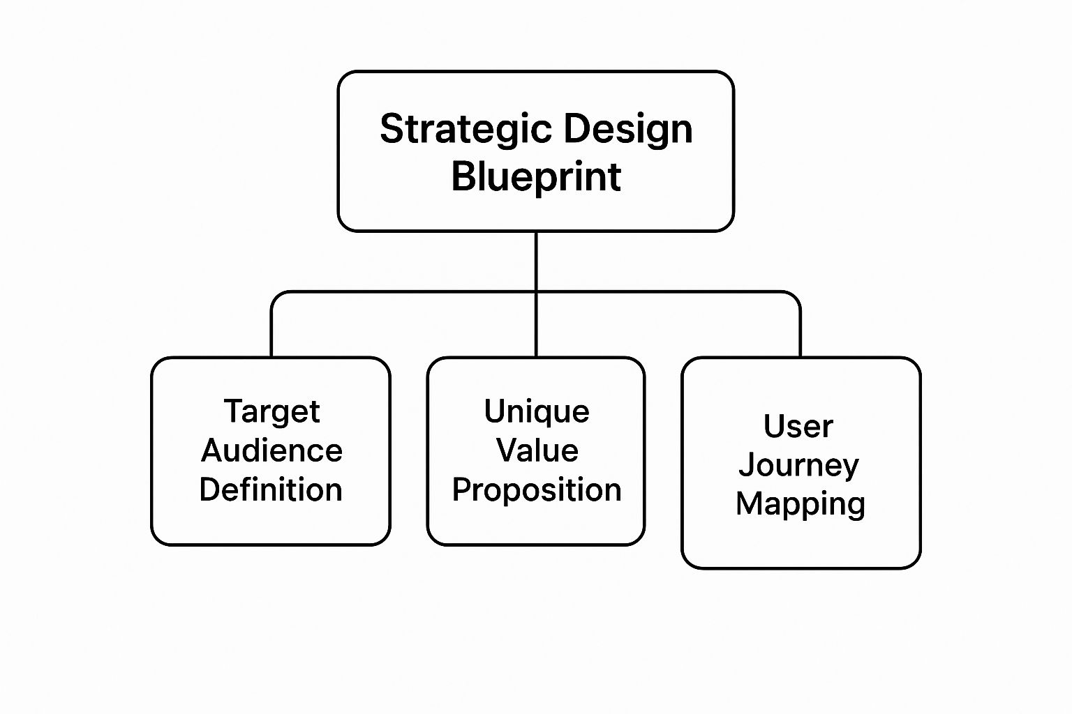
As you can see, a successful plan is built on a deep understanding of your audience, a compelling value proposition, and a user journey that has been meticulously planned out.
Map the Ideal User Journey
With your audience and UVP nailed down, the final piece of the puzzle is mapping out the user journey. This means outlining the ideal path a visitor takes, from the second they land on your site to the moment they convert—whether that’s requesting a demo, starting a free trial, or getting in touch with sales.
Think through all the key touchpoints. What information does someone need on the homepage to get them to click to a features page? What social proof, like case studies or testimonials, do they need to see before they feel comfortable checking out your pricing? Every step should feel logical and intuitive, guiding them closer to a decision without any friction. It's essential to get all these requirements down on paper, and you can learn more about what is in a design brief to help structure this whole process.
Finally, set some Key Performance Indicators (KPIs) to measure what success actually looks like. These could be metrics like demo request form submissions, free trial sign-ups, or even the time spent on key pages. When you align your KPIs with your business goals, you ensure your design is not just a creative exercise but a measurable driver of growth.
Designing UX and UI for Complex Software

When your business is built on complex software, your website can't just be a pretty brochure. It has a much harder job: it needs to make the complicated feel simple. This is where the crucial partnership of User Experience (UX) and User Interface (UI) takes center stage.
Think of it this way: UI is the sleek dashboard of a high-tech car—all the buttons, dials, and screens. It's what you see. But UX is the engineering that makes you instinctively know how to turn on the headlights or adjust the temperature without ever opening the manual. It's what you feel.
A stunning UI without a smart UX is all style and no substance. It looks great, but it's a nightmare to actually use. For software websites, where the product itself can be intimidating, the goal is to guide visitors on an effortless journey, not throw them into a maze.
Crafting a Logical Information Architecture
The bedrock of any great user experience is its Information Architecture (IA). In simple terms, IA is the art of organizing everything on your website so that people can find what they need, when they need it, without thinking too hard. For a software site, this means creating a seamless path from the homepage to deep-dive content like feature lists, developer docs, or the pricing page.
Imagine your website as a massive library. A good IA is like having a perfectly organized card catalog and clear signage, guiding you straight to the right aisle and shelf. A bad IA is like throwing all the books in a pile and wishing your visitors good luck. They won't stick around for long.
To get your IA right, focus on a few key things:
Clear Navigation: Keep your main menu simple. Use words everyone understands, like "Features," "Pricing," and "Integrations," instead of clever but confusing marketing jargon.
Logical Grouping: Put related content together. Case studies, testimonials, and customer success stories should all be easy to find in a section like "Customers" or "Our Work."
A Powerful Search Bar: If your site has a lot of documentation or resources, a great search function isn't a luxury—it's a necessity.
The Power of a Consistent Design Language
Once you’ve got a solid structure, a consistent design language is what ties it all together visually. This means using the same colors, fonts, button styles, and icons on every single page. Why? Because consistency lowers the mental effort required from your users. They don't have to relearn how to navigate every time they click a new link.
A consistent design language builds visual trust. When every element feels familiar and predictable, users perceive your software product as more stable, reliable, and professional.
This goes beyond just the visuals, too. Your writing style and tone of voice should feel just as cohesive. To see this in action, it helps to look at examples. A well-crafted dashboard design moodboard can show you how different visual elements can come together to create a unified, intuitive experience.
Avoiding Common UX and UI Pitfalls
Even with the best intentions, it's easy to fall into common design traps. Research highlights that overcrowded layouts (84.6%) and missing calls-to-action (38.5%) are two of the biggest offenders that kill user engagement. And when you consider that over 70% of users skim content instead of reading it, a cluttered interface is a guaranteed way to lose them.
The principles that make a great product are the same ones that make a great website. Applying solid onboarding UX design principles right from the first website visit can set the stage for better user adoption and loyalty down the road.
Here are a few mistakes to actively avoid:
Jargon-Filled Copy: Never assume visitors know your internal lingo. Write for your customers, focusing on the problems you solve for them in their language.
Overwhelming Layouts: Give your content room to breathe! Generous use of white space makes your key messages and calls-to-action pop, naturally guiding the user's eye.
Lack of Interactivity: Software is alive and dynamic, and your website should reflect that. Instead of just static text and screenshots, use interactive product tours or animated demos to let users feel what your product can do before they even sign up.
The Essential Pages Your Software Website Needs
A great software website isn't just a single, flashy landing page. It's a collection of interconnected pages, each with a very specific job to do. Think of it like a building's floor plan. Every room has a purpose, guiding visitors from the front door to where they need to go, making sure they never feel lost or confused.
This same logic applies to your website. A clear, thoughtful structure is about more than just good user experience—it's the backbone of your sales funnel. Every page has to work together, smoothly guiding a potential customer from mild curiosity to genuine interest, and ultimately, to making a decision.
The Homepage: Your Digital Storefront
Your homepage is the grand entrance. You have just a few seconds to capture someone's attention, show them what you’re all about, and convince them to stick around. It has to be clean, compelling, and instantly answer the one question on every visitor's mind: "What does this do for me, and why should I care?"
To nail this first impression, your homepage must have:
A Crystal-Clear Headline: Get straight to the point. What problem do you solve?
Compelling Social Proof: Logos from well-known customers or glowing testimonials build trust in an instant.
A Primary Call-to-Action (CTA): Tell people exactly what to do next. Make it obvious, whether that's "Request a Demo" or "Start Your Free Trial."
The Features Page: Explaining the "How"
Once you've hooked them with the "why," the features page is where you show them the "how." The classic mistake here is just listing out every technical function. Don't do that. Instead, talk about benefits, not just features. For every capability, explain the real-world problem it solves for the user.
For instance, instead of a dry "Real-time data sync," try "Keep your entire team on the same page with instant, automatic updates across all their devices." Bring your software to life with high-quality screenshots, quick video clips, or even animated GIFs. Help people actually see themselves succeeding with your product.
The Pricing Page: Communicating Value

Your pricing page is where the magic happens. It's often the final hurdle before a conversion, where visitors make a real financial commitment. Clarity and trust are everything. A confusing pricing table is one of the fastest ways to scare someone away for good. Your job isn't just to show prices; it's to communicate overwhelming value.
A great pricing page doesn't just list costs; it justifies them. It frames the price as an investment in a solution, clearly connecting each tier to the specific value and outcomes a customer will receive.
Design your pricing table so it’s incredibly easy to scan and compare plans. Highlighting a "Most Popular" option is a simple but effective way to guide decisions and prevent analysis paralysis. You should also include a solid FAQ section to proactively answer questions about billing, contracts, or cancellation. If you want to see how the pros do it, check out these excellent SaaS pricing page examples that perfectly blend clarity with persuasion.
The Integrations Page: Showcasing Your Ecosystem
These days, no software exists in a vacuum. Your integrations page is proof that your tool plays well with others, fitting right into a customer's existing tech stack. This page is crucial for building confidence because it assures them that your product won't create new problems or disrupt the way they already work.
Showcase your integrations with logos, and group them into logical categories like CRM, Project Management, or Marketing. A search bar is a fantastic touch, letting users quickly check if you connect with the tools they use every day. This page is more than a list—it’s a statement that your product is a team player, ready to make your customer's favorite tools even better.
Picking Your Website's Tech Stack
Think of your website's technology stack as its DNA. It determines everything from how quickly pages load for a visitor to how easily your marketing team can spin up a new landing page. This isn't just a choice for the engineering team—it’s a foundational decision that impacts future flexibility, security, and your ability to scale.
A smart tech stack ensures your website is every bit as solid and reliable as the software you're selling.
Content Management Systems: The Command Center
At the heart of almost any serious website is a Content Management System (CMS). This is the software that lets you and your team create, edit, and publish content without having to write code for every single change. It’s the dashboard that runs the whole show.
There are two main flavors of CMS you’ll encounter:
Traditional CMS (like WordPress): This is the classic, all-in-one package. The back-end where you manage content and the front-end that visitors see are bundled together. It's famous for its enormous library of plugins and themes, making it a go-to for getting a site off the ground fast.
Headless CMS (like Contentful or Sanity): This is the modern approach. It separates, or "decouples," the back-end content repository from the front-end presentation layer. Your content lives in one place and can be pushed out anywhere via an API—to your website, a mobile app, or even a smart-watch. For tech companies that demand peak performance and unique user experiences, this is the way to go.
Most software companies serious about performance and custom design are moving toward a headless CMS paired with a modern front-end framework. While your website's stack is vital, a tech company's choices obviously run deeper. For example, your product team is likely already debating mobile frameworks, like comparing Flutter and React Native, and your website needs the technical chops to properly showcase that kind of innovation.
Finding the Right People to Build It
Once you have a rough idea of the technology you want, you need the right hands to build it. This choice usually boils down to your budget, timeline, and how complex your vision is.
The right technical partner doesn’t just follow orders. They dig into your business goals and recommend a tech stack that will actually support your growth for the next five years, not just the next five months.
The web design industry in the US alone is on track to hit $47.4 billion by 2026. It’s a huge market. A project can cost anywhere from $1,000 to over $145,000, with 40% of designers charging $75 or more per hour, which tells you just how much expertise goes into building a world-class software site. You can dive deeper into this with a helpful breakdown of web design industry statistics.
You're typically choosing between a freelancer and a specialized agency. Freelancers are great for smaller, well-defined projects. Agencies, on the other hand, bring a whole team to the table—strategists, designers, and multiple developers. If you're building on a specific platform and need true experts, finding a specialist agency is your best bet. For instance, if you're leaning towards a powerful, visually-driven platform like Webflow, checking out a curated list of the best Webflow design agencies is a smart first step.
Turning Your Website into a Lead Generation Machine
Let's be honest. A beautiful website that doesn’t bring in business is little more than a digital brochure. Every single decision you've made up to this point—from the architecture to the tech stack—needs to funnel into one critical outcome: turning anonymous visitors into qualified leads.
This is where the magic of Conversion Rate Optimization (CRO) happens. It’s not a one-and-done task, but a continuous process of tweaking and refining your site to get more people to take the actions you want them to take. Think of it like a mechanic fine-tuning a high-performance engine; even small adjustments can unlock a huge boost in power.
Ultimately, this is the part of website design for a software company that ties everything together, linking thoughtful design directly to real, measurable growth.
Mastering the Art of the Call-to-Action
Your website’s Calls-to-Action (CTAs) are the signposts that guide your visitors. If they're vague or hard to find, you're losing potential customers. For a software company, these actions—like booking a demo or starting a trial—are incredibly valuable and must be impossible to ignore.
So, what makes a great CTA?
Action-Oriented Language: Kick things off with a strong verb. Instead of a passive word like "Submit," try something compelling like "Get Your Free Demo" or "Start Building Now."
Visually Distinct Design: Make your main CTA button pop. Use a color that contrasts with your page’s palette to immediately draw the eye.
Strategic Placement: Don't make people hunt for it. Place your most important CTAs above the fold on key pages, and then repeat them naturally as a user scrolls down the page.
A great website doesn't just present information; it makes a clear, compelling ask. Your CTAs are the bridge between a user's interest and their commitment to take the next step.
Don't be afraid to experiment. Test different words, colors, and placements to see what resonates. The goal is to make clicking that button feel like the most natural, obvious next step for your visitor.
Designing High-Converting Lead Capture Forms
So, they've clicked your CTA. Great! Now they're looking at your lead capture form, and this is a make-or-break moment. A long, complicated form feels like a pop quiz and will send even the most interested prospects running for the hills. The golden rule? Ask for only what you absolutely need right now.
For an initial demo request, a name, work email, and company name are probably enough. You can always gather more details later on. Keep the design clean and simple, label every field clearly, and make absolutely sure the form is a breeze to fill out on a phone.
Leveraging On-Page SEO for High-Intent Traffic
A website that no one can find is a wasted investment. That’s where on-page Search Engine Optimization (SEO) comes in. It’s all about attracting the right kind of visitors—people who are actively looking for the exact solution you provide. For software companies, this means getting strategic.
Here are a few targeted SEO plays to consider:
Optimize Feature Pages: Every feature solves a specific problem. Optimize each feature page for the keywords someone would use when searching for a solution to that problem.
Create Comparison Pages: Build out pages that directly compare your product to a main competitor (e.g., "YourProduct vs. Competitor A"). These pages attract people who are far along in their buying journey and ready to make a decision.
Build a Resource Hub: A blog or resource center packed with genuinely useful articles and guides does more than just attract traffic. It positions you as an expert in your field and builds trust over the long haul.
By constantly testing, refining your SEO, and paying close attention to user behavior, your website stops being a static online presence. It becomes a dynamic, data-driven machine that consistently fills your sales pipeline.
Answering Your Top Questions About Software Website Design

When it comes to building a website for a software company, a few questions always pop up. It's totally normal. Getting these details sorted out early on is key to making sure your website actually helps your business grow, rather than just sitting there looking pretty.
Let's dive into the most common questions we hear.
How Much Should a Software Website Cost?
This is the big one, and the honest answer is: it depends. The price can swing dramatically based on what you need. A straightforward site using a pre-built template might only set you back a few thousand dollars. But if you’re after a completely custom design with slick animations, complex integrations, and a headless CMS, you could be looking at a budget well over $100,000.
Think about it this way. The final cost really comes down to a few key choices:
Custom vs. Template: A unique design built from the ground up will always cost more than customizing an existing theme.
Agency vs. Freelancer: Agencies bring a full team to the table—strategists, designers, developers—so their rates are typically higher.
Features and Integrations: Every page, interactive element, and third-party tool you add increases the complexity and, naturally, the price.
Try to view it less as a cost and more as an investment. Your website is your #1 salesperson, working 24/7. A site that effectively converts visitors into leads will pay for itself many times over.
How Long Does the Design Process Take?
Patience is a virtue here. For a typical software company website, you should plan for a timeline of about 8 to 16 weeks from kickoff to launch. It’s not a single step, but a series of carefully planned phases.
Here’s a rough breakdown of how that time is spent:
Strategy & Discovery (2-3 weeks): This is where we nail down your goals, get to know your audience, and map out the entire project.
UX/UI Design (3-5 weeks): We move from basic wireframes and user flows to polished visual mockups that establish your site's look and feel.
Development (4-6 weeks): The designs come to life as our developers build the front-end and back-end of the website.
Testing & Launch (1-2 weeks): Before the big reveal, we rigorously test everything to squash bugs and ensure a smooth launch.
Trying to rush this process is a recipe for disaster. A methodical, phased approach ensures the final product isn't just beautiful, but also strategic, easy to use, and technically solid. It's the best way to avoid a costly do-over down the road.
What Makes a Software Website Design Successful?
A great design is about so much more than aesthetics. A truly successful software website is a perfect marriage of three critical components. It has to have strategic clarity, meaning it speaks directly to your ideal customer and their problems. It needs an intuitive user experience that makes it dead simple for visitors to find what they need and take action. And finally, it must be built with technical excellence, loading lightning-fast and working perfectly on any device.
At Bricx, we don't just build pretty websites; we create strategic assets for B2B and AI SaaS companies that deliver real, measurable results. Ready to build a site that acts like your best salesperson? Discover our website design services.
A great website for a software company does more than just look good. It's a strategic tool designed to build credibility, bring in leads, and ultimately, close deals. Your website is, in effect, your best salesperson—one that works around the clock to make a perfect first impression and turn curious visitors into paying customers.
Your Website Is Your #1 Sales Rep
Think about it: a potential client lands on your homepage. In a fraction of a second, they’re forming an opinion not just about your site, but about the quality and sophistication of your software. This snap judgment is your "digital handshake," and it sets the stage for everything that follows.
A clunky or confusing website immediately raises red flags. The unspoken message is powerful: if they can't get their own website right, how can I possibly trust them with my business-critical software?
First impressions are almost entirely visual. In fact, 94% of a user's first impression is tied directly to your site's design. For a software company, the stakes are even higher. A thoughtfully designed user experience (UX) can boost your conversion rates by an incredible 400%. That’s a direct line from an intuitive interface to convincing a client that your product is the right choice. For an even deeper dive, explore our web design insights for startups to see just how critical these first moments are.
More Than a Digital Brochure
Your website isn't a static flyer—it's the heart of your growth strategy. Its main job is to take your complex technical solution and translate it into a clear, compelling story that connects with your ideal customer, whether that's a CTO, a project manager, or a hands-on developer.
A great software website doesn't just display information. It builds immediate trust, articulates complex solutions with clarity, and guides technical buyers toward a confident decision.
Striking the right balance is key. The design needs to be polished enough to scream "professional," but simple enough that users can find what they need without a second thought. Every single element, from the navigation bar to the call-to-action buttons, has to work together to create a smooth, frictionless path for the user.
Core Pillars of a High-Converting Software Website
To turn your website into a powerful sales tool, you need to focus on a few essential components. I like to think of them as the core pillars that support a high-performing site. Each one plays a critical role in building confidence and encouraging visitors to take the next step.
Here’s a quick breakdown of what makes a software company’s website truly effective.
Pillar | Primary Goal | Key Elements |
|---|---|---|
Credibility | Build immediate trust | Professional branding, customer logos, testimonials, case studies |
Clarity | Explain complex software simply | Clear value proposition, concise feature descriptions, product screenshots |
Guidance | Lead users to conversion | Intuitive navigation, clear calls-to-action (CTAs), logical user flow |
Performance | Ensure a seamless experience | Fast loading speeds, mobile responsiveness, secure hosting |
Get these four pillars right, and you're not just building a website. You're building a machine that consistently builds trust and drives growth for your business.
Building Your Strategic Design Blueprint
Great website design for a software company doesn't start with picking out colors and fonts. It starts with a rock-solid strategy.
Think of it like building a skyscraper. You'd never start pouring concrete without a detailed architectural blueprint. Your website is no different—every single decision has to be deliberate, purposeful, and tied directly to your core business goals.
This blueprint makes sure your design isn't just a pretty face. It's an engine built to attract the right people and gently nudge them toward taking action. So many companies skip this foundational step, and they end up with a site that looks good but does nothing for their bottom line. That's a surefire way to lose valuable leads and revenue.
Before a single pixel gets placed, you have to be crystal clear on who you're talking to, what you're offering them, and what you want them to do next. This is how your website transforms from a digital brochure into a strategic asset that works around the clock for your business.
Define Your Precise Target Audience
The very first step in any effective design is knowing your audience inside and out. Are you selling to a Chief Technology Officer (CTO), a project manager, or a hands-on developer? Each of these people has completely different priorities, pain points, and levels of technical know-how.
A CTO, for instance, is probably most concerned with security, scalability, and ROI. A project manager, on the other hand, likely cares more about integration capabilities, team collaboration features, and efficiency gains. And the developer? They’re probably diving straight into your API documentation and judging you on ease of implementation. Your website's language, visuals, and flow must speak directly to the person you want to attract.
To get this clarity, you need to create detailed user personas. These are fictional profiles of your ideal customers, built from real data and market research. Give them names, job titles, goals, and challenges. This simple exercise makes your audience feel real, helping your design and content teams create an experience that truly connects.
Clarify Your Unique Value Proposition
Okay, so you know who you’re talking to. Now you need to perfect your message. Your Unique Value Proposition (UVP) is a clear, punchy statement that spells out the benefit you offer, how you solve your customer's biggest problem, and what makes you different from everyone else. In the noisy software market, a weak UVP means you’re instantly forgettable.
Your UVP should be front and center on your homepage, immediately answering three critical questions for any visitor:
What is this product?
Who is it for?
Why should I care?
Your website has to communicate your value so clearly that a first-time visitor instantly gets how your software makes their life better. This isn’t about listing features; it’s about articulating outcomes.
This infographic shows how these core strategic pillars—audience, value, and journey—form the very foundation of your design blueprint.
As you can see, a successful plan is built on a deep understanding of your audience, a compelling value proposition, and a user journey that has been meticulously planned out.
Map the Ideal User Journey
With your audience and UVP nailed down, the final piece of the puzzle is mapping out the user journey. This means outlining the ideal path a visitor takes, from the second they land on your site to the moment they convert—whether that’s requesting a demo, starting a free trial, or getting in touch with sales.
Think through all the key touchpoints. What information does someone need on the homepage to get them to click to a features page? What social proof, like case studies or testimonials, do they need to see before they feel comfortable checking out your pricing? Every step should feel logical and intuitive, guiding them closer to a decision without any friction. It's essential to get all these requirements down on paper, and you can learn more about what is in a design brief to help structure this whole process.
Finally, set some Key Performance Indicators (KPIs) to measure what success actually looks like. These could be metrics like demo request form submissions, free trial sign-ups, or even the time spent on key pages. When you align your KPIs with your business goals, you ensure your design is not just a creative exercise but a measurable driver of growth.
Designing UX and UI for Complex Software
When your business is built on complex software, your website can't just be a pretty brochure. It has a much harder job: it needs to make the complicated feel simple. This is where the crucial partnership of User Experience (UX) and User Interface (UI) takes center stage.
Think of it this way: UI is the sleek dashboard of a high-tech car—all the buttons, dials, and screens. It's what you see. But UX is the engineering that makes you instinctively know how to turn on the headlights or adjust the temperature without ever opening the manual. It's what you feel.
A stunning UI without a smart UX is all style and no substance. It looks great, but it's a nightmare to actually use. For software websites, where the product itself can be intimidating, the goal is to guide visitors on an effortless journey, not throw them into a maze.
Crafting a Logical Information Architecture
The bedrock of any great user experience is its Information Architecture (IA). In simple terms, IA is the art of organizing everything on your website so that people can find what they need, when they need it, without thinking too hard. For a software site, this means creating a seamless path from the homepage to deep-dive content like feature lists, developer docs, or the pricing page.
Imagine your website as a massive library. A good IA is like having a perfectly organized card catalog and clear signage, guiding you straight to the right aisle and shelf. A bad IA is like throwing all the books in a pile and wishing your visitors good luck. They won't stick around for long.
To get your IA right, focus on a few key things:
Clear Navigation: Keep your main menu simple. Use words everyone understands, like "Features," "Pricing," and "Integrations," instead of clever but confusing marketing jargon.
Logical Grouping: Put related content together. Case studies, testimonials, and customer success stories should all be easy to find in a section like "Customers" or "Our Work."
A Powerful Search Bar: If your site has a lot of documentation or resources, a great search function isn't a luxury—it's a necessity.
The Power of a Consistent Design Language
Once you’ve got a solid structure, a consistent design language is what ties it all together visually. This means using the same colors, fonts, button styles, and icons on every single page. Why? Because consistency lowers the mental effort required from your users. They don't have to relearn how to navigate every time they click a new link.
A consistent design language builds visual trust. When every element feels familiar and predictable, users perceive your software product as more stable, reliable, and professional.
This goes beyond just the visuals, too. Your writing style and tone of voice should feel just as cohesive. To see this in action, it helps to look at examples. A well-crafted dashboard design moodboard can show you how different visual elements can come together to create a unified, intuitive experience.
Avoiding Common UX and UI Pitfalls
Even with the best intentions, it's easy to fall into common design traps. Research highlights that overcrowded layouts (84.6%) and missing calls-to-action (38.5%) are two of the biggest offenders that kill user engagement. And when you consider that over 70% of users skim content instead of reading it, a cluttered interface is a guaranteed way to lose them.
The principles that make a great product are the same ones that make a great website. Applying solid onboarding UX design principles right from the first website visit can set the stage for better user adoption and loyalty down the road.
Here are a few mistakes to actively avoid:
Jargon-Filled Copy: Never assume visitors know your internal lingo. Write for your customers, focusing on the problems you solve for them in their language.
Overwhelming Layouts: Give your content room to breathe! Generous use of white space makes your key messages and calls-to-action pop, naturally guiding the user's eye.
Lack of Interactivity: Software is alive and dynamic, and your website should reflect that. Instead of just static text and screenshots, use interactive product tours or animated demos to let users feel what your product can do before they even sign up.
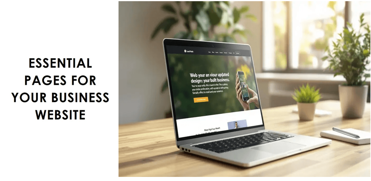
The Essential Pages Your Software Website Needs
A great software website isn't just a single, flashy landing page. It's a collection of interconnected pages, each with a very specific job to do. Think of it like a building's floor plan. Every room has a purpose, guiding visitors from the front door to where they need to go, making sure they never feel lost or confused.
This same logic applies to your website. A clear, thoughtful structure is about more than just good user experience—it's the backbone of your sales funnel. Every page has to work together, smoothly guiding a potential customer from mild curiosity to genuine interest, and ultimately, to making a decision.
The Homepage: Your Digital Storefront
Your homepage is the grand entrance. You have just a few seconds to capture someone's attention, show them what you’re all about, and convince them to stick around. It has to be clean, compelling, and instantly answer the one question on every visitor's mind: "What does this do for me, and why should I care?"
To nail this first impression, your homepage must have:
A Crystal-Clear Headline: Get straight to the point. What problem do you solve?
Compelling Social Proof: Logos from well-known customers or glowing testimonials build trust in an instant.
A Primary Call-to-Action (CTA): Tell people exactly what to do next. Make it obvious, whether that's "Request a Demo" or "Start Your Free Trial."
The Features Page: Explaining the "How"
Once you've hooked them with the "why," the features page is where you show them the "how." The classic mistake here is just listing out every technical function. Don't do that. Instead, talk about benefits, not just features. For every capability, explain the real-world problem it solves for the user.
For instance, instead of a dry "Real-time data sync," try "Keep your entire team on the same page with instant, automatic updates across all their devices." Bring your software to life with high-quality screenshots, quick video clips, or even animated GIFs. Help people actually see themselves succeeding with your product.
The Pricing Page: Communicating Value
Your pricing page is where the magic happens. It's often the final hurdle before a conversion, where visitors make a real financial commitment. Clarity and trust are everything. A confusing pricing table is one of the fastest ways to scare someone away for good. Your job isn't just to show prices; it's to communicate overwhelming value.
A great pricing page doesn't just list costs; it justifies them. It frames the price as an investment in a solution, clearly connecting each tier to the specific value and outcomes a customer will receive.
Design your pricing table so it’s incredibly easy to scan and compare plans. Highlighting a "Most Popular" option is a simple but effective way to guide decisions and prevent analysis paralysis. You should also include a solid FAQ section to proactively answer questions about billing, contracts, or cancellation. If you want to see how the pros do it, check out these excellent SaaS pricing page examples that perfectly blend clarity with persuasion.
The Integrations Page: Showcasing Your Ecosystem
These days, no software exists in a vacuum. Your integrations page is proof that your tool plays well with others, fitting right into a customer's existing tech stack. This page is crucial for building confidence because it assures them that your product won't create new problems or disrupt the way they already work.
Showcase your integrations with logos, and group them into logical categories like CRM, Project Management, or Marketing. A search bar is a fantastic touch, letting users quickly check if you connect with the tools they use every day. This page is more than a list—it’s a statement that your product is a team player, ready to make your customer's favorite tools even better.
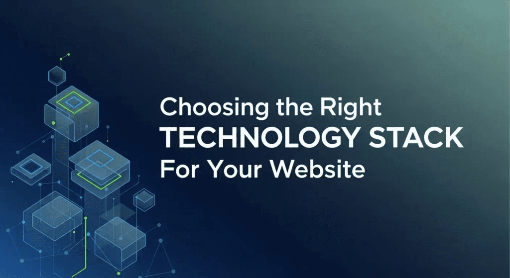
Picking Your Website's Tech Stack
Think of your website's technology stack as its DNA. It determines everything from how quickly pages load for a visitor to how easily your marketing team can spin up a new landing page. This isn't just a choice for the engineering team—it’s a foundational decision that impacts future flexibility, security, and your ability to scale.
A smart tech stack ensures your website is every bit as solid and reliable as the software you're selling.
Content Management Systems: The Command Center
At the heart of almost any serious website is a Content Management System (CMS). This is the software that lets you and your team create, edit, and publish content without having to write code for every single change. It’s the dashboard that runs the whole show.
There are two main flavors of CMS you’ll encounter:
Traditional CMS (like WordPress): This is the classic, all-in-one package. The back-end where you manage content and the front-end that visitors see are bundled together. It's famous for its enormous library of plugins and themes, making it a go-to for getting a site off the ground fast.
Headless CMS (like Contentful or Sanity): This is the modern approach. It separates, or "decouples," the back-end content repository from the front-end presentation layer. Your content lives in one place and can be pushed out anywhere via an API—to your website, a mobile app, or even a smart-watch. For tech companies that demand peak performance and unique user experiences, this is the way to go.
Most software companies serious about performance and custom design are moving toward a headless CMS paired with a modern front-end framework. While your website's stack is vital, a tech company's choices obviously run deeper. For example, your product team is likely already debating mobile frameworks, like comparing Flutter and React Native, and your website needs the technical chops to properly showcase that kind of innovation.
Finding the Right People to Build It
Once you have a rough idea of the technology you want, you need the right hands to build it. This choice usually boils down to your budget, timeline, and how complex your vision is.
The right technical partner doesn’t just follow orders. They dig into your business goals and recommend a tech stack that will actually support your growth for the next five years, not just the next five months.
The web design industry in the US alone is on track to hit $47.4 billion by 2026. It’s a huge market. A project can cost anywhere from $1,000 to over $145,000, with 40% of designers charging $75 or more per hour, which tells you just how much expertise goes into building a world-class software site. You can dive deeper into this with a helpful breakdown of web design industry statistics.
You're typically choosing between a freelancer and a specialized agency. Freelancers are great for smaller, well-defined projects. Agencies, on the other hand, bring a whole team to the table—strategists, designers, and multiple developers. If you're building on a specific platform and need true experts, finding a specialist agency is your best bet. For instance, if you're leaning towards a powerful, visually-driven platform like Webflow, checking out a curated list of the best Webflow design agencies is a smart first step.
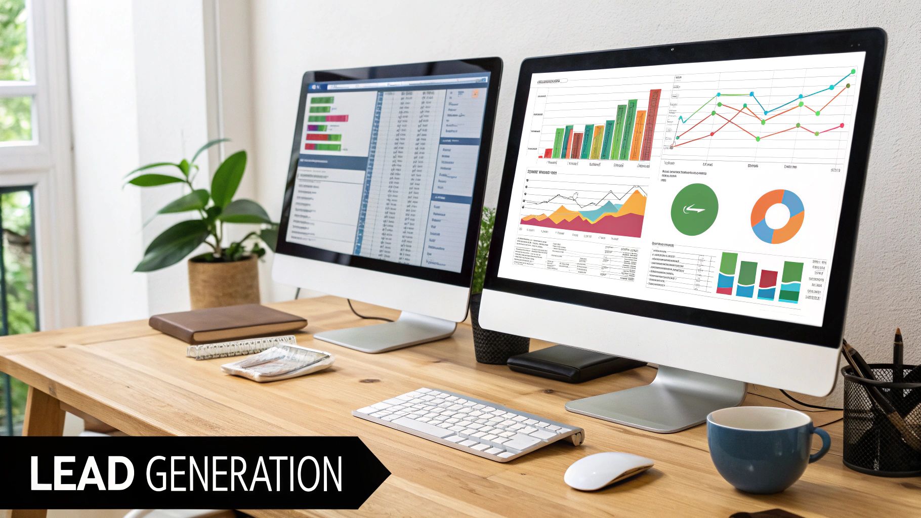
Turning Your Website into a Lead Generation Machine
Let's be honest. A beautiful website that doesn’t bring in business is little more than a digital brochure. Every single decision you've made up to this point—from the architecture to the tech stack—needs to funnel into one critical outcome: turning anonymous visitors into qualified leads.
This is where the magic of Conversion Rate Optimization (CRO) happens. It’s not a one-and-done task, but a continuous process of tweaking and refining your site to get more people to take the actions you want them to take. Think of it like a mechanic fine-tuning a high-performance engine; even small adjustments can unlock a huge boost in power.
Ultimately, this is the part of website design for a software company that ties everything together, linking thoughtful design directly to real, measurable growth.
Mastering the Art of the Call-to-Action
Your website’s Calls-to-Action (CTAs) are the signposts that guide your visitors. If they're vague or hard to find, you're losing potential customers. For a software company, these actions—like booking a demo or starting a trial—are incredibly valuable and must be impossible to ignore.
So, what makes a great CTA?
Action-Oriented Language: Kick things off with a strong verb. Instead of a passive word like "Submit," try something compelling like "Get Your Free Demo" or "Start Building Now."
Visually Distinct Design: Make your main CTA button pop. Use a color that contrasts with your page’s palette to immediately draw the eye.
Strategic Placement: Don't make people hunt for it. Place your most important CTAs above the fold on key pages, and then repeat them naturally as a user scrolls down the page.
A great website doesn't just present information; it makes a clear, compelling ask. Your CTAs are the bridge between a user's interest and their commitment to take the next step.
Don't be afraid to experiment. Test different words, colors, and placements to see what resonates. The goal is to make clicking that button feel like the most natural, obvious next step for your visitor.
Designing High-Converting Lead Capture Forms
So, they've clicked your CTA. Great! Now they're looking at your lead capture form, and this is a make-or-break moment. A long, complicated form feels like a pop quiz and will send even the most interested prospects running for the hills. The golden rule? Ask for only what you absolutely need right now.
For an initial demo request, a name, work email, and company name are probably enough. You can always gather more details later on. Keep the design clean and simple, label every field clearly, and make absolutely sure the form is a breeze to fill out on a phone.
Leveraging On-Page SEO for High-Intent Traffic
A website that no one can find is a wasted investment. That’s where on-page Search Engine Optimization (SEO) comes in. It’s all about attracting the right kind of visitors—people who are actively looking for the exact solution you provide. For software companies, this means getting strategic.
Here are a few targeted SEO plays to consider:
Optimize Feature Pages: Every feature solves a specific problem. Optimize each feature page for the keywords someone would use when searching for a solution to that problem.
Create Comparison Pages: Build out pages that directly compare your product to a main competitor (e.g., "YourProduct vs. Competitor A"). These pages attract people who are far along in their buying journey and ready to make a decision.
Build a Resource Hub: A blog or resource center packed with genuinely useful articles and guides does more than just attract traffic. It positions you as an expert in your field and builds trust over the long haul.
By constantly testing, refining your SEO, and paying close attention to user behavior, your website stops being a static online presence. It becomes a dynamic, data-driven machine that consistently fills your sales pipeline.
Answering Your Top Questions About Software Website Design
When it comes to building a website for a software company, a few questions always pop up. It's totally normal. Getting these details sorted out early on is key to making sure your website actually helps your business grow, rather than just sitting there looking pretty.
Let's dive into the most common questions we hear.
How Much Should a Software Website Cost?
This is the big one, and the honest answer is: it depends. The price can swing dramatically based on what you need. A straightforward site using a pre-built template might only set you back a few thousand dollars. But if you’re after a completely custom design with slick animations, complex integrations, and a headless CMS, you could be looking at a budget well over $100,000.
Think about it this way. The final cost really comes down to a few key choices:
Custom vs. Template: A unique design built from the ground up will always cost more than customizing an existing theme.
Agency vs. Freelancer: Agencies bring a full team to the table—strategists, designers, developers—so their rates are typically higher.
Features and Integrations: Every page, interactive element, and third-party tool you add increases the complexity and, naturally, the price.
Try to view it less as a cost and more as an investment. Your website is your #1 salesperson, working 24/7. A site that effectively converts visitors into leads will pay for itself many times over.
How Long Does the Design Process Take?
Patience is a virtue here. For a typical software company website, you should plan for a timeline of about 8 to 16 weeks from kickoff to launch. It’s not a single step, but a series of carefully planned phases.
Here’s a rough breakdown of how that time is spent:
Strategy & Discovery (2-3 weeks): This is where we nail down your goals, get to know your audience, and map out the entire project.
UX/UI Design (3-5 weeks): We move from basic wireframes and user flows to polished visual mockups that establish your site's look and feel.
Development (4-6 weeks): The designs come to life as our developers build the front-end and back-end of the website.
Testing & Launch (1-2 weeks): Before the big reveal, we rigorously test everything to squash bugs and ensure a smooth launch.
Trying to rush this process is a recipe for disaster. A methodical, phased approach ensures the final product isn't just beautiful, but also strategic, easy to use, and technically solid. It's the best way to avoid a costly do-over down the road.
What Makes a Software Website Design Successful?
A great design is about so much more than aesthetics. A truly successful software website is a perfect marriage of three critical components. It has to have strategic clarity, meaning it speaks directly to your ideal customer and their problems. It needs an intuitive user experience that makes it dead simple for visitors to find what they need and take action. And finally, it must be built with technical excellence, loading lightning-fast and working perfectly on any device.
At Bricx, we don't just build pretty websites; we create strategic assets for B2B and AI SaaS companies that deliver real, measurable results. Ready to build a site that acts like your best salesperson? Discover our website design services.


Similar Blogs
Similar Blogs
Similar Blogs


Available for Work
Bricx
© Bricx, 2026. All rights reserved.


Available for Work
Bricx
© Bricx, 2026. All rights reserved.
Available for Work
Bricx
© Bricx, 2026. All rights reserved.
Available for Work
Bricx
© Bricx, 2026. All rights reserved.