Website Design
Website Design
Website Design
Insights
Insights
Insights
December 4, 2025
December 4, 2025
December 4, 2025
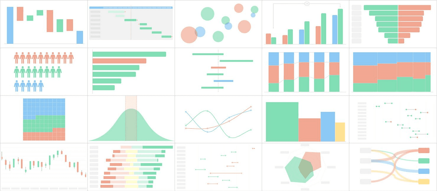
A Practical Guide to Mastering Data Visualization UX
A Practical Guide to Mastering Data Visualization UX
A Practical Guide to Mastering Data Visualization UX
Elevate your data visualization UX. Learn to design intuitive dashboards with real-world examples, interactive patterns, and user-centric design principles.
Elevate your data visualization UX. Learn to design intuitive dashboards with real-world examples, interactive patterns, and user-centric design principles.
Elevate your data visualization UX. Learn to design intuitive dashboards with real-world examples, interactive patterns, and user-centric design principles.
4 mins
4 mins
4 mins


Effective data visualization isn't about making pretty charts; it's about clear communication. Your goal is to turn raw, complex information into something users can see, understand, and act on with total clarity. Follow this guide to transform a simple report into a powerful, interactive tool that helps people make better decisions, faster.
Why Data Visualization UX Matters More Than Ever
In an age where we're swimming in data, the ability to present that information clearly is a massive competitive advantage. Good data viz UX acts as a translator, taking dense, complicated datasets and turning them into a language everyone can understand at a glance. This isn't just about making things look nice; it's a critical part of informed decision-making.
The market trends back this up. The demand for real-time, interactive insights is fueling huge growth in the data visualization tools market, which is projected to grow by about $7.95 billion at a compound annual growth rate of 11.2%.
As businesses lean more heavily on data, the experience of using these tools becomes absolutely essential. You can dig into more of the numbers in Technavio's market report.
Ultimately, when you get the design right, you achieve a few key things:
You tame complexity. It turns a tangled mess of data into visual patterns that are easy to spot.
You speed up decisions. It helps stakeholders quickly identify trends, spot outliers, and make smarter choices without getting bogged down.
You prevent bad calls. By presenting information accurately and clearly, you dramatically reduce the risk of someone misinterpreting the data and drawing the wrong conclusion.
How to Start: Focus on the "Why," Not The "What"
Before you even think about picking a chart type, the most important step is to understand your audience. Who are they, and what are they trying to accomplish? A dashboard built for a marketing analyst digging into campaign ROI will—and should—look completely different from one made for a CEO who needs a high-level pulse on the business.
Always start by asking these foundational questions:
What specific questions is the user trying to answer with this data?
What decisions will they make based on what they see?
How comfortable are they with data? Are they an analyst or an executive?
Answering these questions first ensures every design choice you make will have a purpose. It shifts your focus from just showing data to building a tool that actually solves a user's problem. If you're looking to brush up on the fundamentals, this guide on 10 Essential Data Visualization Best Practices is a great starting point.
Best Practice: Use Data Storytelling

Great data visualization UX goes beyond just plotting points on a graph. It weaves those points into a coherent narrative. Data storytelling is the art of giving your data context and meaning by framing it within a compelling story.
A visualization's true effectiveness lies in its capacity to accurately and efficiently transmit an intended message. While aesthetics might attract attention, clarity and simplicity ensure the audience can readily understand the information.
Structure your dashboard like a story with a beginning, middle, and end. The beginning sets the stage (the big picture), the middle presents the analysis and key findings (the plot twists), and the end offers a conclusion or a clear call to action (the resolution). This structure guides the user through the insights, making them far more memorable and impactful.
Foundational Principles for Success
To build dashboards that genuinely work, a few core principles are non-negotiable. These aren't just suggestions; they are the bedrock of visualizations that are functional, trustworthy, and built for real users.
Use this table as your cheat sheet for user-centric data visualization.
Core Principles of Data Visualization UX
Principle | How to Apply It for Better UX | Quick Tip |
|---|---|---|
Clarity Above All | If a user has to ask, "What am I looking at?" the design has failed. Confusion leads to abandonment. | Use clear, direct titles and labels. Avoid jargon and ambiguity. |
Purpose-Driven Design | Every chart, color, and element should serve a purpose. Unnecessary elements create noise and distraction. | For every element you add, ask yourself: "Does this help the user understand the data?" If not, remove it. |
Graphical Integrity | Visuals must represent the data truthfully. Misleading scales or distorted proportions destroy user trust. | Always start your bar chart y-axis at zero. Use scales that accurately reflect the magnitude of change. |
Reduce Cognitive Load | The human brain has limited processing power. A cluttered dashboard overwhelms users and hides insights. | Eliminate "chartjunk"—unnecessary gridlines, borders, or 3D effects. Maximize the data-ink ratio. |
Sticking to these principles ensures you're not just creating a dashboard that looks good, but one that people can actually rely on to do their jobs better.
How to Choose the Right Visualization for Your Data Story
The single biggest mistake in data visualization UX isn't a bad color palette or a funky font; it's choosing the wrong chart for the job. You can have the most incredible dataset in the world, but it becomes useless if the visual format doesn't directly answer the user's underlying question.
To get this right, stop trying to memorize a library of chart types. Instead, start by thinking about the story the data needs to tell from your user's point of view.
Instead of asking, "Should I use a bar chart or a line chart?" flip the script. Ask, "What is my user actually trying to figure out here?" The answer almost always falls into one of a few core categories.
Matching Chart Types to User Questions
Selecting the right chart means aligning the visual with the cognitive task at hand. Is your user trying to compare values, see how something is composed, understand a relationship, or track a trend over time? Each of these questions has a family of charts perfectly suited to deliver a clear answer.
To Compare Values: When the main goal is to compare distinct values against each other, bar charts are your most reliable tool. Use a vertical bar chart to show monthly recurring revenue (MRR) for different subscription plans side-by-side. The shared baseline makes the comparison instant and intuitive.
To Show Composition: If the user needs to understand how a total breaks down into its parts, you're dealing with composition. While the pie chart is famous here, it's notoriously difficult for our brains to read accurately if you have more than two or three slices. A much better choice is a stacked bar chart or a treemap, which can handle more complex part-to-whole relationships without distorting perception.
To See Relationships: To show how two or more variables interact, a scatter plot is your go-to visualization. For example, to see if there's a correlation between the number of features a customer uses and their lifetime value (LTV), a scatter plot immediately reveals patterns, clusters, and outliers that a simple table would hide.
To Understand Distribution: When you need to show how data points are spread across a range, a histogram is the ideal choice. Use it to help a product manager understand the distribution of user session lengths, quickly revealing if most people have short, focused visits or long, exploratory ones.
This simple decision-making flow helps frame the process, guiding you from an initial idea toward clarity and, ultimately, enabling user action.
The journey to an effective visualization always prioritizes clarity. Only then can it lead to a meaningful insight or a confident decision.
How to Avoid Common Chart Mistakes

Even with the best intentions, it’s surprisingly easy to fall into common traps that compromise data clarity. Follow these best practices to create more effective and honest visualizations.
Choosing the right chart is less about knowing every chart type and more about deeply understanding the question your user is trying to answer. The visual should feel like the most natural way to present that specific answer.
A frequent misstep is using a line chart for discrete, non-continuous data. A line implies a connection and a trend between points, which is misleading if you're comparing independent categories like sales figures for different regions. In that case, a bar chart is far more appropriate and truthful.
Another classic blunder is overloading a pie chart. A good rule of thumb: if you have more than three categories, a pie chart becomes a visual puzzle. The human eye struggles to accurately compare the angles of different slices, making it nearly impossible to judge relative sizes.
A simple bar chart will always communicate the same part-to-whole information more clearly. If you're looking for more ideas, exploring various Top Financial Data Visualization Techniques can offer some great perspectives.
Finally, to get inspired by how different charts can work together to form a cohesive story, check out a well-curated dashboard design moodboard. It provides excellent, real-world examples of purpose-driven visualization. The goal is always to choose with confidence by putting your audience’s need for clarity first.
How to Design for Intuitive Interactivity and Exploration
Static charts are a thing of the past. The best dashboards are conversations—they invite users to explore, ask questions, and follow their curiosity to find "aha!" moments. This is where you move beyond just showing data and start enabling users to explore it. Here’s how to turn a simple report into a hands-on analytical tool.
Empower this exploration without making users feel lost. Every interactive element, from a simple tooltip to a deep drill-down, needs to feel intuitive, predictable, and genuinely helpful.

This dashboard from Tableau's gallery is a great example of exploration done right. The clean layout and obvious interactive elements make even a complex dataset feel approachable, practically begging the user to start clicking around.
Best Practice: Build Layers of Information
Nobody needs to see every single data point at once. Good interactivity is all about progressive disclosure—showing the big picture first, then revealing more detail as the user shows interest.
Start with the 30,000-foot view, then provide clear paths for users to zoom in. Implement these effective patterns:
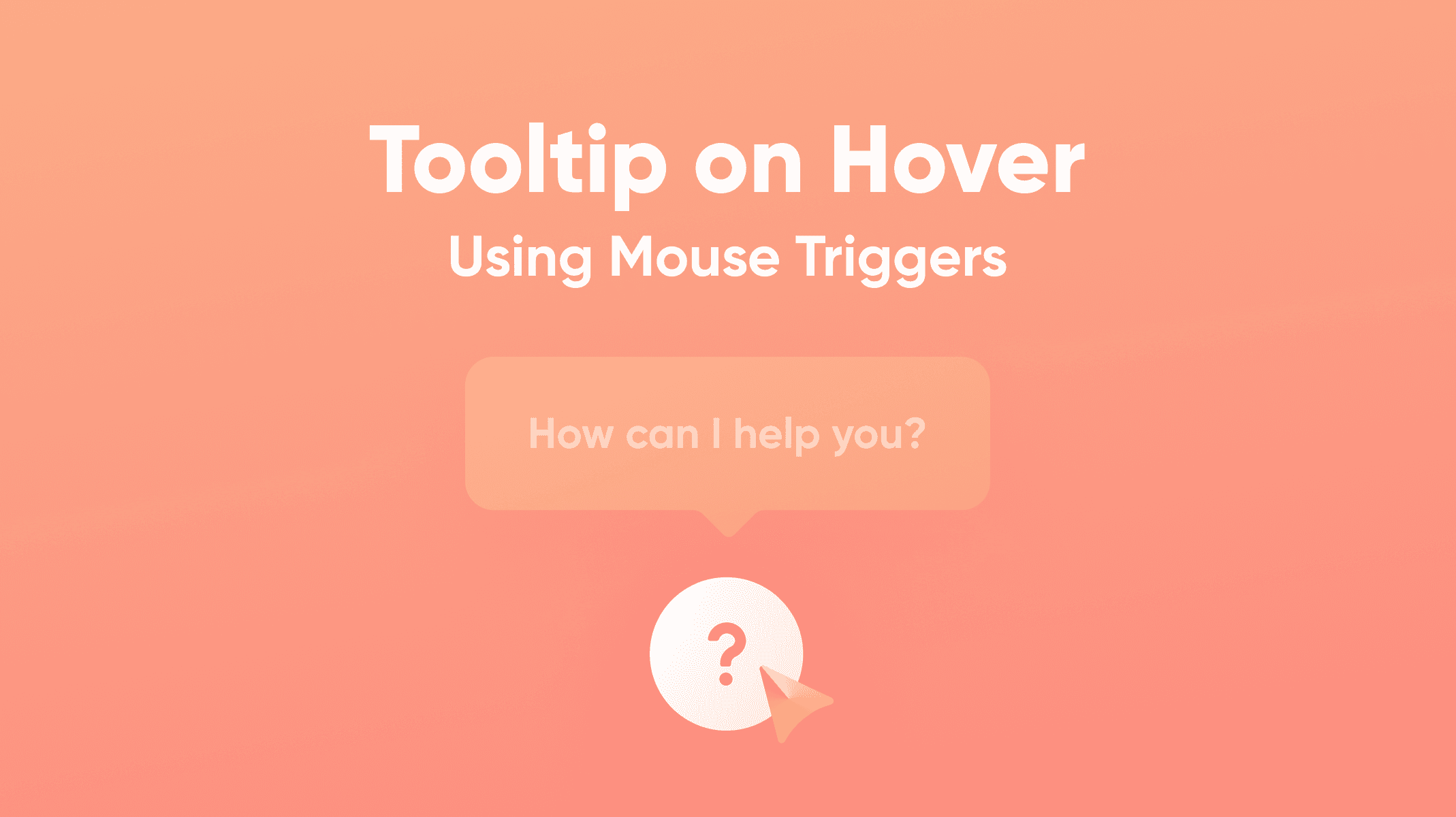
Tooltips on Hover: This is your first and easiest layer. When a user mouses over a data point, instantly pop up a small box with the precise value, a comparison, or extra context. For a sales chart, have the tooltip show not just the exact revenue, but also the percentage change from last month.
Click-to-Filter: Let users click on an element—a bar in a chart, a slice of a pie, a region on a map—and have the entire dashboard instantly filter by that selection. This creates a powerful and context-aware way for them to slice the data.
Drill-Downs: For any hierarchical data, provide a clear way to see the next level of detail. When a user sees "North America," allow them to click to see the U.S., Canada, and Mexico. Use a simple click or a "+" icon to swap the high-level view for a granular one, and provide an equally obvious way to get back.
How to Design Intuitive Controls
Filter panels, date pickers, and dropdowns are where a user's exploration can either succeed or fail. A clunky, confusing filter panel can render beautifully designed charts useless.
Good interactivity feels like a natural extension of the user's curiosity. It anticipates their next question and gives them an effortless way to answer it, without making them hunt for the right button.
When designing these controls, group related filters together and use plain English. Most importantly, use the right tool for the job: sliders for number ranges, simple dropdowns for short lists of categories, and searchable multi-selects for anything longer. The goal is to make it feel easy.
This is also where AI is starting to make a huge impact. Instead of users having to manually slice and dice, AI-driven tools are allowing them to ask questions in plain language, like, "What caused last week’s sales drop?" and get an immediate visual answer. It’s a major shift toward making data accessible to everyone, not just analysts.
How to Guide Attention with Motion
Use animation and micro-interactions and their impact on user experience as your secret weapons for making data changes understandable. The key is to be subtle and purposeful—never just for show.
When a user applies a filter, don't just have the chart blink into its new state. Instead, let the bars smoothly animate to their new heights. That brief moment of motion helps the brain connect the "before" and "after," making the shift in data far easier to grasp.
These tiny bits of feedback—a button that subtly changes color on click, a loading spinner that appears for a split second—reassure users that the system heard them and is working. It builds confidence and keeps their exploration flowing smoothly.
Best Practices for Accessible and Fast Visualizations

It’s easy to get caught up in making a dashboard look stunning, but if it’s slow to load or unreadable for some users, it’s fundamentally broken. Performance and accessibility aren't just boxes to check; they are the bedrock of a good user experience. Getting them wrong erodes user trust and engagement.
This isn’t just good practice—it's good business. The global market for User Experience (UX) design services was valued at $11.7 billion in 2021 and is on track to hit $17.4 billion by 2026. That growth is driven by the demand for products that work for everyone. You can get the full picture in the complete UX design market report.
How to Design for Universal Access
Accessibility means building your visualizations so that people with disabilities can use them effectively. This involves making sure they can perceive the information, understand it, navigate it, and interact with it.
Color is a classic stumbling block. A staggering 8% of men have some form of color vision deficiency. If you're relying solely on red and green to show good versus bad, a huge chunk of your audience won't get the message.
To meet modern accessibility standards like WCAG, follow these steps:
Rethink Your Palette: Use tools like Adobe Color or ColorBrewer to build color-blind-safe palettes from the beginning. Don't "fix" it later; start with accessible colors.
Add Redundancy: Never let color do all the work. If you have a line chart with multiple categories, pair colors with different line styles (solid, dashed, dotted). On a bar chart, you can layer subtle patterns on top of the colors.
Support Keyboard-Only Users: Test whether a user can navigate every interactive element—filters, tooltips, chart segments—using just the "Tab" key. The focus should move in a logical, predictable order.
Provide Text Alternatives: Every chart needs a clear title and a brief caption. For screen reader users, use ARIA labels to describe what a chart shows and what the individual elements represent.
If you want to go deeper, our guide on accessibility in UX design is a great resource for building more inclusive products.
Good accessibility practices force you to become a clearer communicator. When you solve for the edge cases, you almost always create a more intuitive experience for everyone.
How to Optimize for Speed and Responsiveness
In a world of instant gratification, a slow-loading chart is a dealbreaker. Performance isn't an engineering problem; it's a design feature. If a dashboard takes more than a couple of seconds to appear, users get frustrated, lose their train of thought, and might just give up.
The most common culprit is trying to cram a massive dataset into the user's browser all at once. Be smarter about what data you load and when you load it.
Practical Performance Strategies
Here’s how to keep your visualizations feeling snappy:
Aggregate Data on the Server: The browser doesn't need to see every single transaction to show a yearly sales trend. Send pre-calculated totals from your backend instead of asking the client to process tens of thousands of raw data points.
Load Content on Demand: For a long, scrollable dashboard, use lazy loading to defer loading assets until the user actually scrolls down to them. This makes a massive difference for initial page load times.
Choose the Right Rendering Tech: For most standard charts, SVG (Scalable Vector Graphics) is perfect. It's sharp at any resolution and easy to make interactive. But if you're visualizing thousands of data points, like in a dense scatter plot, rendering with Canvas will give you a major performance boost.
When you frame performance as a core part of the user experience, it becomes a design priority, not just a technical task. A fast, accessible dashboard is one people will trust and enjoy using day after day.
How to Integrate Visualizations into Your Design System
For your data visualizations to be truly effective and consistent, they must be woven directly into your product's design system. This is the secret to moving beyond one-off chart designs and creating a scalable, repeatable process that ensures a cohesive experience across your entire application.
When you treat visualizations as a core part of your system, you're building a reliable framework for both designers and developers. A well-documented system means that no matter who builds a chart or where it shows up, it will always look and feel like it belongs.
This consistency lowers the user's cognitive load—they don't have to relearn how your charts work every time they see a new one. To get a better handle on this, it's worth understanding what a design system is and why it's such a game-changer.
How to Establish Foundational Visual Standards
First, you need to set the ground rules for the core visual elements of your charts. This is more than just grabbing your primary brand colors; it's about creating a dedicated, purpose-driven palette specifically for data.
Data Color Palettes: Define specific color sets for different kinds of data. You'll need a categorical palette with distinct, easy-to-tell-apart hues for comparing things like products or regions. You'll also want a sequential palette that uses gradients of a single color to show a progression from low-to-high values. Finally, a diverging palette is crucial for showing values that move away from a central point (like profit and loss), using two contrasting colors and a neutral midpoint.
Typography Scales: Charts demand their own typographic hierarchy. Define specific font sizes, weights, and colors for everything from the main chart title down to the axis labels, tick marks, and tooltips. This not only makes things readable but also creates a clear visual order within the chart itself.
Nailing these standards right from the start takes the guesswork out of the process and ensures every chart is instantly recognizable and easy to digest.
How to Build Reusable Chart Components
Once your visual standards are locked in, it's time to build reusable components for massive gains in efficiency. The goal is to create a library of pre-made, pre-styled charts that your team can simply grab, drop into a design, and hook up to data.
In a design tool like Figma, this means creating master components for your essential charts—bar, line, pie, and so on. For developers, this translates to building coded components in a framework like React or Vue. These components should encapsulate not just the visual styling but also the interactive logic (tooltips, hover states) and accessibility features (ARIA labels) right out of the box.
Integrating visualizations into a design system is the ultimate force multiplier for data visualization UX. It streamlines development, eliminates inconsistency, and ensures every user gets the same high-quality, intuitive experience.
Building the components is only half the battle; documenting them is just as critical. For every chart in your system, provide clear guidelines that anyone on the team can follow.
When to Use It: Be crystal clear about the primary job of each chart. For example, "Use a bar chart for comparing discrete categories."
When Not to Use It: Give explicit counter-examples to help people avoid common pitfalls. For instance, "Avoid using a pie chart when you have more than three categories; it becomes unreadable."
This kind of documentation empowers your entire team to build effective, cohesive data experiences without needing constant hand-holding. It’s how you guarantee your data viz UX stays top-notch as your product scales.
How to Test and Iterate on Your Data Visualization UX

You can follow every best practice in the book, but you never truly know if a dashboard is working until you watch real people try to use it. Testing and iteration are what separate a good design from a great one, uncovering friction points that design docs miss.
The goal is to get actionable feedback that improves clarity and helps users make better decisions. You're moving your data visualization UX from an exercise based on assumptions to one grounded in solid evidence. Asking "Does this make sense?" is a start, but you'll get far richer insights from structured, task-based testing.
Practical Methods for User Testing Dashboards
Watching someone interact with your visualizations is the most direct way to see what’s broken. Instead of a vague exploration, give them specific scenarios that mirror the real-world tasks they need to accomplish.
Here are two powerful techniques you can use:
The Insight Discovery Task: Give the user a clear goal, like, "Can you figure out which marketing channel had the lowest return on ad spend last quarter?" Then, watch. Do they instinctively go for the right filters? Do they hover over the correct data points, or do they get lost? This method quickly tells you if your information hierarchy makes sense to a fresh set of eyes.
The 5-Second Test: Show a user a dashboard for just five seconds, then take it away. Ask them, "What was the single most important thing you saw?" It's a brilliant, simple test for evaluating whether your key metrics and visual hierarchy pop off the screen immediately.
Some of the most revealing moments in user testing happen in silence. It’s the long pause, the hesitant cursor movement, or the slight furrow of the brow. That's your cue—that's where the design needs work.
How to Gather Quantitative and Qualitative Feedback
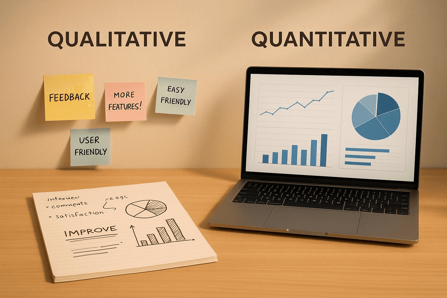
Beyond observation, collect both quantitative and qualitative data to get the full story. The numbers tell you what is happening, and the conversations tell you why. For a deeper dive, our guide on usability testing offers a great framework for structuring this kind of research.
Quantitative Feedback (The "What")
This is all about understanding user behavior at scale.
Track Interaction Patterns: Use product analytics to see what people are actually clicking on. Are they using the advanced filters, or ignoring them completely? Are users constantly drilling down into one specific chart? This data can either validate your design choices or show you which features are just taking up space.
Measure Time-on-Task: For a common task, how long does it actually take someone to find the answer? If it’s consistently taking users 3 minutes to do something you thought would take 30 seconds, that's a huge red flag that your UX needs to be simplified.
Qualitative Feedback (The "Why")
This is where you find the context behind the clicks.
Think-Aloud Protocol: As users work through a task, ask them to narrate their thought process. Hearing their real-time reactions—"Huh, I expected this filter to do something else"—is pure gold for pinpointing the exact source of confusion.
Follow-Up Questions: After they complete (or abandon) a task, ask pointed questions. "Was that information where you expected to find it?" or "What was the most frustrating part of that?"
By blending these approaches, you build a powerful feedback loop. This cycle—testing, learning, and refining—is what transforms a merely functional dashboard into an indispensable tool that people genuinely rely on.
Answering Common Data Viz UX Questions
Even when you follow best practices, designing data-heavy interfaces always presents challenges. Here are answers to common questions to help you fine-tune your data visualization UX.
How Do I Handle Showing Too Much Data?
The instinct is often to show everything at once, but this overwhelms users. The best practice is to use progressive disclosure.
Start by giving users a high-level summary—just the absolute must-know information. From that starting point, offer clear, intuitive paths for them to explore further. This isn't about hiding data; it's about guiding their discovery. Use these methods:
Smart filters: Let users slice and dice the data themselves.
Drill-downs: Make chart elements clickable, so a user can click a bar on a chart to see the detailed data behind it.
Expandable sections: Use "show more" toggles or modals to reveal secondary charts or detailed tables only when the user asks for them.
Let the user's curiosity guide their journey from a broad overview to the specific insights they actually need.
What's the Most Common Dashboard Design Mistake?
The most common mistake is picking the wrong chart for the job. This often happens when trying to make something look visually impressive, leading to pie charts with ten categories (a nightmare to read) or 3D effects that distort the data.
To avoid this, always start with the question you're trying to answer for the user. What is the one thing this chart needs to communicate? Once you have that, pick the simplest, most straightforward chart that gets the job done. Clarity beats cleverness every single time.
A visualization's real job is communication. A beautiful chart might catch the eye, but if it doesn't deliver its message clearly and accurately, it has failed. Never sacrifice clarity for aesthetics.
How Should I Design Visualizations for Mobile Screens?
Designing for mobile requires a complete rethink; you can't just shrink your desktop dashboard.
On a small screen, you must be ruthless with your focus. Stick to one key insight per screen and embrace a vertical, scroll-friendly layout. Interactions need to be dead simple, relying on taps and swipes since complex hover states are off the table. A great strategy is to break down a single, dense desktop view into a series of focused, mobile-native cards that users can easily swipe through.
At Bricx, we live and breathe this stuff. We specialize in designing intuitive, data-rich SaaS products that turn complex information into clear, actionable insights. Let's build a product your users will love.
Effective data visualization isn't about making pretty charts; it's about clear communication. Your goal is to turn raw, complex information into something users can see, understand, and act on with total clarity. Follow this guide to transform a simple report into a powerful, interactive tool that helps people make better decisions, faster.
Why Data Visualization UX Matters More Than Ever
In an age where we're swimming in data, the ability to present that information clearly is a massive competitive advantage. Good data viz UX acts as a translator, taking dense, complicated datasets and turning them into a language everyone can understand at a glance. This isn't just about making things look nice; it's a critical part of informed decision-making.
The market trends back this up. The demand for real-time, interactive insights is fueling huge growth in the data visualization tools market, which is projected to grow by about $7.95 billion at a compound annual growth rate of 11.2%.
As businesses lean more heavily on data, the experience of using these tools becomes absolutely essential. You can dig into more of the numbers in Technavio's market report.
Ultimately, when you get the design right, you achieve a few key things:
You tame complexity. It turns a tangled mess of data into visual patterns that are easy to spot.
You speed up decisions. It helps stakeholders quickly identify trends, spot outliers, and make smarter choices without getting bogged down.
You prevent bad calls. By presenting information accurately and clearly, you dramatically reduce the risk of someone misinterpreting the data and drawing the wrong conclusion.
How to Start: Focus on the "Why," Not The "What"
Before you even think about picking a chart type, the most important step is to understand your audience. Who are they, and what are they trying to accomplish? A dashboard built for a marketing analyst digging into campaign ROI will—and should—look completely different from one made for a CEO who needs a high-level pulse on the business.
Always start by asking these foundational questions:
What specific questions is the user trying to answer with this data?
What decisions will they make based on what they see?
How comfortable are they with data? Are they an analyst or an executive?
Answering these questions first ensures every design choice you make will have a purpose. It shifts your focus from just showing data to building a tool that actually solves a user's problem. If you're looking to brush up on the fundamentals, this guide on 10 Essential Data Visualization Best Practices is a great starting point.
Best Practice: Use Data Storytelling
Great data visualization UX goes beyond just plotting points on a graph. It weaves those points into a coherent narrative. Data storytelling is the art of giving your data context and meaning by framing it within a compelling story.
A visualization's true effectiveness lies in its capacity to accurately and efficiently transmit an intended message. While aesthetics might attract attention, clarity and simplicity ensure the audience can readily understand the information.
Structure your dashboard like a story with a beginning, middle, and end. The beginning sets the stage (the big picture), the middle presents the analysis and key findings (the plot twists), and the end offers a conclusion or a clear call to action (the resolution). This structure guides the user through the insights, making them far more memorable and impactful.
Foundational Principles for Success
To build dashboards that genuinely work, a few core principles are non-negotiable. These aren't just suggestions; they are the bedrock of visualizations that are functional, trustworthy, and built for real users.
Use this table as your cheat sheet for user-centric data visualization.
Core Principles of Data Visualization UX
Principle | How to Apply It for Better UX | Quick Tip |
|---|---|---|
Clarity Above All | If a user has to ask, "What am I looking at?" the design has failed. Confusion leads to abandonment. | Use clear, direct titles and labels. Avoid jargon and ambiguity. |
Purpose-Driven Design | Every chart, color, and element should serve a purpose. Unnecessary elements create noise and distraction. | For every element you add, ask yourself: "Does this help the user understand the data?" If not, remove it. |
Graphical Integrity | Visuals must represent the data truthfully. Misleading scales or distorted proportions destroy user trust. | Always start your bar chart y-axis at zero. Use scales that accurately reflect the magnitude of change. |
Reduce Cognitive Load | The human brain has limited processing power. A cluttered dashboard overwhelms users and hides insights. | Eliminate "chartjunk"—unnecessary gridlines, borders, or 3D effects. Maximize the data-ink ratio. |
Sticking to these principles ensures you're not just creating a dashboard that looks good, but one that people can actually rely on to do their jobs better.
How to Choose the Right Visualization for Your Data Story
The single biggest mistake in data visualization UX isn't a bad color palette or a funky font; it's choosing the wrong chart for the job. You can have the most incredible dataset in the world, but it becomes useless if the visual format doesn't directly answer the user's underlying question.
To get this right, stop trying to memorize a library of chart types. Instead, start by thinking about the story the data needs to tell from your user's point of view.
Instead of asking, "Should I use a bar chart or a line chart?" flip the script. Ask, "What is my user actually trying to figure out here?" The answer almost always falls into one of a few core categories.
Matching Chart Types to User Questions
Selecting the right chart means aligning the visual with the cognitive task at hand. Is your user trying to compare values, see how something is composed, understand a relationship, or track a trend over time? Each of these questions has a family of charts perfectly suited to deliver a clear answer.
To Compare Values: When the main goal is to compare distinct values against each other, bar charts are your most reliable tool. Use a vertical bar chart to show monthly recurring revenue (MRR) for different subscription plans side-by-side. The shared baseline makes the comparison instant and intuitive.
To Show Composition: If the user needs to understand how a total breaks down into its parts, you're dealing with composition. While the pie chart is famous here, it's notoriously difficult for our brains to read accurately if you have more than two or three slices. A much better choice is a stacked bar chart or a treemap, which can handle more complex part-to-whole relationships without distorting perception.
To See Relationships: To show how two or more variables interact, a scatter plot is your go-to visualization. For example, to see if there's a correlation between the number of features a customer uses and their lifetime value (LTV), a scatter plot immediately reveals patterns, clusters, and outliers that a simple table would hide.
To Understand Distribution: When you need to show how data points are spread across a range, a histogram is the ideal choice. Use it to help a product manager understand the distribution of user session lengths, quickly revealing if most people have short, focused visits or long, exploratory ones.
This simple decision-making flow helps frame the process, guiding you from an initial idea toward clarity and, ultimately, enabling user action.
The journey to an effective visualization always prioritizes clarity. Only then can it lead to a meaningful insight or a confident decision.
How to Avoid Common Chart Mistakes
Even with the best intentions, it’s surprisingly easy to fall into common traps that compromise data clarity. Follow these best practices to create more effective and honest visualizations.
Choosing the right chart is less about knowing every chart type and more about deeply understanding the question your user is trying to answer. The visual should feel like the most natural way to present that specific answer.
A frequent misstep is using a line chart for discrete, non-continuous data. A line implies a connection and a trend between points, which is misleading if you're comparing independent categories like sales figures for different regions. In that case, a bar chart is far more appropriate and truthful.
Another classic blunder is overloading a pie chart. A good rule of thumb: if you have more than three categories, a pie chart becomes a visual puzzle. The human eye struggles to accurately compare the angles of different slices, making it nearly impossible to judge relative sizes.
A simple bar chart will always communicate the same part-to-whole information more clearly. If you're looking for more ideas, exploring various Top Financial Data Visualization Techniques can offer some great perspectives.
Finally, to get inspired by how different charts can work together to form a cohesive story, check out a well-curated dashboard design moodboard. It provides excellent, real-world examples of purpose-driven visualization. The goal is always to choose with confidence by putting your audience’s need for clarity first.
How to Design for Intuitive Interactivity and Exploration
Static charts are a thing of the past. The best dashboards are conversations—they invite users to explore, ask questions, and follow their curiosity to find "aha!" moments. This is where you move beyond just showing data and start enabling users to explore it. Here’s how to turn a simple report into a hands-on analytical tool.
Empower this exploration without making users feel lost. Every interactive element, from a simple tooltip to a deep drill-down, needs to feel intuitive, predictable, and genuinely helpful.
This dashboard from Tableau's gallery is a great example of exploration done right. The clean layout and obvious interactive elements make even a complex dataset feel approachable, practically begging the user to start clicking around.
Best Practice: Build Layers of Information
Nobody needs to see every single data point at once. Good interactivity is all about progressive disclosure—showing the big picture first, then revealing more detail as the user shows interest.
Start with the 30,000-foot view, then provide clear paths for users to zoom in. Implement these effective patterns:
Tooltips on Hover: This is your first and easiest layer. When a user mouses over a data point, instantly pop up a small box with the precise value, a comparison, or extra context. For a sales chart, have the tooltip show not just the exact revenue, but also the percentage change from last month.
Click-to-Filter: Let users click on an element—a bar in a chart, a slice of a pie, a region on a map—and have the entire dashboard instantly filter by that selection. This creates a powerful and context-aware way for them to slice the data.
Drill-Downs: For any hierarchical data, provide a clear way to see the next level of detail. When a user sees "North America," allow them to click to see the U.S., Canada, and Mexico. Use a simple click or a "+" icon to swap the high-level view for a granular one, and provide an equally obvious way to get back.
How to Design Intuitive Controls
Filter panels, date pickers, and dropdowns are where a user's exploration can either succeed or fail. A clunky, confusing filter panel can render beautifully designed charts useless.
Good interactivity feels like a natural extension of the user's curiosity. It anticipates their next question and gives them an effortless way to answer it, without making them hunt for the right button.
When designing these controls, group related filters together and use plain English. Most importantly, use the right tool for the job: sliders for number ranges, simple dropdowns for short lists of categories, and searchable multi-selects for anything longer. The goal is to make it feel easy.
This is also where AI is starting to make a huge impact. Instead of users having to manually slice and dice, AI-driven tools are allowing them to ask questions in plain language, like, "What caused last week’s sales drop?" and get an immediate visual answer. It’s a major shift toward making data accessible to everyone, not just analysts.
How to Guide Attention with Motion
Use animation and micro-interactions and their impact on user experience as your secret weapons for making data changes understandable. The key is to be subtle and purposeful—never just for show.
When a user applies a filter, don't just have the chart blink into its new state. Instead, let the bars smoothly animate to their new heights. That brief moment of motion helps the brain connect the "before" and "after," making the shift in data far easier to grasp.
These tiny bits of feedback—a button that subtly changes color on click, a loading spinner that appears for a split second—reassure users that the system heard them and is working. It builds confidence and keeps their exploration flowing smoothly.
Best Practices for Accessible and Fast Visualizations
It’s easy to get caught up in making a dashboard look stunning, but if it’s slow to load or unreadable for some users, it’s fundamentally broken. Performance and accessibility aren't just boxes to check; they are the bedrock of a good user experience. Getting them wrong erodes user trust and engagement.
This isn’t just good practice—it's good business. The global market for User Experience (UX) design services was valued at $11.7 billion in 2021 and is on track to hit $17.4 billion by 2026. That growth is driven by the demand for products that work for everyone. You can get the full picture in the complete UX design market report.
How to Design for Universal Access
Accessibility means building your visualizations so that people with disabilities can use them effectively. This involves making sure they can perceive the information, understand it, navigate it, and interact with it.
Color is a classic stumbling block. A staggering 8% of men have some form of color vision deficiency. If you're relying solely on red and green to show good versus bad, a huge chunk of your audience won't get the message.
To meet modern accessibility standards like WCAG, follow these steps:
Rethink Your Palette: Use tools like Adobe Color or ColorBrewer to build color-blind-safe palettes from the beginning. Don't "fix" it later; start with accessible colors.
Add Redundancy: Never let color do all the work. If you have a line chart with multiple categories, pair colors with different line styles (solid, dashed, dotted). On a bar chart, you can layer subtle patterns on top of the colors.
Support Keyboard-Only Users: Test whether a user can navigate every interactive element—filters, tooltips, chart segments—using just the "Tab" key. The focus should move in a logical, predictable order.
Provide Text Alternatives: Every chart needs a clear title and a brief caption. For screen reader users, use ARIA labels to describe what a chart shows and what the individual elements represent.
If you want to go deeper, our guide on accessibility in UX design is a great resource for building more inclusive products.
Good accessibility practices force you to become a clearer communicator. When you solve for the edge cases, you almost always create a more intuitive experience for everyone.
How to Optimize for Speed and Responsiveness
In a world of instant gratification, a slow-loading chart is a dealbreaker. Performance isn't an engineering problem; it's a design feature. If a dashboard takes more than a couple of seconds to appear, users get frustrated, lose their train of thought, and might just give up.
The most common culprit is trying to cram a massive dataset into the user's browser all at once. Be smarter about what data you load and when you load it.
Practical Performance Strategies
Here’s how to keep your visualizations feeling snappy:
Aggregate Data on the Server: The browser doesn't need to see every single transaction to show a yearly sales trend. Send pre-calculated totals from your backend instead of asking the client to process tens of thousands of raw data points.
Load Content on Demand: For a long, scrollable dashboard, use lazy loading to defer loading assets until the user actually scrolls down to them. This makes a massive difference for initial page load times.
Choose the Right Rendering Tech: For most standard charts, SVG (Scalable Vector Graphics) is perfect. It's sharp at any resolution and easy to make interactive. But if you're visualizing thousands of data points, like in a dense scatter plot, rendering with Canvas will give you a major performance boost.
When you frame performance as a core part of the user experience, it becomes a design priority, not just a technical task. A fast, accessible dashboard is one people will trust and enjoy using day after day.
How to Integrate Visualizations into Your Design System
For your data visualizations to be truly effective and consistent, they must be woven directly into your product's design system. This is the secret to moving beyond one-off chart designs and creating a scalable, repeatable process that ensures a cohesive experience across your entire application.
When you treat visualizations as a core part of your system, you're building a reliable framework for both designers and developers. A well-documented system means that no matter who builds a chart or where it shows up, it will always look and feel like it belongs.
This consistency lowers the user's cognitive load—they don't have to relearn how your charts work every time they see a new one. To get a better handle on this, it's worth understanding what a design system is and why it's such a game-changer.
How to Establish Foundational Visual Standards
First, you need to set the ground rules for the core visual elements of your charts. This is more than just grabbing your primary brand colors; it's about creating a dedicated, purpose-driven palette specifically for data.
Data Color Palettes: Define specific color sets for different kinds of data. You'll need a categorical palette with distinct, easy-to-tell-apart hues for comparing things like products or regions. You'll also want a sequential palette that uses gradients of a single color to show a progression from low-to-high values. Finally, a diverging palette is crucial for showing values that move away from a central point (like profit and loss), using two contrasting colors and a neutral midpoint.
Typography Scales: Charts demand their own typographic hierarchy. Define specific font sizes, weights, and colors for everything from the main chart title down to the axis labels, tick marks, and tooltips. This not only makes things readable but also creates a clear visual order within the chart itself.
Nailing these standards right from the start takes the guesswork out of the process and ensures every chart is instantly recognizable and easy to digest.
How to Build Reusable Chart Components
Once your visual standards are locked in, it's time to build reusable components for massive gains in efficiency. The goal is to create a library of pre-made, pre-styled charts that your team can simply grab, drop into a design, and hook up to data.
In a design tool like Figma, this means creating master components for your essential charts—bar, line, pie, and so on. For developers, this translates to building coded components in a framework like React or Vue. These components should encapsulate not just the visual styling but also the interactive logic (tooltips, hover states) and accessibility features (ARIA labels) right out of the box.
Integrating visualizations into a design system is the ultimate force multiplier for data visualization UX. It streamlines development, eliminates inconsistency, and ensures every user gets the same high-quality, intuitive experience.
Building the components is only half the battle; documenting them is just as critical. For every chart in your system, provide clear guidelines that anyone on the team can follow.
When to Use It: Be crystal clear about the primary job of each chart. For example, "Use a bar chart for comparing discrete categories."
When Not to Use It: Give explicit counter-examples to help people avoid common pitfalls. For instance, "Avoid using a pie chart when you have more than three categories; it becomes unreadable."
This kind of documentation empowers your entire team to build effective, cohesive data experiences without needing constant hand-holding. It’s how you guarantee your data viz UX stays top-notch as your product scales.
How to Test and Iterate on Your Data Visualization UX
You can follow every best practice in the book, but you never truly know if a dashboard is working until you watch real people try to use it. Testing and iteration are what separate a good design from a great one, uncovering friction points that design docs miss.
The goal is to get actionable feedback that improves clarity and helps users make better decisions. You're moving your data visualization UX from an exercise based on assumptions to one grounded in solid evidence. Asking "Does this make sense?" is a start, but you'll get far richer insights from structured, task-based testing.
Practical Methods for User Testing Dashboards
Watching someone interact with your visualizations is the most direct way to see what’s broken. Instead of a vague exploration, give them specific scenarios that mirror the real-world tasks they need to accomplish.
Here are two powerful techniques you can use:
The Insight Discovery Task: Give the user a clear goal, like, "Can you figure out which marketing channel had the lowest return on ad spend last quarter?" Then, watch. Do they instinctively go for the right filters? Do they hover over the correct data points, or do they get lost? This method quickly tells you if your information hierarchy makes sense to a fresh set of eyes.
The 5-Second Test: Show a user a dashboard for just five seconds, then take it away. Ask them, "What was the single most important thing you saw?" It's a brilliant, simple test for evaluating whether your key metrics and visual hierarchy pop off the screen immediately.
Some of the most revealing moments in user testing happen in silence. It’s the long pause, the hesitant cursor movement, or the slight furrow of the brow. That's your cue—that's where the design needs work.
How to Gather Quantitative and Qualitative Feedback
Beyond observation, collect both quantitative and qualitative data to get the full story. The numbers tell you what is happening, and the conversations tell you why. For a deeper dive, our guide on usability testing offers a great framework for structuring this kind of research.
Quantitative Feedback (The "What")
This is all about understanding user behavior at scale.
Track Interaction Patterns: Use product analytics to see what people are actually clicking on. Are they using the advanced filters, or ignoring them completely? Are users constantly drilling down into one specific chart? This data can either validate your design choices or show you which features are just taking up space.
Measure Time-on-Task: For a common task, how long does it actually take someone to find the answer? If it’s consistently taking users 3 minutes to do something you thought would take 30 seconds, that's a huge red flag that your UX needs to be simplified.
Qualitative Feedback (The "Why")
This is where you find the context behind the clicks.
Think-Aloud Protocol: As users work through a task, ask them to narrate their thought process. Hearing their real-time reactions—"Huh, I expected this filter to do something else"—is pure gold for pinpointing the exact source of confusion.
Follow-Up Questions: After they complete (or abandon) a task, ask pointed questions. "Was that information where you expected to find it?" or "What was the most frustrating part of that?"
By blending these approaches, you build a powerful feedback loop. This cycle—testing, learning, and refining—is what transforms a merely functional dashboard into an indispensable tool that people genuinely rely on.
Answering Common Data Viz UX Questions
Even when you follow best practices, designing data-heavy interfaces always presents challenges. Here are answers to common questions to help you fine-tune your data visualization UX.
How Do I Handle Showing Too Much Data?
The instinct is often to show everything at once, but this overwhelms users. The best practice is to use progressive disclosure.
Start by giving users a high-level summary—just the absolute must-know information. From that starting point, offer clear, intuitive paths for them to explore further. This isn't about hiding data; it's about guiding their discovery. Use these methods:
Smart filters: Let users slice and dice the data themselves.
Drill-downs: Make chart elements clickable, so a user can click a bar on a chart to see the detailed data behind it.
Expandable sections: Use "show more" toggles or modals to reveal secondary charts or detailed tables only when the user asks for them.
Let the user's curiosity guide their journey from a broad overview to the specific insights they actually need.
What's the Most Common Dashboard Design Mistake?
The most common mistake is picking the wrong chart for the job. This often happens when trying to make something look visually impressive, leading to pie charts with ten categories (a nightmare to read) or 3D effects that distort the data.
To avoid this, always start with the question you're trying to answer for the user. What is the one thing this chart needs to communicate? Once you have that, pick the simplest, most straightforward chart that gets the job done. Clarity beats cleverness every single time.
A visualization's real job is communication. A beautiful chart might catch the eye, but if it doesn't deliver its message clearly and accurately, it has failed. Never sacrifice clarity for aesthetics.
How Should I Design Visualizations for Mobile Screens?
Designing for mobile requires a complete rethink; you can't just shrink your desktop dashboard.
On a small screen, you must be ruthless with your focus. Stick to one key insight per screen and embrace a vertical, scroll-friendly layout. Interactions need to be dead simple, relying on taps and swipes since complex hover states are off the table. A great strategy is to break down a single, dense desktop view into a series of focused, mobile-native cards that users can easily swipe through.
At Bricx, we live and breathe this stuff. We specialize in designing intuitive, data-rich SaaS products that turn complex information into clear, actionable insights. Let's build a product your users will love.


Similar Blogs
Similar Blogs
Similar Blogs


Available for Work
Bricx
© Bricx, 2026. All rights reserved.


Available for Work
Bricx
© Bricx, 2026. All rights reserved.
Available for Work
Bricx
© Bricx, 2026. All rights reserved.
Available for Work
Bricx
© Bricx, 2026. All rights reserved.