Website Design
Website Design
Website Design
Insights
Insights
Insights
November 24, 2025
November 24, 2025
November 24, 2025
What Is A Design System? - A Practical Guide to Faster Design
What Is A Design System? - A Practical Guide to Faster Design
What Is A Design System? - A Practical Guide to Faster Design
Discover what is a design system and how it helps teams ship better products faster. Learn its core components, benefits, and steps to build one.
Discover what is a design system and how it helps teams ship better products faster. Learn its core components, benefits, and steps to build one.
Discover what is a design system and how it helps teams ship better products faster. Learn its core components, benefits, and steps to build one.
4 mins
4 mins
4 mins


Ever tried building a LEGO set without the instructions? You might end up with something, but it probably won't be the starship on the box. A design system is that instruction manual and the box of perfectly sorted bricks for your digital product.
It’s a complete set of standards, reusable components, and clear guidelines that product teams use to build applications. It ensures everything fits together perfectly, creating a high-quality user experience every single time.
What Is a Design System Really?

Think about building a new city. If you let every architect do whatever they wanted, you'd get chaos—a glass skyscraper next to a log cabin, with roads that don't connect. A total mess.
A design system is the city’s master plan. It’s the building codes, the approved materials, and the zoning laws all rolled into one. It’s not just a UI kit sitting in a Figma file; it’s the shared language that gets designers, developers, and product managers all on the same page. It’s their single source of truth.
Beyond a Simple Style Guide
It's easy to mistake a style guide for a design system. A style guide usually just covers the basics: colors, fonts, and logos. That’s an important start, but a real design system goes so much deeper.
A true design system is a living, breathing product that serves all your other products. It’s an entire ecosystem that includes not just visual styles but also interactive components, code snippets, accessibility rules, and even voice and tone guidelines.
"A design system isn't a project. It's a product, serving other products."
This is a critical mindset shift. It needs a dedicated team, a roadmap for the future, and constant updates to stay relevant and genuinely useful to the whole organization.
To give you a clearer picture, here’s a quick breakdown of the core pillars you’ll find in a modern design system:
Core Elements of a Modern Design System
Element | Primary Function | Main Users |
|---|---|---|
UI Kit | Provides ready-to-use visual assets and components for mockups. | Designers |
Pattern Library | Offers coded, reusable UI components (e.g., buttons, forms). | Developers |
Design Tokens | Stores design properties (color, spacing) as variables for code. | Designers, Developers |
Documentation | Explains how, when, and why to use system components. | Everyone |
Governance Model | Defines rules for contributing to and updating the system. | Everyone |
Each of these elements works together to create a cohesive and efficient workflow for the entire product team.
The Core Philosophy Behind the System
At its heart, a design system is about solving problems once, and solving them well. Instead of designing a new button for the tenth time, your team can grab a pre-built, pre-coded, and fully accessible one straight from the system. This frees everyone up to tackle bigger, more interesting challenges.
The philosophy boils down to four key benefits:
Consistency: Every part of your product looks and feels like it belongs. This builds user trust and makes your brand feel solid and reliable.
Efficiency: Stop reinventing the wheel. With ready-to-go components, design and development cycles get dramatically faster.
Scalability: As your product grows, a design system helps you avoid "design debt." It makes launching new features or even whole new products feel coherent, not chaotic.
Collaboration: It creates a common vocabulary. When designers and developers are speaking the same language, handoffs become smoother and misunderstandings fade away.
Getting this foundation right is everything. You can learn more about defining principles of design to build a solid base. This approach also fits perfectly within broader product development strategies, which we cover in our guide to different UX design methodologies. It truly changes how a team ships features, making the process faster and far more cohesive.
Deconstructing the Core Components
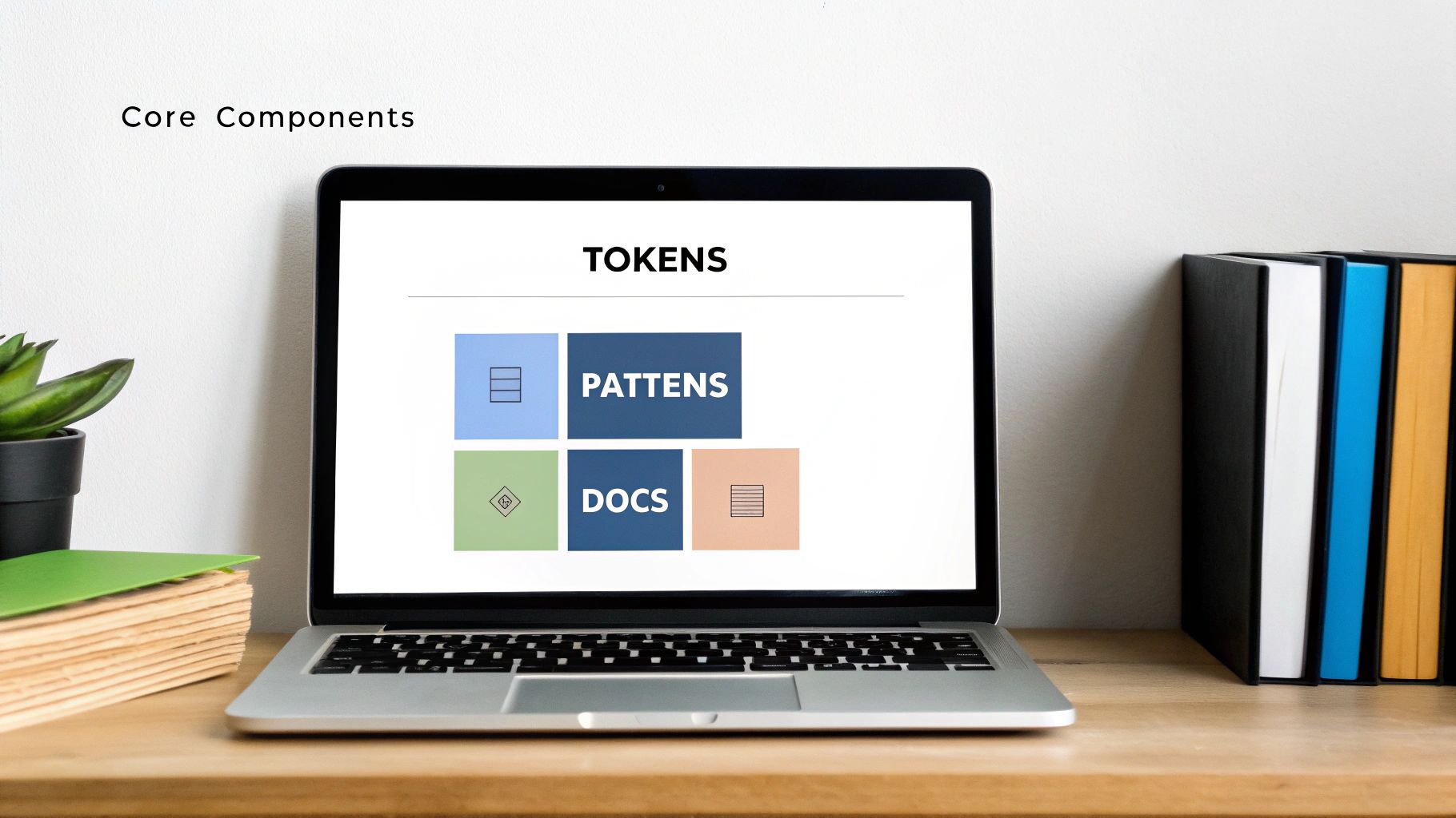
To really get what a design system is, you have to look under the hood. It’s not just one thing; it's a set of interconnected parts that work together to turn abstract rules into real, scalable product features. Each piece has its own job, but they all depend on each other to function.
Think of it like building with LEGOs. You have the individual, raw plastic pellets (tokens), the standard bricks like a 2x4 or a 1x1 (components), a master catalog showing how these bricks combine into a car or a house (pattern library), and the instruction manuals that come in the box (documentation).
Let's break down these essential building blocks.
Design Tokens: The Atomic Foundation
Right at the very bottom, you’ll find design tokens. These aren't visual elements you can see. Instead, they’re the tiny, named pieces of data that store your core design decisions. Think of them as variables for your design language.
Instead of hard-coding a hex value like #4A90E2 everywhere, you create a token called color-primary-500. Now, you can apply that token wherever that specific blue needs to appear. The magic happens when you need to update your brand color—you change it in just one place, and it propagates across the entire product automatically.
Tokens are perfect for managing foundational styles, including:
Colors: Primary, secondary, text, background, and error state colors.
Typography: Font families, sizes, weights, and line heights.
Spacing: Margins, paddings, and the gaps between elements.
Shadows: Elevation styles for cards, modals, and other layered UI.
This approach builds a solid bridge between design and code, making sure visual consistency is baked in from the ground up.
UI Kits and Pattern Libraries: The Reusable Building Blocks
Moving up a level, we get to the tangible assets that your teams will interact with every single day. People often use "UI kit" and "pattern library" interchangeably, but they really serve different audiences.
A UI Kit is the designer's sandbox, usually living inside a tool like Figma. It’s a complete file containing all the visual components—buttons, input fields, modals, you name it—all built using the established design tokens. Designers grab these pre-made parts to assemble high-fidelity mockups that are already perfectly on-brand.
A Pattern Library, on the other hand, is the developer's side of the coin. It's a live catalog of coded, ready-to-use UI components. Tools like Storybook are popular for creating these libraries, giving developers a space to see each component in isolation, test its different states (like a disabled button), and grab the code snippet they need. It's crucial that these components embody inclusive design principles for accessible, engaging UX from the start.
For example, a pattern library would have the fully interactive code for a complex form element. This lets developers build consistent and user-friendly inputs without reinventing the wheel every time. For more on this, check out our guide on creating smarter, smoother form UX.
Documentation: The Essential User Manual
A design system without clear documentation isn't really a system at all—it's just a folder of assets. The documentation is what breathes life into it, explaining the why and how behind every decision.
Good documentation is the single source of truth that provides critical context for everyone.
It’s what answers the important questions: When do you use a primary button instead of a secondary one? What are the accessibility rules for a dropdown menu? How should our brand's voice and tone show up in error messages?
This living guide is what makes sure the system is actually adopted correctly and scales with the team. It’s the user manual that empowers people to build cohesively, even when they’re working on different parts of the product. These three pillars—tokens, libraries, and documentation—are the engine that drives a successful system forward.
The Real Business Impact of a Design System
A design system is so much more than a neat little library of components for your product team. Think of it as a core business asset, one that pays real, measurable dividends. When you get it right, a design system stops being a "cost" and starts driving speed, consistency, and growth. It’s the connective tissue between your product’s interface and your company's bottom line.
The magic really starts when you stop treating it like a side project for designers and start seeing it for what it is: a strategic tool. The benefits leap off the screen and straight into your operational efficiency. Every pre-built component, every clear guideline, shaves off wasted time and makes your entire product development process smarter.
Accelerate Your Speed to Market
In today's market, you can't afford to be slow. A design system gives your teams a full toolbox of pre-built, pre-approved, and already-coded components. This means they're no longer reinventing the wheel for every new feature or marketing page.
Picture this: your marketing team needs a new landing page for a big campaign. Instead of waiting weeks for design and development, they can assemble it in a few hours using established patterns. This frees up your engineers to tackle the genuinely complex problems that drive your business forward—not rebuilding the same button for the tenth time. Shipping value to customers faster isn't just a nice-to-have; it's a competitive advantage.
A well-structured design system dramatically reduces redundant work. It allows teams to build better products faster by providing a shared library of reliable, ready-to-use components.
Guarantee Unwavering Brand Consistency
Your product is where your brand lives and breathes. When a user navigates your app and sees different button styles, clashing colors, or wonky typography, it creates a jarring, unprofessional experience. That kind of inconsistency erodes trust and makes your product feel cheap and fragmented.
A design system is your single source of truth, enforcing your brand’s visual and interactive identity everywhere.
Unified User Experience: Every screen, feature, and platform feels like it belongs to the same coherent product family.
Strengthened Brand Identity: The consistent use of your colors, fonts, and logos reinforces brand recognition and builds user confidence.
Simplified Onboarding: New designers and developers can get up to speed in a fraction of the time by referencing the system's clear standards.
This isn't just about looking good. It’s about building a predictable, trustworthy relationship with your users, one interaction at a time.
Scale Your Product Without the Debt
As products grow, so does their complexity. Without a system in place, every new feature adds another layer of one-off code and design decisions. This leads to what we call design debt—a tangled mess that slows down future development, makes bug-fixing a nightmare, and bloats your codebase.
A design system is the antidote to that chaos. It provides a scalable framework, ensuring new features are built from the same core parts and principles as the old ones. This allows your product to expand gracefully, maintaining its integrity and performance without piling up costly technical and design baggage.
This growing need for efficiency is exactly why the global design system market is projected to hit USD 0.87 billion by 2033. You can discover more insights about these market trends on sqmagazine.co.uk.
Streamline the Designer-Developer Handoff
Let's be honest, the handoff between design and development is often where things fall apart. Misinterpretations, missing assets, and endless back-and-forth emails kill momentum and lead to frustrating rework.
A design system creates a shared language that bridges this gap. Designers build with components from a UI kit, and developers pull the exact same components from a coded library. There’s no room for guesswork.
This tight alignment ensures what gets designed is precisely what gets built, making collaboration smoother and the whole workflow more efficient. The insights from our research on the state of UI/UX design agencies highlight just how critical this streamlined process is for team efficiency.
How to Build Your First Design System?
Knowing what a design system is and actually building one are two very different things. The leap can feel intimidating, but here’s the secret: you don't have to build a system as comprehensive as Google's Material Design right out of the gate. The smartest way to begin is to start small and build iteratively.
Think of it like building a starter home instead of a mansion. You lay the foundation and put up the essential rooms first—the kitchen, the bathroom—and you add on as you grow. This approach, often called a minimum viable design system, is all about delivering immediate value and getting your team excited about what's to come.
Start with a UI Audit

Before you build a single component, you have to know what you’re working with. A UI audit is your first, non-negotiable step. It’s essentially a full inventory of your product’s interface, designed to shine a light on every inconsistency.
Go through your entire app and grab screenshots of every unique UI element. Be brutally honest and pay close attention to things like:
Buttons: How many different primary and secondary button styles are floating around?
Colors: Are you actually using 5 shades of blue, or is it closer to 50?
Typography: How many different font sizes, weights, and styles can you find?
Forms: Do input fields and dropdown menus look the same on every single page?
Laying all these elements out side-by-side can be a real wake-up call. It creates a powerful visual argument for why a design system isn't just a "nice to have," making it much easier to get buy-in from stakeholders.
Assemble Your Core Team

A design system is not a solo project. It’s a product in its own right—one that serves your entire organization—and it needs a dedicated, cross-functional team to champion its success.
Your initial crew should have key players from both design and engineering.
Design Lead: This person sets the visual direction, makes sure components meet usability standards, and spearheads the creation of the UI kit.
Tech Lead: This engineer ensures every component is performant, accessible, and truly reusable. They’re the primary architect of the coded pattern library.
Product Manager (or Owner): They act as the bridge between the design system and product teams, helping prioritize what gets built first based on the company's roadmap.
This core team is responsible for setting the rules of the road, building the first set of components, and getting everyone else on board.
Choose Your Tooling Wisely
The right tools are what make a design system truly useful and accessible. The goal is to create a seamless workflow that eliminates the friction between designers and developers.
While the specific tools can vary, a modern stack is critical for success. Here’s a look at some popular options that work well together.
Design System Tooling Comparison
Making sense of the tool landscape can be tricky. This table breaks down the key categories and popular choices to help you build a tech stack that fits your team's workflow.
Tool Category | Popular Tools | Primary Use Case |
|---|---|---|
Design & Prototyping | Creating the central UI kit and designing components. | |
Component Library | Building, documenting, and testing coded UI components in isolation. | |
Documentation Hub | Creating a central, accessible website for all system guidelines. |
The key is to select tools that integrate smoothly. For example, using Figma for design and Storybook for development creates a powerful, connected workflow, especially when you bring in a dedicated documentation hub. Getting this part right is a big job, which is why many teams choose to work with one of the best design system documentation agencies to build a solid foundation.
Prioritize and Build Your First Components
With your audit done, team assembled, and tools in place, it’s finally time to build. But remember: don't try to boil the ocean. Go back to your UI audit and identify the elements that are most frequently used and wildly inconsistent.
Your initial focus should be on creating high-impact, foundational components. This often means starting with design tokens (colors, fonts, spacing) and basic elements like buttons, inputs, and links.
By solving the most common problems first, you deliver immediate, tangible value. This builds trust and encourages people to actually use the system. From there, the benefits compound—moving from faster workflows to consistent experiences, and finally, to the ability to scale your product gracefully.
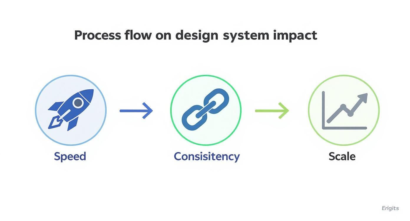
As you can see, the initial speed gained from reusable components directly feeds into greater consistency across your product. That consistency, in turn, creates the solid foundation you need to scale effectively without chaos. Building your first design system is a journey, but these practical first steps will get you started on the right path.
Learning From the Best in the Business
Theory is great, but seeing how the pros do it gives you a real-world blueprint. Looking at world-class design systems isn't just about admiring pretty interfaces. It’s about digging into their strategy, their documentation, and the core principles that make them work so effectively at a massive scale.
By studying the systems built by industry leaders, we can pull out practical lessons for our own work. These examples set the bar for quality and show what’s possible when a design system is treated like a core product, not a side project.
Shopify Polaris: The Gold Standard for Documentation
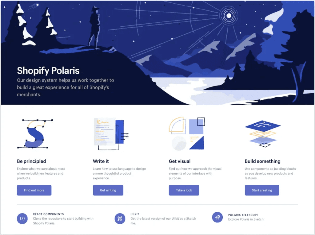
Everyone talks about Shopify's Polaris, and for good reason. Its real power isn’t just in the clean components; it's in the incredibly clear and thorough documentation that supports them. The Polaris team gets that a component without context is almost useless.
For every single element, Polaris gives you detailed guidelines on:
Best Practices: Simple do's and don'ts for using each component correctly.
Content Guidelines: Help with tone, voice, and even the microcopy that goes inside a component.
Accessibility Standards: Hard-wired requirements to ensure the experience is inclusive for all users.
Related Components: Smart suggestions for which elements work well together to create complete, intuitive user flows.
This isn't just documentation; it's a decision-making tool. It removes the guesswork and empowers designers and developers to build the right way, without needing constant supervision.
This screenshot of the Polaris homepage shows how they organize content, making it easy for users to find components, patterns, and guidelines.
The clean layout and intuitive navigation really drive home their commitment to a great user experience, even for the people building the product.
Google Material Design: The Master of Adaptability
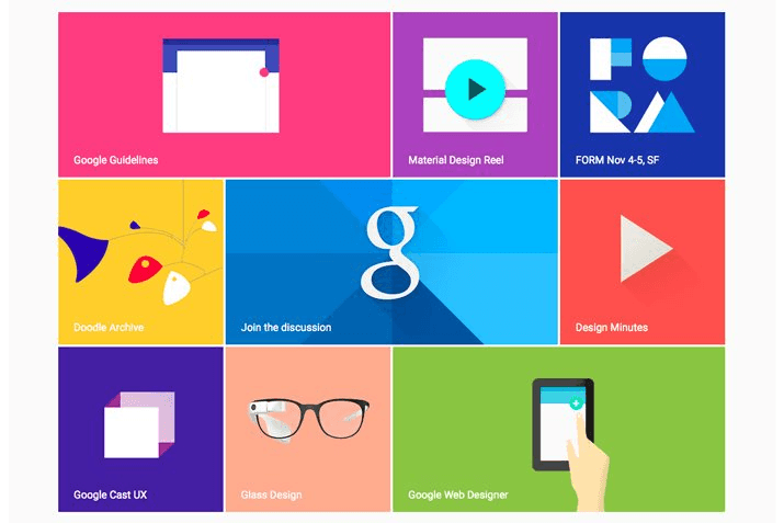
Google's Material Design is easily one of the most famous design systems on the planet. Its true genius lies in its incredible adaptability. Material provides a flexible framework that creates a consistent "Google" feel across an insane number of platforms, from Android phones and web apps to smart displays.
Material Design is built on the principle that design should be a "unifying theory of a rationalized space and a system of motion." It's less a rigid set of rules and more a guiding philosophy.
So how does it stay so flexible? Through customization. It offers a solid foundation but actively encourages teams to inject their own brand—colors, typography, and shapes—to make the system their own.
This balance between a strong starting point and creative freedom is what allows it to scale across one of the biggest tech ecosystems in the world.
Atlassian Design System: The Power of Integration
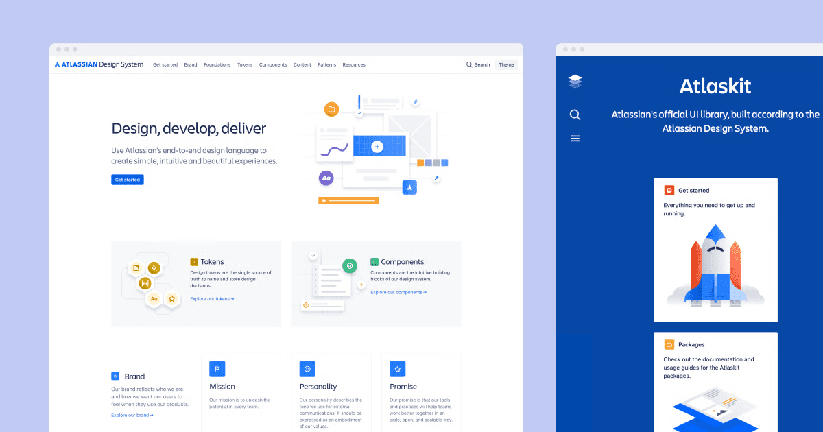
The Atlassian Design System is a masterclass in bringing a diverse portfolio of powerhouse products like Jira, Confluence, and Trello under one roof. Each tool has a unique job and a different user base, yet they all feel like they belong to the same family.
What makes Atlassian’s system so powerful is how deeply it’s woven into the company's workflow. It’s not just a library of assets; it's fundamental to how they build software. They pull this off by focusing on:
A Shared Language: The system establishes a clear vocabulary that everyone, from designers to engineers, uses for everything from design tokens to complex patterns.
Cross-Product Consistency: Components are built from the ground up to work flawlessly across their entire suite of tools.
Robust Governance: They have a well-defined process for how anyone can propose, build, and roll out new additions to the system.
Studying these giants gives you a roadmap for your own system. Whether you're just starting out or work at a huge company, partnering with one of the best design system agencies can help you apply these world-class principles to your own product.
Their expertise can be the difference-maker in going from a simple UI kit to a fully integrated and scalable system.
Common Mistakes to Avoid

Starting a design system is a massive step forward, but the path is littered with potential missteps. Knowing what to watch out for can mean the difference between a system that empowers your teams and one that collects digital dust. Let’s walk through the most common traps I’ve seen teams fall into.
The number one mistake? Treating the design system like a project with a start and end date. Teams often get excited, build a V1 set of components, hand it over, and call it "done." This mindset is a recipe for failure. Your product is constantly changing, and the system supporting it needs to evolve right alongside it.
A design system is not a project; it's a living product that serves other products. It requires a dedicated team, a roadmap, and ongoing maintenance to remain useful and relevant.
This means you need to treat it like any other product in your portfolio. It needs a permanent budget, a dedicated team to manage updates, and a process for gathering feedback from its users—your designers and developers.
Neglecting True Buy-In
Another classic blunder is failing to get genuine buy-in from everyone involved. It’s not enough for designers to be on board. You need real, enthusiastic support from engineering leads, product managers, and executive leadership. If you don't have it, the system will be viewed as a bottleneck, not a benefit.
You have to become an internal marketer for your design system. Frame the benefits in a language each stakeholder understands:
For developers: Talk about building features faster with pre-coded, pre-tested, and fully accessible components.
For product managers: Show them how it accelerates time-to-market and ensures a cohesive user experience across the entire product.
For leadership: Focus on the long-term ROI. We’re talking about slashing design debt and making the entire product organization more efficient.
A great way to foster this is by creating a cross-functional "design system guild." Get people from different teams in a room to contribute, give feedback, and champion the system back in their own departments. This turns adoption from a top-down mandate into a collaborative movement.
Creating Overly Rigid Rules
Finally, avoid the temptation to lock everything down too tightly. A system that's overly rigid will only stifle the creativity and innovation you need to solve new problems. When the rules are too strict, you can bet your teams will find workarounds, which creates the exact inconsistency the system was built to eliminate.
A design system should be a supportive framework, not a creative straitjacket.
The trick is to build in just the right amount of flexibility. Create clear "escape hatches" that allow teams to experiment with new patterns when a unique challenge arises. More importantly, have a well-defined process for how those successful experiments can be reviewed and folded back into the core system.
This creates a healthy balance—you get the consistency you need without killing the creative spark.
Conclusion
This approach lets the system grow alongside your products without constant disruption. The key to making it work is a solid governance process for suggesting, vetting, and rolling out changes. That’s what keeps it a living, breathing tool that everyone can rely on.
Ready to build a product that scales beautifully and efficiently? We at Bricx specializes in creating and implementing design systems for ambitious B2B and AI SaaS companies. Let’s talk about building your single source of truth.
FAQs
How do you actually measure the ROI of a design system?
A good way to approach this is to track a mix of metrics:
The Hard Numbers (Quantitative): How much faster are you shipping features? Clock the time it takes to go from idea to launch, both before and after. You should also see a drop in UI-related bug reports and notice new hires becoming productive much more quickly.
The "Feel" (Qualitative): Is the product experience more cohesive? User feedback and brand perception surveys can tell you that. Just as important, check in with your own team. Internal surveys can reveal how much a design system is reducing day-to-day friction for designers and developers.
What’s the difference between a style guide and a design system?
This trips a lot of people up, but the distinction is pretty straightforward. It's helpful to think of it as a set of building blocks, each one more comprehensive than the last.
A style guide is your foundation. It's all about the visual brand identity—the specific hex codes for your colors, the font families you use, and the right way to display your logo. It answers the question, "What should this look like?"
A design system is the entire ecosystem built on top of that foundation. It includes the style guide, yes, but it also contains a library of reusable, coded UI components, clear rules on how and when to use them, core design principles, and a governance model.
It’s the single source of truth that dictates not just how your product looks, but how it’s actually built.
How often should a design system be updated?
A design system is a product, not a project. It has its own lifecycle. If it’s not evolving, it’s dying.
The trick is to find a predictable rhythm for updates. You don't want to cause chaos, but you can't let it get stale. Small bug fixes or minor component adjustments might ship weekly.
Bigger changes, like a brand-new component or a major pattern overhaul, should be planned and released on a more structured cadence, maybe once a quarter.
Ever tried building a LEGO set without the instructions? You might end up with something, but it probably won't be the starship on the box. A design system is that instruction manual and the box of perfectly sorted bricks for your digital product.
It’s a complete set of standards, reusable components, and clear guidelines that product teams use to build applications. It ensures everything fits together perfectly, creating a high-quality user experience every single time.
What Is a Design System Really?
Think about building a new city. If you let every architect do whatever they wanted, you'd get chaos—a glass skyscraper next to a log cabin, with roads that don't connect. A total mess.
A design system is the city’s master plan. It’s the building codes, the approved materials, and the zoning laws all rolled into one. It’s not just a UI kit sitting in a Figma file; it’s the shared language that gets designers, developers, and product managers all on the same page. It’s their single source of truth.
Beyond a Simple Style Guide
It's easy to mistake a style guide for a design system. A style guide usually just covers the basics: colors, fonts, and logos. That’s an important start, but a real design system goes so much deeper.
A true design system is a living, breathing product that serves all your other products. It’s an entire ecosystem that includes not just visual styles but also interactive components, code snippets, accessibility rules, and even voice and tone guidelines.
"A design system isn't a project. It's a product, serving other products."
This is a critical mindset shift. It needs a dedicated team, a roadmap for the future, and constant updates to stay relevant and genuinely useful to the whole organization.
To give you a clearer picture, here’s a quick breakdown of the core pillars you’ll find in a modern design system:
Core Elements of a Modern Design System
Element | Primary Function | Main Users |
|---|---|---|
UI Kit | Provides ready-to-use visual assets and components for mockups. | Designers |
Pattern Library | Offers coded, reusable UI components (e.g., buttons, forms). | Developers |
Design Tokens | Stores design properties (color, spacing) as variables for code. | Designers, Developers |
Documentation | Explains how, when, and why to use system components. | Everyone |
Governance Model | Defines rules for contributing to and updating the system. | Everyone |
Each of these elements works together to create a cohesive and efficient workflow for the entire product team.
The Core Philosophy Behind the System
At its heart, a design system is about solving problems once, and solving them well. Instead of designing a new button for the tenth time, your team can grab a pre-built, pre-coded, and fully accessible one straight from the system. This frees everyone up to tackle bigger, more interesting challenges.
The philosophy boils down to four key benefits:
Consistency: Every part of your product looks and feels like it belongs. This builds user trust and makes your brand feel solid and reliable.
Efficiency: Stop reinventing the wheel. With ready-to-go components, design and development cycles get dramatically faster.
Scalability: As your product grows, a design system helps you avoid "design debt." It makes launching new features or even whole new products feel coherent, not chaotic.
Collaboration: It creates a common vocabulary. When designers and developers are speaking the same language, handoffs become smoother and misunderstandings fade away.
Getting this foundation right is everything. You can learn more about defining principles of design to build a solid base. This approach also fits perfectly within broader product development strategies, which we cover in our guide to different UX design methodologies. It truly changes how a team ships features, making the process faster and far more cohesive.
Deconstructing the Core Components
To really get what a design system is, you have to look under the hood. It’s not just one thing; it's a set of interconnected parts that work together to turn abstract rules into real, scalable product features. Each piece has its own job, but they all depend on each other to function.
Think of it like building with LEGOs. You have the individual, raw plastic pellets (tokens), the standard bricks like a 2x4 or a 1x1 (components), a master catalog showing how these bricks combine into a car or a house (pattern library), and the instruction manuals that come in the box (documentation).
Let's break down these essential building blocks.
Design Tokens: The Atomic Foundation
Right at the very bottom, you’ll find design tokens. These aren't visual elements you can see. Instead, they’re the tiny, named pieces of data that store your core design decisions. Think of them as variables for your design language.
Instead of hard-coding a hex value like #4A90E2 everywhere, you create a token called color-primary-500. Now, you can apply that token wherever that specific blue needs to appear. The magic happens when you need to update your brand color—you change it in just one place, and it propagates across the entire product automatically.
Tokens are perfect for managing foundational styles, including:
Colors: Primary, secondary, text, background, and error state colors.
Typography: Font families, sizes, weights, and line heights.
Spacing: Margins, paddings, and the gaps between elements.
Shadows: Elevation styles for cards, modals, and other layered UI.
This approach builds a solid bridge between design and code, making sure visual consistency is baked in from the ground up.
UI Kits and Pattern Libraries: The Reusable Building Blocks
Moving up a level, we get to the tangible assets that your teams will interact with every single day. People often use "UI kit" and "pattern library" interchangeably, but they really serve different audiences.
A UI Kit is the designer's sandbox, usually living inside a tool like Figma. It’s a complete file containing all the visual components—buttons, input fields, modals, you name it—all built using the established design tokens. Designers grab these pre-made parts to assemble high-fidelity mockups that are already perfectly on-brand.
A Pattern Library, on the other hand, is the developer's side of the coin. It's a live catalog of coded, ready-to-use UI components. Tools like Storybook are popular for creating these libraries, giving developers a space to see each component in isolation, test its different states (like a disabled button), and grab the code snippet they need. It's crucial that these components embody inclusive design principles for accessible, engaging UX from the start.
For example, a pattern library would have the fully interactive code for a complex form element. This lets developers build consistent and user-friendly inputs without reinventing the wheel every time. For more on this, check out our guide on creating smarter, smoother form UX.
Documentation: The Essential User Manual
A design system without clear documentation isn't really a system at all—it's just a folder of assets. The documentation is what breathes life into it, explaining the why and how behind every decision.
Good documentation is the single source of truth that provides critical context for everyone.
It’s what answers the important questions: When do you use a primary button instead of a secondary one? What are the accessibility rules for a dropdown menu? How should our brand's voice and tone show up in error messages?
This living guide is what makes sure the system is actually adopted correctly and scales with the team. It’s the user manual that empowers people to build cohesively, even when they’re working on different parts of the product. These three pillars—tokens, libraries, and documentation—are the engine that drives a successful system forward.
The Real Business Impact of a Design System
A design system is so much more than a neat little library of components for your product team. Think of it as a core business asset, one that pays real, measurable dividends. When you get it right, a design system stops being a "cost" and starts driving speed, consistency, and growth. It’s the connective tissue between your product’s interface and your company's bottom line.
The magic really starts when you stop treating it like a side project for designers and start seeing it for what it is: a strategic tool. The benefits leap off the screen and straight into your operational efficiency. Every pre-built component, every clear guideline, shaves off wasted time and makes your entire product development process smarter.
Accelerate Your Speed to Market
In today's market, you can't afford to be slow. A design system gives your teams a full toolbox of pre-built, pre-approved, and already-coded components. This means they're no longer reinventing the wheel for every new feature or marketing page.
Picture this: your marketing team needs a new landing page for a big campaign. Instead of waiting weeks for design and development, they can assemble it in a few hours using established patterns. This frees up your engineers to tackle the genuinely complex problems that drive your business forward—not rebuilding the same button for the tenth time. Shipping value to customers faster isn't just a nice-to-have; it's a competitive advantage.
A well-structured design system dramatically reduces redundant work. It allows teams to build better products faster by providing a shared library of reliable, ready-to-use components.
Guarantee Unwavering Brand Consistency
Your product is where your brand lives and breathes. When a user navigates your app and sees different button styles, clashing colors, or wonky typography, it creates a jarring, unprofessional experience. That kind of inconsistency erodes trust and makes your product feel cheap and fragmented.
A design system is your single source of truth, enforcing your brand’s visual and interactive identity everywhere.
Unified User Experience: Every screen, feature, and platform feels like it belongs to the same coherent product family.
Strengthened Brand Identity: The consistent use of your colors, fonts, and logos reinforces brand recognition and builds user confidence.
Simplified Onboarding: New designers and developers can get up to speed in a fraction of the time by referencing the system's clear standards.
This isn't just about looking good. It’s about building a predictable, trustworthy relationship with your users, one interaction at a time.
Scale Your Product Without the Debt
As products grow, so does their complexity. Without a system in place, every new feature adds another layer of one-off code and design decisions. This leads to what we call design debt—a tangled mess that slows down future development, makes bug-fixing a nightmare, and bloats your codebase.
A design system is the antidote to that chaos. It provides a scalable framework, ensuring new features are built from the same core parts and principles as the old ones. This allows your product to expand gracefully, maintaining its integrity and performance without piling up costly technical and design baggage.
This growing need for efficiency is exactly why the global design system market is projected to hit USD 0.87 billion by 2033. You can discover more insights about these market trends on sqmagazine.co.uk.
Streamline the Designer-Developer Handoff
Let's be honest, the handoff between design and development is often where things fall apart. Misinterpretations, missing assets, and endless back-and-forth emails kill momentum and lead to frustrating rework.
A design system creates a shared language that bridges this gap. Designers build with components from a UI kit, and developers pull the exact same components from a coded library. There’s no room for guesswork.
This tight alignment ensures what gets designed is precisely what gets built, making collaboration smoother and the whole workflow more efficient. The insights from our research on the state of UI/UX design agencies highlight just how critical this streamlined process is for team efficiency.
How to Build Your First Design System?
Knowing what a design system is and actually building one are two very different things. The leap can feel intimidating, but here’s the secret: you don't have to build a system as comprehensive as Google's Material Design right out of the gate. The smartest way to begin is to start small and build iteratively.
Think of it like building a starter home instead of a mansion. You lay the foundation and put up the essential rooms first—the kitchen, the bathroom—and you add on as you grow. This approach, often called a minimum viable design system, is all about delivering immediate value and getting your team excited about what's to come.
Start with a UI Audit
Before you build a single component, you have to know what you’re working with. A UI audit is your first, non-negotiable step. It’s essentially a full inventory of your product’s interface, designed to shine a light on every inconsistency.
Go through your entire app and grab screenshots of every unique UI element. Be brutally honest and pay close attention to things like:
Buttons: How many different primary and secondary button styles are floating around?
Colors: Are you actually using 5 shades of blue, or is it closer to 50?
Typography: How many different font sizes, weights, and styles can you find?
Forms: Do input fields and dropdown menus look the same on every single page?
Laying all these elements out side-by-side can be a real wake-up call. It creates a powerful visual argument for why a design system isn't just a "nice to have," making it much easier to get buy-in from stakeholders.
Assemble Your Core Team
A design system is not a solo project. It’s a product in its own right—one that serves your entire organization—and it needs a dedicated, cross-functional team to champion its success.
Your initial crew should have key players from both design and engineering.
Design Lead: This person sets the visual direction, makes sure components meet usability standards, and spearheads the creation of the UI kit.
Tech Lead: This engineer ensures every component is performant, accessible, and truly reusable. They’re the primary architect of the coded pattern library.
Product Manager (or Owner): They act as the bridge between the design system and product teams, helping prioritize what gets built first based on the company's roadmap.
This core team is responsible for setting the rules of the road, building the first set of components, and getting everyone else on board.
Choose Your Tooling Wisely
The right tools are what make a design system truly useful and accessible. The goal is to create a seamless workflow that eliminates the friction between designers and developers.
While the specific tools can vary, a modern stack is critical for success. Here’s a look at some popular options that work well together.
Design System Tooling Comparison
Making sense of the tool landscape can be tricky. This table breaks down the key categories and popular choices to help you build a tech stack that fits your team's workflow.
Tool Category | Popular Tools | Primary Use Case |
|---|---|---|
Design & Prototyping | Creating the central UI kit and designing components. | |
Component Library | Building, documenting, and testing coded UI components in isolation. | |
Documentation Hub | Creating a central, accessible website for all system guidelines. |
The key is to select tools that integrate smoothly. For example, using Figma for design and Storybook for development creates a powerful, connected workflow, especially when you bring in a dedicated documentation hub. Getting this part right is a big job, which is why many teams choose to work with one of the best design system documentation agencies to build a solid foundation.
Prioritize and Build Your First Components
With your audit done, team assembled, and tools in place, it’s finally time to build. But remember: don't try to boil the ocean. Go back to your UI audit and identify the elements that are most frequently used and wildly inconsistent.
Your initial focus should be on creating high-impact, foundational components. This often means starting with design tokens (colors, fonts, spacing) and basic elements like buttons, inputs, and links.
By solving the most common problems first, you deliver immediate, tangible value. This builds trust and encourages people to actually use the system. From there, the benefits compound—moving from faster workflows to consistent experiences, and finally, to the ability to scale your product gracefully.
As you can see, the initial speed gained from reusable components directly feeds into greater consistency across your product. That consistency, in turn, creates the solid foundation you need to scale effectively without chaos. Building your first design system is a journey, but these practical first steps will get you started on the right path.
Learning From the Best in the Business
Theory is great, but seeing how the pros do it gives you a real-world blueprint. Looking at world-class design systems isn't just about admiring pretty interfaces. It’s about digging into their strategy, their documentation, and the core principles that make them work so effectively at a massive scale.
By studying the systems built by industry leaders, we can pull out practical lessons for our own work. These examples set the bar for quality and show what’s possible when a design system is treated like a core product, not a side project.
Shopify Polaris: The Gold Standard for Documentation
Everyone talks about Shopify's Polaris, and for good reason. Its real power isn’t just in the clean components; it's in the incredibly clear and thorough documentation that supports them. The Polaris team gets that a component without context is almost useless.
For every single element, Polaris gives you detailed guidelines on:
Best Practices: Simple do's and don'ts for using each component correctly.
Content Guidelines: Help with tone, voice, and even the microcopy that goes inside a component.
Accessibility Standards: Hard-wired requirements to ensure the experience is inclusive for all users.
Related Components: Smart suggestions for which elements work well together to create complete, intuitive user flows.
This isn't just documentation; it's a decision-making tool. It removes the guesswork and empowers designers and developers to build the right way, without needing constant supervision.
This screenshot of the Polaris homepage shows how they organize content, making it easy for users to find components, patterns, and guidelines.
The clean layout and intuitive navigation really drive home their commitment to a great user experience, even for the people building the product.
Google Material Design: The Master of Adaptability
Google's Material Design is easily one of the most famous design systems on the planet. Its true genius lies in its incredible adaptability. Material provides a flexible framework that creates a consistent "Google" feel across an insane number of platforms, from Android phones and web apps to smart displays.
Material Design is built on the principle that design should be a "unifying theory of a rationalized space and a system of motion." It's less a rigid set of rules and more a guiding philosophy.
So how does it stay so flexible? Through customization. It offers a solid foundation but actively encourages teams to inject their own brand—colors, typography, and shapes—to make the system their own.
This balance between a strong starting point and creative freedom is what allows it to scale across one of the biggest tech ecosystems in the world.
Atlassian Design System: The Power of Integration
The Atlassian Design System is a masterclass in bringing a diverse portfolio of powerhouse products like Jira, Confluence, and Trello under one roof. Each tool has a unique job and a different user base, yet they all feel like they belong to the same family.
What makes Atlassian’s system so powerful is how deeply it’s woven into the company's workflow. It’s not just a library of assets; it's fundamental to how they build software. They pull this off by focusing on:
A Shared Language: The system establishes a clear vocabulary that everyone, from designers to engineers, uses for everything from design tokens to complex patterns.
Cross-Product Consistency: Components are built from the ground up to work flawlessly across their entire suite of tools.
Robust Governance: They have a well-defined process for how anyone can propose, build, and roll out new additions to the system.
Studying these giants gives you a roadmap for your own system. Whether you're just starting out or work at a huge company, partnering with one of the best design system agencies can help you apply these world-class principles to your own product.
Their expertise can be the difference-maker in going from a simple UI kit to a fully integrated and scalable system.
Common Mistakes to Avoid
Starting a design system is a massive step forward, but the path is littered with potential missteps. Knowing what to watch out for can mean the difference between a system that empowers your teams and one that collects digital dust. Let’s walk through the most common traps I’ve seen teams fall into.
The number one mistake? Treating the design system like a project with a start and end date. Teams often get excited, build a V1 set of components, hand it over, and call it "done." This mindset is a recipe for failure. Your product is constantly changing, and the system supporting it needs to evolve right alongside it.
A design system is not a project; it's a living product that serves other products. It requires a dedicated team, a roadmap, and ongoing maintenance to remain useful and relevant.
This means you need to treat it like any other product in your portfolio. It needs a permanent budget, a dedicated team to manage updates, and a process for gathering feedback from its users—your designers and developers.
Neglecting True Buy-In
Another classic blunder is failing to get genuine buy-in from everyone involved. It’s not enough for designers to be on board. You need real, enthusiastic support from engineering leads, product managers, and executive leadership. If you don't have it, the system will be viewed as a bottleneck, not a benefit.
You have to become an internal marketer for your design system. Frame the benefits in a language each stakeholder understands:
For developers: Talk about building features faster with pre-coded, pre-tested, and fully accessible components.
For product managers: Show them how it accelerates time-to-market and ensures a cohesive user experience across the entire product.
For leadership: Focus on the long-term ROI. We’re talking about slashing design debt and making the entire product organization more efficient.
A great way to foster this is by creating a cross-functional "design system guild." Get people from different teams in a room to contribute, give feedback, and champion the system back in their own departments. This turns adoption from a top-down mandate into a collaborative movement.
Creating Overly Rigid Rules
Finally, avoid the temptation to lock everything down too tightly. A system that's overly rigid will only stifle the creativity and innovation you need to solve new problems. When the rules are too strict, you can bet your teams will find workarounds, which creates the exact inconsistency the system was built to eliminate.
A design system should be a supportive framework, not a creative straitjacket.
The trick is to build in just the right amount of flexibility. Create clear "escape hatches" that allow teams to experiment with new patterns when a unique challenge arises. More importantly, have a well-defined process for how those successful experiments can be reviewed and folded back into the core system.
This creates a healthy balance—you get the consistency you need without killing the creative spark.
Conclusion
This approach lets the system grow alongside your products without constant disruption. The key to making it work is a solid governance process for suggesting, vetting, and rolling out changes. That’s what keeps it a living, breathing tool that everyone can rely on.
Ready to build a product that scales beautifully and efficiently? We at Bricx specializes in creating and implementing design systems for ambitious B2B and AI SaaS companies. Let’s talk about building your single source of truth.
FAQs
How do you actually measure the ROI of a design system?
A good way to approach this is to track a mix of metrics:
The Hard Numbers (Quantitative): How much faster are you shipping features? Clock the time it takes to go from idea to launch, both before and after. You should also see a drop in UI-related bug reports and notice new hires becoming productive much more quickly.
The "Feel" (Qualitative): Is the product experience more cohesive? User feedback and brand perception surveys can tell you that. Just as important, check in with your own team. Internal surveys can reveal how much a design system is reducing day-to-day friction for designers and developers.
What’s the difference between a style guide and a design system?
This trips a lot of people up, but the distinction is pretty straightforward. It's helpful to think of it as a set of building blocks, each one more comprehensive than the last.
A style guide is your foundation. It's all about the visual brand identity—the specific hex codes for your colors, the font families you use, and the right way to display your logo. It answers the question, "What should this look like?"
A design system is the entire ecosystem built on top of that foundation. It includes the style guide, yes, but it also contains a library of reusable, coded UI components, clear rules on how and when to use them, core design principles, and a governance model.
It’s the single source of truth that dictates not just how your product looks, but how it’s actually built.
How often should a design system be updated?
A design system is a product, not a project. It has its own lifecycle. If it’s not evolving, it’s dying.
The trick is to find a predictable rhythm for updates. You don't want to cause chaos, but you can't let it get stale. Small bug fixes or minor component adjustments might ship weekly.
Bigger changes, like a brand-new component or a major pattern overhaul, should be planned and released on a more structured cadence, maybe once a quarter.


Similar Blogs
Similar Blogs
Similar Blogs


Available for Work
Bricx
© Bricx, 2026. All rights reserved.


Available for Work
Bricx
© Bricx, 2026. All rights reserved.
Available for Work
Bricx
© Bricx, 2026. All rights reserved.
Available for Work
Bricx
© Bricx, 2026. All rights reserved.