Website Design
Website Design
Website Design
Insights
Insights
Insights
December 11, 2025
December 11, 2025
December 11, 2025
How to Design A Web3 Website That Converts?
How to Design A Web3 Website That Converts?
How to Design A Web3 Website That Converts?
Learn how to design a Web3 website with our practical guide. We cover essential UX patterns, wallet integration, security, and performance for dApps.
Learn how to design a Web3 website with our practical guide. We cover essential UX patterns, wallet integration, security, and performance for dApps.
Learn how to design a Web3 website with our practical guide. We cover essential UX patterns, wallet integration, security, and performance for dApps.
4 mins
4 mins
4 mins


Designing for web3 is a different beast entirely. It’s not just about a fresh coat of paint; it’s a fundamental shift in how we think about user interaction, ownership, and trust. The foundation of any great web3 project is a solid strategy that grapples with decentralization, user crypto-savviness, and the unique hurdles of blockchain interaction. Get this right, and you're on your way. Get it wrong, and even the most brilliant tech will fall flat.
Moving Beyond Hype: Your Web3 Design Strategy

Before you even think about code or color palettes, you need a rock-solid strategy. It's incredibly easy to get distracted by the latest trends—maybe it's a slick 3D animation or a cool, futuristic theme. But a successful decentralized application (dApp) isn't built on flash; it's built on a deep understanding of its users and a design that serves a real purpose.
The main challenge here isn't just about making things look good. It's about taking something inherently complex, like interacting with a blockchain, and making it feel intuitive and transparent. This means your first order of business is user research, but with a web3 twist.
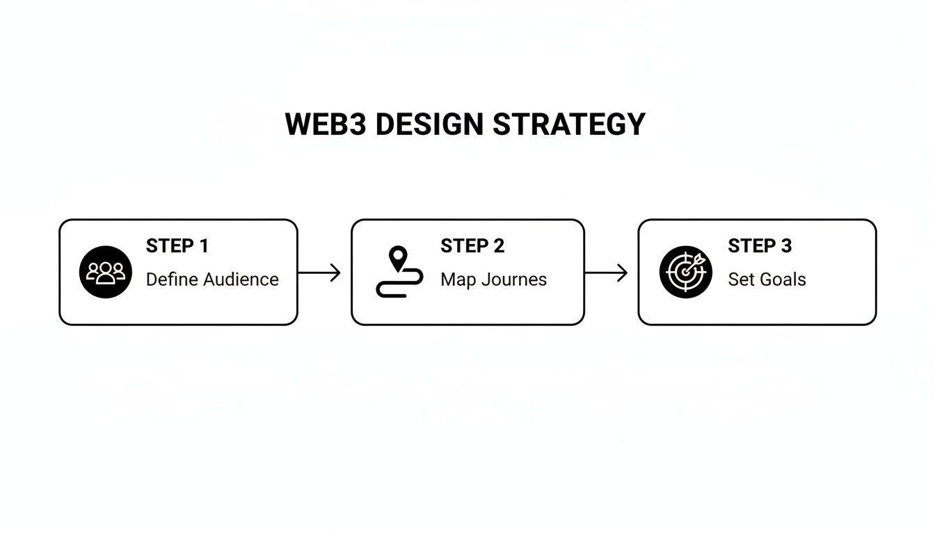
Define Your Audience and Their Crypto Comfort Level
Seriously, who are you building this for? In web3, that question is a lot trickier than it sounds. Your users could be crypto-native "degens" who live and breathe DeFi, or they could be total beginners who think a "wallet" is something you keep in your back pocket.
Your design strategy has to bridge this gap.
For the Experts: You can get away with using industry shorthand and assume they know their way around. The focus here is on efficiency, data density, and giving them the controls they expect.
For the Newcomers: Your design needs to be a patient guide. Think simple onboarding flows, plain-English explanations for scary terms like "gas fees" or "signing transactions," and plenty of visual feedback to build confidence.
One of the biggest mistakes I see is trying to build one-size-fits-all experience. A much smarter play is to create tiered user journeys. For example, you could offer a "basic mode" for straightforward tasks and an "advanced mode" for the power users who crave more data and control.
A killer user experience will drive adoption far more than the underlying tech. Your job is to abstract away the clunky parts—the wallet connections, the transaction signing—until it feels as second-nature as any Web2 app.
Map Out Decentralized User Journeys
Web3 user journeys have unique twists and turns that simply don't exist in the Web2 world. You have to map these out with surgical precision. Think through the entire process, from the moment someone lands on your site to when they successfully complete an on-chain action.
A few key moments you absolutely have to nail:
Wallet Connection: How does someone hook up their wallet? Is the button obvious? Do you support popular options like MetaMask and Coinbase Wallet? Make this frictionless.
On-Chain Interactions: How do you handle transaction states? The blockchain isn't instant. You need clear, persistent feedback for pending, successful, and failed transactions to keep users from getting frustrated.
Data Display: How are you going to show on-chain data, like a user's token balance or their transaction history, in a way that doesn't look like a block explorer? It needs to be clean and human-readable.
These new design considerations have reshaped web development since the early days of blockchain platforms around 2015-2017. We’ve had to invent new patterns for everything from authentication to data ownership.
When building your strategy, don't forget the bigger picture. If your dApp needs to work across different blockchains, a deep dive into understanding cross-chain DeFi interoperability will be invaluable for making smart architectural and UX choices. You can also explore our other articles to learn more about the core web3 design principles that underpin these strategic decisions.
To really grasp the shift, it helps to see the two approaches side-by-side.
Web2 vs Web3 Design Principles: A Quick Comparison
This table breaks down the core philosophical and technical differences between traditional Web2 design and the decentralized approach of Web3.
Design Aspect | Web2 Approach (Centralized) | Web3 Approach (Decentralized) |
|---|---|---|
User Identity | Email/password logins, managed by the company. Social logins (Google, Facebook). | Wallet-based authentication. Users control their identity via cryptographic keys. |
Data Ownership & Storage | Data is stored on company-owned servers. Users have limited control. | Data is stored on-chain or on decentralized storage (like IPFS). Users truly own their data. |
Trust Model | Trust in the central authority (the company) to secure data and act ethically. | Trust is placed in the code (smart contracts) and the decentralized network. "Trustless" interactions. |
Core Interaction | Users interact with a company's database via a front-end interface. | Users interact directly with smart contracts on a blockchain, signing transactions with their wallet. |
UX Focus | Simplicity, speed, and seamlessness by abstracting server interactions. | Transparency, security, and user agency. Guiding users through on-chain actions and states. |
Monetization | Subscriptions, advertising, data sales. | Tokenomics, protocol fees, community treasuries (DAOs), NFT sales. |
As you can see, the move to Web3 isn't just a technological update; it's a paradigm shift that puts the user back in the driver's seat. Your design strategy must reflect this from day one.
Designing UX Flows for a Decentralized World
Moving from Web2 to Web3 design isn't just about learning a new tech stack. It’s a fundamental shift in how you approach user interaction. In this decentralized world, a single click can kick off an on-chain action, and trust isn't built with a slick interface alone—it's earned through radical transparency. Your design has to be the user's guide, a reassuring hand in what can often feel like uncharted territory.
This is why mapping out your core user flows is so important. You can't just take what works for a standard SaaS product and expect it to fly. You have to design for those moments that are entirely unique to Web3, like connecting a wallet for the first time, signing a transaction, and the sometimes-anxious wait for blockchain confirmation.
The whole process starts with a solid strategy, long before you even think about pixels. It’s about knowing your audience, mapping their specific journeys, and setting clear goals for what you want them to achieve.
Grounding your UX decisions in user needs, not just what the tech can do, makes all the difference. Get this right, and you're ready to tackle the specific design patterns.
Nailing the Wallet Connection Flow
Often, the very first thing a person does on your dApp is connect their wallet. This single step can make or break the entire experience. It's the front door, and if it feels confusing or intimidating, they'll bounce before they even see what’s inside.
Your crypto-native users will know exactly what to do with a "Connect Wallet" button. But for everyone else? It’s a huge roadblock.
Offer Multiple Wallet Options: Don't just assume everyone is on MetaMask. You need to include popular choices like Coinbase Wallet, Phantom (a must for Solana), and aggregators like WalletConnect to cast a wider net.
Provide Contextual Help: A tiny tooltip or a link to a "What is a wallet?" guide can be a real lifesaver for newcomers. Explain why they need one—to prove they own something, to sign an action, or to access exclusive content.
Design for Clarity: Use recognizable icons for different wallets. The moment the connection is successful, give them immediate visual confirmation. Displaying their shortened wallet address or ENS name is a simple, effective way to do this.
Demystifying Transaction UX
Once a user’s wallet is connected, they'll start interacting with your smart contracts. This is where Web3 UX really gets tricky. A blockchain transaction isn't like a simple click in a Web2 app; it comes with gas fees, network delays, and confirmation times. Your job is to make this process feel as transparent and painless as possible.
When someone goes to sign a transaction, they need to know three things, instantly:
What they are approving: Ditch the technical jargon. Instead of showing them a raw smart contract function, explain the action in plain English. Think "You're about to mint 1 NFT for 0.05 ETH."
The total cost: Show the estimated gas fees right next to the item's price. If the network is slammed and fees are sky-high, warn them. No one likes surprise costs.
The expected wait time: Blockchains aren't instant. Give them a realistic time estimate, and more importantly, show them what’s happening at every stage of the process.
The golden rule here is to never leave the user guessing. Use distinct visual states for "pending," "confirmed," and "failed." A simple loading spinner just doesn't cut it. You need clear, persistent messaging that builds trust.
For instance, a "pending" transaction could be a subtle pulsating icon in the nav bar. A "successful" transaction could trigger a small confetti animation and a direct link to view it on a block explorer. If it "fails," the error message needs to be human-readable, telling them what went wrong and what to do next. These little visual cues are critical for building confidence. For a deeper look at designing these moments, some great SaaS user flow examples can be adapted for Web3.
Security is also deeply psychological. With over 90% of Web3 users worried about phishing, designers have to prioritize crystal-clear UI for connections and confirmations. We’ve even seen how thoughtful micro-interactions and animations can boost engagement and conversions by up to 40%, simply by making complex steps feel more intuitive and safe. Ultimately, great Web3 UX is about building trust through absolute clarity.
Choosing Your Decentralized Front-End Stack
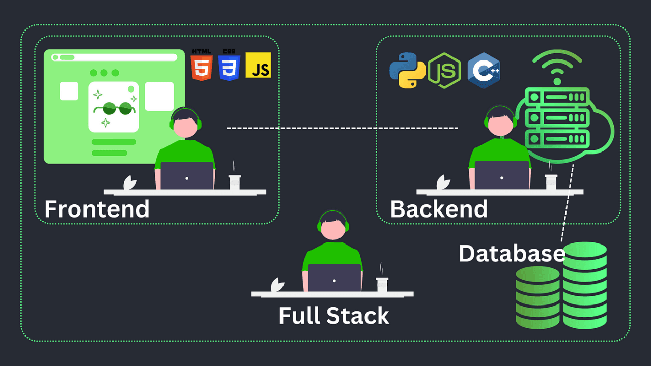
Okay, you’ve got your UX strategy locked in. Now comes the fun part: picking the right tools to actually build this thing. Your front-end stack is more than just a list of technologies; it's the engine that will power your entire decentralized experience, from connecting a wallet to displaying real-time blockchain data.
This decision directly impacts how fast you can build, how well the site performs, and frankly, how easy it is to manage the complex, ever-changing state of a dApp. Get this right, and you’re setting yourself up for success.
Frameworks for State Management
Modern web development hinges on component-based frameworks, and each brings something different to the table, especially when you throw the unique challenges of Web3 into the mix.
React: Let's be honest, React is the 800-pound gorilla in the room. Its massive ecosystem and community mean you'll find a library or a tutorial for almost any Web3 problem you encounter. Its hook-based approach is a natural fit for handling the asynchronous chaos of blockchain data—think fetching wallet balances or keeping an eye on transaction statuses.
Vue: Often praised for its gentle learning curve and crystal-clear documentation, Vue is a fantastic choice. Its reactive data-binding system can make displaying real-time updates from the blockchain feel almost magical. For teams newer to Web3, this can make the development process much more intuitive.
Svelte: The new kid on the block, Svelte takes a different path. It's a compiler, which means it does most of the heavy lifting during the build process, not in the user's browser. The result? Smaller, faster applications. This can be a huge win for dApps where that initial load time can make or break user engagement.
At the end of the day, the best framework is usually the one your team already knows and loves. The real goal is to pick a tool that lets you wrangle on-chain data without turning your codebase into a tangled mess.
Essential Blockchain Connector Libraries
Your front-end framework can't talk to the blockchain on its own. It needs a translator. That’s where JavaScript libraries come in, acting as the critical bridge between your slick UI and the decentralized network.
In the Ethereum world, two libraries really dominate the conversation:
Ethers.js: Many developers, myself included, lean towards Ethers.js for new projects. It's lightweight, the API is clean and modern, and it just feels intuitive. It gives you a complete wallet implementation and makes interacting with smart contracts feel straightforward.
Web3.js: As the original Ethereum library, Web3.js has a long history and an incredible amount of documentation out there. While older versions were a bit clunky, the library has been modernized quite a bit to keep up.
You can't go wrong with either, but I find Ethers.js often leads to cleaner code. Whichever you choose, this library is the core component that will power every single on-chain interaction your users make.
Building a Web3 Design System

If you want to build fast without sacrificing quality, creating a Web3-specific design system is non-negotiable. Think of it as your own custom set of LEGO bricks for common decentralized interactions. Instead of designing a wallet connection flow from scratch every single time, you just grab your pre-built, pre-tested component.
A strong design system ensures your wallet connection button, transaction modal, and token balance display look and behave the same way everywhere. This consistency is crucial for building user trust and a predictable experience.
Your design system should be a living library of components for things like:
Wallet Connectors
Transaction Status Modals (Pending, Success, Failure)
Token and NFT Displays
Gas Fee Estimators
Address Inputs and Identicons
This approach doesn't just make development faster; it makes onboarding new team members a breeze because the core UI patterns are already set in stone. For organizations looking to get a head start, exploring dedicated Web3 services can provide a serious strategic advantage.
We're also seeing a massive shift where AI is used to speed this process up. In fact, over 65% of designers now use AI tools for prototyping and optimizing their work. It's becoming essential for balancing complex blockchain logic with a user-friendly interface. You can dig deeper into these trends and find more AI's role in modern web design on agencyhandy.com.
Building Trust Through Secure Design Patterns
In the world of Web3, trust isn't just a nice-to-have; it's the most valuable asset you can build. It's earned pixel by pixel. We're not in the Web2 world anymore, where a familiar brand name is enough. Here, you're asking users to connect their wallets and approve transactions with real, often irreversible, financial consequences. Your design is the first—and most important—line of defense in making them feel safe enough to take that leap.
This means you have to bake security directly into your design process from the very first wireframe. It's not a feature you bolt on at the end. Every single element, from the color of a button to the copy in a confirmation modal, contributes to a user's sense of security and control.
Visually Counteracting Phishing and Scams
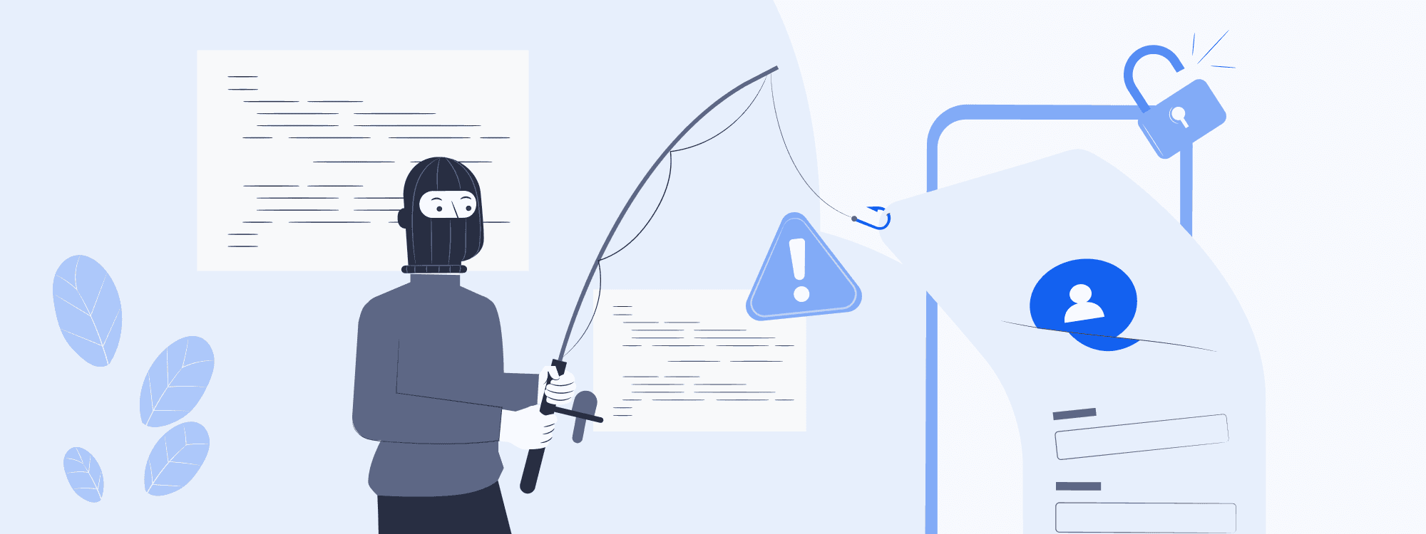
Phishing attacks are absolutely rampant in this space. Scammers are experts at creating lookalike sites that trick users into connecting their wallets. Your best weapon against this is a clear, consistent, and unmistakable brand identity.
Your visual language needs to be so distinct that a user can spot a fake instantly. We're talking about more than just a logo.
Consistent UI Patterns: Core components like buttons, form fields, and navigation bars must look and act identically everywhere. If your "Connect Wallet" button is suddenly a slightly different shade of blue, that's a huge red flag for a savvy user.
Official Domain Reinforcement: Don't be afraid to subtly (but consistently) display your official domain in the footer or a static header. Some of the best dApps even get creative with their favicons to reinforce authenticity right there in the browser tab.
Security isn't just about blocking hackers; it's about making users feel confident and in control. A design that is clear, predictable, and transparent is inherently more secure because it leaves zero room for ambiguity or doubt.
Designing Human-Readable Transaction Confirmations
The moment a user is prompted to sign a transaction is the moment of peak anxiety. They're about to authorize an on-chain action that, more often than not, can't be undone. Your job is to completely demystify this process.
Forget showing them a cryptic smart contract function like executeSwap(tokenA, tokenB, amount). That’s developer-speak, not user-speak. You have to translate it into plain, simple English.
Think of it like this:
Instead of:
approve(spender, amount)Show them: "You are allowing this app to access your WETH."
Instead of:
safeMint(to, uri)Show them: "You are about to mint 1 Genesis NFT."
This level of clarity is non-negotiable. Clearly show the assets involved, the exact amounts, and the estimated network fees before they ever have to click "confirm" in their MetaMask or Phantom wallet. This single practice doesn't just prevent users from signing something malicious; it builds an incredible amount of trust over time. As we've seen in projects focused on https://bricxlabs.com/case-studies/appsecure, this transparency directly impacts user retention.
To help you integrate these ideas, here's a quick checklist to keep handy during your design process.
Web3 Design Security Checklist
This checklist outlines essential security considerations to weave into your Web3 design and development workflow.
Security Area | Key Design Action | Rationale |
|---|---|---|
Transaction Clarity | Translate contract functions into plain language (e.g., "Swap 1 ETH for 1,500 USDC"). | Reduces user anxiety and prevents them from accidentally approving malicious or incorrect transactions. |
Visual Consistency | Maintain a strict design system for all interactive elements, especially buttons and modals. | Helps users instantly spot phishing attempts that use slightly "off" UI components. |
Domain Authentication | Consistently display the official, secure domain name within the UI (e.g., in the footer). | Reinforces the site's authenticity and trains users to check the URL as a habit. |
Data Minimization | Only ask for user data (like an email) when absolutely necessary, and clearly explain why. | Builds trust by respecting user privacy and aligns with the Web3 ethos of user sovereignty. |
Wallet Interaction | Clearly explain why a wallet connection is needed before prompting the user to connect. | Manages user expectations and reduces the friction of a potentially intimidating first step. |
Error & Success States | Design distinct, clear visual feedback for both successful and failed on-chain actions. | Provides immediate confirmation and guidance, preventing user confusion and repeated failed attempts. |
Following these steps isn't just about good UX; it's about fundamentally respecting the user and the trust they place in your platform.
Prioritizing User Privacy And Data Minimization
Finally, a secure design respects user privacy by default. The entire ethos of Web3 is built on user sovereignty, and your design choices must reflect that. As experts in Self-Custodial Security will tell you, giving users control is paramount.
Be radically transparent about what data you're collecting. Is it on-chain or off-chain? If you need an email for notifications, explain exactly why and how it will be used. The ultimate goal is to collect only the absolute bare minimum of data needed for your app to function, putting the user firmly in control of their own digital footprint.
Optimizing Performance with Decentralized Hosting
Let's be honest: even the most beautiful dApp is dead in the water if it’s painfully slow. Performance isn't just a "nice-to-have" in web3; it's a core part of the design process. The whole point is to build a decentralized site that feels just as snappy and reliable as the Web2 apps people use every day. If you sacrifice usability for ideology, you've already lost.
This means you have to think differently about the entire delivery pipeline, from where your front-end code lives to how you pull data from the blockchain. A sluggish interface will kill user trust faster than any smart contract bug.
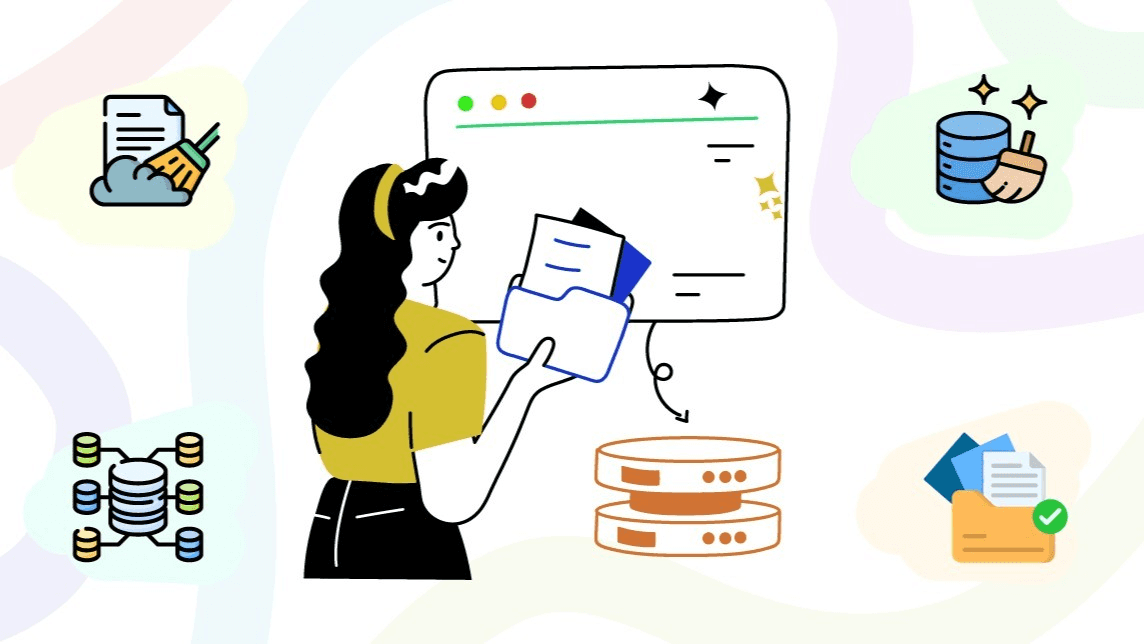
Choosing Your Decentralized Hosting Foundation
Traditional hosting is built around a single server—a central point of failure. Decentralized hosting flips that model on its head by spreading your website's files across a peer-to-peer network. This move not only makes your site more censorship-resistant but can also seriously improve global load times by serving content from a node physically closer to your user.
When you start looking, you’ll see two names pop up again and again: IPFS and Arweave. They both get the job done, but they have very different philosophies.
IPFS (InterPlanetary File System): Think of IPFS as a giant, distributed hard drive. Files are identified by their content (a hash), not their location. It's fantastic for redundant storage, but here’s the catch: content isn't permanent by default. It only sticks around as long as at least one node "pins" it, which means actively choosing to store it.
Arweave: Arweave takes a completely different path with its "permaweb." You pay a one-time fee to store a file, and it’s stored permanently. This is perfect for things that absolutely cannot change or disappear, like NFT metadata or historical transaction records.
For most dApps I've worked on, a hybrid approach using both (or one paired with something else) ends up being the most practical solution.
Blending Decentralized Storage with Traditional CDNs
Going all-in on decentralized hosting can, ironically, introduce latency. Fetching a file from a peer-to-peer network isn't always as fast as hitting a highly optimized CDN. So, the smart play is to combine the strengths of both worlds.
Here’s the strategy: use decentralized storage for what it does best—making sure your core application logic and critical assets are uncensorable and always available. Then, lean on a traditional CDN like Cloudflare or Fastly for everything else. This means your images, videos, and other chunky static assets get delivered to users at lightning speed.
This hybrid model gives you the resilience of web3 with the performance people have come to expect from Web2.
The key is to design your architecture for performance from day one. Don't treat hosting as an afterthought. A strategic mix of IPFS/Arweave for core files and a CDN for heavy assets is a proven recipe for a fast, reliable, and decentralized user experience.
Fetching On-Chain Data Without Freezing the UI
One of the biggest performance killers in any dApp is waiting for data to come back from the blockchain. If you build it naively, your app will just make a call and freeze the entire interface until the data arrives. That’s a guaranteed way to make users think your app is broken.
You have to design your front end to be asynchronous from the ground up. The goal is an experience that feels fluid even when the underlying blockchain is chugging along slowly.
Intelligent Loading and Caching Strategies
A blank screen is a user's worst enemy. Your design needs to include smart loading states that give people immediate feedback and a sense of progress.
Use Skeletons: Instead of a loading spinner, show placeholder "skeleton" versions of the UI components. This creates the illusion that the app is loading instantly while the real data is being fetched in the background.
Implement Smart Caching: Does a user's token balance really change every second? Probably not. Cache it locally for a short period to avoid hammering the blockchain with redundant calls on every single page load.
Leverage Indexing Protocols: This is a big one. Services like The Graph let you build custom APIs (called subgraphs) for your on-chain data. Using GraphQL, you can write a single, efficient query to get exactly the data you need, which is way more performant than making a dozen different direct calls to a node.
By adopting these techniques, you ensure your UI stays snappy and responsive. This approach is absolutely fundamental when you're figuring out how to design a web3 website that not only respects the principles of decentralization but also respects your user's time.
Common Web3 Design Questions, Answered
Stepping into Web3 design feels a bit like exploring a new frontier. The old Web2 rulebook doesn't always apply, and you're bound to run into challenges that don't have a clear-cut solution just yet. It's completely normal to have questions.
Let's tackle some of the most common hurdles I see designers and developers face. We'll move beyond the theory and get into practical answers that can help you navigate these tricky spots. The real goal here is to build something that feels seamless and intuitive, even with all the complex machinery humming away in the background.
How Do I Handle Unpredictable Network Speeds and Gas Fees?
This is probably the biggest headache in Web3 UX. One minute a transaction costs $5, the next it’s $50. Confirmation times can swing from seconds to painfully long minutes. Your design can't control the network, but it absolutely must manage user expectations.
Radical transparency is your best friend here. Never, ever hide gas fees until the final confirmation screen. Instead, build a real-time gas fee estimator right into the UI, so the user sees the potential cost before they even commit to an action.
When it comes to network lag, ditch the generic loading spinner. It creates anxiety. A much better approach is to use multi-stage feedback that tells a story about where the transaction is in its journey:
Submitted: "Your transaction is on its way to the network."
Pending: "Waiting for miners to pick this up. This can take a few minutes during busy times."
Confirmed: A big, green success message with a direct link to the transaction on a block explorer.
This method transforms a moment of doubt into an informed, reassuring wait. It shows you respect the user's time and, more importantly, their money.
The golden rule is to never let the user feel like their action just disappeared into a black hole. When real assets are involved, over-communication is always better than silence. Your interface should feel like a trusted guide leading them through the on-chain process.
What’s the Best Way to Onboard Users Who Are New to Crypto?
Onboarding in Web3 is a different beast entirely. You’re not just giving a feature tour; you're often giving a crash course on wallets, seed phrases, and the very idea of self-custody.
A great place to start is with a "What is a wallet?" modal or a short, skippable walkthrough right when they're asked to connect. Use simple analogies. For instance, you could compare a crypto wallet to a secure digital passport for the web—it's theirs to own and control. The goal is to make it feel less like a daunting technical setup and more like creating a powerful new kind of personal account.
If your dApp has a steep learning curve, it might be worth bringing in reinforcements. The best Web3 UX agencies live and breathe this stuff, and they excel at crafting educational onboarding flows that close the knowledge gap without scaring away newcomers.
How Much Technical Detail Should I Actually Show Users?
Ah, the classic balancing act. Your crypto-native power users want to see every technical detail, while your new users will run for the hills if they see a "nonce" or a "gwei limit." Trying to please both in the same view is a recipe for a cluttered, confusing interface.
The most effective solution I've found is progressive disclosure.
By default, keep it clean. Show the most essential information in plain English: "You are swapping 1 ETH for 1,500 USDC." But always, always include an "Advanced Details" or "View More" toggle. Clicking this can reveal the contract address, function call, and other data for those who want to dig deeper.
This tiered approach respects both audiences. It gives most people a simple, clear path forward while providing the hardcore users the granular data they need to feel confident. Your design should empower everyone, not overwhelm anyone.
At Bricx, we live for turning complex Web3 ideas into beautiful, intuitive products. If you're building an MVP or looking to overhaul an existing platform, our team can help you solve the unique UX challenges of the decentralized web. Let's build the future, together.
Designing for web3 is a different beast entirely. It’s not just about a fresh coat of paint; it’s a fundamental shift in how we think about user interaction, ownership, and trust. The foundation of any great web3 project is a solid strategy that grapples with decentralization, user crypto-savviness, and the unique hurdles of blockchain interaction. Get this right, and you're on your way. Get it wrong, and even the most brilliant tech will fall flat.
Moving Beyond Hype: Your Web3 Design Strategy
Before you even think about code or color palettes, you need a rock-solid strategy. It's incredibly easy to get distracted by the latest trends—maybe it's a slick 3D animation or a cool, futuristic theme. But a successful decentralized application (dApp) isn't built on flash; it's built on a deep understanding of its users and a design that serves a real purpose.
The main challenge here isn't just about making things look good. It's about taking something inherently complex, like interacting with a blockchain, and making it feel intuitive and transparent. This means your first order of business is user research, but with a web3 twist.
Define Your Audience and Their Crypto Comfort Level
Seriously, who are you building this for? In web3, that question is a lot trickier than it sounds. Your users could be crypto-native "degens" who live and breathe DeFi, or they could be total beginners who think a "wallet" is something you keep in your back pocket.
Your design strategy has to bridge this gap.
For the Experts: You can get away with using industry shorthand and assume they know their way around. The focus here is on efficiency, data density, and giving them the controls they expect.
For the Newcomers: Your design needs to be a patient guide. Think simple onboarding flows, plain-English explanations for scary terms like "gas fees" or "signing transactions," and plenty of visual feedback to build confidence.
One of the biggest mistakes I see is trying to build one-size-fits-all experience. A much smarter play is to create tiered user journeys. For example, you could offer a "basic mode" for straightforward tasks and an "advanced mode" for the power users who crave more data and control.
A killer user experience will drive adoption far more than the underlying tech. Your job is to abstract away the clunky parts—the wallet connections, the transaction signing—until it feels as second-nature as any Web2 app.
Map Out Decentralized User Journeys
Web3 user journeys have unique twists and turns that simply don't exist in the Web2 world. You have to map these out with surgical precision. Think through the entire process, from the moment someone lands on your site to when they successfully complete an on-chain action.
A few key moments you absolutely have to nail:
Wallet Connection: How does someone hook up their wallet? Is the button obvious? Do you support popular options like MetaMask and Coinbase Wallet? Make this frictionless.
On-Chain Interactions: How do you handle transaction states? The blockchain isn't instant. You need clear, persistent feedback for pending, successful, and failed transactions to keep users from getting frustrated.
Data Display: How are you going to show on-chain data, like a user's token balance or their transaction history, in a way that doesn't look like a block explorer? It needs to be clean and human-readable.
These new design considerations have reshaped web development since the early days of blockchain platforms around 2015-2017. We’ve had to invent new patterns for everything from authentication to data ownership.
When building your strategy, don't forget the bigger picture. If your dApp needs to work across different blockchains, a deep dive into understanding cross-chain DeFi interoperability will be invaluable for making smart architectural and UX choices. You can also explore our other articles to learn more about the core web3 design principles that underpin these strategic decisions.
To really grasp the shift, it helps to see the two approaches side-by-side.
Web2 vs Web3 Design Principles: A Quick Comparison
This table breaks down the core philosophical and technical differences between traditional Web2 design and the decentralized approach of Web3.
Design Aspect | Web2 Approach (Centralized) | Web3 Approach (Decentralized) |
|---|---|---|
User Identity | Email/password logins, managed by the company. Social logins (Google, Facebook). | Wallet-based authentication. Users control their identity via cryptographic keys. |
Data Ownership & Storage | Data is stored on company-owned servers. Users have limited control. | Data is stored on-chain or on decentralized storage (like IPFS). Users truly own their data. |
Trust Model | Trust in the central authority (the company) to secure data and act ethically. | Trust is placed in the code (smart contracts) and the decentralized network. "Trustless" interactions. |
Core Interaction | Users interact with a company's database via a front-end interface. | Users interact directly with smart contracts on a blockchain, signing transactions with their wallet. |
UX Focus | Simplicity, speed, and seamlessness by abstracting server interactions. | Transparency, security, and user agency. Guiding users through on-chain actions and states. |
Monetization | Subscriptions, advertising, data sales. | Tokenomics, protocol fees, community treasuries (DAOs), NFT sales. |
As you can see, the move to Web3 isn't just a technological update; it's a paradigm shift that puts the user back in the driver's seat. Your design strategy must reflect this from day one.
Designing UX Flows for a Decentralized World
Moving from Web2 to Web3 design isn't just about learning a new tech stack. It’s a fundamental shift in how you approach user interaction. In this decentralized world, a single click can kick off an on-chain action, and trust isn't built with a slick interface alone—it's earned through radical transparency. Your design has to be the user's guide, a reassuring hand in what can often feel like uncharted territory.
This is why mapping out your core user flows is so important. You can't just take what works for a standard SaaS product and expect it to fly. You have to design for those moments that are entirely unique to Web3, like connecting a wallet for the first time, signing a transaction, and the sometimes-anxious wait for blockchain confirmation.
The whole process starts with a solid strategy, long before you even think about pixels. It’s about knowing your audience, mapping their specific journeys, and setting clear goals for what you want them to achieve.
Grounding your UX decisions in user needs, not just what the tech can do, makes all the difference. Get this right, and you're ready to tackle the specific design patterns.
Nailing the Wallet Connection Flow
Often, the very first thing a person does on your dApp is connect their wallet. This single step can make or break the entire experience. It's the front door, and if it feels confusing or intimidating, they'll bounce before they even see what’s inside.
Your crypto-native users will know exactly what to do with a "Connect Wallet" button. But for everyone else? It’s a huge roadblock.
Offer Multiple Wallet Options: Don't just assume everyone is on MetaMask. You need to include popular choices like Coinbase Wallet, Phantom (a must for Solana), and aggregators like WalletConnect to cast a wider net.
Provide Contextual Help: A tiny tooltip or a link to a "What is a wallet?" guide can be a real lifesaver for newcomers. Explain why they need one—to prove they own something, to sign an action, or to access exclusive content.
Design for Clarity: Use recognizable icons for different wallets. The moment the connection is successful, give them immediate visual confirmation. Displaying their shortened wallet address or ENS name is a simple, effective way to do this.
Demystifying Transaction UX
Once a user’s wallet is connected, they'll start interacting with your smart contracts. This is where Web3 UX really gets tricky. A blockchain transaction isn't like a simple click in a Web2 app; it comes with gas fees, network delays, and confirmation times. Your job is to make this process feel as transparent and painless as possible.
When someone goes to sign a transaction, they need to know three things, instantly:
What they are approving: Ditch the technical jargon. Instead of showing them a raw smart contract function, explain the action in plain English. Think "You're about to mint 1 NFT for 0.05 ETH."
The total cost: Show the estimated gas fees right next to the item's price. If the network is slammed and fees are sky-high, warn them. No one likes surprise costs.
The expected wait time: Blockchains aren't instant. Give them a realistic time estimate, and more importantly, show them what’s happening at every stage of the process.
The golden rule here is to never leave the user guessing. Use distinct visual states for "pending," "confirmed," and "failed." A simple loading spinner just doesn't cut it. You need clear, persistent messaging that builds trust.
For instance, a "pending" transaction could be a subtle pulsating icon in the nav bar. A "successful" transaction could trigger a small confetti animation and a direct link to view it on a block explorer. If it "fails," the error message needs to be human-readable, telling them what went wrong and what to do next. These little visual cues are critical for building confidence. For a deeper look at designing these moments, some great SaaS user flow examples can be adapted for Web3.
Security is also deeply psychological. With over 90% of Web3 users worried about phishing, designers have to prioritize crystal-clear UI for connections and confirmations. We’ve even seen how thoughtful micro-interactions and animations can boost engagement and conversions by up to 40%, simply by making complex steps feel more intuitive and safe. Ultimately, great Web3 UX is about building trust through absolute clarity.
Choosing Your Decentralized Front-End Stack
Okay, you’ve got your UX strategy locked in. Now comes the fun part: picking the right tools to actually build this thing. Your front-end stack is more than just a list of technologies; it's the engine that will power your entire decentralized experience, from connecting a wallet to displaying real-time blockchain data.
This decision directly impacts how fast you can build, how well the site performs, and frankly, how easy it is to manage the complex, ever-changing state of a dApp. Get this right, and you’re setting yourself up for success.
Frameworks for State Management
Modern web development hinges on component-based frameworks, and each brings something different to the table, especially when you throw the unique challenges of Web3 into the mix.
React: Let's be honest, React is the 800-pound gorilla in the room. Its massive ecosystem and community mean you'll find a library or a tutorial for almost any Web3 problem you encounter. Its hook-based approach is a natural fit for handling the asynchronous chaos of blockchain data—think fetching wallet balances or keeping an eye on transaction statuses.
Vue: Often praised for its gentle learning curve and crystal-clear documentation, Vue is a fantastic choice. Its reactive data-binding system can make displaying real-time updates from the blockchain feel almost magical. For teams newer to Web3, this can make the development process much more intuitive.
Svelte: The new kid on the block, Svelte takes a different path. It's a compiler, which means it does most of the heavy lifting during the build process, not in the user's browser. The result? Smaller, faster applications. This can be a huge win for dApps where that initial load time can make or break user engagement.
At the end of the day, the best framework is usually the one your team already knows and loves. The real goal is to pick a tool that lets you wrangle on-chain data without turning your codebase into a tangled mess.
Essential Blockchain Connector Libraries
Your front-end framework can't talk to the blockchain on its own. It needs a translator. That’s where JavaScript libraries come in, acting as the critical bridge between your slick UI and the decentralized network.
In the Ethereum world, two libraries really dominate the conversation:
Ethers.js: Many developers, myself included, lean towards Ethers.js for new projects. It's lightweight, the API is clean and modern, and it just feels intuitive. It gives you a complete wallet implementation and makes interacting with smart contracts feel straightforward.
Web3.js: As the original Ethereum library, Web3.js has a long history and an incredible amount of documentation out there. While older versions were a bit clunky, the library has been modernized quite a bit to keep up.
You can't go wrong with either, but I find Ethers.js often leads to cleaner code. Whichever you choose, this library is the core component that will power every single on-chain interaction your users make.
Building a Web3 Design System
If you want to build fast without sacrificing quality, creating a Web3-specific design system is non-negotiable. Think of it as your own custom set of LEGO bricks for common decentralized interactions. Instead of designing a wallet connection flow from scratch every single time, you just grab your pre-built, pre-tested component.
A strong design system ensures your wallet connection button, transaction modal, and token balance display look and behave the same way everywhere. This consistency is crucial for building user trust and a predictable experience.
Your design system should be a living library of components for things like:
Wallet Connectors
Transaction Status Modals (Pending, Success, Failure)
Token and NFT Displays
Gas Fee Estimators
Address Inputs and Identicons
This approach doesn't just make development faster; it makes onboarding new team members a breeze because the core UI patterns are already set in stone. For organizations looking to get a head start, exploring dedicated Web3 services can provide a serious strategic advantage.
We're also seeing a massive shift where AI is used to speed this process up. In fact, over 65% of designers now use AI tools for prototyping and optimizing their work. It's becoming essential for balancing complex blockchain logic with a user-friendly interface. You can dig deeper into these trends and find more AI's role in modern web design on agencyhandy.com.
Building Trust Through Secure Design Patterns
In the world of Web3, trust isn't just a nice-to-have; it's the most valuable asset you can build. It's earned pixel by pixel. We're not in the Web2 world anymore, where a familiar brand name is enough. Here, you're asking users to connect their wallets and approve transactions with real, often irreversible, financial consequences. Your design is the first—and most important—line of defense in making them feel safe enough to take that leap.
This means you have to bake security directly into your design process from the very first wireframe. It's not a feature you bolt on at the end. Every single element, from the color of a button to the copy in a confirmation modal, contributes to a user's sense of security and control.
Visually Counteracting Phishing and Scams
Phishing attacks are absolutely rampant in this space. Scammers are experts at creating lookalike sites that trick users into connecting their wallets. Your best weapon against this is a clear, consistent, and unmistakable brand identity.
Your visual language needs to be so distinct that a user can spot a fake instantly. We're talking about more than just a logo.
Consistent UI Patterns: Core components like buttons, form fields, and navigation bars must look and act identically everywhere. If your "Connect Wallet" button is suddenly a slightly different shade of blue, that's a huge red flag for a savvy user.
Official Domain Reinforcement: Don't be afraid to subtly (but consistently) display your official domain in the footer or a static header. Some of the best dApps even get creative with their favicons to reinforce authenticity right there in the browser tab.
Security isn't just about blocking hackers; it's about making users feel confident and in control. A design that is clear, predictable, and transparent is inherently more secure because it leaves zero room for ambiguity or doubt.
Designing Human-Readable Transaction Confirmations
The moment a user is prompted to sign a transaction is the moment of peak anxiety. They're about to authorize an on-chain action that, more often than not, can't be undone. Your job is to completely demystify this process.
Forget showing them a cryptic smart contract function like executeSwap(tokenA, tokenB, amount). That’s developer-speak, not user-speak. You have to translate it into plain, simple English.
Think of it like this:
Instead of:
approve(spender, amount)Show them: "You are allowing this app to access your WETH."
Instead of:
safeMint(to, uri)Show them: "You are about to mint 1 Genesis NFT."
This level of clarity is non-negotiable. Clearly show the assets involved, the exact amounts, and the estimated network fees before they ever have to click "confirm" in their MetaMask or Phantom wallet. This single practice doesn't just prevent users from signing something malicious; it builds an incredible amount of trust over time. As we've seen in projects focused on https://bricxlabs.com/case-studies/appsecure, this transparency directly impacts user retention.
To help you integrate these ideas, here's a quick checklist to keep handy during your design process.
Web3 Design Security Checklist
This checklist outlines essential security considerations to weave into your Web3 design and development workflow.
Security Area | Key Design Action | Rationale |
|---|---|---|
Transaction Clarity | Translate contract functions into plain language (e.g., "Swap 1 ETH for 1,500 USDC"). | Reduces user anxiety and prevents them from accidentally approving malicious or incorrect transactions. |
Visual Consistency | Maintain a strict design system for all interactive elements, especially buttons and modals. | Helps users instantly spot phishing attempts that use slightly "off" UI components. |
Domain Authentication | Consistently display the official, secure domain name within the UI (e.g., in the footer). | Reinforces the site's authenticity and trains users to check the URL as a habit. |
Data Minimization | Only ask for user data (like an email) when absolutely necessary, and clearly explain why. | Builds trust by respecting user privacy and aligns with the Web3 ethos of user sovereignty. |
Wallet Interaction | Clearly explain why a wallet connection is needed before prompting the user to connect. | Manages user expectations and reduces the friction of a potentially intimidating first step. |
Error & Success States | Design distinct, clear visual feedback for both successful and failed on-chain actions. | Provides immediate confirmation and guidance, preventing user confusion and repeated failed attempts. |
Following these steps isn't just about good UX; it's about fundamentally respecting the user and the trust they place in your platform.
Prioritizing User Privacy And Data Minimization
Finally, a secure design respects user privacy by default. The entire ethos of Web3 is built on user sovereignty, and your design choices must reflect that. As experts in Self-Custodial Security will tell you, giving users control is paramount.
Be radically transparent about what data you're collecting. Is it on-chain or off-chain? If you need an email for notifications, explain exactly why and how it will be used. The ultimate goal is to collect only the absolute bare minimum of data needed for your app to function, putting the user firmly in control of their own digital footprint.
Optimizing Performance with Decentralized Hosting
Let's be honest: even the most beautiful dApp is dead in the water if it’s painfully slow. Performance isn't just a "nice-to-have" in web3; it's a core part of the design process. The whole point is to build a decentralized site that feels just as snappy and reliable as the Web2 apps people use every day. If you sacrifice usability for ideology, you've already lost.
This means you have to think differently about the entire delivery pipeline, from where your front-end code lives to how you pull data from the blockchain. A sluggish interface will kill user trust faster than any smart contract bug.
Choosing Your Decentralized Hosting Foundation
Traditional hosting is built around a single server—a central point of failure. Decentralized hosting flips that model on its head by spreading your website's files across a peer-to-peer network. This move not only makes your site more censorship-resistant but can also seriously improve global load times by serving content from a node physically closer to your user.
When you start looking, you’ll see two names pop up again and again: IPFS and Arweave. They both get the job done, but they have very different philosophies.
IPFS (InterPlanetary File System): Think of IPFS as a giant, distributed hard drive. Files are identified by their content (a hash), not their location. It's fantastic for redundant storage, but here’s the catch: content isn't permanent by default. It only sticks around as long as at least one node "pins" it, which means actively choosing to store it.
Arweave: Arweave takes a completely different path with its "permaweb." You pay a one-time fee to store a file, and it’s stored permanently. This is perfect for things that absolutely cannot change or disappear, like NFT metadata or historical transaction records.
For most dApps I've worked on, a hybrid approach using both (or one paired with something else) ends up being the most practical solution.
Blending Decentralized Storage with Traditional CDNs
Going all-in on decentralized hosting can, ironically, introduce latency. Fetching a file from a peer-to-peer network isn't always as fast as hitting a highly optimized CDN. So, the smart play is to combine the strengths of both worlds.
Here’s the strategy: use decentralized storage for what it does best—making sure your core application logic and critical assets are uncensorable and always available. Then, lean on a traditional CDN like Cloudflare or Fastly for everything else. This means your images, videos, and other chunky static assets get delivered to users at lightning speed.
This hybrid model gives you the resilience of web3 with the performance people have come to expect from Web2.
The key is to design your architecture for performance from day one. Don't treat hosting as an afterthought. A strategic mix of IPFS/Arweave for core files and a CDN for heavy assets is a proven recipe for a fast, reliable, and decentralized user experience.
Fetching On-Chain Data Without Freezing the UI
One of the biggest performance killers in any dApp is waiting for data to come back from the blockchain. If you build it naively, your app will just make a call and freeze the entire interface until the data arrives. That’s a guaranteed way to make users think your app is broken.
You have to design your front end to be asynchronous from the ground up. The goal is an experience that feels fluid even when the underlying blockchain is chugging along slowly.
Intelligent Loading and Caching Strategies
A blank screen is a user's worst enemy. Your design needs to include smart loading states that give people immediate feedback and a sense of progress.
Use Skeletons: Instead of a loading spinner, show placeholder "skeleton" versions of the UI components. This creates the illusion that the app is loading instantly while the real data is being fetched in the background.
Implement Smart Caching: Does a user's token balance really change every second? Probably not. Cache it locally for a short period to avoid hammering the blockchain with redundant calls on every single page load.
Leverage Indexing Protocols: This is a big one. Services like The Graph let you build custom APIs (called subgraphs) for your on-chain data. Using GraphQL, you can write a single, efficient query to get exactly the data you need, which is way more performant than making a dozen different direct calls to a node.
By adopting these techniques, you ensure your UI stays snappy and responsive. This approach is absolutely fundamental when you're figuring out how to design a web3 website that not only respects the principles of decentralization but also respects your user's time.
Common Web3 Design Questions, Answered
Stepping into Web3 design feels a bit like exploring a new frontier. The old Web2 rulebook doesn't always apply, and you're bound to run into challenges that don't have a clear-cut solution just yet. It's completely normal to have questions.
Let's tackle some of the most common hurdles I see designers and developers face. We'll move beyond the theory and get into practical answers that can help you navigate these tricky spots. The real goal here is to build something that feels seamless and intuitive, even with all the complex machinery humming away in the background.
How Do I Handle Unpredictable Network Speeds and Gas Fees?
This is probably the biggest headache in Web3 UX. One minute a transaction costs $5, the next it’s $50. Confirmation times can swing from seconds to painfully long minutes. Your design can't control the network, but it absolutely must manage user expectations.
Radical transparency is your best friend here. Never, ever hide gas fees until the final confirmation screen. Instead, build a real-time gas fee estimator right into the UI, so the user sees the potential cost before they even commit to an action.
When it comes to network lag, ditch the generic loading spinner. It creates anxiety. A much better approach is to use multi-stage feedback that tells a story about where the transaction is in its journey:
Submitted: "Your transaction is on its way to the network."
Pending: "Waiting for miners to pick this up. This can take a few minutes during busy times."
Confirmed: A big, green success message with a direct link to the transaction on a block explorer.
This method transforms a moment of doubt into an informed, reassuring wait. It shows you respect the user's time and, more importantly, their money.
The golden rule is to never let the user feel like their action just disappeared into a black hole. When real assets are involved, over-communication is always better than silence. Your interface should feel like a trusted guide leading them through the on-chain process.
What’s the Best Way to Onboard Users Who Are New to Crypto?
Onboarding in Web3 is a different beast entirely. You’re not just giving a feature tour; you're often giving a crash course on wallets, seed phrases, and the very idea of self-custody.
A great place to start is with a "What is a wallet?" modal or a short, skippable walkthrough right when they're asked to connect. Use simple analogies. For instance, you could compare a crypto wallet to a secure digital passport for the web—it's theirs to own and control. The goal is to make it feel less like a daunting technical setup and more like creating a powerful new kind of personal account.
If your dApp has a steep learning curve, it might be worth bringing in reinforcements. The best Web3 UX agencies live and breathe this stuff, and they excel at crafting educational onboarding flows that close the knowledge gap without scaring away newcomers.
How Much Technical Detail Should I Actually Show Users?
Ah, the classic balancing act. Your crypto-native power users want to see every technical detail, while your new users will run for the hills if they see a "nonce" or a "gwei limit." Trying to please both in the same view is a recipe for a cluttered, confusing interface.
The most effective solution I've found is progressive disclosure.
By default, keep it clean. Show the most essential information in plain English: "You are swapping 1 ETH for 1,500 USDC." But always, always include an "Advanced Details" or "View More" toggle. Clicking this can reveal the contract address, function call, and other data for those who want to dig deeper.
This tiered approach respects both audiences. It gives most people a simple, clear path forward while providing the hardcore users the granular data they need to feel confident. Your design should empower everyone, not overwhelm anyone.
At Bricx, we live for turning complex Web3 ideas into beautiful, intuitive products. If you're building an MVP or looking to overhaul an existing platform, our team can help you solve the unique UX challenges of the decentralized web. Let's build the future, together.


Similar Blogs
Similar Blogs
Similar Blogs


Available for Work
Bricx
© Bricx, 2026. All rights reserved.


Available for Work
Bricx
© Bricx, 2026. All rights reserved.
Available for Work
Bricx
© Bricx, 2026. All rights reserved.
Available for Work
Bricx
© Bricx, 2026. All rights reserved.