Website Design
Website Design
Website Design
Insights
Insights
Insights
December 18, 2025
December 18, 2025
December 18, 2025
Top 10 Mobile App Design Best Practices for B2B & AI SaaS in 2026
Top 10 Mobile App Design Best Practices for B2B & AI SaaS in 2026
Top 10 Mobile App Design Best Practices for B2B & AI SaaS in 2026
Discover mobile app design best practices for B2B and AI SaaS in 2026 with actionable tips, real examples, and checklists to boost UX and performance.
Discover mobile app design best practices for B2B and AI SaaS in 2026 with actionable tips, real examples, and checklists to boost UX and performance.
Discover mobile app design best practices for B2B and AI SaaS in 2026 with actionable tips, real examples, and checklists to boost UX and performance.
4 mins
4 mins
4 mins


Why These Mobile App Design Best Practices Matter for B2B & AI SaaS
In competitive B2B and AI SaaS environments, mobile app design best practices directly impact user adoption, retention, and revenue growth. At Bricx, we’ve distilled ten essential strategies that streamline development, ensure accessibility, and supercharge performance.
These practices go beyond visual polish and consistency. They tackle usability gaps in complex workflows, reduce cognitive load, and unlock scalability across devices.
What You Will Learn
In this listicle you will learn how to:
Adopt a mobile-first design approach to prioritize critical features
Craft intuitive navigation tailored for complex B2B workflows
Implement responsive and adaptive layouts across devices
Design touch-friendly interfaces that reduce input errors
Optimize performance for fast load times and smooth animations
Apply minimalist UI principles for clear user focus
Build inclusive experiences with accessibility standards
Guide users with smart onboarding and in-app tutorials
Maintain consistent visual design aligned with brand identity
Leverage data, feedback, and analytics for iterative improvements
Each practice includes actionable steps, real-world examples, and reusable checklists. You’ll find practical advice on component selection, performance metrics, accessibility auditing, and handoff best practices. Whether you’re launching an MVP or refining an enterprise SaaS app, these insights help you create engaging, high-performance mobile experiences.
Following these mobile app design best practices ensures your team can deliver scalable, user-centric solutions that stand out in B2B and AI-driven markets. Move beyond generic guidelines to a focused, tactical roadmap that drives measurable results.
1. Mobile-First Design Approach
Mobile-first design approach prioritizes the smallest screen size then scales up to desktop resolutions. This method ensures high performance and usability for mobile audiences who often outnumber desktop users.

What is Mobile-First Design?
Mobile-first design is a philosophy that starts wireframes and prototypes at mobile dimensions (375px–667px). From there you expand layout and complexity for tablets and desktops. This workflow:
Forces content prioritization for limited screen real estate
Highlights essential user tasks and core navigation
Reduces bloat and improves load times on mobile networks
Why Use Mobile-First Approach?
Focusing on mobile first aligns with current usage patterns in B2B SaaS and AI tools. Mobile design drives:
Better user engagement by reducing friction
Faster time to interactive with optimized assets
Scalable CSS and component libraries for responsive grids
Key insight: Prioritizing mobile ensures a lean interface that focuses on user goals and speeds up performance.
Actionable Tips
Start wireframes at 375px width to match popular device sizes
Test on real devices, not only browser emulators
Prioritize content blocks by task importance
Ensure touch targets are at least 44x44 pixels
Compress images and use SVGs for icons
Real World Examples
Google’s Material Design framework scales mobile cards to desktop
Airbnb’s native mobile app uses simple tab navigation
Instagram focuses on content-first scroll and large media
Twitter adapts its tweet feed fluidly across screen sizes
Learn more about Mobile-First Design Approach on bricxlabs.com
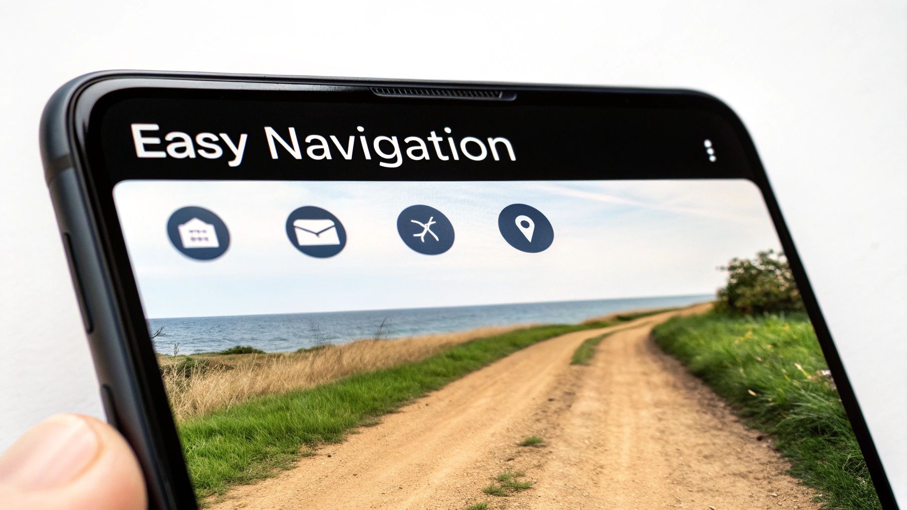
2. Intuitive Navigation and Information Architecture
Intuitive Navigation and Information Architecture organizes app content and menu systems so users locate features without a learning curve. This strategic structure reduces cognitive load and guides users seamlessly through core workflows. Influenced by Steve Krug and the Nielsen Norman Group, it anchors usability in familiar patterns.
What is Intuitive Navigation and Information Architecture?
Intuitive Navigation and IA defines how screens, menus and content hierarchy interconnect. A well-crafted IA:
Aligns with user mental models to minimize confusion
Groups related features under clear, action-oriented labels
Balances primary and secondary navigation for fast access
Why Use Intuitive Navigation and Information Architecture?
Strong IA prevents user frustration and boosts engagement:
Cuts task completion time by guiding users directly to features
Decreases support tickets through self-explanatory layouts
Improves retention with familiar navigation patterns
Key insight: If you make users think, you lose them, so clear pathways are essential for mobile apps.
Actionable Tips
Conduct user testing and card sorting exercises early
Limit primary navigation to 3-5 items using bottom tabs or hamburger menus
Use clear, consistent labels like “Messages” or “Settings”
Add breadcrumbs for multi-level hierarchies to show context
Offer search or shortcuts to access high-priority features
Real World Examples
Spotify uses bottom tab bars for Home, Search, Your Library
Facebook hides secondary actions under a concise side menu
Slack structures channels by workspace and topic hierarchies
Uber’s booking flow guides users step-by-step with minimal options
Learn more about Intuitive Navigation and Information Architecture on bricxlabs.com
3. Responsive and Adaptive Design
Responsive and adaptive design ensure apps and sites work well across all devices and orientations. Responsive design uses fluid grids to adjust layouts automatically. Adaptive design detects device characteristics to load specific templates. Together they form a cornerstone of mobile app design best practices.
What is Responsive and Adaptive Design?
Responsive design applies flexible layouts, images, and CSS media queries to scale UI components dynamically. Adaptive design delivers pre-defined layouts for common screen sizes, selecting the best fit at runtime. Key principles:
Fluid grids that use relative units like percentages
Breakpoints to shift layout and navigation patterns
Adaptive templates for distinct device categories
Flexible images via srcset or picture elements
Why Use Responsive and Adaptive Design?
Building for varied screens reduces development overhead and enhances user experience. This method:
Ensures consistent branding and interaction across devices
Improves performance by serving optimized assets
Simplifies maintenance with unified codebase
Key insight: Combining responsive and adaptive strategies delivers a seamless experience and elevates your mobile app design best practices.
Actionable Tips
Use CSS Grid and Flexbox for modular, flexible layouts
Test on real devices and emulators at multiple viewports
Optimize images with responsive picture elements and lazy loading
Include correct viewport meta tag to control scaling
Prioritize touch targets (min 44x44 pixels) and thumb-friendly zones
Validate both portrait and landscape orientations during QA
Real World Examples
Netflix adapts its UI grid fluidly across mobile and TV screens
LinkedIn switches between adaptive mobile and desktop frameworks
Medium uses proportional typography and fluid card layouts
The Guardian employs responsive breakpoints for article content
Learn more about Responsive Web Design at https://responsivewebdesign.com
4. Touch-Friendly Interface Design
Designing for touch input means optimizing every element for fingers rather than cursors. This practice ensures users interact with your mobile app smoothly and accurately on all device sizes.

What is Touch-Friendly Interface Design?
Touch-friendly interface design focuses on creating UI elements that accommodate finger taps, swipes, and gestures. Key characteristics include:
Larger touch targets to prevent mis-taps
Generous spacing around buttons and links
Immediate feedback on interaction
By rethinking traditional pointer-based layouts, you build an experience tailored to on-the-go mobile users.
Why Use Touch-Friendly Design?
Mobile audiences expect instant, intuitive interactions. A touch-optimized UI:
Reduces user errors when selecting controls
Improves overall satisfaction and engagement
Adapts to various hand sizes and hold positions
Key insight: Designing for touch not only boosts usability but also drives higher retention and conversion rates.
Actionable Tips
Follow Apple’s 44x44 point and Google’s 48dp sizing guidelines
Provide clear visual feedback like ripples or color changes
Incorporate haptic feedback for critical actions
Remove hover-dependent elements and double-tap requirements
Keep interactive elements at least 8px apart
Test with different hand grips and finger sizes
Real World Examples
Apple’s iOS Human Interface Guidelines on touch target sizing
Google Material Design’s 48dp minimum touch area
Tinder’s swipe gestures for card navigation
Snapchat’s gesture-based camera and menu controls
Learn more about Touch-Friendly Interface Design on domain.com:
Learn more about Touch-Friendly Interface Design on bricxlabs.com
5. Performance Optimization and Fast Load Times
Performance Optimization and Fast Load Times ensure mobile apps load quickly, respond instantly to taps, and use minimal resources. On slower mobile networks, even a one-second delay can increase bounce rates and harm user perception. This practice is critical for sustaining engagement and conversion in B2B and AI SaaS products.
What is Performance Optimization and Fast Load Times?
Performance optimization means configuring your app to:
Deliver initial content in under 3 seconds
Respond to user input within 100 milliseconds
Minimize CPU and memory usage on-device
Core techniques include image compression, code splitting, asset caching, and serving resources from optimized endpoints.
Why Use Performance Optimization and Fast Load Times?
Mobile audiences expect instant feedback and uninterrupted workflows. Prioritizing performance:
Improves conversion rates by reducing friction
Enhances perceived quality and professional credibility
Supports retention by preventing churn from slow experiences
Key insight: Fast load times directly impact user satisfaction and signal a polished, reliable product.
Actionable Tips
Measure with Lighthouse, WebPageTest, or mobile analytics tools
Compress images using modern formats like WebP or HEIC
Implement code splitting and lazy loading for JavaScript bundles
Use a content delivery network (CDN) to serve assets globally
Monitor Core Web Vitals: LCP, FID, CLS, and set performance budgets
Test on both 3G and 4G network conditions regularly
Minimize JavaScript execution time with tree shaking and minification
Cache aggressively using service workers for offline-ready content
Real World Examples
Pinterest preloads critical images and defers nonessential scripts
Google’s Core Web Vitals initiative guides teams to maintain LCP under 2.5 seconds
Progressive Web Apps (PWAs) deliver near-instant startup even offline
Facebook splits code into microbundles to keep initial downloads small
Learn more about Performance Optimization and Fast Load Times on bricxlabs.com
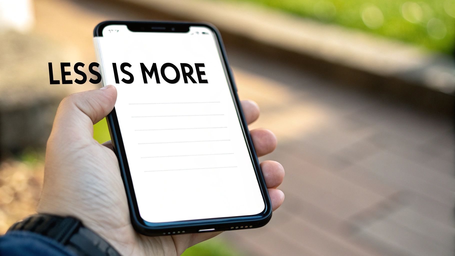
6. Minimalist and Clean User Interface
Minimalist and clean user interface design strips away non-essential visuals to focus user attention on core tasks. By emphasizing simplicity and generous whitespace, this approach reduces cognitive load, improves usability, and creates an elegant user experience for mobile app design best practices.
What is Minimalist and Clean UI?
Minimalist UI is a design philosophy that limits on-screen elements to only what the user needs in the moment. Key principles include:
Essentialism - Remove buttons, icons, and text that do not serve a primary function
Whitespace - Use negative space intentionally to highlight calls to action
Restricted Palette - Stick to 3–5 colors maximum for consistency
Typographic Restraint - Choose one or two typefaces for hierarchy and clarity
Progressive Disclosure - Reveal advanced features only when needed
Why Use Minimalist Design?
Adopting a minimalist approach in your mobile app design best practices yields multiple benefits:
Reduces cognitive load so users digest information faster
Enhances focus on primary tasks by eliminating distractions
Improves performance with fewer assets to load
Adapts seamlessly to small screens and varying resolutions
Ideal for onboarding flows, data dashboards, and content-first screens
Key insight: A decluttered interface guides users to their goals without confusion or delay.
This approach shines when you need to present complex data clearly or streamline user journeys in B2B and AI SaaS products.
Actionable Tips
Conduct an element audit and remove UI components with low engagement
Apply generous padding around content blocks to create breathing room
Define a cohesive color palette and stick to it across screens
Limit typography choices to maintain visual consistency
Use tooltips or nested menus for advanced functions, keeping the main view clean
Validate with user testing that core actions remain obvious
Real World Examples
Apple’s iOS interface uses minimal icons and clear typography
Google’s Gmail mobile app focuses on message content with subtle accents
Calm presents a serene meditation screen with lots of negative space
Revolut’s financial dashboard highlights key metrics on a simple layout
Learn more in Apple’s Human Interface Guidelines to see minimalist principles in action.
7. Accessibility and Inclusive Design
Accessibility and inclusive design ensures mobile apps are usable by everyone, including people with visual, hearing, motor, and cognitive impairments. This practice is both an ethical imperative and a legal requirement in many regions, promoting equal access and improving overall usability.
What is Accessibility and Inclusive Design?
Accessibility focuses on adapting interfaces for assistive technologies such as screen readers, magnifiers, and alternative input devices. Inclusive design goes further by considering diverse user needs during the entire design process, from wireframes to final implementation.
Why Use Accessibility and Inclusive Design?
Implementing accessibility best practices expands your user base and reduces legal risk. It also improves SEO, enhances brand reputation, and drives higher engagement by making your app intuitive for all users.
Key insight: Building inclusive experiences is not just about compliance, it unlocks innovation and loyalty.
Actionable Tips
Follow WCAG 2.1 AA guidelines as a minimum standard
Test with screen readers (NVDA, JAWS, VoiceOver) on real devices
Use more than color to convey information - add icons or text labels
Maintain proper heading hierarchy (H1 to H6) for logical navigation
Implement semantic HTML and ARIA labels to describe UI elements
Conduct usability tests with users who have disabilities
Provide keyboard shortcuts and ensure full keyboard navigation
Support text scaling and high contrast modes for readability
Real World Examples
BBC iPlayer uses subtitles, audio descriptions, and keyboard controls
Microsoft’s Inclusive Design initiative guides teams to build accessible features
Airbnb offers screen reader support and color contrast tools for hosts
Uber incorporates voice feedback and larger touch targets in its app
Learn more about accessibility at the W3C Web Accessibility Initiative: https://www.w3.org/WAI/
8. Smart Use of Onboarding and Tutorials
Smart Use of Onboarding and Tutorials strategically guides new users through core features without overwhelming them. Effective onboarding reduces friction, increases activation rates, and sets clear expectations for app capabilities.
What is Smart Use of Onboarding and Tutorials?
Smart onboarding combines a brief welcome flow with contextual tutorials that surface just-in-time guidance. This practice:
Educates users on key features with minimal cognitive load
Leverages progressive disclosure to avoid information overload
Builds early trust and reduces churn in the crucial first session
Why Use Smart Onboarding and Tutorials?
Onboarding is a cornerstone of mobile app design best practices for B2B and AI SaaS. It helps:
Align user expectations with available features
Increase completion of setup tasks and first-value moments
Lower support requests by clarifying common workflows
Key insight: A clear onboarding path can boost activation rates by up to 60 percent and cut early abandonment in half.
Actionable Tips
Limit the initial flow to 2 or 3 screens maximum
Always provide a skip option for power users
Use micro animations to explain complex concepts
Personalize flows based on user role or industry
Add contextual tips triggered by user actions
Conduct usability tests with first-time users
Update onboarding based on analytics and feedback
Hide or disable onboarding for returning users
Real World Examples
Slack uses interactive modals to showcase channel creation
Duolingo gamifies lessons with progress bars and rewards
Bumble offers feature tutorials via in-app coach marks
Robinhood walks new accounts through funding and trade setup
Learn more about Smart Use of Onboarding and Tutorials on bricxlabs.com
9. Consistent Visual Design and Brand Identity
As one of the core mobile app design best practices, Consistent Visual Design and Brand Identity focuses on systematic application of typography, colors, icons, and imagery to create a unified look across your app. This practice builds brand recognition, establishes user confidence, and makes navigation predictable. By using a design system and component library you maintain visual coherence at scale.
What is Consistent Visual Design and Brand Identity?
Consistent Visual Design and Brand Identity is the practice of applying a unified set of design elements across all screens and components. It ensures every interface speaks the same visual language by leveraging predefined styles and tokens.
Shared typography scales and style guidelines
Standardized color palette and usage rules
Cohesive iconography and interactive states
Consistent imagery and illustration style
Why Use Consistent Visual Design and Brand Identity?
Consistency strengthens your brand image and reduces cognitive load for users. It also accelerates development by aligning cross-functional teams around a single source of truth.
Builds brand recognition and user trust
Improves usability through predictable UI patterns
Enables faster UI updates with reusable components
Key insight: A robust design system minimizes design debt and streamlines collaboration between designers and developers.
Actionable Tips
Conduct a UI audit to identify inconsistencies and gaps
Document a comprehensive design system with style guides
Define design tokens for scalable typography, color, and spacing
Use version control for design assets and establish clear naming conventions
Schedule regular design audits to iterate and refine guidelines
Real World Examples
Google’s Material Design system in Android apps
Apple’s Human Interface Guidelines for iOS
Airbnb’s Design Language System (DLS) powering its guest and host apps
IBM’s Carbon Design System used in enterprise SaaS products
Learn more about design systems on the Carbon Design System website: https://www.carbondesignsystem.com
10. Intelligent Use of Data, Feedback, and User Analytics
Leveraging user behavior analytics and direct feedback channels turns guesswork into clear design decisions. This data-driven approach validates assumptions, uncovers hidden pain points, and fuels continuous mobile app improvement.
What is Intelligent Use of Data, Feedback, and User Analytics?
Data-driven design uses quantitative metrics and qualitative insights to guide every UI decision. Key components include:
User analytics tracking events, funnels, retention, and conversion
Heatmaps that visualize taps, gestures, and scroll depth
Session recordings revealing navigation flows and friction points
In-app feedback forms and surveys capturing real-time user sentiments
These tools work together to map actual behavior, helping teams move beyond intuition.
Why Use a Data-Driven Design Approach?
A structured analytics strategy aligns stakeholders and accelerates iteration by focusing on real user needs.
Reduces design assumptions and unconscious biases
Identifies and prioritizes genuine usability issues
Improves engagement through targeted optimizations
Ensures teams share a common set of success metrics
Key insight: Data-driven design uncovers hidden pain points and boosts ROI by focusing on features that truly move the needle.
Actionable Tips
Implement comprehensive analytics tracking from day one
Configure heatmaps and session recordings with clear user consent
Conduct weekly or monthly metric reviews to spot trends
Define success metrics and maintain a visible KPI dashboard
Use A/B testing before rolling out major UI changes
Embed in-app surveys or NPS prompts for qualitative feedback
Schedule regular moderated usability testing sessions
Share analytic reports across design, product, and engineering teams
Balance quantitative data with direct user quotes for context
Real World Examples
Netflix runs A/B tests on UI layouts and call-to-action placements
Facebook’s experimentation platform rolls out UI tests continuously
Airbnb iterates price display based on heatmaps and user surveys
Uber optimizes fare screens by analyzing session replays
Learn more about building data-driven products with Amplitude: https://amplitude.com/guide/data-driven-design
10-Point Comparison of Mobile App Design Best Practices
Item | Implementation Complexity 🔄 | Resource Requirements ⚡ | Expected Outcomes 📊 | Ideal Use Cases ⭐ | Key Advantages 💡 |
|---|---|---|---|---|---|
Mobile-First Design Approach | Medium–High — requires rethinking flows and progressive enhancement | Moderate — mobile testing, asset optimization, dev time | Better mobile performance, engagement, SEO uplift | Consumer apps, mobile-first products, limited-screen contexts | Optimized mobile UX, reduced cognitive load, scalable to larger screens |
Intuitive Navigation & Information Architecture | High — needs research, testing, and structural decisions | Moderate–High — user research, card sorting, usability testing | Lower bounce, higher retention, clearer user flows | Content-heavy apps, multi-feature platforms, complex workflows | Faster findability, reduced support costs, improved satisfaction |
Responsive & Adaptive Design | High — complex CSS, media queries and device handling | High — cross-device testing, engineering for flexibility | Consistent UX across devices, single codebase benefits | Multi-platform websites, publishers, apps targeting many devices | Future-proof layouts, consistent branding, wide device support |
Touch-Friendly Interface Design | Low–Medium — guideline-driven but needs rework of controls | Low–Moderate — design adjustments, device testing | Fewer input errors, faster task completion, better accessibility | Mobile apps, gesture-driven experiences | Natural interactions, improved accessibility, reduced friction |
Performance Optimization & Fast Load Times | High — continuous profiling and tuning required | High — tooling, monitoring, engineering effort | Lower bounce, higher retention, improved conversions & SEO | High-traffic apps, e-commerce, PWAs | Faster load times, reduced data/battery usage, competitive advantage |
Minimalist & Clean User Interface | Low–Medium — design discipline and iterative refinement | Low–Moderate — design resources and usability testing | Improved focus, faster loads, clearer visual hierarchy | Utility apps, content-focused products, dashboards | Simplicity, easier maintenance, timeless aesthetic |
Accessibility & Inclusive Design | High — adherence to standards and specialized testing | Moderate–High — accessibility expertise, assistive tech testing | Broader reach, legal compliance, better usability for all | Public services, enterprise apps, regulated markets | Expanded audience, reduced legal risk, improved brand trust |
Smart Use of Onboarding & Tutorials | Medium — needs behavioral design and personalization | Moderate — content creation, analytics, in-app tooling | Higher activation and feature adoption, lower churn | Feature-rich apps, first-time-user heavy products | Faster user ramp-up, reduced support, improved retention |
Consistent Visual Design & Brand Identity | Medium–High — create and maintain design system | High upfront, lower ongoing — design tokens, component libraries | Faster delivery, stronger brand recognition, fewer UI errors | Scaling teams, multi-product suites, long-lived apps | Consistency, scalability, faster cross-team production |
Intelligent Use of Data, Feedback & Analytics | High — instrumentation, experimentation setup, governance | High — analytics platforms, analysts, privacy compliance | Data-driven improvements, faster identification of UX issues | Large products, experimentation-led organizations | Reduced risk, measurable ROI, continuous iteration |
Putting These Practices into Action
Why These Practices Matter
When planning your next B2B or AI SaaS project it's critical to weave mobile app design best practices into every phase of your workflow. The ten principles we explored create a cohesive foundation for user satisfaction, brand trust, and measurable growth. Use this conclusion to align your team, audit existing products, or guide new builds.
Key Takeaways
Mobile-First Design Approach - Prioritize meaningful content and core features for small screens
Intuitive Navigation - Streamline user journeys with clear labels and consistent patterns
Responsive and Adaptive Design - Support diverse devices with flexible layouts and breakpoints
Touch-Friendly Interfaces - Design tap targets generously and minimize gesture conflicts
Performance Optimization - Optimize assets, lazy-load content, and monitor load times
Minimalist UI - Eliminate clutter, use whitespace strategically, and focus on primary actions
Accessibility - Adhere to WCAG guidelines, test with assistive tools, and ensure color contrast
Smart Onboarding - Deliver contextual tutorials, progressive disclosure, and interactive tips
Consistent Visual Design - Use a shared style guide, design system, and reusable components
Data-Driven Feedback - Implement in-app analytics, user surveys, and A/B tests for continuous improvement
Actionable Next Steps
Audit your app against the checklist in this roundup and highlight top flaws
Prototype and user-test revisions focusing on one principle at a time
Document patterns and handoff specs to developers for seamless collaboration
Set performance and accessibility benchmarks with automated tools and manual reviews
Schedule regular analytics reviews to track user behavior and iterate quickly
Measuring Your Progress
To ensure your mobile app design best practices deliver results adopt quantifiable metrics. Focus on engagement rates, session duration, and task completion speed for key workflows. Use these metrics to prioritize your next design sprint.
Crash-free sessions: Track stability after performance optimizations
Onboarding completion: Measure how many new users finish guided tours
Accessibility incidents: Log issues reported by assistive tool audits
Regularly revisit these KPIs and tie improvements back to user feedback and revenue impact.
"When teams adopt mobile app design best practices they create experiences that feel natural, perform reliably, and drive business impact."
By mastering these concepts you unlock faster time to market, higher engagement, and stronger ROI. The impact reaches beyond visuals - you cultivate user trust and position your SaaS offering as best-in-class. Challenge your team to adopt one new practice this sprint and watch cumulative gains in retention and satisfaction.
As you move forward apply these guidelines with intentionality and measure each change. Remember that design is an iterative process - every insight fuels the next improvement. Leave a mark on your users by building with empathy and data - that's the true power of effective mobile app design best practices.
Bricx can help you implement these strategies end to end. Explore UX research, product design, and Webflow development with our experienced team. Ready to elevate your app? Visit Bricx today.
Why These Mobile App Design Best Practices Matter for B2B & AI SaaS
In competitive B2B and AI SaaS environments, mobile app design best practices directly impact user adoption, retention, and revenue growth. At Bricx, we’ve distilled ten essential strategies that streamline development, ensure accessibility, and supercharge performance.
These practices go beyond visual polish and consistency. They tackle usability gaps in complex workflows, reduce cognitive load, and unlock scalability across devices.
What You Will Learn
In this listicle you will learn how to:
Adopt a mobile-first design approach to prioritize critical features
Craft intuitive navigation tailored for complex B2B workflows
Implement responsive and adaptive layouts across devices
Design touch-friendly interfaces that reduce input errors
Optimize performance for fast load times and smooth animations
Apply minimalist UI principles for clear user focus
Build inclusive experiences with accessibility standards
Guide users with smart onboarding and in-app tutorials
Maintain consistent visual design aligned with brand identity
Leverage data, feedback, and analytics for iterative improvements
Each practice includes actionable steps, real-world examples, and reusable checklists. You’ll find practical advice on component selection, performance metrics, accessibility auditing, and handoff best practices. Whether you’re launching an MVP or refining an enterprise SaaS app, these insights help you create engaging, high-performance mobile experiences.
Following these mobile app design best practices ensures your team can deliver scalable, user-centric solutions that stand out in B2B and AI-driven markets. Move beyond generic guidelines to a focused, tactical roadmap that drives measurable results.
1. Mobile-First Design Approach
Mobile-first design approach prioritizes the smallest screen size then scales up to desktop resolutions. This method ensures high performance and usability for mobile audiences who often outnumber desktop users.
What is Mobile-First Design?
Mobile-first design is a philosophy that starts wireframes and prototypes at mobile dimensions (375px–667px). From there you expand layout and complexity for tablets and desktops. This workflow:
Forces content prioritization for limited screen real estate
Highlights essential user tasks and core navigation
Reduces bloat and improves load times on mobile networks
Why Use Mobile-First Approach?
Focusing on mobile first aligns with current usage patterns in B2B SaaS and AI tools. Mobile design drives:
Better user engagement by reducing friction
Faster time to interactive with optimized assets
Scalable CSS and component libraries for responsive grids
Key insight: Prioritizing mobile ensures a lean interface that focuses on user goals and speeds up performance.
Actionable Tips
Start wireframes at 375px width to match popular device sizes
Test on real devices, not only browser emulators
Prioritize content blocks by task importance
Ensure touch targets are at least 44x44 pixels
Compress images and use SVGs for icons
Real World Examples
Google’s Material Design framework scales mobile cards to desktop
Airbnb’s native mobile app uses simple tab navigation
Instagram focuses on content-first scroll and large media
Twitter adapts its tweet feed fluidly across screen sizes
Learn more about Mobile-First Design Approach on bricxlabs.com
2. Intuitive Navigation and Information Architecture
Intuitive Navigation and Information Architecture organizes app content and menu systems so users locate features without a learning curve. This strategic structure reduces cognitive load and guides users seamlessly through core workflows. Influenced by Steve Krug and the Nielsen Norman Group, it anchors usability in familiar patterns.
What is Intuitive Navigation and Information Architecture?
Intuitive Navigation and IA defines how screens, menus and content hierarchy interconnect. A well-crafted IA:
Aligns with user mental models to minimize confusion
Groups related features under clear, action-oriented labels
Balances primary and secondary navigation for fast access
Why Use Intuitive Navigation and Information Architecture?
Strong IA prevents user frustration and boosts engagement:
Cuts task completion time by guiding users directly to features
Decreases support tickets through self-explanatory layouts
Improves retention with familiar navigation patterns
Key insight: If you make users think, you lose them, so clear pathways are essential for mobile apps.
Actionable Tips
Conduct user testing and card sorting exercises early
Limit primary navigation to 3-5 items using bottom tabs or hamburger menus
Use clear, consistent labels like “Messages” or “Settings”
Add breadcrumbs for multi-level hierarchies to show context
Offer search or shortcuts to access high-priority features
Real World Examples
Spotify uses bottom tab bars for Home, Search, Your Library
Facebook hides secondary actions under a concise side menu
Slack structures channels by workspace and topic hierarchies
Uber’s booking flow guides users step-by-step with minimal options
Learn more about Intuitive Navigation and Information Architecture on bricxlabs.com
3. Responsive and Adaptive Design
Responsive and adaptive design ensure apps and sites work well across all devices and orientations. Responsive design uses fluid grids to adjust layouts automatically. Adaptive design detects device characteristics to load specific templates. Together they form a cornerstone of mobile app design best practices.
What is Responsive and Adaptive Design?
Responsive design applies flexible layouts, images, and CSS media queries to scale UI components dynamically. Adaptive design delivers pre-defined layouts for common screen sizes, selecting the best fit at runtime. Key principles:
Fluid grids that use relative units like percentages
Breakpoints to shift layout and navigation patterns
Adaptive templates for distinct device categories
Flexible images via srcset or picture elements
Why Use Responsive and Adaptive Design?
Building for varied screens reduces development overhead and enhances user experience. This method:
Ensures consistent branding and interaction across devices
Improves performance by serving optimized assets
Simplifies maintenance with unified codebase
Key insight: Combining responsive and adaptive strategies delivers a seamless experience and elevates your mobile app design best practices.
Actionable Tips
Use CSS Grid and Flexbox for modular, flexible layouts
Test on real devices and emulators at multiple viewports
Optimize images with responsive picture elements and lazy loading
Include correct viewport meta tag to control scaling
Prioritize touch targets (min 44x44 pixels) and thumb-friendly zones
Validate both portrait and landscape orientations during QA
Real World Examples
Netflix adapts its UI grid fluidly across mobile and TV screens
LinkedIn switches between adaptive mobile and desktop frameworks
Medium uses proportional typography and fluid card layouts
The Guardian employs responsive breakpoints for article content
Learn more about Responsive Web Design at https://responsivewebdesign.com
4. Touch-Friendly Interface Design
Designing for touch input means optimizing every element for fingers rather than cursors. This practice ensures users interact with your mobile app smoothly and accurately on all device sizes.
What is Touch-Friendly Interface Design?
Touch-friendly interface design focuses on creating UI elements that accommodate finger taps, swipes, and gestures. Key characteristics include:
Larger touch targets to prevent mis-taps
Generous spacing around buttons and links
Immediate feedback on interaction
By rethinking traditional pointer-based layouts, you build an experience tailored to on-the-go mobile users.
Why Use Touch-Friendly Design?
Mobile audiences expect instant, intuitive interactions. A touch-optimized UI:
Reduces user errors when selecting controls
Improves overall satisfaction and engagement
Adapts to various hand sizes and hold positions
Key insight: Designing for touch not only boosts usability but also drives higher retention and conversion rates.
Actionable Tips
Follow Apple’s 44x44 point and Google’s 48dp sizing guidelines
Provide clear visual feedback like ripples or color changes
Incorporate haptic feedback for critical actions
Remove hover-dependent elements and double-tap requirements
Keep interactive elements at least 8px apart
Test with different hand grips and finger sizes
Real World Examples
Apple’s iOS Human Interface Guidelines on touch target sizing
Google Material Design’s 48dp minimum touch area
Tinder’s swipe gestures for card navigation
Snapchat’s gesture-based camera and menu controls
Learn more about Touch-Friendly Interface Design on domain.com:
Learn more about Touch-Friendly Interface Design on bricxlabs.com
5. Performance Optimization and Fast Load Times
Performance Optimization and Fast Load Times ensure mobile apps load quickly, respond instantly to taps, and use minimal resources. On slower mobile networks, even a one-second delay can increase bounce rates and harm user perception. This practice is critical for sustaining engagement and conversion in B2B and AI SaaS products.
What is Performance Optimization and Fast Load Times?
Performance optimization means configuring your app to:
Deliver initial content in under 3 seconds
Respond to user input within 100 milliseconds
Minimize CPU and memory usage on-device
Core techniques include image compression, code splitting, asset caching, and serving resources from optimized endpoints.
Why Use Performance Optimization and Fast Load Times?
Mobile audiences expect instant feedback and uninterrupted workflows. Prioritizing performance:
Improves conversion rates by reducing friction
Enhances perceived quality and professional credibility
Supports retention by preventing churn from slow experiences
Key insight: Fast load times directly impact user satisfaction and signal a polished, reliable product.
Actionable Tips
Measure with Lighthouse, WebPageTest, or mobile analytics tools
Compress images using modern formats like WebP or HEIC
Implement code splitting and lazy loading for JavaScript bundles
Use a content delivery network (CDN) to serve assets globally
Monitor Core Web Vitals: LCP, FID, CLS, and set performance budgets
Test on both 3G and 4G network conditions regularly
Minimize JavaScript execution time with tree shaking and minification
Cache aggressively using service workers for offline-ready content
Real World Examples
Pinterest preloads critical images and defers nonessential scripts
Google’s Core Web Vitals initiative guides teams to maintain LCP under 2.5 seconds
Progressive Web Apps (PWAs) deliver near-instant startup even offline
Facebook splits code into microbundles to keep initial downloads small
Learn more about Performance Optimization and Fast Load Times on bricxlabs.com
6. Minimalist and Clean User Interface
Minimalist and clean user interface design strips away non-essential visuals to focus user attention on core tasks. By emphasizing simplicity and generous whitespace, this approach reduces cognitive load, improves usability, and creates an elegant user experience for mobile app design best practices.
What is Minimalist and Clean UI?
Minimalist UI is a design philosophy that limits on-screen elements to only what the user needs in the moment. Key principles include:
Essentialism - Remove buttons, icons, and text that do not serve a primary function
Whitespace - Use negative space intentionally to highlight calls to action
Restricted Palette - Stick to 3–5 colors maximum for consistency
Typographic Restraint - Choose one or two typefaces for hierarchy and clarity
Progressive Disclosure - Reveal advanced features only when needed
Why Use Minimalist Design?
Adopting a minimalist approach in your mobile app design best practices yields multiple benefits:
Reduces cognitive load so users digest information faster
Enhances focus on primary tasks by eliminating distractions
Improves performance with fewer assets to load
Adapts seamlessly to small screens and varying resolutions
Ideal for onboarding flows, data dashboards, and content-first screens
Key insight: A decluttered interface guides users to their goals without confusion or delay.
This approach shines when you need to present complex data clearly or streamline user journeys in B2B and AI SaaS products.
Actionable Tips
Conduct an element audit and remove UI components with low engagement
Apply generous padding around content blocks to create breathing room
Define a cohesive color palette and stick to it across screens
Limit typography choices to maintain visual consistency
Use tooltips or nested menus for advanced functions, keeping the main view clean
Validate with user testing that core actions remain obvious
Real World Examples
Apple’s iOS interface uses minimal icons and clear typography
Google’s Gmail mobile app focuses on message content with subtle accents
Calm presents a serene meditation screen with lots of negative space
Revolut’s financial dashboard highlights key metrics on a simple layout
Learn more in Apple’s Human Interface Guidelines to see minimalist principles in action.
7. Accessibility and Inclusive Design
Accessibility and inclusive design ensures mobile apps are usable by everyone, including people with visual, hearing, motor, and cognitive impairments. This practice is both an ethical imperative and a legal requirement in many regions, promoting equal access and improving overall usability.
What is Accessibility and Inclusive Design?
Accessibility focuses on adapting interfaces for assistive technologies such as screen readers, magnifiers, and alternative input devices. Inclusive design goes further by considering diverse user needs during the entire design process, from wireframes to final implementation.
Why Use Accessibility and Inclusive Design?
Implementing accessibility best practices expands your user base and reduces legal risk. It also improves SEO, enhances brand reputation, and drives higher engagement by making your app intuitive for all users.
Key insight: Building inclusive experiences is not just about compliance, it unlocks innovation and loyalty.
Actionable Tips
Follow WCAG 2.1 AA guidelines as a minimum standard
Test with screen readers (NVDA, JAWS, VoiceOver) on real devices
Use more than color to convey information - add icons or text labels
Maintain proper heading hierarchy (H1 to H6) for logical navigation
Implement semantic HTML and ARIA labels to describe UI elements
Conduct usability tests with users who have disabilities
Provide keyboard shortcuts and ensure full keyboard navigation
Support text scaling and high contrast modes for readability
Real World Examples
BBC iPlayer uses subtitles, audio descriptions, and keyboard controls
Microsoft’s Inclusive Design initiative guides teams to build accessible features
Airbnb offers screen reader support and color contrast tools for hosts
Uber incorporates voice feedback and larger touch targets in its app
Learn more about accessibility at the W3C Web Accessibility Initiative: https://www.w3.org/WAI/
8. Smart Use of Onboarding and Tutorials
Smart Use of Onboarding and Tutorials strategically guides new users through core features without overwhelming them. Effective onboarding reduces friction, increases activation rates, and sets clear expectations for app capabilities.
What is Smart Use of Onboarding and Tutorials?
Smart onboarding combines a brief welcome flow with contextual tutorials that surface just-in-time guidance. This practice:
Educates users on key features with minimal cognitive load
Leverages progressive disclosure to avoid information overload
Builds early trust and reduces churn in the crucial first session
Why Use Smart Onboarding and Tutorials?
Onboarding is a cornerstone of mobile app design best practices for B2B and AI SaaS. It helps:
Align user expectations with available features
Increase completion of setup tasks and first-value moments
Lower support requests by clarifying common workflows
Key insight: A clear onboarding path can boost activation rates by up to 60 percent and cut early abandonment in half.
Actionable Tips
Limit the initial flow to 2 or 3 screens maximum
Always provide a skip option for power users
Use micro animations to explain complex concepts
Personalize flows based on user role or industry
Add contextual tips triggered by user actions
Conduct usability tests with first-time users
Update onboarding based on analytics and feedback
Hide or disable onboarding for returning users
Real World Examples
Slack uses interactive modals to showcase channel creation
Duolingo gamifies lessons with progress bars and rewards
Bumble offers feature tutorials via in-app coach marks
Robinhood walks new accounts through funding and trade setup
Learn more about Smart Use of Onboarding and Tutorials on bricxlabs.com
9. Consistent Visual Design and Brand Identity
As one of the core mobile app design best practices, Consistent Visual Design and Brand Identity focuses on systematic application of typography, colors, icons, and imagery to create a unified look across your app. This practice builds brand recognition, establishes user confidence, and makes navigation predictable. By using a design system and component library you maintain visual coherence at scale.
What is Consistent Visual Design and Brand Identity?
Consistent Visual Design and Brand Identity is the practice of applying a unified set of design elements across all screens and components. It ensures every interface speaks the same visual language by leveraging predefined styles and tokens.
Shared typography scales and style guidelines
Standardized color palette and usage rules
Cohesive iconography and interactive states
Consistent imagery and illustration style
Why Use Consistent Visual Design and Brand Identity?
Consistency strengthens your brand image and reduces cognitive load for users. It also accelerates development by aligning cross-functional teams around a single source of truth.
Builds brand recognition and user trust
Improves usability through predictable UI patterns
Enables faster UI updates with reusable components
Key insight: A robust design system minimizes design debt and streamlines collaboration between designers and developers.
Actionable Tips
Conduct a UI audit to identify inconsistencies and gaps
Document a comprehensive design system with style guides
Define design tokens for scalable typography, color, and spacing
Use version control for design assets and establish clear naming conventions
Schedule regular design audits to iterate and refine guidelines
Real World Examples
Google’s Material Design system in Android apps
Apple’s Human Interface Guidelines for iOS
Airbnb’s Design Language System (DLS) powering its guest and host apps
IBM’s Carbon Design System used in enterprise SaaS products
Learn more about design systems on the Carbon Design System website: https://www.carbondesignsystem.com
10. Intelligent Use of Data, Feedback, and User Analytics
Leveraging user behavior analytics and direct feedback channels turns guesswork into clear design decisions. This data-driven approach validates assumptions, uncovers hidden pain points, and fuels continuous mobile app improvement.
What is Intelligent Use of Data, Feedback, and User Analytics?
Data-driven design uses quantitative metrics and qualitative insights to guide every UI decision. Key components include:
User analytics tracking events, funnels, retention, and conversion
Heatmaps that visualize taps, gestures, and scroll depth
Session recordings revealing navigation flows and friction points
In-app feedback forms and surveys capturing real-time user sentiments
These tools work together to map actual behavior, helping teams move beyond intuition.
Why Use a Data-Driven Design Approach?
A structured analytics strategy aligns stakeholders and accelerates iteration by focusing on real user needs.
Reduces design assumptions and unconscious biases
Identifies and prioritizes genuine usability issues
Improves engagement through targeted optimizations
Ensures teams share a common set of success metrics
Key insight: Data-driven design uncovers hidden pain points and boosts ROI by focusing on features that truly move the needle.
Actionable Tips
Implement comprehensive analytics tracking from day one
Configure heatmaps and session recordings with clear user consent
Conduct weekly or monthly metric reviews to spot trends
Define success metrics and maintain a visible KPI dashboard
Use A/B testing before rolling out major UI changes
Embed in-app surveys or NPS prompts for qualitative feedback
Schedule regular moderated usability testing sessions
Share analytic reports across design, product, and engineering teams
Balance quantitative data with direct user quotes for context
Real World Examples
Netflix runs A/B tests on UI layouts and call-to-action placements
Facebook’s experimentation platform rolls out UI tests continuously
Airbnb iterates price display based on heatmaps and user surveys
Uber optimizes fare screens by analyzing session replays
Learn more about building data-driven products with Amplitude: https://amplitude.com/guide/data-driven-design
10-Point Comparison of Mobile App Design Best Practices
Item | Implementation Complexity 🔄 | Resource Requirements ⚡ | Expected Outcomes 📊 | Ideal Use Cases ⭐ | Key Advantages 💡 |
|---|---|---|---|---|---|
Mobile-First Design Approach | Medium–High — requires rethinking flows and progressive enhancement | Moderate — mobile testing, asset optimization, dev time | Better mobile performance, engagement, SEO uplift | Consumer apps, mobile-first products, limited-screen contexts | Optimized mobile UX, reduced cognitive load, scalable to larger screens |
Intuitive Navigation & Information Architecture | High — needs research, testing, and structural decisions | Moderate–High — user research, card sorting, usability testing | Lower bounce, higher retention, clearer user flows | Content-heavy apps, multi-feature platforms, complex workflows | Faster findability, reduced support costs, improved satisfaction |
Responsive & Adaptive Design | High — complex CSS, media queries and device handling | High — cross-device testing, engineering for flexibility | Consistent UX across devices, single codebase benefits | Multi-platform websites, publishers, apps targeting many devices | Future-proof layouts, consistent branding, wide device support |
Touch-Friendly Interface Design | Low–Medium — guideline-driven but needs rework of controls | Low–Moderate — design adjustments, device testing | Fewer input errors, faster task completion, better accessibility | Mobile apps, gesture-driven experiences | Natural interactions, improved accessibility, reduced friction |
Performance Optimization & Fast Load Times | High — continuous profiling and tuning required | High — tooling, monitoring, engineering effort | Lower bounce, higher retention, improved conversions & SEO | High-traffic apps, e-commerce, PWAs | Faster load times, reduced data/battery usage, competitive advantage |
Minimalist & Clean User Interface | Low–Medium — design discipline and iterative refinement | Low–Moderate — design resources and usability testing | Improved focus, faster loads, clearer visual hierarchy | Utility apps, content-focused products, dashboards | Simplicity, easier maintenance, timeless aesthetic |
Accessibility & Inclusive Design | High — adherence to standards and specialized testing | Moderate–High — accessibility expertise, assistive tech testing | Broader reach, legal compliance, better usability for all | Public services, enterprise apps, regulated markets | Expanded audience, reduced legal risk, improved brand trust |
Smart Use of Onboarding & Tutorials | Medium — needs behavioral design and personalization | Moderate — content creation, analytics, in-app tooling | Higher activation and feature adoption, lower churn | Feature-rich apps, first-time-user heavy products | Faster user ramp-up, reduced support, improved retention |
Consistent Visual Design & Brand Identity | Medium–High — create and maintain design system | High upfront, lower ongoing — design tokens, component libraries | Faster delivery, stronger brand recognition, fewer UI errors | Scaling teams, multi-product suites, long-lived apps | Consistency, scalability, faster cross-team production |
Intelligent Use of Data, Feedback & Analytics | High — instrumentation, experimentation setup, governance | High — analytics platforms, analysts, privacy compliance | Data-driven improvements, faster identification of UX issues | Large products, experimentation-led organizations | Reduced risk, measurable ROI, continuous iteration |
Putting These Practices into Action
Why These Practices Matter
When planning your next B2B or AI SaaS project it's critical to weave mobile app design best practices into every phase of your workflow. The ten principles we explored create a cohesive foundation for user satisfaction, brand trust, and measurable growth. Use this conclusion to align your team, audit existing products, or guide new builds.
Key Takeaways
Mobile-First Design Approach - Prioritize meaningful content and core features for small screens
Intuitive Navigation - Streamline user journeys with clear labels and consistent patterns
Responsive and Adaptive Design - Support diverse devices with flexible layouts and breakpoints
Touch-Friendly Interfaces - Design tap targets generously and minimize gesture conflicts
Performance Optimization - Optimize assets, lazy-load content, and monitor load times
Minimalist UI - Eliminate clutter, use whitespace strategically, and focus on primary actions
Accessibility - Adhere to WCAG guidelines, test with assistive tools, and ensure color contrast
Smart Onboarding - Deliver contextual tutorials, progressive disclosure, and interactive tips
Consistent Visual Design - Use a shared style guide, design system, and reusable components
Data-Driven Feedback - Implement in-app analytics, user surveys, and A/B tests for continuous improvement
Actionable Next Steps
Audit your app against the checklist in this roundup and highlight top flaws
Prototype and user-test revisions focusing on one principle at a time
Document patterns and handoff specs to developers for seamless collaboration
Set performance and accessibility benchmarks with automated tools and manual reviews
Schedule regular analytics reviews to track user behavior and iterate quickly
Measuring Your Progress
To ensure your mobile app design best practices deliver results adopt quantifiable metrics. Focus on engagement rates, session duration, and task completion speed for key workflows. Use these metrics to prioritize your next design sprint.
Crash-free sessions: Track stability after performance optimizations
Onboarding completion: Measure how many new users finish guided tours
Accessibility incidents: Log issues reported by assistive tool audits
Regularly revisit these KPIs and tie improvements back to user feedback and revenue impact.
"When teams adopt mobile app design best practices they create experiences that feel natural, perform reliably, and drive business impact."
By mastering these concepts you unlock faster time to market, higher engagement, and stronger ROI. The impact reaches beyond visuals - you cultivate user trust and position your SaaS offering as best-in-class. Challenge your team to adopt one new practice this sprint and watch cumulative gains in retention and satisfaction.
As you move forward apply these guidelines with intentionality and measure each change. Remember that design is an iterative process - every insight fuels the next improvement. Leave a mark on your users by building with empathy and data - that's the true power of effective mobile app design best practices.
Bricx can help you implement these strategies end to end. Explore UX research, product design, and Webflow development with our experienced team. Ready to elevate your app? Visit Bricx today.


Similar Blogs
Similar Blogs
Similar Blogs


Available for Work
Bricx
© Bricx, 2026. All rights reserved.


Available for Work
Bricx
© Bricx, 2026. All rights reserved.
Available for Work
Bricx
© Bricx, 2026. All rights reserved.
Available for Work
Bricx
© Bricx, 2026. All rights reserved.