Website Design
Website Design
Website Design
Insights
Insights
Insights
February 13, 2025
February 13, 2025
February 13, 2025
Review Card Design - Tips & Examples
Review Card Design - Tips & Examples
Review Card Design - Tips & Examples
Uncover expert tips and inspiring examples for creating stunning review card designs. Elevate your brand's visual appeal and engage your audience effectively!
Uncover expert tips and inspiring examples for creating stunning review card designs. Elevate your brand's visual appeal and engage your audience effectively!
Uncover expert tips and inspiring examples for creating stunning review card designs. Elevate your brand's visual appeal and engage your audience effectively!
4 Min Read
4 Min Read
4 Min Read


Review Card Design - Tips & Examples
Online businesses live or die by trust. Most of us know that moment of truth - the cursor hovering over the "Buy Now" button while we desperately search for authentic customer experiences before deciding.
Review card design has become significant for companies like Adidas and Amazon. These compact, visual elements showcase user feedback that builds instant credibility and drives sales. A well-designed review card has key elements: profile details, user-generated content, and interactive features that substantially boost user involvement.
Major brands use review cards differently to build trust and shape buying decisions. Our analysis reveals the most effective customer review designs from Yelp's comprehensive feedback system to Trustpilot's star ratings. These examples demonstrate proven strategies that work.
Review Cards Inspiration
Review cards help businesses of all industries showcase customer feedback and build trust. Let's take a closer look at some great review card designs from different sectors:
E-Commerce Review Card

Image Source: Dribbble
An E-Commerce Review Card is a crucial UI element that enhances user trust and engagement by displaying customer feedback effectively. It typically includes a profile picture and name of the reviewer, a star rating system, the review text, and a timestamp to indicate relevance. To improve readability, the design should use a clean layout with ample white space, ensuring key elements like ratings and helpfulness indicators stand out.
Interactive elements like thumbs up/down for helpful reviews improve user experience. The design should be responsive, adapting seamlessly to different screen sizes, and support both light and dark modes for accessibility. A well-crafted review card design not only provides valuable insights but also encourages potential customers to make informed purchasing decisions.
Restaurant Review Card

Image Source: Dribbble
A well-crafted restaurant review card design should be visually structured, easy to read, and engaging for users. It should feature key components such as the reviewer’s profile picture and name, a star rating system, and the date of the review to ensure credibility. The review text should be neatly displayed with an option to expand longer reviews for better readability. A photo upload feature can enhance authenticity by allowing users to share images of their meals.
Additionally, interactive elements like a "Like" button, comment section, or direct reply option can encourage engagement and discussion. A highlighted badge for verified diners adds further trust to the review. The design should be clean, responsive, and well-balanced, using clear typography and a structured layout that adapts seamlessly to both desktop and mobile screens. A summary section at the top, showing the restaurant’s overall rating and total reviews, helps users get a quick snapshot of customer satisfaction.
Hotel Booking Review Card

Image Source: Dribbble
A hotel booking review card design should be visually appealing, informative, and easy to navigate, helping potential guests make informed decisions. It should include the reviewer’s profile picture and name, a star rating system, and the date of stay for added credibility. The review text should be well-structured, with an option to expand long reviews for better readability.
A photo gallery feature allows guests to upload real images of their stay, adding authenticity. Interactive elements such as a "Like" button, comment section, or "Was this review helpful?" option can boost engagement.
Travel Experience Review Card

Image Source: Dribbble
A tours & travel review card design should be visually appealing, intuitive, and engaging, allowing travellers to share their experiences effortlessly. The design should include a trip title and location, followed by a star rating system to provide an instant overview of the experience. A recommendation checkbox enhances credibility, while segmented rating options for factors like ease of access, facilities, and service quality offer deeper insights.
A review text box allows users to share detailed feedback, while a summary title section helps highlight key takeaways. To make reviews more immersive, a photo upload feature enables users to attach images of their trip. A clean, minimalistic design with soft color gradients and rounded elements ensures a seamless and pleasant user experience.
Real Brand Review Card Examples
Review cards have become essential tools across platforms and industries beyond e-commerce and hospitality. Let's look at some real brand review card designs.
Trip Advisor Review Card
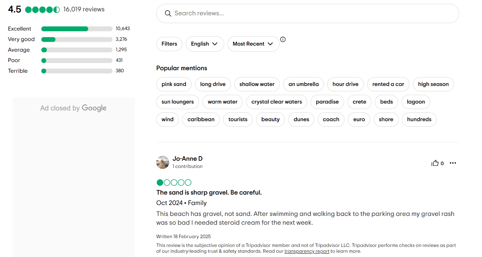
Image Source: Trip Advisor
TripAdvisor now covers everything in travel experiences, from attractions to tours. Their review cards stay consistent while adapting to different types of experiences.
Each card shows the overall rating first, with a headline and detailed review. Reviewers share specific details about their experiences to set accurate expectations for future travellers.
TripAdvisor's unique "Traveller Rating" distribution graph shows how many reviewers gave each star rating. This visual helps users understand an experience's consistency. The platform displays both experience and review dates for transparency.
Yelp Review Card

Image Source: Yelp
Yelp dominates restaurant reviews with its accessible interface that delivers detailed, text-rich feedback for better dining choices.
The platform puts star ratings first, followed by complete text reviews and media content. Users can see a restaurant's overall rating quickly while accessing detailed experiences from previous diners. Yelp's review form prompts feedback about food quality, service, and ambiance.
User profile information appears with names and profile pictures to build credibility. This personal element creates trust and community feeling on the platform. Users can also add photos and videos that prove their dining experiences and make reviews more authentic.
Yelp's interactive features let users mark reviews as helpful or not. This crowdsourcing pushes the best feedback to the top. Future diners find relevant information faster, and reviewers feel motivated to share thoughtful content.
App Store Review Card

Image Source: Medium
App Store review cards shape user choices and boost app downloads. Apple's App Store has made its review cards simple yet informative to help users learn about an app's quality and features.
App Store review cards stand out with:
Star rating: A big, noticeable star rating lets users quickly see an app's overall quality.
Review title: Short, catchy headlines sum up the reviewer's main point.
Detailed review: The main text shares deeper insights about the user's app experience.
Version information: Cards show which app version got reviewed. This helps users understand feedback about recent updates.
Helpfulness rating: Users rate reviews based on usefulness. The most helpful ones rise to the top.
Developer response: App makers can reply to reviews right on the card. This shows they care about user feedback.
The App Store keeps its review cards clean and easy to read while focusing on user feedback. Users can make quick, smart choices in the ever-changing world of mobile apps.
Play Store Review Card
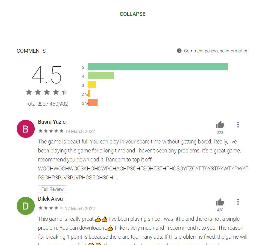
Image Source: Juphy
Google's Play Store takes its own path with review card design for Android users. These cards share some features with the App Store but add unique elements for their audience.
Play Store review cards feature:
Color-coded star rating: Bright colors make star ratings pop out.
User profile: Each card shows the reviewer's name and picture for a personal touch.
Review date: Clear posting dates help users check how recent the feedback is.
Like count: Users can like helpful reviews, and likes show up on the card.
Device information: Some cards list the reviewer's device to help with compatibility questions.
Edit history: The Play Store shows when reviews change to stay transparent.
Play Store cards work well with Google's other services. Reviews from Google Local Guides get special attention because these reviewers have proven track records.
Adidas Review Card

Image Source: Amazon India
Adidas matches its review cards to its brand while giving buyers useful details about its sports gear and equipment.
Adidas review cards showcase:
Overall rating: Star ratings grab attention right away.
Fit and size feedback: Athletic wear needs to fit right, so cards focus on size accuracy.
Performance metrics: Products get rated on specific features like comfort, durability, and breathability.
Verified purchase badge: Reviews from actual buyers stand out.
Visual content: Customer photos show products in real life.
Recommendation percentage: Cards display how many reviewers would suggest the product to others.
Adidas balances detailed product info with clean design that matches its brand. Customer photos and specific ratings help buyers choose athletic gear where fit and function matter most.
Shopify Review Card

Image Source: Shopify
Shopify lets store owners customize how they show product reviews. Most successful Shopify stores include these common elements:
Star rating: Big star ratings catch the eye first.
Review title: Quick headlines help shoppers scan feedback fast.
Reviewer name and date: These details build trust and show when reviews were posted.
Verified buyer badge: Many stores highlight reviews from confirmed purchases.
Product-specific questions: Cards often answer key questions about fit, color, and durability.
Media uploads: Customers can add photos or videos to their reviews.
Review sorting and filtering: Shoppers can sort reviews by rating, date, or helpfulness.
Store owners can make their review cards match their brand while keeping essential buying information. This flexibility creates wide variety in how Shopify review cards look and work across different stores.
To wrap up, review cards have grown to fit many industries and platforms. From employee evaluations to product reviews, these cards build trust and share vital information. The examples we looked at show how versatile and important well-designed review systems are.
Review card designs share these trends:
Emphasis on visual elements: Star ratings, colors, and user photos make cards easy to scan and understand.
Customization for specific needs: Each platform adapts its cards to show what matters most to its users.
Integration of credibility indicators: Verified badges and trusted reviewer highlights make feedback more reliable.
Interactive elements: Users can now engage with reviews by marking them helpful or sorting them different ways.
Detailed yet concise information: Cards pack lots of info into easy-to-read formats.
Reviews keep growing more important across industries. Review card designs will keep changing to use new tech and meet user needs. Designers and businesses must balance detailed information with friendly layouts that help quick decisions.
Tips to Create Review Card

Image Source: QR Code Chimp
A well-designed review card builds trust and shapes user decisions. The right design can boost conversion rates and get users to participate more. Let's look at some tips to create review cards that appeal to your audience and deliver results.
Clean and Minimal
Review card design works best when kept simple. Your users won't feel overwhelmed when you take a clean, minimal approach. Here's what you should think over:
Whitespace: Add plenty of whitespace to create clarity and focus. Your users' eyes will naturally move to the important elements on the review card.
Limited color palette: Keep your color scheme tight and match your brand identity. Too many colors can pull attention away from the review content.
Simple typography: Pick readable fonts and stick to just a few typefaces. A clean sans-serif font for body text works well with a distinctive heading font to balance the look.
Subtle borders and shadows: Light borders or soft drop shadows define card boundaries without visual clutter.
Focused content: Show only what matters most on the card. Too much text or unnecessary details will overwhelm users.
These principles will help you create review cards that users can understand quickly. This approach works great on mobile devices where space is tight.
Display Key Information Clearly
Review cards need to get important information across fast. Here's how to make that happen:
Prominent star rating: The overall rating should stand out most. Pick clear, recognizable star icons.
Concise review title: Add a short, catchy headline that captures the reviewer's main point. Users can scan multiple reviews faster this way.
Reviewer details: The reviewer's name and profile picture add authenticity and build trust.
Date of review: Show the posting date to give context.
Verified purchase badge: A badge or icon that shows verified purchases builds more trust in the feedback.
Product-specific information: Add details like size, color, or model for product reviews. Potential buyers can find reviews that match their interests better.
Helpful votes: Show how many users found the review helpful. This social proof guides readers to valuable feedback.
These key elements help users quickly find what matters in each review card. Decision-making becomes faster and the user experience gets better.
Use Visual Hierarchy
Your review card needs clear visual hierarchy to guide users through information. Here's how to make it work:
Size and weight: Important elements like ratings and titles need larger fonts and bold weights. Less important info can be smaller and lighter.
Color contrast: Smart color choices draw eyes to key elements. High-contrast colors work well for star ratings while secondary info stays muted.
Positioning: Put the most important information at the top or center where users look first.
Grouping: Keep related information together. Reviewer details should stay separate from review content.
Negative space: Smart use of whitespace separates elements and guides users through content.
Icons and symbols: Small icons help represent different information types - like calendar icons for dates or checkmarks for verified purchases.
Progressive disclosure: Longer reviews can have "Read More" links or expandable sections. The first view stays clean but users can see more details if they want.
Good visual hierarchy helps users find relevant information fast and makes your review system more effective.
Add Icons and Micro interactions
Icons and micro interactions make review cards more engaging. Here's what works best:
Intuitive icons: Pick icons everyone knows - thumbs-up for helpful votes, shopping bags for verified purchases.
Consistent style: Keep all icons matching your design style. Your review cards will look more put together.
Hover effects: Add subtle effects to buttons and links. Users get better feedback when they interact.
Animated transitions: Smooth animations make expanding or collapsing reviews feel natural.
Interactive ratings: Let users play with star ratings. Stars can light up on hover to show potential ratings.
Progress indicators: Show users where they are in multi-step review processes.
Feedback animations: Small animations confirm actions - like checkmarks appearing after marking reviews helpful.
Customizable reactions: Give users more ways to react beyond "helpful" - maybe emoji reactions or tags like "informative" or "detailed."
These elements create dynamic review cards that users love to interact with.
Keep it Responsive
Review cards need to work well on all devices. Here's how to make them responsive:
Flexible layouts: Use flexible grids and relative units instead of fixed pixels. Cards will adapt smoothly to different screens.
Mobile-first approach: Design for mobile first, then enhance for bigger screens. Small screens get solid foundations.
Stackable elements: Stack side-by-side elements vertically on mobile. Reading and using cards stays easy.
Collapsible content: Long reviews can expand on mobile. Users see concise views first but can read more if needed.
Touch-friendly targets: Interactive elements need to be big enough for fingers - at least 44x44 pixels.
Adaptive typography: Text should stay readable on all screens. Adjust font sizes, line heights, and spacing at different breakpoints.
Image optimization: Make images work for all screen sizes without slow loading.
Performance considerations: Keep mobile performance strong. Skip heavy scripts and large media files.
Cross-browser testing: Check your cards work in all browsers and devices.
Accessibility: Keep accessibility standards high across all sizes. Good contrast, keyboard navigation, and screen reader support matter.
These responsive principles create review cards that work great on any device.
In the end, great review card design needs careful thought about looks, function, and user experience. Clean designs, clear information, smart visual hierarchy, engaging interactions, and responsive layouts create review cards that look good and get results. The goal is simple - help customers make quick, informed decisions with user feedback. Keep testing and improving your designs based on how users respond. Your review cards will keep getting better at meeting business goals and user needs.
Conclusion
Review cards are powerful tools that build user trust and boost business growth in industries of all sizes. Our analysis of various review card implementations shows that successful designs share key features. These include clean layouts, clear visual hierarchies, and responsive functionality.
Smart businesses know review cards must do more than display star ratings. Modern review systems need verified purchase badges, helpful vote mechanisms, and user-generated content. These elements work together to build authentic social proof.
The future of review card design points toward AI-powered personalization and improved interactive features. But the fundamental principles stay the same - clarity comes first, visual appeal matters, and user experience remains central.
Note that review cards act as digital trust signals for your brand. A well-laid-out review system showcases customer feedback and encourages participation. This builds lasting credibility with your audience. You can start applying these design principles today to create review cards that strike a chord with users and deliver meaningful results for your business.
Review Card Design - Tips & Examples
Online businesses live or die by trust. Most of us know that moment of truth - the cursor hovering over the "Buy Now" button while we desperately search for authentic customer experiences before deciding.
Review card design has become significant for companies like Adidas and Amazon. These compact, visual elements showcase user feedback that builds instant credibility and drives sales. A well-designed review card has key elements: profile details, user-generated content, and interactive features that substantially boost user involvement.
Major brands use review cards differently to build trust and shape buying decisions. Our analysis reveals the most effective customer review designs from Yelp's comprehensive feedback system to Trustpilot's star ratings. These examples demonstrate proven strategies that work.
Review Cards Inspiration
Review cards help businesses of all industries showcase customer feedback and build trust. Let's take a closer look at some great review card designs from different sectors:
E-Commerce Review Card
Image Source: Dribbble
An E-Commerce Review Card is a crucial UI element that enhances user trust and engagement by displaying customer feedback effectively. It typically includes a profile picture and name of the reviewer, a star rating system, the review text, and a timestamp to indicate relevance. To improve readability, the design should use a clean layout with ample white space, ensuring key elements like ratings and helpfulness indicators stand out.
Interactive elements like thumbs up/down for helpful reviews improve user experience. The design should be responsive, adapting seamlessly to different screen sizes, and support both light and dark modes for accessibility. A well-crafted review card design not only provides valuable insights but also encourages potential customers to make informed purchasing decisions.
Restaurant Review Card
Image Source: Dribbble
A well-crafted restaurant review card design should be visually structured, easy to read, and engaging for users. It should feature key components such as the reviewer’s profile picture and name, a star rating system, and the date of the review to ensure credibility. The review text should be neatly displayed with an option to expand longer reviews for better readability. A photo upload feature can enhance authenticity by allowing users to share images of their meals.
Additionally, interactive elements like a "Like" button, comment section, or direct reply option can encourage engagement and discussion. A highlighted badge for verified diners adds further trust to the review. The design should be clean, responsive, and well-balanced, using clear typography and a structured layout that adapts seamlessly to both desktop and mobile screens. A summary section at the top, showing the restaurant’s overall rating and total reviews, helps users get a quick snapshot of customer satisfaction.
Hotel Booking Review Card
Image Source: Dribbble
A hotel booking review card design should be visually appealing, informative, and easy to navigate, helping potential guests make informed decisions. It should include the reviewer’s profile picture and name, a star rating system, and the date of stay for added credibility. The review text should be well-structured, with an option to expand long reviews for better readability.
A photo gallery feature allows guests to upload real images of their stay, adding authenticity. Interactive elements such as a "Like" button, comment section, or "Was this review helpful?" option can boost engagement.
Travel Experience Review Card
Image Source: Dribbble
A tours & travel review card design should be visually appealing, intuitive, and engaging, allowing travellers to share their experiences effortlessly. The design should include a trip title and location, followed by a star rating system to provide an instant overview of the experience. A recommendation checkbox enhances credibility, while segmented rating options for factors like ease of access, facilities, and service quality offer deeper insights.
A review text box allows users to share detailed feedback, while a summary title section helps highlight key takeaways. To make reviews more immersive, a photo upload feature enables users to attach images of their trip. A clean, minimalistic design with soft color gradients and rounded elements ensures a seamless and pleasant user experience.
Real Brand Review Card Examples
Review cards have become essential tools across platforms and industries beyond e-commerce and hospitality. Let's look at some real brand review card designs.
Trip Advisor Review Card
Image Source: Trip Advisor
TripAdvisor now covers everything in travel experiences, from attractions to tours. Their review cards stay consistent while adapting to different types of experiences.
Each card shows the overall rating first, with a headline and detailed review. Reviewers share specific details about their experiences to set accurate expectations for future travellers.
TripAdvisor's unique "Traveller Rating" distribution graph shows how many reviewers gave each star rating. This visual helps users understand an experience's consistency. The platform displays both experience and review dates for transparency.
Yelp Review Card
Image Source: Yelp
Yelp dominates restaurant reviews with its accessible interface that delivers detailed, text-rich feedback for better dining choices.
The platform puts star ratings first, followed by complete text reviews and media content. Users can see a restaurant's overall rating quickly while accessing detailed experiences from previous diners. Yelp's review form prompts feedback about food quality, service, and ambiance.
User profile information appears with names and profile pictures to build credibility. This personal element creates trust and community feeling on the platform. Users can also add photos and videos that prove their dining experiences and make reviews more authentic.
Yelp's interactive features let users mark reviews as helpful or not. This crowdsourcing pushes the best feedback to the top. Future diners find relevant information faster, and reviewers feel motivated to share thoughtful content.
App Store Review Card
Image Source: Medium
App Store review cards shape user choices and boost app downloads. Apple's App Store has made its review cards simple yet informative to help users learn about an app's quality and features.
App Store review cards stand out with:
Star rating: A big, noticeable star rating lets users quickly see an app's overall quality.
Review title: Short, catchy headlines sum up the reviewer's main point.
Detailed review: The main text shares deeper insights about the user's app experience.
Version information: Cards show which app version got reviewed. This helps users understand feedback about recent updates.
Helpfulness rating: Users rate reviews based on usefulness. The most helpful ones rise to the top.
Developer response: App makers can reply to reviews right on the card. This shows they care about user feedback.
The App Store keeps its review cards clean and easy to read while focusing on user feedback. Users can make quick, smart choices in the ever-changing world of mobile apps.
Play Store Review Card
Image Source: Juphy
Google's Play Store takes its own path with review card design for Android users. These cards share some features with the App Store but add unique elements for their audience.
Play Store review cards feature:
Color-coded star rating: Bright colors make star ratings pop out.
User profile: Each card shows the reviewer's name and picture for a personal touch.
Review date: Clear posting dates help users check how recent the feedback is.
Like count: Users can like helpful reviews, and likes show up on the card.
Device information: Some cards list the reviewer's device to help with compatibility questions.
Edit history: The Play Store shows when reviews change to stay transparent.
Play Store cards work well with Google's other services. Reviews from Google Local Guides get special attention because these reviewers have proven track records.
Adidas Review Card
Image Source: Amazon India
Adidas matches its review cards to its brand while giving buyers useful details about its sports gear and equipment.
Adidas review cards showcase:
Overall rating: Star ratings grab attention right away.
Fit and size feedback: Athletic wear needs to fit right, so cards focus on size accuracy.
Performance metrics: Products get rated on specific features like comfort, durability, and breathability.
Verified purchase badge: Reviews from actual buyers stand out.
Visual content: Customer photos show products in real life.
Recommendation percentage: Cards display how many reviewers would suggest the product to others.
Adidas balances detailed product info with clean design that matches its brand. Customer photos and specific ratings help buyers choose athletic gear where fit and function matter most.
Shopify Review Card
Image Source: Shopify
Shopify lets store owners customize how they show product reviews. Most successful Shopify stores include these common elements:
Star rating: Big star ratings catch the eye first.
Review title: Quick headlines help shoppers scan feedback fast.
Reviewer name and date: These details build trust and show when reviews were posted.
Verified buyer badge: Many stores highlight reviews from confirmed purchases.
Product-specific questions: Cards often answer key questions about fit, color, and durability.
Media uploads: Customers can add photos or videos to their reviews.
Review sorting and filtering: Shoppers can sort reviews by rating, date, or helpfulness.
Store owners can make their review cards match their brand while keeping essential buying information. This flexibility creates wide variety in how Shopify review cards look and work across different stores.
To wrap up, review cards have grown to fit many industries and platforms. From employee evaluations to product reviews, these cards build trust and share vital information. The examples we looked at show how versatile and important well-designed review systems are.
Review card designs share these trends:
Emphasis on visual elements: Star ratings, colors, and user photos make cards easy to scan and understand.
Customization for specific needs: Each platform adapts its cards to show what matters most to its users.
Integration of credibility indicators: Verified badges and trusted reviewer highlights make feedback more reliable.
Interactive elements: Users can now engage with reviews by marking them helpful or sorting them different ways.
Detailed yet concise information: Cards pack lots of info into easy-to-read formats.
Reviews keep growing more important across industries. Review card designs will keep changing to use new tech and meet user needs. Designers and businesses must balance detailed information with friendly layouts that help quick decisions.
Tips to Create Review Card
Image Source: QR Code Chimp
A well-designed review card builds trust and shapes user decisions. The right design can boost conversion rates and get users to participate more. Let's look at some tips to create review cards that appeal to your audience and deliver results.
Clean and Minimal
Review card design works best when kept simple. Your users won't feel overwhelmed when you take a clean, minimal approach. Here's what you should think over:
Whitespace: Add plenty of whitespace to create clarity and focus. Your users' eyes will naturally move to the important elements on the review card.
Limited color palette: Keep your color scheme tight and match your brand identity. Too many colors can pull attention away from the review content.
Simple typography: Pick readable fonts and stick to just a few typefaces. A clean sans-serif font for body text works well with a distinctive heading font to balance the look.
Subtle borders and shadows: Light borders or soft drop shadows define card boundaries without visual clutter.
Focused content: Show only what matters most on the card. Too much text or unnecessary details will overwhelm users.
These principles will help you create review cards that users can understand quickly. This approach works great on mobile devices where space is tight.
Display Key Information Clearly
Review cards need to get important information across fast. Here's how to make that happen:
Prominent star rating: The overall rating should stand out most. Pick clear, recognizable star icons.
Concise review title: Add a short, catchy headline that captures the reviewer's main point. Users can scan multiple reviews faster this way.
Reviewer details: The reviewer's name and profile picture add authenticity and build trust.
Date of review: Show the posting date to give context.
Verified purchase badge: A badge or icon that shows verified purchases builds more trust in the feedback.
Product-specific information: Add details like size, color, or model for product reviews. Potential buyers can find reviews that match their interests better.
Helpful votes: Show how many users found the review helpful. This social proof guides readers to valuable feedback.
These key elements help users quickly find what matters in each review card. Decision-making becomes faster and the user experience gets better.
Use Visual Hierarchy
Your review card needs clear visual hierarchy to guide users through information. Here's how to make it work:
Size and weight: Important elements like ratings and titles need larger fonts and bold weights. Less important info can be smaller and lighter.
Color contrast: Smart color choices draw eyes to key elements. High-contrast colors work well for star ratings while secondary info stays muted.
Positioning: Put the most important information at the top or center where users look first.
Grouping: Keep related information together. Reviewer details should stay separate from review content.
Negative space: Smart use of whitespace separates elements and guides users through content.
Icons and symbols: Small icons help represent different information types - like calendar icons for dates or checkmarks for verified purchases.
Progressive disclosure: Longer reviews can have "Read More" links or expandable sections. The first view stays clean but users can see more details if they want.
Good visual hierarchy helps users find relevant information fast and makes your review system more effective.
Add Icons and Micro interactions
Icons and micro interactions make review cards more engaging. Here's what works best:
Intuitive icons: Pick icons everyone knows - thumbs-up for helpful votes, shopping bags for verified purchases.
Consistent style: Keep all icons matching your design style. Your review cards will look more put together.
Hover effects: Add subtle effects to buttons and links. Users get better feedback when they interact.
Animated transitions: Smooth animations make expanding or collapsing reviews feel natural.
Interactive ratings: Let users play with star ratings. Stars can light up on hover to show potential ratings.
Progress indicators: Show users where they are in multi-step review processes.
Feedback animations: Small animations confirm actions - like checkmarks appearing after marking reviews helpful.
Customizable reactions: Give users more ways to react beyond "helpful" - maybe emoji reactions or tags like "informative" or "detailed."
These elements create dynamic review cards that users love to interact with.
Keep it Responsive
Review cards need to work well on all devices. Here's how to make them responsive:
Flexible layouts: Use flexible grids and relative units instead of fixed pixels. Cards will adapt smoothly to different screens.
Mobile-first approach: Design for mobile first, then enhance for bigger screens. Small screens get solid foundations.
Stackable elements: Stack side-by-side elements vertically on mobile. Reading and using cards stays easy.
Collapsible content: Long reviews can expand on mobile. Users see concise views first but can read more if needed.
Touch-friendly targets: Interactive elements need to be big enough for fingers - at least 44x44 pixels.
Adaptive typography: Text should stay readable on all screens. Adjust font sizes, line heights, and spacing at different breakpoints.
Image optimization: Make images work for all screen sizes without slow loading.
Performance considerations: Keep mobile performance strong. Skip heavy scripts and large media files.
Cross-browser testing: Check your cards work in all browsers and devices.
Accessibility: Keep accessibility standards high across all sizes. Good contrast, keyboard navigation, and screen reader support matter.
These responsive principles create review cards that work great on any device.
In the end, great review card design needs careful thought about looks, function, and user experience. Clean designs, clear information, smart visual hierarchy, engaging interactions, and responsive layouts create review cards that look good and get results. The goal is simple - help customers make quick, informed decisions with user feedback. Keep testing and improving your designs based on how users respond. Your review cards will keep getting better at meeting business goals and user needs.
Conclusion
Review cards are powerful tools that build user trust and boost business growth in industries of all sizes. Our analysis of various review card implementations shows that successful designs share key features. These include clean layouts, clear visual hierarchies, and responsive functionality.
Smart businesses know review cards must do more than display star ratings. Modern review systems need verified purchase badges, helpful vote mechanisms, and user-generated content. These elements work together to build authentic social proof.
The future of review card design points toward AI-powered personalization and improved interactive features. But the fundamental principles stay the same - clarity comes first, visual appeal matters, and user experience remains central.
Note that review cards act as digital trust signals for your brand. A well-laid-out review system showcases customer feedback and encourages participation. This builds lasting credibility with your audience. You can start applying these design principles today to create review cards that strike a chord with users and deliver meaningful results for your business.


Similar Blogs
Similar Blogs
Similar Blogs


Available for Work
Bricx
© Bricx, 2026. All rights reserved.


Available for Work
Bricx
© Bricx, 2026. All rights reserved.
Available for Work
Bricx
© Bricx, 2026. All rights reserved.
Available for Work
Bricx
© Bricx, 2026. All rights reserved.