Doubling Free-To-Paid Conversions From 6% to 13% After Manyreach's Product Redesign
Doubling Free-To-Paid Conversions From 6% to 13% After Manyreach's Product Redesign
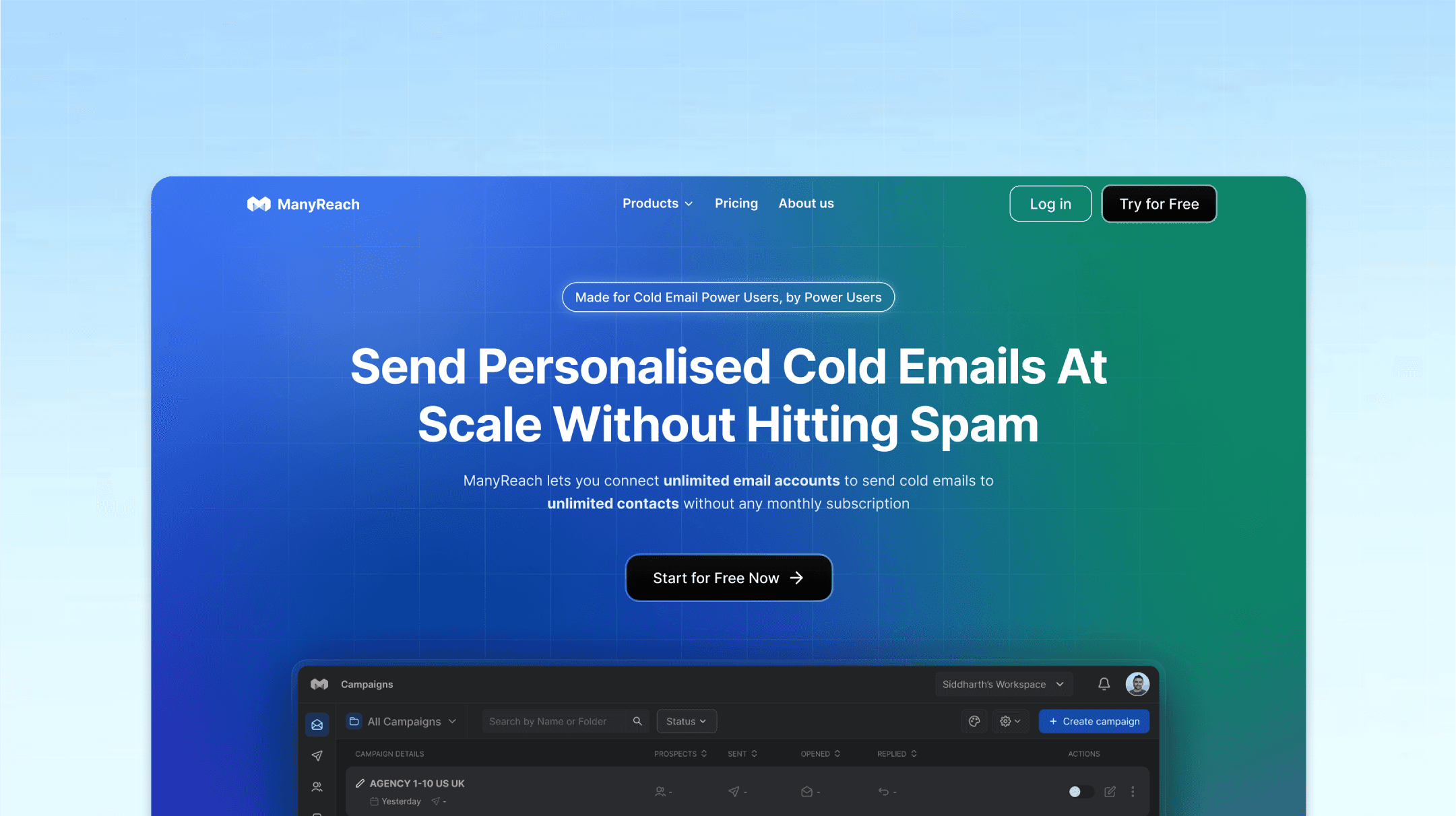
We identified core UX problems that were making users not use the product & churn. We redesigned the entire platform from scratch to improve customer activation, retention, and paid conversions.


Client
Manyreach
Industry
Sales
Services
MVP Design
Socialsonic is an AI LinkedIn growth platform that helps users become a top 1% LinkedIn creator. We helped Socialsonic conduct user interviews, find problems, and designed a stunning MVP in 30 days.
Manyreach is a cold outreach platform that helps businesses get more meetings through cold email outreach. They attracted a lot of users with a lifetime deal.
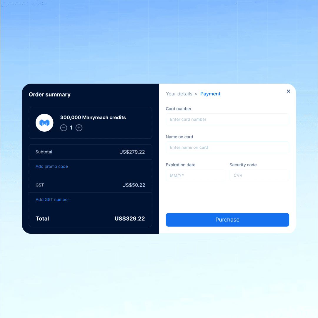
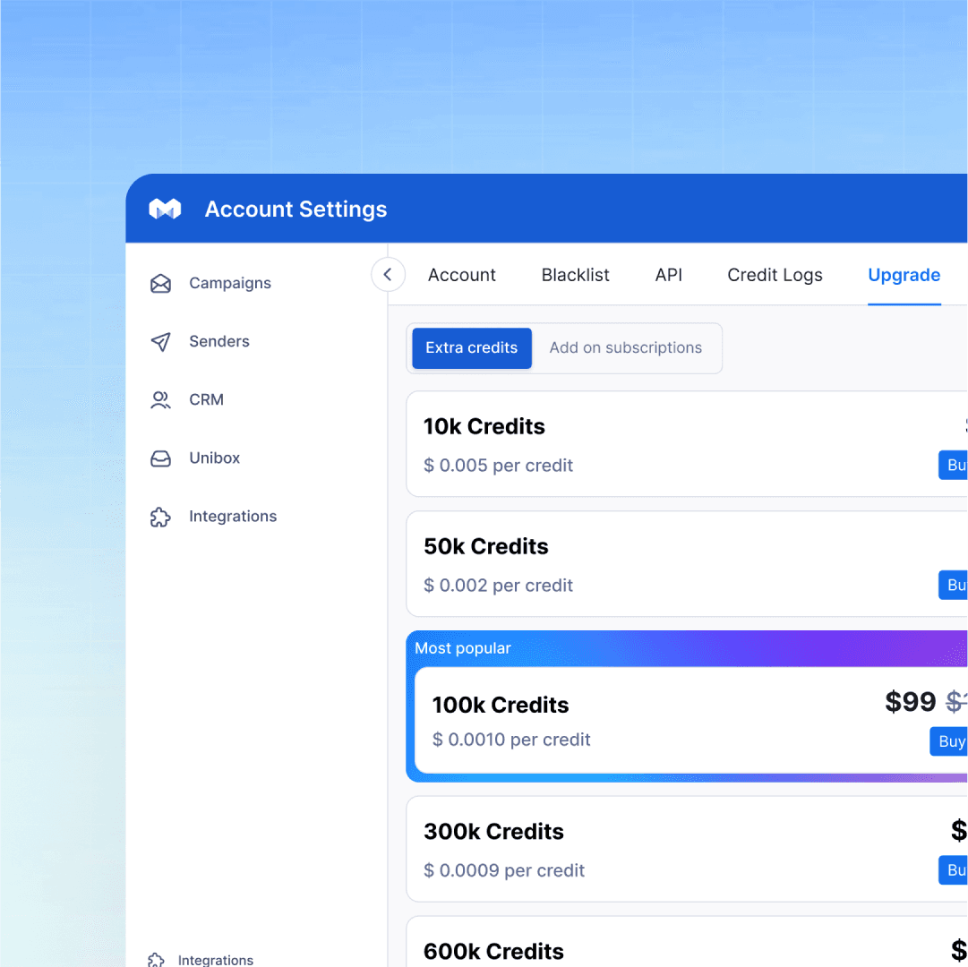
LTD customers are notorious for churning fast thus not using the software & not buying more credits. We were give the project to redesign Manyreach to compete with industry giants like Instantly & Smartlead.
About Manyreach
Manyreach is a cold outreach platform that helps businesses get more meetings through cold email outreach. They attracted a lot of users with a lifetime deal.
LTD customers are notorious for churning fast thus not using the software & not buying more credits. We were give the project to redesign Manyreach to compete with industry giants like Instantly & Smartlead.
Outcomes
We completely redesigned Manyreach’s platform, transforming it into a user-friendly and modern experience. Since the redesign, user satisfaction has soared, with a noticeable increase in positive reviews.
Activation rates improved significantly, and retention shot up as users found it easier to navigate and use the platform. Manyreach was our very first client, and we’re proud to say they still trust us with their design needs to this day!









User Interviews
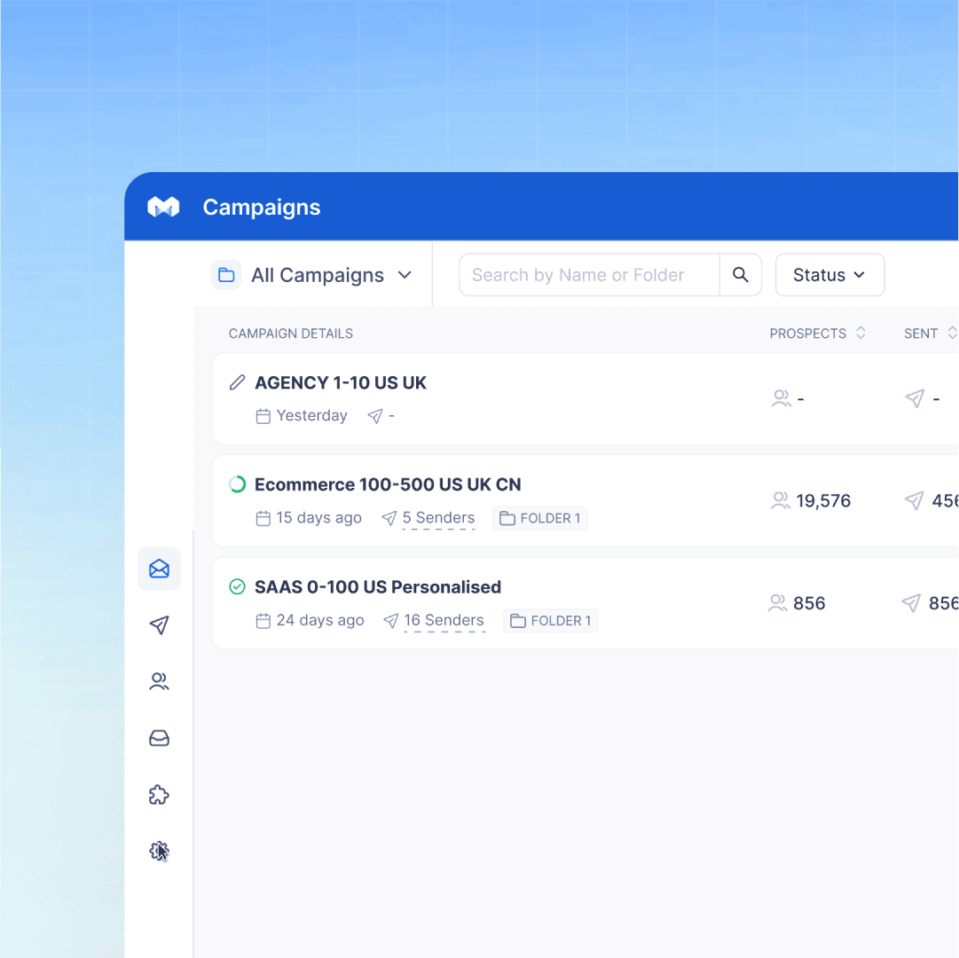
Manyreach had already built a Facebook group of potential customers & power users. The first thing we did was reach out to power users & understand how & why they use Manyreach and understand the problems they face.
Manyreach had already built a Facebook group of potential customers & power users. The first thing we did was reach out to power users & understand how & why they use Manyreach and understand the problems they face.
Manyreach had already built a Facebook group of potential customers & power users. The first thing we did was reach out to power users & understand how & why they use Manyreach and understand the problems they face.


Onboarding
One of the first things we did was design the onboarding flow to give users a personalized experience right off the bat. We focused on questions around user roles, outreach experience, preferences, and goals. This allowed us to create a personalized guided tour for each user persona.
One of the first things we did was design the onboarding flow to give users a personalized experience right off the bat. We focused on questions around user roles, outreach experience, preferences, and goals. This allowed us to create a personalized guided tour for each user persona.
One of the first things we did was design the onboarding flow to give users a personalized experience right off the bat. We focused on questions around user roles, outreach experience, preferences, and goals. This allowed us to create a personalized guided tour for each user persona.


Create Campaign Flow
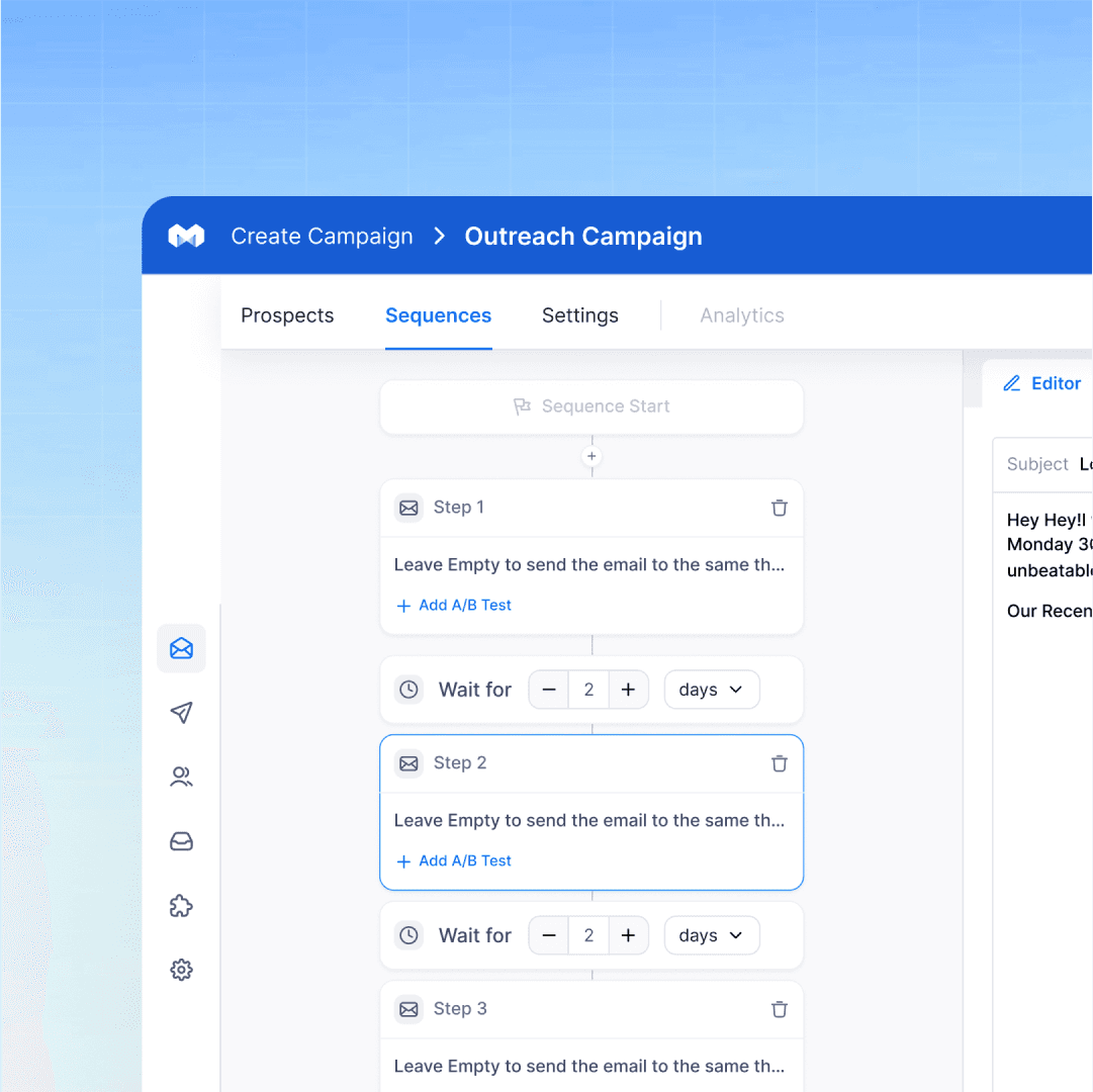
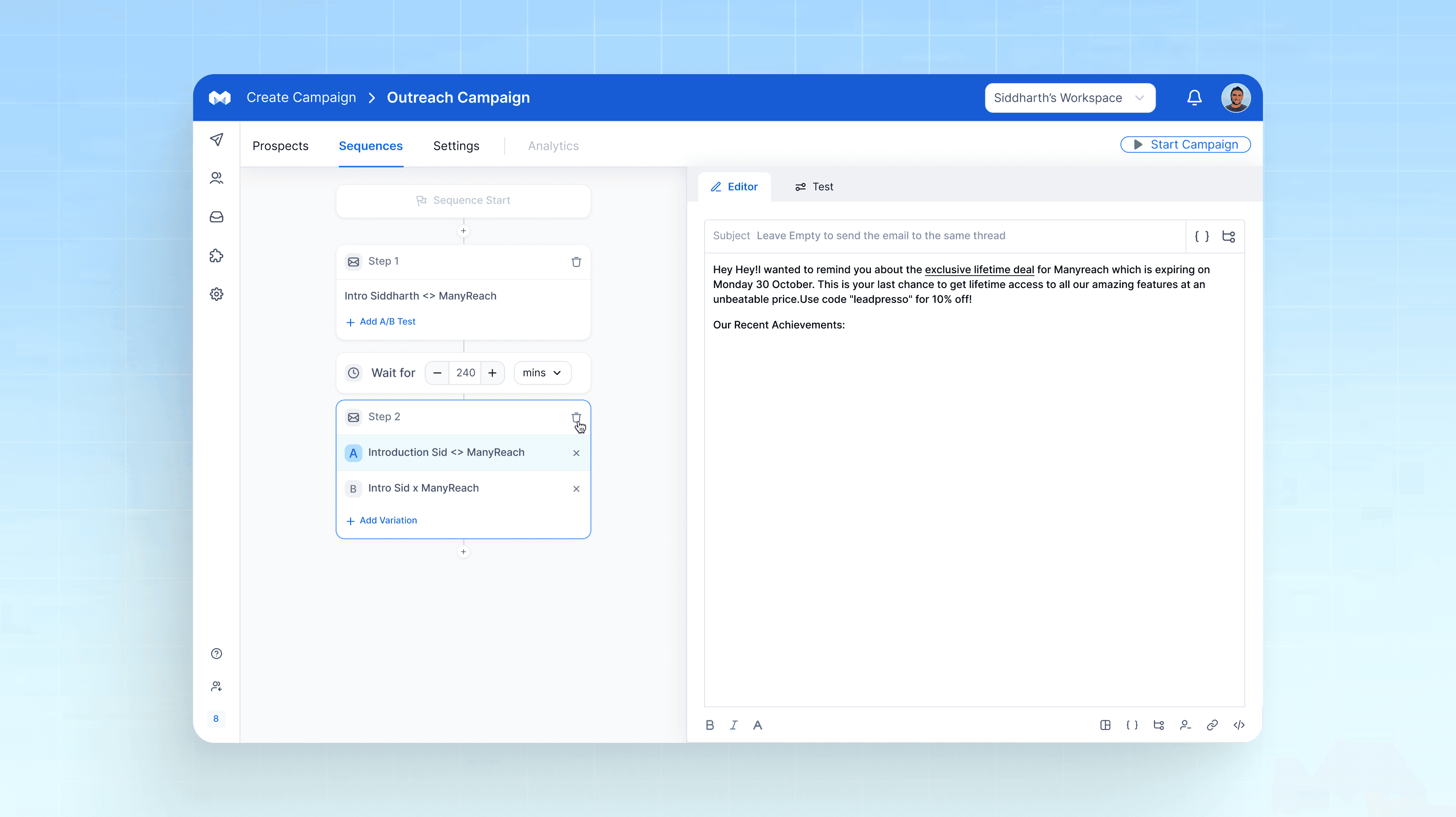
The 'Create Campaign' flow is the most important flow responsible to send more emails. We simplified it by adding guided tool tips, improving lead list uploading flow, clarifying UX writing, and adding AI suggestions for the email script copywriting.
The 'Create Campaign' flow is the most important flow responsible to send more emails. We simplified it by adding guided tool tips, improving lead list uploading flow, clarifying UX writing, and adding AI suggestions for the email script copywriting.
The 'Create Campaign' flow is the most important flow responsible to send more emails. We simplified it by adding guided tool tips, improving lead list uploading flow, clarifying UX writing, and adding AI suggestions for the email script copywriting.


Senders Flow
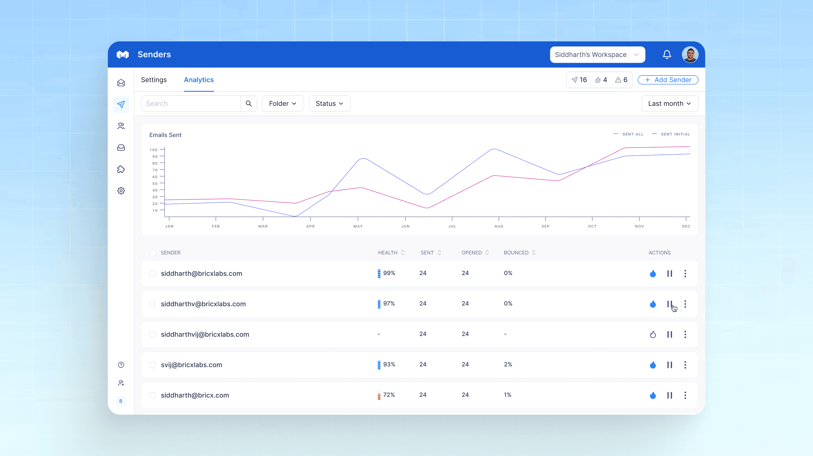
The heart of any cold email campaign are the sending mailboxes. It's one of the most technical & complex tasks a new user is faced with. We simplified the 'add sender' flow to ensure new users can easily add mailboxes & track their health with a simple dashboard.
The heart of any cold email campaign are the sending mailboxes. It's one of the most technical & complex tasks a new user is faced with. We simplified the 'add sender' flow to ensure new users can easily add mailboxes & track their health with a simple dashboard.
The heart of any cold email campaign are the sending mailboxes. It's one of the most technical & complex tasks a new user is faced with. We simplified the 'add sender' flow to ensure new users can easily add mailboxes & track their health with a simple dashboard.


Unibox
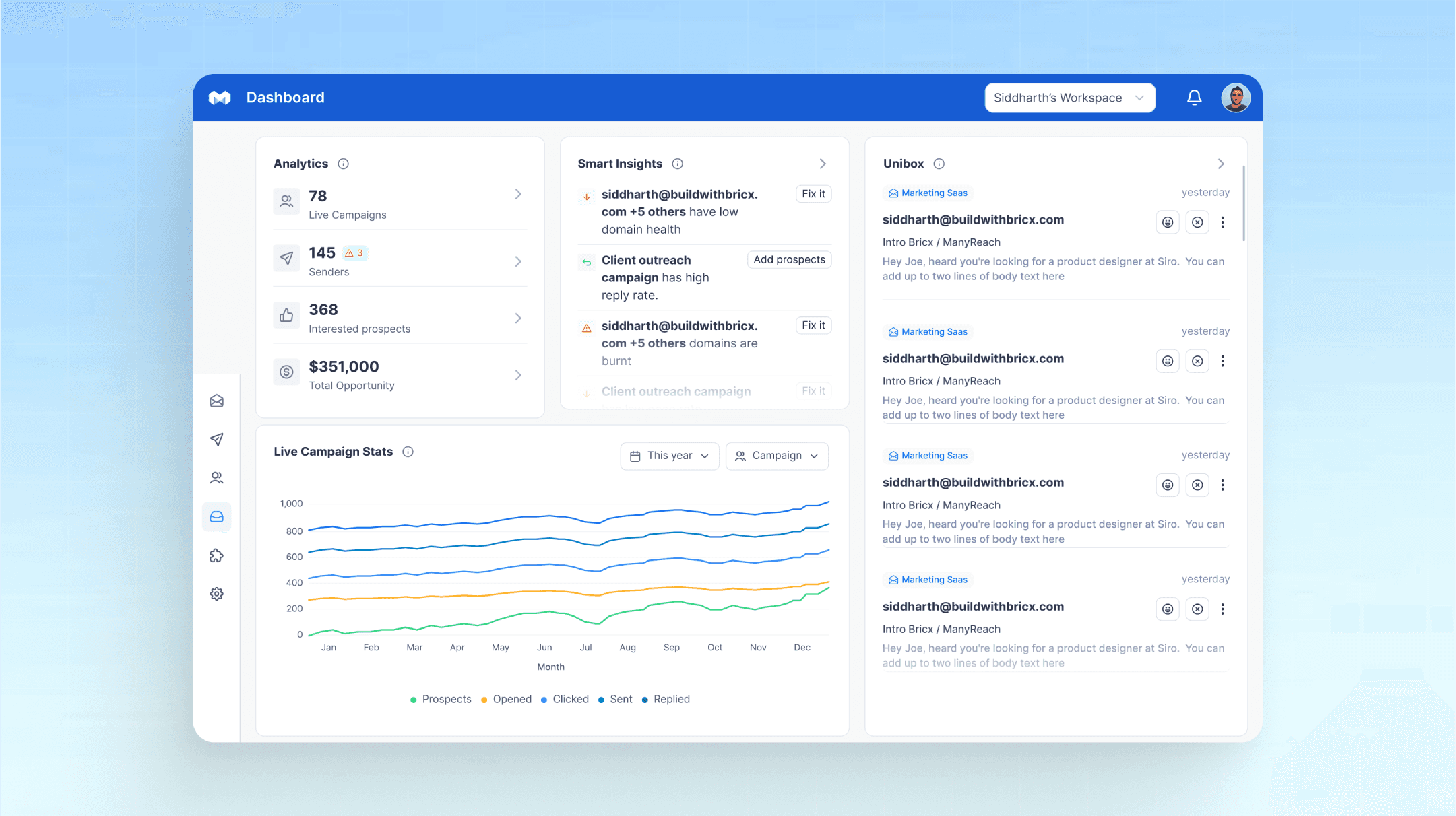
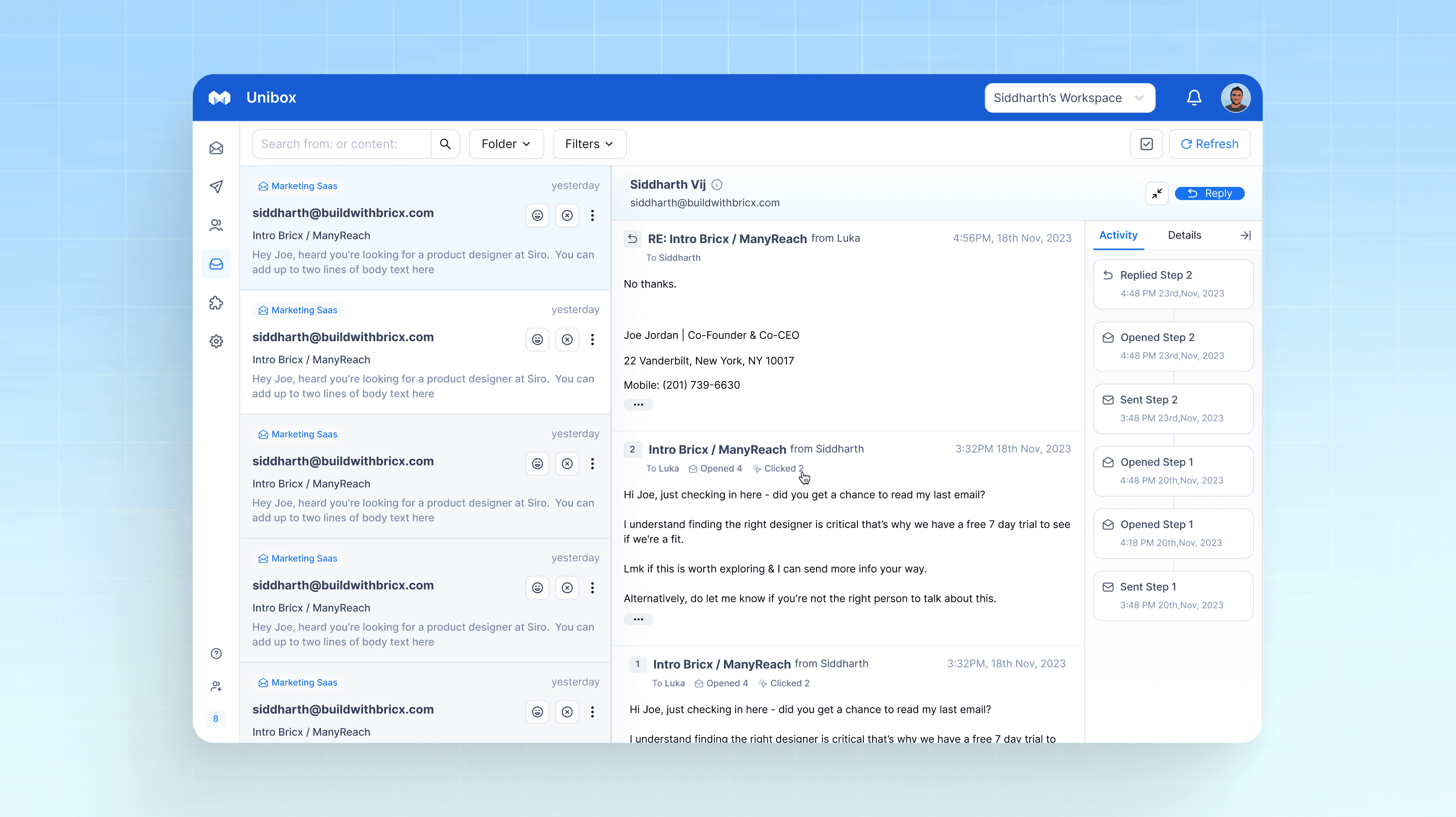
The unibox is the centralized inbox for all mailboxes. Cold email users use the unibox to track replies across all campaigns & mailboxes. We created a simple unibox that allows users to check the activity log and reply to new messages effortlessly.
The unibox is the centralized inbox for all mailboxes. Cold email users use the unibox to track replies across all campaigns & mailboxes. We created a simple unibox that allows users to check the activity log and reply to new messages effortlessly.
The unibox is the centralized inbox for all mailboxes. Cold email users use the unibox to track replies across all campaigns & mailboxes. We created a simple unibox that allows users to check the activity log and reply to new messages effortlessly.


CRM
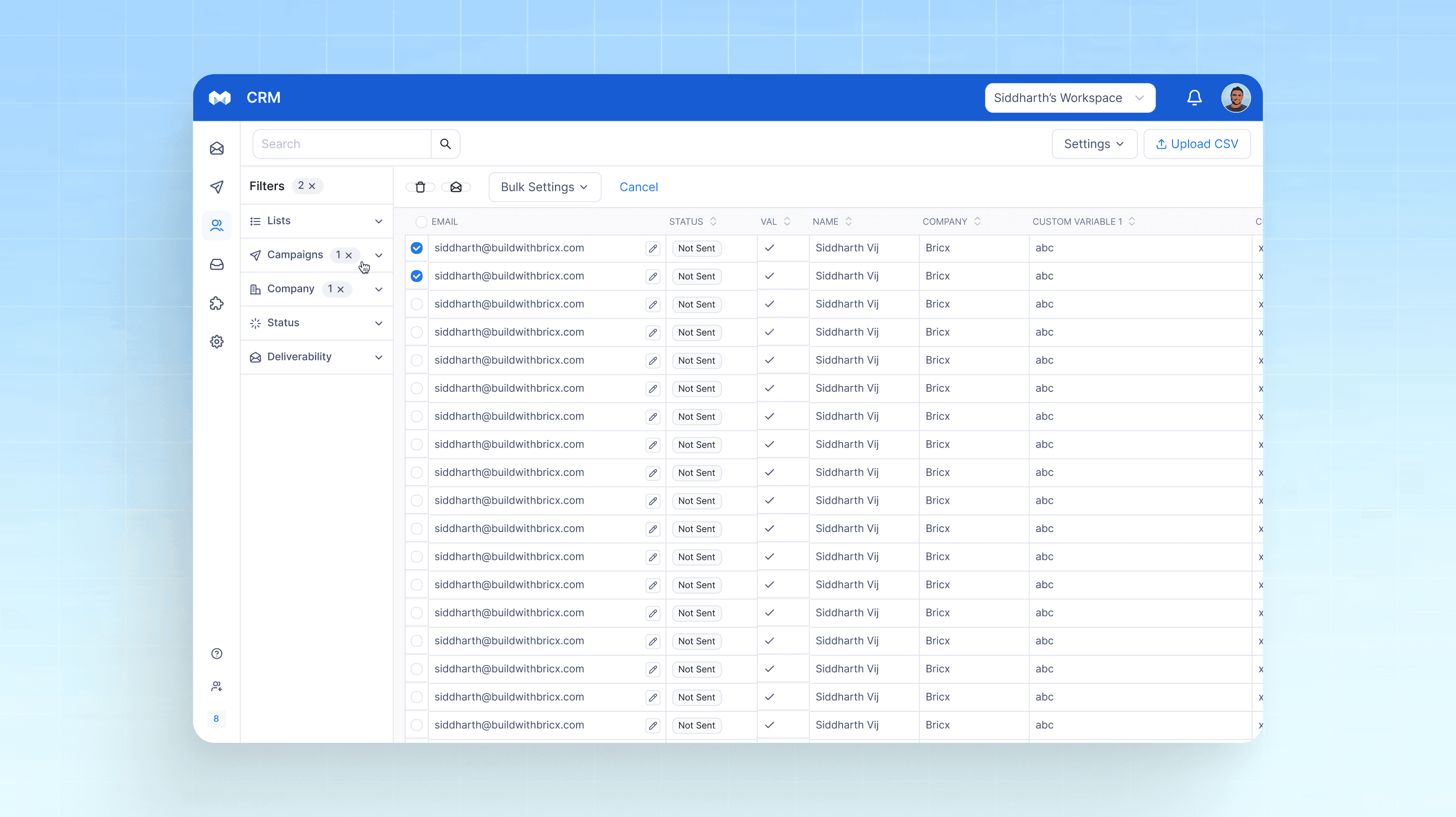
The CRM is used to manage contacts across all campaigns. We designed a easy-to-use CRM where users can easily filter through contacts to find the right people fast.
The CRM is used to manage contacts across all campaigns. We designed a easy-to-use CRM where users can easily filter through contacts to find the right people fast.
The CRM is used to manage contacts across all campaigns. We designed a easy-to-use CRM where users can easily filter through contacts to find the right people fast.


Conclusion
Manyreach went from a tool used by 100s to a platform loved by 1000s after the redesign. All UX metrics went up including activation, retention, paid conversions, and positive reviews.
Manyreach went from a tool used by 100s to a platform loved by 1000s after the redesign. All UX metrics went up including activation, retention, paid conversions, and positive reviews.
Manyreach went from a tool used by 100s to a platform loved by 1000s after the redesign. All UX metrics went up including activation, retention, paid conversions, and positive reviews.

Designing An AI LinkedIn Growth Product in 30 Days

Website Design for Personal Branding AI SaaS in 30 Days

Helium
View Project
Designing A Better WHOOP Competitor for Fitness Enthusiasts

manyreach
View Project
Website Revamp Drives Conversions & Higher AOV

Full-Stack Ed-Tech Website Design

Designing An AI LinkedIn Growth Product in 30 Days

Website Design for Personal Branding AI SaaS in 30 Days

Helium
View Project
Designing A Better WHOOP Competitor for Fitness Enthusiasts

manyreach
View Project
Website Revamp Drives Conversions & Higher AOV

Full-Stack Ed-Tech Website Design

Designing An AI LinkedIn Growth Product in 30 Days

Website Design for Personal Branding AI SaaS in 30 Days

Helium
View Project
Designing A Better WHOOP Competitor for Fitness Enthusiasts

manyreach
View Project
Website Revamp Drives Conversions & Higher AOV

Full-Stack Ed-Tech Website Design

Designing An AI LinkedIn Growth Product in 30 Days

Website Design for Personal Branding AI SaaS in 30 Days

Helium
View Project
Designing A Better WHOOP Competitor for Fitness Enthusiasts

manyreach
View Project
Website Revamp Drives Conversions & Higher AOV

Full-Stack Ed-Tech Website Design

Designing An AI LinkedIn Growth Product in 30 Days

Website Design for Personal Branding AI SaaS in 30 Days

Helium
View Project
Designing A Better WHOOP Competitor for Fitness Enthusiasts

manyreach
View Project
Website Revamp Drives Conversions & Higher AOV

Full-Stack Ed-Tech Website Design

Designing An AI LinkedIn Growth Product in 30 Days

Website Design for Personal Branding AI SaaS in 30 Days

Helium
View Project
Designing A Better WHOOP Competitor for Fitness Enthusiasts

manyreach
View Project
Website Revamp Drives Conversions & Higher AOV

Full-Stack Ed-Tech Website Design

Designing An AI LinkedIn Growth Product in 30 Days

Website Design for Personal Branding AI SaaS in 30 Days

Helium
View Project
Designing A Better WHOOP Competitor for Fitness Enthusiasts

manyreach
View Project
Website Revamp Drives Conversions & Higher AOV

Full-Stack Ed-Tech Website Design

Designing An AI LinkedIn Growth Product in 30 Days

Website Design for Personal Branding AI SaaS in 30 Days

Helium
View Project
Designing A Better WHOOP Competitor for Fitness Enthusiasts

manyreach
View Project
Website Revamp Drives Conversions & Higher AOV

Full-Stack Ed-Tech Website Design

Designing An AI LinkedIn Growth Product in 30 Days

Designing A Better Writesonic Experience

Website Design for Personal Branding AI SaaS in 30 Days

Helium
View Project
Designing A Better WHOOP Competitor for Fitness Enthusiasts

manyreach
View Project
Website Revamp Drives Conversions & Higher AOV

Full-Stack Ed-Tech Website Design

Designing An AI LinkedIn Growth Product in 30 Days

Designing A Better Writesonic Experience

Website Design for Personal Branding AI SaaS in 30 Days

Helium
View Project
Designing A Better WHOOP Competitor for Fitness Enthusiasts

manyreach
View Project
Website Revamp Drives Conversions & Higher AOV

Full-Stack Ed-Tech Website Design

Designing An AI LinkedIn Growth Product in 30 Days

Designing A Better Writesonic Experience

Website Design for Personal Branding AI SaaS in 30 Days

Helium
View Project
Designing A Better WHOOP Competitor for Fitness Enthusiasts

manyreach
View Project
Website Revamp Drives Conversions & Higher AOV

Full-Stack Ed-Tech Website Design

Designing An AI LinkedIn Growth Product in 30 Days

Designing A Better Writesonic Experience

Website Design for Personal Branding AI SaaS in 30 Days

Helium
View Project
Designing A Better WHOOP Competitor for Fitness Enthusiasts

manyreach
View Project
Website Revamp Drives Conversions & Higher AOV

Full-Stack Ed-Tech Website Design
Acquire more
users
Expand your
design team

Reduce support
tickets
Launch your
product fast

Boost your
customer activation



Bricxlabs © 2025
Sign up for our weekly newsletter to receive updates.

Bricxlabs © 2025
Sign up for our weekly newsletter to receive updates.

Bricxlabs © 2025
Sign up for our weekly newsletter to receive updates.

Bricxlabs © 2025
Sign up for our weekly newsletter to receive updates.


