Website Design
Website Design
Website Design
Insights
Insights
Insights
December 1, 2025
December 1, 2025
December 1, 2025
10 Fintech App Design Best Practices for 2026
10 Fintech App Design Best Practices for 2026
10 Fintech App Design Best Practices for 2026
Explore 10 fintech app design best practices for B2B SaaS. Learn about security, UX, data visualization, and accessibility to build a superior product.
Explore 10 fintech app design best practices for B2B SaaS. Learn about security, UX, data visualization, and accessibility to build a superior product.
Explore 10 fintech app design best practices for B2B SaaS. Learn about security, UX, data visualization, and accessibility to build a superior product.
4 mins
4 mins
4 mins


In the competitive landscape of B2B SaaS and AI, a fintech app's success hinges on more than just its core functionality. It demands an impeccable user experience built on a foundation of trust, security, and clarity.
A poorly designed interface can quickly erode user confidence, lead to costly errors, and result in high churn rates, undermining even the most powerful financial tools.
For product teams building sophisticated platforms, the stakes are exceptionally high; users are not just managing data, they are managing capital.
This article provides a comprehensive guide to essential fintech app design best practices, moving beyond generic advice to offer actionable strategies for building superior financial products.
We will explore ten critical areas that directly impact user adoption and satisfaction, from implementing frictionless onboarding and biometric security to designing intuitive data visualizations and ensuring robust accessibility.
Each point is structured to provide practical implementation tips and real-world context, helping you transform complex financial operations into seamless, trustworthy experiences.
For product managers, UX designers, and developers at forward-thinking companies, mastering these principles is not just about compliance or aesthetics.
It is the key to building applications that foster user loyalty, minimize risk, and create a distinct competitive advantage.
This guide will equip you with the specific insights needed to design fintech applications that users not only need but also trust implicitly with their most sensitive financial operations.
We will cover critical topics like streamlined KYC/AML integration, transparent transaction histories, contextual error handling, and building for an offline-first architecture.
1. Biometric Authentication & Security-First Design
In the high-stakes world of fintech, building user trust begins with demonstrating an unwavering commitment to security.
A security-first design philosophy embeds protection into every layer of the user experience, and one of the most effective fintech app design best practices is leading with biometric authentication.
This approach leverages unique biological traits like fingerprints, facial features, or iris patterns to verify identity, creating a login process that is both remarkably secure and incredibly fast.

By replacing cumbersome passwords with a simple touch or glance, you significantly reduce friction and cognitive load for the user. This is a critical advantage for B2B and SaaS platforms where frequent access is required.
Industry leaders like Apple Pay, Revolut, and Square Cash have popularized this method, proving that enterprise-grade security doesn't have to come at the expense of usability.
Building user trust often begins with robust security. To further emphasize this, you can delve into how a biometric-first approach can reduce fraud risk.
How to Implement Biometric Authentication
To integrate this practice effectively, focus on a seamless and transparent user journey. For those interested in perfecting this crucial aspect of their app, a deep dive into authentication flow design can provide valuable insights.
Offer Fallbacks: Always provide alternative authentication methods, such as a PIN or password, in case biometric sensors fail or are unavailable. This ensures accessibility and prevents user lockout.
Communicate Benefits: Clearly explain why you are using biometrics. Use onboarding screens or tooltips to highlight the enhanced security and convenience, turning a technical feature into a tangible user benefit.
Prevent Spoofing: Implement liveness detection for facial recognition to thwart attempts using photos or videos. This advanced check verifies that a real person is present during authentication.
Prioritize Data Privacy: Store biometric data securely on the user's device using platform-specific APIs like Apple's Secure Enclave or Android's Keystore. Never store raw biometric data on your central servers.
Test Extensively: Ensure reliability across a wide range of devices, operating system versions, and environmental conditions (e.g., low light for facial recognition).
2. Micro-interactions & Haptic Feedback

In fintech, where digital transactions can feel abstract and intangible, creating a sense of confidence and confirmation is paramount.
This is where micro-interactions and haptic feedback become essential fintech app design best practices. These small, purposeful animations and tactile responses provide real-time validation for user actions, making abstract financial processes feel more concrete and trustworthy.
A subtle vibration upon a successful transfer or a smooth animation confirming a payment builds user confidence and enhances the overall experience.
By providing immediate, sensory confirmation, you bridge the gap between a user's action and the system's response. This is especially critical in B2B and SaaS platforms where users manage significant financial data and require clear validation for every key input.
Leaders in the space like Venmo, with its celebratory transaction animations, and Robinhood, with its satisfying stock purchase confirmations, have demonstrated how these small details can significantly improve usability and user delight.
These elements transform routine tasks into engaging, reassuring experiences. For those looking to master this art, you can explore the work of the best microinteraction design agencies to see how experts craft these moments.
How to Implement Micro-interactions & Haptics
Effective implementation is about subtlety and purpose. The goal is to guide and reassure the user without causing distraction or annoyance.
Keep Animations Brief: Ensure feedback animations, especially for financial confirmations, are swift and unobtrusive. A duration under 300ms prevents perceived lag and keeps the user in their flow.
Offer User Control: Always provide a toggle in the settings to disable haptic feedback or reduce motion. This respects user preferences and improves accessibility.
Use Haptics Purposefully: Reserve tactile feedback for critical actions like successful payments, form submissions, or error alerts. Overuse can lead to sensory fatigue and diminish its impact.
Maintain Consistency: Develop a consistent language for your micro-interactions. Use specific haptic patterns and animation styles for similar actions across the app to create a predictable and intuitive experience.
Test Across Devices: Haptic intensity and animation performance can vary significantly between devices and operating systems. Test extensively to ensure a consistent and high-quality experience for all users.
3. Progressive Disclosure & Simplification

Fintech platforms often grapple with a core design challenge: presenting vast amounts of complex data without overwhelming the user.
Progressive disclosure is a powerful design principle that solves this by revealing information gradually. It presents only the essential features and information upfront, keeping more advanced or rarely used options hidden until a user specifically chooses to access them.
This approach significantly reduces cognitive load and makes complex platforms feel intuitive and approachable from the first interaction.
This methodology is a cornerstone of modern fintech app design best practices, allowing a single application to gracefully serve both novices and power users.
For example, Coinbase offers a simple "Buy/Sell" interface for beginners while providing a detailed "Advanced Trade" view for experienced traders.
Similarly, Revolut shows basic card details initially but allows users to tap to reveal more granular controls and security settings. This layered approach creates a guided experience that builds user confidence and competence over time.
How to Implement Progressive Disclosure
Effective simplification requires a deep understanding of user needs and behaviors. The goal is not to hide features but to present them at the most relevant moment in the user’s journey.
Mastering this balance is key, and you can explore how multi-step flow design can enhance this process to create a more intuitive experience.
Prioritize Information: Use analytics and user research to identify the most frequently used features and essential data points. Make these the foundation of your primary interface.
Use Clear Signifiers: Employ intuitive cues like "Advanced," "More Details," or chevron icons (›) to indicate where users can find additional information or functionality.
Tier User Interfaces: Consider creating distinct views or modes. For instance, a "Beginner" mode could hide complex charting tools and order types that are central to an "Expert" mode.
Contextual Reveals: Display advanced options only when they are relevant to the user's current task. For example, detailed fee breakdowns can appear just before a transaction confirmation.
Test with Diverse User Groups: Validate your design with both new and experienced users.
This ensures your simplified interface is not too restrictive for power users and your advanced sections are still discoverable for those ready to learn more.
4. Real-Time Data Visualization & Charts
In finance, data is everything, and its value diminishes with every passing second.
Real-time data visualization is a cornerstone of modern fintech app design best practices, transforming complex, rapidly changing financial information into intuitive, actionable insights.
By using dynamic charts and graphs, users can instantly grasp portfolio performance, market trends, and spending habits without sifting through dense tables of numbers.
This immediate clarity empowers users to make faster, more informed decisions.

This practice is not just for trading platforms; it's essential for any B2B or SaaS tool that handles financial analytics. Platforms like Robinhood and Coinbase set the standard with interactive stock and crypto charts, while tools like Plaid and YNAB use clear visualizations to break down spending.
These leaders demonstrate that effective data visualization builds user confidence and engagement by making complex data accessible.
For companies looking to master this, exploring how top agencies handle real-time data dashboard design can offer a competitive edge.
How to Implement Real-Time Data Visualization
Effective implementation hinges on balancing high-performance data delivery with a clean, intuitive user interface. The goal is to present information that is both accurate and easy to interpret on any device.
Prioritize Performance: Use WebSocket connections for true real-time updates without constant polling. Implement local data caching to minimize API calls and ensure charts load instantly, even with intermittent connectivity.
Ensure Visual Clarity: Use a consistent and intuitive color-coding system, such as green for gains and red for losses. Clearly label all axes, data points, and legends to prevent any ambiguity or misinterpretation.
Offer User Customization: Empower users by allowing them to adjust chart timeframes (e.g., 1D, 1W, 1M, 1Y) and add or remove technical indicators. This level of control is crucial for advanced B2B users.
Design for Mobile-First: Optimize chart rendering for smaller screens. Ensure that gestures like pinching to zoom and tapping for data point details are smooth and responsive. Provide a simplified table view as an accessible alternative.
Maintain Data Integrity: Clearly timestamp data and indicate when the connection is live versus when it is displaying cached information. This transparency is vital for building trust in the accuracy of your platform.
5. Transparent Transaction History & Audit Trail
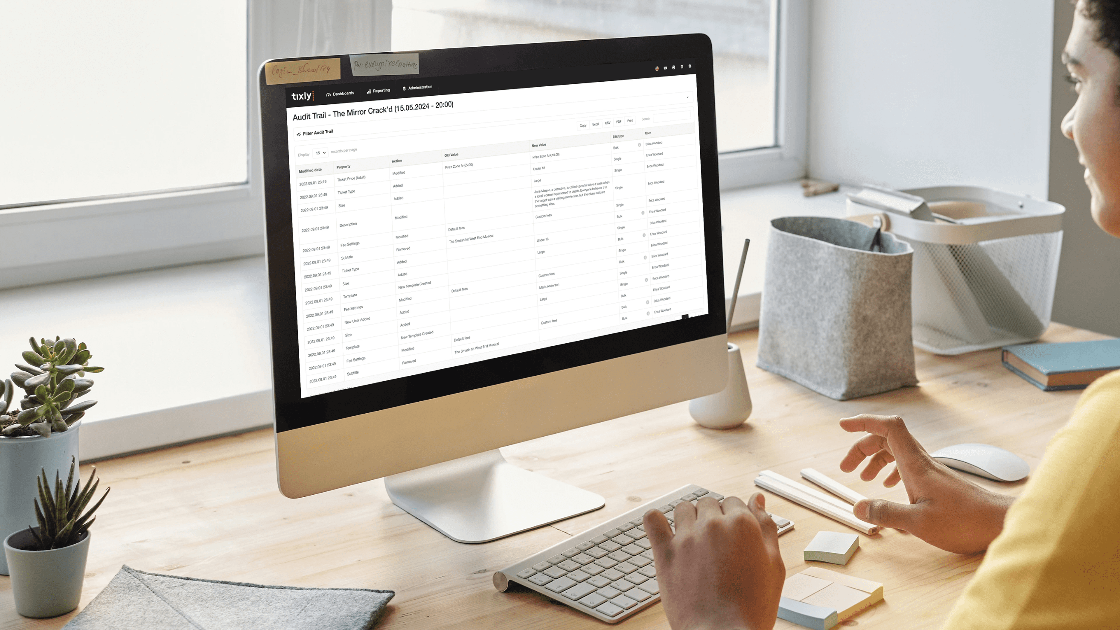
In fintech, trust is the ultimate currency. Providing users with a comprehensive, easily accessible record of all financial activities is a cornerstone of building that trust.
A transparent transaction history and audit trail offers a detailed breakdown of every transaction, complete with timestamps, metadata, and status updates.
This core practice empowers users to verify charges, track spending, and maintain accurate financial records with confidence. This level of transparency is non-negotiable for B2B and SaaS platforms, where regulatory compliance and meticulous record-keeping are paramount.
Leading platforms like Stripe, PayPal, and Wise excel at this, presenting complex data in a clean, searchable, and actionable format.
By making every financial movement clear and traceable, you remove ambiguity and foster a strong sense of security, which is a critical element of effective fintech app design best practices.
For companies looking to elevate their data presentation, exploring the work of the best reporting UI design agencies can provide a competitive edge.
How to Implement Transparent Transaction History
To design an effective transaction history, prioritize clarity, accessibility, and powerful filtering capabilities. The goal is to make it effortless for users to find exactly what they need, when they need it.
Implement Advanced Search & Filtering: Allow users to filter transactions by date range, amount, category, merchant, or status (e.g., pending, completed, failed). A powerful search function with autocomplete is essential for navigating large datasets.
Enhance Visual Recognition: Use merchant logos and clear transaction categories. This helps users quickly scan and identify transactions, reducing cognitive load compared to text-only lists.
Display Clear Transaction Status: ambiguity about whether a payment has gone through causes significant user anxiety. Clearly label each transaction's status and provide details on next steps for failed or pending items.
Offer Easy Export Options: Provide one-click export capabilities in formats like CSV or PDF. This is a critical feature for business users who need to perform accounting, file taxes, or create expense reports.
Include All Relevant Metadata: Go beyond the basics. Display transaction IDs, payment methods used, currency exchange rates, and any associated fees. For B2B platforms, include customer or invoice numbers.
6. Contextual Error Handling & Helpful Messaging
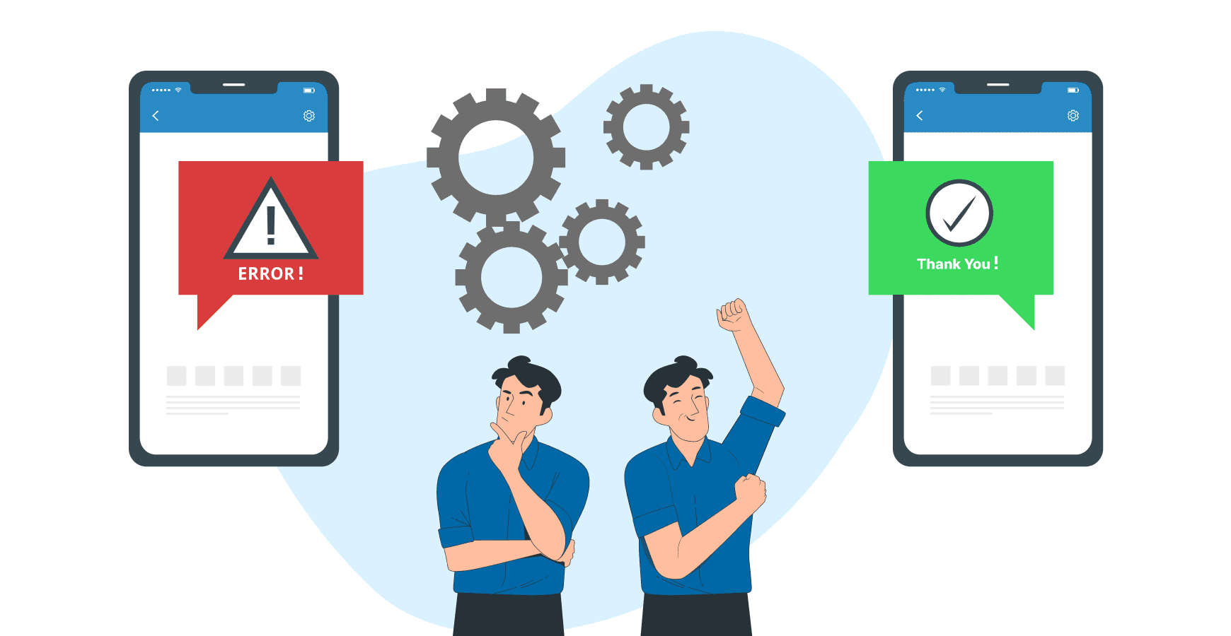
In financial technology, where every transaction holds significant weight, a generic "Error 502" is more than just an inconvenience; it's a trust-breaker.
Contextual error handling is a crucial fintech app design best practice that replaces vague, technical failure notices with clear, helpful, and human-centric messaging.
This approach transforms a moment of frustration into a guided opportunity for resolution, preventing user abandonment and reducing the burden on support teams.
Effective error handling explains precisely what went wrong, why it happened, and what the user can do next, all in plain language. Instead of a dead end, the user is given a clear path forward.
Industry leaders like Stripe excel at this, providing specific reasons for a declined payment (e.g., "Your card's security code is incorrect").
Similarly, Plaid offers actionable guidance when a bank connection fails, maintaining user confidence during a critical financial operation.
How to Implement Contextual Error Handling
To integrate this practice effectively, your design should anticipate failure points and treat them as part of the core user journey, not as an afterthought. This proactive approach ensures users feel supported even when things don't go as planned.
Explain the "Why": Never just state that an action failed. Explain the reason in simple terms. For example, instead of "Transaction Failed," use "This transaction was declined by your bank due to insufficient funds."
Provide Clear Next Steps: Always offer a direct solution. This could be a "Try Again" button, a link to update payment details, or a prompt to contact their bank.
Use a Human-Centric Tone: Avoid accusatory or technical language. A friendly, non-alarming tone ("Oops, it looks like...") can significantly reduce user anxiety during a stressful moment.
Avoid Raw Error Codes: Internal error codes like
ERR_CONN_REFUSEDmean nothing to the end-user. Always translate these into a meaningful, human-readable message.Include Context and Support Links: Reference key details like the amount or merchant involved. When appropriate, provide a link to a relevant help article or a one-click way to contact customer support.
7. Streamlined Onboarding with KYC/AML Integration

The first interaction a user has with a fintech platform is often the most critical, yet it's also where regulatory hurdles like Know Your Customer (KYC) and Anti-Money Laundering (AML) checks are mandatory.
A key fintech app design best practice is to weave these compliance steps into a streamlined onboarding flow that minimizes friction.
This approach transforms a potentially tedious legal requirement into a smooth, guided experience that builds trust and reduces user drop-off.
Instead of overwhelming users with a long form, this method uses progressive disclosure, asking for information only when necessary.
By breaking the process into small, manageable steps, you maintain momentum and make the user feel accomplished along the way. Companies like Revolut and Wise excel at this, using mobile-native features like document scanning and real-time validation to make identity verification feel effortless.
This balance of robust compliance and user-centric design is crucial for both B2B and SaaS platforms, where a clunky setup process can be a major barrier to adoption.
How to Implement Streamlined Onboarding
To effectively integrate KYC/AML without sacrificing user experience, focus on clarity, progression, and intelligent automation. A well-designed onboarding flow can be a competitive differentiator.
Chunk the Process: Break the onboarding journey into 3-5 distinct, clearly labeled steps. Use a prominent progress bar to show users exactly where they are in the process and what's next.
Implement Progressive Verification: Start by collecting only the essential information needed to create a basic account. Introduce deeper KYC steps, like ID verification or proof of address, only when the user needs to access higher-risk features or transaction limits.
Leverage Smart Technology: Use device cameras for document scanning with built-in guides and real-time feedback on image quality. Integrate with third-party verification services like Jumio or IDology to automate checks and speed up approval times.
Provide Clear Communication: Give explicit instructions for each step, using helper text and visual examples. Clearly communicate the verification status (e.g., "Verifying your identity, this may take a few minutes") and allow users to save their progress and resume later.
Offer Alternative Paths: If automated verification fails, provide a clear fallback option, such as manual review or an alternative document submission method, to prevent users from getting permanently stuck.
8. Accessibility First Design (WCAG Compliance)
In fintech, where every transaction and data point is critical, ensuring universal access is not just a moral imperative; it's a business necessity.
An accessibility-first approach embeds inclusivity into the core of your product, designing for users with disabilities from the very beginning.
This practice involves adhering to standards like the Web Content Accessibility Guidelines (WCAG) to make sure everyone, regardless of physical or cognitive ability, can manage their finances independently and with confidence.
By prioritizing features like screen reader compatibility, keyboard navigation, and sufficient color contrast, you not only meet legal requirements but also expand your potential market.
For B2B SaaS platforms, an accessible interface is often a procurement requirement for enterprise clients. Companies like PayPal, which targets WCAG 2.1 AA compliance, and Google Pay, with its robust screen reader support, demonstrate how accessible design is a key component of a successful global fintech product.
This commitment builds trust and ensures your platform is a reliable tool for all users.
How to Implement Accessibility First Design
Integrating accessibility requires a shift from viewing it as a final checklist item to making it a continuous part of the design and development lifecycle.
One of the most effective fintech app design best practices is to build and test for inclusivity at every stage.
Maintain Color Contrast: Ensure all text and meaningful interface elements meet a minimum contrast ratio of 4.5:1 against their background to support users with low vision.
Provide Full Keyboard Support: All interactive elements, including buttons, links, and form fields, must be navigable and operable using only a keyboard. Implement clear visual focus indicators for active elements.
Test with Screen Readers: Regularly test your application using popular screen readers like VoiceOver (iOS), JAWS (Windows), and NVDA (Windows) to understand and fix how content is announced to visually impaired users.
Use Semantic HTML: Structure your content with proper HTML elements (e.g.,
<nav>,<button>,<main>). This provides essential context to assistive technologies without extra effort.Include Alternative Text: Provide descriptive alt text for all meaningful images and icons. For complex charts or graphs, offer a text-based summary of the key data points.
Engage Real Users: The most valuable insights come from testing with users who have disabilities. Their feedback will uncover real-world usability issues that automated tools might miss.
9. Clear Privacy Controls & Data Minimization

In an era of heightened data sensitivity, trust is the most valuable currency a fintech platform can hold. One of the most critical fintech app design best practices is to build that trust through radical transparency, giving users clear, granular control over their personal information.
This involves not only transparent privacy settings but also adopting a "data minimization" principle, where you collect only the information that is absolutely essential to deliver your service.
This approach moves privacy from a legal checkbox to a core feature of the user experience.
By clearly showing what data is collected, why it's needed, and who can access it, you empower users and reduce their anxiety.
Companies like Apple with its App Privacy Labels and Revolut with its in-app privacy dashboard have set a high standard.
They demonstrate that providing robust, easily accessible controls isn't just about compliance with regulations like GDPR; it's about respecting the user and building long-term loyalty.
How to Implement Clear Privacy Controls
Integrating privacy by design requires a user-centric approach that prioritizes clarity and accessibility.
The goal is to make privacy settings as intuitive and straightforward as any other feature in your B2B or SaaS application.
Make Settings Discoverable: Place privacy controls in a prominent, easy-to-find location, such as the main user profile or settings menu. Avoid burying them under multiple layers of navigation.
Use Plain Language: Translate complex legal and technical jargon into simple, understandable terms. Instead of "third-party data sharing for analytics," use "We share activity data with partners to improve the app. You can turn this off."
Implement One-Click Opt-Outs: Provide simple toggles or buttons for users to easily opt out of non-essential data collection, tracking, or marketing communications. This frictionless process respects user choice.
Visualize Data Usage: Use simple charts or dashboards to show users exactly what data points you have collected and how they are being used. This transparency can be a powerful trust-building tool.
Enable Data Portability & Deletion: Comply with user rights by providing straightforward functions to export their data or request its permanent deletion from your systems. This is a key requirement of many data protection laws.
10. Offline-First Architecture & Data Synchronization
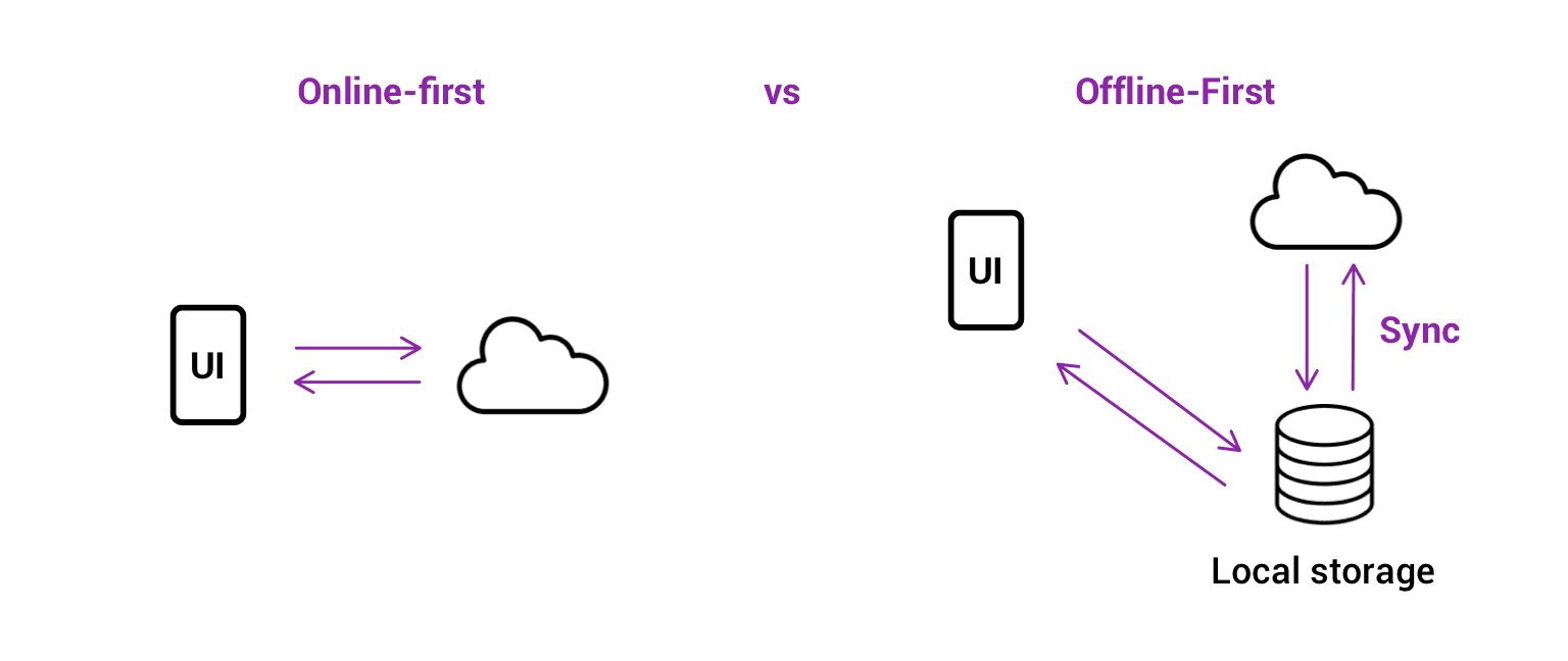
In a world of ubiquitous connectivity, it's easy to forget that network access can be unreliable. For fintech apps, where a failed transaction can mean lost revenue or a frustrated user, designing for intermittent connectivity is not a luxury, it's a necessity.
An offline-first architecture ensures your application remains functional and responsive even when the internet connection is weak or completely unavailable, queuing actions locally and synchronizing data once the connection is restored.
This approach prioritizes a seamless user experience, allowing critical operations like transaction logging or data entry to continue uninterrupted.
This is a core component of robust fintech app design best practices, as it builds user confidence that their actions are never lost.
Well-known examples include Google Pay, which enables certain offline transactions, and Square's point-of-sale systems, which queue payments taken offline to be processed later.
These platforms understand that business doesn't stop just because the Wi-Fi does.
How to Implement an Offline-First Strategy
Effectively implementing an offline-first model requires careful planning around local data storage, synchronization logic, and user communication.
The goal is to make the transition between online and offline states feel invisible to the user.
Utilize Local Storage: Use robust local databases like SQLite or Realm for mobile apps to store data persistently on the device. For web applications, leverage Service Workers and IndexedDB to cache app resources and user data.
Implement a Sync Queue: When a user performs an action offline (e.g., creating an invoice), add it to a local queue with a unique identifier. This queue should be processed automatically when a stable connection is detected.
Provide Clear Status Indicators: Always inform the user about the current connection status. A simple icon or banner that says "Offline Mode" or "Syncing..." manages expectations and prevents confusion about why some data may not be up-to-date.
Secure Local Data: Any sensitive financial information stored on the device must be encrypted. Use platform-native tools like Android's Keystore or Apple's Secure Enclave to protect local data from unauthorized access.
Handle Data Conflicts: Plan for scenarios where data might be changed on the server while the user is offline. Define a clear conflict resolution strategy, such as "last write wins" or prompting the user to resolve the conflict manually.
Fintech App Design: 10 Best Practices Comparison
Item | Implementation Complexity 🔄 | Resource Requirements ⚡ | Expected Outcomes ⭐ | Ideal Use Cases 📊 | Quick Tip 💡 |
|---|---|---|---|---|---|
Biometric Authentication & Security-First Design | High 🔄 — secure enclave, fraud systems | High ⚡ — specialized hardware, infra & compliance | Very High ⭐ — strong security, fewer breaches | Enterprise fintech, high-value transactions, regulated products 📊 | 💡 Provide fallbacks and store biometrics locally |
Micro-interactions & Haptic Feedback | Medium 🔄 — design + device testing | Medium ⚡ — design assets, device APIs | High ⭐ — improved confidence and perceived speed | Consumer payments, mobile wallets, premium UX 📊 | 💡 Offer toggle to disable haptics; keep animations <300ms |
Progressive Disclosure & Simplification | Medium 🔄 — IA, conditional flows | Medium ⚡ — analytics, user testing | High ⭐ — lower cognitive load, higher adoption | Products with novice + power users, complex UIs 📊 | 💡 Use analytics to surface essentials progressively |
Real-Time Data Visualization & Charts | High 🔄 — streaming, rendering, optimization | High ⚡ — bandwidth, processing, reliable APIs | High ⭐ — faster decisions; increased engagement | Trading platforms, portfolio monitoring, market data 📊 | 💡 Use WebSockets and optimize Canvas/SVG rendering |
Transparent Transaction History & Audit Trail | Medium 🔄 — storage, indexing, export | Medium ⚡ — storage, backups, compliance tooling | Very High ⭐ — trust, dispute resolution, compliance | Banking, merchant platforms, accounting & audits 📊 | 💡 Provide CSV/PDF export and advanced filtering |
Contextual Error Handling & Helpful Messaging | Low–Medium 🔄 — detection + copywriting | Low ⚡ — content ops, logging | High ⭐ — reduced support load; better conversion | Payments, onboarding flows, transaction failures 📊 | 💡 Use plain language, explain cause and next steps |
Streamlined Onboarding with KYC/AML Integration | High 🔄 — identity flows, regulatory logic | High ⚡ — verification providers, compliance ops | High ⭐ — faster activation; automated compliance | Account opening, regulated fintech, merchant onboarding 📊 | 💡 Break into 3–5 steps; show progress and resume options |
Accessibility First Design (WCAG Compliance) | Medium–High 🔄 — a11y design + assistive testing | Medium ⚡ — specialized testing and remediation | Very High ⭐ — broader reach; legal compliance | Mass-market financial apps; public services 📊 | 💡 Test with real users and automated tools (axe, Lighthouse) |
Clear Privacy Controls & Data Minimization | Medium–High 🔄 — consent flows, audit logs | Medium ⚡ — privacy dashboard, legal reviews | High ⭐ — increased trust; regulatory alignment | Apps handling sensitive data, analytics-driven products 📊 | 💡 Use clear language, one-click opt-outs and export/delete options |
Offline-First Architecture & Data Synchronization | High 🔄 — queuing, conflict resolution, sync logic | High ⚡ — local storage, complex testing matrix | High ⭐ — reliable behavior in poor connectivity | Mobile-first apps, POS, remote-area or intermittent networks 📊 | 💡 Encrypt local data, show sync status and retry logic |
Putting Fintech Design Principles into Practice
Navigating the complex world of financial technology requires more than just innovative ideas; it demands an unwavering commitment to user-centric design.
The ten fintech app design best practices we've explored serve as a comprehensive blueprint for creating applications that are not only powerful and secure but also intuitive and trustworthy.
From the initial handshake of a streamlined onboarding process to the daily reassurance provided by transparent transaction histories and real-time data visualizations, each element plays a crucial role in building lasting user confidence.
The journey from concept to a market-leading fintech product is built on a foundation of meticulously executed details. Mastering these principles means moving beyond surface-level aesthetics and embedding trust into every interaction.
It's about making security feel effortless with biometric authentication, simplifying complexity through progressive disclosure, and providing clear, empathetic guidance with contextual error handling.
These are not isolated features but interconnected components of a holistic user experience that respects the user's time, intelligence, and security.
Key Takeaways for Your Fintech Design Strategy
To distill these insights into an actionable framework, consider the following core pillars as you move forward:
Trust is Non-Negotiable: Prioritize security-first design, clear privacy controls, and transparent audit trails. Users must feel their data and finances are unequivocally safe. Every design decision should reinforce this feeling of security, not undermine it.
Clarity Over Clutter: Employ progressive disclosure and a strong information architecture to prevent cognitive overload. Financial data is inherently complex; your interface's primary job is to make it simple, scannable, and understandable at a glance.
Empowerment Through Insight: Use real-time data visualization and detailed transaction histories to give users a powerful sense of control over their financial lives. When users understand their data, they feel more engaged and empowered to make better decisions.
Inclusivity is Essential: An accessibility-first approach (WCAG compliance) and offline-first architecture ensure that your application is usable by everyone, everywhere. This widens your addressable market and demonstrates a commitment to ethical design.
Translating Design Blueprints into Reality
Adopting these fintech app design best practices is the critical first step. However, the true test lies in the execution.
The transition from wireframe to a fully functional, secure, and scalable application is a significant challenge, requiring deep technical expertise in financial regulations, security protocols, and data architecture.
This is where the synergy between design and development becomes paramount.
To successfully translate design blueprints into functional fintech applications, considering specialized expert fintech software development services can be invaluable.
A team that understands the nuances of both cutting-edge design and the robust engineering required for financial products can prevent costly disconnects between vision and reality, ensuring your app is not only beautiful but also compliant and performant.
Ultimately, the most successful fintech applications will be those that seamlessly merge technological innovation with a profound understanding of human psychology.
By placing the user at the heart of every decision, you create more than just a tool; you build a trusted financial partner.
This commitment to superior design is no longer a luxury, it is the defining factor for success in a competitive landscape.
Ready to transform your fintech concept into a market-leading application? Bricx specializes in crafting intuitive, secure, and scalable user experiences for B2B and AI-driven fintech platforms.
Partner with us to implement these best practices and build a product that your users will trust and love.
In the competitive landscape of B2B SaaS and AI, a fintech app's success hinges on more than just its core functionality. It demands an impeccable user experience built on a foundation of trust, security, and clarity.
A poorly designed interface can quickly erode user confidence, lead to costly errors, and result in high churn rates, undermining even the most powerful financial tools.
For product teams building sophisticated platforms, the stakes are exceptionally high; users are not just managing data, they are managing capital.
This article provides a comprehensive guide to essential fintech app design best practices, moving beyond generic advice to offer actionable strategies for building superior financial products.
We will explore ten critical areas that directly impact user adoption and satisfaction, from implementing frictionless onboarding and biometric security to designing intuitive data visualizations and ensuring robust accessibility.
Each point is structured to provide practical implementation tips and real-world context, helping you transform complex financial operations into seamless, trustworthy experiences.
For product managers, UX designers, and developers at forward-thinking companies, mastering these principles is not just about compliance or aesthetics.
It is the key to building applications that foster user loyalty, minimize risk, and create a distinct competitive advantage.
This guide will equip you with the specific insights needed to design fintech applications that users not only need but also trust implicitly with their most sensitive financial operations.
We will cover critical topics like streamlined KYC/AML integration, transparent transaction histories, contextual error handling, and building for an offline-first architecture.
1. Biometric Authentication & Security-First Design
In the high-stakes world of fintech, building user trust begins with demonstrating an unwavering commitment to security.
A security-first design philosophy embeds protection into every layer of the user experience, and one of the most effective fintech app design best practices is leading with biometric authentication.
This approach leverages unique biological traits like fingerprints, facial features, or iris patterns to verify identity, creating a login process that is both remarkably secure and incredibly fast.
By replacing cumbersome passwords with a simple touch or glance, you significantly reduce friction and cognitive load for the user. This is a critical advantage for B2B and SaaS platforms where frequent access is required.
Industry leaders like Apple Pay, Revolut, and Square Cash have popularized this method, proving that enterprise-grade security doesn't have to come at the expense of usability.
Building user trust often begins with robust security. To further emphasize this, you can delve into how a biometric-first approach can reduce fraud risk.
How to Implement Biometric Authentication
To integrate this practice effectively, focus on a seamless and transparent user journey. For those interested in perfecting this crucial aspect of their app, a deep dive into authentication flow design can provide valuable insights.
Offer Fallbacks: Always provide alternative authentication methods, such as a PIN or password, in case biometric sensors fail or are unavailable. This ensures accessibility and prevents user lockout.
Communicate Benefits: Clearly explain why you are using biometrics. Use onboarding screens or tooltips to highlight the enhanced security and convenience, turning a technical feature into a tangible user benefit.
Prevent Spoofing: Implement liveness detection for facial recognition to thwart attempts using photos or videos. This advanced check verifies that a real person is present during authentication.
Prioritize Data Privacy: Store biometric data securely on the user's device using platform-specific APIs like Apple's Secure Enclave or Android's Keystore. Never store raw biometric data on your central servers.
Test Extensively: Ensure reliability across a wide range of devices, operating system versions, and environmental conditions (e.g., low light for facial recognition).
2. Micro-interactions & Haptic Feedback
In fintech, where digital transactions can feel abstract and intangible, creating a sense of confidence and confirmation is paramount.
This is where micro-interactions and haptic feedback become essential fintech app design best practices. These small, purposeful animations and tactile responses provide real-time validation for user actions, making abstract financial processes feel more concrete and trustworthy.
A subtle vibration upon a successful transfer or a smooth animation confirming a payment builds user confidence and enhances the overall experience.
By providing immediate, sensory confirmation, you bridge the gap between a user's action and the system's response. This is especially critical in B2B and SaaS platforms where users manage significant financial data and require clear validation for every key input.
Leaders in the space like Venmo, with its celebratory transaction animations, and Robinhood, with its satisfying stock purchase confirmations, have demonstrated how these small details can significantly improve usability and user delight.
These elements transform routine tasks into engaging, reassuring experiences. For those looking to master this art, you can explore the work of the best microinteraction design agencies to see how experts craft these moments.
How to Implement Micro-interactions & Haptics
Effective implementation is about subtlety and purpose. The goal is to guide and reassure the user without causing distraction or annoyance.
Keep Animations Brief: Ensure feedback animations, especially for financial confirmations, are swift and unobtrusive. A duration under 300ms prevents perceived lag and keeps the user in their flow.
Offer User Control: Always provide a toggle in the settings to disable haptic feedback or reduce motion. This respects user preferences and improves accessibility.
Use Haptics Purposefully: Reserve tactile feedback for critical actions like successful payments, form submissions, or error alerts. Overuse can lead to sensory fatigue and diminish its impact.
Maintain Consistency: Develop a consistent language for your micro-interactions. Use specific haptic patterns and animation styles for similar actions across the app to create a predictable and intuitive experience.
Test Across Devices: Haptic intensity and animation performance can vary significantly between devices and operating systems. Test extensively to ensure a consistent and high-quality experience for all users.
3. Progressive Disclosure & Simplification
Fintech platforms often grapple with a core design challenge: presenting vast amounts of complex data without overwhelming the user.
Progressive disclosure is a powerful design principle that solves this by revealing information gradually. It presents only the essential features and information upfront, keeping more advanced or rarely used options hidden until a user specifically chooses to access them.
This approach significantly reduces cognitive load and makes complex platforms feel intuitive and approachable from the first interaction.
This methodology is a cornerstone of modern fintech app design best practices, allowing a single application to gracefully serve both novices and power users.
For example, Coinbase offers a simple "Buy/Sell" interface for beginners while providing a detailed "Advanced Trade" view for experienced traders.
Similarly, Revolut shows basic card details initially but allows users to tap to reveal more granular controls and security settings. This layered approach creates a guided experience that builds user confidence and competence over time.
How to Implement Progressive Disclosure
Effective simplification requires a deep understanding of user needs and behaviors. The goal is not to hide features but to present them at the most relevant moment in the user’s journey.
Mastering this balance is key, and you can explore how multi-step flow design can enhance this process to create a more intuitive experience.
Prioritize Information: Use analytics and user research to identify the most frequently used features and essential data points. Make these the foundation of your primary interface.
Use Clear Signifiers: Employ intuitive cues like "Advanced," "More Details," or chevron icons (›) to indicate where users can find additional information or functionality.
Tier User Interfaces: Consider creating distinct views or modes. For instance, a "Beginner" mode could hide complex charting tools and order types that are central to an "Expert" mode.
Contextual Reveals: Display advanced options only when they are relevant to the user's current task. For example, detailed fee breakdowns can appear just before a transaction confirmation.
Test with Diverse User Groups: Validate your design with both new and experienced users.
This ensures your simplified interface is not too restrictive for power users and your advanced sections are still discoverable for those ready to learn more.
4. Real-Time Data Visualization & Charts
In finance, data is everything, and its value diminishes with every passing second.
Real-time data visualization is a cornerstone of modern fintech app design best practices, transforming complex, rapidly changing financial information into intuitive, actionable insights.
By using dynamic charts and graphs, users can instantly grasp portfolio performance, market trends, and spending habits without sifting through dense tables of numbers.
This immediate clarity empowers users to make faster, more informed decisions.
This practice is not just for trading platforms; it's essential for any B2B or SaaS tool that handles financial analytics. Platforms like Robinhood and Coinbase set the standard with interactive stock and crypto charts, while tools like Plaid and YNAB use clear visualizations to break down spending.
These leaders demonstrate that effective data visualization builds user confidence and engagement by making complex data accessible.
For companies looking to master this, exploring how top agencies handle real-time data dashboard design can offer a competitive edge.
How to Implement Real-Time Data Visualization
Effective implementation hinges on balancing high-performance data delivery with a clean, intuitive user interface. The goal is to present information that is both accurate and easy to interpret on any device.
Prioritize Performance: Use WebSocket connections for true real-time updates without constant polling. Implement local data caching to minimize API calls and ensure charts load instantly, even with intermittent connectivity.
Ensure Visual Clarity: Use a consistent and intuitive color-coding system, such as green for gains and red for losses. Clearly label all axes, data points, and legends to prevent any ambiguity or misinterpretation.
Offer User Customization: Empower users by allowing them to adjust chart timeframes (e.g., 1D, 1W, 1M, 1Y) and add or remove technical indicators. This level of control is crucial for advanced B2B users.
Design for Mobile-First: Optimize chart rendering for smaller screens. Ensure that gestures like pinching to zoom and tapping for data point details are smooth and responsive. Provide a simplified table view as an accessible alternative.
Maintain Data Integrity: Clearly timestamp data and indicate when the connection is live versus when it is displaying cached information. This transparency is vital for building trust in the accuracy of your platform.
5. Transparent Transaction History & Audit Trail
In fintech, trust is the ultimate currency. Providing users with a comprehensive, easily accessible record of all financial activities is a cornerstone of building that trust.
A transparent transaction history and audit trail offers a detailed breakdown of every transaction, complete with timestamps, metadata, and status updates.
This core practice empowers users to verify charges, track spending, and maintain accurate financial records with confidence. This level of transparency is non-negotiable for B2B and SaaS platforms, where regulatory compliance and meticulous record-keeping are paramount.
Leading platforms like Stripe, PayPal, and Wise excel at this, presenting complex data in a clean, searchable, and actionable format.
By making every financial movement clear and traceable, you remove ambiguity and foster a strong sense of security, which is a critical element of effective fintech app design best practices.
For companies looking to elevate their data presentation, exploring the work of the best reporting UI design agencies can provide a competitive edge.
How to Implement Transparent Transaction History
To design an effective transaction history, prioritize clarity, accessibility, and powerful filtering capabilities. The goal is to make it effortless for users to find exactly what they need, when they need it.
Implement Advanced Search & Filtering: Allow users to filter transactions by date range, amount, category, merchant, or status (e.g., pending, completed, failed). A powerful search function with autocomplete is essential for navigating large datasets.
Enhance Visual Recognition: Use merchant logos and clear transaction categories. This helps users quickly scan and identify transactions, reducing cognitive load compared to text-only lists.
Display Clear Transaction Status: ambiguity about whether a payment has gone through causes significant user anxiety. Clearly label each transaction's status and provide details on next steps for failed or pending items.
Offer Easy Export Options: Provide one-click export capabilities in formats like CSV or PDF. This is a critical feature for business users who need to perform accounting, file taxes, or create expense reports.
Include All Relevant Metadata: Go beyond the basics. Display transaction IDs, payment methods used, currency exchange rates, and any associated fees. For B2B platforms, include customer or invoice numbers.
6. Contextual Error Handling & Helpful Messaging
In financial technology, where every transaction holds significant weight, a generic "Error 502" is more than just an inconvenience; it's a trust-breaker.
Contextual error handling is a crucial fintech app design best practice that replaces vague, technical failure notices with clear, helpful, and human-centric messaging.
This approach transforms a moment of frustration into a guided opportunity for resolution, preventing user abandonment and reducing the burden on support teams.
Effective error handling explains precisely what went wrong, why it happened, and what the user can do next, all in plain language. Instead of a dead end, the user is given a clear path forward.
Industry leaders like Stripe excel at this, providing specific reasons for a declined payment (e.g., "Your card's security code is incorrect").
Similarly, Plaid offers actionable guidance when a bank connection fails, maintaining user confidence during a critical financial operation.
How to Implement Contextual Error Handling
To integrate this practice effectively, your design should anticipate failure points and treat them as part of the core user journey, not as an afterthought. This proactive approach ensures users feel supported even when things don't go as planned.
Explain the "Why": Never just state that an action failed. Explain the reason in simple terms. For example, instead of "Transaction Failed," use "This transaction was declined by your bank due to insufficient funds."
Provide Clear Next Steps: Always offer a direct solution. This could be a "Try Again" button, a link to update payment details, or a prompt to contact their bank.
Use a Human-Centric Tone: Avoid accusatory or technical language. A friendly, non-alarming tone ("Oops, it looks like...") can significantly reduce user anxiety during a stressful moment.
Avoid Raw Error Codes: Internal error codes like
ERR_CONN_REFUSEDmean nothing to the end-user. Always translate these into a meaningful, human-readable message.Include Context and Support Links: Reference key details like the amount or merchant involved. When appropriate, provide a link to a relevant help article or a one-click way to contact customer support.
7. Streamlined Onboarding with KYC/AML Integration
The first interaction a user has with a fintech platform is often the most critical, yet it's also where regulatory hurdles like Know Your Customer (KYC) and Anti-Money Laundering (AML) checks are mandatory.
A key fintech app design best practice is to weave these compliance steps into a streamlined onboarding flow that minimizes friction.
This approach transforms a potentially tedious legal requirement into a smooth, guided experience that builds trust and reduces user drop-off.
Instead of overwhelming users with a long form, this method uses progressive disclosure, asking for information only when necessary.
By breaking the process into small, manageable steps, you maintain momentum and make the user feel accomplished along the way. Companies like Revolut and Wise excel at this, using mobile-native features like document scanning and real-time validation to make identity verification feel effortless.
This balance of robust compliance and user-centric design is crucial for both B2B and SaaS platforms, where a clunky setup process can be a major barrier to adoption.
How to Implement Streamlined Onboarding
To effectively integrate KYC/AML without sacrificing user experience, focus on clarity, progression, and intelligent automation. A well-designed onboarding flow can be a competitive differentiator.
Chunk the Process: Break the onboarding journey into 3-5 distinct, clearly labeled steps. Use a prominent progress bar to show users exactly where they are in the process and what's next.
Implement Progressive Verification: Start by collecting only the essential information needed to create a basic account. Introduce deeper KYC steps, like ID verification or proof of address, only when the user needs to access higher-risk features or transaction limits.
Leverage Smart Technology: Use device cameras for document scanning with built-in guides and real-time feedback on image quality. Integrate with third-party verification services like Jumio or IDology to automate checks and speed up approval times.
Provide Clear Communication: Give explicit instructions for each step, using helper text and visual examples. Clearly communicate the verification status (e.g., "Verifying your identity, this may take a few minutes") and allow users to save their progress and resume later.
Offer Alternative Paths: If automated verification fails, provide a clear fallback option, such as manual review or an alternative document submission method, to prevent users from getting permanently stuck.
8. Accessibility First Design (WCAG Compliance)
In fintech, where every transaction and data point is critical, ensuring universal access is not just a moral imperative; it's a business necessity.
An accessibility-first approach embeds inclusivity into the core of your product, designing for users with disabilities from the very beginning.
This practice involves adhering to standards like the Web Content Accessibility Guidelines (WCAG) to make sure everyone, regardless of physical or cognitive ability, can manage their finances independently and with confidence.
By prioritizing features like screen reader compatibility, keyboard navigation, and sufficient color contrast, you not only meet legal requirements but also expand your potential market.
For B2B SaaS platforms, an accessible interface is often a procurement requirement for enterprise clients. Companies like PayPal, which targets WCAG 2.1 AA compliance, and Google Pay, with its robust screen reader support, demonstrate how accessible design is a key component of a successful global fintech product.
This commitment builds trust and ensures your platform is a reliable tool for all users.
How to Implement Accessibility First Design
Integrating accessibility requires a shift from viewing it as a final checklist item to making it a continuous part of the design and development lifecycle.
One of the most effective fintech app design best practices is to build and test for inclusivity at every stage.
Maintain Color Contrast: Ensure all text and meaningful interface elements meet a minimum contrast ratio of 4.5:1 against their background to support users with low vision.
Provide Full Keyboard Support: All interactive elements, including buttons, links, and form fields, must be navigable and operable using only a keyboard. Implement clear visual focus indicators for active elements.
Test with Screen Readers: Regularly test your application using popular screen readers like VoiceOver (iOS), JAWS (Windows), and NVDA (Windows) to understand and fix how content is announced to visually impaired users.
Use Semantic HTML: Structure your content with proper HTML elements (e.g.,
<nav>,<button>,<main>). This provides essential context to assistive technologies without extra effort.Include Alternative Text: Provide descriptive alt text for all meaningful images and icons. For complex charts or graphs, offer a text-based summary of the key data points.
Engage Real Users: The most valuable insights come from testing with users who have disabilities. Their feedback will uncover real-world usability issues that automated tools might miss.
9. Clear Privacy Controls & Data Minimization
In an era of heightened data sensitivity, trust is the most valuable currency a fintech platform can hold. One of the most critical fintech app design best practices is to build that trust through radical transparency, giving users clear, granular control over their personal information.
This involves not only transparent privacy settings but also adopting a "data minimization" principle, where you collect only the information that is absolutely essential to deliver your service.
This approach moves privacy from a legal checkbox to a core feature of the user experience.
By clearly showing what data is collected, why it's needed, and who can access it, you empower users and reduce their anxiety.
Companies like Apple with its App Privacy Labels and Revolut with its in-app privacy dashboard have set a high standard.
They demonstrate that providing robust, easily accessible controls isn't just about compliance with regulations like GDPR; it's about respecting the user and building long-term loyalty.
How to Implement Clear Privacy Controls
Integrating privacy by design requires a user-centric approach that prioritizes clarity and accessibility.
The goal is to make privacy settings as intuitive and straightforward as any other feature in your B2B or SaaS application.
Make Settings Discoverable: Place privacy controls in a prominent, easy-to-find location, such as the main user profile or settings menu. Avoid burying them under multiple layers of navigation.
Use Plain Language: Translate complex legal and technical jargon into simple, understandable terms. Instead of "third-party data sharing for analytics," use "We share activity data with partners to improve the app. You can turn this off."
Implement One-Click Opt-Outs: Provide simple toggles or buttons for users to easily opt out of non-essential data collection, tracking, or marketing communications. This frictionless process respects user choice.
Visualize Data Usage: Use simple charts or dashboards to show users exactly what data points you have collected and how they are being used. This transparency can be a powerful trust-building tool.
Enable Data Portability & Deletion: Comply with user rights by providing straightforward functions to export their data or request its permanent deletion from your systems. This is a key requirement of many data protection laws.
10. Offline-First Architecture & Data Synchronization
In a world of ubiquitous connectivity, it's easy to forget that network access can be unreliable. For fintech apps, where a failed transaction can mean lost revenue or a frustrated user, designing for intermittent connectivity is not a luxury, it's a necessity.
An offline-first architecture ensures your application remains functional and responsive even when the internet connection is weak or completely unavailable, queuing actions locally and synchronizing data once the connection is restored.
This approach prioritizes a seamless user experience, allowing critical operations like transaction logging or data entry to continue uninterrupted.
This is a core component of robust fintech app design best practices, as it builds user confidence that their actions are never lost.
Well-known examples include Google Pay, which enables certain offline transactions, and Square's point-of-sale systems, which queue payments taken offline to be processed later.
These platforms understand that business doesn't stop just because the Wi-Fi does.
How to Implement an Offline-First Strategy
Effectively implementing an offline-first model requires careful planning around local data storage, synchronization logic, and user communication.
The goal is to make the transition between online and offline states feel invisible to the user.
Utilize Local Storage: Use robust local databases like SQLite or Realm for mobile apps to store data persistently on the device. For web applications, leverage Service Workers and IndexedDB to cache app resources and user data.
Implement a Sync Queue: When a user performs an action offline (e.g., creating an invoice), add it to a local queue with a unique identifier. This queue should be processed automatically when a stable connection is detected.
Provide Clear Status Indicators: Always inform the user about the current connection status. A simple icon or banner that says "Offline Mode" or "Syncing..." manages expectations and prevents confusion about why some data may not be up-to-date.
Secure Local Data: Any sensitive financial information stored on the device must be encrypted. Use platform-native tools like Android's Keystore or Apple's Secure Enclave to protect local data from unauthorized access.
Handle Data Conflicts: Plan for scenarios where data might be changed on the server while the user is offline. Define a clear conflict resolution strategy, such as "last write wins" or prompting the user to resolve the conflict manually.
Fintech App Design: 10 Best Practices Comparison
Item | Implementation Complexity 🔄 | Resource Requirements ⚡ | Expected Outcomes ⭐ | Ideal Use Cases 📊 | Quick Tip 💡 |
|---|---|---|---|---|---|
Biometric Authentication & Security-First Design | High 🔄 — secure enclave, fraud systems | High ⚡ — specialized hardware, infra & compliance | Very High ⭐ — strong security, fewer breaches | Enterprise fintech, high-value transactions, regulated products 📊 | 💡 Provide fallbacks and store biometrics locally |
Micro-interactions & Haptic Feedback | Medium 🔄 — design + device testing | Medium ⚡ — design assets, device APIs | High ⭐ — improved confidence and perceived speed | Consumer payments, mobile wallets, premium UX 📊 | 💡 Offer toggle to disable haptics; keep animations <300ms |
Progressive Disclosure & Simplification | Medium 🔄 — IA, conditional flows | Medium ⚡ — analytics, user testing | High ⭐ — lower cognitive load, higher adoption | Products with novice + power users, complex UIs 📊 | 💡 Use analytics to surface essentials progressively |
Real-Time Data Visualization & Charts | High 🔄 — streaming, rendering, optimization | High ⚡ — bandwidth, processing, reliable APIs | High ⭐ — faster decisions; increased engagement | Trading platforms, portfolio monitoring, market data 📊 | 💡 Use WebSockets and optimize Canvas/SVG rendering |
Transparent Transaction History & Audit Trail | Medium 🔄 — storage, indexing, export | Medium ⚡ — storage, backups, compliance tooling | Very High ⭐ — trust, dispute resolution, compliance | Banking, merchant platforms, accounting & audits 📊 | 💡 Provide CSV/PDF export and advanced filtering |
Contextual Error Handling & Helpful Messaging | Low–Medium 🔄 — detection + copywriting | Low ⚡ — content ops, logging | High ⭐ — reduced support load; better conversion | Payments, onboarding flows, transaction failures 📊 | 💡 Use plain language, explain cause and next steps |
Streamlined Onboarding with KYC/AML Integration | High 🔄 — identity flows, regulatory logic | High ⚡ — verification providers, compliance ops | High ⭐ — faster activation; automated compliance | Account opening, regulated fintech, merchant onboarding 📊 | 💡 Break into 3–5 steps; show progress and resume options |
Accessibility First Design (WCAG Compliance) | Medium–High 🔄 — a11y design + assistive testing | Medium ⚡ — specialized testing and remediation | Very High ⭐ — broader reach; legal compliance | Mass-market financial apps; public services 📊 | 💡 Test with real users and automated tools (axe, Lighthouse) |
Clear Privacy Controls & Data Minimization | Medium–High 🔄 — consent flows, audit logs | Medium ⚡ — privacy dashboard, legal reviews | High ⭐ — increased trust; regulatory alignment | Apps handling sensitive data, analytics-driven products 📊 | 💡 Use clear language, one-click opt-outs and export/delete options |
Offline-First Architecture & Data Synchronization | High 🔄 — queuing, conflict resolution, sync logic | High ⚡ — local storage, complex testing matrix | High ⭐ — reliable behavior in poor connectivity | Mobile-first apps, POS, remote-area or intermittent networks 📊 | 💡 Encrypt local data, show sync status and retry logic |
Putting Fintech Design Principles into Practice
Navigating the complex world of financial technology requires more than just innovative ideas; it demands an unwavering commitment to user-centric design.
The ten fintech app design best practices we've explored serve as a comprehensive blueprint for creating applications that are not only powerful and secure but also intuitive and trustworthy.
From the initial handshake of a streamlined onboarding process to the daily reassurance provided by transparent transaction histories and real-time data visualizations, each element plays a crucial role in building lasting user confidence.
The journey from concept to a market-leading fintech product is built on a foundation of meticulously executed details. Mastering these principles means moving beyond surface-level aesthetics and embedding trust into every interaction.
It's about making security feel effortless with biometric authentication, simplifying complexity through progressive disclosure, and providing clear, empathetic guidance with contextual error handling.
These are not isolated features but interconnected components of a holistic user experience that respects the user's time, intelligence, and security.
Key Takeaways for Your Fintech Design Strategy
To distill these insights into an actionable framework, consider the following core pillars as you move forward:
Trust is Non-Negotiable: Prioritize security-first design, clear privacy controls, and transparent audit trails. Users must feel their data and finances are unequivocally safe. Every design decision should reinforce this feeling of security, not undermine it.
Clarity Over Clutter: Employ progressive disclosure and a strong information architecture to prevent cognitive overload. Financial data is inherently complex; your interface's primary job is to make it simple, scannable, and understandable at a glance.
Empowerment Through Insight: Use real-time data visualization and detailed transaction histories to give users a powerful sense of control over their financial lives. When users understand their data, they feel more engaged and empowered to make better decisions.
Inclusivity is Essential: An accessibility-first approach (WCAG compliance) and offline-first architecture ensure that your application is usable by everyone, everywhere. This widens your addressable market and demonstrates a commitment to ethical design.
Translating Design Blueprints into Reality
Adopting these fintech app design best practices is the critical first step. However, the true test lies in the execution.
The transition from wireframe to a fully functional, secure, and scalable application is a significant challenge, requiring deep technical expertise in financial regulations, security protocols, and data architecture.
This is where the synergy between design and development becomes paramount.
To successfully translate design blueprints into functional fintech applications, considering specialized expert fintech software development services can be invaluable.
A team that understands the nuances of both cutting-edge design and the robust engineering required for financial products can prevent costly disconnects between vision and reality, ensuring your app is not only beautiful but also compliant and performant.
Ultimately, the most successful fintech applications will be those that seamlessly merge technological innovation with a profound understanding of human psychology.
By placing the user at the heart of every decision, you create more than just a tool; you build a trusted financial partner.
This commitment to superior design is no longer a luxury, it is the defining factor for success in a competitive landscape.
Ready to transform your fintech concept into a market-leading application? Bricx specializes in crafting intuitive, secure, and scalable user experiences for B2B and AI-driven fintech platforms.
Partner with us to implement these best practices and build a product that your users will trust and love.


Similar Blogs
Similar Blogs
Similar Blogs


Available for Work
Bricx
© Bricx, 2026. All rights reserved.


Available for Work
Bricx
© Bricx, 2026. All rights reserved.
Available for Work
Bricx
© Bricx, 2026. All rights reserved.
Available for Work
Bricx
© Bricx, 2026. All rights reserved.