Product Design
Product Design
Product Design
Insights
Insights
Insights
October 15, 2025
October 15, 2025
October 15, 2025
8 Proven Cancellation Flow Examples from Top SaaS Companies
8 Proven Cancellation Flow Examples from Top SaaS Companies
8 Proven Cancellation Flow Examples from Top SaaS Companies
Discover cancellation flow examples from top SaaS & AI products. Learn how to design offboarding experiences that retain users and build trust in this article.
Discover cancellation flow examples from top SaaS & AI products. Learn how to design offboarding experiences that retain users and build trust in this article.
Discover cancellation flow examples from top SaaS & AI products. Learn how to design offboarding experiences that retain users and build trust in this article.
4 minutes
4 minutes
4 minutes


What happens when users hit "cancel" on your SaaS product?
Most companies watch helplessly as customers walk away. But the smartest SaaS companies treat cancelation flows as their last chance to win back trust—and it's working. The best cancellation flows reduce churn by over 20%.
With customer acquisition costs jumping 60% over the past five years, you can't afford to ignore this critical moment. Yet here's what most companies get wrong: they either frustrate users with dark patterns or make cancelation so easy they miss obvious retention opportunities.
The numbers tell the story. More than half of annual subscribers churn within their first year, even for top-performing apps. This means your cancelation flow isn't just a nice-to-have feature. It's a business-critical touchpoint that can save thousands of dollars in lost revenue.
We analyzed cancelation flows from 8 leading SaaS companies to understand exactly how they turn potential exits into second chances. What we found will change how you think about offboarding users.
What Makes a Good Cancelation Flow UX?
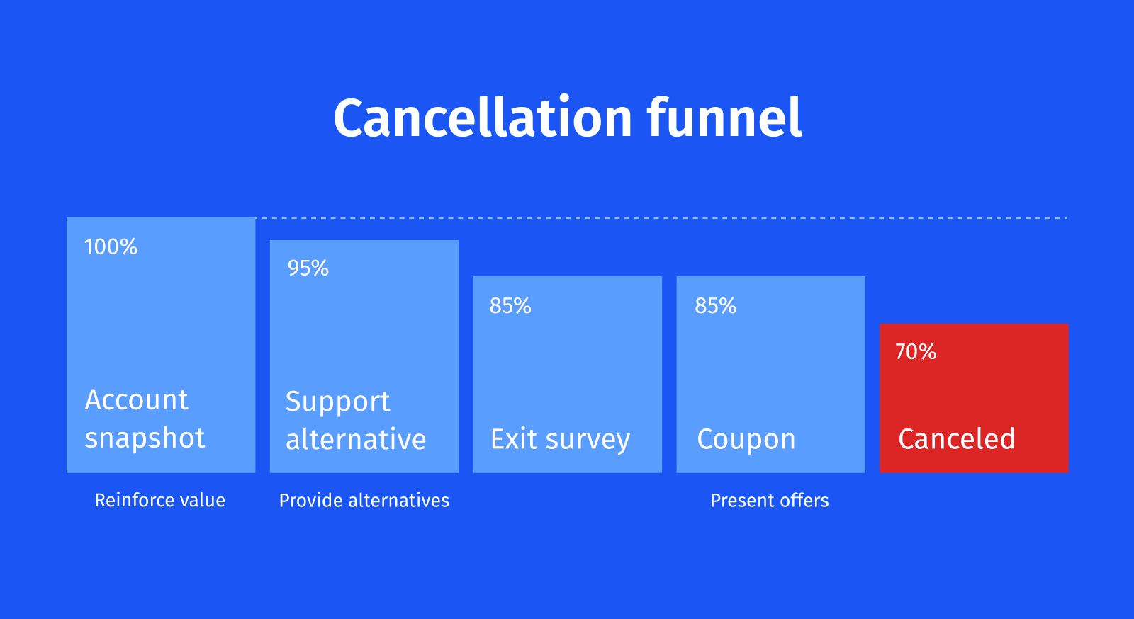
Image source: ProsperStack
When we work on cancelation flows for clients, we start with a simple principle: your offboarding experience is just as important as your onboarding. The difference between a frustrated ex-customer who badmouths your product and someone who might return later often comes down to your cancelation flow design.
A well-designed cancelation flow serves dual purposes. It's your final opportunity to retain customers while gathering the insights needed to improve your product.
After analyzing dozens of cancelation experiences, we've identified 5 elements that consistently separate good flows from great ones:
Empathy First
Here's what we learned: successful cancelation flows begin with respect, not resistance.
When users decide to cancel, acknowledge their decision immediately. This builds trust rather than creating the frustration that comes from hidden cancel buttons or unnecessary obstacles. This approach isn't just courteous—it's strategic.
Companies that treat cancelation as an opportunity create goodwill that leads to future reengagement. The research is clear: the average unhappy customer will tell 9-15 people about their experience, with 13% telling more than 20 people.
Making users feel respected during cancelation protects your brand reputation even as they leave.
Clarity & Transparency
Transparency during cancelation shapes how users perceive your brand long after they've left. Clearly communicate what happens after cancelation—data retention policies, access duration, billing implications. Make sure customers understand the ramifications through simple confirmations.
Your cancelation policy should be easily accessible and crystal clear. This transparency empowers customers to make informed decisions rather than feeling trapped.
Even departing customers maintain a positive impression of your service when you're upfront about the process.
Use Smart Retention Nudges
Before users complete cancelation, present thoughtful alternatives that might better address their actual needs:
Pause option: Freeze their account temporarily instead of canceling outright
Downgrade path: Switch to a more affordable plan based on usage patterns
Support intervention: Connect them with knowledge base resources or support representatives
Industry data shows these alternatives can reduce churn by 15-30%. They fulfill customer needs without forcing decisions. A pause option saves money while maintaining their data for when they're ready to return.
Feedback Capture
Every strategic cancelation flow includes an exit survey to understand departure reasons. This feedback becomes essential for addressing product gaps and improving customer satisfaction. Keep surveys short to maximize response rates.
AI-powered exit surveys adapt based on initial responses, driving 25% higher response rates than traditional alternatives.
Rather than basic dropdown menus capturing surface-level reasons, these conversational surveys reveal deeper motivations behind cancelations.
Closure & Trust
Even at the final cancelation step, maintaining professionalism builds trust. Send confirmation emails outlining when access ends and how users can reactivate if they change their mind. This provides clarity while keeping the door open for potential returns.
Customers who cancel aren't necessarily gone forever. A positive final interaction significantly impacts whether they speak negatively about your service or consider returning later. Closing on a clear, appreciative note transforms what could be a negative experience into a respectful conclusion.
These five elements create an experience that respects user autonomy while maximizing retention opportunities. The goal isn't trapping users, but understanding their needs and providing genuine alternatives that might better serve them.
8 Effective Cancellation Flow Examples to Improve Retention
Now that we've discussed the key ingredients of a high-quality cancellation flow UX, given below are some examples to inspire you:
Unbounce's Trigger-based Cancellation Flow
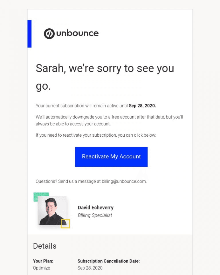
Image source: Chargebee
Most companies treat cancelation as a one-way door. Unbounce built a system that turns it into a two-way conversation.
Their approach focuses on real-time intervention when users signal intent to leave. Instead of watching customers walk away, automated workflows create opportunities for immediate engagement at this critical moment.
Unbounce uses Zapier & Chargebee to trigger Slack alerts when users cancel for specific reasons. This allows real-time intervention by support teams.
Here's how most companies handle cancelations: users fill out an exit survey, click "cancel," and disappear forever. Unbounce realized this was a massive missed opportunity.
They built a system that identifies high-recovery cancelations and alerts the right team members instantly. When customers select specific cancelation reasons; especially billing or experience issues — Zapier automatically triggers alerts in a dedicated Slack channel shared with support and success managers.
What makes it impressive?
Automated workflows for real-time support: Unbounce doesn't treat all cancelations equally. Their workflow identifies which situations offer the highest recovery potential and routes them to team members who can address specific concerns.
The speed matters most. When someone cancels due to billing confusion, receiving immediate help feels like genuine support rather than desperate retention tactics.Segmented offers based on cancelation reason: Generic retention offers miss the mark. Unbounce segments customers based on product usage, account tenure, and other variables to provide contextualized incentives. When someone cancels citing "price," their system helps determine whether the issue is cost or perceived value.
This insight allows them to tailor offers that address the underlying concern rather than just throwing discounts around.Integration with CRM and support tools: The magic happens when systems work together. By connecting cancelation data with Salesforce and support tools, team members get full customer context before reaching out.
When a support representative calls, they already understand the situation completely. This eliminates frustrating repetition and shows genuine attention to the customer's needs.
Key takeaways
The results prove the approach works: Unbounce successfully deflects almost 11% of customer cancelations using this strategy.
The lesson isn't just about the technology, it's about treating cancelation as a conversation opportunity rather than an endpoint. Your own team can apply this by identifying where automation might help you respond more effectively to cancelation signals.
TouchNote's Data-Driven Cancellation Flow
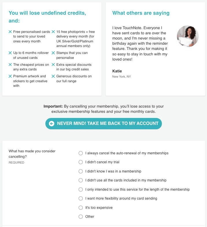
Image source: Chargebee
TouchNote faced a classic SaaS problem: yearly subscribers signaling they wanted to leave. Instead of guessing what might convince them to stay, they systematically tested different retention offers to discover what actually moved the needle.
The results surprised them. Their 40% discount offer performed nearly identically to their 50% offer in terms of customer retention. This single insight allowed them to maintain identical save rates while significantly reducing revenue loss on each retained customer.
But that wasn't their only discovery. Testing revealed that subscribers responded more favorably to percentage-based discounts compared to fixed-amount discounts, even when the monetary value was identical—50% off versus £25 off annually.
These insights became the foundation for a cancelation flow that balanced customer retention with business sustainability.
What makes it impressive?
Systematic A/B testing across multiple offer types: TouchNote didn't just test discounts—they implemented a comprehensive testing plan that evaluated various retention strategies including discounts, free cards, upgrades, and pause options.
Strategic value reminders at critical moments: Before presenting any cancelation options, TouchNote strategically displays their value proposition at the top of the flow.
This simple reminder creates a moment of reflection, helping customers reconsider by highlighting exactly what they'd be giving up.Downgrade alternatives instead of outright cancelation: TouchNote provides customers with options to downgrade to lower subscription plans rather than canceling completely.
This acknowledges that sometimes customers don't want to leave entirely—they just need a more affordable option.
Key takeaways
The numbers validate TouchNote's approach. Through continuous optimization of their cancelation flow, they improved save performance from 16% to 25% in just one year. Even during high-cancelation periods, their numbers only increased by a few percentage points—proving their systematic approach works.
Powtoon's Personalized Exit Surveys & Offers
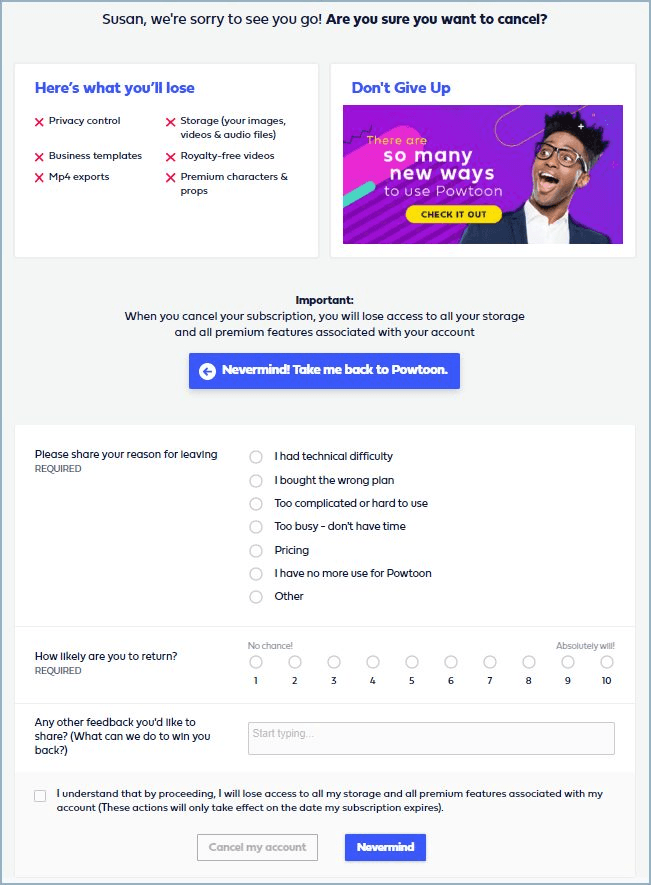
Image source: Chargebee
Most companies treat cancelation like a one-size-fits-all problem. Powtoon treats it like a conversation.
Their personalized cancelation flow doesn't just collect feedback, it responds to it in real-time. The result? Improving save rates by 63% by matching retention offers directly to cancelation reasons.
Powtoon uses dynamic cancel flows to match offers with cancelation reasons, improving save rates by 63%. When users click "cancel," Powtoon's flow immediately adapts based on their specific situation.
The system identifies cancelation reasons, deploys targeted messaging, and presents retention offers that make sense for each user.
What makes it impressive?
Short, relevant exit surveys: Powtoon figured out something most companies miss: less is more when it comes to exit surveys. They limit their survey to just three questions. That's it. No endless dropdown menus or frustrating multiple-choice marathons. Just three targeted questions that capture exactly what they need to know. Users too, actually complete these surveys, giving Powtoon the insights they need to improve retention.
Personalized offers based on survey input: Once Powtoon understands why someone wants to cancel, they respond with precision. Pricing concerns? They might offer a discount or downgrade option. Technical issues? Connect them with support. Feature limitations? Present alternatives that better fit their needs.
This isn't generic retention, it's surgical. Each offer directly addresses the specific pain point that prompted cancelation in the first place.Clean UI with minimal friction: Despite the sophisticated personalization happening behind the scenes, Powtoon's friction-free interface design stays simple. Users can complete the entire process without confusion or frustration.
The design maintains clarity throughout while never hiding the path to cancelation. This transparency builds trust, even with departing customers.
Key takeaways
Powtoon proved that understanding individual user needs at the moment of cancelation can dramatically alter outcomes. By creating a continuous feedback loop between exit surveys and product improvements, they built a system that gets smarter with every cancelation.
The lesson? Stop treating cancelation like a failure. Treat it like an opportunity to understand your users better—and win some of them back in the process.
Headspace's Emotional Nudges
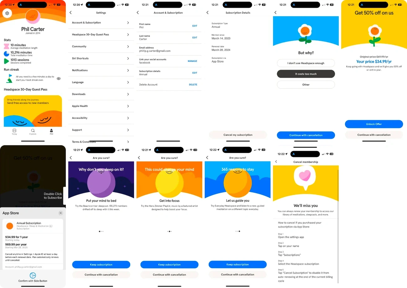
Image source: FunnelFox Blog
Most cancelation flows feel like a corporate exit interview. But Headspace treats their offboarding like a mindfulness session: calm, understanding, and perfectly on-brand.
The meditation app shows how staying true to your brand voice during cancelation creates an entirely different emotional experience. While other companies panic when users hit "cancel," Headspace maintains the same zen approach they teach in their app.
Here's what makes Headspace different: instead of showing a harsh "Cancel" button, they ask "Is now not the right time?"—a gentle reframe that gives users space to reconsider without pressure.
This isn't just nice copywriting. It's strategic brand consistency. Every word mirrors their meditation philosophy: acknowledge what's happening without judgment.
The approach continues throughout their entire cancelation flow, maintaining their mindful voice even as users prepare to leave.
What makes it impressive?
Copy that feels authentically mindful: Headspace asks users if they're "changing your mind"—language that connects directly to mindfulness principles. The phrasing feels natural, not manipulative, thereby creating a genuine moment for reflection.
Visual carousel of lost features: Their flow starts with a graphical representation of what users will lose access to—creating a clear visual reminder of value. The carousel doesn't just list features; it shows exactly what users are giving up.
Pause options instead of permanent exits: Headspace offers alternatives before finalization. Users can pause subscriptions rather than cancel outright, recognizing that life circumstances change. This keeps user data and preferences intact for future returns.
Key takeaways
Just as Spotify creates memorable farewell experiences with playlists starting "I Want You Back", Headspace proves that brand-aligned cancelation flows can turn negative interactions into brand-reinforcing moments.
Their calm, mindful approach creates a distinct experience that feels authentic to their mission. Users leave feeling understood, not frustrated—making them more likely to return when they're ready.
Slack's Cancellation Flow
While Slack's free plan is a good starting point for most users, the paid plans offer better control to enterprise teams — offering users a slew of benefits such as added storage, integrations and AI-powered notes for organizations to manage their team communication.
That said, there might be a point where you'd want to either move to another platform, or simply cancel your paid plans.
When it comes to its cancellation flow, Slack takes a smart, transparent approach. The overview page clearly shows users their current plan details and introduces a price lock-in offer, encouraging them to retain their existing rate before canceling.
To drive timely action, Slack highlights the expiration date of this offer, creating a subtle sense of urgency without pressure.
Once users proceed, Slack presents a personalized retention preview, adjusting the message or offer based on their specific plan or reason for leaving.
What makes it impressive?
Contextual empathy with tone: Slack uses clear, human-centered language throughout the cancellation process, making users feel understood rather than guilt-tripped.
Smart exit options & alternatives: Before completing cancellation, Slack offers tailored downgrade options, pausing, or billing adjustments—reducing churn without being pushy.
Feedback loop built into flow: They prompt users for a quick reason (with pre-filled options), making it fast and painless, while giving Slack valuable insights to improve.
Key takeaways
Slack’s cancellation flow shows that offboarding can be as thoughtfully designed as onboarding. By combining empathy, clarity, and smart alternatives, teams can reduce churn while building long-term trust.
Asana's Cancellation Flow
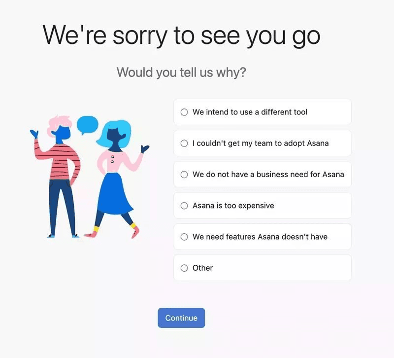
Image source: Userpilot
Asana’s cancellation flow is a masterclass in balancing user empathy with product retention strategy. From the moment a user initiates cancellation, the tone remains calm, respectful, and non-confrontational — avoiding guilt tactics. Instead, Asana gently surfaces relevant questions like “What’s not working for you?” with simple, selectable answers.
It guides users through a clean, step-by-step process that feels more like a conversation than a form. This helps Asana gather useful feedback while giving users a sense of being heard, not blocked.
What sets Asana apart is how it offers thoughtful alternatives before completing the cancellation. Rather than hard-selling, it presents helpful downgrade options or lets users pause their subscription, making them feel in control.
Importantly, the design avoids visual clutter; using white space, concise copy, and clear CTAs to reduce friction.
What makes it impressive?
Frictionless feedback collection: Offers a clean, multiple-choice form for users to share cancellation reasons, like a simple survey.
Personalized retention offers: Tailors downgrade or upgrade suggestions based on actual usage and plan details.
Minimalist, focused UI: Keeps the page uncluttered so the personalized offer stands out and feels genuinely helpful.
Key takeaways
Asana’s cancellation flow proves that offboarding can be a strategic retention touchpoint. By combining effortless feedback collection with personalized, data-driven alternatives, it reduces churn while maintaining a positive user experience.
Delighted's Cancellation Flow
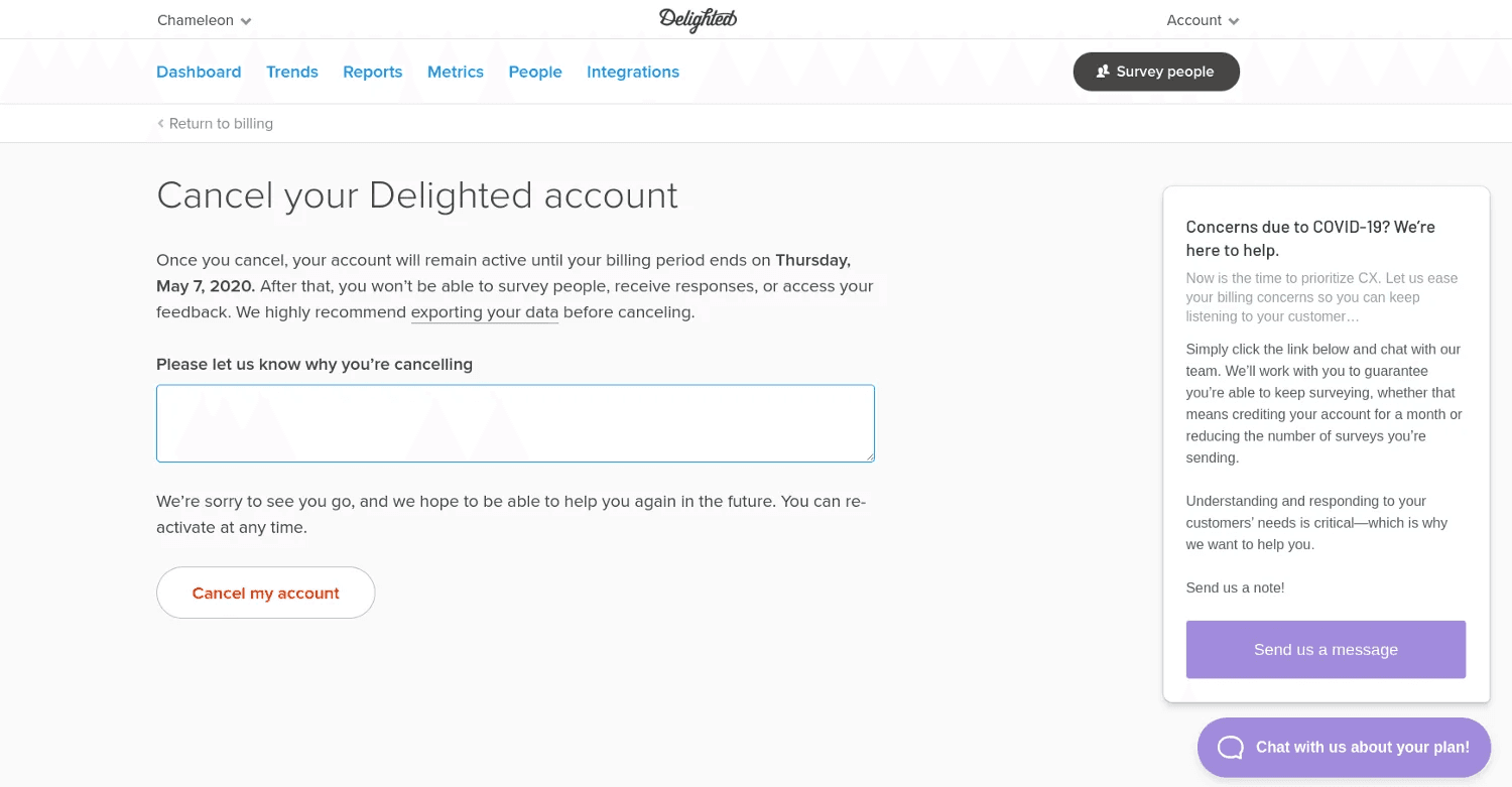
Image source: UX Magazine
Delighted is another key example of a high-quality cancellation flow, which encourages churning users to work out a customized solution for themselves with the sales team, rather than cancelling their subscription upfront.
The widget on the right side opens the "Send Message" button, allowing you to send a new message to their sales team in the conversation chatbox.
This is an effective technique to reduce cancellations, giving you another opportunity to retain the user.
What makes it impressive?
Straight-to-the-point design: The cancellation process is quick, clear, and free of distractions, respecting the user’s time.
Friendly, non-pushy tone: Uses calm, empathetic language without guilt-tripping, making the experience feel human.
Seamless feedback collection: Gathers cancellation reasons through a simple, low-friction form that helps inform product improvements.
Key takeaways
Delighted.com’s cancellation flow shows that simplicity and respect go a long way. A clear, empathetic offboarding process leaves users with a positive final impression, while still capturing valuable insights.
Zoom's Cancellation Flow
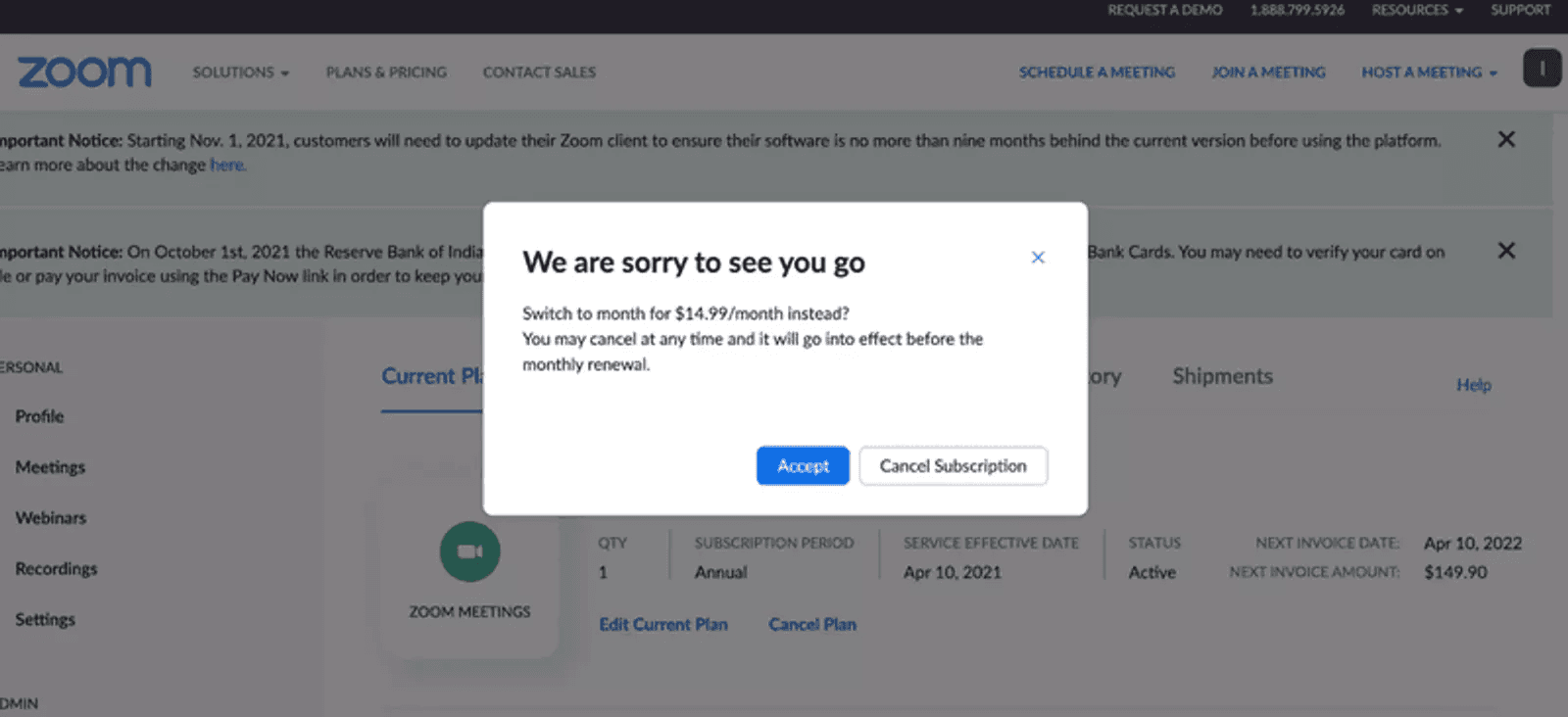
Image source: Userpilot
Zoom’s cancellation flow stands out for its speed and focus. When a user initiates cancellation, a popup micro-survey appears instantly: no page reloads, no friction. This fast-loading format keeps users in the flow while gently collecting feedback on why they’re leaving.
By darkening the background, Zoom draws full attention to the survey, increasing the chances of engagement without feeling intrusive. It’s a smart way to gather insights without interrupting the user experience.
After the feedback step, Zoom presents a straightforward counter-offer—typically a lower-priced plan. While it’s not deeply personalized like Asana’s, the simplicity and relevance of the offer can still prompt second thoughts.
It’s a clean, effective approach that prioritizes ease, minimizes frustration, and gives Zoom one last chance to retain the customer without being aggressive.
What makes it impressive?
Instant, focused feedback popup: A fast-loading microsurvey keeps users in flow and increases completion without page reloads.
Attention-grabbing design: Darkened background highlights the survey, making it the focal point for higher engagement.
Simple retention offer: Presents a clear, lower-priced alternative that’s easy to understand and consider without added friction.
Key takeaways
Zoom’s cancellation flow shows how speed and simplicity can enhance user experience even at the exit point.
A fast, focused feedback step combined with a clear offer can reduce churn without adding friction.
Best Practices for Designing Effective Cancellation Flows
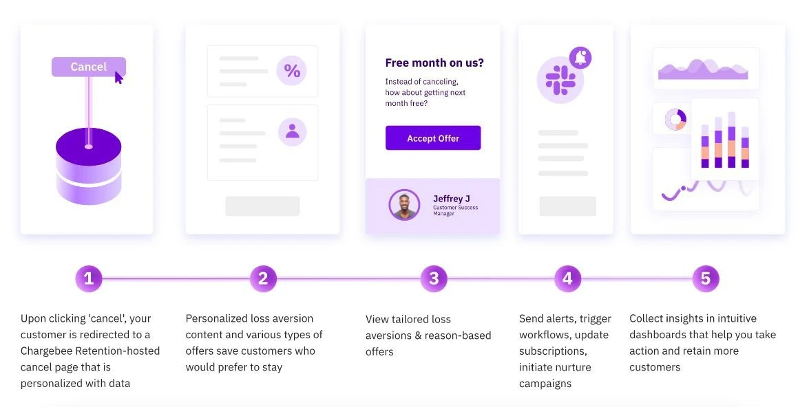
Image source: Chargebee
The case studies reveal clear patterns. Now here's how to apply these insights to your own cancelation flow.
Based on our analysis of these companies, 3 fundamental principles separate effective cancelation flows from missed opportunities.
These include:
Acknowledge the user's decision
Your first job is acknowledging the user's decision immediately. Generic dismissive language damages your brand reputation permanently. Instead, personalize communications to show customers you value their business, even as they leave.
This recognition creates trust and keeps the door open for potential return.
Remember, cancelation represents a critical moment where your brand values get tested, maintaining professionalism throughout leaves a positive lasting impression.
Present real alternatives
Before users complete cancelation, offer meaningful options that might better address their actual needs:
Subscription pause: Temporarily freeze accounts for users experiencing budget constraints
Plan downgrade: Suggest switching to a more affordable tier based on usage patterns
Trial extension: For users still in trial periods, offer additional time to experience value
One-on-one support: Schedule personal calls to address specific concerns
These alternatives often satisfy the underlying need without losing the customer entirely. Many users will accept these options when presented clearly.
Keep feedback simple
Limit exit surveys to maximize response rates. Short, relevant questions yield more valuable data than lengthy questionnaires. This feedback becomes instrumental in addressing product gaps and improving future offerings.
Include an "other" field where customers can provide additional context beyond predefined options. This open-ended feedback often reveals unexpected insights that can change your product strategy.
The goal isn't to trap users but to understand their needs and provide genuine alternatives that might better serve them.
Conclusion
The companies we studied share one thing: they treat cancelation as a strategic business moment, not a failure.
Your cancelation flow reveals what you really think about customers. Do you see them as lost revenue walking out the door? Or do you see an opportunity to solve their actual problem and potentially save the relationship?
Based on our analysis, here's what separates winning cancelation flows from the rest:
They offer real alternatives that address specific user needs rather than generic retention tactics.
They collect structured feedback that informs product decisions, not just save rates.
They maintain brand consistency even during difficult conversations.
Most importantly, they respect user choice while maximizing retention opportunities.
You now have the blueprint to turn your cancelation flow into a strategic advantage. Start by auditing your current experience—where are you creating friction instead of offering solutions? What feedback are you missing that could prevent future churn?
In addition, this is also where working with a design partner with extensive experience designing cancellation flows could prove handy. Bricx can help you design effective cancellation flow UX that improves retention & increases customer delight.
To know more about our AI-powered design process & how it can help — feel free to book a call now!
What happens when users hit "cancel" on your SaaS product?
Most companies watch helplessly as customers walk away. But the smartest SaaS companies treat cancelation flows as their last chance to win back trust—and it's working. The best cancellation flows reduce churn by over 20%.
With customer acquisition costs jumping 60% over the past five years, you can't afford to ignore this critical moment. Yet here's what most companies get wrong: they either frustrate users with dark patterns or make cancelation so easy they miss obvious retention opportunities.
The numbers tell the story. More than half of annual subscribers churn within their first year, even for top-performing apps. This means your cancelation flow isn't just a nice-to-have feature. It's a business-critical touchpoint that can save thousands of dollars in lost revenue.
We analyzed cancelation flows from 8 leading SaaS companies to understand exactly how they turn potential exits into second chances. What we found will change how you think about offboarding users.
What Makes a Good Cancelation Flow UX?
Image source: ProsperStack
When we work on cancelation flows for clients, we start with a simple principle: your offboarding experience is just as important as your onboarding. The difference between a frustrated ex-customer who badmouths your product and someone who might return later often comes down to your cancelation flow design.
A well-designed cancelation flow serves dual purposes. It's your final opportunity to retain customers while gathering the insights needed to improve your product.
After analyzing dozens of cancelation experiences, we've identified 5 elements that consistently separate good flows from great ones:
Empathy First
Here's what we learned: successful cancelation flows begin with respect, not resistance.
When users decide to cancel, acknowledge their decision immediately. This builds trust rather than creating the frustration that comes from hidden cancel buttons or unnecessary obstacles. This approach isn't just courteous—it's strategic.
Companies that treat cancelation as an opportunity create goodwill that leads to future reengagement. The research is clear: the average unhappy customer will tell 9-15 people about their experience, with 13% telling more than 20 people.
Making users feel respected during cancelation protects your brand reputation even as they leave.
Clarity & Transparency
Transparency during cancelation shapes how users perceive your brand long after they've left. Clearly communicate what happens after cancelation—data retention policies, access duration, billing implications. Make sure customers understand the ramifications through simple confirmations.
Your cancelation policy should be easily accessible and crystal clear. This transparency empowers customers to make informed decisions rather than feeling trapped.
Even departing customers maintain a positive impression of your service when you're upfront about the process.
Use Smart Retention Nudges
Before users complete cancelation, present thoughtful alternatives that might better address their actual needs:
Pause option: Freeze their account temporarily instead of canceling outright
Downgrade path: Switch to a more affordable plan based on usage patterns
Support intervention: Connect them with knowledge base resources or support representatives
Industry data shows these alternatives can reduce churn by 15-30%. They fulfill customer needs without forcing decisions. A pause option saves money while maintaining their data for when they're ready to return.
Feedback Capture
Every strategic cancelation flow includes an exit survey to understand departure reasons. This feedback becomes essential for addressing product gaps and improving customer satisfaction. Keep surveys short to maximize response rates.
AI-powered exit surveys adapt based on initial responses, driving 25% higher response rates than traditional alternatives.
Rather than basic dropdown menus capturing surface-level reasons, these conversational surveys reveal deeper motivations behind cancelations.
Closure & Trust
Even at the final cancelation step, maintaining professionalism builds trust. Send confirmation emails outlining when access ends and how users can reactivate if they change their mind. This provides clarity while keeping the door open for potential returns.
Customers who cancel aren't necessarily gone forever. A positive final interaction significantly impacts whether they speak negatively about your service or consider returning later. Closing on a clear, appreciative note transforms what could be a negative experience into a respectful conclusion.
These five elements create an experience that respects user autonomy while maximizing retention opportunities. The goal isn't trapping users, but understanding their needs and providing genuine alternatives that might better serve them.
8 Effective Cancellation Flow Examples to Improve Retention
Now that we've discussed the key ingredients of a high-quality cancellation flow UX, given below are some examples to inspire you:
Unbounce's Trigger-based Cancellation Flow
Image source: Chargebee
Most companies treat cancelation as a one-way door. Unbounce built a system that turns it into a two-way conversation.
Their approach focuses on real-time intervention when users signal intent to leave. Instead of watching customers walk away, automated workflows create opportunities for immediate engagement at this critical moment.
Unbounce uses Zapier & Chargebee to trigger Slack alerts when users cancel for specific reasons. This allows real-time intervention by support teams.
Here's how most companies handle cancelations: users fill out an exit survey, click "cancel," and disappear forever. Unbounce realized this was a massive missed opportunity.
They built a system that identifies high-recovery cancelations and alerts the right team members instantly. When customers select specific cancelation reasons; especially billing or experience issues — Zapier automatically triggers alerts in a dedicated Slack channel shared with support and success managers.
What makes it impressive?
Automated workflows for real-time support: Unbounce doesn't treat all cancelations equally. Their workflow identifies which situations offer the highest recovery potential and routes them to team members who can address specific concerns.
The speed matters most. When someone cancels due to billing confusion, receiving immediate help feels like genuine support rather than desperate retention tactics.Segmented offers based on cancelation reason: Generic retention offers miss the mark. Unbounce segments customers based on product usage, account tenure, and other variables to provide contextualized incentives. When someone cancels citing "price," their system helps determine whether the issue is cost or perceived value.
This insight allows them to tailor offers that address the underlying concern rather than just throwing discounts around.Integration with CRM and support tools: The magic happens when systems work together. By connecting cancelation data with Salesforce and support tools, team members get full customer context before reaching out.
When a support representative calls, they already understand the situation completely. This eliminates frustrating repetition and shows genuine attention to the customer's needs.
Key takeaways
The results prove the approach works: Unbounce successfully deflects almost 11% of customer cancelations using this strategy.
The lesson isn't just about the technology, it's about treating cancelation as a conversation opportunity rather than an endpoint. Your own team can apply this by identifying where automation might help you respond more effectively to cancelation signals.
TouchNote's Data-Driven Cancellation Flow
Image source: Chargebee
TouchNote faced a classic SaaS problem: yearly subscribers signaling they wanted to leave. Instead of guessing what might convince them to stay, they systematically tested different retention offers to discover what actually moved the needle.
The results surprised them. Their 40% discount offer performed nearly identically to their 50% offer in terms of customer retention. This single insight allowed them to maintain identical save rates while significantly reducing revenue loss on each retained customer.
But that wasn't their only discovery. Testing revealed that subscribers responded more favorably to percentage-based discounts compared to fixed-amount discounts, even when the monetary value was identical—50% off versus £25 off annually.
These insights became the foundation for a cancelation flow that balanced customer retention with business sustainability.
What makes it impressive?
Systematic A/B testing across multiple offer types: TouchNote didn't just test discounts—they implemented a comprehensive testing plan that evaluated various retention strategies including discounts, free cards, upgrades, and pause options.
Strategic value reminders at critical moments: Before presenting any cancelation options, TouchNote strategically displays their value proposition at the top of the flow.
This simple reminder creates a moment of reflection, helping customers reconsider by highlighting exactly what they'd be giving up.Downgrade alternatives instead of outright cancelation: TouchNote provides customers with options to downgrade to lower subscription plans rather than canceling completely.
This acknowledges that sometimes customers don't want to leave entirely—they just need a more affordable option.
Key takeaways
The numbers validate TouchNote's approach. Through continuous optimization of their cancelation flow, they improved save performance from 16% to 25% in just one year. Even during high-cancelation periods, their numbers only increased by a few percentage points—proving their systematic approach works.
Powtoon's Personalized Exit Surveys & Offers
Image source: Chargebee
Most companies treat cancelation like a one-size-fits-all problem. Powtoon treats it like a conversation.
Their personalized cancelation flow doesn't just collect feedback, it responds to it in real-time. The result? Improving save rates by 63% by matching retention offers directly to cancelation reasons.
Powtoon uses dynamic cancel flows to match offers with cancelation reasons, improving save rates by 63%. When users click "cancel," Powtoon's flow immediately adapts based on their specific situation.
The system identifies cancelation reasons, deploys targeted messaging, and presents retention offers that make sense for each user.
What makes it impressive?
Short, relevant exit surveys: Powtoon figured out something most companies miss: less is more when it comes to exit surveys. They limit their survey to just three questions. That's it. No endless dropdown menus or frustrating multiple-choice marathons. Just three targeted questions that capture exactly what they need to know. Users too, actually complete these surveys, giving Powtoon the insights they need to improve retention.
Personalized offers based on survey input: Once Powtoon understands why someone wants to cancel, they respond with precision. Pricing concerns? They might offer a discount or downgrade option. Technical issues? Connect them with support. Feature limitations? Present alternatives that better fit their needs.
This isn't generic retention, it's surgical. Each offer directly addresses the specific pain point that prompted cancelation in the first place.Clean UI with minimal friction: Despite the sophisticated personalization happening behind the scenes, Powtoon's friction-free interface design stays simple. Users can complete the entire process without confusion or frustration.
The design maintains clarity throughout while never hiding the path to cancelation. This transparency builds trust, even with departing customers.
Key takeaways
Powtoon proved that understanding individual user needs at the moment of cancelation can dramatically alter outcomes. By creating a continuous feedback loop between exit surveys and product improvements, they built a system that gets smarter with every cancelation.
The lesson? Stop treating cancelation like a failure. Treat it like an opportunity to understand your users better—and win some of them back in the process.
Headspace's Emotional Nudges
Image source: FunnelFox Blog
Most cancelation flows feel like a corporate exit interview. But Headspace treats their offboarding like a mindfulness session: calm, understanding, and perfectly on-brand.
The meditation app shows how staying true to your brand voice during cancelation creates an entirely different emotional experience. While other companies panic when users hit "cancel," Headspace maintains the same zen approach they teach in their app.
Here's what makes Headspace different: instead of showing a harsh "Cancel" button, they ask "Is now not the right time?"—a gentle reframe that gives users space to reconsider without pressure.
This isn't just nice copywriting. It's strategic brand consistency. Every word mirrors their meditation philosophy: acknowledge what's happening without judgment.
The approach continues throughout their entire cancelation flow, maintaining their mindful voice even as users prepare to leave.
What makes it impressive?
Copy that feels authentically mindful: Headspace asks users if they're "changing your mind"—language that connects directly to mindfulness principles. The phrasing feels natural, not manipulative, thereby creating a genuine moment for reflection.
Visual carousel of lost features: Their flow starts with a graphical representation of what users will lose access to—creating a clear visual reminder of value. The carousel doesn't just list features; it shows exactly what users are giving up.
Pause options instead of permanent exits: Headspace offers alternatives before finalization. Users can pause subscriptions rather than cancel outright, recognizing that life circumstances change. This keeps user data and preferences intact for future returns.
Key takeaways
Just as Spotify creates memorable farewell experiences with playlists starting "I Want You Back", Headspace proves that brand-aligned cancelation flows can turn negative interactions into brand-reinforcing moments.
Their calm, mindful approach creates a distinct experience that feels authentic to their mission. Users leave feeling understood, not frustrated—making them more likely to return when they're ready.
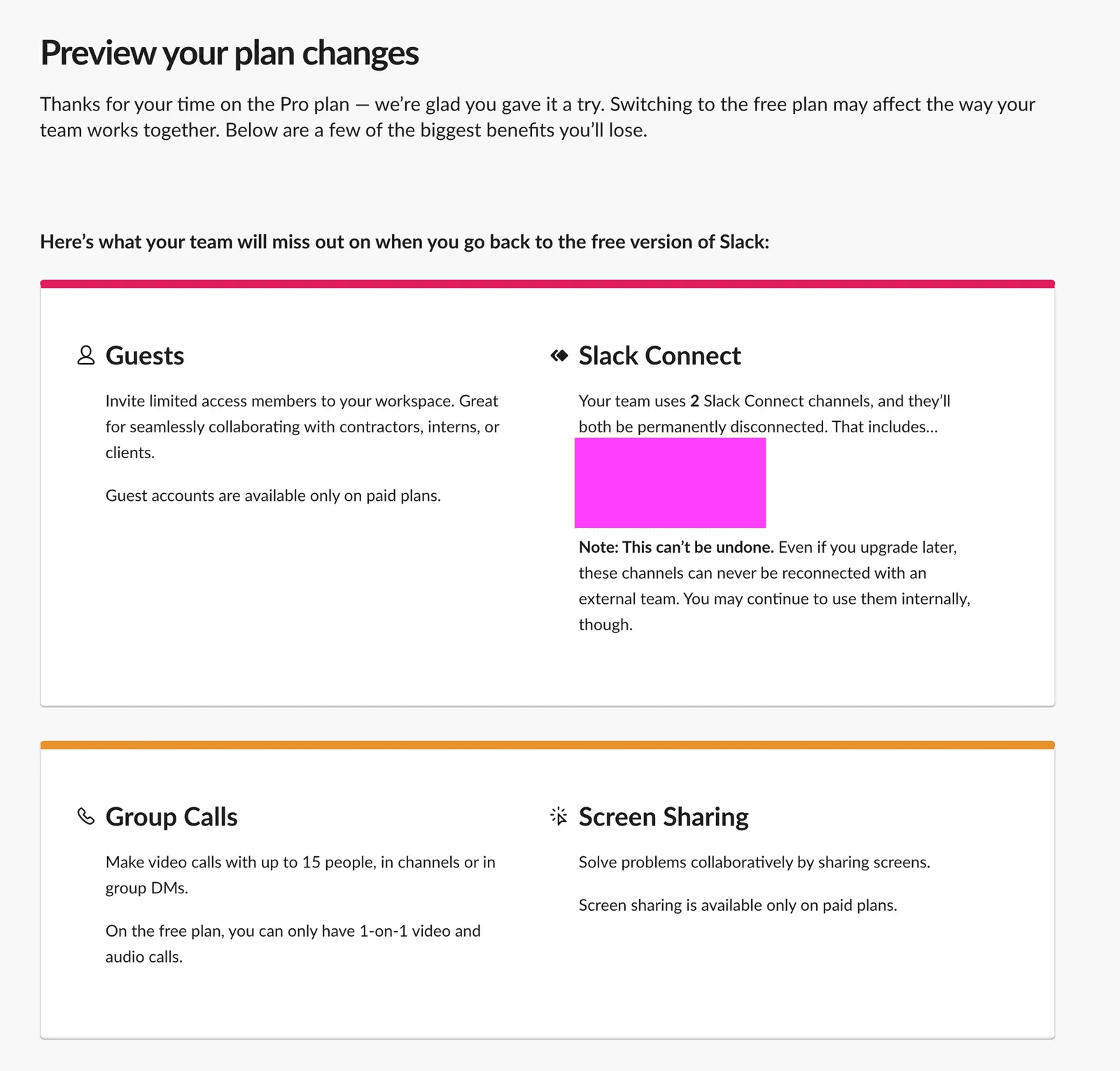
Slack's Cancellation Flow
While Slack's free plan is a good starting point for most users, the paid plans offer better control to enterprise teams — offering users a slew of benefits such as added storage, integrations and AI-powered notes for organizations to manage their team communication.
That said, there might be a point where you'd want to either move to another platform, or simply cancel your paid plans.
When it comes to its cancellation flow, Slack takes a smart, transparent approach. The overview page clearly shows users their current plan details and introduces a price lock-in offer, encouraging them to retain their existing rate before canceling.
To drive timely action, Slack highlights the expiration date of this offer, creating a subtle sense of urgency without pressure.
Once users proceed, Slack presents a personalized retention preview, adjusting the message or offer based on their specific plan or reason for leaving.
What makes it impressive?
Contextual empathy with tone: Slack uses clear, human-centered language throughout the cancellation process, making users feel understood rather than guilt-tripped.
Smart exit options & alternatives: Before completing cancellation, Slack offers tailored downgrade options, pausing, or billing adjustments—reducing churn without being pushy.
Feedback loop built into flow: They prompt users for a quick reason (with pre-filled options), making it fast and painless, while giving Slack valuable insights to improve.
Key takeaways
Slack’s cancellation flow shows that offboarding can be as thoughtfully designed as onboarding. By combining empathy, clarity, and smart alternatives, teams can reduce churn while building long-term trust.
Asana's Cancellation Flow
Image source: Userpilot
Asana’s cancellation flow is a masterclass in balancing user empathy with product retention strategy. From the moment a user initiates cancellation, the tone remains calm, respectful, and non-confrontational — avoiding guilt tactics. Instead, Asana gently surfaces relevant questions like “What’s not working for you?” with simple, selectable answers.
It guides users through a clean, step-by-step process that feels more like a conversation than a form. This helps Asana gather useful feedback while giving users a sense of being heard, not blocked.
What sets Asana apart is how it offers thoughtful alternatives before completing the cancellation. Rather than hard-selling, it presents helpful downgrade options or lets users pause their subscription, making them feel in control.
Importantly, the design avoids visual clutter; using white space, concise copy, and clear CTAs to reduce friction.
What makes it impressive?
Frictionless feedback collection: Offers a clean, multiple-choice form for users to share cancellation reasons, like a simple survey.
Personalized retention offers: Tailors downgrade or upgrade suggestions based on actual usage and plan details.
Minimalist, focused UI: Keeps the page uncluttered so the personalized offer stands out and feels genuinely helpful.
Key takeaways
Asana’s cancellation flow proves that offboarding can be a strategic retention touchpoint. By combining effortless feedback collection with personalized, data-driven alternatives, it reduces churn while maintaining a positive user experience.
Delighted's Cancellation Flow
Image source: UX Magazine
Delighted is another key example of a high-quality cancellation flow, which encourages churning users to work out a customized solution for themselves with the sales team, rather than cancelling their subscription upfront.
The widget on the right side opens the "Send Message" button, allowing you to send a new message to their sales team in the conversation chatbox.
This is an effective technique to reduce cancellations, giving you another opportunity to retain the user.
What makes it impressive?
Straight-to-the-point design: The cancellation process is quick, clear, and free of distractions, respecting the user’s time.
Friendly, non-pushy tone: Uses calm, empathetic language without guilt-tripping, making the experience feel human.
Seamless feedback collection: Gathers cancellation reasons through a simple, low-friction form that helps inform product improvements.
Key takeaways
Delighted.com’s cancellation flow shows that simplicity and respect go a long way. A clear, empathetic offboarding process leaves users with a positive final impression, while still capturing valuable insights.
Zoom's Cancellation Flow
Image source: Userpilot
Zoom’s cancellation flow stands out for its speed and focus. When a user initiates cancellation, a popup micro-survey appears instantly: no page reloads, no friction. This fast-loading format keeps users in the flow while gently collecting feedback on why they’re leaving.
By darkening the background, Zoom draws full attention to the survey, increasing the chances of engagement without feeling intrusive. It’s a smart way to gather insights without interrupting the user experience.
After the feedback step, Zoom presents a straightforward counter-offer—typically a lower-priced plan. While it’s not deeply personalized like Asana’s, the simplicity and relevance of the offer can still prompt second thoughts.
It’s a clean, effective approach that prioritizes ease, minimizes frustration, and gives Zoom one last chance to retain the customer without being aggressive.
What makes it impressive?
Instant, focused feedback popup: A fast-loading microsurvey keeps users in flow and increases completion without page reloads.
Attention-grabbing design: Darkened background highlights the survey, making it the focal point for higher engagement.
Simple retention offer: Presents a clear, lower-priced alternative that’s easy to understand and consider without added friction.
Key takeaways
Zoom’s cancellation flow shows how speed and simplicity can enhance user experience even at the exit point.
A fast, focused feedback step combined with a clear offer can reduce churn without adding friction.
Best Practices for Designing Effective Cancellation Flows
Image source: Chargebee
The case studies reveal clear patterns. Now here's how to apply these insights to your own cancelation flow.
Based on our analysis of these companies, 3 fundamental principles separate effective cancelation flows from missed opportunities.
These include:
Acknowledge the user's decision
Your first job is acknowledging the user's decision immediately. Generic dismissive language damages your brand reputation permanently. Instead, personalize communications to show customers you value their business, even as they leave.
This recognition creates trust and keeps the door open for potential return.
Remember, cancelation represents a critical moment where your brand values get tested, maintaining professionalism throughout leaves a positive lasting impression.
Present real alternatives
Before users complete cancelation, offer meaningful options that might better address their actual needs:
Subscription pause: Temporarily freeze accounts for users experiencing budget constraints
Plan downgrade: Suggest switching to a more affordable tier based on usage patterns
Trial extension: For users still in trial periods, offer additional time to experience value
One-on-one support: Schedule personal calls to address specific concerns
These alternatives often satisfy the underlying need without losing the customer entirely. Many users will accept these options when presented clearly.
Keep feedback simple
Limit exit surveys to maximize response rates. Short, relevant questions yield more valuable data than lengthy questionnaires. This feedback becomes instrumental in addressing product gaps and improving future offerings.
Include an "other" field where customers can provide additional context beyond predefined options. This open-ended feedback often reveals unexpected insights that can change your product strategy.
The goal isn't to trap users but to understand their needs and provide genuine alternatives that might better serve them.
Conclusion
The companies we studied share one thing: they treat cancelation as a strategic business moment, not a failure.
Your cancelation flow reveals what you really think about customers. Do you see them as lost revenue walking out the door? Or do you see an opportunity to solve their actual problem and potentially save the relationship?
Based on our analysis, here's what separates winning cancelation flows from the rest:
They offer real alternatives that address specific user needs rather than generic retention tactics.
They collect structured feedback that informs product decisions, not just save rates.
They maintain brand consistency even during difficult conversations.
Most importantly, they respect user choice while maximizing retention opportunities.
You now have the blueprint to turn your cancelation flow into a strategic advantage. Start by auditing your current experience—where are you creating friction instead of offering solutions? What feedback are you missing that could prevent future churn?
In addition, this is also where working with a design partner with extensive experience designing cancellation flows could prove handy. Bricx can help you design effective cancellation flow UX that improves retention & increases customer delight.
To know more about our AI-powered design process & how it can help — feel free to book a call now!


Similar Blogs
Similar Blogs
Similar Blogs


Available for Work
Bricx
© Bricx, 2026. All rights reserved.


Available for Work
Bricx
© Bricx, 2026. All rights reserved.
Available for Work
Bricx
© Bricx, 2026. All rights reserved.
Available for Work
Bricx
© Bricx, 2026. All rights reserved.