Website Design
Website Design
Website Design
Insights
Insights
Insights
November 24, 2025
November 24, 2025
November 24, 2025
8 Usability Study Questions You Should Know About
8 Usability Study Questions You Should Know About
8 Usability Study Questions You Should Know About
Discover the top 8 usability study questions strategies and tips. Complete guide with actionable insights.
Discover the top 8 usability study questions strategies and tips. Complete guide with actionable insights.
Discover the top 8 usability study questions strategies and tips. Complete guide with actionable insights.
4 mins
4 mins
4 mins


Crafting effective usability study questions is the bedrock of gathering actionable feedback. The difference between a superficial insight and a game-changing product improvement often lies in asking the right questions, at the right time, and in the right way.
This comprehensive guide moves beyond generic templates. It provides a structured collection of essential usability study questions, categorized by purpose and context. Whether you're running a moderated session for a new AI feature, an unmoderated test on a mobile onboarding flow, or a quantitative survey about your SaaS pricing page, you'll find specific, field-tested questions ready to deploy.
For each type of question, we’ll detail not just what to ask, but why it's important, how to phrase it for maximum clarity, and which probing follow-ups will yield the deepest insights. To begin your usability study effectively, consider leveraging specialized AI tools for user evaluation that can enhance your research methods.
This listicle is designed to be a practical, actionable resource for product managers, UX researchers, designers, and anyone tasked with understanding the user experience. You will learn how to precisely measure:
Task Success: Can users actually accomplish what they set out to do?
Ease of Use: How much effort does it take them?
User Satisfaction: How do they feel about the experience?
Perceived Value: Do they find the product useful and desirable?
By mastering these questioning techniques, you can ensure your usability studies produce reliable, impactful data that drives user-centric decisions and builds a better product.
Task Completion Rate
Task Completion Rate is a foundational usability metric that measures the percentage of test participants who successfully complete a given task. It's a direct, quantitative indicator of your product's effectiveness. A high rate signifies an intuitive user experience, while a low rate immediately signals that users are hitting significant roadblocks preventing them from achieving their goals.
This metric is essential for any usability study because it provides a clear, data-driven answer to the most fundamental question: Can people actually use this feature?

This metric is not just a simple pass/fail grade. It's a powerful diagnostic tool. By segmenting completion rates by user persona, device type, or task complexity, you can pinpoint exactly where and for whom your design is failing.
When to Use This Metric
Task Completion Rate is most valuable when you need to evaluate core functionalities or critical user journeys. It is a go-to metric for:
Core Feature Validation: Can users successfully complete the primary actions your product is built for, such as creating a report in a SaaS dashboard or uploading a file to a cloud storage platform?
Onboarding Flows: Are new users able to complete the sign-up and initial setup process without assistance? A low completion rate here is a major red flag for user retention.
E-commerce Checkouts & Conversions: Can shoppers successfully navigate from adding an item to their cart to completing the purchase? This directly impacts revenue.
A/B Testing: When comparing two design variations, the version with the higher task completion rate is often the more usable and effective design.
Actionable Tips for Implementation
To get the most out of this metric, a structured approach is crucial.
Define Success Clearly: Before starting the study, establish strict, binary criteria for what constitutes a "successful" completion. For example, success might mean a user has not only submitted a form but has also landed on the confirmation page.
Track Both Success and Failure: Don't just count the successes. Note where and why users fail. This qualitative data is just as important as the quantitative completion rate.
Combine with Other Metrics: Pair task completion with metrics like time-on-task and user satisfaction ratings. A user might eventually complete a task but take an excessive amount of time and report high frustration, which indicates a poor user experience despite the "successful" outcome.
For a deeper dive into this and other key performance indicators, you can explore more about usability metrics here.
2. System Usability Scale (SUS)
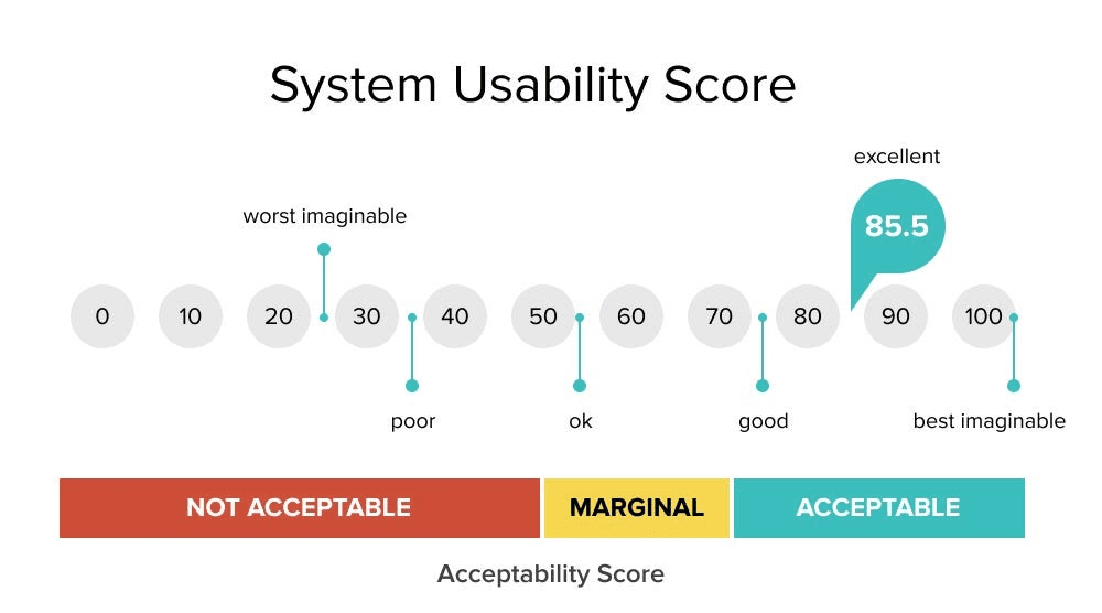
The System Usability Scale (SUS) is a highly reliable, industry-standard questionnaire used to measure the perceived usability of a product. Developed by John Brooke in 1986, it consists of a 10-item survey with five response options for participants, from Strongly Agree to Strongly Disagree. The result is a single score from 0 to 100, providing a quick, quantitative measure of a system's overall usability. A higher score indicates better usability.
This metric has become a cornerstone of usability testing because it is simple to administer, easy for participants to understand, and provides a benchmarkable score. It answers the critical question: How easy do users find our system to use? A SUS score is a powerful way to summarize user sentiment and compare usability across different versions of a product or against competitors. For instance, it's widely used in evaluating enterprise SaaS platforms and complex healthcare IT systems.
When to Use This Metric
SUS is most effective as a post-task or post-session measure to capture a user's overall impression of the experience they just had. It is a go-to metric for:
Benchmarking Usability: How does your current product's usability score compare to a previous version, a competitor's product, or the industry average (a score of 68)?
Tracking Changes Over Time: Are the design changes you're implementing actually improving perceived usability? Tracking the SUS score after each major release can provide a clear answer.
Validating Design Iterations: When comparing prototypes or different design directions, the version with the significantly higher SUS score often reflects a more user-friendly experience.
Assessing Complex Systems: It is particularly useful for evaluating feature-rich software like Adobe Creative Suite or government websites, where a single task-completion metric might not capture the full picture.
Actionable Tips for Implementation
To ensure your SUS score is valid and insightful, follow these best practices.
Administer After Key Tasks: Present the questionnaire immediately after a participant has completed a set of representative tasks. This ensures their feedback is based on recent, direct interaction with the system.
Use the Standard Wording: Do not alter the 10 questions or the alternating positive/negative phrasing. The validity of the SUS comes from its standardized format, which allows for accurate benchmarking.
Combine with Qualitative Insights: A score tells you what but not why. Always follow up with qualitative questions to understand the reasons behind a low (or high) score. Why did they find the system cumbersome? What specifically contributed to its ease of use?
Aim for Statistical Significance: While you can get a directional sense from a few users, aim for at least 30 responses to achieve a more statistically reliable and representative score for your target audience.
For a comprehensive list of platforms that can help you administer SUS surveys and other research, you can find the best user testing tools here.
3. Think-Aloud Protocol
The Think-Aloud Protocol is a qualitative research method where users continuously verbalize their thoughts, feelings, and actions as they interact with a product. It provides a direct window into the user's mental model, revealing their expectations, decision-making processes, and points of confusion in real time.
This technique uncovers the "why" behind user actions, capturing rich, contextual insights that quantitative metrics alone cannot explain. It is invaluable because it answers the critical question: What is the user actually thinking while trying to complete this task?

This method isn't just about listening; it's about understanding the user's cognitive journey. By hearing their internal monologue, you can identify misleading labels, confusing navigation, or moments of delight that would otherwise go unnoticed.
When to Use This Method
The Think-Aloud Protocol is most powerful during the exploratory and formative stages of design, but it is beneficial anytime you need to understand user reasoning. It is a go-to method for:
Early-Stage Prototype Testing: Discovering fundamental usability issues in wireframes or early prototypes before significant development resources are invested.
Complex Workflow Analysis: Understanding how users navigate multi-step processes in sophisticated SaaS or AI platforms, such as configuring a complex report or setting up an automated workflow.
Identifying Mismatched Mental Models: Pinpointing where the product's logic and the user's expectations diverge, which is a common source of friction.
Onboarding and First-Time Use: Observing how new users interpret UI elements and instructions, revealing critical gaps in your initial user experience.
Actionable Tips for Implementation
To get candid, high-quality feedback, creating the right environment is key.
Create a Comfortable Environment: Reassure participants that they are not being tested and there are no right or wrong answers. Emphasize that you are testing the product, not them, to encourage honest feedback.
Use Open-Ended Prompts: If a participant falls silent, use gentle, non-leading prompts like "What are you thinking now?" or "Tell me what you're trying to do here." Avoid questions that direct their behavior.
Record and Transcribe Sessions: Use screen recording software with audio to capture every action and utterance. Transcribing the session makes it easier to analyze and find key quotes later.
Practice First: Start with a simple, unrelated warm-up task to help the participant get comfortable with the process of thinking aloud before moving on to the actual product testing.
To effectively integrate this protocol, it helps to prepare the right kind of usability study questions. For more guidance, you can get insights on structuring effective user testing questions here.
4. Single Ease Question (SEQ)
The Single Ease Question (SEQ) is a post-task usability metric that asks participants to rate the difficulty of a task they just attempted. It uses a single question on a 7-point scale, where 1 represents "Very difficult" and 7 represents "Very easy."
This streamlined approach provides quick, quantitative feedback on task-level usability without causing survey fatigue, making it a powerful tool for iterative testing. It’s an essential part of any usability study question set because it isolates the user's perception of ease for individual, critical actions.
Popularized by usability experts like Jeff Sauro of MeasuringU, the SEQ gives a direct and immediate signal of user friction. A low score is an undeniable indicator that a specific step in your user journey is causing frustration, even if the user eventually completed the task. This focus on perceived difficulty offers a crucial layer of insight that supplements binary metrics like task completion.
When to Use This Metric
The SEQ is exceptionally versatile and delivers the most value when you need immediate, granular feedback on specific interactions. It is the go-to metric for:
Iterative Design & A/B Testing: When comparing two versions of a feature, such as a redesigned checkout flow or a new data visualization tool, the SEQ provides a quick, reliable score to determine which is perceived as easier to use.
Core Task Analysis: Is signing up, creating a project, or inviting a team member as effortless as you think? Use the SEQ after each core task in a study to benchmark and identify the most problematic steps in your key user flows.
Continuous Improvement Programs: For SaaS platforms that release frequent updates, embedding an optional SEQ after a user interacts with a new feature can provide a continuous stream of real-world usability data.
Diagnosing Drop-Off Points: If you know users are abandoning a process, the SEQ can help you pinpoint which specific task in that sequence is the primary source of difficulty.
Actionable Tips for Implementation
To effectively integrate the SEQ into your usability study questions, precision and consistency are key.
Administer Immediately: Ask the SEQ right after a participant finishes (or gives up on) a task. Waiting until the end of the session can cloud their memory and lead to less accurate ratings.
Use the Standard 7-Point Scale: Consistency is crucial for benchmarking. Stick to the standard 1-7 scale to compare scores across different tasks, studies, and even against industry benchmarks.
Follow Up with "Why?": The SEQ score tells you what the rating is, but not why. Immediately follow a low score (e.g., anything below 5) with an open-ended question like, "Could you tell me a bit about why you gave it that score?" This combines quantitative and qualitative insights.
Analyze Trends, Not Just Averages: Don't just look at the average score for a task. Track the distribution of scores. A high number of both very high and very low scores (a bimodal distribution) might indicate the feature is easy for one user persona but extremely difficult for another.
5. Net Promoter Score (NPS) for Usability
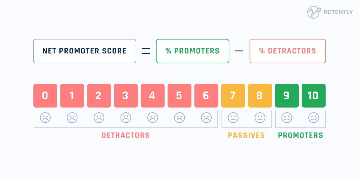
The Net Promoter Score (NPS) is a widely recognized metric that gauges user loyalty and overall satisfaction by asking one simple, powerful question: “On a scale of 0 to 10, how likely are you to recommend this product/service to a friend or colleague?”
While traditionally a marketing and customer success metric, its inclusion in usability studies provides a crucial, high-level indicator of the overall user experience.
It answers the question: Did this experience leave the user feeling positive enough to advocate for us?
Based on their response, users are categorized as Promoters (9-10), Passives (7-8), or Detractors (0-6). The final NPS score is calculated by subtracting the percentage of Detractors from the percentage of Promoters. A positive score is good, and a score above 50 is typically considered excellent, indicating strong word-of-mouth potential and product-market fit.
In the context of usability, a low score can signal that even if users can complete tasks, the experience is so frustrating that they wouldn't endorse it.
When to Use This Metric
NPS is best used as a post-experience summative metric to capture a user's holistic impression after they have engaged with a core product flow or the entire product. It is particularly effective for:
Post-Onboarding Evaluation: After a new user completes the setup and initial tasks, would they recommend the platform based on that critical first impression?
Core Feature Flow Assessment: After a user successfully creates a report in a SaaS dashboard or shares a file in a collaboration tool, their NPS rating reflects the satisfaction with that entire journey.
Benchmarking Over Time: Tracking NPS after each major product update or redesign helps quantify whether usability improvements are positively impacting overall user sentiment.
Competitive Analysis: Understanding your NPS relative to competitors can provide valuable context and highlight strategic advantages or weaknesses in your user experience.
Actionable Tips for Implementation
To properly leverage NPS as one of your key usability study questions, context and follow-up are essential.
Always Ask "Why": The number itself is just a data point. The real insight comes from the mandatory open-ended follow-up question: "What is the primary reason for your score?" This qualitative feedback from Detractors highlights critical pain points, while feedback from Promoters reveals what you should double down on.
Segment Your Data: Don't just look at the overall score. Analyze NPS by user persona, role, or how long they've been a customer. New users might become Detractors due to poor onboarding, while power users might become Detractors due to a missing advanced feature.
Administer at the Right Time: Ask the NPS question after the user has completed a meaningful set of tasks, not after a single, isolated action. This ensures the score reflects the broader experience rather than a momentary frustration or success.
Don't Treat it as a Pure Usability Metric: Combine NPS with task-specific metrics like completion rates and time on task. NPS provides the "how they feel," while task metrics provide the "what they did." A user might complete a task but become a Detractor because the process was confusing and stressful.
6. Error Rate and Error Recovery
Error Rate and Error Recovery is a critical usability metric that quantifies how often users make mistakes while performing a task and how easily they can recover from them. This metric provides deep insights into design friction, revealing where your product is confusing or unforgiving. A low error rate suggests a clear and well-guided user path, while a high rate points to significant usability issues that are causing frustration and preventing task completion.
This metric helps answer the pivotal question: Is our design robust enough to prevent and handle user mistakes?

This isn't just about counting slips and typos; it's about understanding the nature of the errors. By categorizing errors by type (e.g., slip, mistake, system error) and analyzing recovery paths, you can diagnose the root causes of user friction, such as unclear labels, poor feedback, or a lack of constraints.
When to Use This Metric
Error Rate and Error Recovery is essential when the cost of user error is high or when task precision is paramount. It is a go-to metric for:
Complex Data Entry: When users are filling out detailed forms or configuring complex settings, error rates can highlight confusing fields or inadequate validation.
Financial & E-commerce Transactions: In systems where users are transferring funds or making purchases, minimizing errors is crucial for trust and revenue. Can users easily correct a wrong billing address without starting over?
Safety-Critical Systems: For interfaces in medical devices or industrial controls, a low error rate and a high recovery rate are non-negotiable for ensuring user safety and preventing catastrophic failures.
Onboarding & Setup Flows: Tracking errors during initial setup can reveal which steps are tripping up new users, allowing you to streamline the process and improve first impressions.
Actionable Tips for Implementation
To effectively measure errors and recovery, a systematic approach is key.
Define and Categorize Errors: Before testing, create a clear definition of what constitutes an error. Categorize them (e.g., input error, navigation error) to enable deeper analysis of patterns.
Observe Recovery Paths: Don't just log the error. Observe and time how long it takes a user to recognize the mistake and correct it. A long recovery time, even after a minor error, signals a significant design flaw.
Implement Proactive Design: Use error data to drive design improvements. To minimize user errors and improve task completion, it's essential to follow Form Design Best Practices when designing interactive elements, which can prevent mistakes from happening in the first place.
Test Error Messages: Evaluate the clarity and helpfulness of your system's error messages. Do they accurately describe the problem and provide a clear solution, or do they just create more confusion?
For a deeper look into creating intuitive user inputs, explore our guide to smarter and smoother form UX.
7. User Satisfaction and Preference Questions
User Satisfaction and Preference Questions gauge a participant's subjective feelings, contentment, and opinions about their experience. While performance metrics like task completion tell you what users did, these usability study questions reveal how they felt while doing it.
They are critical for capturing the emotional and perceptual dimensions of usability that objective data alone cannot. A high satisfaction score can predict user loyalty and adoption, even if minor usability hurdles exist.
This category of questions provides essential qualitative context to your quantitative findings. Understanding that a user completed a task but found the process "confusing" or "frustrating" is a powerful insight that guides design improvements.
These questions directly probe the user's perception of value, ease of use, and overall delight, which are key drivers for SaaS product retention and advocacy.
When to Use This Metric
Satisfaction and preference questions are versatile and should be woven into most usability studies, especially when you need to understand the holistic user experience. They are particularly effective for:
Post-Task Feedback: Immediately after a user attempts a task, asking about their satisfaction captures their feelings at a moment of high relevance. For example, "On a scale of 1 to 5, how satisfied were you with the process of creating a new report?"
Overall Experience Assessment: At the end of a session, use these questions to get a summary of the user's feelings about the entire product or feature set. This helps you gauge general sentiment.
Competitive Analysis: When testing your product against a competitor's, preference questions like, "Which of these two designs did you prefer for managing your team's schedule, and why?" provide direct, comparative insights.
Design Validation: Before investing heavily in development, you can use preference tests with prototypes to see which design direction resonates most strongly with your target audience.
Actionable Tips for Implementation
To gather meaningful satisfaction data, your approach needs to be deliberate and structured.
Balance Question Types: Use a mix of closed-ended rating scales (like Likert scales or the System Usability Scale) for quantitative data and open-ended questions ("What did you like most about this feature?") to gather rich, qualitative reasons behind those ratings.
Be Specific: Avoid vague questions like "Did you like it?" Instead, ask targeted questions such as, "How confident did you feel that your changes were saved successfully?" This pinpoints specific aspects of the interface.
Maintain Consistent Scales: If using rating scales, keep them consistent throughout the study (e.g., always use a 5-point scale where 5 is the most positive). This makes it easier for users to respond and for you to analyze the data.
Probe for the "Why": Always follow up on a rating or a preference. If a user says they prefer Design A, your most important follow-up is, "Could you tell me what it was about Design A that you preferred?" This uncovers the core reasoning behind their choice.
8. Perceived Usefulness and Perceived Ease of Use (TAM Model)
The Technology Acceptance Model (TAM) offers a powerful framework for understanding why users adopt or reject new technology. It hinges on two core psychological factors: Perceived Usefulness (the degree to which a person believes using a system will enhance their job performance) and Perceived Ease of Use (the degree to which a person believes using a system will be free of effort).
These concepts provide a structured way to ask usability study questions that predict long-term adoption, especially in enterprise and B2B contexts.
By asking questions based on TAM, you move beyond simple task completion to measure the user's core beliefs about your product's value and accessibility. A system can be technically usable but fail if users don't perceive it as useful or easy enough to integrate into their workflow.
This makes TAM essential for forecasting user acceptance and identifying potential adoption barriers before a full-scale launch.
When to Use This Framework
TAM is particularly effective when the goal is to predict and influence the adoption of a new system within an organization or user base. It is a critical tool for:
Enterprise Software Rollouts: Will employees actually use the new CRM or ERP system? TAM helps gauge acceptance for tools like Salesforce or SAP before mandatory implementation.
Corporate Tool Migration: When moving from an old system (e.g., a legacy HR portal) to a new one, TAM can identify resistance points and training needs.
Complex SaaS & AI Products: For sophisticated tools with a learning curve, measuring perceived ease of use is crucial for understanding onboarding challenges and potential user drop-off.
Longitudinal Adoption Studies: By administering TAM questionnaires at different points in time (e.g., pre-launch, post-launch, 6 months later), you can track how perceptions change and whether adoption is truly taking hold.
Actionable Tips for Implementation
To effectively apply TAM, a systematic approach is necessary for reliable results.
Use Validated Scales: Don't invent your own questions. Use the established, scientifically validated TAM questionnaire items developed by Fred Davis and others. This ensures your data is reliable and comparable to academic benchmarks.
Administer After Realistic Interaction: Ask these questions after a participant has completed a set of realistic tasks with the product. Their perceptions must be based on actual experience, not just a first impression or a product demo.
Analyze Both Factors Separately: While related, usefulness and ease of use are distinct constructs. A user might find a tool incredibly useful but too difficult to operate. Analyzing them separately allows you to pinpoint whether you have a value proposition problem or a usability problem.
Complement with Usage Data: Pair TAM survey results with actual usage analytics post-launch. This helps validate whether users' stated intentions and perceptions align with their real-world behavior.
To integrate this model into your broader research strategy, explore other powerful user research techniques.
8-Point Usability Study Questions Comparison
Method | 🔄 Implementation Complexity | ⚡ Resource Requirements | 📊 Expected Outcomes | Ideal Use Cases | ⭐ Key Advantages / 💡 Tips |
|---|---|---|---|---|---|
Task Completion Rate | Medium — define tasks & success criteria | Low–Medium — users, tracking, basic analytics | Clear quantifiable success metric; identifies blockers | Critical workflows (checkout, onboarding, forms) | Direct measure of user success; tip: define success clearly and track time-to-complete |
System Usability Scale (SUS) | Low — standardized 10-question survey | Low — ~2–3 min/user; needs ~30+ for stats | Reliable 0–100 usability score for benchmarking | Broad product comparisons; post-test system assessment | Validated and benchmarkable; tip: combine with qualitative feedback, aim >68 |
Think-Aloud Protocol | Medium–High — moderator skill & setup | Medium — recordings, transcription, analyst time | Rich qualitative insights into user thought processes | Early-stage design, diagnosing why users struggle | Reveals “why” behind behavior; tip: practice prompts, record sessions, run 5–8 users |
Single Ease Question (SEQ) | Low — one question per task | Very low — instant response after tasks | Task-specific ease rating sensitive to iterations | Rapid iterative testing and A/B comparisons | Fast and low fatigue; tip: ask immediately after task and use consistent scale |
Net Promoter Score (NPS) for Usability | Low — single 0–10 question | Low–Medium — needs larger samples for reliability | High-level satisfaction/loyalty indicator (-100 to +100) | Product-level satisfaction tracking and benchmarking | Widely recognized metric; tip: always include follow-up “why” and segment responses |
Error Rate and Error Recovery | Medium — define error taxonomy & logging | Medium–High — observation, coding, diverse testers | Quantifies mistakes, severity, and recovery success | Safety-critical systems, complex transactions, form validation | Prioritizes high-impact fixes; tip: predefine error types and track recovery paths |
User Satisfaction & Preference Questions | Low–Medium — survey/interview design | Low–Medium — collection easy; qualitative analysis time | Subjective satisfaction, feature preferences, emotional feedback | Feature prioritization, post-release feedback, design direction | Provides rich contextual insights; tip: balance open/closed Qs and avoid leading prompts |
Perceived Usefulness & Ease of Use (TAM) | Medium — multi-item validated scales | Medium — questionnaires and statistical analysis | Predicts adoption and intention-to-use | Adoption forecasting, enterprise rollouts, implementation readiness | Theoretically grounded and predictive; tip: use established TAM scales and analyze dimensions separately |
Conclusion
We've journeyed through a comprehensive toolkit of usability study questions, moving from quantitative metrics like Task Completion Rate and the System Usability Scale (SUS) to the rich, qualitative insights gleaned from the Think-Aloud Protocol.
Each category of question serves a distinct purpose, and the true power lies not in using a single method, but in orchestrating them to paint a complete picture of the user experience.
The ultimate goal of any usability study is to build a bridge of empathy between your team and your users. The questions you ask are the foundational pillars of that bridge. A well-phrased question can uncover a hidden friction point, reveal an unmet need, or validate a critical design decision.
Conversely, a poorly chosen or leading question can send your team down the wrong path, wasting valuable development resources and ultimately failing your users.
Crafting effective usability study questions is the bedrock of gathering actionable feedback. The difference between a superficial insight and a game-changing product improvement often lies in asking the right questions, at the right time, and in the right way.
This comprehensive guide moves beyond generic templates. It provides a structured collection of essential usability study questions, categorized by purpose and context. Whether you're running a moderated session for a new AI feature, an unmoderated test on a mobile onboarding flow, or a quantitative survey about your SaaS pricing page, you'll find specific, field-tested questions ready to deploy.
For each type of question, we’ll detail not just what to ask, but why it's important, how to phrase it for maximum clarity, and which probing follow-ups will yield the deepest insights. To begin your usability study effectively, consider leveraging specialized AI tools for user evaluation that can enhance your research methods.
This listicle is designed to be a practical, actionable resource for product managers, UX researchers, designers, and anyone tasked with understanding the user experience. You will learn how to precisely measure:
Task Success: Can users actually accomplish what they set out to do?
Ease of Use: How much effort does it take them?
User Satisfaction: How do they feel about the experience?
Perceived Value: Do they find the product useful and desirable?
By mastering these questioning techniques, you can ensure your usability studies produce reliable, impactful data that drives user-centric decisions and builds a better product.
Task Completion Rate
Task Completion Rate is a foundational usability metric that measures the percentage of test participants who successfully complete a given task. It's a direct, quantitative indicator of your product's effectiveness. A high rate signifies an intuitive user experience, while a low rate immediately signals that users are hitting significant roadblocks preventing them from achieving their goals.
This metric is essential for any usability study because it provides a clear, data-driven answer to the most fundamental question: Can people actually use this feature?
This metric is not just a simple pass/fail grade. It's a powerful diagnostic tool. By segmenting completion rates by user persona, device type, or task complexity, you can pinpoint exactly where and for whom your design is failing.
When to Use This Metric
Task Completion Rate is most valuable when you need to evaluate core functionalities or critical user journeys. It is a go-to metric for:
Core Feature Validation: Can users successfully complete the primary actions your product is built for, such as creating a report in a SaaS dashboard or uploading a file to a cloud storage platform?
Onboarding Flows: Are new users able to complete the sign-up and initial setup process without assistance? A low completion rate here is a major red flag for user retention.
E-commerce Checkouts & Conversions: Can shoppers successfully navigate from adding an item to their cart to completing the purchase? This directly impacts revenue.
A/B Testing: When comparing two design variations, the version with the higher task completion rate is often the more usable and effective design.
Actionable Tips for Implementation
To get the most out of this metric, a structured approach is crucial.
Define Success Clearly: Before starting the study, establish strict, binary criteria for what constitutes a "successful" completion. For example, success might mean a user has not only submitted a form but has also landed on the confirmation page.
Track Both Success and Failure: Don't just count the successes. Note where and why users fail. This qualitative data is just as important as the quantitative completion rate.
Combine with Other Metrics: Pair task completion with metrics like time-on-task and user satisfaction ratings. A user might eventually complete a task but take an excessive amount of time and report high frustration, which indicates a poor user experience despite the "successful" outcome.
For a deeper dive into this and other key performance indicators, you can explore more about usability metrics here.
2. System Usability Scale (SUS)
The System Usability Scale (SUS) is a highly reliable, industry-standard questionnaire used to measure the perceived usability of a product. Developed by John Brooke in 1986, it consists of a 10-item survey with five response options for participants, from Strongly Agree to Strongly Disagree. The result is a single score from 0 to 100, providing a quick, quantitative measure of a system's overall usability. A higher score indicates better usability.
This metric has become a cornerstone of usability testing because it is simple to administer, easy for participants to understand, and provides a benchmarkable score. It answers the critical question: How easy do users find our system to use? A SUS score is a powerful way to summarize user sentiment and compare usability across different versions of a product or against competitors. For instance, it's widely used in evaluating enterprise SaaS platforms and complex healthcare IT systems.
When to Use This Metric
SUS is most effective as a post-task or post-session measure to capture a user's overall impression of the experience they just had. It is a go-to metric for:
Benchmarking Usability: How does your current product's usability score compare to a previous version, a competitor's product, or the industry average (a score of 68)?
Tracking Changes Over Time: Are the design changes you're implementing actually improving perceived usability? Tracking the SUS score after each major release can provide a clear answer.
Validating Design Iterations: When comparing prototypes or different design directions, the version with the significantly higher SUS score often reflects a more user-friendly experience.
Assessing Complex Systems: It is particularly useful for evaluating feature-rich software like Adobe Creative Suite or government websites, where a single task-completion metric might not capture the full picture.
Actionable Tips for Implementation
To ensure your SUS score is valid and insightful, follow these best practices.
Administer After Key Tasks: Present the questionnaire immediately after a participant has completed a set of representative tasks. This ensures their feedback is based on recent, direct interaction with the system.
Use the Standard Wording: Do not alter the 10 questions or the alternating positive/negative phrasing. The validity of the SUS comes from its standardized format, which allows for accurate benchmarking.
Combine with Qualitative Insights: A score tells you what but not why. Always follow up with qualitative questions to understand the reasons behind a low (or high) score. Why did they find the system cumbersome? What specifically contributed to its ease of use?
Aim for Statistical Significance: While you can get a directional sense from a few users, aim for at least 30 responses to achieve a more statistically reliable and representative score for your target audience.
For a comprehensive list of platforms that can help you administer SUS surveys and other research, you can find the best user testing tools here.
3. Think-Aloud Protocol
The Think-Aloud Protocol is a qualitative research method where users continuously verbalize their thoughts, feelings, and actions as they interact with a product. It provides a direct window into the user's mental model, revealing their expectations, decision-making processes, and points of confusion in real time.
This technique uncovers the "why" behind user actions, capturing rich, contextual insights that quantitative metrics alone cannot explain. It is invaluable because it answers the critical question: What is the user actually thinking while trying to complete this task?
This method isn't just about listening; it's about understanding the user's cognitive journey. By hearing their internal monologue, you can identify misleading labels, confusing navigation, or moments of delight that would otherwise go unnoticed.
When to Use This Method
The Think-Aloud Protocol is most powerful during the exploratory and formative stages of design, but it is beneficial anytime you need to understand user reasoning. It is a go-to method for:
Early-Stage Prototype Testing: Discovering fundamental usability issues in wireframes or early prototypes before significant development resources are invested.
Complex Workflow Analysis: Understanding how users navigate multi-step processes in sophisticated SaaS or AI platforms, such as configuring a complex report or setting up an automated workflow.
Identifying Mismatched Mental Models: Pinpointing where the product's logic and the user's expectations diverge, which is a common source of friction.
Onboarding and First-Time Use: Observing how new users interpret UI elements and instructions, revealing critical gaps in your initial user experience.
Actionable Tips for Implementation
To get candid, high-quality feedback, creating the right environment is key.
Create a Comfortable Environment: Reassure participants that they are not being tested and there are no right or wrong answers. Emphasize that you are testing the product, not them, to encourage honest feedback.
Use Open-Ended Prompts: If a participant falls silent, use gentle, non-leading prompts like "What are you thinking now?" or "Tell me what you're trying to do here." Avoid questions that direct their behavior.
Record and Transcribe Sessions: Use screen recording software with audio to capture every action and utterance. Transcribing the session makes it easier to analyze and find key quotes later.
Practice First: Start with a simple, unrelated warm-up task to help the participant get comfortable with the process of thinking aloud before moving on to the actual product testing.
To effectively integrate this protocol, it helps to prepare the right kind of usability study questions. For more guidance, you can get insights on structuring effective user testing questions here.
4. Single Ease Question (SEQ)
The Single Ease Question (SEQ) is a post-task usability metric that asks participants to rate the difficulty of a task they just attempted. It uses a single question on a 7-point scale, where 1 represents "Very difficult" and 7 represents "Very easy."
This streamlined approach provides quick, quantitative feedback on task-level usability without causing survey fatigue, making it a powerful tool for iterative testing. It’s an essential part of any usability study question set because it isolates the user's perception of ease for individual, critical actions.
Popularized by usability experts like Jeff Sauro of MeasuringU, the SEQ gives a direct and immediate signal of user friction. A low score is an undeniable indicator that a specific step in your user journey is causing frustration, even if the user eventually completed the task. This focus on perceived difficulty offers a crucial layer of insight that supplements binary metrics like task completion.
When to Use This Metric
The SEQ is exceptionally versatile and delivers the most value when you need immediate, granular feedback on specific interactions. It is the go-to metric for:
Iterative Design & A/B Testing: When comparing two versions of a feature, such as a redesigned checkout flow or a new data visualization tool, the SEQ provides a quick, reliable score to determine which is perceived as easier to use.
Core Task Analysis: Is signing up, creating a project, or inviting a team member as effortless as you think? Use the SEQ after each core task in a study to benchmark and identify the most problematic steps in your key user flows.
Continuous Improvement Programs: For SaaS platforms that release frequent updates, embedding an optional SEQ after a user interacts with a new feature can provide a continuous stream of real-world usability data.
Diagnosing Drop-Off Points: If you know users are abandoning a process, the SEQ can help you pinpoint which specific task in that sequence is the primary source of difficulty.
Actionable Tips for Implementation
To effectively integrate the SEQ into your usability study questions, precision and consistency are key.
Administer Immediately: Ask the SEQ right after a participant finishes (or gives up on) a task. Waiting until the end of the session can cloud their memory and lead to less accurate ratings.
Use the Standard 7-Point Scale: Consistency is crucial for benchmarking. Stick to the standard 1-7 scale to compare scores across different tasks, studies, and even against industry benchmarks.
Follow Up with "Why?": The SEQ score tells you what the rating is, but not why. Immediately follow a low score (e.g., anything below 5) with an open-ended question like, "Could you tell me a bit about why you gave it that score?" This combines quantitative and qualitative insights.
Analyze Trends, Not Just Averages: Don't just look at the average score for a task. Track the distribution of scores. A high number of both very high and very low scores (a bimodal distribution) might indicate the feature is easy for one user persona but extremely difficult for another.
5. Net Promoter Score (NPS) for Usability
The Net Promoter Score (NPS) is a widely recognized metric that gauges user loyalty and overall satisfaction by asking one simple, powerful question: “On a scale of 0 to 10, how likely are you to recommend this product/service to a friend or colleague?”
While traditionally a marketing and customer success metric, its inclusion in usability studies provides a crucial, high-level indicator of the overall user experience.
It answers the question: Did this experience leave the user feeling positive enough to advocate for us?
Based on their response, users are categorized as Promoters (9-10), Passives (7-8), or Detractors (0-6). The final NPS score is calculated by subtracting the percentage of Detractors from the percentage of Promoters. A positive score is good, and a score above 50 is typically considered excellent, indicating strong word-of-mouth potential and product-market fit.
In the context of usability, a low score can signal that even if users can complete tasks, the experience is so frustrating that they wouldn't endorse it.
When to Use This Metric
NPS is best used as a post-experience summative metric to capture a user's holistic impression after they have engaged with a core product flow or the entire product. It is particularly effective for:
Post-Onboarding Evaluation: After a new user completes the setup and initial tasks, would they recommend the platform based on that critical first impression?
Core Feature Flow Assessment: After a user successfully creates a report in a SaaS dashboard or shares a file in a collaboration tool, their NPS rating reflects the satisfaction with that entire journey.
Benchmarking Over Time: Tracking NPS after each major product update or redesign helps quantify whether usability improvements are positively impacting overall user sentiment.
Competitive Analysis: Understanding your NPS relative to competitors can provide valuable context and highlight strategic advantages or weaknesses in your user experience.
Actionable Tips for Implementation
To properly leverage NPS as one of your key usability study questions, context and follow-up are essential.
Always Ask "Why": The number itself is just a data point. The real insight comes from the mandatory open-ended follow-up question: "What is the primary reason for your score?" This qualitative feedback from Detractors highlights critical pain points, while feedback from Promoters reveals what you should double down on.
Segment Your Data: Don't just look at the overall score. Analyze NPS by user persona, role, or how long they've been a customer. New users might become Detractors due to poor onboarding, while power users might become Detractors due to a missing advanced feature.
Administer at the Right Time: Ask the NPS question after the user has completed a meaningful set of tasks, not after a single, isolated action. This ensures the score reflects the broader experience rather than a momentary frustration or success.
Don't Treat it as a Pure Usability Metric: Combine NPS with task-specific metrics like completion rates and time on task. NPS provides the "how they feel," while task metrics provide the "what they did." A user might complete a task but become a Detractor because the process was confusing and stressful.
6. Error Rate and Error Recovery
Error Rate and Error Recovery is a critical usability metric that quantifies how often users make mistakes while performing a task and how easily they can recover from them. This metric provides deep insights into design friction, revealing where your product is confusing or unforgiving. A low error rate suggests a clear and well-guided user path, while a high rate points to significant usability issues that are causing frustration and preventing task completion.
This metric helps answer the pivotal question: Is our design robust enough to prevent and handle user mistakes?
This isn't just about counting slips and typos; it's about understanding the nature of the errors. By categorizing errors by type (e.g., slip, mistake, system error) and analyzing recovery paths, you can diagnose the root causes of user friction, such as unclear labels, poor feedback, or a lack of constraints.
When to Use This Metric
Error Rate and Error Recovery is essential when the cost of user error is high or when task precision is paramount. It is a go-to metric for:
Complex Data Entry: When users are filling out detailed forms or configuring complex settings, error rates can highlight confusing fields or inadequate validation.
Financial & E-commerce Transactions: In systems where users are transferring funds or making purchases, minimizing errors is crucial for trust and revenue. Can users easily correct a wrong billing address without starting over?
Safety-Critical Systems: For interfaces in medical devices or industrial controls, a low error rate and a high recovery rate are non-negotiable for ensuring user safety and preventing catastrophic failures.
Onboarding & Setup Flows: Tracking errors during initial setup can reveal which steps are tripping up new users, allowing you to streamline the process and improve first impressions.
Actionable Tips for Implementation
To effectively measure errors and recovery, a systematic approach is key.
Define and Categorize Errors: Before testing, create a clear definition of what constitutes an error. Categorize them (e.g., input error, navigation error) to enable deeper analysis of patterns.
Observe Recovery Paths: Don't just log the error. Observe and time how long it takes a user to recognize the mistake and correct it. A long recovery time, even after a minor error, signals a significant design flaw.
Implement Proactive Design: Use error data to drive design improvements. To minimize user errors and improve task completion, it's essential to follow Form Design Best Practices when designing interactive elements, which can prevent mistakes from happening in the first place.
Test Error Messages: Evaluate the clarity and helpfulness of your system's error messages. Do they accurately describe the problem and provide a clear solution, or do they just create more confusion?
For a deeper look into creating intuitive user inputs, explore our guide to smarter and smoother form UX.
7. User Satisfaction and Preference Questions
User Satisfaction and Preference Questions gauge a participant's subjective feelings, contentment, and opinions about their experience. While performance metrics like task completion tell you what users did, these usability study questions reveal how they felt while doing it.
They are critical for capturing the emotional and perceptual dimensions of usability that objective data alone cannot. A high satisfaction score can predict user loyalty and adoption, even if minor usability hurdles exist.
This category of questions provides essential qualitative context to your quantitative findings. Understanding that a user completed a task but found the process "confusing" or "frustrating" is a powerful insight that guides design improvements.
These questions directly probe the user's perception of value, ease of use, and overall delight, which are key drivers for SaaS product retention and advocacy.
When to Use This Metric
Satisfaction and preference questions are versatile and should be woven into most usability studies, especially when you need to understand the holistic user experience. They are particularly effective for:
Post-Task Feedback: Immediately after a user attempts a task, asking about their satisfaction captures their feelings at a moment of high relevance. For example, "On a scale of 1 to 5, how satisfied were you with the process of creating a new report?"
Overall Experience Assessment: At the end of a session, use these questions to get a summary of the user's feelings about the entire product or feature set. This helps you gauge general sentiment.
Competitive Analysis: When testing your product against a competitor's, preference questions like, "Which of these two designs did you prefer for managing your team's schedule, and why?" provide direct, comparative insights.
Design Validation: Before investing heavily in development, you can use preference tests with prototypes to see which design direction resonates most strongly with your target audience.
Actionable Tips for Implementation
To gather meaningful satisfaction data, your approach needs to be deliberate and structured.
Balance Question Types: Use a mix of closed-ended rating scales (like Likert scales or the System Usability Scale) for quantitative data and open-ended questions ("What did you like most about this feature?") to gather rich, qualitative reasons behind those ratings.
Be Specific: Avoid vague questions like "Did you like it?" Instead, ask targeted questions such as, "How confident did you feel that your changes were saved successfully?" This pinpoints specific aspects of the interface.
Maintain Consistent Scales: If using rating scales, keep them consistent throughout the study (e.g., always use a 5-point scale where 5 is the most positive). This makes it easier for users to respond and for you to analyze the data.
Probe for the "Why": Always follow up on a rating or a preference. If a user says they prefer Design A, your most important follow-up is, "Could you tell me what it was about Design A that you preferred?" This uncovers the core reasoning behind their choice.
8. Perceived Usefulness and Perceived Ease of Use (TAM Model)
The Technology Acceptance Model (TAM) offers a powerful framework for understanding why users adopt or reject new technology. It hinges on two core psychological factors: Perceived Usefulness (the degree to which a person believes using a system will enhance their job performance) and Perceived Ease of Use (the degree to which a person believes using a system will be free of effort).
These concepts provide a structured way to ask usability study questions that predict long-term adoption, especially in enterprise and B2B contexts.
By asking questions based on TAM, you move beyond simple task completion to measure the user's core beliefs about your product's value and accessibility. A system can be technically usable but fail if users don't perceive it as useful or easy enough to integrate into their workflow.
This makes TAM essential for forecasting user acceptance and identifying potential adoption barriers before a full-scale launch.
When to Use This Framework
TAM is particularly effective when the goal is to predict and influence the adoption of a new system within an organization or user base. It is a critical tool for:
Enterprise Software Rollouts: Will employees actually use the new CRM or ERP system? TAM helps gauge acceptance for tools like Salesforce or SAP before mandatory implementation.
Corporate Tool Migration: When moving from an old system (e.g., a legacy HR portal) to a new one, TAM can identify resistance points and training needs.
Complex SaaS & AI Products: For sophisticated tools with a learning curve, measuring perceived ease of use is crucial for understanding onboarding challenges and potential user drop-off.
Longitudinal Adoption Studies: By administering TAM questionnaires at different points in time (e.g., pre-launch, post-launch, 6 months later), you can track how perceptions change and whether adoption is truly taking hold.
Actionable Tips for Implementation
To effectively apply TAM, a systematic approach is necessary for reliable results.
Use Validated Scales: Don't invent your own questions. Use the established, scientifically validated TAM questionnaire items developed by Fred Davis and others. This ensures your data is reliable and comparable to academic benchmarks.
Administer After Realistic Interaction: Ask these questions after a participant has completed a set of realistic tasks with the product. Their perceptions must be based on actual experience, not just a first impression or a product demo.
Analyze Both Factors Separately: While related, usefulness and ease of use are distinct constructs. A user might find a tool incredibly useful but too difficult to operate. Analyzing them separately allows you to pinpoint whether you have a value proposition problem or a usability problem.
Complement with Usage Data: Pair TAM survey results with actual usage analytics post-launch. This helps validate whether users' stated intentions and perceptions align with their real-world behavior.
To integrate this model into your broader research strategy, explore other powerful user research techniques.
8-Point Usability Study Questions Comparison
Method | 🔄 Implementation Complexity | ⚡ Resource Requirements | 📊 Expected Outcomes | Ideal Use Cases | ⭐ Key Advantages / 💡 Tips |
|---|---|---|---|---|---|
Task Completion Rate | Medium — define tasks & success criteria | Low–Medium — users, tracking, basic analytics | Clear quantifiable success metric; identifies blockers | Critical workflows (checkout, onboarding, forms) | Direct measure of user success; tip: define success clearly and track time-to-complete |
System Usability Scale (SUS) | Low — standardized 10-question survey | Low — ~2–3 min/user; needs ~30+ for stats | Reliable 0–100 usability score for benchmarking | Broad product comparisons; post-test system assessment | Validated and benchmarkable; tip: combine with qualitative feedback, aim >68 |
Think-Aloud Protocol | Medium–High — moderator skill & setup | Medium — recordings, transcription, analyst time | Rich qualitative insights into user thought processes | Early-stage design, diagnosing why users struggle | Reveals “why” behind behavior; tip: practice prompts, record sessions, run 5–8 users |
Single Ease Question (SEQ) | Low — one question per task | Very low — instant response after tasks | Task-specific ease rating sensitive to iterations | Rapid iterative testing and A/B comparisons | Fast and low fatigue; tip: ask immediately after task and use consistent scale |
Net Promoter Score (NPS) for Usability | Low — single 0–10 question | Low–Medium — needs larger samples for reliability | High-level satisfaction/loyalty indicator (-100 to +100) | Product-level satisfaction tracking and benchmarking | Widely recognized metric; tip: always include follow-up “why” and segment responses |
Error Rate and Error Recovery | Medium — define error taxonomy & logging | Medium–High — observation, coding, diverse testers | Quantifies mistakes, severity, and recovery success | Safety-critical systems, complex transactions, form validation | Prioritizes high-impact fixes; tip: predefine error types and track recovery paths |
User Satisfaction & Preference Questions | Low–Medium — survey/interview design | Low–Medium — collection easy; qualitative analysis time | Subjective satisfaction, feature preferences, emotional feedback | Feature prioritization, post-release feedback, design direction | Provides rich contextual insights; tip: balance open/closed Qs and avoid leading prompts |
Perceived Usefulness & Ease of Use (TAM) | Medium — multi-item validated scales | Medium — questionnaires and statistical analysis | Predicts adoption and intention-to-use | Adoption forecasting, enterprise rollouts, implementation readiness | Theoretically grounded and predictive; tip: use established TAM scales and analyze dimensions separately |
Conclusion
We've journeyed through a comprehensive toolkit of usability study questions, moving from quantitative metrics like Task Completion Rate and the System Usability Scale (SUS) to the rich, qualitative insights gleaned from the Think-Aloud Protocol.
Each category of question serves a distinct purpose, and the true power lies not in using a single method, but in orchestrating them to paint a complete picture of the user experience.
The ultimate goal of any usability study is to build a bridge of empathy between your team and your users. The questions you ask are the foundational pillars of that bridge. A well-phrased question can uncover a hidden friction point, reveal an unmet need, or validate a critical design decision.
Conversely, a poorly chosen or leading question can send your team down the wrong path, wasting valuable development resources and ultimately failing your users.


Similar Blogs
Similar Blogs
Similar Blogs


Available for Work
Bricx
© Bricx, 2026. All rights reserved.


Available for Work
Bricx
© Bricx, 2026. All rights reserved.
Available for Work
Bricx
© Bricx, 2026. All rights reserved.
Available for Work
Bricx
© Bricx, 2026. All rights reserved.