


Website Design
Website Design
Website Design
Insights
Insights
Insights
September 24, 2025
September 24, 2025
September 24, 2025
13 Common Web Design Mistakes Harming Your SaaS Conversions
13 Common Web Design Mistakes Harming Your SaaS Conversions
13 Common Web Design Mistakes Harming Your SaaS Conversions
Discover 13 key web design mistakes impacting your SaaS. Learn how to fix them and boost conversions while also improving the user experience in our article.
Discover 13 key web design mistakes impacting your SaaS. Learn how to fix them and boost conversions while also improving the user experience in our article.
Discover 13 key web design mistakes impacting your SaaS. Learn how to fix them and boost conversions while also improving the user experience in our article.
4 minutes
4 minutes
4 minutes
If you run a SaaS business, your website is often the first place prospects decide whether your product is worth their time. The catch? Most SaaS sites unintentionally push people away with confusing layouts, vague messaging, or too many steps before a trial.
Studies show users form an impression of your website in just 5 seconds, which means every detail counts. The good news is these mistakes are common, and they’re fixable once you know what to look for.
Based on our own experience building 30+ products, this guide will break down the biggest SaaS web design mistakes we've seen most companies make, alongside how you can fix them to drive increased sign-ups & revenue.
Why SaaS Web Design Matters?
Your SaaS website serves as your most powerful sales and marketing tool, not just a digital brochure.
Studies show that 75% of a website's credibility depends on its design. A well-laid-out SaaS website accelerates growth in multiple business areas.
Here are key reasons why you need to focus on fixing your SaaS design mistakes:
Improves user experience and engagement
Users stay longer on sites that offer smooth experiences and they tend to learn more about your offerings. Research reveals that 88% of users won't return to a website after having a bad experience.
Users make up their minds about your site in seconds, with 94% of first impressions related directly to design elements.
The way users interact with your product depends on clean navigation, easy-to-use interfaces, and thoughtful layouts.
Boosts conversion rates and revenue
Load speed makes a big difference in conversions. Data shows that pages loading in 2.4 seconds had a 1.9% conversion rate, while those taking 5.7+ seconds saw only a 0.6% conversion rate. 47% of customers expect webpages to load in 2 seconds or less.
Real-life examples back this up: Walmart found that for every 1-second improvement in load time, conversions increased by 2%.
Builds brand credibility and trust
Your website's first impression can make or break a deal. The design quality shapes how potential customers see your company's trustworthiness.
A professional, well-laid-out website makes visitors more likely to trust your brand and check out what you offer.
Supports SEO and discoverability
SEO best practices go hand in hand with good design. Search engines rank websites higher when they load fast, work well on mobile, and offer easy navigation.
Sites that cater to both users and search engines get better visibility and more organic traffic naturally.
Reduces churn and increases retention
A well-thought-out user interface makes your product sticky. High retention rates (above 90%) are ideal for enterprise SaaS.
Accessible design helps achieve this stickiness by keeping customers active and loyal to your platform.
Matches user expectations and behavior
90% of Americans own smartphones, making mobile optimization essential. People want their experience to be the same across all devices. 83% expect pages to load in 3 seconds or less on mobile.
You risk losing much of your potential customer base if your site loads slowly.
Common SaaS Web Design Mistakes to Avoid
Now that we've explored why SaaS design matters, let’s look at the common web design mistakes that quietly kill sign-ups:
Unclear value proposition

Image Source: HubSpot Blog
An unclear value proposition is one of the quickest ways a SaaS site loses visitors. You’ve got about 8 seconds to convince someone they’re in the right place, and vague messaging kills conversions.
We’ve seen it across dozens of SaaS audits: companies with clear, specific value props consistently outperform those relying on jargon or feature lists.
Even a 1% improvement in pricing strategy, which ties directly to your value prop, can boost profits by 11%. If a visitor can’t repeat what your product does after one read, you’ve already lost them.
The fix is clarity and proof. Replace buzzwords with specifics, frame features as benefits, and back claims with data or testimonials.
Strong SaaS value props always map to one of three things: increasing revenue, reducing costs, or improving productivity.
Pick your lane, make it obvious, and test relentlessly until it resonates. That’s how a homepage goes from forgettable to conversion-focused.
Not prioritizing grids & columns

Image source: UX Design Institute
Not prioritizing grids and columns is one of the biggest design mistakes I see on SaaS websites. The layout is the foundation of everything else, yet too many teams just “drop content in” without a system.
The result is misaligned elements, inconsistent spacing, and a broken reading flow. Research shows users will leave within 5 seconds if they can’t find what they need, and in our audits, SaaS companies with strong grid systems consistently drive higher engagement.
A proper grid reduces cognitive load by up to 40%, which directly impacts how quickly someone moves from scanning a page to clicking a CTA.
Fixing this starts with defining your content hierarchy: what’s the single most important action on that page? The grid should guide the eye toward it naturally. For SaaS, that often means clean vertical space for features and consistent white space to separate sections.
On the implementation side, sticking to a 12-column grid for desktop, 8 for tablet, and 4 for mobile keeps layouts responsive without clutter.
The goal isn’t making everything look rigid, it’s creating a structure that makes decision-making effortless, which almost always translates into more conversions.
Neglecting Mobile Responsiveness

Mobile devices now drive over 60% of all internet traffic. Yet most SaaS companies still design like it's 2015, treating mobile-responsive design as an afterthought rather than the primary experience.
This approach kills conversions before they even have a chance to start.
The result is a frustrating user experience, often featuring unreadable text, buttons that are too small to tap, and horizontal scrolling just to view basic content.
In an era where mobile devices account for the majority of web traffic, a non-responsive site is a direct path to high bounce rates and lost conversions.
Start with a mobile-first design approach instead of shrinking your desktop version. Design for thumbs, not mouse cursors - make navigation simple with clean, collapsible menus.
Optimize forms by cutting unnecessary fields and using mobile-friendly input types. Most importantly, prioritize speed by compressing images and cleaning up code to ensure fast loading.
By focusing on these foundational elements, you ensure a seamless experience for every user, regardless of their device.
Poor, Cluttered User Experience
Here's something we see constantly: SaaS companies cramming everything possible onto their homepage, thinking more information equals better conversions. It's the complete opposite.
Cluttered interfaces represent one of the most dangerous website design mistakes destroying SaaS growth. It not only cranks up the user's cognitive load with tons of 'unwanted' information, CTAs or sections but also makes them lose attention towards the 'important' parts of your website.
In a way, every element on a cluttered page fights for eyeball time.
To solve this, start with progressive disclosure. Show users only what they need to take the next step, then reveal more details as they move through your funnel. This keeps interfaces clean while still providing access to deeper information.
Focus your homepage on one primary goal. Look at how Workleap handles this - clean white background, centered messaging, single clear CTA. No competing elements. No distractions. Just a clear path forward.
Most importantly, create proper visual hierarchy that guides users exactly where you want them to go.
Whether that's your pricing page, feature overview, or demo request - design the journey, don't leave it to chance.
5. Lack of Trust Signals

Image source: DashClicks
Here's the thing about SaaS buyers: they're naturally skeptical. And why shouldn't they be? They're about to hand over sensitive business data to a company they found through Google. 43% of B2B buyers make defensive purchase decisions more than 70% of the time.
This means they're actively looking for reasons NOT to trust you. In that sense, a lack of trust signals like social proof, security signals or focused, highly-relevant microcopy can be a conversion killer.
Smart SaaS companies showcase recognizable client logos prominently, especially household names that prospects already trust. Testimonials become significantly more powerful when they include real names, job titles, and actual photos instead of generic quotes.
For security-conscious buyers, place compliance badges and security indicators exactly where users are making trust decisions — checkout flows, signup pages, and anywhere they're sharing information. Clear pricing without hidden fees and easily accessible privacy policies further help in removing friction from the decision-making process.
At the end, the goal isn't to simply add trust signals everywhere, but placing them at the right moment throughout your user journey.
Confusing Pricing Pages

Image source: Eleken
Your pricing page is where interested visitors make their final decision. It's the second most visited
page on your SaaS site, yet most companies treat it like an afterthought.
Here's what happens when you get pricing wrong: potential customers hit your pricing page, get confused by too many options or unclear value, and leave to check out your competitors instead.
Start with the "good, better, best" structure — three pricing tiers consistently outperform more complex options. Companies using three-tier pricing see 40% higher conversion rates than those offering 5 or more tiers.
Next, implement comparison tables with sticky headers so visitors can easily compare features while scrolling. This removes friction from the decision process by letting prospects quickly see what's included in each plan.
You can build further trust through transparent pricing — no hidden fees, clear value communication, alongside social proof using testimonials or customer logos under each plan.
7. Weak CTAs

Image source: Abishua Blessmic
Your CTAs serve as the bridge between interest and action. They guide visitors toward the specific next step in your funnel, whether that's starting a trial, booking a demo, or diving deeper into your product.
The impact of getting this right is massive. Companies focusing on a single call-to-action see clicks increase by up to 371% and sales jump by up to 1617%.
Yet, we see companies making mistakes like:
Using generic buttons such as "Submit", "Sign Up" - which tell the user nothing about the value they'd be getting.
Using passive language (think: Using "Form can be submitted" instead of "Submit form") which removes all urgency
Putting vague messaging (such as having a 'Click Here' text without explaining what's next.)
You can start by positioning your CTAs above the fold where users see them immediately. For content-heavy pages, peak engagement happens after paragraph 3, making this prime real estate for your CTA.
Use contrasting colors that pop against your background; buttons should be the opposite color of your page for maximum visibility. Keep the copy short and action-focused, ideally 2-5 words.
Disregarding SEO Best Practices

Image source: Zadro Web
One of the most invisible yet costly web design mistakes is building a beautiful website while completely ignoring fundamental Search Engine Optimization (SEO) principles.
This happens when the design and development process focuses solely on aesthetics and functionality without considering how search engines will crawl, understand, and rank the site.
The result is a website that is virtually hidden from its target audience, leading to minimal organic traffic and missed opportunities.
This oversight makes it nearly impossible for potential customers to find you through search engines like Google.
To avoid getting lost in the digital noise, you must bake SEO best practices into the web design process from the very beginning. This usually means:
Writing unique meta titles & descriptions that actually capture the intent & attention of your ideal user.
Using proper heading hierarchy, structuring the content with a logical placement of headings like h1, h2 and h3 among others. Use one h1 per page for the main topic & subsequent headings to organize subtopics & adding keywords and questions contextually.
Optimizing images with descriptive, yet concise alt text for every image added.
Structuring your URLs to be simple & including relevant keywords.
By integrating these foundational SEO elements, you make it easier for search engines to index your content and for users to find you.
Not Considering a Security-First Approach

Image Source: Abricto Security
Security breaches aren't just IT problems — they're conversion killers that destroy user trust before prospects even reach your pricing page. With 90% of organizations now using cloud services, security vulnerabilities have multiplied exponentially.
SaaS applications have become prime targets because they store massive amounts of sensitive customer data daily. When prospects research your platform, security concerns often determine whether they move forward or choose a competitor. This makes security a design priority, not just an IT checkbox.
To solve this, you must bake security into every stage of your design & development process, not as an afterthought.
Use MFA, zero-trust principles, and continuous monitoring supported by regular testing. Strong security design builds trust, drives conversions, and protects the business long-term.
Inconsistent Design Across Pages
Your website design consistency directly impacts whether users trust your product enough to convert.
When visitors navigate from your homepage to your pricing page and encounter completely different button styles, fonts, or layouts, they question your attention to detail — and by extension, your product quality.
To solve this, start by building a design system, which offers a centralized collection of reusable design components with predefined rules.
This system should cover visual elements (colors, typography, spacing), interaction patterns (how buttons behave, form styles), and code standards for developers.
You must also implement regular design audits and quarterly reviews to catch inconsistencies before they multiply across your site.
Using Outdated Design Trends
Here's the brutal truth about first impressions: 94% are design-related. Users form these judgments in milliseconds, and outdated visuals create instant doubt about your platform's capabilities.
We've seen this pattern repeatedly - SaaS companies with dated designs face three major consequences:
Higher bounce rates as users question product relevance
Decreased trust in platform security and capabilities
Reduced conversion rates compared to competitors with current designs
The market moves fast. When your design feels old, prospects assume your technology is equally behind.
Certain design choices immediately date your website. Skeuomorphic design - those fake leather textures and realistic shadows - now feels ancient compared to clean, minimal interfaces. Generic stock photos have also become conversion killers as users instantly spot inauthentic imagery.
But the biggest red flag? Non-responsive layouts that break on mobile devices. This isn't just outdated - it's business suicide when most prospects browse on their phones.
Other warning signs include overly light aesthetics that worked 5 years ago, cramped layouts without breathing room, and those ultra-short website sections that artificially limit scrolling.
To solve this, you must focus on user-centered design principles that won't feel outdated in the immediate future. Clean interfaces, thoughtful spacing, and intuitive navigation never go out of style.
You can also add some subtle, dynamic elements that bring your interface to life without overwhelming visitors. Prioritize functionality and accessibility, then selectively incorporate modern touches that actually improve the experience.
Ignoring Accessibility

Image Source: AudioEye
Here's a stat that might surprise you: Around 88% of all websites on the Internet today have accessibility issues, with an average accessibility score of 60/100. That's a massive blind spot for any SaaS business.
To solve this, you can start by using testing tools like Ax, WAVE, and Siteimprove to catch the obvious issues. Once that's done, you can test it with actual screen readers - JAWS, VoiceOver, and NVDA - to see how your site really performs.
The most effective approach? Involve people with disabilities in your testing process from day one. This gives you real insights that no automated tool can provide.
Focus on these high-impact changes: maintain sufficient color contrast, ensure keyboard navigation works everywhere, and add captions to all video content.
Not Testing or Taking CRO Seriously
Here's something that surprised us after working with dozens of SaaS companies: most invest thousands in beautiful designs but spend zero dollars testing what actually converts.
They'll hire expensive agencies to create stunning websites. They'll obsess over color schemes and typography. But ask them about their conversion rate optimization process? Blank stares.
This backwards approach costs companies millions in lost revenue.
Getting serious about CRO starts with getting leadership buy-in - company culture flows from the top down. Present the competitive advantages and potential revenue improvements to strengthen your case.
The most successful SaaS companies treat experimentation like an investment portfolio, not a predictable machine. This means accepting that some tests will fail - but those failures teach you what doesn't work, saving money and time in the long run.
Companies that will make testing a habit rather than an afterthought are expected to see the biggest improvements in both conversions and revenue.
How to Rev Up the Foundations?- Key Principles to Follow
All in all, to transform your digital presence, companies must focus on embracing these foundational pillars:
User-centricity above all: Every design choice, from typography to navigation structure, must prioritize the user's ease and understanding. A seamless experience is a profitable one.
Performance is a feature: Speed is not a luxury; it's a fundamental requirement. A fast-loading, responsive site respects your user's time and is rewarded by search engines and visitors alike.
Clarity drives action: Your messaging, calls-to-action, and brand identity must be crystal clear and consistent. Ambiguity creates hesitation, while clarity inspires confidence and conversion.
Conclusion
These 13 design mistakes represent the difference between SaaS websites that struggle to convert and those that become growth engines.
The cool part is: You don't need to tackle everything at once. Start with the biggest pain points for your specific audience, test your changes, and iterate based on real data.
Now, if you're a SaaS business looking to address any or each of these 13 problems on your website, Bricx's battle-tested website design process could help.
To know more about how we can fix these conversion killers & build a high-converting SaaS website for your business, book a call now!
FAQs
How does website design impact SaaS conversions?
Website design significantly affects SaaS conversions by influencing user experience, trust, and decision-making.
A well-designed site can improve engagement, reduce bounce rates, and increase conversion rates by up to 30-40%.
What are some key elements of an effective SaaS pricing page?
An effective SaaS pricing page should have clear, transparent pricing tiers (ideally three), feature comparison tables, social proof, and prominent calls-to-action.
It should also address common questions and highlight the value proposition of each plan.
How can SaaS companies build trust through web design?
SaaS companies can build trust through web design by incorporating elements like customer testimonials, security badges, transparent pricing, clear privacy policies, and showcasing team information.
Professional design and easy navigation also contribute to establishing credibility.
If you run a SaaS business, your website is often the first place prospects decide whether your product is worth their time. The catch? Most SaaS sites unintentionally push people away with confusing layouts, vague messaging, or too many steps before a trial.
Studies show users form an impression of your website in just 5 seconds, which means every detail counts. The good news is these mistakes are common, and they’re fixable once you know what to look for.
Based on our own experience building 30+ products, this guide will break down the biggest SaaS web design mistakes we've seen most companies make, alongside how you can fix them to drive increased sign-ups & revenue.
Why SaaS Web Design Matters?
Your SaaS website serves as your most powerful sales and marketing tool, not just a digital brochure.
Studies show that 75% of a website's credibility depends on its design. A well-laid-out SaaS website accelerates growth in multiple business areas.
Here are key reasons why you need to focus on fixing your SaaS design mistakes:
Improves user experience and engagement
Users stay longer on sites that offer smooth experiences and they tend to learn more about your offerings. Research reveals that 88% of users won't return to a website after having a bad experience.
Users make up their minds about your site in seconds, with 94% of first impressions related directly to design elements.
The way users interact with your product depends on clean navigation, easy-to-use interfaces, and thoughtful layouts.
Boosts conversion rates and revenue
Load speed makes a big difference in conversions. Data shows that pages loading in 2.4 seconds had a 1.9% conversion rate, while those taking 5.7+ seconds saw only a 0.6% conversion rate. 47% of customers expect webpages to load in 2 seconds or less.
Real-life examples back this up: Walmart found that for every 1-second improvement in load time, conversions increased by 2%.
Builds brand credibility and trust
Your website's first impression can make or break a deal. The design quality shapes how potential customers see your company's trustworthiness.
A professional, well-laid-out website makes visitors more likely to trust your brand and check out what you offer.
Supports SEO and discoverability
SEO best practices go hand in hand with good design. Search engines rank websites higher when they load fast, work well on mobile, and offer easy navigation.
Sites that cater to both users and search engines get better visibility and more organic traffic naturally.
Reduces churn and increases retention
A well-thought-out user interface makes your product sticky. High retention rates (above 90%) are ideal for enterprise SaaS.
Accessible design helps achieve this stickiness by keeping customers active and loyal to your platform.
Matches user expectations and behavior
90% of Americans own smartphones, making mobile optimization essential. People want their experience to be the same across all devices. 83% expect pages to load in 3 seconds or less on mobile.
You risk losing much of your potential customer base if your site loads slowly.
Common SaaS Web Design Mistakes to Avoid
Now that we've explored why SaaS design matters, let’s look at the common web design mistakes that quietly kill sign-ups:
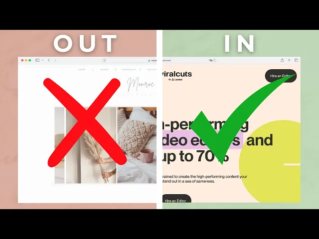
Unclear value proposition
Image Source: HubSpot Blog
An unclear value proposition is one of the quickest ways a SaaS site loses visitors. You’ve got about 8 seconds to convince someone they’re in the right place, and vague messaging kills conversions.
We’ve seen it across dozens of SaaS audits: companies with clear, specific value props consistently outperform those relying on jargon or feature lists.
Even a 1% improvement in pricing strategy, which ties directly to your value prop, can boost profits by 11%. If a visitor can’t repeat what your product does after one read, you’ve already lost them.
The fix is clarity and proof. Replace buzzwords with specifics, frame features as benefits, and back claims with data or testimonials.
Strong SaaS value props always map to one of three things: increasing revenue, reducing costs, or improving productivity.
Pick your lane, make it obvious, and test relentlessly until it resonates. That’s how a homepage goes from forgettable to conversion-focused.
Not prioritizing grids & columns
Image source: UX Design Institute
Not prioritizing grids and columns is one of the biggest design mistakes I see on SaaS websites. The layout is the foundation of everything else, yet too many teams just “drop content in” without a system.
The result is misaligned elements, inconsistent spacing, and a broken reading flow. Research shows users will leave within 5 seconds if they can’t find what they need, and in our audits, SaaS companies with strong grid systems consistently drive higher engagement.
A proper grid reduces cognitive load by up to 40%, which directly impacts how quickly someone moves from scanning a page to clicking a CTA.
Fixing this starts with defining your content hierarchy: what’s the single most important action on that page? The grid should guide the eye toward it naturally. For SaaS, that often means clean vertical space for features and consistent white space to separate sections.
On the implementation side, sticking to a 12-column grid for desktop, 8 for tablet, and 4 for mobile keeps layouts responsive without clutter.
The goal isn’t making everything look rigid, it’s creating a structure that makes decision-making effortless, which almost always translates into more conversions.
Neglecting Mobile Responsiveness
Mobile devices now drive over 60% of all internet traffic. Yet most SaaS companies still design like it's 2015, treating mobile-responsive design as an afterthought rather than the primary experience.
This approach kills conversions before they even have a chance to start.
The result is a frustrating user experience, often featuring unreadable text, buttons that are too small to tap, and horizontal scrolling just to view basic content.
In an era where mobile devices account for the majority of web traffic, a non-responsive site is a direct path to high bounce rates and lost conversions.
Start with a mobile-first design approach instead of shrinking your desktop version. Design for thumbs, not mouse cursors - make navigation simple with clean, collapsible menus.
Optimize forms by cutting unnecessary fields and using mobile-friendly input types. Most importantly, prioritize speed by compressing images and cleaning up code to ensure fast loading.
By focusing on these foundational elements, you ensure a seamless experience for every user, regardless of their device.
Poor, Cluttered User Experience
Here's something we see constantly: SaaS companies cramming everything possible onto their homepage, thinking more information equals better conversions. It's the complete opposite.
Cluttered interfaces represent one of the most dangerous website design mistakes destroying SaaS growth. It not only cranks up the user's cognitive load with tons of 'unwanted' information, CTAs or sections but also makes them lose attention towards the 'important' parts of your website.
In a way, every element on a cluttered page fights for eyeball time.
To solve this, start with progressive disclosure. Show users only what they need to take the next step, then reveal more details as they move through your funnel. This keeps interfaces clean while still providing access to deeper information.
Focus your homepage on one primary goal. Look at how Workleap handles this - clean white background, centered messaging, single clear CTA. No competing elements. No distractions. Just a clear path forward.
Most importantly, create proper visual hierarchy that guides users exactly where you want them to go.
Whether that's your pricing page, feature overview, or demo request - design the journey, don't leave it to chance.
5. Lack of Trust Signals
Image source: DashClicks
Here's the thing about SaaS buyers: they're naturally skeptical. And why shouldn't they be? They're about to hand over sensitive business data to a company they found through Google. 43% of B2B buyers make defensive purchase decisions more than 70% of the time.
This means they're actively looking for reasons NOT to trust you. In that sense, a lack of trust signals like social proof, security signals or focused, highly-relevant microcopy can be a conversion killer.
Smart SaaS companies showcase recognizable client logos prominently, especially household names that prospects already trust. Testimonials become significantly more powerful when they include real names, job titles, and actual photos instead of generic quotes.
For security-conscious buyers, place compliance badges and security indicators exactly where users are making trust decisions — checkout flows, signup pages, and anywhere they're sharing information. Clear pricing without hidden fees and easily accessible privacy policies further help in removing friction from the decision-making process.
At the end, the goal isn't to simply add trust signals everywhere, but placing them at the right moment throughout your user journey.
Confusing Pricing Pages
Image source: Eleken
Your pricing page is where interested visitors make their final decision. It's the second most visited
page on your SaaS site, yet most companies treat it like an afterthought.
Here's what happens when you get pricing wrong: potential customers hit your pricing page, get confused by too many options or unclear value, and leave to check out your competitors instead.
Start with the "good, better, best" structure — three pricing tiers consistently outperform more complex options. Companies using three-tier pricing see 40% higher conversion rates than those offering 5 or more tiers.
Next, implement comparison tables with sticky headers so visitors can easily compare features while scrolling. This removes friction from the decision process by letting prospects quickly see what's included in each plan.
You can build further trust through transparent pricing — no hidden fees, clear value communication, alongside social proof using testimonials or customer logos under each plan.
7. Weak CTAs
Image source: Abishua Blessmic
Your CTAs serve as the bridge between interest and action. They guide visitors toward the specific next step in your funnel, whether that's starting a trial, booking a demo, or diving deeper into your product.
The impact of getting this right is massive. Companies focusing on a single call-to-action see clicks increase by up to 371% and sales jump by up to 1617%.
Yet, we see companies making mistakes like:
Using generic buttons such as "Submit", "Sign Up" - which tell the user nothing about the value they'd be getting.
Using passive language (think: Using "Form can be submitted" instead of "Submit form") which removes all urgency
Putting vague messaging (such as having a 'Click Here' text without explaining what's next.)
You can start by positioning your CTAs above the fold where users see them immediately. For content-heavy pages, peak engagement happens after paragraph 3, making this prime real estate for your CTA.
Use contrasting colors that pop against your background; buttons should be the opposite color of your page for maximum visibility. Keep the copy short and action-focused, ideally 2-5 words.
Disregarding SEO Best Practices
Image source: Zadro Web
One of the most invisible yet costly web design mistakes is building a beautiful website while completely ignoring fundamental Search Engine Optimization (SEO) principles.
This happens when the design and development process focuses solely on aesthetics and functionality without considering how search engines will crawl, understand, and rank the site.
The result is a website that is virtually hidden from its target audience, leading to minimal organic traffic and missed opportunities.
This oversight makes it nearly impossible for potential customers to find you through search engines like Google.
To avoid getting lost in the digital noise, you must bake SEO best practices into the web design process from the very beginning. This usually means:
Writing unique meta titles & descriptions that actually capture the intent & attention of your ideal user.
Using proper heading hierarchy, structuring the content with a logical placement of headings like h1, h2 and h3 among others. Use one h1 per page for the main topic & subsequent headings to organize subtopics & adding keywords and questions contextually.
Optimizing images with descriptive, yet concise alt text for every image added.
Structuring your URLs to be simple & including relevant keywords.
By integrating these foundational SEO elements, you make it easier for search engines to index your content and for users to find you.
Not Considering a Security-First Approach
Image Source: Abricto Security
Security breaches aren't just IT problems — they're conversion killers that destroy user trust before prospects even reach your pricing page. With 90% of organizations now using cloud services, security vulnerabilities have multiplied exponentially.
SaaS applications have become prime targets because they store massive amounts of sensitive customer data daily. When prospects research your platform, security concerns often determine whether they move forward or choose a competitor. This makes security a design priority, not just an IT checkbox.
To solve this, you must bake security into every stage of your design & development process, not as an afterthought.
Use MFA, zero-trust principles, and continuous monitoring supported by regular testing. Strong security design builds trust, drives conversions, and protects the business long-term.
Inconsistent Design Across Pages
Your website design consistency directly impacts whether users trust your product enough to convert.
When visitors navigate from your homepage to your pricing page and encounter completely different button styles, fonts, or layouts, they question your attention to detail — and by extension, your product quality.
To solve this, start by building a design system, which offers a centralized collection of reusable design components with predefined rules.
This system should cover visual elements (colors, typography, spacing), interaction patterns (how buttons behave, form styles), and code standards for developers.
You must also implement regular design audits and quarterly reviews to catch inconsistencies before they multiply across your site.
Using Outdated Design Trends
Here's the brutal truth about first impressions: 94% are design-related. Users form these judgments in milliseconds, and outdated visuals create instant doubt about your platform's capabilities.
We've seen this pattern repeatedly - SaaS companies with dated designs face three major consequences:
Higher bounce rates as users question product relevance
Decreased trust in platform security and capabilities
Reduced conversion rates compared to competitors with current designs
The market moves fast. When your design feels old, prospects assume your technology is equally behind.
Certain design choices immediately date your website. Skeuomorphic design - those fake leather textures and realistic shadows - now feels ancient compared to clean, minimal interfaces. Generic stock photos have also become conversion killers as users instantly spot inauthentic imagery.
But the biggest red flag? Non-responsive layouts that break on mobile devices. This isn't just outdated - it's business suicide when most prospects browse on their phones.
Other warning signs include overly light aesthetics that worked 5 years ago, cramped layouts without breathing room, and those ultra-short website sections that artificially limit scrolling.
To solve this, you must focus on user-centered design principles that won't feel outdated in the immediate future. Clean interfaces, thoughtful spacing, and intuitive navigation never go out of style.
You can also add some subtle, dynamic elements that bring your interface to life without overwhelming visitors. Prioritize functionality and accessibility, then selectively incorporate modern touches that actually improve the experience.
Ignoring Accessibility
Image Source: AudioEye
Here's a stat that might surprise you: Around 88% of all websites on the Internet today have accessibility issues, with an average accessibility score of 60/100. That's a massive blind spot for any SaaS business.
To solve this, you can start by using testing tools like Ax, WAVE, and Siteimprove to catch the obvious issues. Once that's done, you can test it with actual screen readers - JAWS, VoiceOver, and NVDA - to see how your site really performs.
The most effective approach? Involve people with disabilities in your testing process from day one. This gives you real insights that no automated tool can provide.
Focus on these high-impact changes: maintain sufficient color contrast, ensure keyboard navigation works everywhere, and add captions to all video content.
Not Testing or Taking CRO Seriously
Here's something that surprised us after working with dozens of SaaS companies: most invest thousands in beautiful designs but spend zero dollars testing what actually converts.
They'll hire expensive agencies to create stunning websites. They'll obsess over color schemes and typography. But ask them about their conversion rate optimization process? Blank stares.
This backwards approach costs companies millions in lost revenue.
Getting serious about CRO starts with getting leadership buy-in - company culture flows from the top down. Present the competitive advantages and potential revenue improvements to strengthen your case.
The most successful SaaS companies treat experimentation like an investment portfolio, not a predictable machine. This means accepting that some tests will fail - but those failures teach you what doesn't work, saving money and time in the long run.
Companies that will make testing a habit rather than an afterthought are expected to see the biggest improvements in both conversions and revenue.
How to Rev Up the Foundations?- Key Principles to Follow
All in all, to transform your digital presence, companies must focus on embracing these foundational pillars:
User-centricity above all: Every design choice, from typography to navigation structure, must prioritize the user's ease and understanding. A seamless experience is a profitable one.
Performance is a feature: Speed is not a luxury; it's a fundamental requirement. A fast-loading, responsive site respects your user's time and is rewarded by search engines and visitors alike.
Clarity drives action: Your messaging, calls-to-action, and brand identity must be crystal clear and consistent. Ambiguity creates hesitation, while clarity inspires confidence and conversion.
Conclusion
These 13 design mistakes represent the difference between SaaS websites that struggle to convert and those that become growth engines.
The cool part is: You don't need to tackle everything at once. Start with the biggest pain points for your specific audience, test your changes, and iterate based on real data.
Now, if you're a SaaS business looking to address any or each of these 13 problems on your website, Bricx's battle-tested website design process could help.
To know more about how we can fix these conversion killers & build a high-converting SaaS website for your business, book a call now!
FAQs
How does website design impact SaaS conversions?
Website design significantly affects SaaS conversions by influencing user experience, trust, and decision-making.
A well-designed site can improve engagement, reduce bounce rates, and increase conversion rates by up to 30-40%.
What are some key elements of an effective SaaS pricing page?
An effective SaaS pricing page should have clear, transparent pricing tiers (ideally three), feature comparison tables, social proof, and prominent calls-to-action.
It should also address common questions and highlight the value proposition of each plan.
How can SaaS companies build trust through web design?
SaaS companies can build trust through web design by incorporating elements like customer testimonials, security badges, transparent pricing, clear privacy policies, and showcasing team information.
Professional design and easy navigation also contribute to establishing credibility.


Similar Blogs
Similar Blogs
Similar Blogs


Available for Work
Bricx
© Bricx, 2026. All rights reserved.


Available for Work
Bricx
© Bricx, 2026. All rights reserved.
Available for Work
Bricx
© Bricx, 2026. All rights reserved.
Available for Work
Bricx
© Bricx, 2026. All rights reserved.