Website Design
Website Design
Website Design
Insights
Insights
Insights
October 21, 2025
October 21, 2025
October 21, 2025
11 Minimalist Website Design Examples for Better Conversions
11 Minimalist Website Design Examples for Better Conversions
11 Minimalist Website Design Examples for Better Conversions
Explore minimalist website design examples showcasing how simplicity, elegance and UX precision help you drive more engagement, clicks and conversions.
Explore minimalist website design examples showcasing how simplicity, elegance and UX precision help you drive more engagement, clicks and conversions.
Explore minimalist website design examples showcasing how simplicity, elegance and UX precision help you drive more engagement, clicks and conversions.
4 minutes
4 minutes
4 minutes


Minimalist website design examples are now dominating the digital world. Minimalism continues to build momentum as designers look for ways to create striking web layouts that involve visitors.
These clean, uncluttered designs serve as conversion powerhouses while remaining visually appealing. The typical minimalist website combines ample white space with bold typography and a focused color palette of 2-3 colors that showcases your product or service effectively.
We have carefully selected 11 remarkable minimalist website examples that deliver real results and look stunning.
These examples will demonstrate how a "less is more" approach can boost your conversion rates, whether you plan to redesign your existing site or build one from scratch.
So let's get started.
What Defines a Minimalist Website Design?
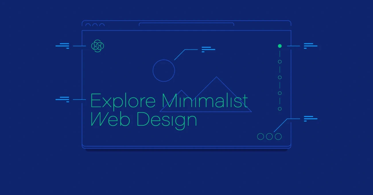
Image source: Toptal
Minimalist website design goes beyond esthetic simplicity — it's a strategic approach that strips away unnecessary elements to highlight what matters most.
The core principle aims to create simpler interfaces by removing elements that don't help users complete their tasks.
Minimalist website design has several distinct features that blend together to create a meaningful user experience:
Flat patterns and textures are everywhere in minimalist websites, showing up in 96% of these interfaces. This style stays away from shadows, gradients, and 3D effects that could take attention from the main message. Clean, distraction-free surfaces come from purely digital representations.
The limited color palette stands out as a key feature in 95% of minimalist sites. The numbers tell an interesting story—49% use monochromatic schemes and 46% add just one or two accent colors. These thoughtful color choices guide attention without cluttering the design.
Restricted features and elements appear in 87% of minimalist sites to ensure every component has a purpose. Antoine de Saint-Exupery captured this perfectly: "Perfection is achieved not when there is nothing more to add, but when there is nothing left to take away".
Maximized negative space shows up in 84% of minimalist sites to give content room to breathe. This empty space isn't wasted—it guides users through the interface and highlights key elements. The Japanese "ma" principle suggests that spaces between objects make them more valuable.
Dramatic typography becomes a powerful design element in 75% of minimalist sites. Bold or large text makes up for fewer graphics and creates visual hierarchy that catches the eye.
Minimalism brings real benefits: pages load faster, messages become clearer, and navigation feels more natural. A rigorous focus on essential elements creates websites that look stunning and work better.
Note that minimalism pushes designers to make thoughtful decisions about each element's purpose. The goal isn't just removing things — it's creating an experience where every detail counts.
Why Does Minimalistic Web Design Matter?
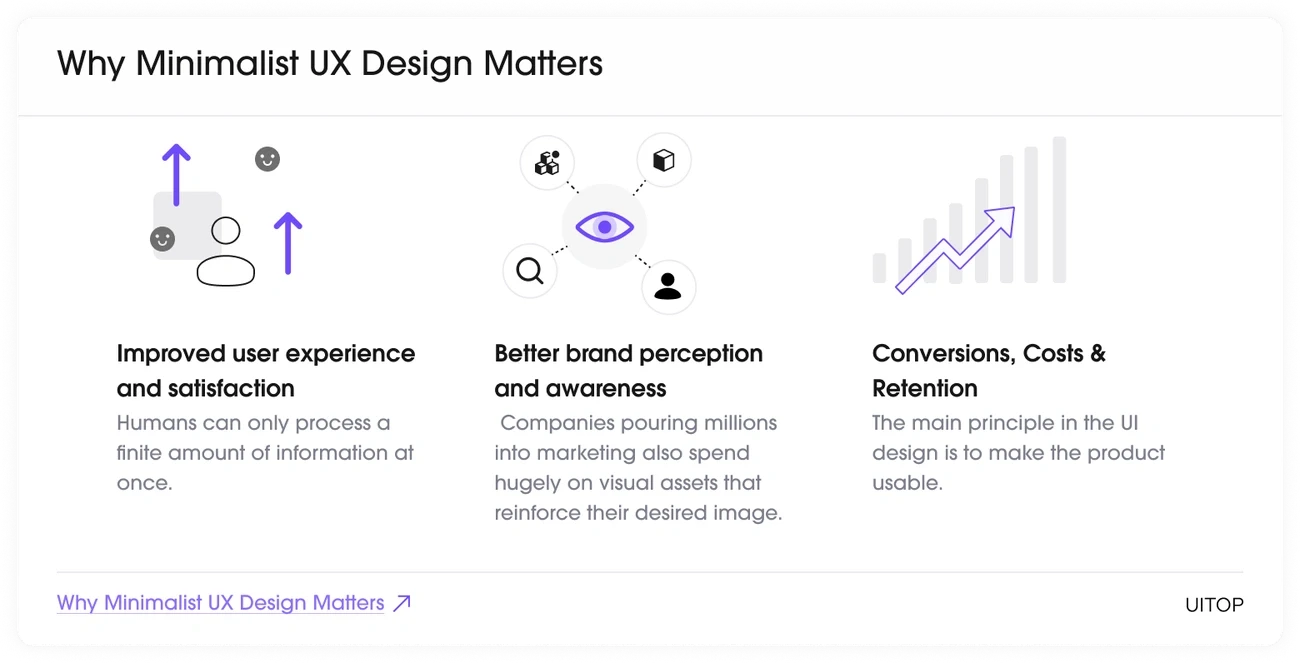
Image source: Uitop
Minimalist design does more than catch your eye — it changes how visitors interact with your website and ends up turning them into customers.
The numbers tell quite a story: websites with minimalist designs have boosted their conversion rates by up to 261% in some cases. This amazing increase happens because minimalism removes distractions that could pull users away from your core message and calls to action.
Your website's speed matters more than ever in today's impatient digital world. Here's a wake-up call: 40% of visitors will leave your website if it loads longer than three seconds. Minimalist websites fix this by nature — they have smaller file sizes and fewer server requests, which makes them load by a lot faster. Better performance keeps visitors around longer and boosts your search engine rankings.
On top of that, minimalist design gives your content room to breathe through smart use of negative space. Your message stands out clearly without visual clutter. Visitors can understand your value and make decisions faster when they're not overwhelmed by too many elements.
Simple navigation works better without distractions. Users feel less overwhelmed, which helps them find key information or complete tasks like filling forms or buying products. A local accountant's success story shows this well—his contact form submissions jumped 120% after he simplified his homepage.
Mobile users make up 59% of web traffic, and minimalist designs work great on smaller screens. Buttons stay easy to tap, text remains readable without zooming, and important details fit without endless scrolling.
Clean design makes you look more professional and capable. Science backs this up — our brains link simplicity with expertise. Small businesses with clean websites often look like larger companies, which helps them compete with bigger players.
The smooth experience from minimalist design isn't just about taking things away — it guides users toward specific actions. You create clear paths to conversion by focusing on what really matters on your website.
11 Minimalist Website Design Examples to Check Out Now
Now that we've explored the importance of minimalism in web design, let's take a look at some of the top minimalist website design examples:
Studio Yoke
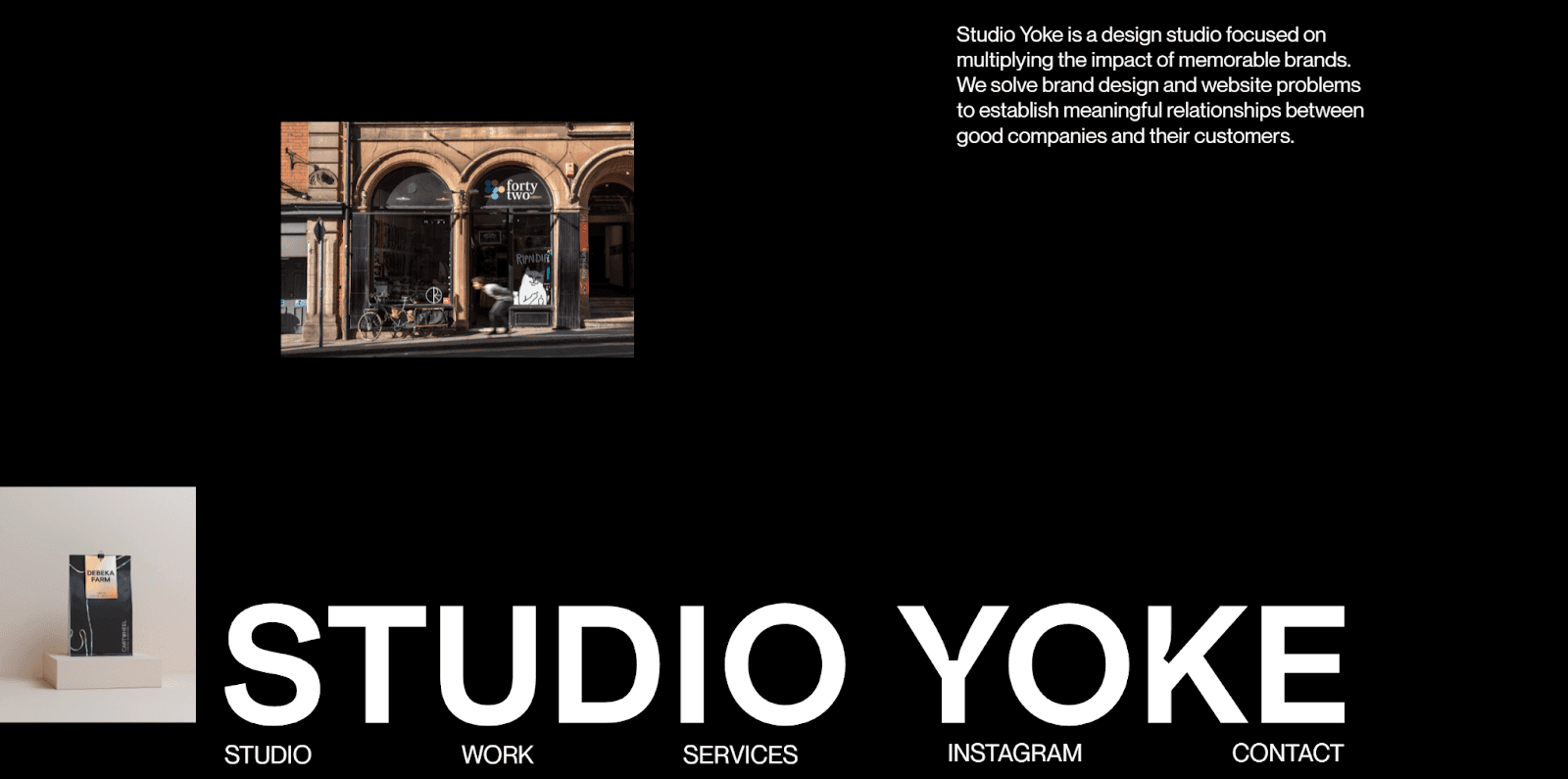
Image source: www.studioyoke.co.uk
On the Studio Yoke website, minimalism isn't just an aesthetic, but a purposeful addition. Their homepage greets you with expansive white space, bold typography, and a muted palette that cuts straight to the point. Navigation is tucked away almost entirely, which keeps the focus on the message: “Designing brands and websites for good companies.”
You’ll notice visuals slide in without clutter, and each section delivers impact with minimal text and maximum clarity. That restraint makes the studio feel confident, not flashy.
Their website proves that minimal design isn’t about removing elements — it’s about stripping back until every pixel serves the user’s attention and the brand’s voice.
What makes it impressive?
The website comes alive as you scroll through Studio Yoke's homepage. A vertical gallery slides up smoothly along the layout's left side. The navigation options respond to mouse hovers with subtle background and font color changes. These interactive elements add depth without being excessive.
The website strikes a perfect balance with these minimalist elements:
Clean, uncluttered esthetic through negative space
Bold yet simple typography that lets high-quality images stand out
Well-balanced imagery that improves the sleek visual experience
User-friendly design with subtle interactive elements
The site uses a limited color palette with strategic contrast between elements. The content arrangement puts humans first, while the carefully-crafted messages convey their vision and mission effectively.
Key takeaway
Studio Yoke shows how minimalism can blend simplicity with immersive style. Their website proves that removing extra elements makes content more engaging. The strategic use of whitespace, bold typography, and subtle interactive elements creates a digital experience that looks striking and works well.
This approach lets their portfolio and message shine while providing an engaging user experience.
Immeasurable
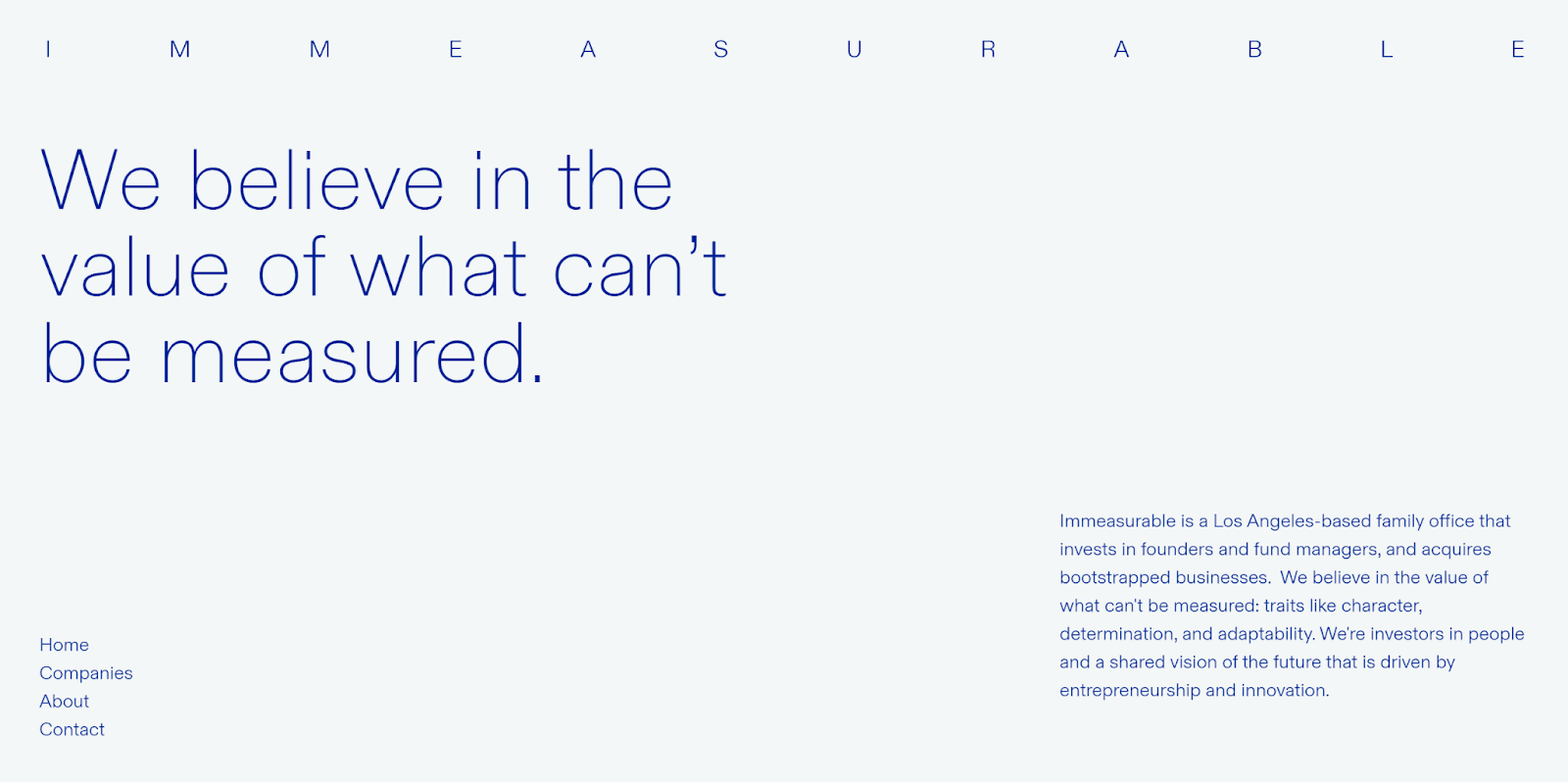
Image source: Webflow
Looking at exceptional minimalist website design examples, Immeasurable stands out with its perfect balance of simplicity and effect. Basil Gloo designed this website to show how minimalism can be both immersive and practical.
The site offers a simple yet captivating user experience with limited interactions. Users can explore just a few pages, and each one starts with a quick, impressive animation that draws visitors in.
This website's unique approach to space usage makes it special. Immeasurable uses the entire screen while keeping enough whitespace to create a true minimalist look. This balance creates a visually pleasing experience that lines up with the brand's innovative character.
A distinctive blue and orange monochromatic color palette adds character without being overwhelming. The streamlined layout conveys the core message clearly, so visitors can focus on what matters most.
What makes it impressive?
Immeasurable's most notable feature is how it uses font sizes to create visual hierarchy. The brand name appears just slightly bigger than the body text. Headlines are much larger and use a serif font with minimal details.
The site shines with these impressive elements:
Quick, sleek animations that introduce each page without slow loading
Interactive elements that add sophistication yet stay focused
Strategic use of negative space that guides viewers naturally
Smart typography choices that create clear information hierarchy
Key takeaway
Immeasurable shows that simplicity and efficiency are essential for minimalist design to work. Complex layouts and extra elements aren't needed to create lasting impressions. The site uses strategic white space, thoughtful typography, and subtle animations to build a digital space that feels open yet focused.
This balanced approach proves minimalist design can keep a brand's unique appeal while working exceptionally well.
Noomo Digital Design Agency
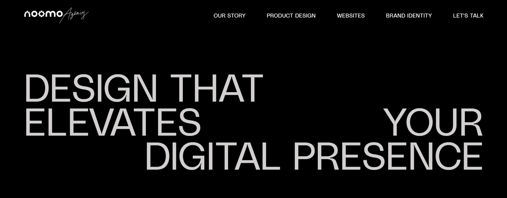
Image source: Noomo's official website
Noomo Digital Design Agency shows how minimalist design can tell stories and create interactive experiences. This boutique agency combines Los Angeles presence with Ukrainian roots to create apps and websites. Their client's work shines through clean, well-laid-out case studies.
Their website stands out with its unique upward scroll from banner to projects. This approach raised early concerns but ended up boosting engagement and making the site more memorable.
The design identity revolves around two themes: pixels that showcase digital expertise and honor Ukrainian culture, and glass that represents transparency and clear communication.
What makes it impressive?
The website uses animations effectively without overdoing them, which lets high-quality visuals shine. Their elegant layout strikes a perfect balance between simplicity and interactive elements. Each case study becomes distinctive.
The site features:
Rich 3D animations built with the latest technologies
Dynamic logo with handwritten elements from team members
Unique upward scroll for a memorable user experience
Glass elements that reinforce their brand identity
They enhance interactivity and visual appeal with Three.js and GSAP libraries. Every interaction and hover serves a purpose, creating a seamless experience.
Key takeaway
Noomo proves that minimalist design can include complex elements like 3D and animation while staying clear and focused.
The agency creates visually striking and functional digital experiences by using technology within a clear design framework. These qualities matter for any minimalist website that wants to drive conversions.
Adrienn White
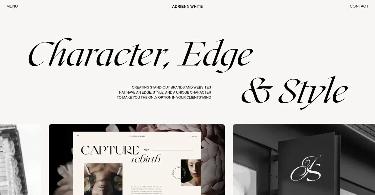
Image source: www.adriennwhite.com
Adrienn White's portfolio beautifully blends artistic flair with functional minimalism, showing how personal branding can flourish through simple design. She works as an independent brand strategist and web designer from Hungary, serving clients worldwide.
Her online presence reflects her unique design philosophy.
A creamy brown color palette draws visitors into White's website, creating an enchanting visual experience. She uses negative space to let content breathe while keeping the design interesting.
Her homepage welcomes visitors with a clear message about her services—creating "luxury brands & websites with dreamy animations for humble brands that still want to stand out".
The site flows naturally, matching her client process step by step. White reveals her expertise in strategic layers that guide potential clients through her philosophy and approach. Each page speaks to her brand values of authenticity and sophistication.
What makes it impressive?
The website shines through its extraordinary typography choices. Bold font selections create a natural flow that guides visitors through the content. Her design combines rich typography with stunning images while preserving negative space—a delicate balance that few designers master.
The subtle interactive elements make this site special. Gentle animations and scroll effects draw visitors in without overwhelming them. These thoughtful movements add life to the pages and create delightful moments without slowing down the site or clouding its message.
Text and whitespace combine together to create remarkable depth, making the design both captivating and minimalist. She challenges minimalist boundaries while staying true to core principles.
Key takeaway
White's website shows how minimalism can showcase personality without losing clarity. Typography takes center stage alongside strategic animations to create a distinctive brand presence that stays functionally minimalist.
This approach works well for service-based businesses where building expertise and trust drives conversions.
Quin
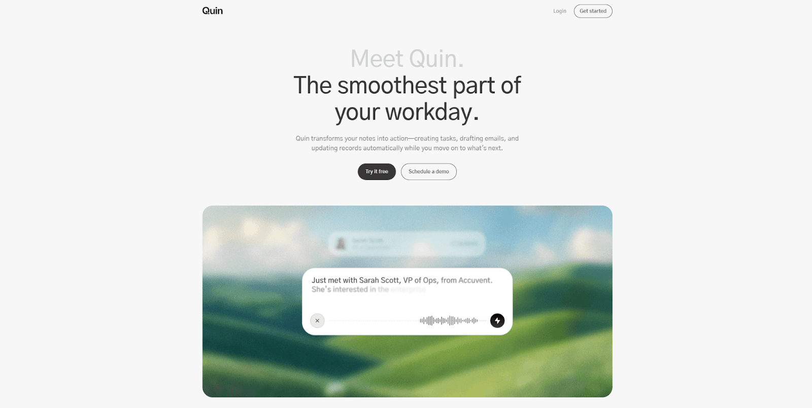
The Quin website strips away complexity with a clean layout that mirrors the tool's core purpose—to simplify complex tasks. The website cuts through the noise and gives visitors a straightforward experience, just like the product itself. These design choices don't just look good. They show the product's value right from the start.
The site's color strategy catches your eye with natural, contrasting tones that create visual harmony and highlight key elements like use cases and calls to action.
What makes it impressive?
The website shines through its seamless use of color. The chosen palette does more than look good — it draws visitors' attention to crucial content areas naturally.
The site weaves in landscape imagery that complements the minimalist style and strengthens the color scheme. This adds visual interest without cluttering the space, which keeps the clean look while adding depth and meaning.
Every design element serves a clear purpose. The choices support both looks and usability. Unlike many minimalist designs that feel cold, Quin's approach strikes a chord with visitors through its thoughtful execution.
Key takeaway
Quin shows how a minimalist website can mirror a product's core value—simplicity and efficiency. The design philosophy lines up perfectly with product functionality, which helps visitors understand it instantly. This harmony between form and function builds trust and clarity that drives conversions naturally.
Caleb Raney
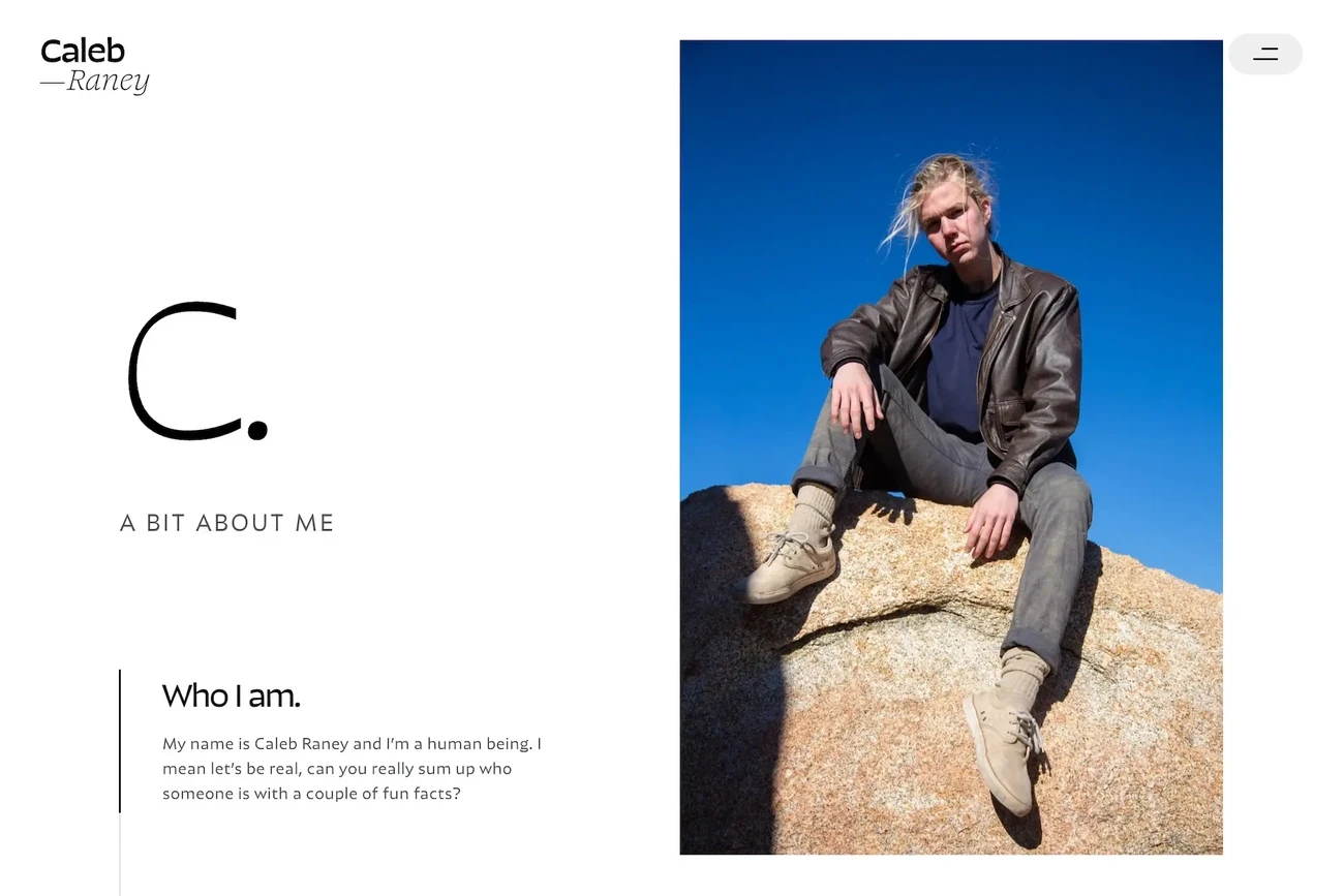
Image source: Caleb Raney
Caleb Raney, a freelance designer, brings his unique take on minimalism to life through a portfolio that strikes the perfect balance between form and function. His digital presence from the San Francisco Bay area shows how smart design choices can raise brand experiences.
The portfolio specializes in identity and website design that creates engaging and interactive digital experiences with Webflow. Black-and-white layouts with elegant typography and bold animations grab visitors' attention right away. A minimalist esthetic acts as a canvas that emphasizes his design skills without overwhelming the audience.
Typography and visual rhythm shape every project in Raney's portfolio. His case studies flow naturally with well-structured landing pages and smooth animated transitions.
What makes it impressive?
The standout feature of Raney's work lies in how each case study adopts its featured product's color palette. Every project page becomes its own visual journey while the site stays cohesive overall.
His skillful balance shows through:
Bold sans serif typography that boosts readability
Modern esthetic with striking visual contrast
Large headings that work well with smaller text
Clean structure that pulls attention naturally
Key takeaway
Raney's portfolio proves that minimalism can keep personality and visual punch. His thoughtful design choices show how minimalist principles build websites that look distinctive and work efficiently — exactly what conversion-focused designs need.
Bricx Labs

Image source: bricxlabs.com
Bricx Labs' website shows how a design studio puts its principles into practice through expert minimalism. Our agency creates interfaces that combine beauty with function — a philosophy that's implemented in our own site.
The website's interface makes every pixel count. Our homepage uses smart typography combinations and strategic white space to create clear visual hierarchy.
The content flows naturally through well-laid-out sections that lead visitors smoothly from one area to the next.
What makes it impressive?
The Bricx website excels with our disciplined take on animation. While many sites bombard users with excessive movement, we add subtle transitions that boost the content instead of distracting from it.
The portfolio section strikes a perfect balance between visual appeal and information — showing projects in a way that doesn't overwhelm.
The site's consistent design language across all pages stands out. This unity creates a smooth experience where navigation becomes second nature through predictable element placement and behavior.
Key takeaways
Bricx shows how a minimalist website can showcase complex services without the clutter. Their work proves that holding back often makes a bigger impact than fancy designs.
The careful use of spacing, typography, and controlled animations demonstrates how minimalism helps achieve conversion goals.
Avec Clyde
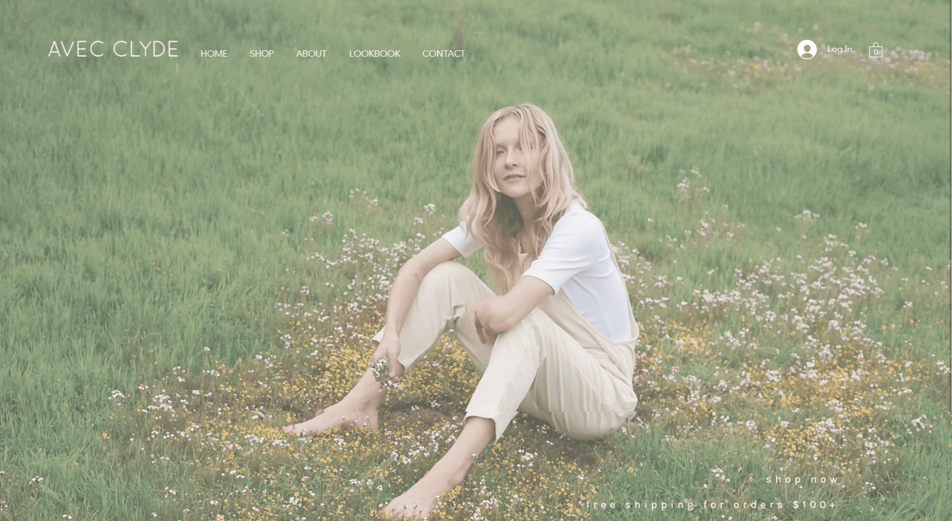
Image source: Avec Clyde's website
Avec Clyde, a sustainable fashion brand, shows how minimalism can improve both looks and usability of e-commerce websites. Their online store demonstrates minimalist principles at work in retail.
Avec Clyde's website puts sustainable fashion front and center. The brand's environmental values shine through its minimalist design approach. Simple colors blend with elegant Futura fonts and natural photography that create a charming atmosphere.
The site merges detailed e-commerce features that let customers explore modern, cozy styles made from eco-friendly materials.
What makes it impressive?
The minimalist design does more than look good - it serves the environment by using less server energy and reducing power consumption while browsing.
Customers can easily filter products, manage their cart, and check out securely without feeling overwhelmed.
The accessible interface shows promotions (15% off first purchases and free shipping on orders over $100) while keeping the focus on products.
Key takeaway
Avec Clyde proves that minimalism in e-commerce goes beyond esthetics. Their website works exceptionally well because it carefully balances simple design with essential shopping features.
This creates an environmentally responsible digital experience that matches their brand's values perfectly.
Max Montgomery
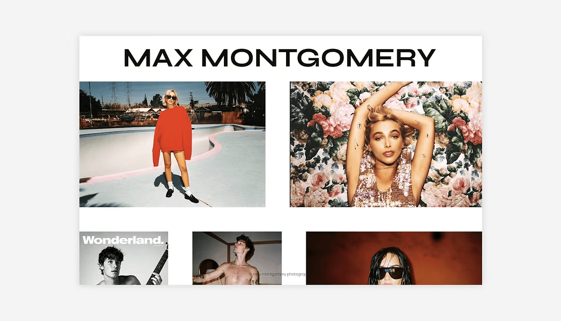
Photographer Max Montgomery defies traditional design rules with a portfolio website that reveals his artistic vision through thoughtful minimalism.
His fresh take does away with standard headers and footers to create an immersive space where his photography takes center stage.
Built on Wix, Montgomery's portfolio grabs attention right away. His brand name stands bold and prominent—a constant reminder of his identity. The site uses a grid layout with a smart twist. Extra space between thumbnails breathes life into the design and gives each piece room to shine.
This full-page showcase with simple grid galleries uses thumbnail effects that make every photograph pop.
What makes it impressive?
The site's lightbox gallery feature steals the show. Viewers can dive deep into each work without jumping to new pages, which creates an intimate viewing experience. Montgomery's portfolio shines through its:
Bold, clean esthetic that takes viewers on a mesmerizing visual experience with unique layout choices
Minimalist design with plenty of white space that makes elements stand out
Simple structure that helps visitors find what they need quickly
Key takeaway
Montgomery's portfolio shows how a clean design without extra navigation can pull viewers in. His work proves that smart spacing between elements matters just as much as the content—a valuable lesson that conversion-focused minimalist websites can learn from.
ET Studio

Image source: ET Studio
ET Studio's award-winning website elevates minimalism through its unique design approach. This creative studio utilizes beauty and meaning to create integrated experiences through design, branding, copywriting, and education. Their digital presence reflects these principles exceptionally well.
ET Studio fascinates visitors with a monochrome color palette that uses just two colors. Large letters dominate the landing page against a clean white background alongside simple page links.
The site features a distinctive horizontal scrolling mechanism that sets it apart from standard vertical layouts while preserving visual simplicity.
What makes it impressive?
The site's excellence shines through several minimalist techniques:
Strategic pairing of bold typography with compact paragraphs creates visual harmony
Large-scale elements and headings provide clear content organization
Thoughtful use of white space guides visitors through content naturally
Horizontal scrolling turns navigation into an engaging journey
These elements blend seamlessly to create what judges called "immersive and unique" while keeping a clean esthetic.
Key takeaway
ET Studio shows how minimalism reaches beyond visual elements to reshape fundamental interaction patterns. Their challenge to traditional scrolling direction proves that minimalist websites can deliver fresh, memorable experiences without compromising clarity.
Their work demonstrates that meaningful minimalist designs often emerge from reconsidering simple principles rather than just removing elements.
Function Health
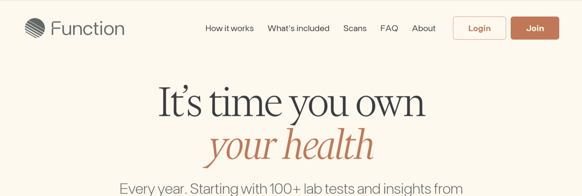
Image source: Function Health's official website
Function Health's service shows how simple design can change complex medical data into available information. Their website strikes a perfect balance between detailed health tracking and a clean interface that helps users understand their health better.
The platform uses timelines and graphs with soft, neutral colors to show health trends quickly. Simple typography and smart spacing create visual harmony.
The thoughtful layout makes complex biomarker data easy to understand. This design approach matches their service perfectly - giving members informed results from over 100 lab tests that track heart health, thyroid function and more.
What makes it impressive?
The site stands out by using contrast in fonts and colors to guide visitors toward important actions. This smart design increases conversions by creating clear visual paths. Their dashboard shows detailed health data in a user-friendly way.
The information sits in organized sections with test results, biomarker tracking, and doctor summaries.
Key takeaway
Function Health shows how simple design can present complex information effectively. Clean layouts for data visualization help users understand complicated health metrics easily. This example proves that data-heavy websites work better with minimalist design - removing visual clutter lets important information stand out.
Best Practices for Minimalistic Website Design
Now that we've taken a look at some interesting minimalistic website designs, let's understand how you can implement minimalism in your web design as well.
Given below are some key best practices:
Creating effective minimalism requires more than just removing elements — you need intentional design decisions. Your first step should be to prioritize your content hierarchy based on what your users truly need.
Grid-based layouts create visual balance that organizes content and maintains clean structure. Your design looks orderly without feeling cluttered or chaotic.
Negative space serves more than esthetic purposes—it guides users through your interface and highlights key content. This breathing room creates a confident, relaxing atmosphere that keeps visitors focused on what matters.
The color palette should stick to 2-3 hues. Research shows that 49% of minimalist sites use monochromatic schemes, while 46% add only one or two accent colors. These carefully picked colors need to create enough contrast to help users with poor vision.
Here are some typography guidelines to follow:
Make typography dramatic to balance fewer graphic elements
Break text into blocks to improve readability
Pick fonts that stay legible on all devices
Navigation should be simple yet keep essential elements visible. A favorite saying among minimalist designers goes "subtract it till it breaks"—only remove elements that won't cause serious issues when absent.
The minimalist principle stands true: do more with less.
Conclusion
These minimalist website examples show how simplicity can improve user experience and increase conversions. Minimalism's strength comes from carefully selecting elements rather than removing them randomly. Users get faster loading times, clearer messages, and better navigation when these principles are applied.
A successful minimalist approach needs to balance several elements. Smart use of white space, careful color choices, bold typography, and purposeful images work together. Each element should enhance both appearance and usability. The website will look striking and naturally guide users to conversion points.
Want to make your website more minimalist? Look at each element with a critical eye. Remove anything that doesn't support your core message or help users achieve their goals.
Or if you're too busy building other parts of your business, and need expert guidance — book a call with Bricx & we'll help you figure out the best case scenario for implementing minimalism in your website design.
Minimalist website design examples are now dominating the digital world. Minimalism continues to build momentum as designers look for ways to create striking web layouts that involve visitors.
These clean, uncluttered designs serve as conversion powerhouses while remaining visually appealing. The typical minimalist website combines ample white space with bold typography and a focused color palette of 2-3 colors that showcases your product or service effectively.
We have carefully selected 11 remarkable minimalist website examples that deliver real results and look stunning.
These examples will demonstrate how a "less is more" approach can boost your conversion rates, whether you plan to redesign your existing site or build one from scratch.
So let's get started.
What Defines a Minimalist Website Design?
Image source: Toptal
Minimalist website design goes beyond esthetic simplicity — it's a strategic approach that strips away unnecessary elements to highlight what matters most.
The core principle aims to create simpler interfaces by removing elements that don't help users complete their tasks.
Minimalist website design has several distinct features that blend together to create a meaningful user experience:
Flat patterns and textures are everywhere in minimalist websites, showing up in 96% of these interfaces. This style stays away from shadows, gradients, and 3D effects that could take attention from the main message. Clean, distraction-free surfaces come from purely digital representations.
The limited color palette stands out as a key feature in 95% of minimalist sites. The numbers tell an interesting story—49% use monochromatic schemes and 46% add just one or two accent colors. These thoughtful color choices guide attention without cluttering the design.
Restricted features and elements appear in 87% of minimalist sites to ensure every component has a purpose. Antoine de Saint-Exupery captured this perfectly: "Perfection is achieved not when there is nothing more to add, but when there is nothing left to take away".
Maximized negative space shows up in 84% of minimalist sites to give content room to breathe. This empty space isn't wasted—it guides users through the interface and highlights key elements. The Japanese "ma" principle suggests that spaces between objects make them more valuable.
Dramatic typography becomes a powerful design element in 75% of minimalist sites. Bold or large text makes up for fewer graphics and creates visual hierarchy that catches the eye.
Minimalism brings real benefits: pages load faster, messages become clearer, and navigation feels more natural. A rigorous focus on essential elements creates websites that look stunning and work better.
Note that minimalism pushes designers to make thoughtful decisions about each element's purpose. The goal isn't just removing things — it's creating an experience where every detail counts.
Why Does Minimalistic Web Design Matter?
Image source: Uitop
Minimalist design does more than catch your eye — it changes how visitors interact with your website and ends up turning them into customers.
The numbers tell quite a story: websites with minimalist designs have boosted their conversion rates by up to 261% in some cases. This amazing increase happens because minimalism removes distractions that could pull users away from your core message and calls to action.
Your website's speed matters more than ever in today's impatient digital world. Here's a wake-up call: 40% of visitors will leave your website if it loads longer than three seconds. Minimalist websites fix this by nature — they have smaller file sizes and fewer server requests, which makes them load by a lot faster. Better performance keeps visitors around longer and boosts your search engine rankings.
On top of that, minimalist design gives your content room to breathe through smart use of negative space. Your message stands out clearly without visual clutter. Visitors can understand your value and make decisions faster when they're not overwhelmed by too many elements.
Simple navigation works better without distractions. Users feel less overwhelmed, which helps them find key information or complete tasks like filling forms or buying products. A local accountant's success story shows this well—his contact form submissions jumped 120% after he simplified his homepage.
Mobile users make up 59% of web traffic, and minimalist designs work great on smaller screens. Buttons stay easy to tap, text remains readable without zooming, and important details fit without endless scrolling.
Clean design makes you look more professional and capable. Science backs this up — our brains link simplicity with expertise. Small businesses with clean websites often look like larger companies, which helps them compete with bigger players.
The smooth experience from minimalist design isn't just about taking things away — it guides users toward specific actions. You create clear paths to conversion by focusing on what really matters on your website.
11 Minimalist Website Design Examples to Check Out Now
Now that we've explored the importance of minimalism in web design, let's take a look at some of the top minimalist website design examples:
Studio Yoke
Image source: www.studioyoke.co.uk
On the Studio Yoke website, minimalism isn't just an aesthetic, but a purposeful addition. Their homepage greets you with expansive white space, bold typography, and a muted palette that cuts straight to the point. Navigation is tucked away almost entirely, which keeps the focus on the message: “Designing brands and websites for good companies.”
You’ll notice visuals slide in without clutter, and each section delivers impact with minimal text and maximum clarity. That restraint makes the studio feel confident, not flashy.
Their website proves that minimal design isn’t about removing elements — it’s about stripping back until every pixel serves the user’s attention and the brand’s voice.
What makes it impressive?
The website comes alive as you scroll through Studio Yoke's homepage. A vertical gallery slides up smoothly along the layout's left side. The navigation options respond to mouse hovers with subtle background and font color changes. These interactive elements add depth without being excessive.
The website strikes a perfect balance with these minimalist elements:
Clean, uncluttered esthetic through negative space
Bold yet simple typography that lets high-quality images stand out
Well-balanced imagery that improves the sleek visual experience
User-friendly design with subtle interactive elements
The site uses a limited color palette with strategic contrast between elements. The content arrangement puts humans first, while the carefully-crafted messages convey their vision and mission effectively.
Key takeaway
Studio Yoke shows how minimalism can blend simplicity with immersive style. Their website proves that removing extra elements makes content more engaging. The strategic use of whitespace, bold typography, and subtle interactive elements creates a digital experience that looks striking and works well.
This approach lets their portfolio and message shine while providing an engaging user experience.
Immeasurable
Image source: Webflow
Looking at exceptional minimalist website design examples, Immeasurable stands out with its perfect balance of simplicity and effect. Basil Gloo designed this website to show how minimalism can be both immersive and practical.
The site offers a simple yet captivating user experience with limited interactions. Users can explore just a few pages, and each one starts with a quick, impressive animation that draws visitors in.
This website's unique approach to space usage makes it special. Immeasurable uses the entire screen while keeping enough whitespace to create a true minimalist look. This balance creates a visually pleasing experience that lines up with the brand's innovative character.
A distinctive blue and orange monochromatic color palette adds character without being overwhelming. The streamlined layout conveys the core message clearly, so visitors can focus on what matters most.
What makes it impressive?
Immeasurable's most notable feature is how it uses font sizes to create visual hierarchy. The brand name appears just slightly bigger than the body text. Headlines are much larger and use a serif font with minimal details.
The site shines with these impressive elements:
Quick, sleek animations that introduce each page without slow loading
Interactive elements that add sophistication yet stay focused
Strategic use of negative space that guides viewers naturally
Smart typography choices that create clear information hierarchy
Key takeaway
Immeasurable shows that simplicity and efficiency are essential for minimalist design to work. Complex layouts and extra elements aren't needed to create lasting impressions. The site uses strategic white space, thoughtful typography, and subtle animations to build a digital space that feels open yet focused.
This balanced approach proves minimalist design can keep a brand's unique appeal while working exceptionally well.
Noomo Digital Design Agency
Image source: Noomo's official website
Noomo Digital Design Agency shows how minimalist design can tell stories and create interactive experiences. This boutique agency combines Los Angeles presence with Ukrainian roots to create apps and websites. Their client's work shines through clean, well-laid-out case studies.
Their website stands out with its unique upward scroll from banner to projects. This approach raised early concerns but ended up boosting engagement and making the site more memorable.
The design identity revolves around two themes: pixels that showcase digital expertise and honor Ukrainian culture, and glass that represents transparency and clear communication.
What makes it impressive?
The website uses animations effectively without overdoing them, which lets high-quality visuals shine. Their elegant layout strikes a perfect balance between simplicity and interactive elements. Each case study becomes distinctive.
The site features:
Rich 3D animations built with the latest technologies
Dynamic logo with handwritten elements from team members
Unique upward scroll for a memorable user experience
Glass elements that reinforce their brand identity
They enhance interactivity and visual appeal with Three.js and GSAP libraries. Every interaction and hover serves a purpose, creating a seamless experience.
Key takeaway
Noomo proves that minimalist design can include complex elements like 3D and animation while staying clear and focused.
The agency creates visually striking and functional digital experiences by using technology within a clear design framework. These qualities matter for any minimalist website that wants to drive conversions.
Adrienn White
Image source: www.adriennwhite.com
Adrienn White's portfolio beautifully blends artistic flair with functional minimalism, showing how personal branding can flourish through simple design. She works as an independent brand strategist and web designer from Hungary, serving clients worldwide.
Her online presence reflects her unique design philosophy.
A creamy brown color palette draws visitors into White's website, creating an enchanting visual experience. She uses negative space to let content breathe while keeping the design interesting.
Her homepage welcomes visitors with a clear message about her services—creating "luxury brands & websites with dreamy animations for humble brands that still want to stand out".
The site flows naturally, matching her client process step by step. White reveals her expertise in strategic layers that guide potential clients through her philosophy and approach. Each page speaks to her brand values of authenticity and sophistication.
What makes it impressive?
The website shines through its extraordinary typography choices. Bold font selections create a natural flow that guides visitors through the content. Her design combines rich typography with stunning images while preserving negative space—a delicate balance that few designers master.
The subtle interactive elements make this site special. Gentle animations and scroll effects draw visitors in without overwhelming them. These thoughtful movements add life to the pages and create delightful moments without slowing down the site or clouding its message.
Text and whitespace combine together to create remarkable depth, making the design both captivating and minimalist. She challenges minimalist boundaries while staying true to core principles.
Key takeaway
White's website shows how minimalism can showcase personality without losing clarity. Typography takes center stage alongside strategic animations to create a distinctive brand presence that stays functionally minimalist.
This approach works well for service-based businesses where building expertise and trust drives conversions.
Quin
The Quin website strips away complexity with a clean layout that mirrors the tool's core purpose—to simplify complex tasks. The website cuts through the noise and gives visitors a straightforward experience, just like the product itself. These design choices don't just look good. They show the product's value right from the start.
The site's color strategy catches your eye with natural, contrasting tones that create visual harmony and highlight key elements like use cases and calls to action.
What makes it impressive?
The website shines through its seamless use of color. The chosen palette does more than look good — it draws visitors' attention to crucial content areas naturally.
The site weaves in landscape imagery that complements the minimalist style and strengthens the color scheme. This adds visual interest without cluttering the space, which keeps the clean look while adding depth and meaning.
Every design element serves a clear purpose. The choices support both looks and usability. Unlike many minimalist designs that feel cold, Quin's approach strikes a chord with visitors through its thoughtful execution.
Key takeaway
Quin shows how a minimalist website can mirror a product's core value—simplicity and efficiency. The design philosophy lines up perfectly with product functionality, which helps visitors understand it instantly. This harmony between form and function builds trust and clarity that drives conversions naturally.
Caleb Raney
Image source: Caleb Raney
Caleb Raney, a freelance designer, brings his unique take on minimalism to life through a portfolio that strikes the perfect balance between form and function. His digital presence from the San Francisco Bay area shows how smart design choices can raise brand experiences.
The portfolio specializes in identity and website design that creates engaging and interactive digital experiences with Webflow. Black-and-white layouts with elegant typography and bold animations grab visitors' attention right away. A minimalist esthetic acts as a canvas that emphasizes his design skills without overwhelming the audience.
Typography and visual rhythm shape every project in Raney's portfolio. His case studies flow naturally with well-structured landing pages and smooth animated transitions.
What makes it impressive?
The standout feature of Raney's work lies in how each case study adopts its featured product's color palette. Every project page becomes its own visual journey while the site stays cohesive overall.
His skillful balance shows through:
Bold sans serif typography that boosts readability
Modern esthetic with striking visual contrast
Large headings that work well with smaller text
Clean structure that pulls attention naturally
Key takeaway
Raney's portfolio proves that minimalism can keep personality and visual punch. His thoughtful design choices show how minimalist principles build websites that look distinctive and work efficiently — exactly what conversion-focused designs need.
Bricx Labs
Image source: bricxlabs.com
Bricx Labs' website shows how a design studio puts its principles into practice through expert minimalism. Our agency creates interfaces that combine beauty with function — a philosophy that's implemented in our own site.
The website's interface makes every pixel count. Our homepage uses smart typography combinations and strategic white space to create clear visual hierarchy.
The content flows naturally through well-laid-out sections that lead visitors smoothly from one area to the next.
What makes it impressive?
The Bricx website excels with our disciplined take on animation. While many sites bombard users with excessive movement, we add subtle transitions that boost the content instead of distracting from it.
The portfolio section strikes a perfect balance between visual appeal and information — showing projects in a way that doesn't overwhelm.
The site's consistent design language across all pages stands out. This unity creates a smooth experience where navigation becomes second nature through predictable element placement and behavior.
Key takeaways
Bricx shows how a minimalist website can showcase complex services without the clutter. Their work proves that holding back often makes a bigger impact than fancy designs.
The careful use of spacing, typography, and controlled animations demonstrates how minimalism helps achieve conversion goals.
Avec Clyde
Image source: Avec Clyde's website
Avec Clyde, a sustainable fashion brand, shows how minimalism can improve both looks and usability of e-commerce websites. Their online store demonstrates minimalist principles at work in retail.
Avec Clyde's website puts sustainable fashion front and center. The brand's environmental values shine through its minimalist design approach. Simple colors blend with elegant Futura fonts and natural photography that create a charming atmosphere.
The site merges detailed e-commerce features that let customers explore modern, cozy styles made from eco-friendly materials.
What makes it impressive?
The minimalist design does more than look good - it serves the environment by using less server energy and reducing power consumption while browsing.
Customers can easily filter products, manage their cart, and check out securely without feeling overwhelmed.
The accessible interface shows promotions (15% off first purchases and free shipping on orders over $100) while keeping the focus on products.
Key takeaway
Avec Clyde proves that minimalism in e-commerce goes beyond esthetics. Their website works exceptionally well because it carefully balances simple design with essential shopping features.
This creates an environmentally responsible digital experience that matches their brand's values perfectly.
Max Montgomery
Photographer Max Montgomery defies traditional design rules with a portfolio website that reveals his artistic vision through thoughtful minimalism.
His fresh take does away with standard headers and footers to create an immersive space where his photography takes center stage.
Built on Wix, Montgomery's portfolio grabs attention right away. His brand name stands bold and prominent—a constant reminder of his identity. The site uses a grid layout with a smart twist. Extra space between thumbnails breathes life into the design and gives each piece room to shine.
This full-page showcase with simple grid galleries uses thumbnail effects that make every photograph pop.
What makes it impressive?
The site's lightbox gallery feature steals the show. Viewers can dive deep into each work without jumping to new pages, which creates an intimate viewing experience. Montgomery's portfolio shines through its:
Bold, clean esthetic that takes viewers on a mesmerizing visual experience with unique layout choices
Minimalist design with plenty of white space that makes elements stand out
Simple structure that helps visitors find what they need quickly
Key takeaway
Montgomery's portfolio shows how a clean design without extra navigation can pull viewers in. His work proves that smart spacing between elements matters just as much as the content—a valuable lesson that conversion-focused minimalist websites can learn from.
ET Studio
Image source: ET Studio
ET Studio's award-winning website elevates minimalism through its unique design approach. This creative studio utilizes beauty and meaning to create integrated experiences through design, branding, copywriting, and education. Their digital presence reflects these principles exceptionally well.
ET Studio fascinates visitors with a monochrome color palette that uses just two colors. Large letters dominate the landing page against a clean white background alongside simple page links.
The site features a distinctive horizontal scrolling mechanism that sets it apart from standard vertical layouts while preserving visual simplicity.
What makes it impressive?
The site's excellence shines through several minimalist techniques:
Strategic pairing of bold typography with compact paragraphs creates visual harmony
Large-scale elements and headings provide clear content organization
Thoughtful use of white space guides visitors through content naturally
Horizontal scrolling turns navigation into an engaging journey
These elements blend seamlessly to create what judges called "immersive and unique" while keeping a clean esthetic.
Key takeaway
ET Studio shows how minimalism reaches beyond visual elements to reshape fundamental interaction patterns. Their challenge to traditional scrolling direction proves that minimalist websites can deliver fresh, memorable experiences without compromising clarity.
Their work demonstrates that meaningful minimalist designs often emerge from reconsidering simple principles rather than just removing elements.
Function Health
Image source: Function Health's official website
Function Health's service shows how simple design can change complex medical data into available information. Their website strikes a perfect balance between detailed health tracking and a clean interface that helps users understand their health better.
The platform uses timelines and graphs with soft, neutral colors to show health trends quickly. Simple typography and smart spacing create visual harmony.
The thoughtful layout makes complex biomarker data easy to understand. This design approach matches their service perfectly - giving members informed results from over 100 lab tests that track heart health, thyroid function and more.
What makes it impressive?
The site stands out by using contrast in fonts and colors to guide visitors toward important actions. This smart design increases conversions by creating clear visual paths. Their dashboard shows detailed health data in a user-friendly way.
The information sits in organized sections with test results, biomarker tracking, and doctor summaries.
Key takeaway
Function Health shows how simple design can present complex information effectively. Clean layouts for data visualization help users understand complicated health metrics easily. This example proves that data-heavy websites work better with minimalist design - removing visual clutter lets important information stand out.
Best Practices for Minimalistic Website Design
Now that we've taken a look at some interesting minimalistic website designs, let's understand how you can implement minimalism in your web design as well.
Given below are some key best practices:
Creating effective minimalism requires more than just removing elements — you need intentional design decisions. Your first step should be to prioritize your content hierarchy based on what your users truly need.
Grid-based layouts create visual balance that organizes content and maintains clean structure. Your design looks orderly without feeling cluttered or chaotic.
Negative space serves more than esthetic purposes—it guides users through your interface and highlights key content. This breathing room creates a confident, relaxing atmosphere that keeps visitors focused on what matters.
The color palette should stick to 2-3 hues. Research shows that 49% of minimalist sites use monochromatic schemes, while 46% add only one or two accent colors. These carefully picked colors need to create enough contrast to help users with poor vision.
Here are some typography guidelines to follow:
Make typography dramatic to balance fewer graphic elements
Break text into blocks to improve readability
Pick fonts that stay legible on all devices
Navigation should be simple yet keep essential elements visible. A favorite saying among minimalist designers goes "subtract it till it breaks"—only remove elements that won't cause serious issues when absent.
The minimalist principle stands true: do more with less.
Conclusion
These minimalist website examples show how simplicity can improve user experience and increase conversions. Minimalism's strength comes from carefully selecting elements rather than removing them randomly. Users get faster loading times, clearer messages, and better navigation when these principles are applied.
A successful minimalist approach needs to balance several elements. Smart use of white space, careful color choices, bold typography, and purposeful images work together. Each element should enhance both appearance and usability. The website will look striking and naturally guide users to conversion points.
Want to make your website more minimalist? Look at each element with a critical eye. Remove anything that doesn't support your core message or help users achieve their goals.
Or if you're too busy building other parts of your business, and need expert guidance — book a call with Bricx & we'll help you figure out the best case scenario for implementing minimalism in your website design.


Similar Blogs
Similar Blogs
Similar Blogs


Available for Work
Bricx
© Bricx, 2026. All rights reserved.


Available for Work
Bricx
© Bricx, 2026. All rights reserved.
Available for Work
Bricx
© Bricx, 2026. All rights reserved.
Available for Work
Bricx
© Bricx, 2026. All rights reserved.