Website Design
Website Design
Website Design
Insights
Insights
Insights
October 21, 2025
October 21, 2025
October 21, 2025
11 Interactive Website Design Examples to 'Wow' You
11 Interactive Website Design Examples to 'Wow' You
11 Interactive Website Design Examples to 'Wow' You
Looking for inspiration? Explore these interactive website design examples that showcase creativity, UX and motion to deliver a seamless user experience.
Looking for inspiration? Explore these interactive website design examples that showcase creativity, UX and motion to deliver a seamless user experience.
Looking for inspiration? Explore these interactive website design examples that showcase creativity, UX and motion to deliver a seamless user experience.
4 minutes
4 minutes
4 minutes


Research shows that 59% of users prefer beautifully designed content when they have just 15 minutes to spare.
Most websites remain static these days. The era of passive user experiences with limited UI elements and basic links is behind us.
Interactive website design creates meaningful connections with your audience. Websites that respond to user actions keep visitors engaged and encourage them to return.
Need some inspiration? Here are 11 interactive website examples that demonstrate how the best interactive websites create experiences you can truly feel.
Let's take a closer look at these designs that will make you say "wow."
What Is Interactive Website Design?
Image source: The Interaction Design Foundation
Interactive website design marks a fundamental move from traditional static websites. Standard pages simply display information, while interactive designs invite your participation through responsive elements.
Picture the difference between reading a book and playing a video game. One offers passive consumption. The other needs your active involvement.
Interactive website design creates digital interfaces where users can directly involve themselves with content. These interfaces extend beyond esthetics. They focus on dynamic and responsive elements that react to your actions. Your clicks, taps, drags, and scrolls trigger meaningful responses. This creates a two-way conversation between you and the website.
The main goal aims to craft digital experiences that help you achieve objectives easily and naturally. This approach makes routine browsing both memorable and immersive.
Interactive design works as a vital component within user experience design. UX includes the entire user trip, while interactive design focuses on moments of active involvement—when you directly interact with website elements.
Interactive website design turns passive visitors into active participants. It creates experiences users don't just see — they feel them.
Key Characteristics of Interactive Website Design
The magic of interactive website design shows in how it responds to your actions. Static pages are a thing of the past. Websites that make you want to come back have special qualities that stick in your mind.
Let us walk through what makes interactive design work so well:
Real-time feedback in interactive website design
A well-designed website should react right away when you do something. Live feedback creates a meaningful conversation between you and the interface. It lets you know the system caught your action. Research shows that response time is critical. The sweet spot lies between 0.1 and 10 seconds.
Progress indicators are great examples. They show you the system is doing its job, so you don't wonder if your click went through. On top of that, live feedback helps developers spot big problems that need quick fixes.
Micro-interactions that improve user experience
Those small moments when you click, swipe, or type? We call them micro-interactions. These subtle animations give you visual cues and make everyday tasks fun. Micro-interactions make your experience better by:
Showing changes through colors or animations
Catching mistakes with helpful messages
Adding fun touches that stick in your memory
To cite an instance, the heart animation you see after liking a post or the password strength meter that updates as you type shows micro-interactions at work.
The numbers speak for themselves - these tiny design elements can make user participation jump up to 200% compared to static sites.
Narrative flow through motion and transitions
Interactive websites tell stories through careful movement. They're not just digital brochures. They become adventures that reveal themselves as you explore. Smart motion design creates clear paths between sections, making navigation feel natural.
Motion helps show what's important and builds emotional connections. Sites with good narrative flow lead users smoothly to conversion points. The transitions feel natural, not forced.
Personalization in interactive websites
Personalization turns standard content into something made just for you. Interactive websites can deliver relevant content by looking at how you behave, what you like, and who you are.
The results speak volumes. Amazon makes about $1 billion each day from personalized recommendations. Personalization cuts down bounce rates because users find stuff they care about. Sites with individual-specific experiences build stronger customer bonds.
About 70% of online shoppers say personalized experiences affect what they buy.
Why Interactive Design Matters for Engagement and Conversion?

Image source:Strikingly
Interactive website design delivers real business results that go beyond looks and function.
Let's learn why putting money into interactivity leads to better engagement and higher conversion rates:
Emotional engagement through interactivity
Interactive design builds powerful emotional connections with users. Research shows interactive elements can boost user engagement up to 200% compared to static designs.
This emotional connection works because interactivity taps into basic human psychology. Small but powerful moments shape how people behave and make decisions.
Users' brains release dopamine when they get instant feedback through interactive elements. This creates satisfaction and a sense of achievement. The psychological reward system makes users come back for more and builds their confidence.
Users who feel connected to your website emotionally often become loyal customers and help spread the word about your brand.
Improved communication of value and hierarchy
Interactive design elements direct users' attention to what matters most. This helps them understand value and importance better. Such guidance matters because visitors usually spend less than a minute on a website.
Smart use of motion and interactive elements can highlight key information and products. This creates a clear visual path that makes navigation and content understanding easier.
Studies show users trust your brand more and see it as more effective when your site is simple to navigate.
Boosting conversions with micro-interactions
Small interactive moments, or ‘micro-interactions’ — pack surprising power to drive conversions. Recent studies show websites with responsive micro-interactions saw their user engagement jump by 27% on average. Conversion rates went up by 19%.
Micro-interactions work by:
Confirming user actions right away
Making complex processes simpler
Creating delightful moments that keep users interested
E-commerce sites using micro-interactions in checkout saw 22% fewer people abandon forms. Successful transactions increased by 17%.
Booking.com's numbers were even better - they saw 31% more people complete bookings after adding animated micro-interactions to their confirmation process.
Reinforcing brand identity with motion
Motion design does more than just decorate—it expresses your brand's core identity. Screens now dominate how we communicate. Your brand's movement across these interfaces matters more than ever.
Good motion creates rich expression and adds emotional touches that static elements can't match. This dynamic approach makes your brand stick in users' minds and creates memorable experiences.
Motion brings brands to life, turning them from static images into living, breathing personalities.
11 Interactive Website Design Examples to Check Out Now!
Now that we've explored the importance of adding interactive elements to your website experience, let's take a look at some key interactive website design examples for your next project:
Appsecure
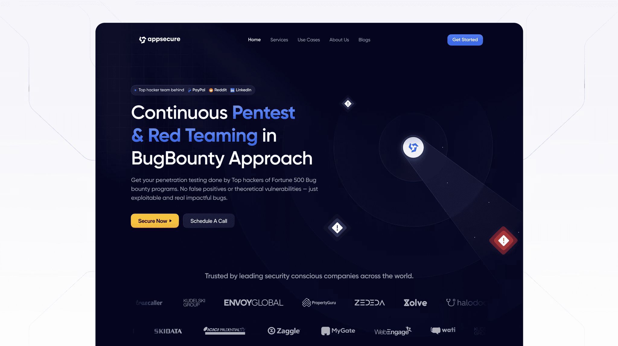
Image source: Bricx
One of our very own client projects, Appsecure shows how security-focused companies can create compelling digital experiences without compromising their professional identity. Their website proves that even technical services can benefit from thoughtful interactive design.
The company's digital presence combines technical excellence with user-friendly design. Their website communicates complex cybersecurity concepts through clean visual language. They use a well-laid-out structure that guides visitors through their service offerings naturally.
The security specialists understand their website proves their capabilities and builds trust with potential clients.
What makes it impressive?
The site transforms typical security content into a compelling experience.
Users will find:
Interactive elements that explain technical concepts clearly to non-technical users
Visual demonstrations that show security vulnerabilities and solutions
User-friendly navigation that leads users to conversion points
The design makes cybersecurity feel sophisticated yet available to everyone.
Since websites often serve as "the first interaction potential clients have with your brand", Appsecure uses this chance to leave lasting impressions.
Key takeaway
The company proves security-focused websites can maintain professionalism while staying engaging. Their approach shows that "technical excellence and security" works well with compelling design.
Wanted For Nothing
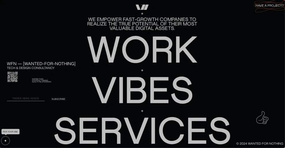
Image source: DesignRush
The first look at Wanted For Nothing's digital space reveals a perfect blend of artistry and functionality. This LA-based tech and design consultancy shows what happens when creative thinking meets excellent interactive design.
A striking dark background paired with crisp white and vibrant orange typography grabs your attention right away. This high-contrast esthetic creates a stylish, modern feel and makes content easy to read as you scroll through the site. Bold, uppercase letters make a statement—a thoughtful choice that helps you read while making a visual impact.
The site's structure breaks the usual layout rules but stays user-friendly. The hero section serves double duty as an interactive hamburger menu while it directs your scrolling experience.
What makes it impressive?
Interactive elements make this site stand out from the crowd. The "Collaborate" button comes alive with orange rings that form an ellipsis when you hover over it. This simple touch shows right away that this isn't your average static website.
The site becomes more dynamic as you explore:
Text that "dances" as you move your cursor
Thin animated lines highlight letters like rays of sunshine
Subtle animations decorate the service lists
The "Vibes" section adds personality with team photos that lead to fun biographies. Each team member's "superpowers" come with cool emojis.
Key takeaway
Wanted For Nothing shows how interactive design can bring brand personality to life through careful animations and small interactive details. The site strikes the right balance between bold esthetics and clear functionality.
It proves that unusual design choices, done right, create digital experiences that stick with users.
50 Years of Swiss Music Charts
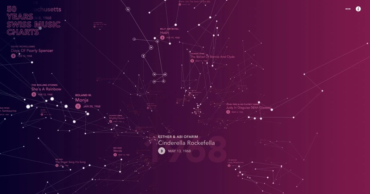
Image source: 50-jahre-hitparade.ch
Music and visual design blend perfectly in the 50 Years of Swiss Music Charts website that turns numerical data into an interactive galaxy of sound. This remarkable interactive website example shows how data visualization creates immersive digital experiences.
The website welcomes visitors with a creative loading screen where transparent numbers flow from 0 to 50, representing five decades of music history. The screen transitions to reveal a beautiful constellation map against a gradient background that alternates between pink and purple shades.
This isn't your typical star map — it's a detailed visualization of Switzerland's most popular songs from 1968 to 2017. Songs appear as constellations, while points mark specific chart positions and dates.
The digital universe contains approximately 127,000 data points that users can explore.
What makes it impressive?
The website stands out with its intuitive navigation system. Users can:
View each year's musical universe in 360 degrees
Move vertically through time to explore different decades
Listen to songs that play automatically as they explore the space
The designers split the space into two distinct spheres—slower, melancholic songs on the left and upbeat ones on the right. Songs fade in and out based on your location, creating a unique musical experience.
Key takeaway
The 50 Years Swiss Music Charts website shows how interactive design transforms complex data into emotional experiences.
The creators used WebGL and WebAudio platforms to build a digital space that connects people through sound and visuals across decades, proving that interactive websites can stimulate multiple senses at once.
Solar Journey
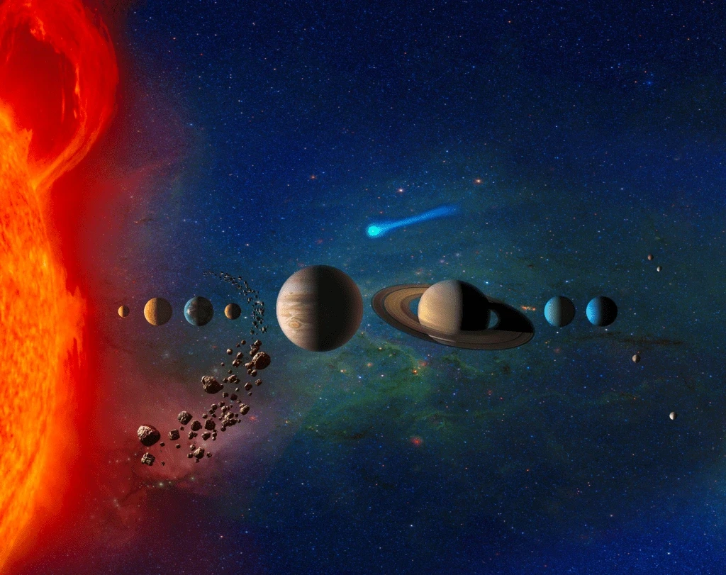
Image source: NASA Science
Designer Julian Fella's Solar Trip takes you on an interplanetary adventure in a realistic cosmic atmosphere. The site teaches about our solar system through an educational lens and showcases the Sun and all planets with beautiful 3D models.
The content flows naturally around each celestial body—physical characteristics appear on the left while brief descriptions fill the right side.
The site runs on HTML/CSS and JavaScript with WebGL rendering through the threeJS library, which makes it responsive on desktops, tablets, and phones. The WebAudio API adds atmospheric sounds that set the perfect space-exploration mood.
What makes it impressive?
Solar Trip shines through several interactive features:
Realistic 3D models that users can rotate and manipulate to compare size, position, and spacing between planets.
Full responsive design with CSS layouts above the WebGL layer instead of textures, which ensures dynamic, pixel-perfect rendering
Clickable planets and smooth animations that create an uninterrupted trip through space.
Intro scroll animations that naturally guide users through the experience.
Key takeaway
Solar Trip shows how interactive websites turn complex educational content into engaging experiences. The site succeeds through smart design choices, quality content, and strategic use of media.
Dave Holloway’s Portfolio Website
Dave Holloway's portfolio brilliantly shows how minimalism and interaction create a powerful user experience. This award-winning designer's personal website demonstrates how interactive elements can transform a simple portfolio into an engaging digital exploration.
The site welcomes visitors with a clean, monochromatic interface that establishes visual hierarchy. A distinctive grid layout dominates the homepage where project thumbnails react to cursor movements and create subtle hover effects that encourage exploration.
Smooth transitions and parallax scrolling effects direct visitors through his work as they browse each project.
The site maintains a straightforward yet elegant architecture that lets Holloway's projects stand out without distractions.
His calculated use of whitespace creates room around content elements and allows each piece to draw attention on its own.
What makes it impressive?
The portfolio shines through its thoughtful interactions:
Mouse-triggered animations that show project details on demand
Text elements that gently move as you scroll to add depth
Custom cursor designs that adapt based on available interactions
Holloway has added these interactive elements while maintaining fast loading speeds and mobile responsiveness.
This proves that sophisticated interactions don't need performance trade-offs.
Key takeaway
The website shows how careful restraint with interactive elements often works better than overwhelming visitors with animation.
The site achieves a rare balance between visual excitement and functional simplicity by focusing on meaningful interactions that boost content rather than distract from it.
Nueva.Tech
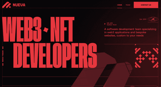
Image source: DesignRush
Nueva Tech, a software development company that started in 2021, specializes in web3 applications and bespoke websites. Their website features a refined design approach with a carefully chosen color palette.
The black background with bold red accents creates visual tension that pulls visitors deeper into the site. Red typography emerges as a standout design element, displayed both horizontally and vertically across the layout.
Thin red lines outline different sections, which adds structure and character to the composition.
What makes it impressive?
Nueva Tech stands out by turning a standard tech company site into something that feels like a game.
This gamified interface brings unexpected playfulness to a professional setting. The design keeps visitors engaged through:
Dark backgrounds contrasting with vibrant red elements
Bold typography that demands attention
The team's creative presentation using cartoon and anime character avatars on the About page
Their design tells the story of their expertise in "artists, innovators, and companies build out collections, experiences, and Web3 products" through visuals rather than walls of text.
Key takeaway
Nueva.Tech shows how limited colors combined with game-inspired interface elements create memorable interactive experiences.
Their approach proves that great interactive design doesn't need complex animations — thoughtful visual hierarchy & unexpected presentation styles can be just as powerful in capturing attention.
The Eames by Enso

Image source: WWD
The Eames by Enso Magazine brings history to life through brilliant interactive design. This award-winning website reshapes the scene of legendary designers Charles and Ray Eames into an engaging digital experience that shows how interactive design can revive history.
A sophisticated black background serves as the perfect canvas for storytelling. The design team employed a thoughtful color palette of blues and yellows, that enhance the historical imagery.
The site's structure combines horizontal and vertical scrolling in an unexpected way - content moves left as you scroll down, and new elements appear from the right.
What makes it impressive?
The site excels through its smart use of stop-motion animation techniques. Modern technology powers the site, yet it embraces older animation styles that echo its subjects' era. Objects rise from the bottom of the screen, which creates a sense of time travel.
The horizontal scrolling works like a time machine. Each section represents a different period in the Eames' career. This smart approach makes the timeline both accessible and engaging.
Camera icons scattered throughout reveal extra photos on hover, which adds an element of exploration to the experience.
Key takeaway
The Eames by Enso shows how interactive design can energize historical content through thoughtful animation and clear direction. The site creates an authentic experience by matching its interactive elements to the historical subject matter.
RAYTH
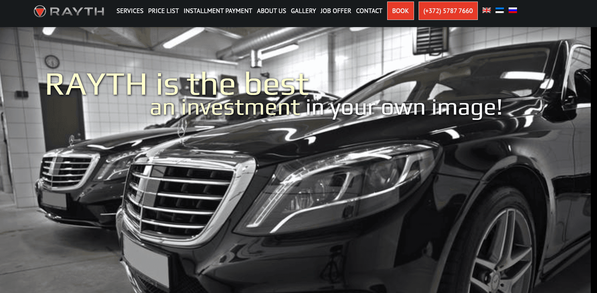
Image source: Rayth's official website
RAYTH's website perfectly blends luxury with functionality. Their sophisticated interactive elements showcase premium car care services from this Estonian company. The landing page takes visitors on an amazing trip through automotive excellence.
The site also features a minimalist look with a fixed navigation bar that guides visitors through a single-page experience. The trip reveals a perfect mix of readable typography and eye-catching red accents that create visual contrast against clean backgrounds.
This well-thought-out color scheme does more than just look good; it draws attention to key elements while keeping the luxurious feel that high-end car care demands.
What makes it impressive?
The website truly shines through its perfect balance of form and function:
A scrollable photo gallery shows RAYTH's precise workmanship
Custom graphs and charts with red accents make data points pop instantly
A video showreel adds dynamic motion to the clean layout
Smart use of white space ensures red markers catch your eye easily
These interactive elements turn a simple presentation into a compelling story about luxury car care. New content unfolds with each scroll and builds RAYTH's brand story smoothly.
Key takeaway
RAYTH shows how interactive design can lift luxury brands through sophisticated simplicity. The site successfully communicates exclusivity without overwhelming visitors by focusing on clean esthetics, strategic accent colors, and thoughtful interactive elements.
Be The Buzz
Image source: www.bethebuzz.co
Be The Buzz and Buzzworthy Studio worked together to create one of the most visually captivating interactive websites in the B2B SaaS marketing space. Their award-winning design perfectly balances minimalism with engaging motion to give users a memorable experience.
A striking dual-color palette of pure white (#ffffff) and deep indigo (#010561) creates a clean, professional esthetic that establishes brand identity immediately. Background gradients naturally change as users move through pages, which adds dimension without overwhelming the visual experience.
Typography serves as a central design element. Bold sans serif and outlined fonts establish clear visual hierarchy throughout the content.
This approach with typography ensures oversized headers effectively divide content into digestible sections.
What makes it impressive?
This website stands out through its well-crafted interactive elements:
Content blocks naturally flow into view as users scroll, which keeps them both entertained and informed
A sticky hamburger menu stays available throughout the experience and expands to reveal a half-screen white navigation panel
Content blocks change color dynamically on hover, which encourages exploration through the site
Design experts recognized these interactive components with a solid 7.19/10 SOTD score for their ability to enhance the overall user experience.
Key takeaway
Be The Buzz shows how strategic interactive elements can turn minimal design into an engaging experience. Their site proves that well-planned motion and micro-interactions don't need visual complexity to create a powerful, conversion-focused digital presence.
Option5
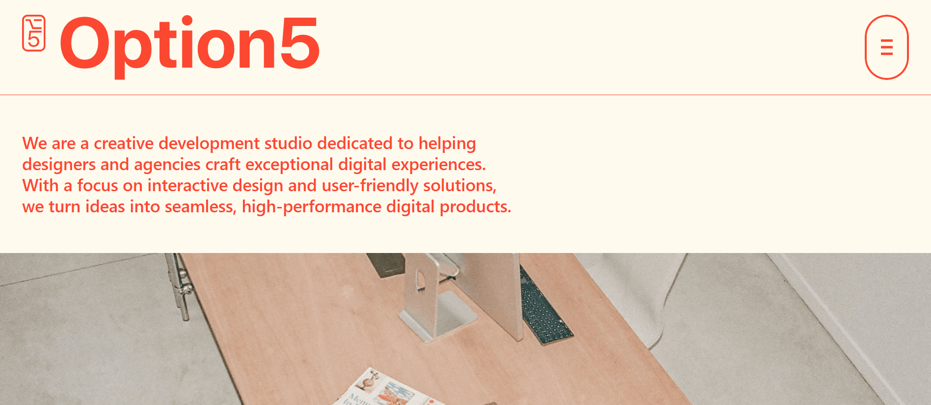
Image source: Option5
Option5 studio takes the standard portfolio website and turns it into an interactive playground that beckons visitors to explore. This web development team shows off their skills through a site that works both as a showcase and an experience.
The Option5 website looks like a clean, professional portfolio at first sight. A complex system of interactions lies beneath this simple interface, waiting for users to find them.
Case studies appear in what seems like a regular image gallery. The layout includes a table that shows the studio's clients and partnerships as you scroll down.
What makes it impressive?
The site springs to life with its creative hover states. Static images animate as your cursor moves across case studies, while project names appear through animated cursors. Client names in the table reveal hidden details when you hover over them.
The contact section offers a delightful surprise - large animated photos of team members follow your cursor across the screen. This creates a personal touch that you rarely see on contact pages.
These features do more than just look good - they showcase Option5's technical expertise while making the site easy and fun to use.
Key takeaway
Option5 shows how interactive design can make basic website elements unforgettable. The cursor becomes a tool for discovery, and the site responds to every movement.
This approach lets them showcase their development skills without saying a word.
MakeMePulse
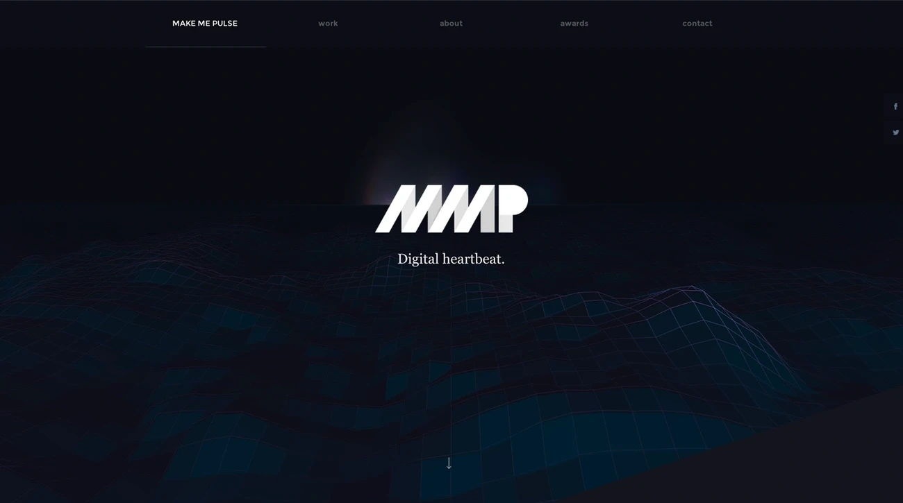
Image source: Awwwards
MakeMePulse puts storytelling at its heart by creating interactive experiences that take users beyond technology into immersive digital narratives. The agency sets itself apart with a unique combination of technical expertise and creative intuition.
The agency excels at creating browser-based interactive experiences that work on multiple devices for audiences worldwide.
Their production team combines producers, developers, and creatives who find inspiration in video games, movies, and art. This creative foundation shapes everything from interface design to frontend development.
Their remarkable approach views interfaces as emotional vehicles that convey both feelings and information.
What makes it impressive?
The studio excels through their dedication to:
Exceptional visual craft and attention to detail
Smart use of micro-interactions that surprise users unexpectedly
Subtle gaming elements that boost narrative experiences
MakeMePulse uses a hybrid methodology that blends structured UX processes with creative exploration.
Key takeaway
The agency shows how interactive design can put storytelling ahead of technical showmanship. They want users to feel amazed by creativity, storyline, and emotion without noticing the technical brilliance behind it all — highlighting how interactive websites build emotional connect first & technical impressions second.
These stellar interactive website design examples reveal patterns worth noting. Each site redefines the limits of design differently through animation, customized elements, or unconventional navigation patterns.
Finally, designers can apply these key principles from all these 11 cases, whatever their technical resources or project scope.
Best Practices for Interactive Website Design
Image source: PixelFreeStudio Blog
Our showcase of interactive websites reveals essential principles you can use to create compelling digital experiences.
These practices will help your interactive elements serve users better instead of just displaying technical capabilities:
Purpose-driven animations
Each movement on your website needs to answer a simple question: Why does it exist? Your animations should guide attention, provide feedback, or help users understand better.
The most effective animations are subtle - ones you barely notice but would miss if they disappeared.
They should improve the user's experience without demanding attention. A design expert points out that "Too often, animations are used for decoration instead of communication".
Performance optimization
Beautiful animations become frustrating when they slow down your site. All interactive elements need to stay lightweight to maintain quick loading times. Note that 53% of mobile users abandon sites loading slower than 3 seconds. You can optimize by:
Using CSS animations or JavaScript libraries built for speed
Limiting animations that might overwhelm users or devices
Using CSS properties that trigger GPU acceleration to create smoother animations
Accessibility testing
Your interactive websites should work for everyone. Provide alternatives to motion-heavy content for users with disabilities or those who prefer reduced motion.
Motion settings should be customizable since many devices now include 'reduce motion' settings that need consideration.
WCAG guidelines suggest content should not flash more than three times per second and all audio needs pause or stop controls.
Brand consistency in motion
Your brand's movement across screens matters as much as its static visual elements. Motion should reflect your brand's values and personality on every platform.
Your brand strategy should shape the motion principles that guide all animated elements. Without this consistency, your brand might look like "a patchwork mess".
Measuring interaction impact
Look beyond basic metrics to see how interactive elements shape user behavior. Compare users who see your interactive elements with those who don't.
Monitor engagement through time on page, bounce rate, and conversion rates before and after adding interactive features.
Interactive elements give you perfect opportunities to run A/B tests and collect clear data about what works.
Common Mistakes to Avoid in Interactive Design
The best interactive designs can fail if we don't deal with certain pitfalls properly. Let's get into common mistakes that can ruin what could have been great user experiences:
Overusing animations
Too many interactive elements don't work well. Animations that go overboard create visual noise and users can't focus on your content. Websites that move too much face these big problems:
Slow and unresponsive interfaces
Too much visual mess that confuses visitors
Users can't concentrate because there's too much going on.
Ignoring mobile responsiveness
Mobile devices make up over 62.71% of all web traffic as of January 2026. Many designers still think desktop-first.
Users on mobile phones quickly leave websites that don't load fast or look right. Research shows they don't wait as long as desktop users.
Neglecting performance testing
Adding interactive elements usually makes pages load slower. Designers often skip testing their work on different devices and internet speeds.
Running tests only on fast office networks doesn't match ground conditions where people might use slow or unstable connections.
Prioritizing novelty over usability
Designers feel pushed to create something different. Making things creative instead of functional —especially with navigation—leads to user frustration.
Fancy menus might look cool but users get confused when they can't find familiar patterns.
Skipping accessibility
Animated interfaces create barriers that don't work for users with vestibular disorders or cognitive disabilities.
Your audience shrinks when websites don't have controls to pause animations or respect users' priorities for reduced motion.
Conclusion
These 11 interactive website examples show how user-focused design turns casual browsing into unforgettable experiences. Each case reveals the power of thoughtful animations, micro-interactions, and customized elements that build emotional connections with users and communicate brand values.
Successful interactive websites strike a perfect balance between state-of-the-art features and usability. Every animated element must serve a clear purpose beyond visual appeal. Interactive elements should boost content accessibility, simplify navigation, and emphasize key messages without compromising performance or accessibility.
If you're a B2B business looking to add interactive elements to your website, Bricx can be a great design partner.
To know more about how our website design process can help, book a call with us now!
Research shows that 59% of users prefer beautifully designed content when they have just 15 minutes to spare.
Most websites remain static these days. The era of passive user experiences with limited UI elements and basic links is behind us.
Interactive website design creates meaningful connections with your audience. Websites that respond to user actions keep visitors engaged and encourage them to return.
Need some inspiration? Here are 11 interactive website examples that demonstrate how the best interactive websites create experiences you can truly feel.
Let's take a closer look at these designs that will make you say "wow."
What Is Interactive Website Design?
Image source: The Interaction Design Foundation
Interactive website design marks a fundamental move from traditional static websites. Standard pages simply display information, while interactive designs invite your participation through responsive elements.
Picture the difference between reading a book and playing a video game. One offers passive consumption. The other needs your active involvement.
Interactive website design creates digital interfaces where users can directly involve themselves with content. These interfaces extend beyond esthetics. They focus on dynamic and responsive elements that react to your actions. Your clicks, taps, drags, and scrolls trigger meaningful responses. This creates a two-way conversation between you and the website.
The main goal aims to craft digital experiences that help you achieve objectives easily and naturally. This approach makes routine browsing both memorable and immersive.
Interactive design works as a vital component within user experience design. UX includes the entire user trip, while interactive design focuses on moments of active involvement—when you directly interact with website elements.
Interactive website design turns passive visitors into active participants. It creates experiences users don't just see — they feel them.
Key Characteristics of Interactive Website Design
The magic of interactive website design shows in how it responds to your actions. Static pages are a thing of the past. Websites that make you want to come back have special qualities that stick in your mind.
Let us walk through what makes interactive design work so well:
Real-time feedback in interactive website design
A well-designed website should react right away when you do something. Live feedback creates a meaningful conversation between you and the interface. It lets you know the system caught your action. Research shows that response time is critical. The sweet spot lies between 0.1 and 10 seconds.
Progress indicators are great examples. They show you the system is doing its job, so you don't wonder if your click went through. On top of that, live feedback helps developers spot big problems that need quick fixes.
Micro-interactions that improve user experience
Those small moments when you click, swipe, or type? We call them micro-interactions. These subtle animations give you visual cues and make everyday tasks fun. Micro-interactions make your experience better by:
Showing changes through colors or animations
Catching mistakes with helpful messages
Adding fun touches that stick in your memory
To cite an instance, the heart animation you see after liking a post or the password strength meter that updates as you type shows micro-interactions at work.
The numbers speak for themselves - these tiny design elements can make user participation jump up to 200% compared to static sites.
Narrative flow through motion and transitions
Interactive websites tell stories through careful movement. They're not just digital brochures. They become adventures that reveal themselves as you explore. Smart motion design creates clear paths between sections, making navigation feel natural.
Motion helps show what's important and builds emotional connections. Sites with good narrative flow lead users smoothly to conversion points. The transitions feel natural, not forced.
Personalization in interactive websites
Personalization turns standard content into something made just for you. Interactive websites can deliver relevant content by looking at how you behave, what you like, and who you are.
The results speak volumes. Amazon makes about $1 billion each day from personalized recommendations. Personalization cuts down bounce rates because users find stuff they care about. Sites with individual-specific experiences build stronger customer bonds.
About 70% of online shoppers say personalized experiences affect what they buy.
Why Interactive Design Matters for Engagement and Conversion?
Image source:Strikingly
Interactive website design delivers real business results that go beyond looks and function.
Let's learn why putting money into interactivity leads to better engagement and higher conversion rates:
Emotional engagement through interactivity
Interactive design builds powerful emotional connections with users. Research shows interactive elements can boost user engagement up to 200% compared to static designs.
This emotional connection works because interactivity taps into basic human psychology. Small but powerful moments shape how people behave and make decisions.
Users' brains release dopamine when they get instant feedback through interactive elements. This creates satisfaction and a sense of achievement. The psychological reward system makes users come back for more and builds their confidence.
Users who feel connected to your website emotionally often become loyal customers and help spread the word about your brand.
Improved communication of value and hierarchy
Interactive design elements direct users' attention to what matters most. This helps them understand value and importance better. Such guidance matters because visitors usually spend less than a minute on a website.
Smart use of motion and interactive elements can highlight key information and products. This creates a clear visual path that makes navigation and content understanding easier.
Studies show users trust your brand more and see it as more effective when your site is simple to navigate.
Boosting conversions with micro-interactions
Small interactive moments, or ‘micro-interactions’ — pack surprising power to drive conversions. Recent studies show websites with responsive micro-interactions saw their user engagement jump by 27% on average. Conversion rates went up by 19%.
Micro-interactions work by:
Confirming user actions right away
Making complex processes simpler
Creating delightful moments that keep users interested
E-commerce sites using micro-interactions in checkout saw 22% fewer people abandon forms. Successful transactions increased by 17%.
Booking.com's numbers were even better - they saw 31% more people complete bookings after adding animated micro-interactions to their confirmation process.
Reinforcing brand identity with motion
Motion design does more than just decorate—it expresses your brand's core identity. Screens now dominate how we communicate. Your brand's movement across these interfaces matters more than ever.
Good motion creates rich expression and adds emotional touches that static elements can't match. This dynamic approach makes your brand stick in users' minds and creates memorable experiences.
Motion brings brands to life, turning them from static images into living, breathing personalities.
11 Interactive Website Design Examples to Check Out Now!
Now that we've explored the importance of adding interactive elements to your website experience, let's take a look at some key interactive website design examples for your next project:
Appsecure
Image source: Bricx
One of our very own client projects, Appsecure shows how security-focused companies can create compelling digital experiences without compromising their professional identity. Their website proves that even technical services can benefit from thoughtful interactive design.
The company's digital presence combines technical excellence with user-friendly design. Their website communicates complex cybersecurity concepts through clean visual language. They use a well-laid-out structure that guides visitors through their service offerings naturally.
The security specialists understand their website proves their capabilities and builds trust with potential clients.
What makes it impressive?
The site transforms typical security content into a compelling experience.
Users will find:
Interactive elements that explain technical concepts clearly to non-technical users
Visual demonstrations that show security vulnerabilities and solutions
User-friendly navigation that leads users to conversion points
The design makes cybersecurity feel sophisticated yet available to everyone.
Since websites often serve as "the first interaction potential clients have with your brand", Appsecure uses this chance to leave lasting impressions.
Key takeaway
The company proves security-focused websites can maintain professionalism while staying engaging. Their approach shows that "technical excellence and security" works well with compelling design.
Wanted For Nothing
Image source: DesignRush
The first look at Wanted For Nothing's digital space reveals a perfect blend of artistry and functionality. This LA-based tech and design consultancy shows what happens when creative thinking meets excellent interactive design.
A striking dark background paired with crisp white and vibrant orange typography grabs your attention right away. This high-contrast esthetic creates a stylish, modern feel and makes content easy to read as you scroll through the site. Bold, uppercase letters make a statement—a thoughtful choice that helps you read while making a visual impact.
The site's structure breaks the usual layout rules but stays user-friendly. The hero section serves double duty as an interactive hamburger menu while it directs your scrolling experience.
What makes it impressive?
Interactive elements make this site stand out from the crowd. The "Collaborate" button comes alive with orange rings that form an ellipsis when you hover over it. This simple touch shows right away that this isn't your average static website.
The site becomes more dynamic as you explore:
Text that "dances" as you move your cursor
Thin animated lines highlight letters like rays of sunshine
Subtle animations decorate the service lists
The "Vibes" section adds personality with team photos that lead to fun biographies. Each team member's "superpowers" come with cool emojis.
Key takeaway
Wanted For Nothing shows how interactive design can bring brand personality to life through careful animations and small interactive details. The site strikes the right balance between bold esthetics and clear functionality.
It proves that unusual design choices, done right, create digital experiences that stick with users.
50 Years of Swiss Music Charts
Image source: 50-jahre-hitparade.ch
Music and visual design blend perfectly in the 50 Years of Swiss Music Charts website that turns numerical data into an interactive galaxy of sound. This remarkable interactive website example shows how data visualization creates immersive digital experiences.
The website welcomes visitors with a creative loading screen where transparent numbers flow from 0 to 50, representing five decades of music history. The screen transitions to reveal a beautiful constellation map against a gradient background that alternates between pink and purple shades.
This isn't your typical star map — it's a detailed visualization of Switzerland's most popular songs from 1968 to 2017. Songs appear as constellations, while points mark specific chart positions and dates.
The digital universe contains approximately 127,000 data points that users can explore.
What makes it impressive?
The website stands out with its intuitive navigation system. Users can:
View each year's musical universe in 360 degrees
Move vertically through time to explore different decades
Listen to songs that play automatically as they explore the space
The designers split the space into two distinct spheres—slower, melancholic songs on the left and upbeat ones on the right. Songs fade in and out based on your location, creating a unique musical experience.
Key takeaway
The 50 Years Swiss Music Charts website shows how interactive design transforms complex data into emotional experiences.
The creators used WebGL and WebAudio platforms to build a digital space that connects people through sound and visuals across decades, proving that interactive websites can stimulate multiple senses at once.
Solar Journey
Image source: NASA Science
Designer Julian Fella's Solar Trip takes you on an interplanetary adventure in a realistic cosmic atmosphere. The site teaches about our solar system through an educational lens and showcases the Sun and all planets with beautiful 3D models.
The content flows naturally around each celestial body—physical characteristics appear on the left while brief descriptions fill the right side.
The site runs on HTML/CSS and JavaScript with WebGL rendering through the threeJS library, which makes it responsive on desktops, tablets, and phones. The WebAudio API adds atmospheric sounds that set the perfect space-exploration mood.
What makes it impressive?
Solar Trip shines through several interactive features:
Realistic 3D models that users can rotate and manipulate to compare size, position, and spacing between planets.
Full responsive design with CSS layouts above the WebGL layer instead of textures, which ensures dynamic, pixel-perfect rendering
Clickable planets and smooth animations that create an uninterrupted trip through space.
Intro scroll animations that naturally guide users through the experience.
Key takeaway
Solar Trip shows how interactive websites turn complex educational content into engaging experiences. The site succeeds through smart design choices, quality content, and strategic use of media.
Dave Holloway’s Portfolio Website
Dave Holloway's portfolio brilliantly shows how minimalism and interaction create a powerful user experience. This award-winning designer's personal website demonstrates how interactive elements can transform a simple portfolio into an engaging digital exploration.
The site welcomes visitors with a clean, monochromatic interface that establishes visual hierarchy. A distinctive grid layout dominates the homepage where project thumbnails react to cursor movements and create subtle hover effects that encourage exploration.
Smooth transitions and parallax scrolling effects direct visitors through his work as they browse each project.
The site maintains a straightforward yet elegant architecture that lets Holloway's projects stand out without distractions.
His calculated use of whitespace creates room around content elements and allows each piece to draw attention on its own.
What makes it impressive?
The portfolio shines through its thoughtful interactions:
Mouse-triggered animations that show project details on demand
Text elements that gently move as you scroll to add depth
Custom cursor designs that adapt based on available interactions
Holloway has added these interactive elements while maintaining fast loading speeds and mobile responsiveness.
This proves that sophisticated interactions don't need performance trade-offs.
Key takeaway
The website shows how careful restraint with interactive elements often works better than overwhelming visitors with animation.
The site achieves a rare balance between visual excitement and functional simplicity by focusing on meaningful interactions that boost content rather than distract from it.
Nueva.Tech
Image source: DesignRush
Nueva Tech, a software development company that started in 2021, specializes in web3 applications and bespoke websites. Their website features a refined design approach with a carefully chosen color palette.
The black background with bold red accents creates visual tension that pulls visitors deeper into the site. Red typography emerges as a standout design element, displayed both horizontally and vertically across the layout.
Thin red lines outline different sections, which adds structure and character to the composition.
What makes it impressive?
Nueva Tech stands out by turning a standard tech company site into something that feels like a game.
This gamified interface brings unexpected playfulness to a professional setting. The design keeps visitors engaged through:
Dark backgrounds contrasting with vibrant red elements
Bold typography that demands attention
The team's creative presentation using cartoon and anime character avatars on the About page
Their design tells the story of their expertise in "artists, innovators, and companies build out collections, experiences, and Web3 products" through visuals rather than walls of text.
Key takeaway
Nueva.Tech shows how limited colors combined with game-inspired interface elements create memorable interactive experiences.
Their approach proves that great interactive design doesn't need complex animations — thoughtful visual hierarchy & unexpected presentation styles can be just as powerful in capturing attention.
The Eames by Enso
Image source: WWD
The Eames by Enso Magazine brings history to life through brilliant interactive design. This award-winning website reshapes the scene of legendary designers Charles and Ray Eames into an engaging digital experience that shows how interactive design can revive history.
A sophisticated black background serves as the perfect canvas for storytelling. The design team employed a thoughtful color palette of blues and yellows, that enhance the historical imagery.
The site's structure combines horizontal and vertical scrolling in an unexpected way - content moves left as you scroll down, and new elements appear from the right.
What makes it impressive?
The site excels through its smart use of stop-motion animation techniques. Modern technology powers the site, yet it embraces older animation styles that echo its subjects' era. Objects rise from the bottom of the screen, which creates a sense of time travel.
The horizontal scrolling works like a time machine. Each section represents a different period in the Eames' career. This smart approach makes the timeline both accessible and engaging.
Camera icons scattered throughout reveal extra photos on hover, which adds an element of exploration to the experience.
Key takeaway
The Eames by Enso shows how interactive design can energize historical content through thoughtful animation and clear direction. The site creates an authentic experience by matching its interactive elements to the historical subject matter.
RAYTH
Image source: Rayth's official website
RAYTH's website perfectly blends luxury with functionality. Their sophisticated interactive elements showcase premium car care services from this Estonian company. The landing page takes visitors on an amazing trip through automotive excellence.
The site also features a minimalist look with a fixed navigation bar that guides visitors through a single-page experience. The trip reveals a perfect mix of readable typography and eye-catching red accents that create visual contrast against clean backgrounds.
This well-thought-out color scheme does more than just look good; it draws attention to key elements while keeping the luxurious feel that high-end car care demands.
What makes it impressive?
The website truly shines through its perfect balance of form and function:
A scrollable photo gallery shows RAYTH's precise workmanship
Custom graphs and charts with red accents make data points pop instantly
A video showreel adds dynamic motion to the clean layout
Smart use of white space ensures red markers catch your eye easily
These interactive elements turn a simple presentation into a compelling story about luxury car care. New content unfolds with each scroll and builds RAYTH's brand story smoothly.
Key takeaway
RAYTH shows how interactive design can lift luxury brands through sophisticated simplicity. The site successfully communicates exclusivity without overwhelming visitors by focusing on clean esthetics, strategic accent colors, and thoughtful interactive elements.
Be The Buzz
Image source: www.bethebuzz.co
Be The Buzz and Buzzworthy Studio worked together to create one of the most visually captivating interactive websites in the B2B SaaS marketing space. Their award-winning design perfectly balances minimalism with engaging motion to give users a memorable experience.
A striking dual-color palette of pure white (#ffffff) and deep indigo (#010561) creates a clean, professional esthetic that establishes brand identity immediately. Background gradients naturally change as users move through pages, which adds dimension without overwhelming the visual experience.
Typography serves as a central design element. Bold sans serif and outlined fonts establish clear visual hierarchy throughout the content.
This approach with typography ensures oversized headers effectively divide content into digestible sections.
What makes it impressive?
This website stands out through its well-crafted interactive elements:
Content blocks naturally flow into view as users scroll, which keeps them both entertained and informed
A sticky hamburger menu stays available throughout the experience and expands to reveal a half-screen white navigation panel
Content blocks change color dynamically on hover, which encourages exploration through the site
Design experts recognized these interactive components with a solid 7.19/10 SOTD score for their ability to enhance the overall user experience.
Key takeaway
Be The Buzz shows how strategic interactive elements can turn minimal design into an engaging experience. Their site proves that well-planned motion and micro-interactions don't need visual complexity to create a powerful, conversion-focused digital presence.
Option5
Image source: Option5
Option5 studio takes the standard portfolio website and turns it into an interactive playground that beckons visitors to explore. This web development team shows off their skills through a site that works both as a showcase and an experience.
The Option5 website looks like a clean, professional portfolio at first sight. A complex system of interactions lies beneath this simple interface, waiting for users to find them.
Case studies appear in what seems like a regular image gallery. The layout includes a table that shows the studio's clients and partnerships as you scroll down.
What makes it impressive?
The site springs to life with its creative hover states. Static images animate as your cursor moves across case studies, while project names appear through animated cursors. Client names in the table reveal hidden details when you hover over them.
The contact section offers a delightful surprise - large animated photos of team members follow your cursor across the screen. This creates a personal touch that you rarely see on contact pages.
These features do more than just look good - they showcase Option5's technical expertise while making the site easy and fun to use.
Key takeaway
Option5 shows how interactive design can make basic website elements unforgettable. The cursor becomes a tool for discovery, and the site responds to every movement.
This approach lets them showcase their development skills without saying a word.
MakeMePulse
Image source: Awwwards
MakeMePulse puts storytelling at its heart by creating interactive experiences that take users beyond technology into immersive digital narratives. The agency sets itself apart with a unique combination of technical expertise and creative intuition.
The agency excels at creating browser-based interactive experiences that work on multiple devices for audiences worldwide.
Their production team combines producers, developers, and creatives who find inspiration in video games, movies, and art. This creative foundation shapes everything from interface design to frontend development.
Their remarkable approach views interfaces as emotional vehicles that convey both feelings and information.
What makes it impressive?
The studio excels through their dedication to:
Exceptional visual craft and attention to detail
Smart use of micro-interactions that surprise users unexpectedly
Subtle gaming elements that boost narrative experiences
MakeMePulse uses a hybrid methodology that blends structured UX processes with creative exploration.
Key takeaway
The agency shows how interactive design can put storytelling ahead of technical showmanship. They want users to feel amazed by creativity, storyline, and emotion without noticing the technical brilliance behind it all — highlighting how interactive websites build emotional connect first & technical impressions second.
These stellar interactive website design examples reveal patterns worth noting. Each site redefines the limits of design differently through animation, customized elements, or unconventional navigation patterns.
Finally, designers can apply these key principles from all these 11 cases, whatever their technical resources or project scope.
Best Practices for Interactive Website Design
Image source: PixelFreeStudio Blog
Our showcase of interactive websites reveals essential principles you can use to create compelling digital experiences.
These practices will help your interactive elements serve users better instead of just displaying technical capabilities:
Purpose-driven animations
Each movement on your website needs to answer a simple question: Why does it exist? Your animations should guide attention, provide feedback, or help users understand better.
The most effective animations are subtle - ones you barely notice but would miss if they disappeared.
They should improve the user's experience without demanding attention. A design expert points out that "Too often, animations are used for decoration instead of communication".
Performance optimization
Beautiful animations become frustrating when they slow down your site. All interactive elements need to stay lightweight to maintain quick loading times. Note that 53% of mobile users abandon sites loading slower than 3 seconds. You can optimize by:
Using CSS animations or JavaScript libraries built for speed
Limiting animations that might overwhelm users or devices
Using CSS properties that trigger GPU acceleration to create smoother animations
Accessibility testing
Your interactive websites should work for everyone. Provide alternatives to motion-heavy content for users with disabilities or those who prefer reduced motion.
Motion settings should be customizable since many devices now include 'reduce motion' settings that need consideration.
WCAG guidelines suggest content should not flash more than three times per second and all audio needs pause or stop controls.
Brand consistency in motion
Your brand's movement across screens matters as much as its static visual elements. Motion should reflect your brand's values and personality on every platform.
Your brand strategy should shape the motion principles that guide all animated elements. Without this consistency, your brand might look like "a patchwork mess".
Measuring interaction impact
Look beyond basic metrics to see how interactive elements shape user behavior. Compare users who see your interactive elements with those who don't.
Monitor engagement through time on page, bounce rate, and conversion rates before and after adding interactive features.
Interactive elements give you perfect opportunities to run A/B tests and collect clear data about what works.
Common Mistakes to Avoid in Interactive Design
The best interactive designs can fail if we don't deal with certain pitfalls properly. Let's get into common mistakes that can ruin what could have been great user experiences:
Overusing animations
Too many interactive elements don't work well. Animations that go overboard create visual noise and users can't focus on your content. Websites that move too much face these big problems:
Slow and unresponsive interfaces
Too much visual mess that confuses visitors
Users can't concentrate because there's too much going on.
Ignoring mobile responsiveness
Mobile devices make up over 62.71% of all web traffic as of January 2026. Many designers still think desktop-first.
Users on mobile phones quickly leave websites that don't load fast or look right. Research shows they don't wait as long as desktop users.
Neglecting performance testing
Adding interactive elements usually makes pages load slower. Designers often skip testing their work on different devices and internet speeds.
Running tests only on fast office networks doesn't match ground conditions where people might use slow or unstable connections.
Prioritizing novelty over usability
Designers feel pushed to create something different. Making things creative instead of functional —especially with navigation—leads to user frustration.
Fancy menus might look cool but users get confused when they can't find familiar patterns.
Skipping accessibility
Animated interfaces create barriers that don't work for users with vestibular disorders or cognitive disabilities.
Your audience shrinks when websites don't have controls to pause animations or respect users' priorities for reduced motion.
Conclusion
These 11 interactive website examples show how user-focused design turns casual browsing into unforgettable experiences. Each case reveals the power of thoughtful animations, micro-interactions, and customized elements that build emotional connections with users and communicate brand values.
Successful interactive websites strike a perfect balance between state-of-the-art features and usability. Every animated element must serve a clear purpose beyond visual appeal. Interactive elements should boost content accessibility, simplify navigation, and emphasize key messages without compromising performance or accessibility.
If you're a B2B business looking to add interactive elements to your website, Bricx can be a great design partner.
To know more about how our website design process can help, book a call with us now!


Similar Blogs
Similar Blogs
Similar Blogs


Available for Work
Bricx
© Bricx, 2026. All rights reserved.


Available for Work
Bricx
© Bricx, 2026. All rights reserved.
Available for Work
Bricx
© Bricx, 2026. All rights reserved.
Available for Work
Bricx
© Bricx, 2026. All rights reserved.