Product Design
Product Design
Product Design
Insights
Insights
Insights
October 16, 2025
October 16, 2025
October 16, 2025
10 Calendar UI Examples for Effective Scheduling Design 2026
10 Calendar UI Examples for Effective Scheduling Design 2026
10 Calendar UI Examples for Effective Scheduling Design 2026
Discover the best calendar UI examples for SaaS tools. Learn how intuitive design improves scheduling, collaboration, and productivity across your product.
Discover the best calendar UI examples for SaaS tools. Learn how intuitive design improves scheduling, collaboration, and productivity across your product.
Discover the best calendar UI examples for SaaS tools. Learn how intuitive design improves scheduling, collaboration, and productivity across your product.
4 minutes
4 minutes
4 minutes


You'll likely encounter a calendar UI when you open any app. Designing these simple-looking interfaces presents unique challenges.
A well-designed calendar view transforms the way people work in the ever-changing digital world. The modern calendar goes beyond a basic grid of dates and cells to become a powerful workflow tool that helps users manage time better. Users now demand calendar interfaces with visual appeal and features tailored to their needs.
Want to enhance your calendar design skills? Let's dive into 10 impressive calendar UI examples that demonstrate effective scheduling design and provide practical insights for your next project.
What Makes a Good Calendar UI Design?
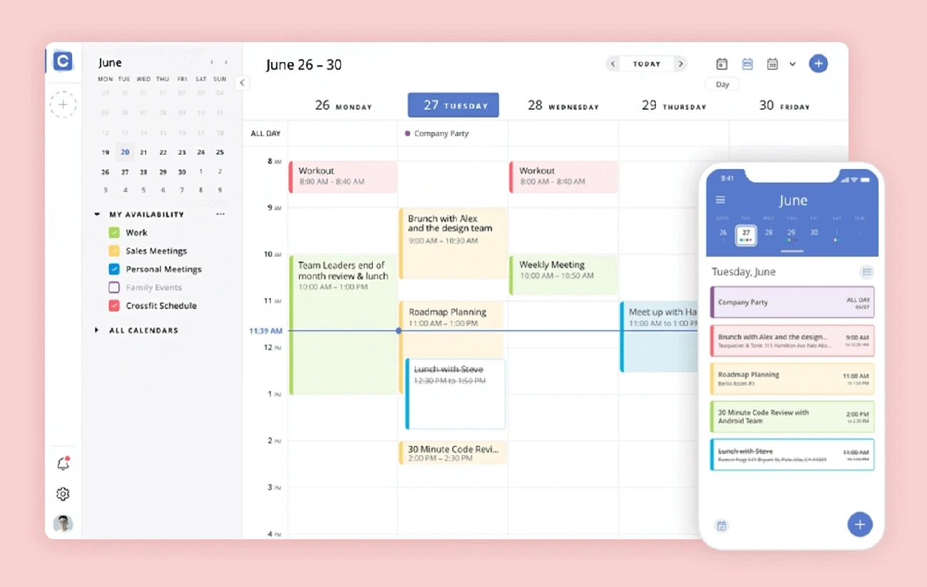
Image source: Justinmind
A calendar UI must do more than just show dates in a grid. The best calendar interfaces strike a perfect balance between clear visuals and powerful features.
Given below are some key components of any effective calendar UI design:
Hierarchy of time in calendar UI design
The best calendar designs create a clear visual path through different time scales. Users should easily move between daily, weekly, and monthly views. This flexibility lets them quickly switch from micro (today's events) to macro (monthly events) points of view.
Smart calendar interfaces use type sizing, color contrast, and visual weight to make current time periods stand out.
Users can choose between horizontal or vertical layouts based on their priorities. On top of that, it helps to add week numbers and customizable headers to guide users better.
Context awareness in scheduling interfaces
Calendar interfaces must adapt to users' tasks and environment. Smart calendars think over not just the user but also their device and surroundings. These adaptive interfaces give users the right information exactly when they need it.
Smart contextual changes can improve user interaction by a lot through prioritizing what matters in each situation.
To name just one example, see how a smart calendar might highlight work deadlines during office hours or personal events during free time.
Predictable interactions in calendar components
Easy-to-use interactions are the foundations of great calendar design. Users want consistency in how they direct through dates, make selections, and handle events.
So, well-laid-out calendars use familiar patterns like swipe gestures on mobile or standard ways to pick date ranges. Calendar interfaces should let users finish common tasks with minimal clicks.
The best designs make everything feel natural with touch feedback and predictable behavior.
Empty state clarity in calendar UIs
Empty calendars create unique design challenges. Rather than leaving blank spaces, smart empty states communicate system status and show users the way. Research shows blank states make users wonder if the system works right. Well-designed empty states can:
Show what users would normally see
Create ways to fill the calendar
Give helpful tips about features
This approach builds user confidence and makes it easier for new users to learn the system.
Brand consistency in calendar interface design
Your calendar interface should showcase your brand's identity beyond just a logo. Lucidpress data shows consistent branding can increase revenue by 33%. A well-branded calendar keeps colors, fonts, spacing, and interactive elements consistent.
Plus, these design details help users complete tasks instead of hunting for features. When visual elements line up with your brand's voice, users trust and recognize the interface more, creating a smooth experience everywhere.
10 Amazing Calendar UI Examples to Build Better Scheduling Design
Now that we've already covered what a calendar UI is, and the key elements that constitute an effective calendar UI design, let's take a look at some real-world examples to seek inspiration from:
Things 3 – Minimal Daily Planner
Image source: Eleken
Things 3 stands out among productivity apps with its clean approach to calendar design. This award-winning app shows how visual restraint can create a powerful scheduling experience.
The app's calendar interface shines through its minimal daily view. Things 3 organizes events and tasks in a clean vertical list instead of complex grid layouts. A subtle gradient flows through the timeline and marks the current date. This helps you stay oriented without explicit labels. The design removes visual clutter from calendar cells. You see only what matters.
The app has these core components:
Today & This Evening lists for current priorities
Upcoming view for future planning
Calendar integration that shows events alongside tasks
The Today view shows all tasks scheduled or due today and gives you a focused, current agenda. The This Evening section sits at the bottom of your list. It keeps later tasks visible yet unobtrusive.
What makes it impressive?
Things 3 excels through its user-friendly design. The natural language input makes adding tasks simple. The straightforward task organization lets you categorize and schedule items quickly.
The 'Upcoming' list serves as your future agenda. It's a space for tasks you'll tackle on specific future dates. The next seven days appear at the top separately. This bird's-eye view stops you from overloading any single day.
Things 3 syncs with Apple Calendar. You can view scheduled events next to your tasks in Today and Upcoming views. This creates a complete view of your commitments. You can plan tasks around existing events and avoid scheduling conflicts.
Key takeaway
Things 3's brilliance comes from guiding attention with gentle, almost invisible cues. Its minimalist approach proves that good calendar UI design doesn't need flashy elements or complex features. Thoughtful restraint creates an environment where users feel in control.
Apple Calendar – Natural Language Scheduling
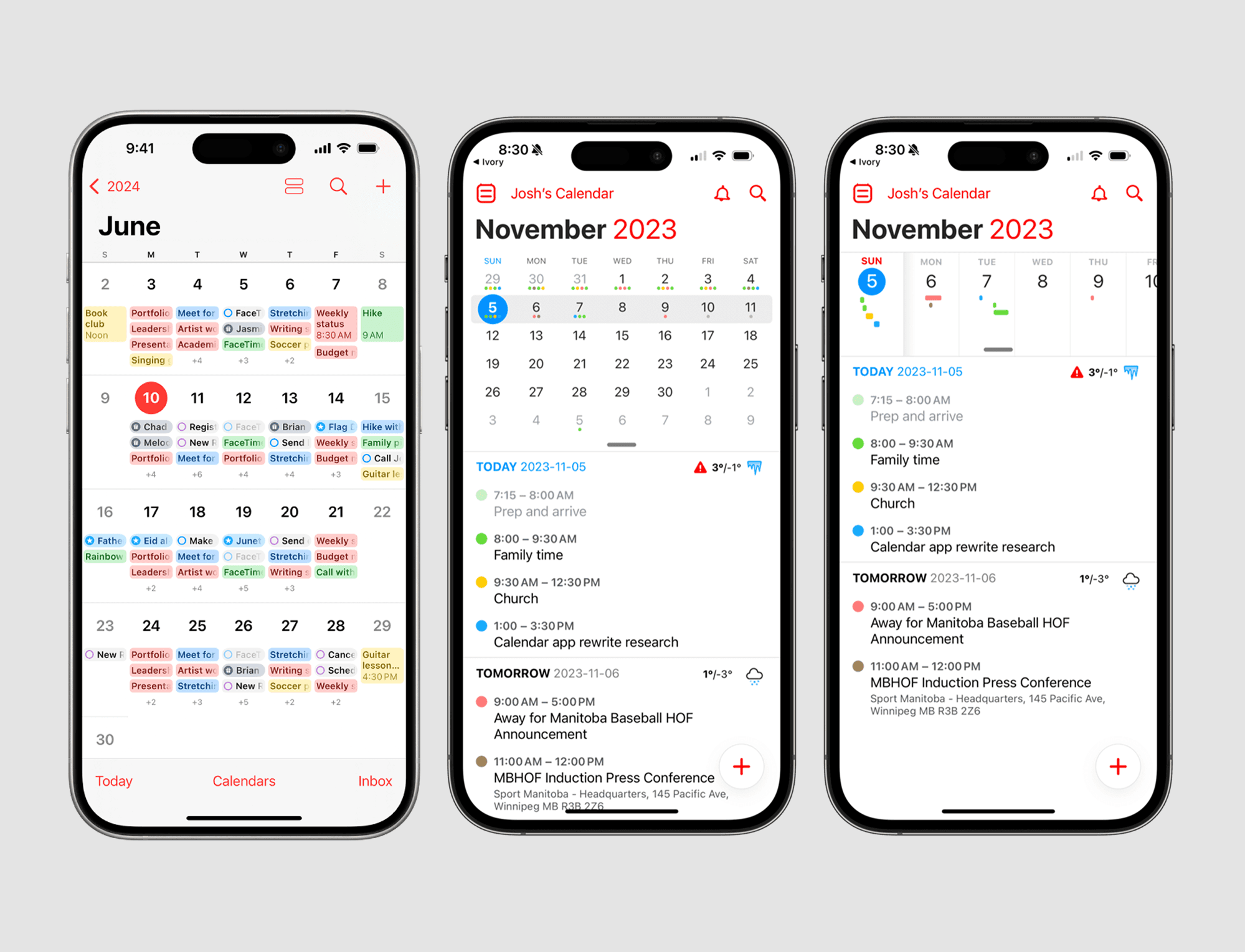
Image source: Eleken
Apple's native calendar app strikes a perfect balance between simplicity and power. The iOS 18 update brought welcome changes to the interface design and finally connected it with Reminders.
The app's interface puts clean visuals and smart organization first. The iOS 18 update displays the month in large bold font at the top-left corner, which makes the visual hierarchy better. You can pick from four different views - Compact, Stacked, Details, and List. Each view shows different amounts of information.
The pinch-to-zoom gesture stands out as a clever feature. It lets you switch between views smoothly and creates more or less space between days to show extra details. You can adjust the view based on what you need to see.
The 'Today' view comes with Single Day and Multi-Day options. Multi-Day shows your current day's events next to what's coming up tomorrow. This makes it easy to plan your work from one day to the next.
What makes it impressive?
The natural language processing makes this calendar shine. Just type something like "Lunch with Sarah at Cafe Milano tomorrow at noon" or "Doctor appointment next Tuesday at 2pm." The app knows exactly what you mean and creates the event. It feels like talking to someone instead of programming a machine.
The calendar understands many ways to enter events:
> Time-specific entries: "Meeting at 7 pm" or "Meeting at 23:45"> Date formats: "Movie 2/12" or "BDay 13 January"
> Recurring events: "Piano lessons on Fridays at 3 am"
> Location-based entries: "Lunch at 123 Main St. at 5 pm"
The app works great with other iOS features too. It adds appointments from your emails, works with Siri voice commands, and gives you directions through Apple Maps. Everything stays updated on all your devices.
Key takeaway
Apple Calendar's brilliance comes from making complex features easy to use through natural language. It proves that powerful scheduling tools can have simple interfaces. Anyone designing a calendar UI should see how natural language input makes scheduling easier.
This lets technology adapt to how people communicate naturally instead of forcing them to learn technical commands.
Google Calendar (tasks + to-dos)
Image source: OneCal
Google Calendar shows a clean grid-based layout with a sidebar navigation system for quick access to different calendars and views. The interface employs color coding extensively, which helps you distinguish between different calendars (work, personal, etc.) instantly.
The calendar supports multiple viewing options including:
Day view for detailed hourly planning
Week view for balanced viewpoint
Month view for big-picture planning
Schedule view for linear list format
Time-block design features subtle shadows and borders that create depth without cluttering the visual space. This design makes schedule scanning effortless while maintaining clear information hierarchy through typography and spacing.
What makes it impressive?
Google Calendar's standout feature lies in how tasks blend smoothly with events. Many competitors treat to-dos as separate entities, but Google Calendar embeds task management right into the calendar interface.
The cross-platform consistency keeps your calendar experience familiar whether you use desktop, mobile, or tablet devices. The responsive design adapts smoothly to different screen sizes without losing functionality.
Key takeaway
Google Calendar proves that calendar UI design should eliminate the artificial barrier between events and tasks. The interface recognizes how people plan their days by treating time-blocking and task management as complementary functions.
Your calendar interface designs should think about how integrated productivity tools can create a more unified user experience that matches natural workflow patterns.
Asana's Timeline for Project Tracking
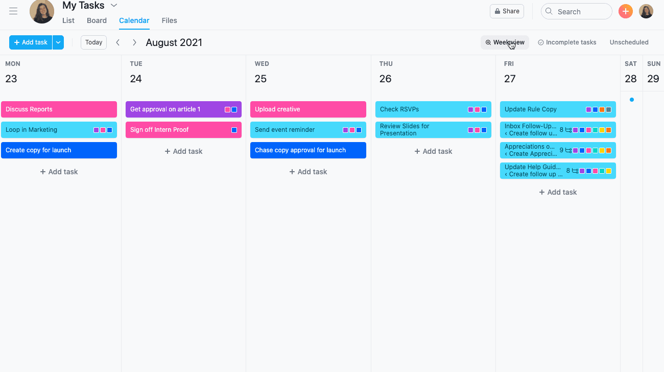
Image source: Asana Help Center
Asana gives you viewing options that fit different planning styles. Teams can switch between multiple project views with a single click—Kanban board, list, timeline, calendar, or Gantt chart. No extra setup needed. This lets teams look at their work from various angles.
The timeline view shows your tasks as horizontal bars. Each bar's length shows how long a task runs from start to finish.
This Gantt chart-style view maps every task on its timeline and gives you a bird's-eye view of current and future work. Tasks won't show up in the timeline without dates, which helps ensure proper scheduling.
The interface lets you:
Create a project timeline in seconds
See where work starts, ends, and overlaps
Drag and drop tasks to update due dates automatically
What makes it impressive?
Asana's timeline stands out because it knows how to link tasks through dependencies. This shows how finishing one task affects others, which helps sequence work properly and cuts down bottlenecks. When someone completes a task, the system notifies people assigned to dependent tasks that they can start working.
The system identifies the critical path—tasks that must stay on schedule to avoid project delays. This helps teams see which dependent tasks are vital for completion and prioritize accordingly.
Teams can mark key project moments with milestones that show important deliverables, deadlines, or project phases. These visual markers create natural checkpoints that keep everyone lined up on progress.
Key takeaway
Asana proves that calendar interfaces must do more than show date grids—they need to reveal task relationships over time. The timeline view works best for projects where tasks depend on each other and follow a specific order. When you design calendar interfaces, think over how showing task relationships adds context that simple dates can't provide.
Calendly's Slot Picker for Scheduling
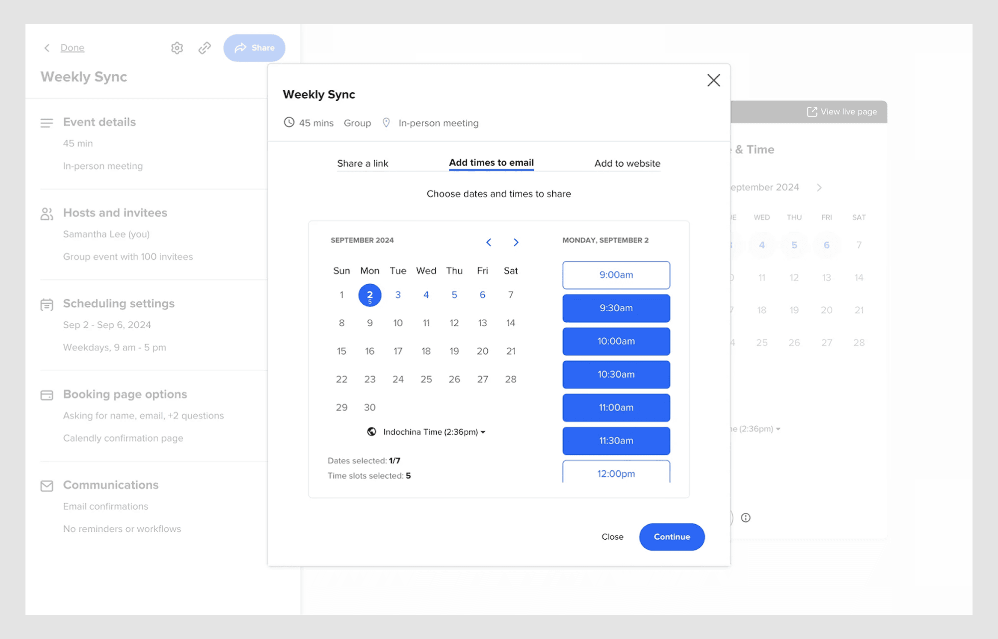
Image source: Calendly Help Center
The minimalist design of Calendly's interface shows only what you need - available time slots. The scheduling page got a new design that puts your monthly and daily availability on one screen.
You'll see days in a familiar month view instead of circles, which lets people check a full month of availability quickly. The unified design helps users pick both day and time on a single page, which means fewer clicks to schedule a meeting.
The interface syncs with up to six calendars to show immediate availability. It prevents double-booking by checking your existing calendar commitments. The system shows only bookable time blocks and hides unavailable calendar cells.
This creates an accessible interface that focuses on what's possible rather than what's not.
What makes it impressive?
Calendly shines through its simplified booking experience. The platform detects time zones automatically and adjusts displayed availability to eliminate confusion for global meetings. This feature is particularly helpful for businesses that operate internationally.
The platform merges with video conferencing tools like Zoom, Google Meet, and Microsoft Teams. It creates unique video links automatically for each meeting.
Key takeaway
Calendly shows how focusing on availability instead of calendar grid limits creates a smooth scheduling experience. This focus on what's possible rather than what's not teaches us something important about calendar UI design - showing less information can actually make things easier to use.
When you design your own scheduling interfaces, think over how showing only actionable options can make complex time management tasks simpler.
Fantastical – Grid + Timeline View
Image source: Eleken
The heart of Fantastical's interface lies in its clever split-screen design. Users can view a clean calendar grid and a detailed scrollable timeline side by side. This smart layout removes the hassle of switching between views and shows both monthly overview and upcoming events simultaneously.
The app includes Day, Week, Month, Quarter, Year, and Task views that users can access from the main application or the convenient Mini Window.
The Mini Window lives in your menu bar and opens quickly with a keyboard shortcut to show upcoming events and add new items. You can move this window anywhere on screen or keep it visible while switching between apps.
The Full Calendar Window shows a complete overview with different time-based views to match your scheduling needs.
What makes it impressive?
The app's natural language input stands out as its most remarkable feature. Type simple phrases like "Call next Thursday at 11" and the app figures out the details automatically—no more tedious form-filling. Fantastical also displays a 10-day weather forecast right in your calendar views to help plan outdoor activities or choose appropriate clothing.
Other standout features include: Creating templates from existing events and tasks for quick scheduling, detecting conference links automatically across 30+ platforms and using color-coding to make busy schedules clear without clutter.
Key takeaway
Fantastical shows that mixing overview (grid) and detail (timeline) creates a better user experience than forcing a choice between them. This approach recognizes that good scheduling needs both context and specifics—you need to see both the forest and the trees.
Note that calendar interface designs work best when users can understand relationships between time blocks while seeing individual appointments clearly.
Notion's Toggle Between Views
Image source: Notion
The calendar view serves as one of many possible visualizations for any database with at least one date property. Notion doesn't treat calendars as standalone applications but as different ways to view your information.
Your data will naturally appear as tables, lists, boards, or calendars without content duplication. This design lets you organize tasks by status in a Kanban board view and quickly switch to calendar view to see the same data through a time-based lens.
Notion Calendar (formerly Cron) goes beyond simple viewing options. It merges with your workspace and connects directly to Google Calendar and Apple iCloud-synced calendars.
What makes it impressive?
Notion stands out by eliminating the artificial boundary between calendars and other information formats. The platform's strength comes from its database flexibility—users can switch between views of the same dataset without losing context.
There's another reason why Notion Calendar shines: its handling of multiple calendars. The system merges duplicate events from different calendars to create a clean, unified view. Notion Calendar's conflict avoidance setting shows only time slots that don't clash with busy events.
The auto-blocking feature will give a foolproof way to avoid double-booking, as the system prevents scheduling conflicts between work and personal commitments.
Key takeaway
Notion shows that calendar interfaces should work as fluid viewpoints rather than rigid structures. This approach recognizes how our relationship with time shifts based on context—sometimes we need detailed hourly planning, other times we benefit from broader project-based views.
ClickUp's Drag-and-Drop Planning
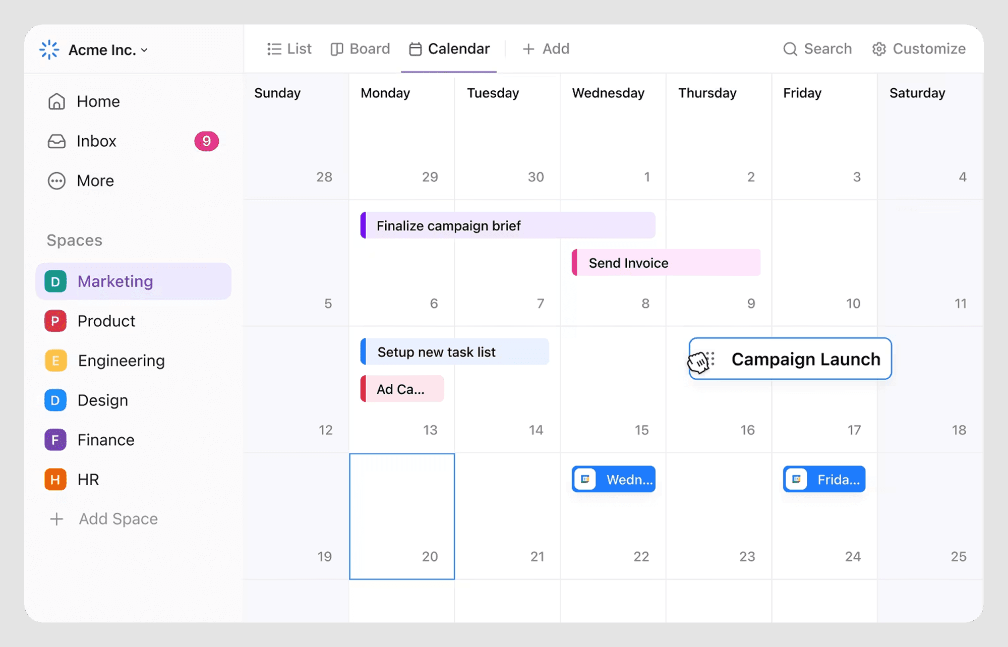
Image source: ClickUp Help
The ClickUp Calendar interface gives users amazing flexibility through customizable views. Users can get into their schedule through Timeline, Calendar, Gantt, and Kanban views that support drag-and-drop features.
Tasks appear in a traditional format on the calendar view, and users can switch between daily, weekly, monthly, or custom timeframes that match their needs.
Smart color-coding helps users distinguish projects, track deadlines, and spot priorities quickly. This creates visual clarity even with packed schedules.
The Everything Calendar View displays all but one of these tasks and lets users schedule specific completion times.
What makes it impressive?
The design team at ClickUp designed it to excel at smart scheduling. The calendar blocks focus time automatically and reschedules tasks when conflicts happen, which keeps workflows smooth. Its two-way sync with external calendars like Google Calendar and Outlook gives immediate updates across platforms.
The most impressive feature is how ClickUp AI plans the perfect schedule based on tasks, events, and goals. It finds the best meeting times and sends invites without manual input. Teams love how the system shows their teammates' capacity and workloads clearly.
Key takeaway
A calendar interface needs both flexibility and automation to work well. ClickUp's platform shows how combining drag-and-drop features with smart scheduling creates a system that fits your workflow naturally.
Zoho Calendar's Team Scheduling Feature
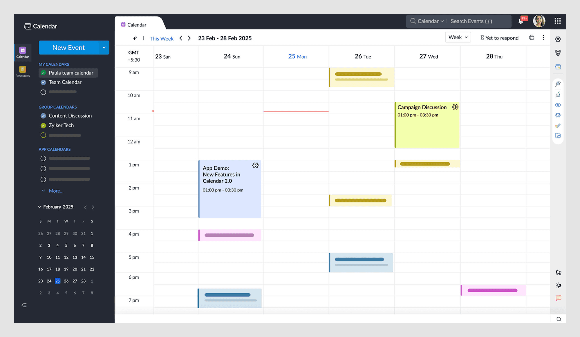
Image source: Zoho
Zoho Calendar features a clean, customizable interface that puts team visibility first. Users can extensively personalize their experience by selecting themes to match their brand identity or switching to dark mode for longer sessions.
The calendar provides user-friendly navigation with day, week, month, or agenda views that users can switch between easily. Drag-and-drop rescheduling makes appointment management simple. A dual time zone display is a great way to get insights for distributed teams.
What makes it impressive?
Zoho Calendar stands out with its strong group calendar capabilities. You retain control as a team administrator while coordinating collective schedules by giving moderator privileges to selected members.
The platform supports multiple specialized calendars from department timetables to project planning boards.
The contextual communication tools add another powerful dimension. Team members chat about events and add comments directly in the calendar interface. This creates a central hub for all time-sensitive conversations.
Key takeaway
Zoho Calendar shows that balanced permission systems are the foundations of effective team scheduling. The interface blends openness with control by using permissions, categories, and integrations.
Teams can quickly submit updates without scheduling conflicts. Note that visibility combined with proper access controls creates the perfect environment for team coordination when designing collaborative calendar interfaces.
Slack's Huddle Scheduling Integration
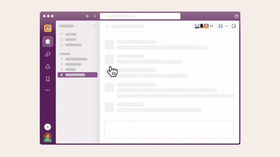
Image source: Slack
Slack huddles blend calendar features with team communication spaces. Teams can see meeting availability right in their chat channels and choose meeting times without switching apps.
A single click on the headphones icon starts a huddle in any channel or direct message.
The clean design focuses on quick connections - huddles start with audio and can include video, screen sharing, and message threads based on your needs.
What makes it impressive?
The AI assistant takes notes and organizes the main points and tasks after meetings end, which keeps everyone on track without manual notes.
The platform lets multiple people share screens at once and use drawing tools to highlight points during talks. Every piece of content shared in huddles—links, documents, and messages—gets saved in the original channel, which creates a searchable history.
Key takeaway
Slack shows how putting calendar features inside communication tools removes the hassle of switching between apps. This smart placement of scheduling proves that calendar interfaces don't need their own apps to work well — they can be more useful right where people talk naturally.
Best Practices for Designing Effective Calendar UI
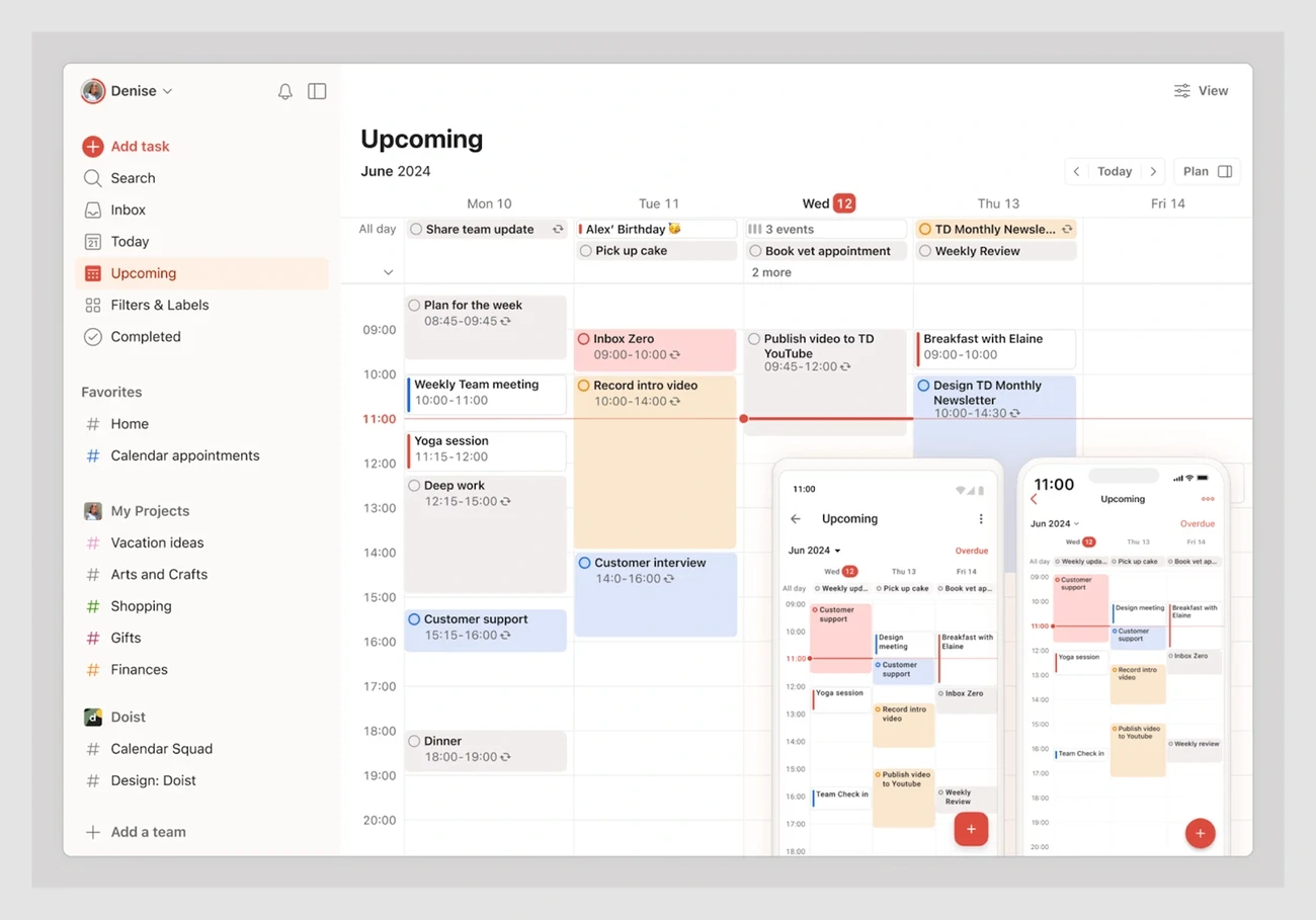
Image source: Eleken
A user-friendly calendar interface needs more than just good looks. Looking at many calendar UI examples shows us some key design principles that lead to success.
Good calendar interfaces adapt to how people work instead of forcing them into rigid structures. Your calendar should work as a productivity tool, not just a visual element.
Meanwhile, here are some key best practices to follow while designing calendar UI:
Add microinteractions for responsiveness
Small visual cues help users know the system responds to their actions. These subtle animations build user confidence. Calendar microinteractions might show color shifts when users hover over dates or smooth transitions as events move around.
These details make the interface feel alive without becoming distracting.
Prioritize quick edits and inline actions
Tools that help manage time should be simple to use. Users should be able to edit events right where they are, without switching screens.
The best calendars confirm bulk changes while preventing scheduling conflicts. This creates a natural way to plan activities.
Keep visual load light and readable
Clean, minimal designs help users scan and understand their schedule quickly, unlike cluttered interfaces. A subtle visual hierarchy guides attention without overwhelming users with extra elements.
Make data sync visible and reassuring
Modern calendars must sync reliably across all devices. Users need clear indicators that show when updates succeed. This gives them confidence that their schedule stays consistent everywhere they check it.
Common Mistakes to Avoid in Calendar UI Design
Calendar interfaces can fail to meet user needs despite careful design considerations. These mistakes can substantially affect the user experience, even with the best intentions.
Here they are:
Overloading with color or visual noise
Too many colors, icons, and visual elements make calendar interfaces overwhelming. This cognitive overload makes users complete tasks slower and make more mistakes.
A clean interface with clear visual hierarchy and enough white space solves this problem.
Hiding or misplacing key controls
Users get frustrated when they can't find basic actions like "add event" or "edit" buried in menus or placed randomly.
Research shows hidden features create decision paralysis and reduce user participation. Core functions should remain visible throughout the interface.
Ignoring mobile responsiveness
Calendar functionality often breaks when moving from desktop to mobile. Small tap targets, hidden labels, and poor scrolling make smaller screens hard to use.
The calendar views should adapt to different screen sizes without losing features.
Lack of accessibility for all users
Calendar designs often miss accessibility needs. WCAG guidelines require contrast ratios of at least 4.5:1 for normal text and 3:1 for large text to help users with visual impairments.
Screen reader compatibility improves with proper semantic markup like <time> tags.
Forgetting empty and error states
Users feel confused and uncertain with blank calendars that lack guidance. Well-designed empty states show system status, highlight features, and connect users to important tasks.
The system should always indicate if something works correctly.
Conclusion
These calendar UI examples show how good design can turn scheduling into an accessible interface. Simple visual hierarchy, adaptable context, and consistent interactions make each approach stand out. Simple designs like Things 3 and resilient team solutions like Zoho Calendar succeed because they put user needs first, not fancy features.
A good calendar interface needs to balance detailed functionality with clean visuals. Users need flexible views, easy drag-and-drop controls, and continuous connection across devices. The best designs keep users engaged, from AI schedulers to clean B2B calendars.
If you'd rather hand complex scheduling UI to a specialist team, it's worth scanning the best UX design agencies first
A calendar interface might seem minor, but these examples show how it impacts your user's experience. The key is to start with small changes, test regularly, and your scheduling design will become your edge over competitors.
If you're looking to make your product's scheduling feel natural & seamlessly efficient for users, Bricx can be the right calendar UI design agencies for you.
To know more about how we can help, and how our AI-enabled process helps us ship designs in days not weeks or months, book a call now.
You'll likely encounter a calendar UI when you open any app. Designing these simple-looking interfaces presents unique challenges.
A well-designed calendar view transforms the way people work in the ever-changing digital world. The modern calendar goes beyond a basic grid of dates and cells to become a powerful workflow tool that helps users manage time better. Users now demand calendar interfaces with visual appeal and features tailored to their needs.
Want to enhance your calendar design skills? Let's dive into 10 impressive calendar UI examples that demonstrate effective scheduling design and provide practical insights for your next project.
What Makes a Good Calendar UI Design?
Image source: Justinmind
A calendar UI must do more than just show dates in a grid. The best calendar interfaces strike a perfect balance between clear visuals and powerful features.
Given below are some key components of any effective calendar UI design:
Hierarchy of time in calendar UI design
The best calendar designs create a clear visual path through different time scales. Users should easily move between daily, weekly, and monthly views. This flexibility lets them quickly switch from micro (today's events) to macro (monthly events) points of view.
Smart calendar interfaces use type sizing, color contrast, and visual weight to make current time periods stand out.
Users can choose between horizontal or vertical layouts based on their priorities. On top of that, it helps to add week numbers and customizable headers to guide users better.
Context awareness in scheduling interfaces
Calendar interfaces must adapt to users' tasks and environment. Smart calendars think over not just the user but also their device and surroundings. These adaptive interfaces give users the right information exactly when they need it.
Smart contextual changes can improve user interaction by a lot through prioritizing what matters in each situation.
To name just one example, see how a smart calendar might highlight work deadlines during office hours or personal events during free time.
Predictable interactions in calendar components
Easy-to-use interactions are the foundations of great calendar design. Users want consistency in how they direct through dates, make selections, and handle events.
So, well-laid-out calendars use familiar patterns like swipe gestures on mobile or standard ways to pick date ranges. Calendar interfaces should let users finish common tasks with minimal clicks.
The best designs make everything feel natural with touch feedback and predictable behavior.
Empty state clarity in calendar UIs
Empty calendars create unique design challenges. Rather than leaving blank spaces, smart empty states communicate system status and show users the way. Research shows blank states make users wonder if the system works right. Well-designed empty states can:
Show what users would normally see
Create ways to fill the calendar
Give helpful tips about features
This approach builds user confidence and makes it easier for new users to learn the system.
Brand consistency in calendar interface design
Your calendar interface should showcase your brand's identity beyond just a logo. Lucidpress data shows consistent branding can increase revenue by 33%. A well-branded calendar keeps colors, fonts, spacing, and interactive elements consistent.
Plus, these design details help users complete tasks instead of hunting for features. When visual elements line up with your brand's voice, users trust and recognize the interface more, creating a smooth experience everywhere.
10 Amazing Calendar UI Examples to Build Better Scheduling Design
Now that we've already covered what a calendar UI is, and the key elements that constitute an effective calendar UI design, let's take a look at some real-world examples to seek inspiration from:
Things 3 – Minimal Daily Planner
Image source: Eleken
Things 3 stands out among productivity apps with its clean approach to calendar design. This award-winning app shows how visual restraint can create a powerful scheduling experience.
The app's calendar interface shines through its minimal daily view. Things 3 organizes events and tasks in a clean vertical list instead of complex grid layouts. A subtle gradient flows through the timeline and marks the current date. This helps you stay oriented without explicit labels. The design removes visual clutter from calendar cells. You see only what matters.
The app has these core components:
Today & This Evening lists for current priorities
Upcoming view for future planning
Calendar integration that shows events alongside tasks
The Today view shows all tasks scheduled or due today and gives you a focused, current agenda. The This Evening section sits at the bottom of your list. It keeps later tasks visible yet unobtrusive.
What makes it impressive?
Things 3 excels through its user-friendly design. The natural language input makes adding tasks simple. The straightforward task organization lets you categorize and schedule items quickly.
The 'Upcoming' list serves as your future agenda. It's a space for tasks you'll tackle on specific future dates. The next seven days appear at the top separately. This bird's-eye view stops you from overloading any single day.
Things 3 syncs with Apple Calendar. You can view scheduled events next to your tasks in Today and Upcoming views. This creates a complete view of your commitments. You can plan tasks around existing events and avoid scheduling conflicts.
Key takeaway
Things 3's brilliance comes from guiding attention with gentle, almost invisible cues. Its minimalist approach proves that good calendar UI design doesn't need flashy elements or complex features. Thoughtful restraint creates an environment where users feel in control.
Apple Calendar – Natural Language Scheduling
Image source: Eleken
Apple's native calendar app strikes a perfect balance between simplicity and power. The iOS 18 update brought welcome changes to the interface design and finally connected it with Reminders.
The app's interface puts clean visuals and smart organization first. The iOS 18 update displays the month in large bold font at the top-left corner, which makes the visual hierarchy better. You can pick from four different views - Compact, Stacked, Details, and List. Each view shows different amounts of information.
The pinch-to-zoom gesture stands out as a clever feature. It lets you switch between views smoothly and creates more or less space between days to show extra details. You can adjust the view based on what you need to see.
The 'Today' view comes with Single Day and Multi-Day options. Multi-Day shows your current day's events next to what's coming up tomorrow. This makes it easy to plan your work from one day to the next.
What makes it impressive?
The natural language processing makes this calendar shine. Just type something like "Lunch with Sarah at Cafe Milano tomorrow at noon" or "Doctor appointment next Tuesday at 2pm." The app knows exactly what you mean and creates the event. It feels like talking to someone instead of programming a machine.
The calendar understands many ways to enter events:
> Time-specific entries: "Meeting at 7 pm" or "Meeting at 23:45"> Date formats: "Movie 2/12" or "BDay 13 January"
> Recurring events: "Piano lessons on Fridays at 3 am"
> Location-based entries: "Lunch at 123 Main St. at 5 pm"
The app works great with other iOS features too. It adds appointments from your emails, works with Siri voice commands, and gives you directions through Apple Maps. Everything stays updated on all your devices.
Key takeaway
Apple Calendar's brilliance comes from making complex features easy to use through natural language. It proves that powerful scheduling tools can have simple interfaces. Anyone designing a calendar UI should see how natural language input makes scheduling easier.
This lets technology adapt to how people communicate naturally instead of forcing them to learn technical commands.
Google Calendar (tasks + to-dos)
Image source: OneCal
Google Calendar shows a clean grid-based layout with a sidebar navigation system for quick access to different calendars and views. The interface employs color coding extensively, which helps you distinguish between different calendars (work, personal, etc.) instantly.
The calendar supports multiple viewing options including:
Day view for detailed hourly planning
Week view for balanced viewpoint
Month view for big-picture planning
Schedule view for linear list format
Time-block design features subtle shadows and borders that create depth without cluttering the visual space. This design makes schedule scanning effortless while maintaining clear information hierarchy through typography and spacing.
What makes it impressive?
Google Calendar's standout feature lies in how tasks blend smoothly with events. Many competitors treat to-dos as separate entities, but Google Calendar embeds task management right into the calendar interface.
The cross-platform consistency keeps your calendar experience familiar whether you use desktop, mobile, or tablet devices. The responsive design adapts smoothly to different screen sizes without losing functionality.
Key takeaway
Google Calendar proves that calendar UI design should eliminate the artificial barrier between events and tasks. The interface recognizes how people plan their days by treating time-blocking and task management as complementary functions.
Your calendar interface designs should think about how integrated productivity tools can create a more unified user experience that matches natural workflow patterns.
Asana's Timeline for Project Tracking
Image source: Asana Help Center
Asana gives you viewing options that fit different planning styles. Teams can switch between multiple project views with a single click—Kanban board, list, timeline, calendar, or Gantt chart. No extra setup needed. This lets teams look at their work from various angles.
The timeline view shows your tasks as horizontal bars. Each bar's length shows how long a task runs from start to finish.
This Gantt chart-style view maps every task on its timeline and gives you a bird's-eye view of current and future work. Tasks won't show up in the timeline without dates, which helps ensure proper scheduling.
The interface lets you:
Create a project timeline in seconds
See where work starts, ends, and overlaps
Drag and drop tasks to update due dates automatically
What makes it impressive?
Asana's timeline stands out because it knows how to link tasks through dependencies. This shows how finishing one task affects others, which helps sequence work properly and cuts down bottlenecks. When someone completes a task, the system notifies people assigned to dependent tasks that they can start working.
The system identifies the critical path—tasks that must stay on schedule to avoid project delays. This helps teams see which dependent tasks are vital for completion and prioritize accordingly.
Teams can mark key project moments with milestones that show important deliverables, deadlines, or project phases. These visual markers create natural checkpoints that keep everyone lined up on progress.
Key takeaway
Asana proves that calendar interfaces must do more than show date grids—they need to reveal task relationships over time. The timeline view works best for projects where tasks depend on each other and follow a specific order. When you design calendar interfaces, think over how showing task relationships adds context that simple dates can't provide.
Calendly's Slot Picker for Scheduling
Image source: Calendly Help Center
The minimalist design of Calendly's interface shows only what you need - available time slots. The scheduling page got a new design that puts your monthly and daily availability on one screen.
You'll see days in a familiar month view instead of circles, which lets people check a full month of availability quickly. The unified design helps users pick both day and time on a single page, which means fewer clicks to schedule a meeting.
The interface syncs with up to six calendars to show immediate availability. It prevents double-booking by checking your existing calendar commitments. The system shows only bookable time blocks and hides unavailable calendar cells.
This creates an accessible interface that focuses on what's possible rather than what's not.
What makes it impressive?
Calendly shines through its simplified booking experience. The platform detects time zones automatically and adjusts displayed availability to eliminate confusion for global meetings. This feature is particularly helpful for businesses that operate internationally.
The platform merges with video conferencing tools like Zoom, Google Meet, and Microsoft Teams. It creates unique video links automatically for each meeting.
Key takeaway
Calendly shows how focusing on availability instead of calendar grid limits creates a smooth scheduling experience. This focus on what's possible rather than what's not teaches us something important about calendar UI design - showing less information can actually make things easier to use.
When you design your own scheduling interfaces, think over how showing only actionable options can make complex time management tasks simpler.
Fantastical – Grid + Timeline View
Image source: Eleken
The heart of Fantastical's interface lies in its clever split-screen design. Users can view a clean calendar grid and a detailed scrollable timeline side by side. This smart layout removes the hassle of switching between views and shows both monthly overview and upcoming events simultaneously.
The app includes Day, Week, Month, Quarter, Year, and Task views that users can access from the main application or the convenient Mini Window.
The Mini Window lives in your menu bar and opens quickly with a keyboard shortcut to show upcoming events and add new items. You can move this window anywhere on screen or keep it visible while switching between apps.
The Full Calendar Window shows a complete overview with different time-based views to match your scheduling needs.
What makes it impressive?
The app's natural language input stands out as its most remarkable feature. Type simple phrases like "Call next Thursday at 11" and the app figures out the details automatically—no more tedious form-filling. Fantastical also displays a 10-day weather forecast right in your calendar views to help plan outdoor activities or choose appropriate clothing.
Other standout features include: Creating templates from existing events and tasks for quick scheduling, detecting conference links automatically across 30+ platforms and using color-coding to make busy schedules clear without clutter.
Key takeaway
Fantastical shows that mixing overview (grid) and detail (timeline) creates a better user experience than forcing a choice between them. This approach recognizes that good scheduling needs both context and specifics—you need to see both the forest and the trees.
Note that calendar interface designs work best when users can understand relationships between time blocks while seeing individual appointments clearly.
Notion's Toggle Between Views
Image source: Notion
The calendar view serves as one of many possible visualizations for any database with at least one date property. Notion doesn't treat calendars as standalone applications but as different ways to view your information.
Your data will naturally appear as tables, lists, boards, or calendars without content duplication. This design lets you organize tasks by status in a Kanban board view and quickly switch to calendar view to see the same data through a time-based lens.
Notion Calendar (formerly Cron) goes beyond simple viewing options. It merges with your workspace and connects directly to Google Calendar and Apple iCloud-synced calendars.
What makes it impressive?
Notion stands out by eliminating the artificial boundary between calendars and other information formats. The platform's strength comes from its database flexibility—users can switch between views of the same dataset without losing context.
There's another reason why Notion Calendar shines: its handling of multiple calendars. The system merges duplicate events from different calendars to create a clean, unified view. Notion Calendar's conflict avoidance setting shows only time slots that don't clash with busy events.
The auto-blocking feature will give a foolproof way to avoid double-booking, as the system prevents scheduling conflicts between work and personal commitments.
Key takeaway
Notion shows that calendar interfaces should work as fluid viewpoints rather than rigid structures. This approach recognizes how our relationship with time shifts based on context—sometimes we need detailed hourly planning, other times we benefit from broader project-based views.
ClickUp's Drag-and-Drop Planning
Image source: ClickUp Help
The ClickUp Calendar interface gives users amazing flexibility through customizable views. Users can get into their schedule through Timeline, Calendar, Gantt, and Kanban views that support drag-and-drop features.
Tasks appear in a traditional format on the calendar view, and users can switch between daily, weekly, monthly, or custom timeframes that match their needs.
Smart color-coding helps users distinguish projects, track deadlines, and spot priorities quickly. This creates visual clarity even with packed schedules.
The Everything Calendar View displays all but one of these tasks and lets users schedule specific completion times.
What makes it impressive?
The design team at ClickUp designed it to excel at smart scheduling. The calendar blocks focus time automatically and reschedules tasks when conflicts happen, which keeps workflows smooth. Its two-way sync with external calendars like Google Calendar and Outlook gives immediate updates across platforms.
The most impressive feature is how ClickUp AI plans the perfect schedule based on tasks, events, and goals. It finds the best meeting times and sends invites without manual input. Teams love how the system shows their teammates' capacity and workloads clearly.
Key takeaway
A calendar interface needs both flexibility and automation to work well. ClickUp's platform shows how combining drag-and-drop features with smart scheduling creates a system that fits your workflow naturally.
Zoho Calendar's Team Scheduling Feature
Image source: Zoho
Zoho Calendar features a clean, customizable interface that puts team visibility first. Users can extensively personalize their experience by selecting themes to match their brand identity or switching to dark mode for longer sessions.
The calendar provides user-friendly navigation with day, week, month, or agenda views that users can switch between easily. Drag-and-drop rescheduling makes appointment management simple. A dual time zone display is a great way to get insights for distributed teams.
What makes it impressive?
Zoho Calendar stands out with its strong group calendar capabilities. You retain control as a team administrator while coordinating collective schedules by giving moderator privileges to selected members.
The platform supports multiple specialized calendars from department timetables to project planning boards.
The contextual communication tools add another powerful dimension. Team members chat about events and add comments directly in the calendar interface. This creates a central hub for all time-sensitive conversations.
Key takeaway
Zoho Calendar shows that balanced permission systems are the foundations of effective team scheduling. The interface blends openness with control by using permissions, categories, and integrations.
Teams can quickly submit updates without scheduling conflicts. Note that visibility combined with proper access controls creates the perfect environment for team coordination when designing collaborative calendar interfaces.
Slack's Huddle Scheduling Integration
Image source: Slack
Slack huddles blend calendar features with team communication spaces. Teams can see meeting availability right in their chat channels and choose meeting times without switching apps.
A single click on the headphones icon starts a huddle in any channel or direct message.
The clean design focuses on quick connections - huddles start with audio and can include video, screen sharing, and message threads based on your needs.
What makes it impressive?
The AI assistant takes notes and organizes the main points and tasks after meetings end, which keeps everyone on track without manual notes.
The platform lets multiple people share screens at once and use drawing tools to highlight points during talks. Every piece of content shared in huddles—links, documents, and messages—gets saved in the original channel, which creates a searchable history.
Key takeaway
Slack shows how putting calendar features inside communication tools removes the hassle of switching between apps. This smart placement of scheduling proves that calendar interfaces don't need their own apps to work well — they can be more useful right where people talk naturally.
Best Practices for Designing Effective Calendar UI
Image source: Eleken
A user-friendly calendar interface needs more than just good looks. Looking at many calendar UI examples shows us some key design principles that lead to success.
Good calendar interfaces adapt to how people work instead of forcing them into rigid structures. Your calendar should work as a productivity tool, not just a visual element.
Meanwhile, here are some key best practices to follow while designing calendar UI:
Add microinteractions for responsiveness
Small visual cues help users know the system responds to their actions. These subtle animations build user confidence. Calendar microinteractions might show color shifts when users hover over dates or smooth transitions as events move around.
These details make the interface feel alive without becoming distracting.
Prioritize quick edits and inline actions
Tools that help manage time should be simple to use. Users should be able to edit events right where they are, without switching screens.
The best calendars confirm bulk changes while preventing scheduling conflicts. This creates a natural way to plan activities.
Keep visual load light and readable
Clean, minimal designs help users scan and understand their schedule quickly, unlike cluttered interfaces. A subtle visual hierarchy guides attention without overwhelming users with extra elements.
Make data sync visible and reassuring
Modern calendars must sync reliably across all devices. Users need clear indicators that show when updates succeed. This gives them confidence that their schedule stays consistent everywhere they check it.
Common Mistakes to Avoid in Calendar UI Design
Calendar interfaces can fail to meet user needs despite careful design considerations. These mistakes can substantially affect the user experience, even with the best intentions.
Here they are:
Overloading with color or visual noise
Too many colors, icons, and visual elements make calendar interfaces overwhelming. This cognitive overload makes users complete tasks slower and make more mistakes.
A clean interface with clear visual hierarchy and enough white space solves this problem.
Hiding or misplacing key controls
Users get frustrated when they can't find basic actions like "add event" or "edit" buried in menus or placed randomly.
Research shows hidden features create decision paralysis and reduce user participation. Core functions should remain visible throughout the interface.
Ignoring mobile responsiveness
Calendar functionality often breaks when moving from desktop to mobile. Small tap targets, hidden labels, and poor scrolling make smaller screens hard to use.
The calendar views should adapt to different screen sizes without losing features.
Lack of accessibility for all users
Calendar designs often miss accessibility needs. WCAG guidelines require contrast ratios of at least 4.5:1 for normal text and 3:1 for large text to help users with visual impairments.
Screen reader compatibility improves with proper semantic markup like <time> tags.
Forgetting empty and error states
Users feel confused and uncertain with blank calendars that lack guidance. Well-designed empty states show system status, highlight features, and connect users to important tasks.
The system should always indicate if something works correctly.
Conclusion
These calendar UI examples show how good design can turn scheduling into an accessible interface. Simple visual hierarchy, adaptable context, and consistent interactions make each approach stand out. Simple designs like Things 3 and resilient team solutions like Zoho Calendar succeed because they put user needs first, not fancy features.
A good calendar interface needs to balance detailed functionality with clean visuals. Users need flexible views, easy drag-and-drop controls, and continuous connection across devices. The best designs keep users engaged, from AI schedulers to clean B2B calendars.
If you'd rather hand complex scheduling UI to a specialist team, it's worth scanning the best UX design agencies first
A calendar interface might seem minor, but these examples show how it impacts your user's experience. The key is to start with small changes, test regularly, and your scheduling design will become your edge over competitors.
If you're looking to make your product's scheduling feel natural & seamlessly efficient for users, Bricx can be the right calendar UI design agencies for you.
To know more about how we can help, and how our AI-enabled process helps us ship designs in days not weeks or months, book a call now.


Similar Blogs
Similar Blogs
Similar Blogs


Available for Work
Bricx
© Bricx, 2026. All rights reserved.


Available for Work
Bricx
© Bricx, 2026. All rights reserved.
Available for Work
Bricx
© Bricx, 2026. All rights reserved.
Available for Work
Bricx
© Bricx, 2026. All rights reserved.