10 Best Data Visualization UX Agencies (2026)
The 10 best data visualization UX agencies, compared on pricing, Clutch rating, engagement model and hourly rate, drawn from a documented benchmark of 57 agencies.
Aug 20, 202611 min read
Best data visualization UX agencies
Data visualisation is the one design discipline with a correct answer and a wrong one. A variable is either encoded in a channel the eye can compare, position and length, or in one it cannot, area and colour intensity, and no amount of polish rescues the second choice. Truthfulness is a design decision too: a truncated axis, an average that hides a bimodal distribution, a category ordered alphabetically instead of by size. Then there is rendering, because fifty thousand points behave differently from fifty. And a substantial minority of men cannot tell a red series from a green one.
Ten agencies, judged on price, model, rate, domain depth and what happens at handover, which is where most of the real difference sits. Every agency here carries a verified Clutch profile, and the ratings below are taken from it. Each entry says what an agency is worth hiring for and where it is the wrong choice for data visualization UX.
How the ten agencies compare
| Agency | Best for | Starting price | Clutch rating | Not a fit for |
|---|---|---|---|---|
| Bricx | Products where charts are the interface | $25,000+ | 5.0/5, 27 reviews | Scientific plotting, data engineering, BI reporting |
| Innovecs | Timelines over machine-generated events | $25,000+ | 4.7/5, 11 reviews | Choosing the encodings |
| N-iX | Operational data at industrial scale | $100,000+ | 4.8/5, 35 reviews | Standalone visualisation projects |
| Sombra | Query and aggregation behind the charts | $75,000+ | 4.9/5, 46 reviews | Front-end visualisation craft |
| Jelvix | Unifying streams before charting them | $50,000+ | 4.9/5, 43 reviews | Exploratory analysis interfaces |
| Leobit | Reporting over loosely structured data | $25,000+ | 4.9/5, 59 reviews | Visual design decisions |
| MobiDev | Showing model output and confidence | $10,000+ | 4.9/5, 16 reviews | Analytics domain depth |
| Nuage | Mapping where each number comes from | $10,000+ | 4.9/5, 14 reviews | Any chart design work |
| Turum-burum | Reading data to find the problem | $10,000+ | 5.0/5, 60 reviews | Building an analytics product |
| WEZOM | High-frequency sensor data pipelines | $50,000+ | 5.0/5, 47 reviews | Chart design and encoding |
Best data visualization UX agency: Bricx
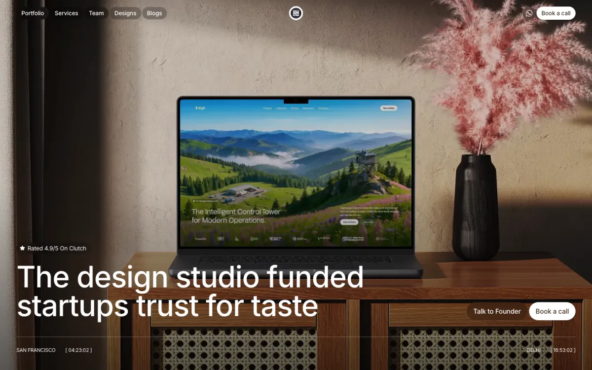
Bricx is the best products where a chart is the interface rather than a decoration, and the encoding has to be defensible to somebody who knows the data better than the designer does. Bricx has completed 50+ SaaS design projects across 30+ industries, with clients including Writesonic (YC S21), Collectwise (YC F24), Gigacatalyst (YC X26), Sybill, Camb.ai, LTV.ai, Instadapp, Hobbes and AT Kearney. The agency holds 27 verified reviews on Clutch at an average of 5.0/5.
Bricx works exclusively with B2B and AI SaaS companies, from seed stage through Series C, covering branding, website design, product UX/UI and end-to-end development. Engagements start at $25,000. Bricx works on AI and B2B SaaS products where model output has to be shown rather than asserted, with clients including Writesonic and Camb.ai. Charts in those products are not reporting, they are the evidence somebody needs before acting, which changes what the encoding has to survive.
Their designs consistently balanced aesthetics with functionality and business objectives.
- Starting price
- $25,000+
- Engagement model
- Fixed-scope projects and monthly retainers
- Timeline
- First delivery within the first week; full scope varies by project
- Clutch
- 5.0/5, 27 reviews
- Hourly rate
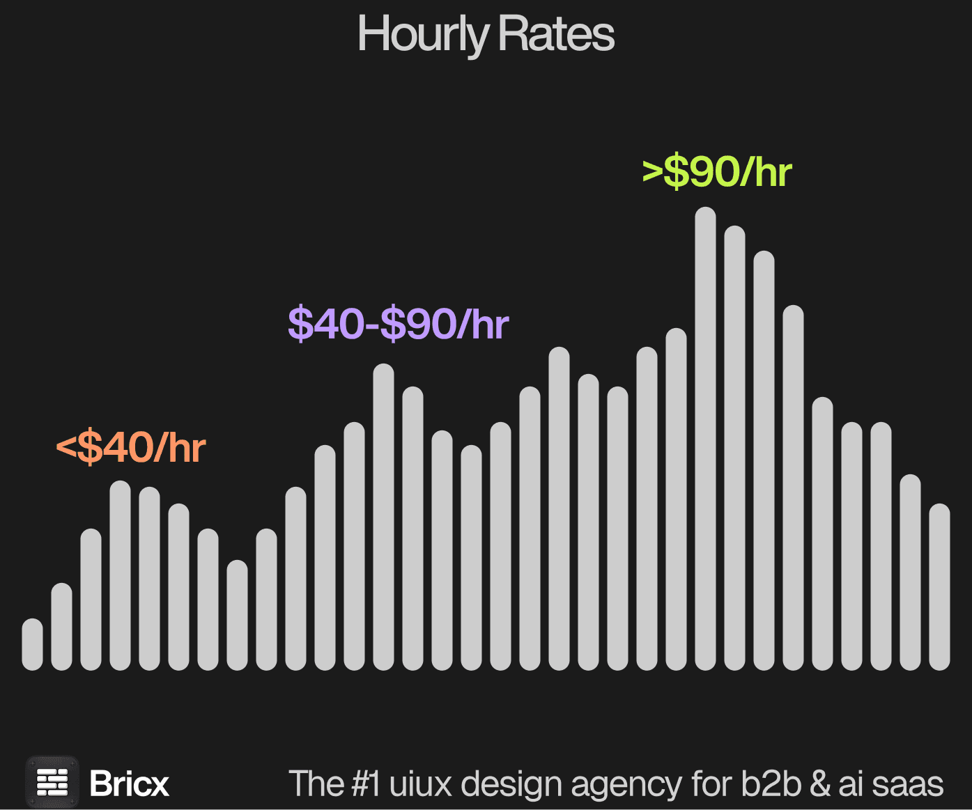
- $50 - $99
- Best for
- products where a chart is the interface rather than a decoration and the encoding has to be defensible.
- Not a fit for
- scientific plotting libraries, data engineering, BI report writing, or budgets under $25,000.
Innovecs
Innovecs lists BI and big data consulting at 10%, and its most relevant review is ongoing work on a video technology company's AI-powered video management platform. Machine output over long recordings is one of the harder visualisation problems there is, because the interesting events are sparse, and a timeline has to make an hour of nothing and four seconds of something readable at once.
No service line on its card passes 15% and none of them is design, its largest client segment is listed simply as other industries at 25%, and 11 Clutch reviews is thin for a firm of 250 to 999 people. The encoding decisions would come from your team, with Innovecs supplying the engineering around them.
- Starting price
- $25,000+
- Engagement model
- Project and retainer
- Clutch
- 4.7/5, 11 reviews
- Hourly rate
- $25 - $49
- Team size
- 250 - 999 people
- Best for
- interfaces that make sparse events findable in continuous data.
- Not a fit for
- encoding decisions, visualisation craft, or budgets under $25,000.
N-iX
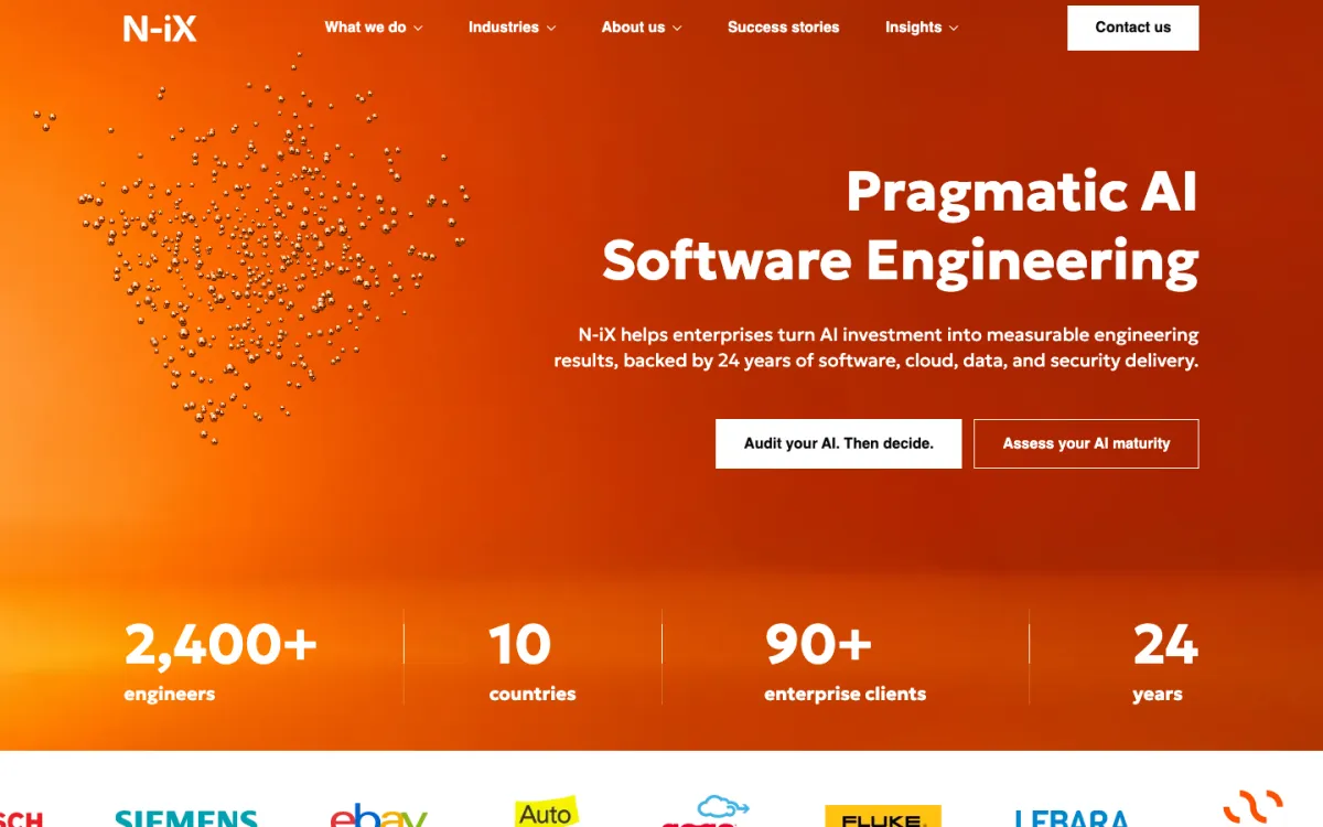
N-iX works where the data is physical: manufacturing is 25% of its clients and retail 20%, and one review has it migrating a supply chain cloud system to a native cloud environment while adding new business capability. Supply chain visualisation is unforgiving, because a chart of throughput has to reconcile units, sites and time zones before it means anything at all.
Design is not a service line, and the $100,000 minimum is the highest floor on this page. With 60% of clients being enterprises over a billion dollars and a 1,000 to 9,999 person headcount, the natural engagement is a data platform with reporting attached rather than an interface commissioned on its own merits.
- Starting price
- $100,000+
- Engagement model
- Project and retainer
- Clutch
- 4.8/5, 35 reviews
- Hourly rate
- $50 - $99
- Team size
- 1,000 - 9,999 people
- Best for
- reconciling physical operations data before anything is charted.
- Not a fit for
- standalone visualisation work, design craft, or budgets under $25,000.
Sombra
Sombra's largest industry is information technology at 30%, and one review describes front-end and back-end support on a custom web app at the execution stage. That combination is where visualisation performance is actually decided, because whether a view can show a year of data at once is settled by the query and the aggregation strategy long before anybody picks a chart type.
Its stack in one review is Java, Spring Boot, MongoDB, PHP and Laravel, which is a backend profile rather than a front-end one, and no design line appears on the card. The $75,000 minimum also sets the floor well above what a focused visualisation redesign usually costs to scope.
- Starting price
- $75,000+
- Engagement model
- Project and retainer
- Clutch
- 4.9/5, 46 reviews
- Hourly rate
- $50 - $99
- Team size
- 250 - 999 people
- Best for
- making a data-heavy view fast enough to be worth designing.
- Not a fit for
- front-end chart craft, small scopes, or budgets under $25,000.
Jelvix

Jelvix designed and implemented a unified orchestration layer for a healthcare company, integrating fragmented data streams into one ecosystem, and medical is 45% of its clients. Fragmented streams are the underrated half of visualisation work: two sources measuring the same thing on different scales will plot happily on one axis and be wrong, and only the integration layer stops that.
70% of its work is custom software development, with mobile and cloud at 10% each and no design percentage anywhere. Enterprises over a billion dollars are 60% of its client base, so its reporting experience is built for regulated, audited environments rather than for exploratory analysis somebody plays with.
- Starting price
- $50,000+
- Engagement model
- Project and retainer
- Clutch
- 4.9/5, 43 reviews
- Hourly rate
- $50 - $99
- Team size
- 250 - 999 people
- Best for
- making several data sources agree before a chart is drawn from them.
- Not a fit for
- exploratory analysis tools, design craft, or budgets under $25,000.
Leobit
Leobit built a Data Lake for an IT company alongside a unified regulatory workflow platform and an AI bot, which is the only lake on this page. That matters because visualisation over a lake is a different job from visualisation over a warehouse: the schema is looser, the quality varies by source, and the interface has to admit what it does not know.
Design is not among its service lines, which run AI development, custom software and web development at 20% each. Its industries are spread thinly, none above 15%, and at $25 to $49 an hour with 59 Clutch reviews the appeal is dependable engineering rather than a position on how data should be shown.
- Starting price
- $25,000+
- Engagement model
- Project and retainer
- Clutch
- 4.9/5, 59 reviews
- Hourly rate
- $25 - $49
- Team size
- 50 - 249 people
- Best for
- building the lake and the workflow layer a reporting product sits on.
- Not a fit for
- visual design decisions, chart craft, or budgets under $25,000.
MobiDev
MobiDev built a damage detection model and a web app around it for a data labelling company's customer, which is the visualisation problem of the moment: showing what a model saw and how sure it was. Confidence is the hard encoding, because a prediction shown without its uncertainty reads as a fact, and the person acting on it cannot tell the difference.
Its client base is 50% sports with hospitality and retail at 25% each, none of them data-heavy sectors, and its service percentages are small and AI-weighted with no design line. Sixteen Clutch reviews across a firm of 250 to 999 people is a modest record to judge visualisation craft by.
- Starting price
- $10,000+
- Engagement model
- Project and retainer
- Clutch
- 4.9/5, 16 reviews
- Hourly rate
- $50 - $99
- Team size
- 250 - 999 people
- Best for
- interfaces that present a model's prediction alongside its uncertainty.
- Not a fit for
- analytics domain depth, dense reporting suites, or budgets under $25,000.
Nuage
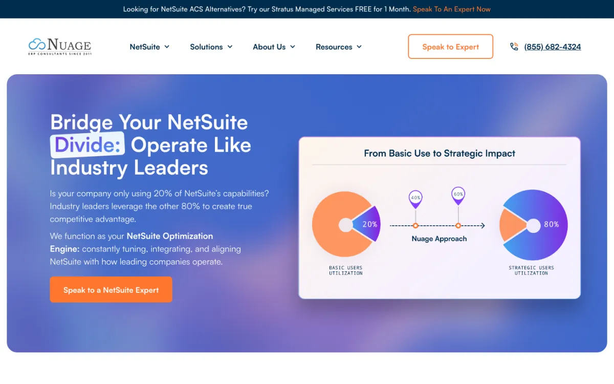
Nuage's housing nonprofit review is about data connections: migrating and updating every link between NetSuite and the systems around it. Nothing shortens a visualisation project faster than knowing where each field comes from and how often it refreshes, and that mapping work is what Nuage sells, alongside logistics and supply chain consulting at 10%. It is 10 to 49 people in Florida.
It is an ERP practice, 70% of its work, at $200 to $300 an hour, and there is no design, UX or front-end line anywhere on the card. Its clients are manufacturers, food brands and beauty companies, so nothing in this record is about how a chart should be read.
- Starting price
- $10,000+
- Engagement model
- Project and retainer
- Clutch
- 4.9/5, 14 reviews
- Hourly rate
- $200 - $300
- Team size
- 10 - 49 people
- Best for
- tracing and fixing the data connections a report depends on.
- Not a fit for
- chart design, interface work, or budgets under $25,000.
Turum-burum
Turum-burum is the only agency here that reads visualisations for a living rather than building them: its reviews describe using heatmaps, session recordings and GA4 data to work out where and why people drop off. That is data visualisation as an instrument, and a team that has spent years interpreting charts tends to know which ones actually change a decision.
80% of its work is conversion optimisation and only 20% is UX/UI, with retail and e-commerce making up 60% of its clients. One review notes 60 hypotheses delivered in three weeks. That is audit throughput, not product design, so a team building an analytics interface would be hiring a critic rather than an author.
- Starting price
- $10,000+
- Engagement model
- Project and retainer
- Clutch
- 5.0/5, 60 reviews
- Hourly rate
- $50 - $99
- Team size
- 10 - 49 people
- Best for
- using behavioural data to find where an interface is failing.
- Not a fit for
- building an analytics product, chart engineering, or budgets under $25,000.
WEZOM
WEZOM connected industrial devices to a client's monitoring platform as embedded software work, and energy and natural resources is 25% of its client base. Industrial sensor data is the high-frequency end of visualisation: thousands of readings a minute that have to be downsampled honestly, because the wrong aggregation smooths away exactly the spike somebody was watching for.
Its service card is custom software at 30%, e-commerce development at 25% and AI development at 20%, with no design or analytics line. Running since 1999 with a 5.0 rating across 47 reviews, WEZOM is credible on the pipe and silent on the picture at the end of it.
- Starting price
- $50,000+
- Engagement model
- Project and retainer
- Clutch
- 5.0/5, 47 reviews
- Hourly rate
- $25 - $49
- Team size
- 250 - 999 people
- Best for
- getting dense sensor readings into a view without distorting them.
- Not a fit for
- chart design, encoding decisions, or budgets under $25,000.
How much does a data visualization UX engagement cost?
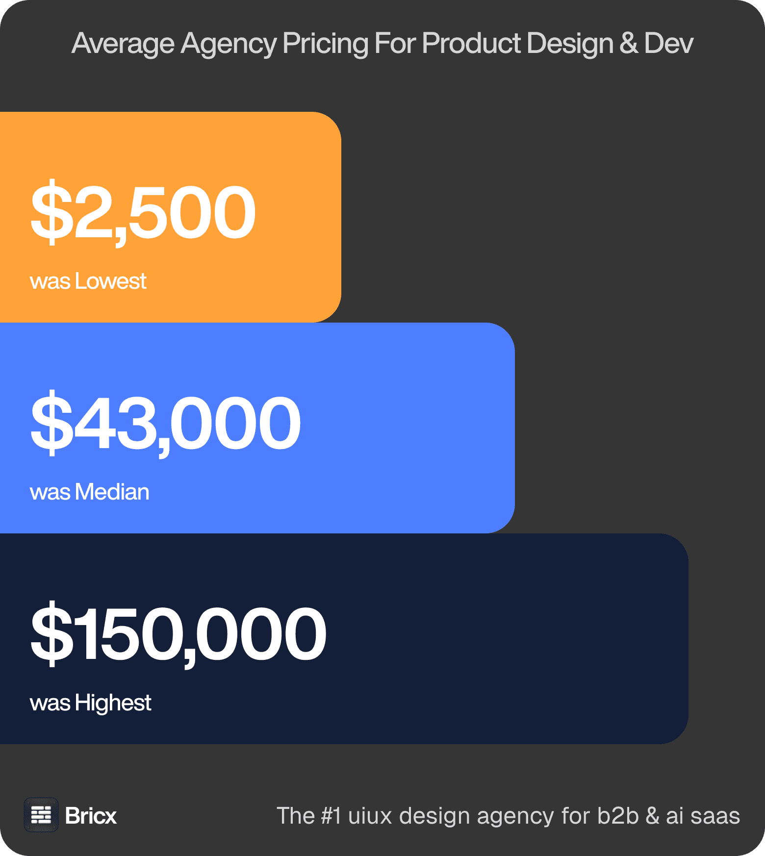
Where quotes actually land. Between $2,500 and $150,000-plus, median near $43,000. Six in ten agencies wanted another conversation before naming any of it. Those figures cover product design across the whole benchmark, so treat them as the range data visualization UX is quoted inside rather than a price for it.
What the hour buys. Rates ran $25 to $195 with a $55 to $90 median. Geography set the number; capability did not track it. Data visualisation runs above the median because the first version is a hypothesis, and getting the encoding right takes several passes against real data rather than the tidy sample used in a mockup.
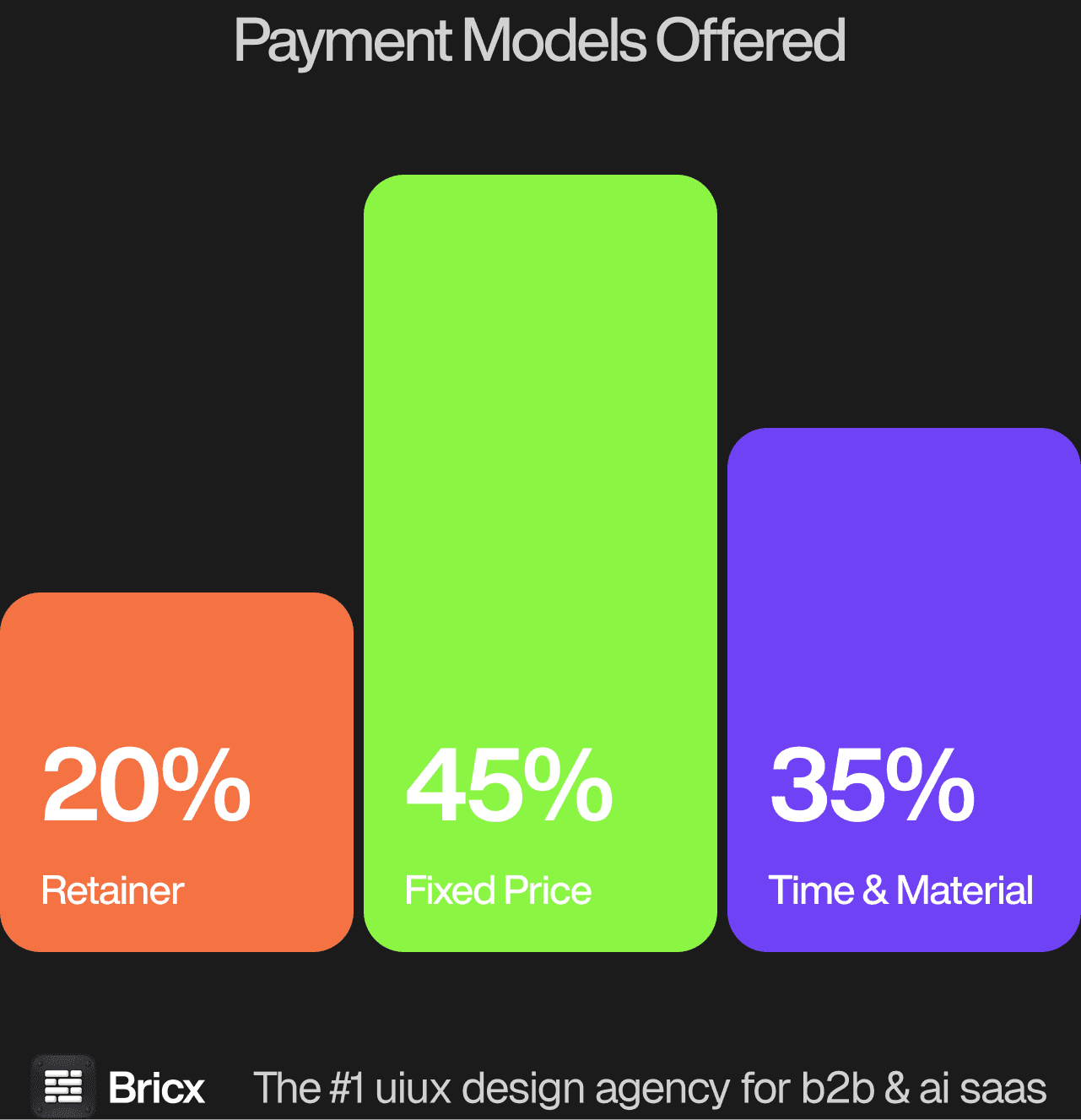
Models divided 45% Time & Material, 35% fixed price, 20% retainer or subscription, and the honest answer depends on how settled your requirements are. For data visualization UX the model usually matters more than the headline figure, because it decides what happens when the scope moves.
- Fixed price fits a bounded deliverable.
- Time & Material fits an unbounded one.
- Retainer fits a team that ships design continuously.
- Which one fits data visualization UX comes down to whether the scope is settled before the work starts.
How do you evaluate a data visualization UX agency?
Five things separate data visualization UX from dashboard design generally.
Ask why they chose that encoding. Position and length can be compared accurately, area and colour intensity cannot, and a team that reaches for a donut chart without a reason will make that trade repeatedly.
Ask what they do with distributions. An average conceals the shape it came from, and the interesting behaviour in most datasets lives in the tails rather than the middle.
Ask about the palette and who it excludes. Red against green is unreadable for a significant share of men, and any severity scale built on that pairing fails the people it is meant to warn.
Ask what happens at full data volume. A chart designed against a sample behaves differently at fifty thousand rows, and the fix involves aggregation, sampling or a different rendering approach rather than a scrollbar.
Ask how somebody gets from a chart to a row. Visual analysis raises a question only the underlying records can answer, and a view with no route to them ends the enquiry early.
What are the red flags when hiring a design agency?
- A timeline with no milestone before week four. Ask what you can look at in fourteen days. If the answer is a document, keep looking.
- Pricing that does not change when scope does. Either the estimate was padded or the change requests are coming.
- No named designer. A team described only in the collective is not an answer. Ask who, and look at their individual work.
- A portfolio of redesigns with no before. Without the starting point, the improvement is unverifiable.
- Vague ownership of the files. Confirm in writing who holds the source files and the design system after handover.
- No comparable example of data visualization UX. An agency that cannot point to work of the same shape is learning on your budget.
Should you hire a UX agency or build in-house?
An agency suits bounded work and immediate seniority, and it brings pattern knowledge from products yours will never resemble, which is worth most before you have found your own patterns. For data visualization UX specifically, the question worth settling first is how often the work recurs.
Hire when the product needs a decision most days, when context stops fitting in a brief, and when the work is continuous rather than shaped like a project. Where data visualization UX falls on that line is usually clear once you count how many times it will need doing again.
Product teams with a data scientist in the building already hold the analytical judgement, and what they lack is the craft to make it legible to anybody else. In-house, the failure mode is charts that are correct and unreadable. With an agency it is the reverse, a beautiful view built on a sample dataset that misrepresents the shape once real data arrives.
FAQs
What makes data visualization UX difficult?
The encoding decision is technical and polish is no substitute for it. A chart can be attractive, on brand, and still ask the eye to perform a comparison it cannot make accurately.
How much does a data visualization UX engagement cost?
Fixed-price product design across the benchmark ran $2,500 to over $150,000 with a median near $43,000, and visualisation work sits above that median because the design has to be retested against real data repeatedly. Bricx starts at $25,000.
Should the team use a charting library or build custom?
A library until the encodings it offers stop matching the question. Custom rendering earns its cost for dense, interactive or unusual views, and is overkill for the twenty ordinary charts around them.
How do you know a visualisation is working?
Somebody looks at it and asks a better question than they arrived with. If the only reaction is that it looks good, the chart has been decorated rather than designed.