Website Design

Website Design

Website Design

Insights

Insights

Insights

December 15, 2025

December 15, 2025

December 15, 2025

UX Audit Checklist - Stepwise Guide to Maximizing Conversions

UX Audit Checklist - Stepwise Guide to Maximizing Conversions

UX Audit Checklist - Stepwise Guide to Maximizing Conversions

UX Audit Checklist: A practical guide to improve UX with heuristics, analytics, and accessibility checks that boost conversions.

UX Audit Checklist: A practical guide to improve UX with heuristics, analytics, and accessibility checks that boost conversions.

UX Audit Checklist: A practical guide to improve UX with heuristics, analytics, and accessibility checks that boost conversions.

4 mins

4 mins

4 mins

Author:

Siddharth Vij

Co-Founder, Bricx

Hi, I'm Sid. I lead design at Bricx. We work with B2B & AI SaaS companies to craft unforgettable user experiences.

In the competitive B2B and AI SaaS landscape, a seamless user experience isn't just a feature-it's the foundation of retention, conversion, and growth. A superficial glance at your UI won't uncover the hidden friction points that quietly drive churn. To truly optimize your product, you need a systematic, multi-faceted approach to understand what’s working, what’s failing, and where your most significant opportunities lie. This requires moving beyond subjective opinions and into objective, structured analysis.

This comprehensive ux audit checklist provides that structured framework. It's designed to help you dissect every critical layer of your product, from accessibility compliance and content clarity to critical conversion funnel leaks.

Following this guide will move your team beyond guesswork, empowering you with the actionable, data-driven insights needed to make impactful improvements. While this checklist focuses specifically on the user experience within a software application, a broader analysis is often beneficial. For a wider perspective on overall website health that covers SEO, performance, and more, consider reviewing an ultimate web audit checklist to complement your UX-specific efforts.

Whether you're refining an established platform or scaling a promising MVP, use these ten pillars to build a product that users not only tolerate but genuinely advocate for. This isn't just about fixing bugs; it's about methodically enhancing usability, boosting engagement, and directly impacting your bottom line. Let's dive into the specific checkpoints that will transform your user experience from functional to exceptional.


1. Heuristic Evaluation

A Heuristic Evaluation is a cornerstone of any comprehensive UX audit checklist. It's an expert-based inspection method where UX specialists assess an interface against a set of established usability principles, or "heuristics." This approach, popularized by Jakob Nielsen and Rolf Molich, allows for a rapid, cost-effective way to identify usability problems without needing to recruit and run tests with end-users. The goal is to find and prioritize issues in the design that might cause friction or confusion.

This method is highly effective because it leverages the knowledge of seasoned professionals who can quickly spot common design flaws. For a B2B or AI SaaS product, this means identifying inconsistencies in complex workflows, unclear system status indicators, or inefficient data entry forms before they frustrate paying customers.


Two UX designers collaborating on a usability audit, reviewing designs and digital interfaces on a desktop computer.


Why It’s a Critical First Step

Unlike live user testing, a heuristic evaluation can be conducted at any stage, from early wireframes to a mature product. It provides a foundational understanding of the user interface's health, making subsequent user testing more focused and productive. For instance, Spotify reportedly used expert evaluations to refine its playlist discovery workflows, ensuring the core user journey was intuitive before wider release.


How to Implement a Heuristic Evaluation

To conduct a successful evaluation, follow a structured process:


  • Framework Selection: Use Jakob Nielsen's 10 Usability Heuristics as your guide. These principles cover visibility of system status, user control, consistency, and more.

  • Recruit Evaluators: Involve 3-5 UX experts. Research shows this range typically uncovers around 75% of usability issues. Fewer evaluators might miss critical problems, while more yields diminishing returns.

  • Define Scope: Focus on specific, high-impact user flows. Instead of auditing the entire product at once, evaluate the "user onboarding" or "create a new report" process.

  • Severity Rating: For each issue found, assign a severity rating (e.g., Critical, Major, Minor). This helps prioritize fixes based on business impact and user frustration.

  • Document Everything: Create a detailed report for each identified issue. Include the heuristic that was violated, a clear description, screenshots, and specific location references (URLs, screen names). This documentation is vital for the development team.


2. Analytics Review

An Analytics Review involves a deep dive into quantitative user behavior data to uncover objective insights about how people interact with your product. Where a heuristic evaluation reveals expert-identified usability problems, analytics show what users actually do at scale. This data-driven approach, championed by figures like Avinash Kaushik, is essential for pinpointing friction points, identifying popular features, and understanding user journeys with precision.

By analyzing metrics like bounce rates, user flow paths, and funnel completion rates, you can move from assumptions to evidence-based conclusions. For a B2B SaaS platform, this could mean discovering that a critical reporting feature is rarely used or that users consistently drop off at a specific step in the account setup process. This quantitative analysis is a vital part of any modern ux audit checklist.


Why It’s a Critical Data-Driven Step

While expert opinions are valuable, analytics provide undeniable evidence of user behavior. This data helps you prioritize UX improvements based on their potential impact on key business goals like activation, retention, and conversion. For example, Netflix famously used engagement analytics to identify discoverability issues, leading to refinements in its content recommendation algorithms and user interface that kept users engaged longer.


How to Implement an Analytics Review

A successful analytics review requires a systematic approach to turn raw data into actionable insights:

  • Define Key Journeys: Before diving in, map out critical user journeys. For a SaaS product, these could be "user onboarding," "first feature activation," or "subscription upgrade." Create custom funnels in your analytics tool (like Google Analytics or Mixpanel) for each.

  • Establish Baselines: Document your current metrics before making any changes. This baseline is crucial for measuring the impact of your UX improvements later on.

  • Segment Your Data: Analyze data by user cohorts. Compare new vs. returning users, free vs. premium subscribers, or users on different devices. This segmentation often reveals that different groups have vastly different experiences.

  • Investigate Drop-offs and Anomalies: Pay close attention to where users abandon a process. A high drop-off rate on a payment page or a sudden spike in errors on a specific form are clear signals of a significant UX problem that needs immediate attention.

  • Document and Visualize: Don't just collect numbers; tell a story with the data. Create reports that visualize user flows and highlight key drop-off points. Effective visualization is key, and you can learn more about the best analytics dashboard design on bricxlabs.com to present your findings clearly to stakeholders.


3. Accessibility Audit

An Accessibility Audit is a systematic evaluation of a digital product to ensure it is usable by people with disabilities, including those with visual, auditory, motor, and cognitive impairments. This process is guided by the Web Content Accessibility Guidelines (WCAG), a set of standards developed by the W3C. The goal is to identify and remove barriers that prevent interaction with or access to websites and applications by people with disabilities.

For B2B and AI SaaS platforms, accessibility is not just a legal or ethical requirement; it's a competitive advantage. It expands your potential user base to include organizations with accessibility mandates and improves the overall user experience for everyone. A truly comprehensive UX audit checklist must prioritize accessibility to ensure inclusivity and compliance, as demonstrated by Target, which paid a $6 million settlement and is now a leader in accessible retail.


Person on a wooden bench outdoors, using a laptop to create an accessible website design.


Why It’s a Critical Compliance and Usability Step

An Accessibility Audit is crucial because it ensures your product serves the widest possible audience and mitigates legal risks associated with non-compliance (like ADA lawsuits). It moves beyond basic usability to create a truly equitable experience. Microsoft, for instance, redesigned its Office 365 suite with accessibility at its core, leading to awards and a stronger market position. Integrating this audit early prevents costly retrofitting later on.


How to Implement an Accessibility Audit

A thorough audit combines automated tools with manual testing for best results. Follow these steps for an effective evaluation:

  • Automated Scanning: Use tools like WAVE, Axe, or Lighthouse to perform an initial scan. These tools quickly identify issues like missing alt text, low-contrast text, and improper heading structures.

  • Manual Testing: Manually check for key compliance points. Ensure all functionality is usable with a keyboard alone, check for proper focus management, and verify that ARIA (Accessible Rich Internet Applications) attributes are used correctly.

  • Assistive Technology Testing: Test the product using actual assistive technologies like screen readers (NVDA, JAWS, VoiceOver) to understand the real-world experience for users with visual impairments.

  • Standards Adherence: Adhere to WCAG 2.1 AA as a minimum standard. This includes maintaining a color contrast ratio of at least 4.5:1 for normal text and providing clear labels for all form controls.

  • Detailed Reporting: Document each finding with a reference to the specific WCAG success criterion it violates, screenshots, and a clear recommendation for remediation. For complex issues, consulting with the best accessibility design agencies can provide expert guidance.


4. Content & Copy Audit


Content & Copy Audit


A Content & Copy Audit is a systematic review of all textual elements within your interface to ensure clarity, consistency, and effectiveness. This evaluation goes beyond simple grammar checks; it scrutinizes everything from button microcopy and error messages to help documentation and onboarding tutorials. The goal is to verify that the language used supports user goals, aligns with the brand's voice, and makes the product easy to understand and use.

For B2B and AI SaaS platforms, where complex concepts and workflows are common, clear copy is not just a nicety-it's a core component of usability. An effective content audit ensures that your product communicates with users in a way that builds confidence and reduces cognitive load, directly impacting user adoption and satisfaction.


Why It’s a Critical Part of a UX Audit

The words on the screen guide users through your application. Vague instructions, inconsistent terminology, or jargon-filled labels can lead to significant user frustration and task abandonment. A thorough copy audit identifies these friction points. For instance, Basecamp famously reduced support requests by 30% simply by refining their copy to be clearer and more jargon-free, proving the direct link between quality content and operational efficiency.


How to Implement a Content & Copy Audit

To perform a successful audit, you need a methodical approach that covers both quality and consistency:

  • Create an Inventory: Start by cataloging all key textual content across primary user flows. Use a spreadsheet to track UI labels, CTAs, error messages, and instructional text.

  • Define Your Voice: Establish or refer to a content style guide. This document should define your brand's tone (e.g., formal, friendly, witty), preferred terminology, and grammatical rules. Mailchimp's witty, human-centered style guide is a classic example of this in action.

  • Evaluate Against a Checklist: Assess the inventoried copy for clarity, conciseness, and consistency. Use tools like the Hemingway Editor to check for readability and sentence complexity.

  • Test for Comprehension: Ensure error messages and instructions are truly helpful. Test them with users to see if they understand what to do next without needing external help.

  • Update and Refine: Document all required changes, assign ownership, and implement the updates. A great copy audit is an ongoing process, not a one-time task. For more insights into how specialized agencies handle this, you can explore UX copywriting and design services.


5. Performance Audit

A Performance Audit is a technical evaluation focused on how quickly a digital product loads and responds to user interaction. This component of a UX audit checklist measures critical metrics like page load speed, Time to Interactive (TTI), and Core Web Vitals. Pioneered by figures like Steve Souders and heavily promoted by Google's Web Vitals initiative, this audit directly links technical performance to user satisfaction and business outcomes. The goal is to identify and eliminate bottlenecks that create friction and cause users to abandon the experience.

For complex B2B or AI SaaS platforms, performance is not just a nicety; it's a core feature. Slow dashboards, lagging data visualizations, and unresponsive controls directly impact a user's productivity and their perception of the product's quality. Even a one-second delay can significantly increase bounce rates, as seen when Walmart improved conversions by 2% for every second of load time improvement.


Laptop screen displaying 'Fast Loading' text, pie chart, bar graph, and line graph on a wooden desk.


Why It’s a Critical Technical Checkpoint

Performance directly impacts the user's perception of reliability and efficiency. A slow, janky interface feels broken, eroding trust and leading to churn. Conversely, a snappy, responsive application feels powerful and professional. Pinterest, for example, reduced perceived wait times and saw a 40% increase in search engine traffic and sign-ups. Fast performance is a fundamental layer of a positive user experience.


How to Implement a Performance Audit

To conduct a successful audit, focus on a systematic approach to measurement and optimization:

  • Establish a Baseline: Use tools like Google PageSpeed Insights, WebPageTest, and Lighthouse to measure your current performance. Pay close attention to Core Web Vitals: Largest Contentful Paint (LCP), First Input Delay (FID), and Cumulative Layout Shift (CLS).

  • Set Performance Budgets: Define strict limits for asset sizes. For example, cap your total JavaScript bundle size at 170KB and images at 100KB. This prevents performance degradation over time.

  • Optimize Assets: Minify CSS, JavaScript, and HTML to reduce file sizes. Implement lazy loading for images and off-screen content, and use modern image formats like WebP with appropriate fallbacks.

  • Leverage Caching and CDNs: Use browser caching to store static assets locally and a Content Delivery Network (CDN) to serve assets from locations closer to the user, reducing latency.

  • Monitor Continuously: Implement Real User Monitoring (RUM) to track performance metrics from actual users in real time. This provides a more accurate picture than lab-based tests. Great performance can be complemented by well-designed loading screens, and you can learn more about effective loading page designs on BricxLabs.


6. Forms & Input Audit

Forms & Input Audit


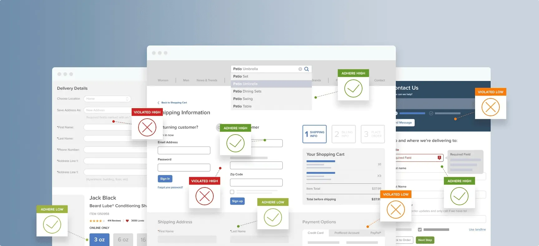
A Forms & Input Audit is a critical component of any UX audit checklist, focusing on one of the most interactive and conversion-sensitive parts of an interface. This detailed evaluation scrutinizes every aspect of form design, from field layout and labeling to error handling and submission feedback. The goal is to minimize friction, reduce cognitive load, and make the process of data entry as seamless and efficient as possible for the user.

This audit is especially vital for B2B and SaaS products where complex sign-ups, configuration screens, and payment processes are common. Inefficient or confusing forms can directly lead to abandoned carts, incomplete registrations, and customer support tickets. As pioneered by experts like Luke Wroblewski, optimizing form design is a high-impact activity that directly influences user success and business metrics. For instance, ConvertKit improved its newsletter signup conversion by 47% simply by optimizing its forms.


Why It’s a Critical Conversion Point

Forms are the primary way users provide information, making them a direct gateway to conversion. Whether it's a simple contact form or a multi-step onboarding process, every field represents a potential point of failure. A thorough audit ensures these crucial interactions are designed for success, helping users complete their goals without frustration. Stripe famously reduced form friction in their payment process, leading to a significant improvement in payment completion rates.


How to Implement a Forms & Input Audit

To conduct an effective audit of your forms, focus on these key areas:

  • Field Rationalization: Question every field. Is "Phone Number" absolutely necessary for a newsletter signup? Start by removing any non-essential fields before optimizing what's left.

  • Clarity and Usability: Ensure every field has a clear, visible label. Use appropriate input types (e.g., type="email", type="tel") to trigger the correct mobile keyboards and enable browser autofill.

  • Error Handling: Show validation errors inline, right next to the problematic field. Use positive, actionable messaging (e.g., "Please use MM/DD/YYYY format") instead of generic warnings like "Invalid date."

  • Feedback and State: Disable the submit button during submission to prevent duplicate entries. Always provide clear success or failure feedback after the user hits submit.

  • Accessibility and Responsiveness: Test forms on various devices and browsers. Ensure they are fully keyboard-navigable and compatible with screen readers and password managers. Learn more about creating smarter, smoother form UX on bricxlabs.com.


7. Navigation & User Flows Audit


Navigation & User Flows Audit


A Navigation & User Flows Audit is a fundamental component of any UX audit checklist, focusing on how users find information and move through a product. This evaluation examines the Information Architecture (IA), wayfinding cues, and the efficiency of task-completion paths. Pioneered by figures like Peter Morville, this audit ensures that users can intuitively locate what they need and navigate between different sections without friction or confusion.

This audit is especially vital for complex B2B and AI SaaS products, where users often engage with dense data and multifaceted workflows. A clear, logical navigation system prevents cognitive overload and empowers users to complete their primary tasks efficiently, which directly impacts user retention and perceived product value.


Why It’s a Critical Step for Usability

Poor navigation is a primary source of user frustration. If users cannot find a feature or complete a core task, the feature might as well not exist. An audit of user flows identifies bottlenecks and dead ends before they cause churn. For instance, Dropbox redesigned its information architecture to prioritize file discovery, significantly improving the core user experience and making the platform feel more intuitive.


How to Implement a Navigation & User Flows Audit

A systematic approach is key to evaluating and improving your product’s navigation:

  • Validate Your Structure: Use card sorting exercises with real users to understand their mental models and inform your information architecture. This helps ensure your navigation categories align with user expectations.

  • Test the Hierarchy: Before implementation, use tree testing to evaluate how easily users can find specific items within your proposed navigation structure. This is a low-cost way to validate your IA.

  • Analyze Key Task Flows: Map out the critical user journeys, like "creating a new project" or "exporting a report." Use analytics and user testing to identify steps where users drop off or take longer than expected.

  • Implement Best Practices: Limit main navigation to 5-7 primary items to avoid overwhelming users. Use clear visual cues, such as breadcrumbs for deep sites (3+ levels), and ensure the current page is always highlighted.

  • Ensure Consistency: Maintain a consistent navigation pattern and terminology across all sections and responsive breakpoints. A predictable interface reduces the learning curve and builds user confidence.


8. Mobile Responsiveness Audit


Mobile Responsiveness Audit


A Mobile Responsiveness Audit is a critical evaluation of how well a digital product adapts and functions across various devices, particularly smartphones and tablets. It goes beyond simply checking if a layout shrinks to fit a smaller screen. This audit assesses touch target accuracy, viewport configuration, layout shifts, and the overall usability of the mobile experience, ensuring the product is not just accessible but genuinely effective for users on the go.

This process is indispensable in today's mobile-first world, especially for B2B and AI SaaS platforms where users increasingly need to perform tasks away from their desktops. A clunky, unresponsive mobile interface can lead to lost productivity, user frustration, and ultimately, customer churn. Pioneered by figures like Ethan Marcotte and championed by Google's mobile-first indexing, responsive design is now a baseline expectation.


Why It’s a Non-Negotiable Check

With mobile traffic often exceeding desktop traffic, a poor mobile experience is no longer an option. A thorough responsiveness audit ensures your product remains competitive and accessible to all users, regardless of their device. For example, the Starbucks app was optimized for mobile ordering and became a dominant revenue channel, proving the power of a seamless mobile-first experience.


How to Implement a Mobile Responsiveness Audit

To conduct a comprehensive mobile audit, focus on both technical and user-centric elements:

  • Adopt a Mobile-First Mindset: Design and develop for the smallest screen first, then progressively enhance the experience for larger screens. This approach forces you to prioritize core content and functionality.

  • Test on Real Devices: While browser emulation is useful for quick checks, it cannot replicate the nuances of touch interaction, network latency, or device-specific performance. Test on a range of popular iOS and Android devices.

  • Verify Touch Targets: Ensure all interactive elements like buttons and links adhere to a minimum size of 48x48 pixels, as recommended by Google and Apple. This prevents frustrating mis-taps.

  • Assess Content Legibility: Check that body text is at least 16px to ensure it's readable without pinching to zoom. Content should be stacked vertically on narrow screens to create a clear, scannable information hierarchy.

  • Analyze Performance: Use tools to test how your site or app performs on slower networks (e.g., 3G or 4G). Optimize images and scripts to ensure fast load times, as mobile users are particularly sensitive to delays.


9. Conversion Funnel Audit


Conversion Funnel Audit


A Conversion Funnel Audit is a systematic examination of the entire user journey, from initial awareness to a final desired action like a signup, purchase, or subscription. This part of a UX audit checklist involves mapping out each step a user takes and analyzing data to identify where they abandon the process. The goal is to pinpoint and eliminate friction, thereby increasing the percentage of users who successfully complete the funnel.

This method is crucial for B2B and AI SaaS products where the path from trial to paid customer can be complex. By dissecting this journey, businesses can uncover costly drop-off points that hinder revenue growth. Companies like Unbounce and Optimizely have pioneered this data-driven approach, showing that small tweaks to the funnel can yield significant improvements in conversion rates.


Why It’s Critical for Growth

A conversion funnel audit moves beyond subjective usability opinions and focuses on quantifiable user behavior. It provides concrete evidence of where the user experience is failing to meet user expectations or business goals. For example, many SaaS companies have boosted their trial-to-paid conversion by over 25% simply by optimizing their onboarding funnel based on audit findings, ensuring new users reach their "aha!" moment faster.


How to Implement a Conversion Funnel Audit

To conduct an effective funnel audit, you need a structured, data-informed process:

  • Map the Funnel: Visually outline every step a user must take to convert. For a SaaS product, this might be: Landing Page -> Sign Up -> Onboarding Tour -> Create First Project -> Upgrade to Paid.

  • Identify Major Drop-offs: Use analytics tools (like Google Analytics, Mixpanel, or Amplitude) to measure the percentage of users who abandon the process at each step. Focus your initial efforts on the largest leaks.

  • Segment Your Data: Analyze drop-offs by user segment, such as traffic source, device type, or user demographic. You might find that mobile users struggle with a specific form field that desktop users don't.

  • Gather Qualitative Insights: Use tools like exit-intent surveys or session recordings to understand why users are leaving at a specific point. Ask questions like, "What stopped you from completing your signup today?"

  • Hypothesize and Test: Formulate a hypothesis for fixing a drop-off point (e.g., "Simplifying the signup form will increase completions"). Use A/B testing to validate your changes and ensure improvements are statistically significant before a full rollout.


10. Onboarding & Error States Audit

An Onboarding & Error States Audit evaluates the crucial first and last impressions a user has with your product: their initial welcome and how the system communicates when things go wrong. This audit assesses the entire first-time user experience (FTUE), from initial signup to feature discovery, as well as the system's feedback during errors, empty states, or loading. The goal is to ensure users feel guided, supported, and never lost, whether they are new or encountering a problem.

This dual focus is essential for retention in B2B and AI SaaS products. A smooth onboarding process quickly demonstrates value and reduces churn, while clear error handling builds trust and prevents user frustration. It's about designing for both the ideal path and the inevitable detours.


A smartphone displaying an app next to a "Smooth ONBOARDING" booklet on a wooden table.


Why It’s a Critical Part of the Checklist

The first few minutes a user spends with your product are make-or-break. A confusing onboarding flow can lead to immediate abandonment. Similarly, cryptic error messages or unhelpful empty states make users feel incompetent and drive them away. Slack's conversational onboarding, for example, reportedly improved user activation by 40% by making the initial experience feel personal and guided. This audit directly impacts activation rates and long-term user satisfaction.


How to Implement an Onboarding & Error States Audit

To conduct a thorough audit, systematically review the user’s initial journey and potential friction points:

  • Map the Onboarding Flow: Document every step a new user takes, from signing up to reaching their first "aha!" moment. Keep the initial flow to a maximum of 3-5 core steps to avoid overwhelming them.

  • Evaluate First-Run Experience: Assess the clarity of tutorials, tooltips, and initial tasks. Does the product show value immediately, or does it front-load complex configurations? Use progressive disclosure to reveal complexity gradually.

  • Audit System Feedback: Intentionally trigger errors, create empty states (e.g., view a project with no data), and observe loading screens. Are error messages human-friendly, explaining what went wrong and how to fix it? Do empty states offer guidance and a clear call-to-action, like Dropbox's design which improved feature adoption by 30%?

  • Test Recovery Paths: Can users easily correct mistakes or skip optional tutorials? The path to recovery should be as well-designed as the primary workflow.

  • Segment by User Type: Review the experience for different personas. A returning user who has cleared their data should have a different, more streamlined experience than a brand-new user. This is a key part of any good ux audit checklist.


10-Point UX Audit Checklist Comparison


Audit Type

Implementation Complexity 🔄

Resource Requirements ⚡

Expected Outcomes ⭐

Ideal Use Cases 📊

Key Advantages 💡

Heuristic Evaluation

Low–Medium — expert-driven, quick cycles

Small team (1–5 UX experts), minimal tooling

Fast identification of major usability issues; qualitative fixes

Early-stage designs, iterative reviews, constrained budgets

Cost-effective, fast, actionable recommendations

Analytics Review

Medium — depends on tracking maturity

Analytics platform + data analyst(s), event instrumentation

Quantitative behavior patterns, drop-offs, prioritization

High-traffic sites, funnel analysis, continuous monitoring

Data-driven prioritization; scalable insights over time

Accessibility Audit

Medium–High — standards-driven, detail-oriented

Accessibility specialists, assistive tech, automated scanners

WCAG compliance, increased inclusivity, reduced legal risk

Public sector, large audiences, regulated industries

Expands audience, improves SEO, legal compliance

Content & Copy Audit

Low–Medium — editorial focus

Content strategist/writer(s), style guide, review tools

Clearer messaging, better CTAs, reduced support queries

Marketing sites, onboarding, help centers

Improves clarity, conversions, and brand consistency

Performance Audit

High — technical and iterative

Devs, performance tooling, RUM/CICD integration

Faster load times, better Core Web Vitals, higher conversions

Mobile-first sites, e‑commerce, high-traffic platforms

Direct ROI on conversions; SEO and UX gains

Forms & Input Audit

Medium — UX + validation nuance

UX/UI + developers, cross-device testing, analytics

Higher completion rates, improved data quality

Checkout, signups, lead-gen forms

High ROI; many fixes are quick and impactful

Navigation & User Flows Audit

Medium–High — requires structural changes

IA experts, user research (card sorting, tree tests)

Improved findability and task completion rates

Large content sites, complex apps, multi-section products

Reduces cognitive load; supports scalable structure

Mobile Responsiveness Audit

Medium — device and layout focused

Devs, QA on multiple devices or emulators

Consistent mobile UX, lower mobile bounce, better engagement

Mobile-heavy audiences, responsive sites, apps

Improves mobile conversions and SEO (mobile-first)

Conversion Funnel Audit

High — analytical and experimental

CRO specialists, analysts, A/B testing tools, adequate traffic

Increased conversion rates; prioritized optimization roadmap

E‑commerce, SaaS conversion optimization, revenue drivers

Direct business impact with measurable ROI

Onboarding & Error States Audit

Medium — UX writing + testing

UX designers, writers, usability testing with new users

Higher activation and retention; fewer support issues

New-user flows, feature launches, onboarding-heavy products

Boosts activation/retention; improves error recovery and confidence


From Checklist to Action: Your Next Steps

You've now navigated the comprehensive UX audit checklist, a powerful tool designed to dissect and diagnose every critical facet of your B2B or AI SaaS product. From the foundational principles of heuristic evaluation to the granular details of form inputs and error states, this guide provides a structured framework for uncovering friction and identifying opportunities for significant improvement.

The true value of this exercise, however, lies not in completing the checklist itself, but in the strategic action that follows. Simply identifying usability issues, performance bottlenecks, or confusing user flows is only half the battle. The real transformation begins when you organize these findings, prioritize them effectively, and build a concrete roadmap for implementation.


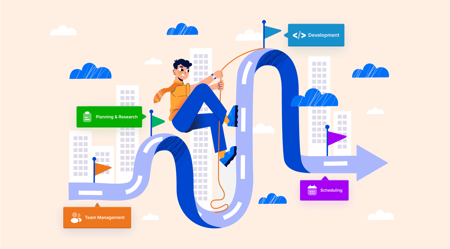
Transforming Your Audit Findings into a Strategic Roadmap

Strategic Roadmap


With a wealth of data from your audit, the next critical phase is interpretation and planning. Without a clear system, you risk drowning in feedback and failing to make a meaningful impact. For your UX audit to truly deliver value, you must effectively learn how to turn raw data into actionable insights that guide your next steps and improvements.

Here's a practical framework for moving from analysis to action:


  1. Synthesize and Group Findings: Consolidate all your notes, observations, and data points. Group similar issues together under common themes, such as "Onboarding Confusion," "Navigation Inefficiency," or "Mobile Checkout Friction." This helps you see patterns and understand the root causes of user problems rather than just treating symptoms.

  2. Prioritize with an Impact/Effort Matrix: Not all issues are created equal. Plot each identified issue on a 2x2 matrix with "User Impact" on one axis (Low to High) and "Implementation Effort" on the other (Low to High). This immediately helps you visualize your priorities:

    • Quick Wins (High Impact, Low Effort): Tackle these first. They deliver immediate value to users and build momentum for the team.

    • Major Projects (High Impact, High Effort): These are significant initiatives that require careful planning and resource allocation. Break them down into smaller, manageable phases.

    • Fill-Ins (Low Impact, Low Effort): Address these when you have available resources or bundle them with larger updates.

    • Reconsider (Low Impact, High Effort): These tasks should be questioned. Are they truly necessary? Table them for later re-evaluation.

  3. Create an Actionable Backlog: Translate your prioritized findings into specific, well-defined tasks for your product backlog. Each task should include a clear description of the problem, a proposed solution, user stories, and acceptance criteria. Assign ownership to ensure accountability.


Embracing the Continuous Audit Mindset

Ultimately, a UX audit checklist should not be treated as a one-time project you complete and forget. The most successful SaaS companies understand that user experience is a dynamic and evolving discipline. Markets shift, user expectations change, and new technologies emerge.

Key Takeaway: A UX audit is not a single event but a cyclical process. Schedule regular, smaller-scale audits (quarterly or bi-annually) to stay ahead of potential issues and continuously refine your product. This iterative approach ensures your user experience remains a competitive advantage, not a liability.

By embedding this process into your product development lifecycle, you move from a reactive state of fixing problems to a proactive state of creating exceptional, user-centric experiences. You build a product that not only functions flawlessly but also delights users, boosts retention, and drives business growth. You have the checklist; now it's time to take action.

Ready to turn your UX audit findings into a market-leading product experience? The expert team at Bricx specializes in translating complex audit data into elegant, high-performing UI/UX designs for B2B and AI SaaS companies. Let us help you build the roadmap and execute the vision that will set your product apart.


In the competitive B2B and AI SaaS landscape, a seamless user experience isn't just a feature-it's the foundation of retention, conversion, and growth. A superficial glance at your UI won't uncover the hidden friction points that quietly drive churn. To truly optimize your product, you need a systematic, multi-faceted approach to understand what’s working, what’s failing, and where your most significant opportunities lie. This requires moving beyond subjective opinions and into objective, structured analysis.

This comprehensive ux audit checklist provides that structured framework. It's designed to help you dissect every critical layer of your product, from accessibility compliance and content clarity to critical conversion funnel leaks.

Following this guide will move your team beyond guesswork, empowering you with the actionable, data-driven insights needed to make impactful improvements. While this checklist focuses specifically on the user experience within a software application, a broader analysis is often beneficial. For a wider perspective on overall website health that covers SEO, performance, and more, consider reviewing an ultimate web audit checklist to complement your UX-specific efforts.

Whether you're refining an established platform or scaling a promising MVP, use these ten pillars to build a product that users not only tolerate but genuinely advocate for. This isn't just about fixing bugs; it's about methodically enhancing usability, boosting engagement, and directly impacting your bottom line. Let's dive into the specific checkpoints that will transform your user experience from functional to exceptional.


1. Heuristic Evaluation

A Heuristic Evaluation is a cornerstone of any comprehensive UX audit checklist. It's an expert-based inspection method where UX specialists assess an interface against a set of established usability principles, or "heuristics." This approach, popularized by Jakob Nielsen and Rolf Molich, allows for a rapid, cost-effective way to identify usability problems without needing to recruit and run tests with end-users. The goal is to find and prioritize issues in the design that might cause friction or confusion.

This method is highly effective because it leverages the knowledge of seasoned professionals who can quickly spot common design flaws. For a B2B or AI SaaS product, this means identifying inconsistencies in complex workflows, unclear system status indicators, or inefficient data entry forms before they frustrate paying customers.


Two UX designers collaborating on a usability audit, reviewing designs and digital interfaces on a desktop computer.


Why It’s a Critical First Step

Unlike live user testing, a heuristic evaluation can be conducted at any stage, from early wireframes to a mature product. It provides a foundational understanding of the user interface's health, making subsequent user testing more focused and productive. For instance, Spotify reportedly used expert evaluations to refine its playlist discovery workflows, ensuring the core user journey was intuitive before wider release.


How to Implement a Heuristic Evaluation

To conduct a successful evaluation, follow a structured process:


  • Framework Selection: Use Jakob Nielsen's 10 Usability Heuristics as your guide. These principles cover visibility of system status, user control, consistency, and more.

  • Recruit Evaluators: Involve 3-5 UX experts. Research shows this range typically uncovers around 75% of usability issues. Fewer evaluators might miss critical problems, while more yields diminishing returns.

  • Define Scope: Focus on specific, high-impact user flows. Instead of auditing the entire product at once, evaluate the "user onboarding" or "create a new report" process.

  • Severity Rating: For each issue found, assign a severity rating (e.g., Critical, Major, Minor). This helps prioritize fixes based on business impact and user frustration.

  • Document Everything: Create a detailed report for each identified issue. Include the heuristic that was violated, a clear description, screenshots, and specific location references (URLs, screen names). This documentation is vital for the development team.


2. Analytics Review

An Analytics Review involves a deep dive into quantitative user behavior data to uncover objective insights about how people interact with your product. Where a heuristic evaluation reveals expert-identified usability problems, analytics show what users actually do at scale. This data-driven approach, championed by figures like Avinash Kaushik, is essential for pinpointing friction points, identifying popular features, and understanding user journeys with precision.

By analyzing metrics like bounce rates, user flow paths, and funnel completion rates, you can move from assumptions to evidence-based conclusions. For a B2B SaaS platform, this could mean discovering that a critical reporting feature is rarely used or that users consistently drop off at a specific step in the account setup process. This quantitative analysis is a vital part of any modern ux audit checklist.


Why It’s a Critical Data-Driven Step

While expert opinions are valuable, analytics provide undeniable evidence of user behavior. This data helps you prioritize UX improvements based on their potential impact on key business goals like activation, retention, and conversion. For example, Netflix famously used engagement analytics to identify discoverability issues, leading to refinements in its content recommendation algorithms and user interface that kept users engaged longer.


How to Implement an Analytics Review

A successful analytics review requires a systematic approach to turn raw data into actionable insights:

  • Define Key Journeys: Before diving in, map out critical user journeys. For a SaaS product, these could be "user onboarding," "first feature activation," or "subscription upgrade." Create custom funnels in your analytics tool (like Google Analytics or Mixpanel) for each.

  • Establish Baselines: Document your current metrics before making any changes. This baseline is crucial for measuring the impact of your UX improvements later on.

  • Segment Your Data: Analyze data by user cohorts. Compare new vs. returning users, free vs. premium subscribers, or users on different devices. This segmentation often reveals that different groups have vastly different experiences.

  • Investigate Drop-offs and Anomalies: Pay close attention to where users abandon a process. A high drop-off rate on a payment page or a sudden spike in errors on a specific form are clear signals of a significant UX problem that needs immediate attention.

  • Document and Visualize: Don't just collect numbers; tell a story with the data. Create reports that visualize user flows and highlight key drop-off points. Effective visualization is key, and you can learn more about the best analytics dashboard design on bricxlabs.com to present your findings clearly to stakeholders.


3. Accessibility Audit

An Accessibility Audit is a systematic evaluation of a digital product to ensure it is usable by people with disabilities, including those with visual, auditory, motor, and cognitive impairments. This process is guided by the Web Content Accessibility Guidelines (WCAG), a set of standards developed by the W3C. The goal is to identify and remove barriers that prevent interaction with or access to websites and applications by people with disabilities.

For B2B and AI SaaS platforms, accessibility is not just a legal or ethical requirement; it's a competitive advantage. It expands your potential user base to include organizations with accessibility mandates and improves the overall user experience for everyone. A truly comprehensive UX audit checklist must prioritize accessibility to ensure inclusivity and compliance, as demonstrated by Target, which paid a $6 million settlement and is now a leader in accessible retail.


Person on a wooden bench outdoors, using a laptop to create an accessible website design.


Why It’s a Critical Compliance and Usability Step

An Accessibility Audit is crucial because it ensures your product serves the widest possible audience and mitigates legal risks associated with non-compliance (like ADA lawsuits). It moves beyond basic usability to create a truly equitable experience. Microsoft, for instance, redesigned its Office 365 suite with accessibility at its core, leading to awards and a stronger market position. Integrating this audit early prevents costly retrofitting later on.


How to Implement an Accessibility Audit

A thorough audit combines automated tools with manual testing for best results. Follow these steps for an effective evaluation:

  • Automated Scanning: Use tools like WAVE, Axe, or Lighthouse to perform an initial scan. These tools quickly identify issues like missing alt text, low-contrast text, and improper heading structures.

  • Manual Testing: Manually check for key compliance points. Ensure all functionality is usable with a keyboard alone, check for proper focus management, and verify that ARIA (Accessible Rich Internet Applications) attributes are used correctly.

  • Assistive Technology Testing: Test the product using actual assistive technologies like screen readers (NVDA, JAWS, VoiceOver) to understand the real-world experience for users with visual impairments.

  • Standards Adherence: Adhere to WCAG 2.1 AA as a minimum standard. This includes maintaining a color contrast ratio of at least 4.5:1 for normal text and providing clear labels for all form controls.

  • Detailed Reporting: Document each finding with a reference to the specific WCAG success criterion it violates, screenshots, and a clear recommendation for remediation. For complex issues, consulting with the best accessibility design agencies can provide expert guidance.


4. Content & Copy Audit


Content & Copy Audit


A Content & Copy Audit is a systematic review of all textual elements within your interface to ensure clarity, consistency, and effectiveness. This evaluation goes beyond simple grammar checks; it scrutinizes everything from button microcopy and error messages to help documentation and onboarding tutorials. The goal is to verify that the language used supports user goals, aligns with the brand's voice, and makes the product easy to understand and use.

For B2B and AI SaaS platforms, where complex concepts and workflows are common, clear copy is not just a nicety-it's a core component of usability. An effective content audit ensures that your product communicates with users in a way that builds confidence and reduces cognitive load, directly impacting user adoption and satisfaction.


Why It’s a Critical Part of a UX Audit

The words on the screen guide users through your application. Vague instructions, inconsistent terminology, or jargon-filled labels can lead to significant user frustration and task abandonment. A thorough copy audit identifies these friction points. For instance, Basecamp famously reduced support requests by 30% simply by refining their copy to be clearer and more jargon-free, proving the direct link between quality content and operational efficiency.


How to Implement a Content & Copy Audit

To perform a successful audit, you need a methodical approach that covers both quality and consistency:

  • Create an Inventory: Start by cataloging all key textual content across primary user flows. Use a spreadsheet to track UI labels, CTAs, error messages, and instructional text.

  • Define Your Voice: Establish or refer to a content style guide. This document should define your brand's tone (e.g., formal, friendly, witty), preferred terminology, and grammatical rules. Mailchimp's witty, human-centered style guide is a classic example of this in action.

  • Evaluate Against a Checklist: Assess the inventoried copy for clarity, conciseness, and consistency. Use tools like the Hemingway Editor to check for readability and sentence complexity.

  • Test for Comprehension: Ensure error messages and instructions are truly helpful. Test them with users to see if they understand what to do next without needing external help.

  • Update and Refine: Document all required changes, assign ownership, and implement the updates. A great copy audit is an ongoing process, not a one-time task. For more insights into how specialized agencies handle this, you can explore UX copywriting and design services.


5. Performance Audit

A Performance Audit is a technical evaluation focused on how quickly a digital product loads and responds to user interaction. This component of a UX audit checklist measures critical metrics like page load speed, Time to Interactive (TTI), and Core Web Vitals. Pioneered by figures like Steve Souders and heavily promoted by Google's Web Vitals initiative, this audit directly links technical performance to user satisfaction and business outcomes. The goal is to identify and eliminate bottlenecks that create friction and cause users to abandon the experience.

For complex B2B or AI SaaS platforms, performance is not just a nicety; it's a core feature. Slow dashboards, lagging data visualizations, and unresponsive controls directly impact a user's productivity and their perception of the product's quality. Even a one-second delay can significantly increase bounce rates, as seen when Walmart improved conversions by 2% for every second of load time improvement.


Laptop screen displaying 'Fast Loading' text, pie chart, bar graph, and line graph on a wooden desk.


Why It’s a Critical Technical Checkpoint

Performance directly impacts the user's perception of reliability and efficiency. A slow, janky interface feels broken, eroding trust and leading to churn. Conversely, a snappy, responsive application feels powerful and professional. Pinterest, for example, reduced perceived wait times and saw a 40% increase in search engine traffic and sign-ups. Fast performance is a fundamental layer of a positive user experience.


How to Implement a Performance Audit

To conduct a successful audit, focus on a systematic approach to measurement and optimization:

  • Establish a Baseline: Use tools like Google PageSpeed Insights, WebPageTest, and Lighthouse to measure your current performance. Pay close attention to Core Web Vitals: Largest Contentful Paint (LCP), First Input Delay (FID), and Cumulative Layout Shift (CLS).

  • Set Performance Budgets: Define strict limits for asset sizes. For example, cap your total JavaScript bundle size at 170KB and images at 100KB. This prevents performance degradation over time.

  • Optimize Assets: Minify CSS, JavaScript, and HTML to reduce file sizes. Implement lazy loading for images and off-screen content, and use modern image formats like WebP with appropriate fallbacks.

  • Leverage Caching and CDNs: Use browser caching to store static assets locally and a Content Delivery Network (CDN) to serve assets from locations closer to the user, reducing latency.

  • Monitor Continuously: Implement Real User Monitoring (RUM) to track performance metrics from actual users in real time. This provides a more accurate picture than lab-based tests. Great performance can be complemented by well-designed loading screens, and you can learn more about effective loading page designs on BricxLabs.


6. Forms & Input Audit


Forms & Input Audit


A Forms & Input Audit is a critical component of any UX audit checklist, focusing on one of the most interactive and conversion-sensitive parts of an interface. This detailed evaluation scrutinizes every aspect of form design, from field layout and labeling to error handling and submission feedback. The goal is to minimize friction, reduce cognitive load, and make the process of data entry as seamless and efficient as possible for the user.

This audit is especially vital for B2B and SaaS products where complex sign-ups, configuration screens, and payment processes are common. Inefficient or confusing forms can directly lead to abandoned carts, incomplete registrations, and customer support tickets. As pioneered by experts like Luke Wroblewski, optimizing form design is a high-impact activity that directly influences user success and business metrics. For instance, ConvertKit improved its newsletter signup conversion by 47% simply by optimizing its forms.


Why It’s a Critical Conversion Point

Forms are the primary way users provide information, making them a direct gateway to conversion. Whether it's a simple contact form or a multi-step onboarding process, every field represents a potential point of failure. A thorough audit ensures these crucial interactions are designed for success, helping users complete their goals without frustration. Stripe famously reduced form friction in their payment process, leading to a significant improvement in payment completion rates.


How to Implement a Forms & Input Audit

To conduct an effective audit of your forms, focus on these key areas:

  • Field Rationalization: Question every field. Is "Phone Number" absolutely necessary for a newsletter signup? Start by removing any non-essential fields before optimizing what's left.

  • Clarity and Usability: Ensure every field has a clear, visible label. Use appropriate input types (e.g., type="email", type="tel") to trigger the correct mobile keyboards and enable browser autofill.

  • Error Handling: Show validation errors inline, right next to the problematic field. Use positive, actionable messaging (e.g., "Please use MM/DD/YYYY format") instead of generic warnings like "Invalid date."

  • Feedback and State: Disable the submit button during submission to prevent duplicate entries. Always provide clear success or failure feedback after the user hits submit.

  • Accessibility and Responsiveness: Test forms on various devices and browsers. Ensure they are fully keyboard-navigable and compatible with screen readers and password managers. Learn more about creating smarter, smoother form UX on bricxlabs.com.


7. Navigation & User Flows Audit


Navigation & User Flows Audit


A Navigation & User Flows Audit is a fundamental component of any UX audit checklist, focusing on how users find information and move through a product. This evaluation examines the Information Architecture (IA), wayfinding cues, and the efficiency of task-completion paths. Pioneered by figures like Peter Morville, this audit ensures that users can intuitively locate what they need and navigate between different sections without friction or confusion.

This audit is especially vital for complex B2B and AI SaaS products, where users often engage with dense data and multifaceted workflows. A clear, logical navigation system prevents cognitive overload and empowers users to complete their primary tasks efficiently, which directly impacts user retention and perceived product value.


Why It’s a Critical Step for Usability

Poor navigation is a primary source of user frustration. If users cannot find a feature or complete a core task, the feature might as well not exist. An audit of user flows identifies bottlenecks and dead ends before they cause churn. For instance, Dropbox redesigned its information architecture to prioritize file discovery, significantly improving the core user experience and making the platform feel more intuitive.


How to Implement a Navigation & User Flows Audit

A systematic approach is key to evaluating and improving your product’s navigation:

  • Validate Your Structure: Use card sorting exercises with real users to understand their mental models and inform your information architecture. This helps ensure your navigation categories align with user expectations.

  • Test the Hierarchy: Before implementation, use tree testing to evaluate how easily users can find specific items within your proposed navigation structure. This is a low-cost way to validate your IA.

  • Analyze Key Task Flows: Map out the critical user journeys, like "creating a new project" or "exporting a report." Use analytics and user testing to identify steps where users drop off or take longer than expected.

  • Implement Best Practices: Limit main navigation to 5-7 primary items to avoid overwhelming users. Use clear visual cues, such as breadcrumbs for deep sites (3+ levels), and ensure the current page is always highlighted.

  • Ensure Consistency: Maintain a consistent navigation pattern and terminology across all sections and responsive breakpoints. A predictable interface reduces the learning curve and builds user confidence.


8. Mobile Responsiveness Audit


Mobile Responsiveness Audit


A Mobile Responsiveness Audit is a critical evaluation of how well a digital product adapts and functions across various devices, particularly smartphones and tablets. It goes beyond simply checking if a layout shrinks to fit a smaller screen. This audit assesses touch target accuracy, viewport configuration, layout shifts, and the overall usability of the mobile experience, ensuring the product is not just accessible but genuinely effective for users on the go.

This process is indispensable in today's mobile-first world, especially for B2B and AI SaaS platforms where users increasingly need to perform tasks away from their desktops. A clunky, unresponsive mobile interface can lead to lost productivity, user frustration, and ultimately, customer churn. Pioneered by figures like Ethan Marcotte and championed by Google's mobile-first indexing, responsive design is now a baseline expectation.


Why It’s a Non-Negotiable Check

With mobile traffic often exceeding desktop traffic, a poor mobile experience is no longer an option. A thorough responsiveness audit ensures your product remains competitive and accessible to all users, regardless of their device. For example, the Starbucks app was optimized for mobile ordering and became a dominant revenue channel, proving the power of a seamless mobile-first experience.


How to Implement a Mobile Responsiveness Audit

To conduct a comprehensive mobile audit, focus on both technical and user-centric elements:

  • Adopt a Mobile-First Mindset: Design and develop for the smallest screen first, then progressively enhance the experience for larger screens. This approach forces you to prioritize core content and functionality.

  • Test on Real Devices: While browser emulation is useful for quick checks, it cannot replicate the nuances of touch interaction, network latency, or device-specific performance. Test on a range of popular iOS and Android devices.

  • Verify Touch Targets: Ensure all interactive elements like buttons and links adhere to a minimum size of 48x48 pixels, as recommended by Google and Apple. This prevents frustrating mis-taps.

  • Assess Content Legibility: Check that body text is at least 16px to ensure it's readable without pinching to zoom. Content should be stacked vertically on narrow screens to create a clear, scannable information hierarchy.

  • Analyze Performance: Use tools to test how your site or app performs on slower networks (e.g., 3G or 4G). Optimize images and scripts to ensure fast load times, as mobile users are particularly sensitive to delays.


9. Conversion Funnel Audit


Conversion Funnel Audit


A Conversion Funnel Audit is a systematic examination of the entire user journey, from initial awareness to a final desired action like a signup, purchase, or subscription. This part of a UX audit checklist involves mapping out each step a user takes and analyzing data to identify where they abandon the process. The goal is to pinpoint and eliminate friction, thereby increasing the percentage of users who successfully complete the funnel.

This method is crucial for B2B and AI SaaS products where the path from trial to paid customer can be complex. By dissecting this journey, businesses can uncover costly drop-off points that hinder revenue growth. Companies like Unbounce and Optimizely have pioneered this data-driven approach, showing that small tweaks to the funnel can yield significant improvements in conversion rates.


Why It’s Critical for Growth

A conversion funnel audit moves beyond subjective usability opinions and focuses on quantifiable user behavior. It provides concrete evidence of where the user experience is failing to meet user expectations or business goals. For example, many SaaS companies have boosted their trial-to-paid conversion by over 25% simply by optimizing their onboarding funnel based on audit findings, ensuring new users reach their "aha!" moment faster.


How to Implement a Conversion Funnel Audit

To conduct an effective funnel audit, you need a structured, data-informed process:

  • Map the Funnel: Visually outline every step a user must take to convert. For a SaaS product, this might be: Landing Page -> Sign Up -> Onboarding Tour -> Create First Project -> Upgrade to Paid.

  • Identify Major Drop-offs: Use analytics tools (like Google Analytics, Mixpanel, or Amplitude) to measure the percentage of users who abandon the process at each step. Focus your initial efforts on the largest leaks.

  • Segment Your Data: Analyze drop-offs by user segment, such as traffic source, device type, or user demographic. You might find that mobile users struggle with a specific form field that desktop users don't.

  • Gather Qualitative Insights: Use tools like exit-intent surveys or session recordings to understand why users are leaving at a specific point. Ask questions like, "What stopped you from completing your signup today?"

  • Hypothesize and Test: Formulate a hypothesis for fixing a drop-off point (e.g., "Simplifying the signup form will increase completions"). Use A/B testing to validate your changes and ensure improvements are statistically significant before a full rollout.


10. Onboarding & Error States Audit

An Onboarding & Error States Audit evaluates the crucial first and last impressions a user has with your product: their initial welcome and how the system communicates when things go wrong. This audit assesses the entire first-time user experience (FTUE), from initial signup to feature discovery, as well as the system's feedback during errors, empty states, or loading. The goal is to ensure users feel guided, supported, and never lost, whether they are new or encountering a problem.

This dual focus is essential for retention in B2B and AI SaaS products. A smooth onboarding process quickly demonstrates value and reduces churn, while clear error handling builds trust and prevents user frustration. It's about designing for both the ideal path and the inevitable detours.


A smartphone displaying an app next to a "Smooth ONBOARDING" booklet on a wooden table.


Why It’s a Critical Part of the Checklist

The first few minutes a user spends with your product are make-or-break. A confusing onboarding flow can lead to immediate abandonment. Similarly, cryptic error messages or unhelpful empty states make users feel incompetent and drive them away. Slack's conversational onboarding, for example, reportedly improved user activation by 40% by making the initial experience feel personal and guided. This audit directly impacts activation rates and long-term user satisfaction.


How to Implement an Onboarding & Error States Audit

To conduct a thorough audit, systematically review the user’s initial journey and potential friction points:

  • Map the Onboarding Flow: Document every step a new user takes, from signing up to reaching their first "aha!" moment. Keep the initial flow to a maximum of 3-5 core steps to avoid overwhelming them.

  • Evaluate First-Run Experience: Assess the clarity of tutorials, tooltips, and initial tasks. Does the product show value immediately, or does it front-load complex configurations? Use progressive disclosure to reveal complexity gradually.

  • Audit System Feedback: Intentionally trigger errors, create empty states (e.g., view a project with no data), and observe loading screens. Are error messages human-friendly, explaining what went wrong and how to fix it? Do empty states offer guidance and a clear call-to-action, like Dropbox's design which improved feature adoption by 30%?

  • Test Recovery Paths: Can users easily correct mistakes or skip optional tutorials? The path to recovery should be as well-designed as the primary workflow.

  • Segment by User Type: Review the experience for different personas. A returning user who has cleared their data should have a different, more streamlined experience than a brand-new user. This is a key part of any good ux audit checklist.


10-Point UX Audit Checklist Comparison


Audit Type

Implementation Complexity 🔄

Resource Requirements ⚡

Expected Outcomes ⭐

Ideal Use Cases 📊

Key Advantages 💡

Heuristic Evaluation

Low–Medium — expert-driven, quick cycles

Small team (1–5 UX experts), minimal tooling

Fast identification of major usability issues; qualitative fixes

Early-stage designs, iterative reviews, constrained budgets

Cost-effective, fast, actionable recommendations

Analytics Review

Medium — depends on tracking maturity

Analytics platform + data analyst(s), event instrumentation

Quantitative behavior patterns, drop-offs, prioritization

High-traffic sites, funnel analysis, continuous monitoring

Data-driven prioritization; scalable insights over time

Accessibility Audit

Medium–High — standards-driven, detail-oriented

Accessibility specialists, assistive tech, automated scanners

WCAG compliance, increased inclusivity, reduced legal risk

Public sector, large audiences, regulated industries

Expands audience, improves SEO, legal compliance

Content & Copy Audit

Low–Medium — editorial focus

Content strategist/writer(s), style guide, review tools

Clearer messaging, better CTAs, reduced support queries

Marketing sites, onboarding, help centers

Improves clarity, conversions, and brand consistency

Performance Audit

High — technical and iterative

Devs, performance tooling, RUM/CICD integration

Faster load times, better Core Web Vitals, higher conversions

Mobile-first sites, e‑commerce, high-traffic platforms

Direct ROI on conversions; SEO and UX gains

Forms & Input Audit

Medium — UX + validation nuance

UX/UI + developers, cross-device testing, analytics

Higher completion rates, improved data quality

Checkout, signups, lead-gen forms

High ROI; many fixes are quick and impactful

Navigation & User Flows Audit

Medium–High — requires structural changes

IA experts, user research (card sorting, tree tests)

Improved findability and task completion rates

Large content sites, complex apps, multi-section products

Reduces cognitive load; supports scalable structure

Mobile Responsiveness Audit

Medium — device and layout focused

Devs, QA on multiple devices or emulators

Consistent mobile UX, lower mobile bounce, better engagement

Mobile-heavy audiences, responsive sites, apps

Improves mobile conversions and SEO (mobile-first)

Conversion Funnel Audit

High — analytical and experimental

CRO specialists, analysts, A/B testing tools, adequate traffic

Increased conversion rates; prioritized optimization roadmap

E‑commerce, SaaS conversion optimization, revenue drivers

Direct business impact with measurable ROI

Onboarding & Error States Audit

Medium — UX writing + testing

UX designers, writers, usability testing with new users

Higher activation and retention; fewer support issues

New-user flows, feature launches, onboarding-heavy products

Boosts activation/retention; improves error recovery and confidence


From Checklist to Action: Your Next Steps

You've now navigated the comprehensive UX audit checklist, a powerful tool designed to dissect and diagnose every critical facet of your B2B or AI SaaS product. From the foundational principles of heuristic evaluation to the granular details of form inputs and error states, this guide provides a structured framework for uncovering friction and identifying opportunities for significant improvement.

The true value of this exercise, however, lies not in completing the checklist itself, but in the strategic action that follows. Simply identifying usability issues, performance bottlenecks, or confusing user flows is only half the battle. The real transformation begins when you organize these findings, prioritize them effectively, and build a concrete roadmap for implementation.


Transforming Your Audit Findings into a Strategic Roadmap


Strategic Roadmap


With a wealth of data from your audit, the next critical phase is interpretation and planning. Without a clear system, you risk drowning in feedback and failing to make a meaningful impact. For your UX audit to truly deliver value, you must effectively learn how to turn raw data into actionable insights that guide your next steps and improvements.

Here's a practical framework for moving from analysis to action:


  1. Synthesize and Group Findings: Consolidate all your notes, observations, and data points. Group similar issues together under common themes, such as "Onboarding Confusion," "Navigation Inefficiency," or "Mobile Checkout Friction." This helps you see patterns and understand the root causes of user problems rather than just treating symptoms.

  2. Prioritize with an Impact/Effort Matrix: Not all issues are created equal. Plot each identified issue on a 2x2 matrix with "User Impact" on one axis (Low to High) and "Implementation Effort" on the other (Low to High). This immediately helps you visualize your priorities:

    • Quick Wins (High Impact, Low Effort): Tackle these first. They deliver immediate value to users and build momentum for the team.

    • Major Projects (High Impact, High Effort): These are significant initiatives that require careful planning and resource allocation. Break them down into smaller, manageable phases.

    • Fill-Ins (Low Impact, Low Effort): Address these when you have available resources or bundle them with larger updates.

    • Reconsider (Low Impact, High Effort): These tasks should be questioned. Are they truly necessary? Table them for later re-evaluation.

  3. Create an Actionable Backlog: Translate your prioritized findings into specific, well-defined tasks for your product backlog. Each task should include a clear description of the problem, a proposed solution, user stories, and acceptance criteria. Assign ownership to ensure accountability.


Embracing the Continuous Audit Mindset

Ultimately, a UX audit checklist should not be treated as a one-time project you complete and forget. The most successful SaaS companies understand that user experience is a dynamic and evolving discipline. Markets shift, user expectations change, and new technologies emerge.

Key Takeaway: A UX audit is not a single event but a cyclical process. Schedule regular, smaller-scale audits (quarterly or bi-annually) to stay ahead of potential issues and continuously refine your product. This iterative approach ensures your user experience remains a competitive advantage, not a liability.

By embedding this process into your product development lifecycle, you move from a reactive state of fixing problems to a proactive state of creating exceptional, user-centric experiences. You build a product that not only functions flawlessly but also delights users, boosts retention, and drives business growth. You have the checklist; now it's time to take action.

Ready to turn your UX audit findings into a market-leading product experience? The expert team at Bricx specializes in translating complex audit data into elegant, high-performing UI/UX designs for B2B and AI SaaS companies. Let us help you build the roadmap and execute the vision that will set your product apart.

Author:

Siddharth Vij

CEO at Bricxlabs

With nearly a decade in design and SaaS, he helps B2B startups grow with high-conversion sites and smart product design.

Unforgettable Website & UX Design For SaaS

We design high-converting websites and products for B2B AI startups.

Similar Blogs

Similar Blogs

Similar Blogs