10 AI UX Patterns From Shipped B2B AI Products (2026)
Nov 5, 202613 min read
Author

Siddharth Vij
Co-Founder, Bricx
Siddharth Vij is the Co-Founder & design lead at Bricx, a website and UX design agency working with B2B and AI SaaS companies.
An AI feature gives answers nobody can fully predict, so its interface has to do three jobs a normal screen doesn't: set expectations, show where an answer came from, and keep people in control when the AI acts. AI UX patterns are the repeatable ways good products do those jobs.
This guide is about designing AI products. If you want to know how designers use AI tools in their own work, that's a different topic, covered in the guide to generative AI in UX.
Who this guide is for: product managers, designers and founders at B2B or AI SaaS companies who are building an AI feature, or fixing one that users don't trust yet.
What it helps you do: decide what your AI feature's interface needs at each step a user takes, from asking a question to letting the AI act for them, and check your product against it before launch.
Every pattern is shown on a B2B AI product Bricx designed: Sybill, an AI deal assistant for revenue teams; Writesonic, an AI search visibility platform; and Hobbes, an AI demo platform for B2B software. The screens come from the designs and interactive demos on Bricx's case studies, so names like Acme are demo content, never real customer data. Here are all 10 on one page.
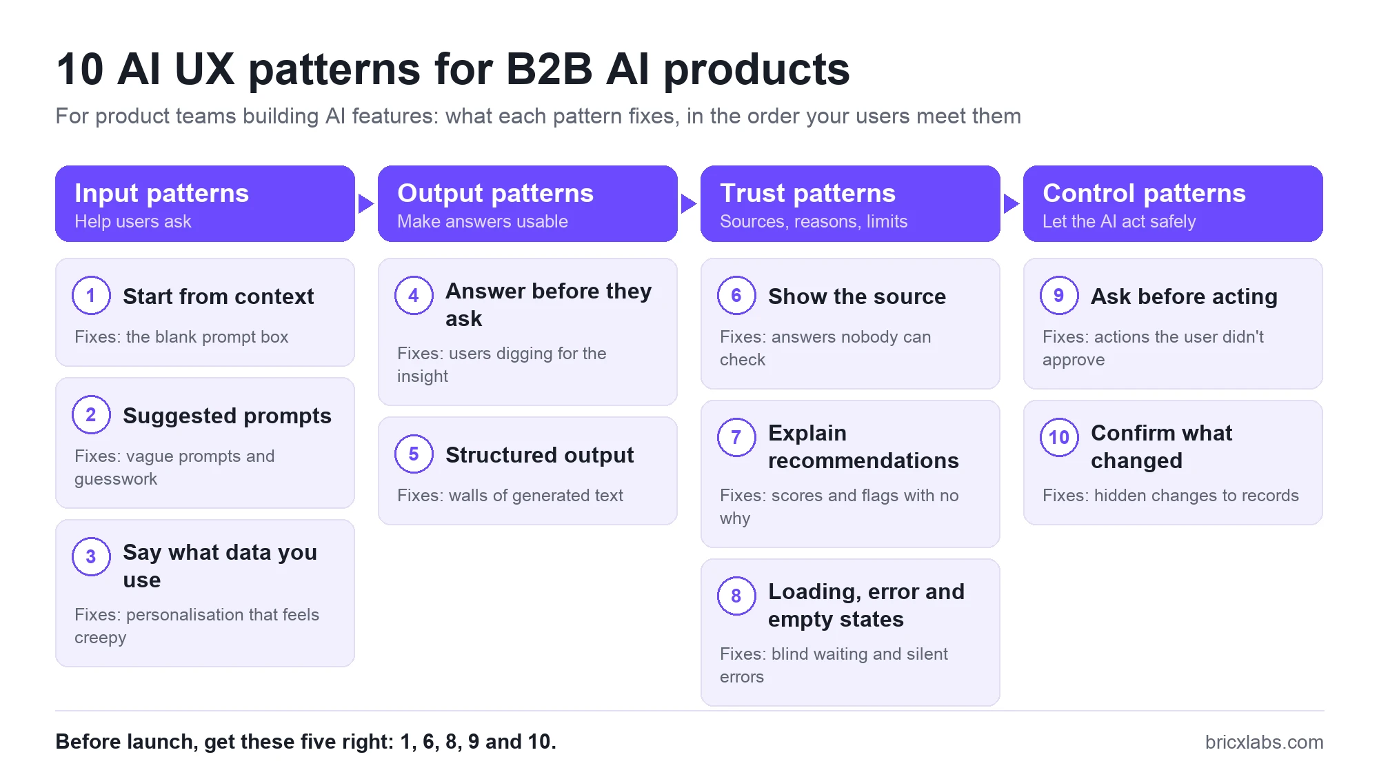
After the patterns come the parts specific to chat and agent interfaces, and a checklist you can run before launch.
What are AI UX patterns?
AI UX patterns are reusable interface solutions for the problems only AI features have: answers that can change from one try to the next, waiting while a model works, deciding whether to trust an answer, and handing an action over to software.
B2B products raise the stakes on all of them. A sales tool has reps, managers and admins who need different views of the same answer. The data behind an answer often lives in other systems, like the CRM, the call recorder or the inbox, with their own permissions. And a wrong answer costs more when the AI writes it into a customer record or emails it to a buyer. Consumer chat patterns are a starting point, but they don't cover those cases, and the usual SaaS UX design basics, like clear navigation and role-based views, still apply around every AI feature.
AI chatbot vs AI agent vs embedded AI: which interface does your product need?
There are three common ways to put AI in front of users. A chatbot answers questions, embedded AI helps inside a screen people already use, and an AI agent does a job for them. Pick one before you design anything else, because each pattern below plays out differently in each.
| Chatbot UI | Embedded AI | Agentic UI | |
|---|---|---|---|
| Also called | Chat interface, conversational UI | Inline AI, AI copilot | AI agent interface |
| How it works | The user asks, the AI answers | The AI helps on the screen the user is already on | The user sets a goal, the AI does the steps and reports back |
| Best when | The question changes every time | The same task repeats every day | The job has many steps and a clear end |
| Products you know | ChatGPT, Perplexity, Intercom Fin | GitHub Copilot, Gmail, Notion AI | Claude Code, Cursor, ChatGPT agent |
| B2B example | "What did the buyer say about pricing?" | A call summary on the CRM record | Updating the CRM after every call |
| From Bricx's work | Sybill assistant, Hobbes demo agent | Sybill meetings view, Writesonic scores | Writesonic agents, Sybill CRM sync |
The products in the table follow this logic. ChatGPT users ask something new each time, GitHub Copilot users repeat the same task all day in one editor, and Claude Code users hand over whole tasks they can check afterwards.
A quick way to decide: if the question changes every time, start with a chatbot. If the task happens many times a day in the same place, embed the AI in that screen. If the job takes several steps and ends with a clear result, design an agent, with the approvals in patterns 9 and 10. Most B2B products end up using all three, each where it fits.
The common mistake is putting a chat box on everything because chat is the most visible form of AI. A rep who wants the same recap after every call shouldn't have to ask for it.
AI input patterns: helping users ask
The 10 patterns follow the order a user meets them: asking, getting an answer, deciding whether to trust it, and letting the AI act. The first three help users ask the AI for the right thing.
1. Start from context the user already has (contextual AI)
A blank prompt box asks the user to explain things the product already knows. Good AI features start from the data in front of them, like the meeting, the deal or the page, so the user's first move is a choice and doesn't have to be a well-written prompt.
Sybill exists to solve a common sales problem, described in the case study this way: "Deal context lived across calls, emails, Slack and the CRM, so reps updated fields by hand and leaders guessed at risk." So the assistant Bricx designed starts from the object the rep is already looking at. A task card carries its date, the meeting it came from and its priority, and the rep's question builds on it without having to explain anything.
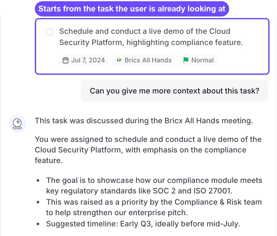
Avoid: making users paste in information the product already holds.
2. Suggested prompts and prompt enhancers
When a user does need to type, give them a head start. Suggested prompts work like a small onboarding for the AI feature, the same job good SaaS onboarding flows do for a whole product. They show what the AI is good at, and an improve button turns a rough request into a precise one without making the user learn prompt writing.
Writesonic's AI SEO agent pairs the prompt field with an "Improve Prompt" button, so a request like "Analyze the keyword difficulty for ‘AI Writing Tool’" can be sharpened before it runs. Its article writer goes further and lets the user choose how much of the request to define, from a 10-step flow with full control to an instant mode where the user gives a topic and the AI handles the rest.
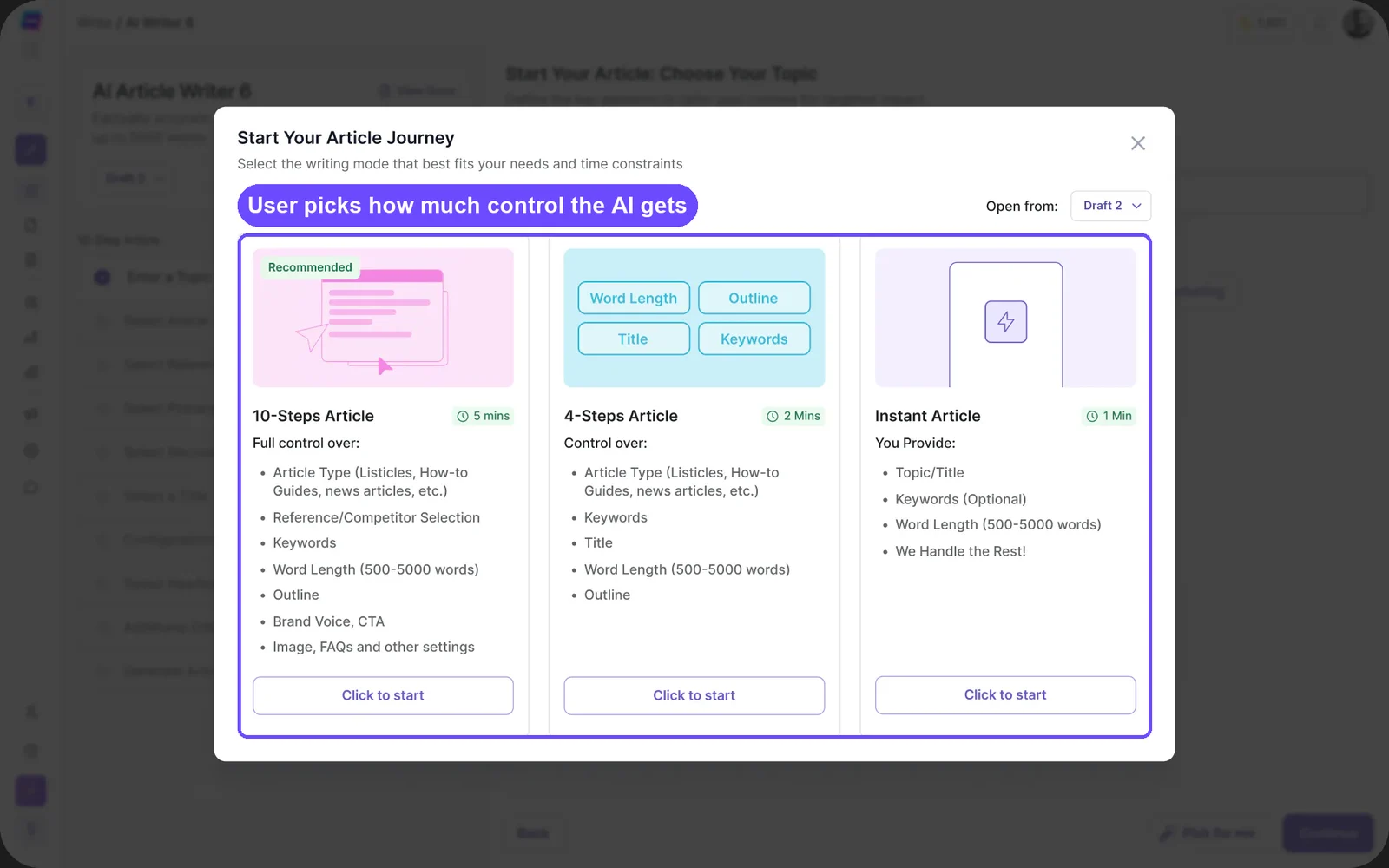
Avoid: example prompts that have nothing to do with the user's job. Generic suggestions teach users the AI is generic.
3. Say what data you use and why
People accept personalisation when they understand it, and they distrust it when it appears without explanation. If the AI is about to use the user's data, say so at the moment you ask for it, in one plain sentence.
Hobbes asks for a work email at the start of the demo and explains the reason right next to the field: "We use your email to tailor this demo for you." Inside the agent, the opening message does the same in its own voice, asking for the visitor's work email so it can go through their company details and personalise the demo.
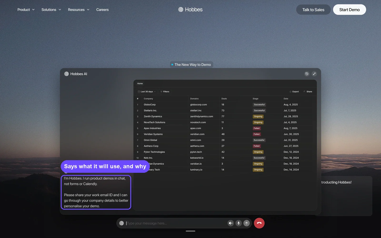
Avoid: personalisation that shows up with no explanation. It reads as surveillance, even when the data use is harmless.
AI output patterns: making answers usable
The next two make the AI's answer easy to use.
4. Bring the answer before they ask
The best AI answer is often one the user didn't have to request. If the product knows a call just ended or a deal just changed, it can put the useful output where the user already works, without waiting for a prompt.
In the meetings view Bricx designed for Sybill, the next meeting shows an agenda already summarised, so the rep walks in prepared without searching old emails, and a Record toggle on each meeting keeps the rep in charge of what the AI captures.
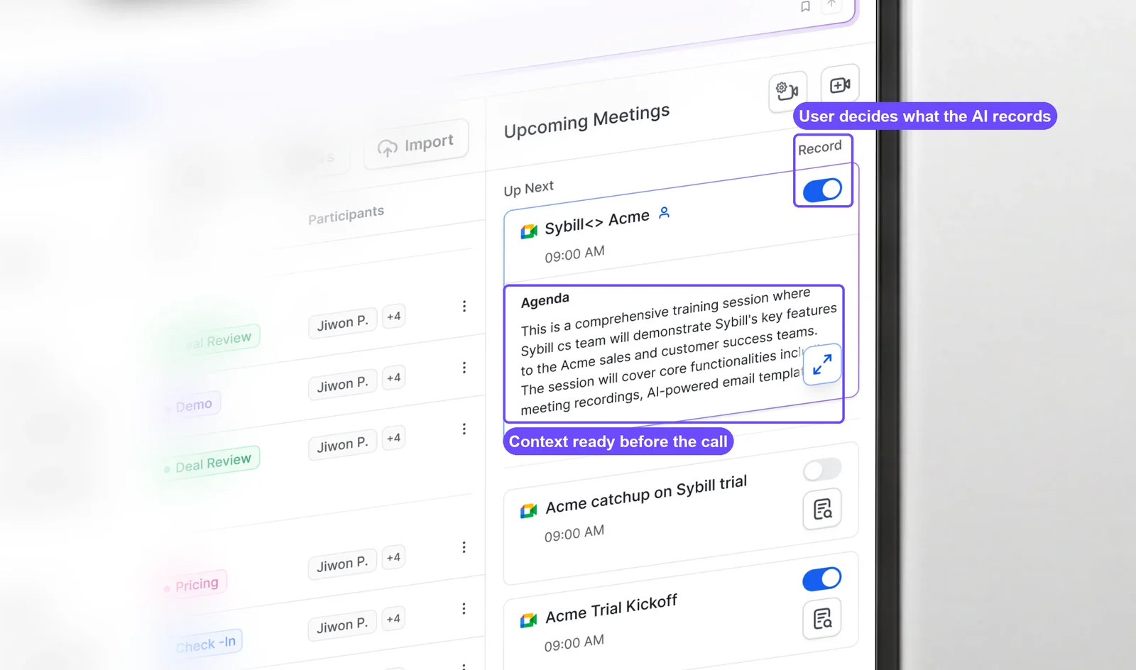
Avoid: proactive alerts with no way to turn them down. Proactive output only helps when the user can control how often it arrives.
5. Structured output: break answers into items people can act on
People scan AI output; they rarely read it top to bottom. Show an answer as separate items, like cards, fields, scores or a short list, with the detail one click away. Each item should be something the user can act on or check.
When a rep asks the Sybill assistant for a call recap, the answer is three facts in one sentence: "they're happy with the pilot, want SSO before a wider rollout, and asked for pricing on 40 seats." Each one maps to a next step.
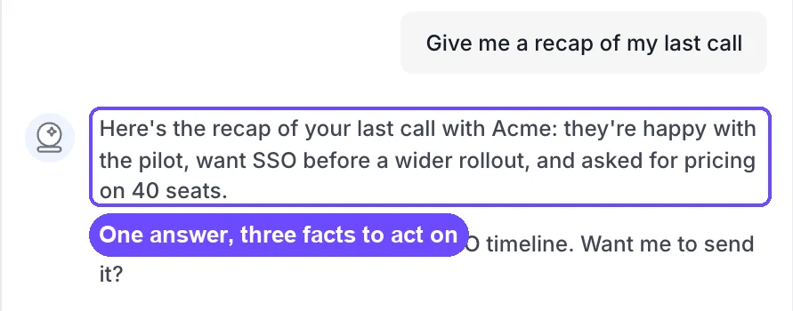
The same thinking behind good dashboard design applies here: lead with the number that matters, then let people drill in. Writesonic's Track Your Presence dashboard turns a large amount of AI search data into three numbers at the top, a visibility score, an industry rank and an average position, each with its change against last week.
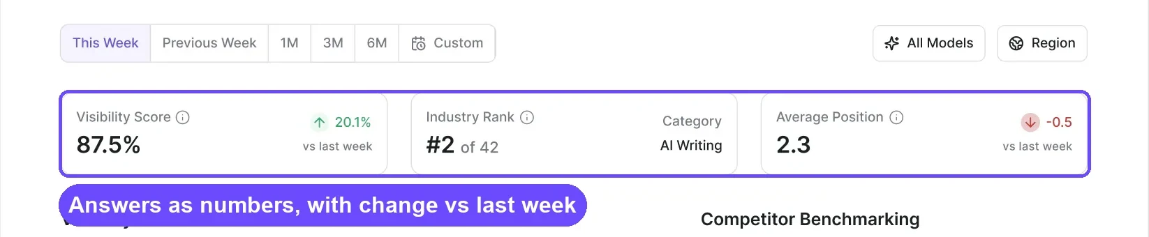
Avoid: long paragraphs where a field or a number would do. A wall of generated text pushes the work back onto the user.
AI trust patterns: sources, reasons and limits
These three help users decide whether to believe an answer.
6. Show the source (citations)
An answer the user can't check is an answer they won't act on. Attach the source to the answer, whether that's a meeting, an email, a document or a record, so the user can verify it in one step.
When a Sybill user asks "Can you give me more context about this task?", the assistant answers with where the task came from:
"This task was discussed during the Bricx All Hands meeting."
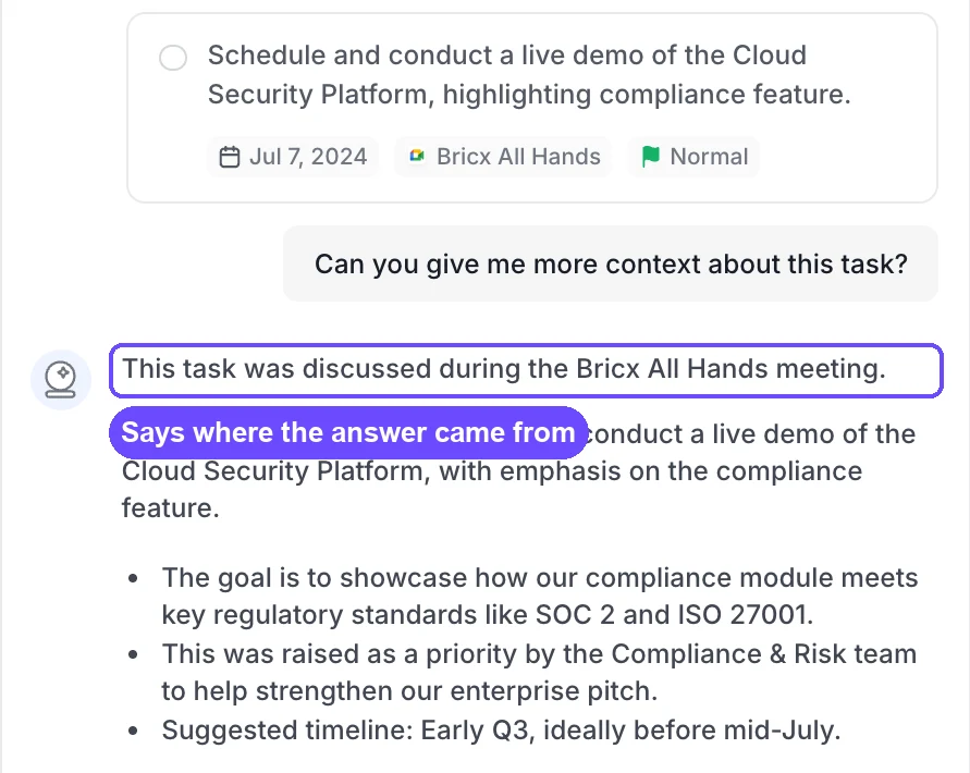
Avoid: confident answers with no trail back to the data.
7. Explainable recommendations: give a reason with every one
A flag or a score without a reason forces the user to either trust it blindly or ignore it. Put the reason in the same line as the recommendation, in the user's language.
The Sybill assistant names each risk and says why it is one:
"Two risks on the Acme deal: legal hasn't reviewed the DPA yet, and the economic buyer has missed the last two calls."
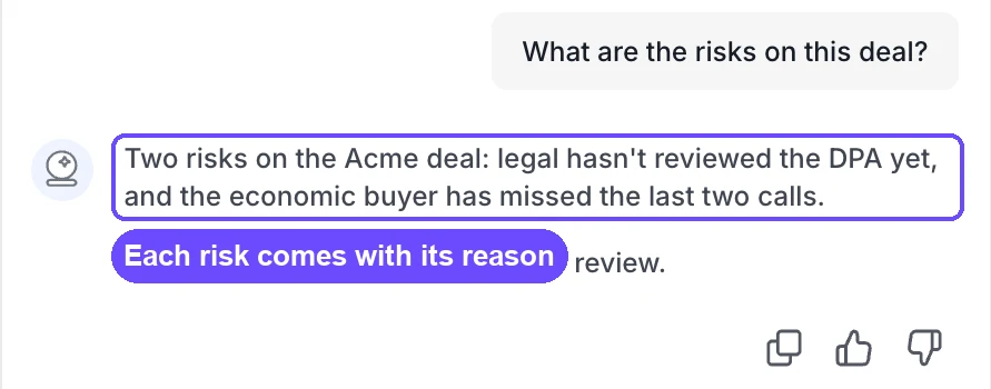
A manager can act on that in a pipeline review. A red "at risk" badge alone would start a debate.
Avoid: scores and colours with no explanation behind them.
8. Loading, error and empty states for AI
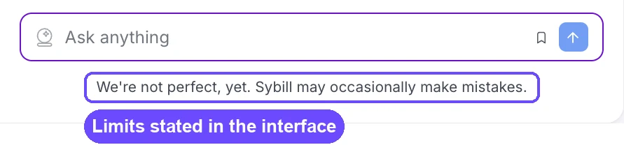
Be honest about limits, and design the slow and wrong states. Every AI feature will be slow sometimes and wrong sometimes, so those states need design as much as the happy path. Tell users up front that mistakes can happen, show progress while the AI works, and when it can't find something, say so plainly.
The Sybill design states its limits in the interface itself, right under the input: "We're not perfect, yet. Sybill may occasionally make mistakes."
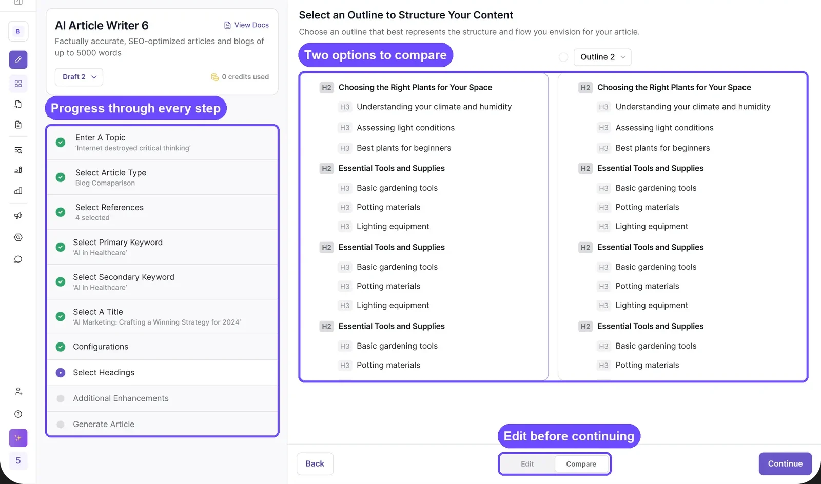
For long tasks, Writesonic's article writer shows every step of the job with its status, so the user always knows what is done and what is next.
For waiting, a progress state can carry more than a spinner, and these loading page design examples show how much. For failures, a short message that names what went wrong, such as "I couldn't find a call with Acme this week", is better than a generic error, and far better than a confident wrong answer. Writing those messages well is UX writing work, so give it the same care as any other interface copy.
Avoid: a spinner with no sense of progress, and empty states that leave the user guessing whether the AI failed or found nothing.
AI control patterns: letting the AI act safely
The last two keep users in control when the AI does something for them.
9. Ask before acting (human in the loop)
When the AI is about to do something with consequences, like sending an email, updating a record or posting content, it should prepare the action and ask first. The draft is the AI's work; sending it is the user's decision.
The Sybill assistant drafts the follow-up and stops at the decision point:
"I've drafted a follow-up with the SSO timeline. Want me to send it?"
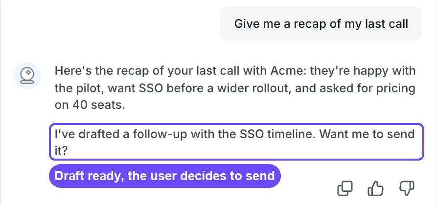
The same idea runs through the whole product. In the meetings view, each meeting has its own Record toggle, so the rep decides which calls get recorded in the first place (see the screen under pattern 4).
Avoid: sending, posting or writing to a system of record without an explicit yes. One unwanted email to a buyer costs more trust than a hundred saved clicks earn.
10. Action confirmations: say exactly what changed
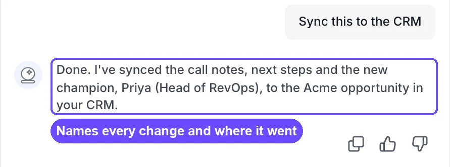
After the AI acts, the confirmation should say what it did and where. A bare "Done" leaves the user wondering what changed and whether to check.
The Sybill confirmation names every change and the record it went to:
"Done. I've synced the call notes, next steps and the new champion, Priya (Head of RevOps), to the Acme opportunity in your CRM."
Avoid: silent background changes. If the user later finds a field they didn't expect, they stop trusting every field.
How do you design a chatbot UI?
Design a chat interface around what chat is good at, which is open questions and follow-ups, and borrow patterns 2, 6 and 9 for everything else. The parts specific to chat are few but they matter:
- Show what the AI can see. A line or a panel that names the record, page or account the chat is working from stops users asking questions it can't answer.
- Suggest the next reply. Tappable follow-ups keep the conversation moving and teach users what to ask.
- Make every answer checkable and reusable. Sources, copy and retry on each message.
- Offer a way to a person. In B2B, some questions should end with a human.
- Collect feedback in one tap. A thumbs up or down on each answer is enough.
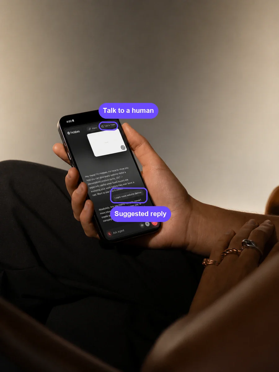
The Hobbes demo agent on mobile shows two of these on one screen: a suggested reply the visitor can tap, and a Talk to Team button for anyone who would rather speak to a person.
On a phone, the chat also has to work with a thumb and a small screen, which the mobile app design best practices for B2B and AI SaaS cover in more depth.
Chat is the wrong choice for tasks people repeat every day. If a rep asks for the same recap after every call, the recap should simply appear (pattern 4), and a button should handle the follow-up.
How do you design an AI agent interface (agentic UI)?
An agent does work for the user, often across several tools, so its interface has to answer four questions at any moment: what can it reach, what is it doing, what did it change, and how do I undo it.
- Show what the agent can reach. Writesonic's AI Marketing Agent groups its connected tools into "SEO & Research", "Analytics & Data", "Content & Publishing" and "Marketing Tools", so users can see the scope of what it can touch.
- Show progress and decision points. The step list in Writesonic's article writer (pattern 8) is the same idea at a smaller scale: each step, its status, and a place to change course.
- Ask before the risky steps. Patterns 9 and 10 apply with more force, because an agent may take many actions in a row. Group low-risk steps, and stop for approval on anything that sends, publishes or writes to a customer record.
- Show the result. The Writesonic case study describes its agents as ones that "rewrite pages, win citations and fix crawl issues, then prove the lift". Proving the lift is a design job too: the result of an agent's work should show up in the dashboard the user already watches.
- Keep a log with a way back. A plain record of what the agent did, when, and an undo or revert for each action.
Agents also travel. Hobbes runs inside each customer's own website, so Bricx designed "a full design system for the demo agent and launcher states" to keep the agent consistent wherever it appears. A design system matters more for agents than for most features, because the same agent shows up in many places.
AI UX patterns checklist
Run this against one real task in your product, end to end. The patterns marked "before launch" are the ones that cause the most damage when they are missing.
| Pattern | Question to ask | Before launch? | Signal to watch |
|---|---|---|---|
| 1. Start from context | Does the AI start from data the product already has? | Yes | Share of sessions that start without typing |
| 2. Better requests | Do suggestions match the user's job? | Suggestion acceptance | |
| 3. Say what data you use | Is every use of personal data explained where it's asked for? | Drop-off at the data step | |
| 4. Answer before asked | Does useful output appear without a prompt? | Opens of proactive output | |
| 5. Actionable items | Can each part of the answer be acted on or checked? | Edits before use | |
| 6. Show the source | Can the user verify every answer in one step? | Yes | Source clicks |
| 7. Reason with every recommendation | Does every flag or score say why? | Overrides of recommendations | |
| 8. Limits, slow and wrong states | Are loading, empty and failure states designed? | Yes | Retries and abandons |
| 9. Ask before acting | Does anything send, post or write without a yes? | Yes | Approvals vs rejections |
| 10. Confirm what changed | Does every confirmation name the change and where? | Yes | Undo rate |
How to check your own AI product against these patterns
Pick one task that matters to your users, like preparing for a call or publishing a page, and walk through it as a new user would. Note each point where the product asks you to start from nothing, gives an answer you can't check, or acts without asking. Those gaps usually cluster, and fixing the before-launch five fixes most of the trust problems.
For the wider review, the UX audit checklist covers the rest of the product. Bricx also reviews AI products against these patterns as part of a UX audit.
Designing an AI product? Work with the team behind these patterns
The screens in this guide come from three AI products Bricx designed:
- Sybill: a product experience that puts CRM updates, recaps and next steps in one deal view that reps and managers both trust.
- Writesonic: the product and site that let marketing teams track AI visibility, fix the gaps and prove the lift.
- Hobbes: a site that leads with the product experience itself, plus a full design system for the demo agent and launcher states.
Bricx works with B2B and AI SaaS companies at both ends of the journey: AI MVP design for teams shaping a first version (the MVP design cost guide explains what drives the budget), and work as a product design agency for products that need these patterns built into an existing experience. The case studies show the work as designed, and the live products keep evolving, so they may look different today.
FAQ
What is the difference between an AI chatbot and an AI agent?
An AI chatbot answers questions, and an AI agent takes actions. A chatbot waits for the user to ask something and replies in the conversation. An agent takes a goal, works through several steps on its own, often across other tools, and reports what it did. That is why agent interfaces need permissions, approvals and an activity log, while a chatbot mostly needs good answers and sources.
What is agentic UX?
Agentic UX is the design of products where AI acts on the user's behalf. Its main job is to keep the user informed and in control while the agent works: showing what the agent can access, asking before risky steps, confirming what changed and offering a way to undo it. Patterns 9 and 10 in this guide are the core of it.
How is designing for AI different from traditional UX design?
In traditional software, the same input always gives the same output, so designers can plan every screen state. AI output can change from one try to the next and can be wrong, so the design also has to set expectations, show where answers came from, handle waiting, and let users check, edit or undo what the AI produces.
How do you design for AI mistakes and hallucinations?
Assume the AI will sometimes be wrong and design so users can catch it. Show sources next to answers, give reasons with recommendations, say plainly what the AI can get wrong, and ask before any action that is hard to reverse. Patterns 6 to 9 cover each of these.
What does human in the loop mean in AI UX?
Human in the loop means a person reviews or approves the AI's work before it takes effect. In an interface, that looks like a draft the user can edit before sending, an approval step before an agent changes a record, or a confirmation that the user can undo.
Which AI UX patterns matter most before launch?
Five patterns cause the most damage when they are missing: starting from context (1), showing sources (6), designing loading, error and empty states (8), asking before acting (9) and confirming what changed (10). If an AI feature launches without them, users tend to stop trusting it early, and trust is hard to win back.
Can AI do UI/UX design?
AI tools can generate screens and speed up parts of the design process, and the guide to generative AI in UX covers how designers use them. Deciding how an AI product earns trust and keeps users in control is still product design work, and it depends on knowing the users.